Upgrade to Pro
— share decks privately, control downloads, hide ads and more …
Speaker Deck
Features
Speaker Deck
PRO
Sign in
Sign up for free
Search
Search
Responsive typography
Search
Sponsored
·
Your Podcast. Everywhere. Effortlessly.
Share. Educate. Inspire. Entertain. You do you. We'll handle the rest.
→
Gunnar Bittersmann
July 08, 2019
Programming
110
0
Share
Embed
Copy iframe code
Copy JS code
Copy link
Start on current slide
Responsive typography
Gunnar Bittersmann
July 08, 2019
More Decks by Gunnar Bittersmann
See All by Gunnar Bittersmann
Responsive typography 2
gunnarbittersmann
0
170
Go home, Prettifier, you’re drunk!!
gunnarbittersmann
0
120
3 Fehler sind zu finden
gunnarbittersmann
0
200
TIL that the future :has already begun
gunnarbittersmann
0
130
TIL how to clear floats
gunnarbittersmann
0
140
TIL about showModal (from small things big things one day come)
gunnarbittersmann
0
140
Inclusive Design 24 2022 – Gunnar’s picks
gunnarbittersmann
0
110
The color rebeccapurple
gunnarbittersmann
0
200
Mehrsprachige Websites
gunnarbittersmann
0
120
Other Decks in Programming
See All in Programming
A2UI という光を覗いてみる
satohjohn
1
160
エンジニア向け会社紹介/Findy Company Profile
findyinc
6
350k
不変条件と整合性境界—ビジネスが決める設計判断と実現パターン / Invariants and Consistency Boundaries
nrslib
14
5.9k
The NotImplementedError Problem in Ruby
koic
1
960
セキュリティの専門家じゃなくてもできる。「セキュリティ意識」をアップデートして サプライチェーン攻撃への耐性を高めよう。
tk3fftk
5
970
Language Server 使ってる? 〜VSCode と Zed の場合〜 / Are you using a Language Server? ~For VS Code and Zed~
handlename
0
810
AIを活用したE2Eテスト実装効率化のあゆみ / ebisu-mobile-14-kotetu
kotetuco
0
130
Oxcを導入して開発体験が向上した話
yug1224
4
340
Javaの型とAI時代に型が大事な理由 / java types and type in AI era
kishida
2
150
TAKTでAI駆動開発の品質を設計する
j5ik2o
7
1.5k
Observability in Practice:Grafana 與 Edge Device SRE 的那些事
blueswen
0
180
気圧・高度・GPSを記録&可視化するアプリ「Koudo」を作った話
hjmkth
1
320
Featured
See All Featured
First, design no harm
axbom
PRO
2
1.2k
Why You Should Never Use an ORM
jnunemaker
PRO
61
9.9k
Unsuck your backbone
ammeep
672
58k
Navigating the moral maze — ethical principles for Al-driven product design
skipperchong
2
400
Thoughts on Productivity
jonyablonski
76
5.2k
Abbi's Birthday
coloredviolet
3
8.3k
"I'm Feeling Lucky" - Building Great Search Experiences for Today's Users (#IAC19)
danielanewman
230
23k
Getting science done with accelerated Python computing platforms
jacobtomlinson
2
240
The Art of Delivering Value - GDevCon NA Keynote
reverentgeek
16
2k
Mobile First: as difficult as doing things right
swwweet
225
10k
Bootstrapping a Software Product
garrettdimon
PRO
307
120k
Building a A Zero-Code AI SEO Workflow
portentint
PRO
0
610
Transcript
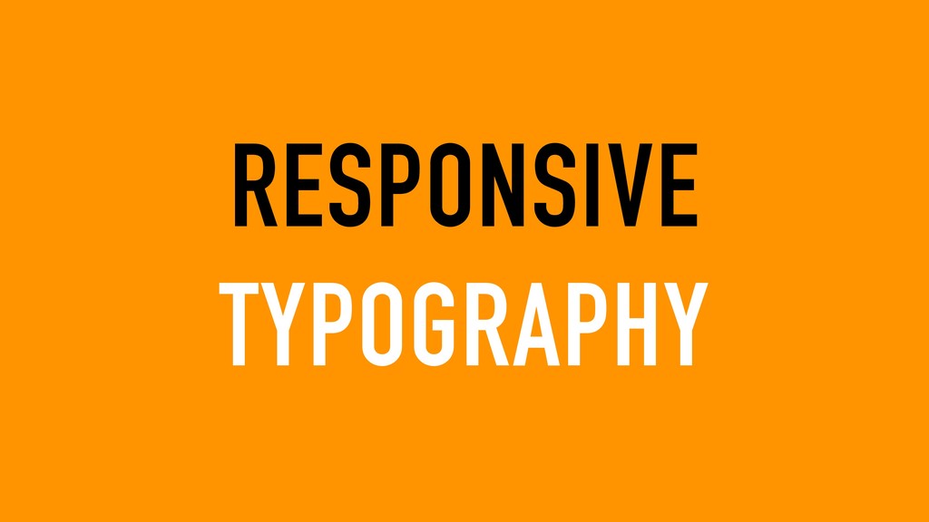
RESPONSIVE TYPOGRAPHY
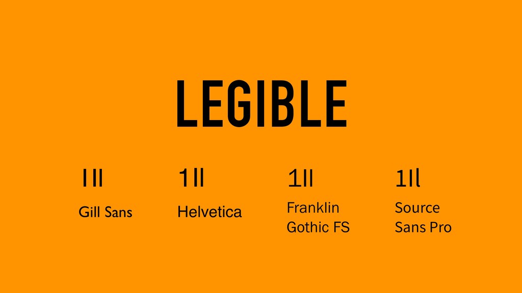
LEGIBLE READABLE
LEGIBLE 1Il Gill Sans 1Il Helvetica 1Il Franklin Gothic
FS 1Il Source Sans Pro
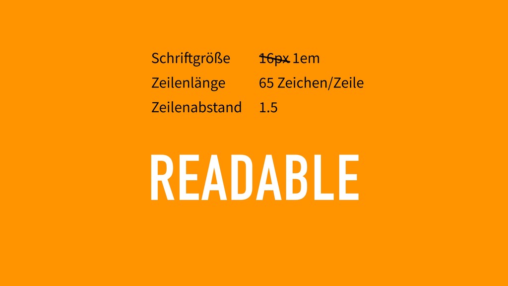
READABLE Schriftgröße Zeilenlänge Zeilenabstand 16px 1em 65 Zeichen/Zeile 1.5
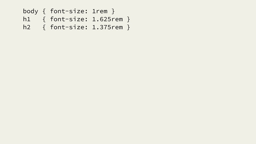
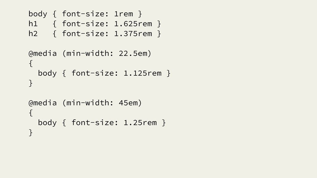
body { font-size: 1rem } h1 { font-size: 1.625rem }
h2 { font-size: 1.375rem }
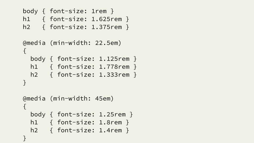
body { font-size: 1rem } h1 { font-size: 1.625rem }
h2 { font-size: 1.375rem } @media (min-width: 22.5em) { body { font-size: 1.125rem } } @media (min-width: 45em) { body { font-size: 1.25rem } }
body { font-size: 1rem } h1 { font-size: 1.625rem }
h2 { font-size: 1.375rem } @media (min-width: 22.5em) { body { font-size: 1.125rem } h1 { font-size: 1.778rem } h2 { font-size: 1.333rem } } @media (min-width: 45em) { body { font-size: 1.25rem } h1 { font-size: 1.8rem } h2 { font-size: 1.4rem } }
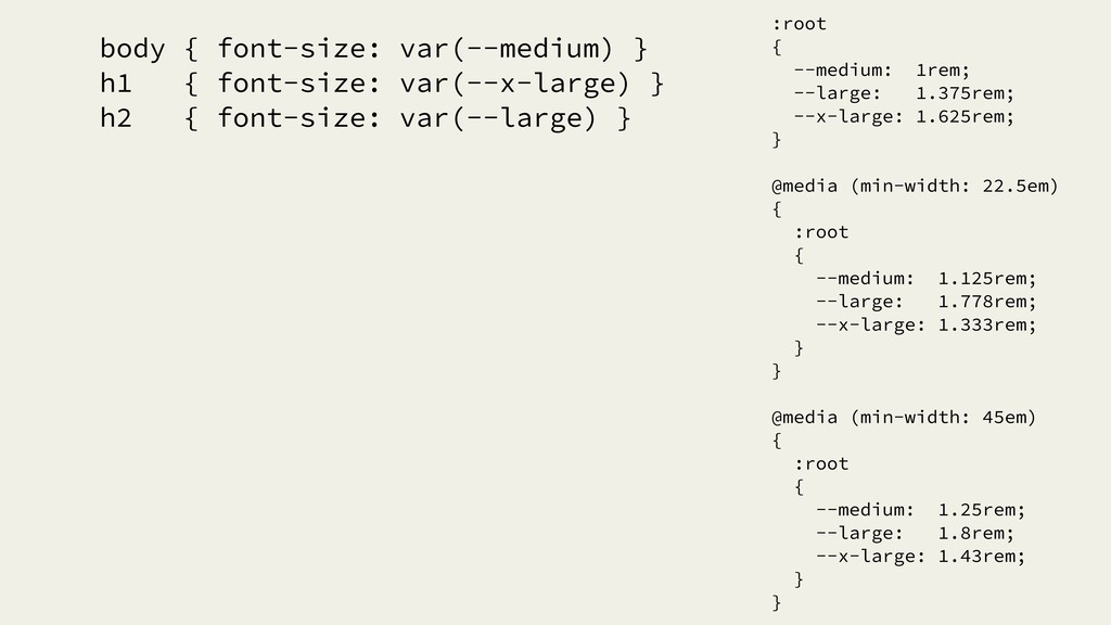
body { font-size: var(--medium) } h1 { font-size: var(--x-large) }
h2 { font-size: var(--large) } :root { --medium: 1rem; --large: 1.375rem; --x-large: 1.625rem; } @media (min-width: 22.5em) { :root { --medium: 1.125rem; --large: 1.778rem; --x-large: 1.333rem; } } @media (min-width: 45em) { :root { --medium: 1.25rem; --large: 1.8rem; --x-large: 1.43rem; } }
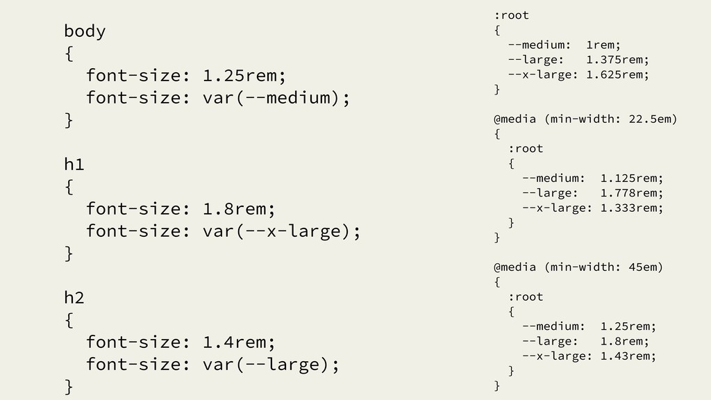
body { font-size: 1.25rem; font-size: var(--medium); } h1 { font-size:
1.8rem; font-size: var(--x-large); } h2 { font-size: 1.4rem; font-size: var(--large); } :root { --medium: 1rem; --large: 1.375rem; --x-large: 1.625rem; } @media (min-width: 22.5em) { :root { --medium: 1.125rem; --large: 1.778rem; --x-large: 1.333rem; } } @media (min-width: 45em) { :root { --medium: 1.25rem; --large: 1.8rem; --x-large: 1.43rem; } }
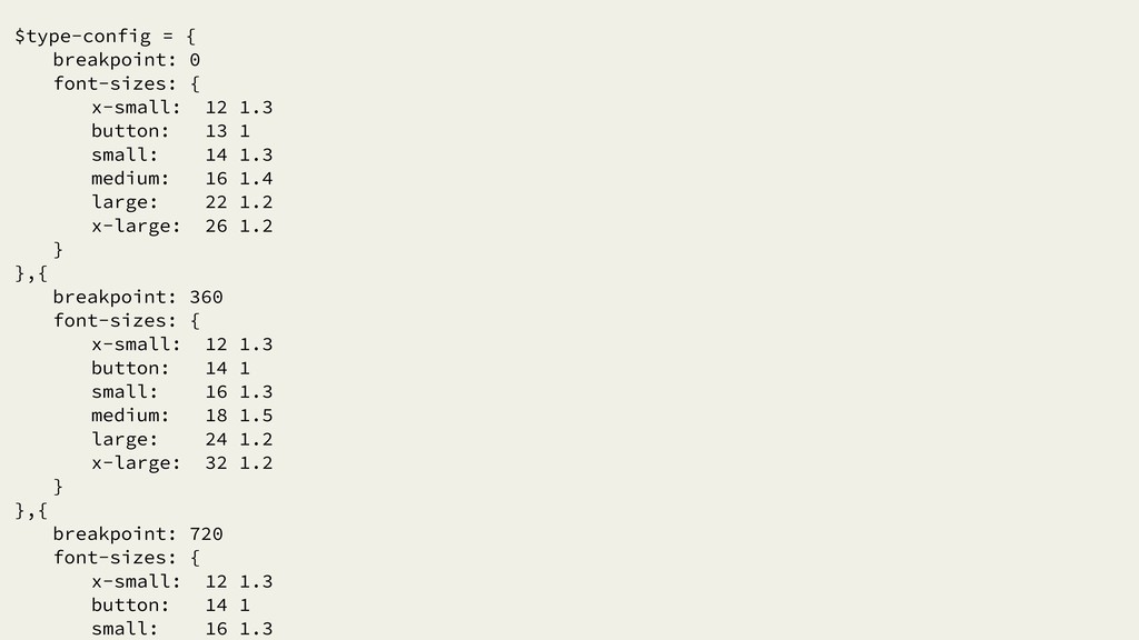
$type-config = { breakpoint: 0 font-sizes: { x-small: 12 1.3
button: 13 1 small: 14 1.3 medium: 16 1.4 large: 22 1.2 x-large: 26 1.2 } },{ breakpoint: 360 font-sizes: { x-small: 12 1.3 button: 14 1 small: 16 1.3 medium: 18 1.5 large: 24 1.2 x-large: 32 1.2 } },{ breakpoint: 720 font-sizes: { x-small: 12 1.3 button: 14 1 small: 16 1.3
$fallback-font-sizes = $type-config[2][font-sizes] $px-factor = 16 set-font-size($font-size, importance = false)
font-size: ($fallback-font-sizes[$font-size][0]/$px-factor)rem (importance is important ? !important :) font-size: s('var(--font-size-%s, %s)', $font-size, ($fallback-font-sizes[$font-size][0]/ $px-factor)rem) (importance is important ? !important :) set-line-height($font-size, importance = false) line-height: $fallback-font-sizes[$font-size][1] (importance is important ? !important :) line-height: s('var(--line-height-%s, %s)', $font-size, $fallback-font-sizes[$font-size][1]) (importance is important ? !important :) set-font-size-line-height($font-size, importance = false) set-font-size($font-size, importance) set-line-height($font-size, importance) :root for $screen-size in $type-config @media (min-width: ($screen-size[breakpoint]/$px-factor)em) for $key, $value in $screen-size[font-sizes] --font-size-{$key}: ($value[0]/$px-factor)rem --line-height-{$key}: $value[1]
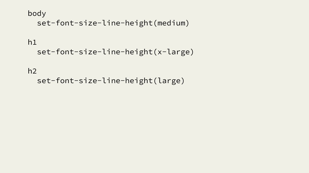
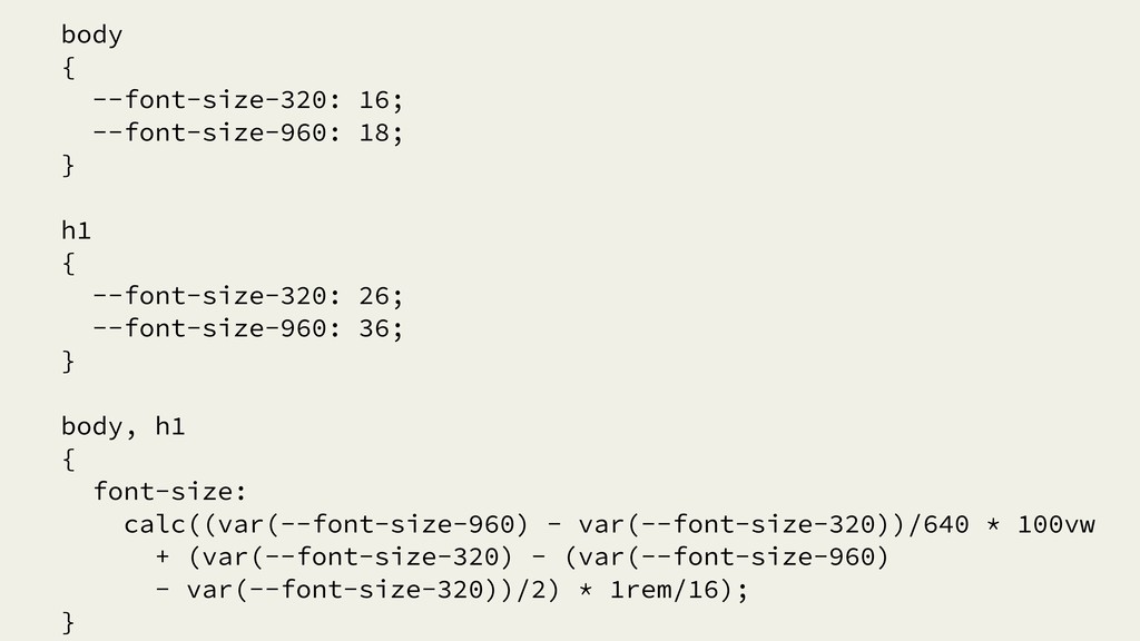
body set-font-size-line-height(medium) h1 set-font-size-line-height(x-large) h2 set-font-size-line-height(large)
FLUID TYPOGRAPHY
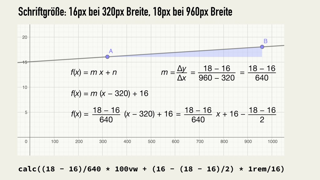
calc((18 - 16)/640 * 100vw + (16 - (18 -
16)/2) * 1rem/16) f(x) = m x + n f(x) = m (x − 320) + 16 m = = = Δy Δx 18 − 16 960 − 320 18 − 16 640 18 − 16 640 f(x) = (x − 320) + 16 18 − 16 640 18 − 16 2 = x + 16 − Schriftgröße: 16px bei 320px Breite, 18px bei 960px Breite
body { font-size: calc((18 - 16)/640 * 100vw + (16
- (18 - 16)/2) * 1rem/16); } Überschrift: 26px bei 320px Breite, 36px bei 960px Breite h1 { font-size: calc((36 - 26)/640 * 100vw + (26 - (36 - 26)/2) * 1rem/16); } Schriftgröße: 16px bei 320px Breite, 18px bei 960px Breite
body { --font-size-320: 16; --font-size-960: 18; } h1 { --font-size-320:
26; --font-size-960: 36; } body, h1 { font-size: calc((var(--font-size-960) - var(--font-size-320))/640 * 100vw + (var(--font-size-320) - (var(--font-size-960) - var(--font-size-320))/2) * 1rem/16); }
 gunnarbittersmann
 satohjohn
 findyinc
 nrslib
 koic
koic
 tk3fftk
 handlename
 kotetuco
 yug1224
 kishida
 j5ik2o
 blueswen
 hjmkth
 axbom
axbom
 jnunemaker
 ammeep
 skipperchong
 jonyablonski
 coloredviolet
 danielanewman
 jacobtomlinson
 reverentgeek
 swwweet
 garrettdimon
 portentint
![$fallback-font-sizes = $type-config[2][font-sizes] $px-factor = 16 set-font-size($font-size, importance = false)](https://files.speakerdeck.com/presentations/53e946fd86ed4c48a18df794bea4c59d/slide_10.jpg)