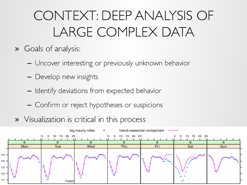
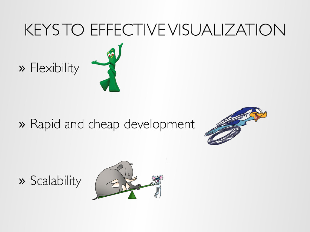
analysis: – Uncover interesting or previously unknown behavior – Develop new insights – Identify deviations from expected behavior – Confirm or reject hypotheses or suspicions » Visualization is critical in this process
do not come with a manual for what to do » If we already (think we) know the algorithm / model to apply and simply apply it to the data, we are not doing analysis, we are processing » Deep analysis means detailed, comprehensive analysis that does not lose important information in the data » It means learning from the data, not forcing our preconceptions on the data » It means being willing and able to use any of the 1000s of statistical, machine learning, and visualization methods as dictated by the data » It means trial and error, an iterative process of hypothesizing, fitting, validating, learning
of the following: – Large number of records – Many variables – Complex data structures not readily put into tabular form of cases by variables – Intricate patterns and dependencies that require complex models and methods of analysis – Does not conform to simple assumptions made by many algorithms
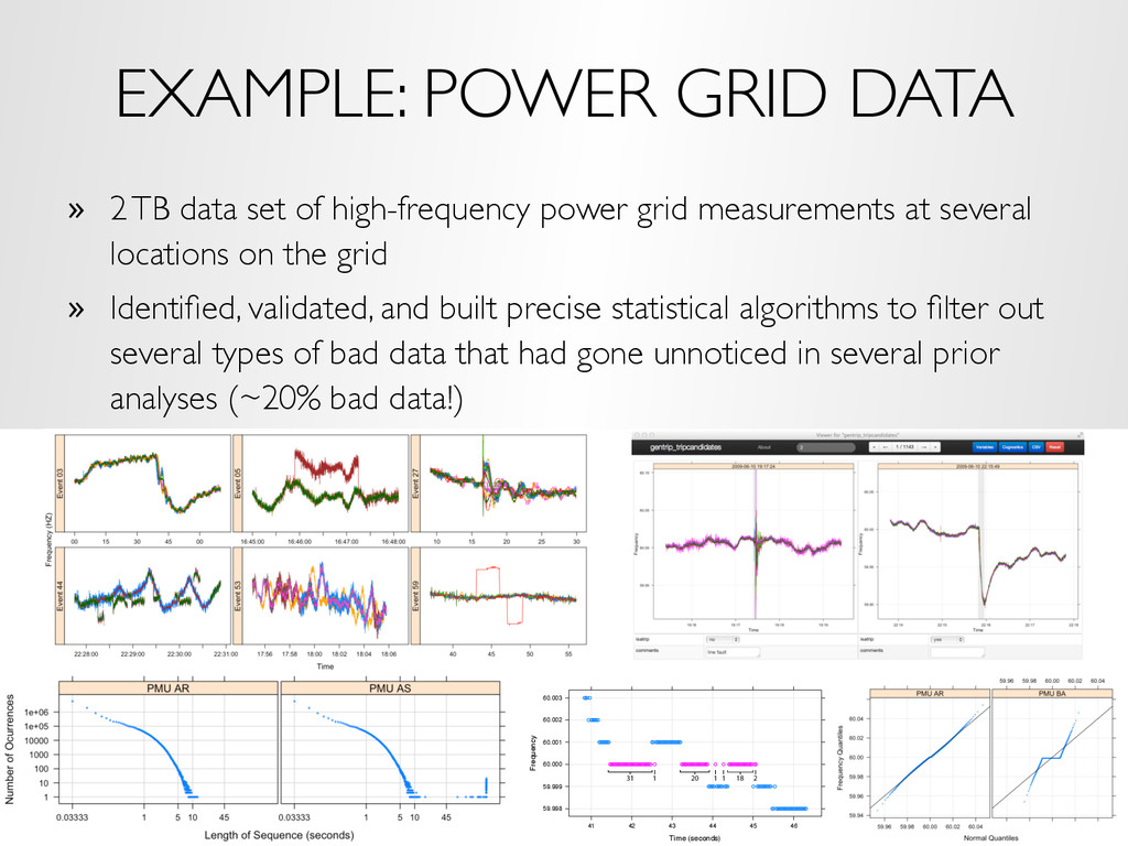
high-frequency power grid measurements at several locations on the grid » Identified, validated, and built precise statistical algorithms to filter out several types of bad data that had gone unnoticed in several prior analyses (~20% bad data!) Time (seconds) Frequency 59.998 59.999 60.000 60.001 60.002 60.003 41 42 43 44 45 46 31 1 20 1 1 18 2
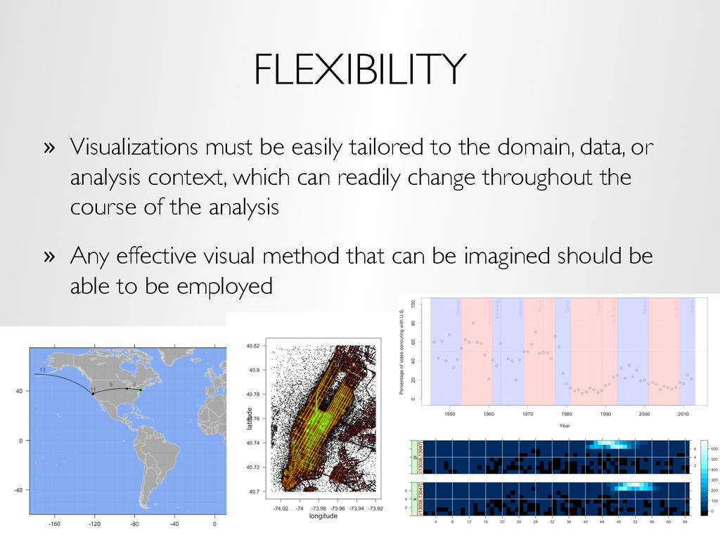
data, or analysis context, which can readily change throughout the course of the analysis » Any effective visual method that can be imagined should be able to be employed
repeated trial and error » Visualization is usually the driver of the iteration – it is most effective at helping us realize we are doing something wrong or at giving us ideas of something new to try » Spending a lot of time / effort / money on any single visualization in this process will slow or stop the iteration » Most often this requires skill and knowledge using a high-level programming environment, although systems like Tableau, Lyra, and others are helping to make it easier to rapidly specify visualizations without programming
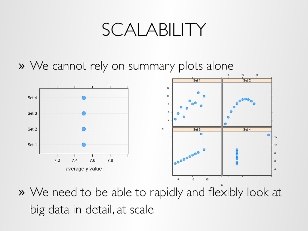
We need to be able to rapidly and flexibly look at big data in detail, at scale average y value Set 1 Set 2 Set 3 Set 4 7.2 7.4 7.6 7.8 x y 4 6 8 10 12 Set 1 5 10 15 Set 2 5 10 15 Set 3 4 6 8 10 12 Set 4
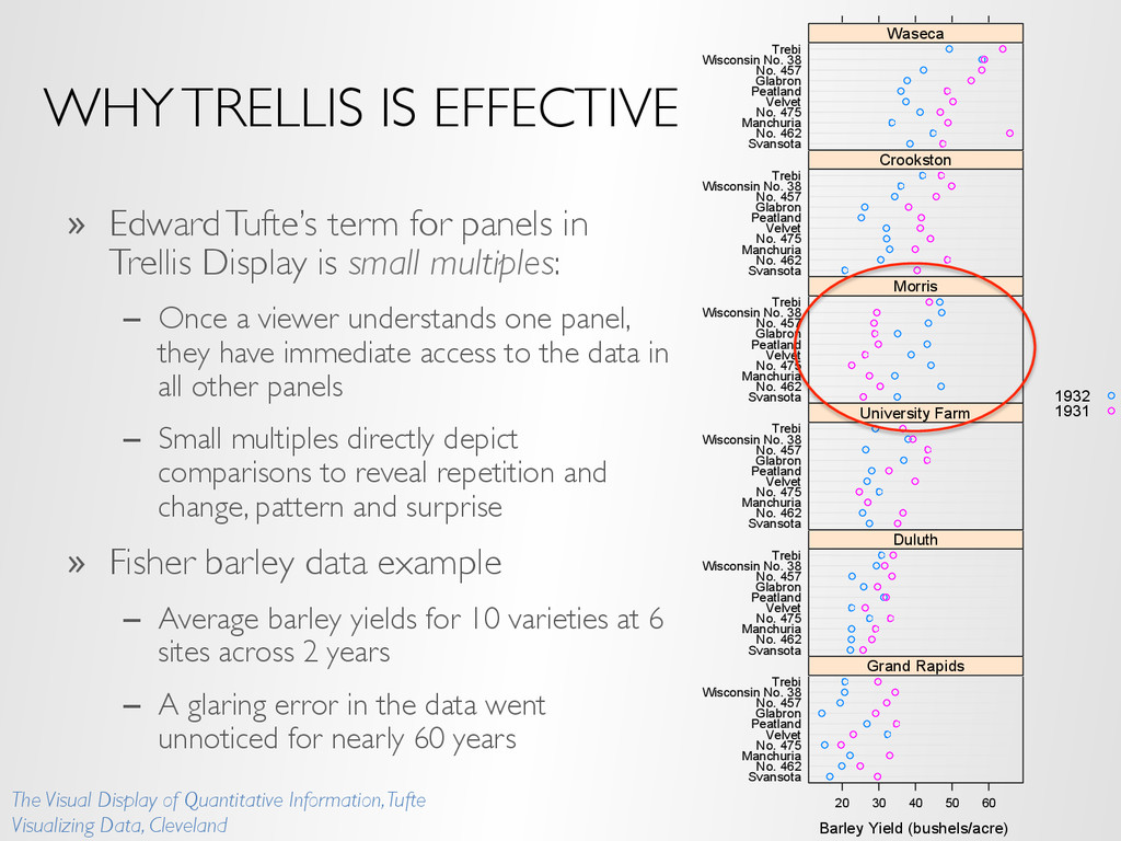
conditioning on variables of the dataset » A visualization method is applied to each subset » The image for each subset is called a “panel” » Panels are arranged in an array of rows, columns, and pages, resembling a garden trellis Time Seasonal Component -0.5 0.0 0.5 Jan 1960197019801990 Feb Mar 1960197019801990 Apr May 1960197019801990 Jun 1960197019801990 Jul Aug 1960197019801990 Sep Oct 1960197019801990 Nov -0.5 0.0 0.5 Dec Average yearly deaths due to cancer per 100000 -0.2 0.0 0.2 0.4 -0.5 0.0 0.5 rate.male -0.2 0.0 0.2 0.4 rate.female 100 200 300 400 500 600
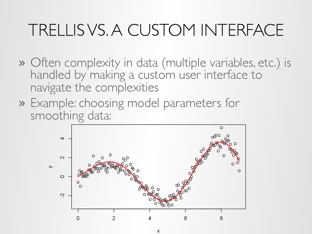
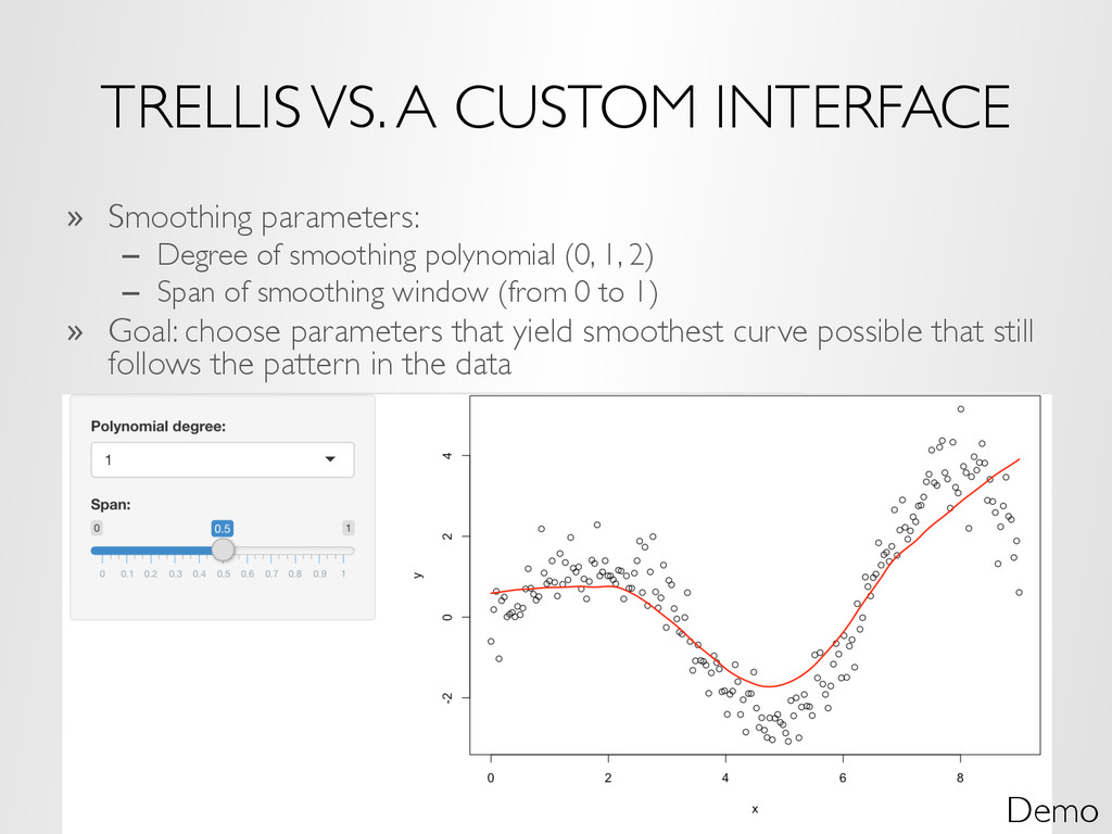
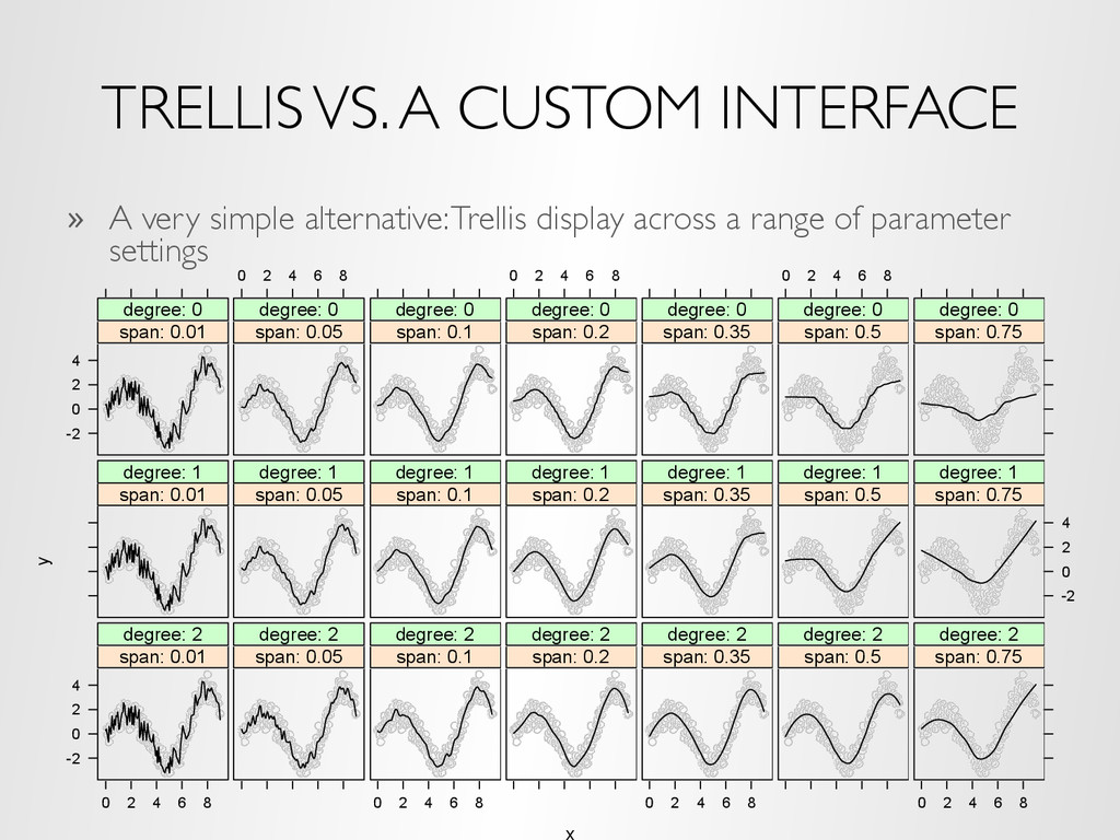
(multiple variables, etc.) is handled by making a custom user interface to navigate the complexities » Example: choosing model parameters for smoothing data: 0 2 4 6 8 -2 0 2 4 x y
of smoothing polynomial (0, 1, 2) – Span of smoothing window (from 0 to 1) » Goal: choose parameters that yield smoothest curve possible that still follows the pattern in the data Demo
appropriate smoothing model is easier with the Trellis display – We can see multiple models at once – we don’t have to try to remember what we’ve seen with other parameter choices – Would be interesting to validate this with an experiment » If you are skeptical about this claim: – It’s still hard to argue that it would be any more difficult – It is most likely much faster to make a reasonable choice from the Trellis display (consider a timed experiment) – Creating the Trellis display is much easier and much faster than creating the interface
Data can be broken up in many ways, facilitating many different views of the data, the ability to visualize higher dimensions, etc. – You can plot anything you want inside a panel – When using a programming environment like R, a large collection of plotting methods is at your disposal » Trellis displays can be developed rapidly – As discussed in the previous example – Displays can be specified through a simple set of commands » But does Trellis display scale?
idea of small multiples – Typically “big data” is big because it is made up of collections of smaller data from many subjects, sensors, locations, time periods, etc. – It is natural to break the data up based on these dimensions and plot it » But this means Trellis displays with potentially thousands or millions of panels » We can create millions of plots, but we will never be able to (or want to) view all of them!
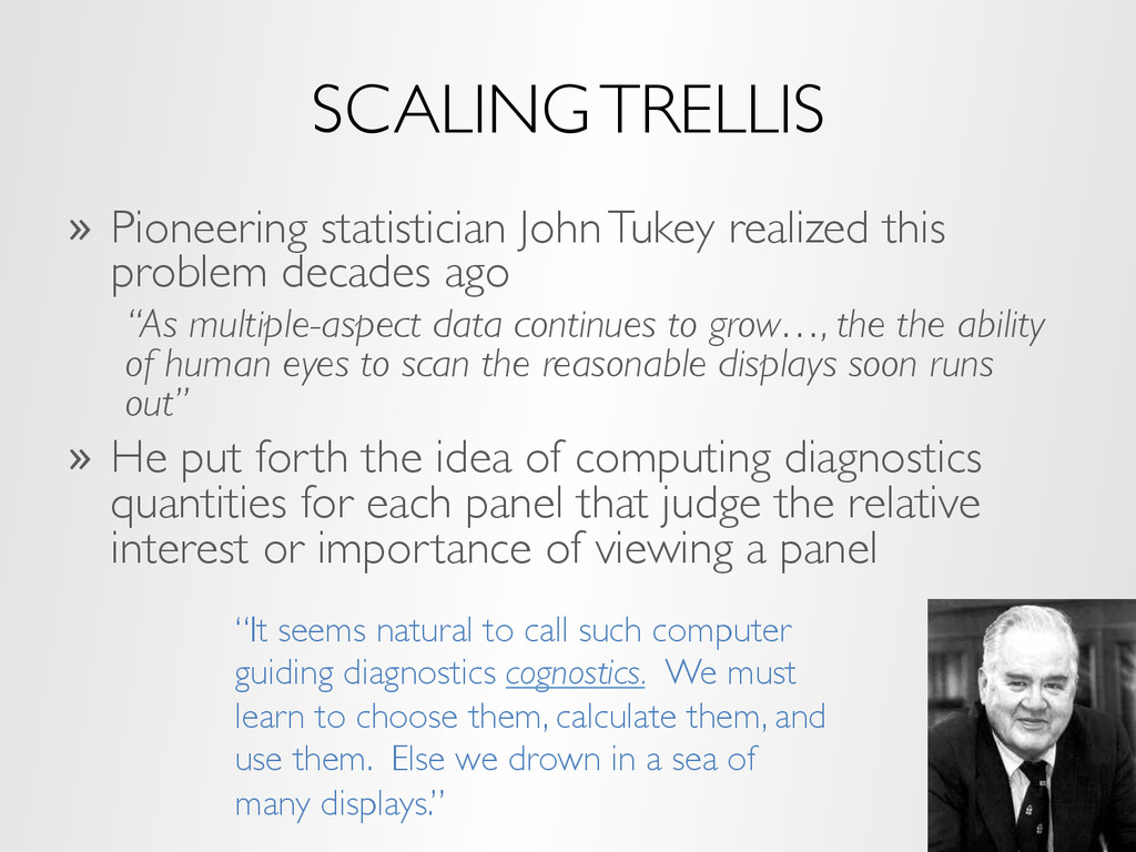
“As multiple-aspect data continues to grow…, the the ability of human eyes to scan the reasonable displays soon runs out” » He put forth the idea of computing diagnostics quantities for each panel that judge the relative interest or importance of viewing a panel SCALING TRELLIS “It seems natural to call such computer guiding diagnostics cognostics. We must learn to choose them, calculate them, and use them. Else we drown in a sea of many displays.”
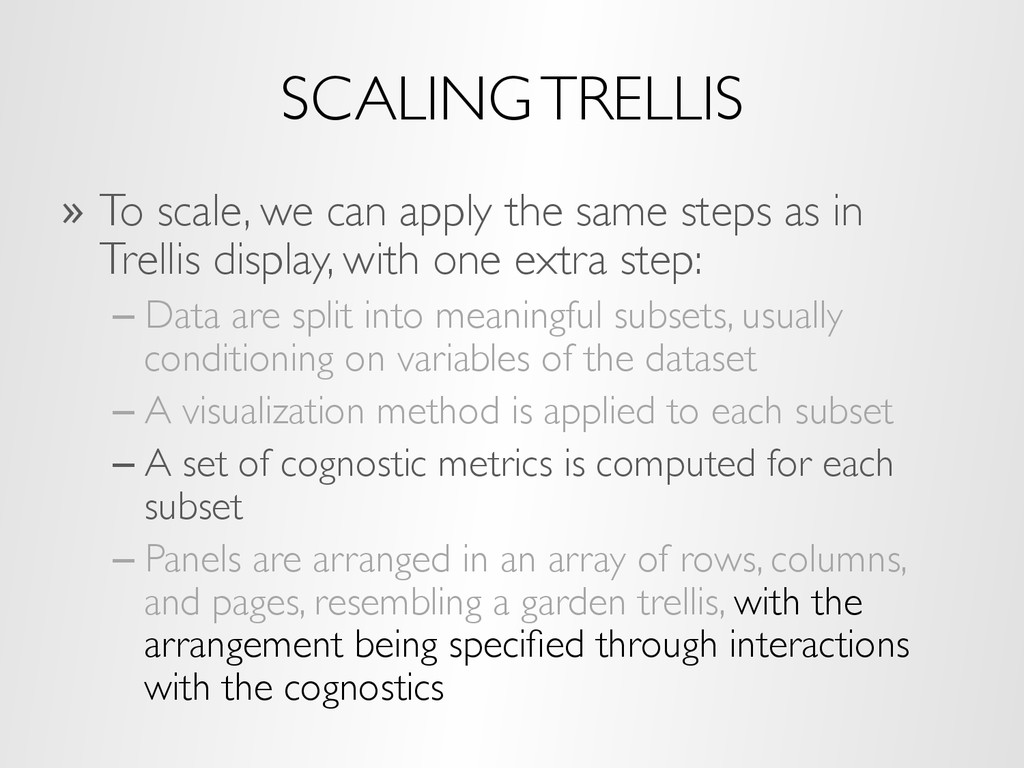
steps as in Trellis display, with one extra step: – Data are split into meaningful subsets, usually conditioning on variables of the dataset – A visualization method is applied to each subset – A set of cognostic metrics is computed for each subset – Panels are arranged in an array of rows, columns, and pages, resembling a garden trellis, with the arrangement being specified through interactions with the cognostics
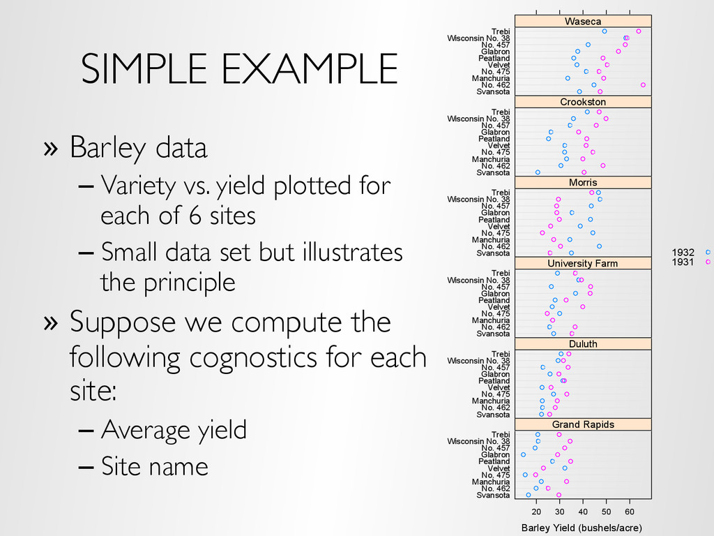
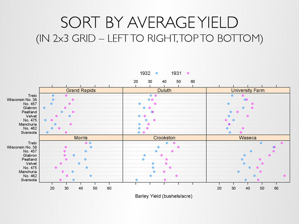
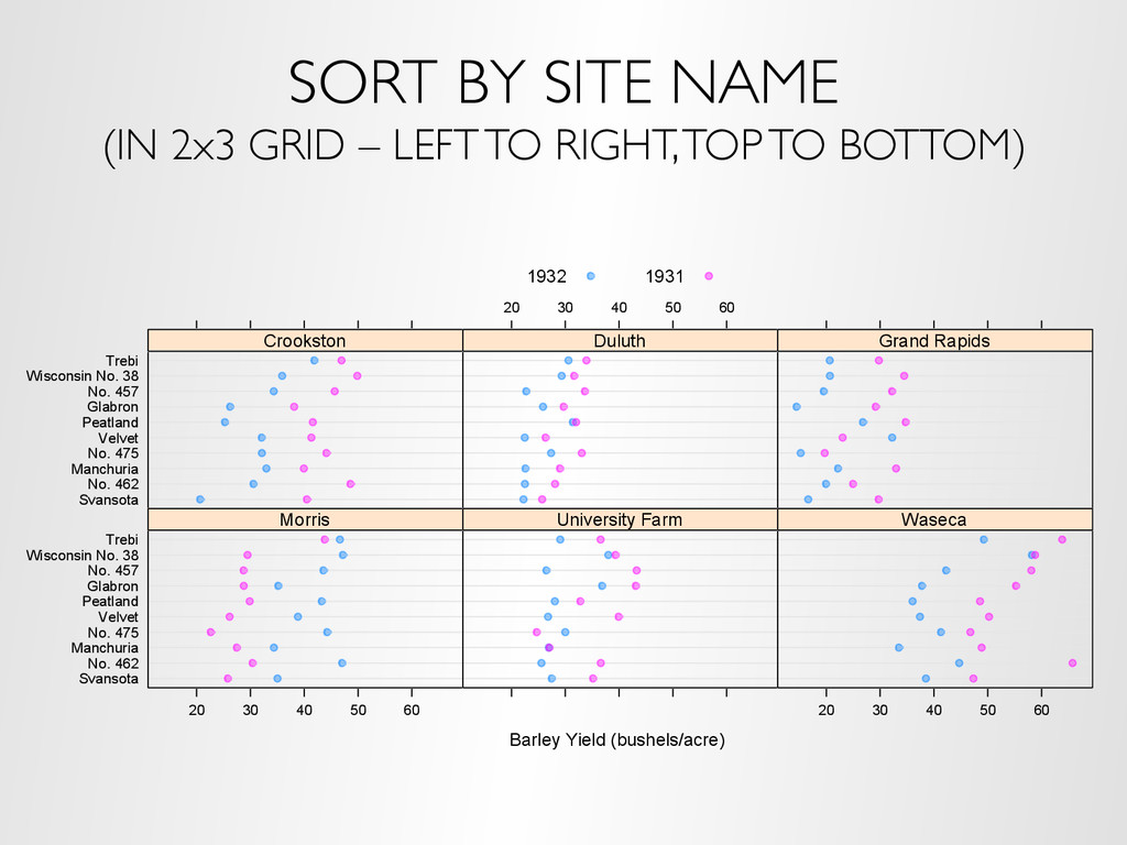
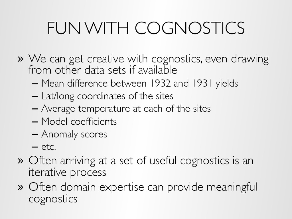
even drawing from other data sets if available – Mean difference between 1932 and 1931 yields – Lat/long coordinates of the sites – Average temperature at each of the sites – Model coefficients – Anomaly scores – etc. » Often arriving at a set of useful cognostics is an iterative process » Often domain expertise can provide meaningful cognostics
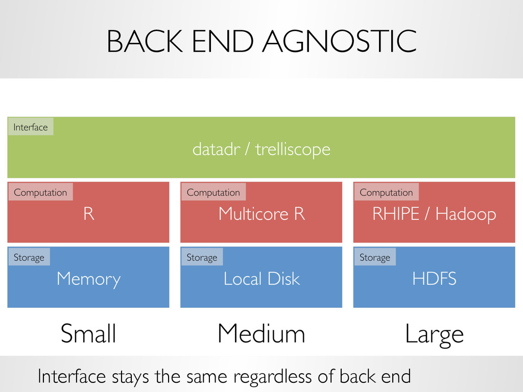
» Tessera is a general environment for deep analysis of large complex data » Tessera provides scalable access to 1000s of analytic methods of statistics, machine learning, and visualization available in the R environment » Trelliscope is the visualization component of Tessera » (recall the importance of visualization and analysis living together) » More information at http://tessera.io
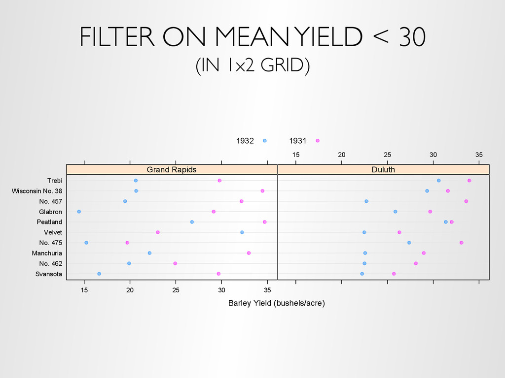
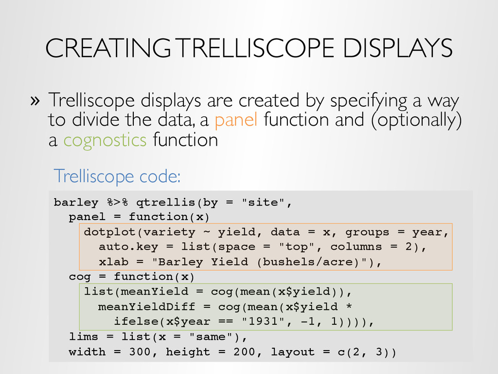
a way to divide the data, a panel function and (optionally) a cognostics function dotplot(variety ~ yield | site, data = barley, groups = year, auto.key = list(space = "top", columns = 2), xlab = "Barley Yield (bushels/acre) ", aspect = 0.5, layout = c(3, 2), ylab = NULL) Trellis code:
the user to interact with panels based on cognostics – Layout (rows, columns), paging – Sorting, filtering on cognostics – Univariate and multivariate visual range filters Demo
– 25ms resolution (trade price, volume, etc.) – Hundreds of gigabytes stored on Hadoop – Use Tessera to partition data by stock symbol and day – Use Tessera to aggregate within symbol / day by second – Over 900K subsets – Use Trelliscope to visualize price vs. time
less expensive and often just as effective as writing a custom application » No technical expertise is needed to view a Trelliscope display » Provides a user friendly way to bring domain experts into the iterative analysis process – visualization is the best medium for communication » Provides the ability to flexibly look at the data in detail, even when it’s big » Visual and analytic methods coexist
custom interactive user interface for each big data problem that comes along, the idea of Trelliscope is to parametrize the desired interactivity into the data partitioning and specification of cognostics » This interactive paradigm has many advantages – The UI is always the same – once you learn it, you don’t need to learn a new interface for each new data set / visualization app – Facilitates simultaneous comparisons against different views of the data (as opposed to adjusting knobs and not remembering what you saw under different settings, etc.) – Preserves state, provenance, etc. in a standard way – a very important aspect of interactive visualization