Upgrade to Pro
— share decks privately, control downloads, hide ads and more …
Speaker Deck
Features
Speaker Deck
PRO
Sign in
Sign up for free
Search
Search
Responsive Design - Polopoly GeekNight Blixttal
Search
Sponsored
·
Ship Features Fearlessly
Turn features on and off without deploys. Used by thousands of Ruby developers.
→
Henrik Ekelöf
November 23, 2011
Programming
410
2
Share
Embed
Copy iframe code
Copy JS code
Copy link
Start on current slide
Responsive Design - Polopoly GeekNight Blixttal
Henrik Ekelöf
November 23, 2011
Other Decks in Programming
See All in Programming
はてなアカウント基盤 State of the Union
cockscomb
1
860
TSKaigi Night Talks 2026_TypeScriptでサプライチェーンの整合性を型に閉じ込める
geekplus_tech
0
410
[2026年度第1回ORセミナー] 計画最適化ベンチャーと競技プログラミング人材
terryu16
0
270
生成AI時代にこそ効くGo | Why Go Works in the Age of Generative AI
mom0tomo
8
3.3k
Lessons from Spec-Driven Development
simas
PRO
0
220
Make SRE Operations Easier with Azure SRE Agent
kkamegawa
0
8.2k
SREは、MCPとSRE Agentをこう使え!
kazumax55
0
120
トークンをケチるな、設計しろ:GitHub Copilotを賢く使うコンテキスト戦略
ochtum
0
190
AI 輔助遺留系統現代化的經驗分享
jame2408
1
1k
Vite+ Unified Toolchain for the Web
naokihaba
0
360
Strategic Design in the Frontend: Moduliths & Micro Frontends @DDDEurope
manfredsteyer
PRO
0
130
なぜ型を書くのか? TSKaigi2026で改めて考える #tskaigi_smarthr
kajitack
0
160
Featured
See All Featured
Helping Users Find Their Own Way: Creating Modern Search Experiences
danielanewman
31
3.2k
Art, The Web, and Tiny UX
lynnandtonic
304
22k
16th Malabo Montpellier Forum Presentation
akademiya2063
PRO
0
150
Designing for Timeless Needs
cassininazir
1
260
Between Models and Reality
mayunak
4
350
I Don’t Have Time: Getting Over the Fear to Launch Your Podcast
jcasabona
34
2.8k
Designing Dashboards & Data Visualisations in Web Apps
destraynor
231
55k
Designing Experiences People Love
moore
143
24k
Being A Developer After 40
akosma
91
590k
Abbi's Birthday
coloredviolet
3
8.3k
Breaking role norms: Why Content Design is so much more than writing copy - Taylor Woolridge
uxyall
0
330
Leo the Paperboy
mayatellez
7
1.9k
Transcript
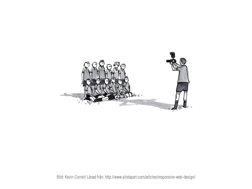
Bild: Kevin Cornell Lånad från: http://www.alistapart.com/articles/responsive-web-design/
Henrik Ekelöf Gränssnittsutvecklare på Valtech
Responsive Design
— ett nytt häftigt sätt att bygga mobilwebb Vad det
inte är:
Faktum är:
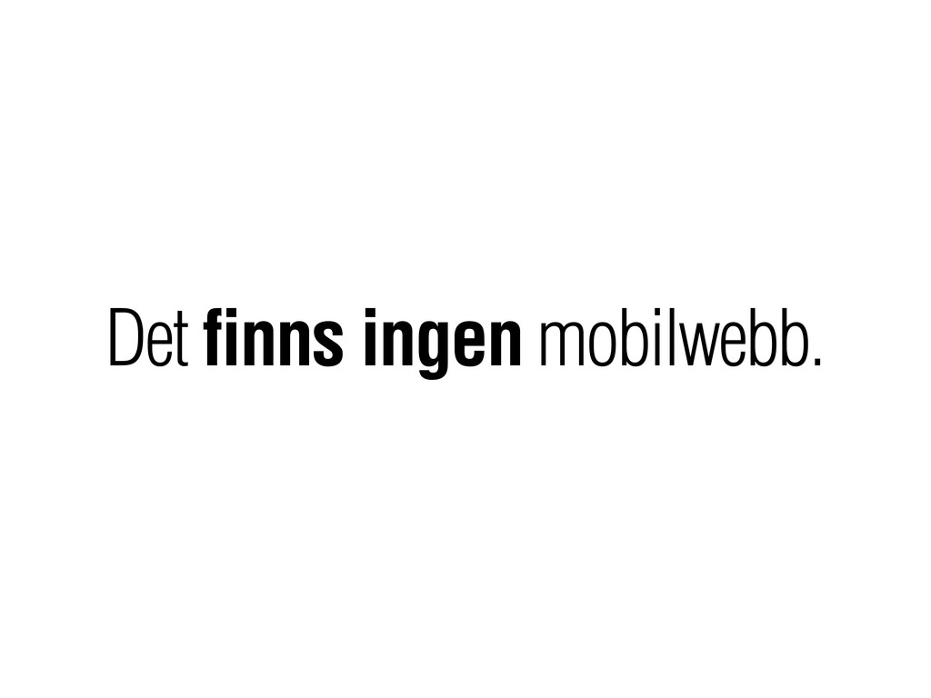
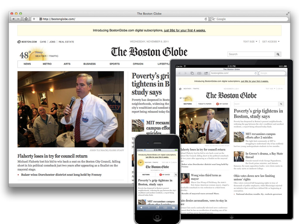
Det finns ingen mobilwebb.
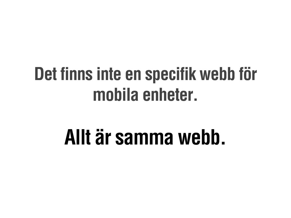
Det finns inte en specifik webb för mobila enheter. Allt
är samma webb.
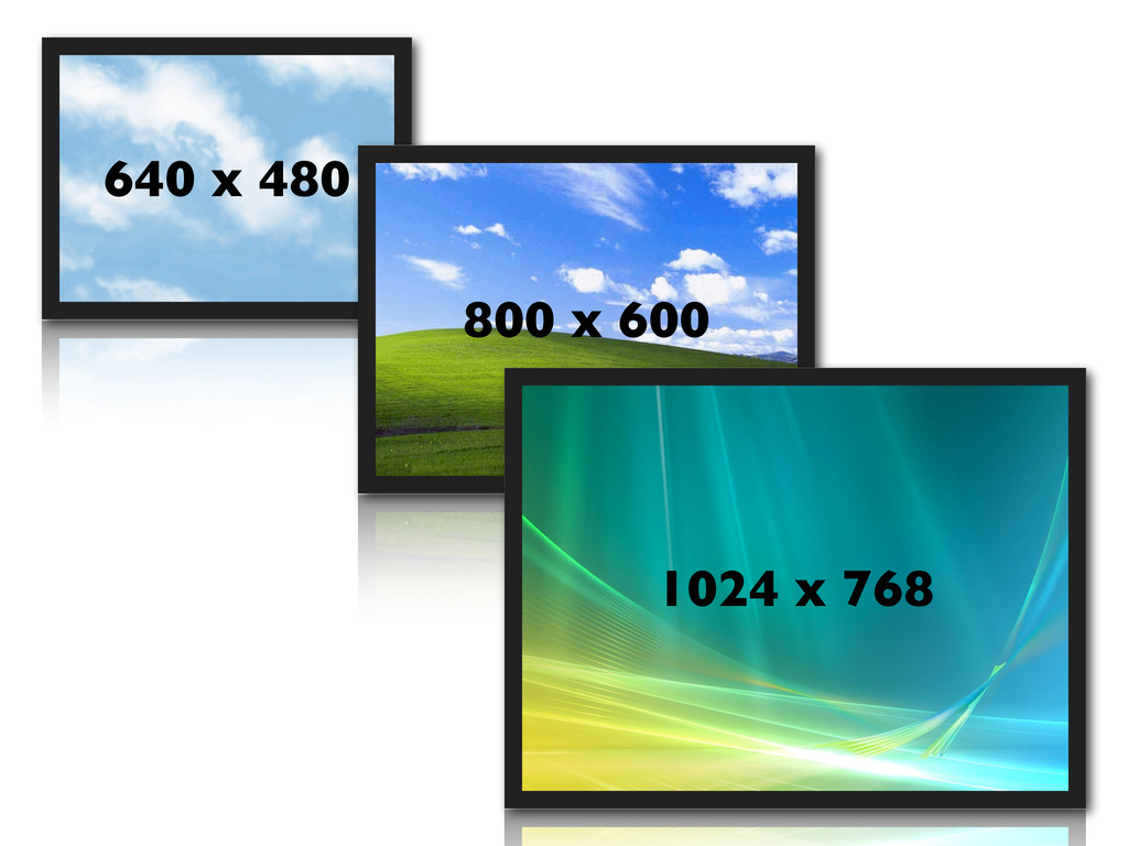
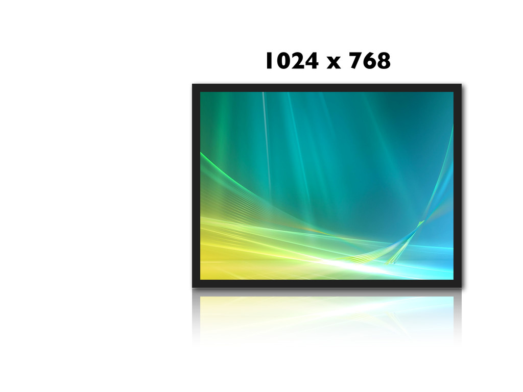
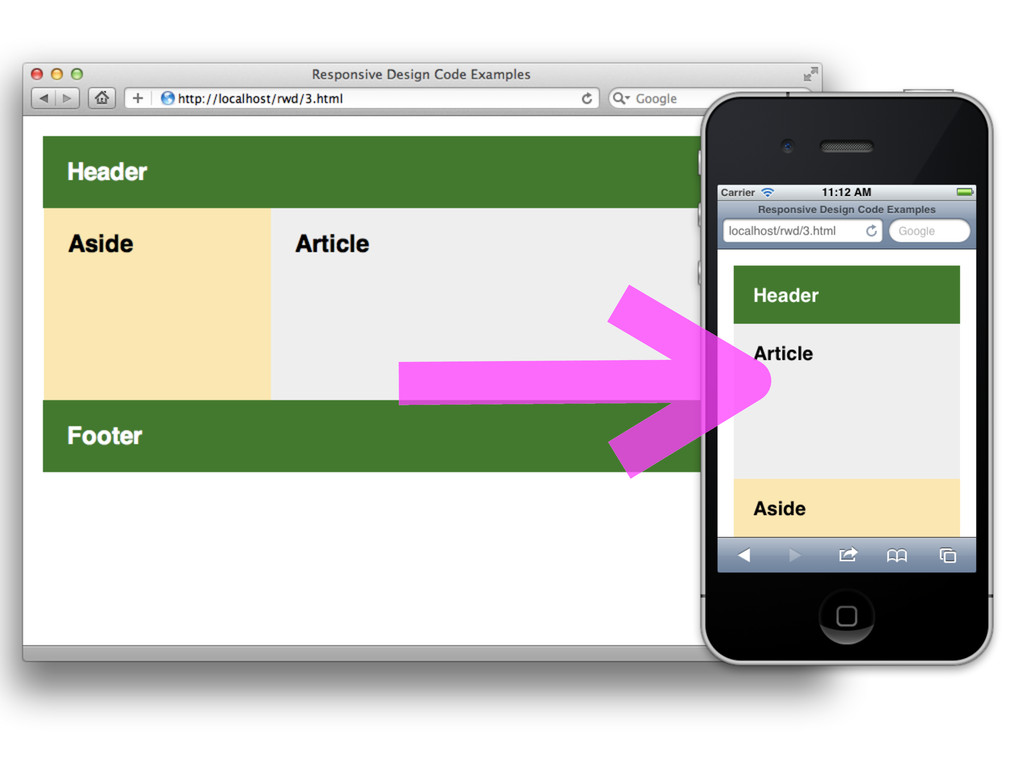
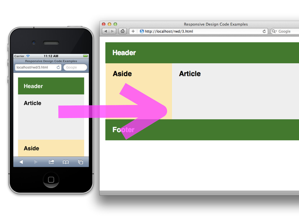
640 x 480 800 x 600 1024 x 768
None
1024 x 768
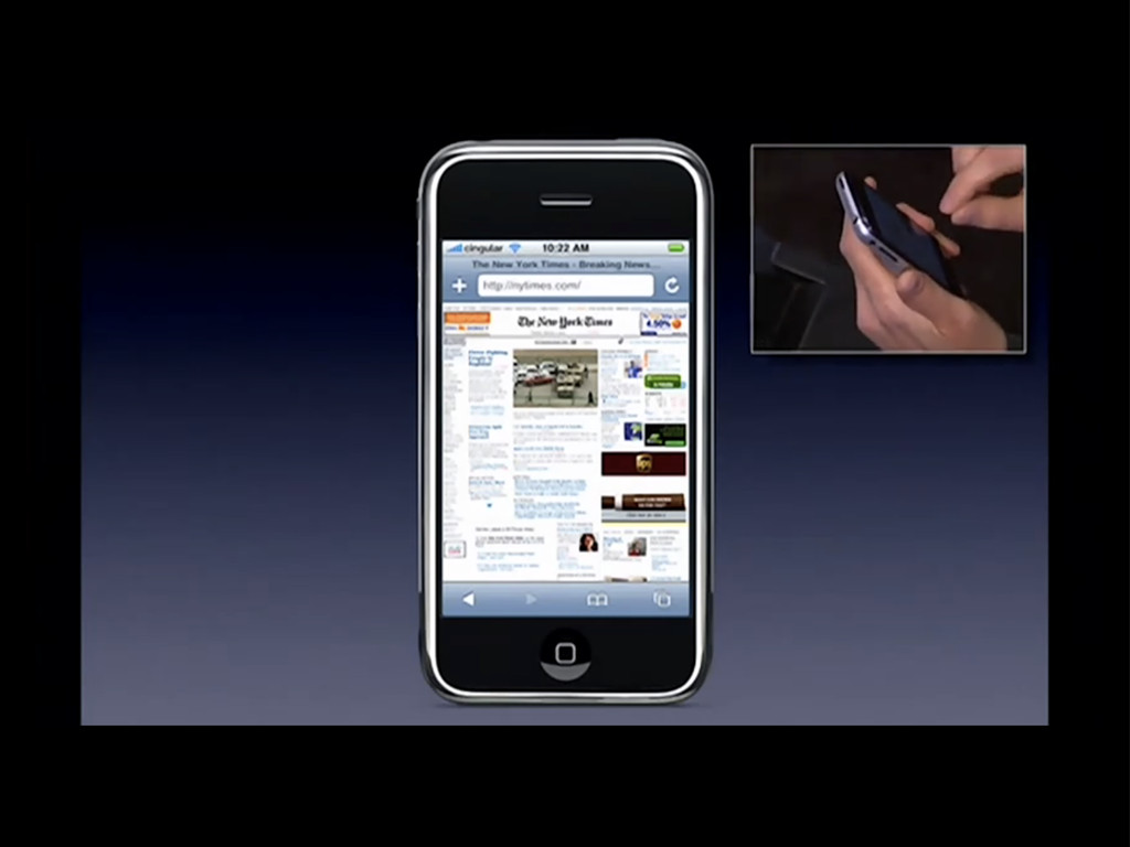
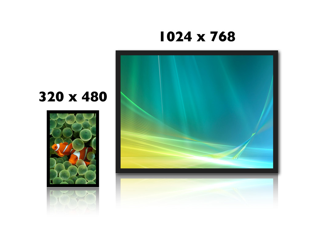
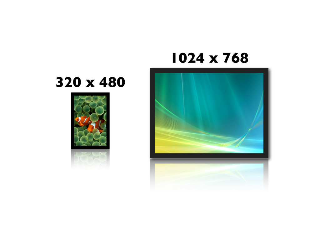
1024 x 768 320 x 480
None
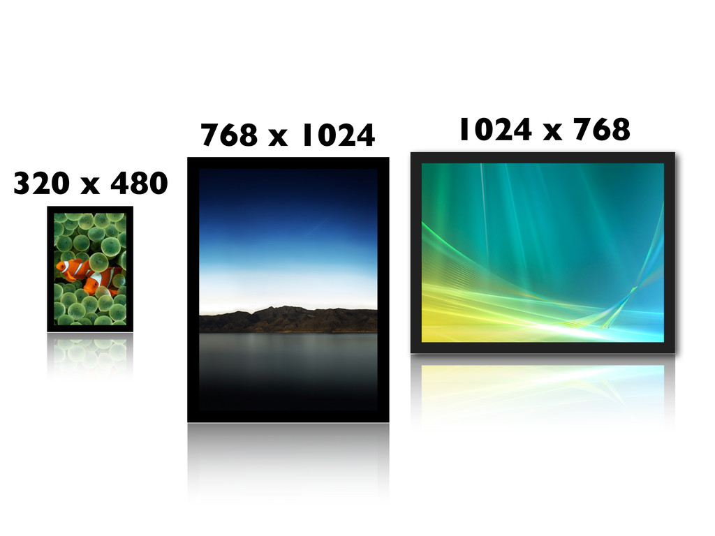
1024 x 768 320 x 480
1024 x 768 320 x 480 768 x 1024
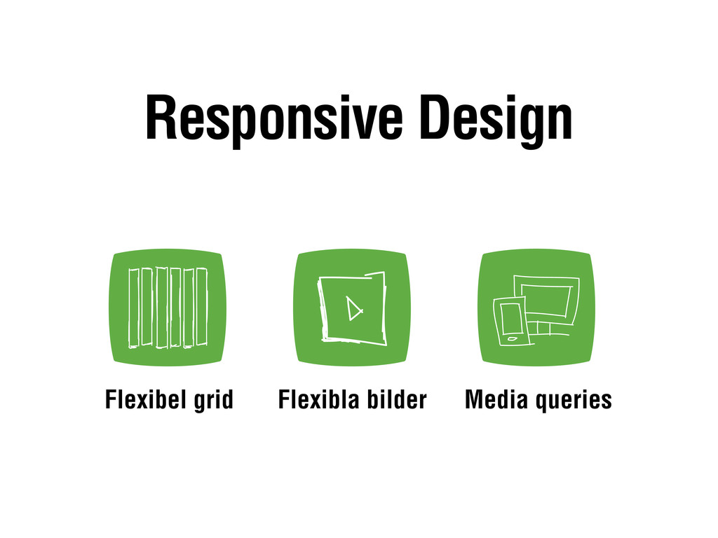
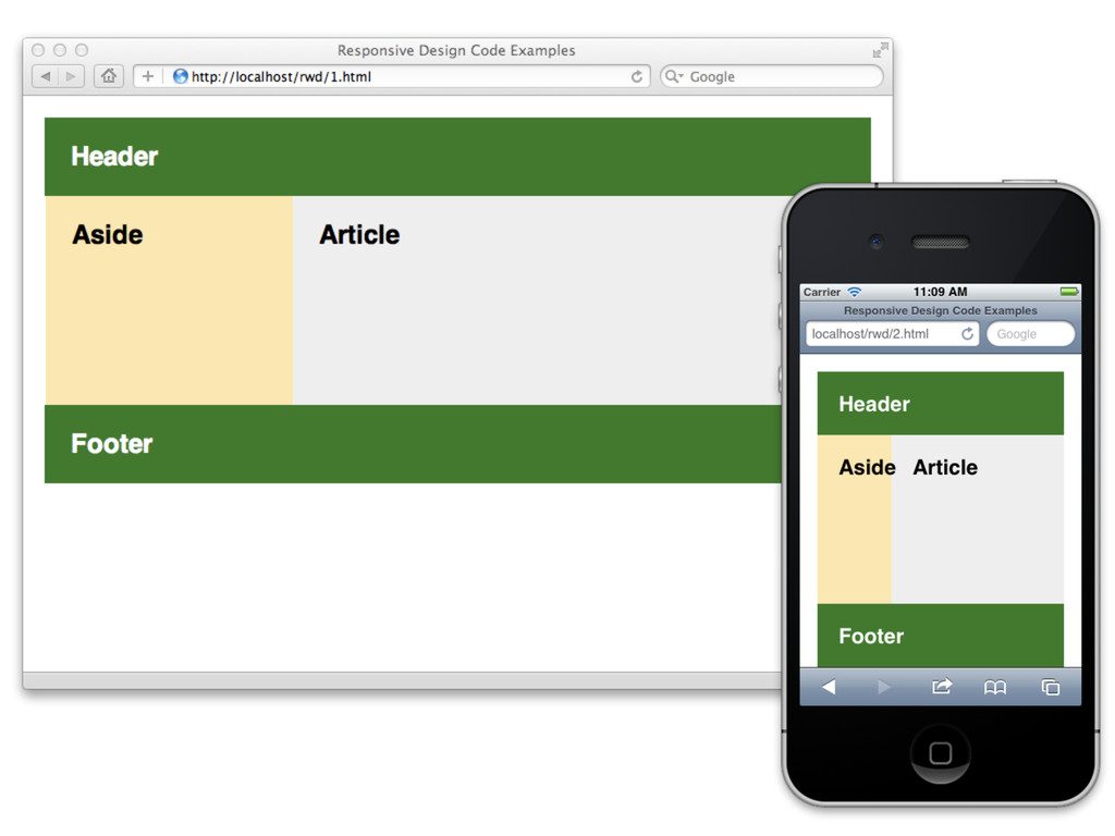
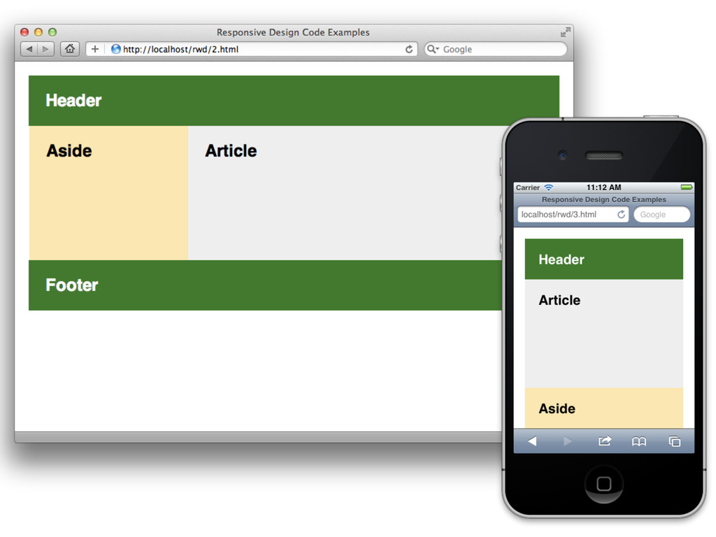
Flexibla bilder Flexibel grid Media queries Responsive Design
None
None
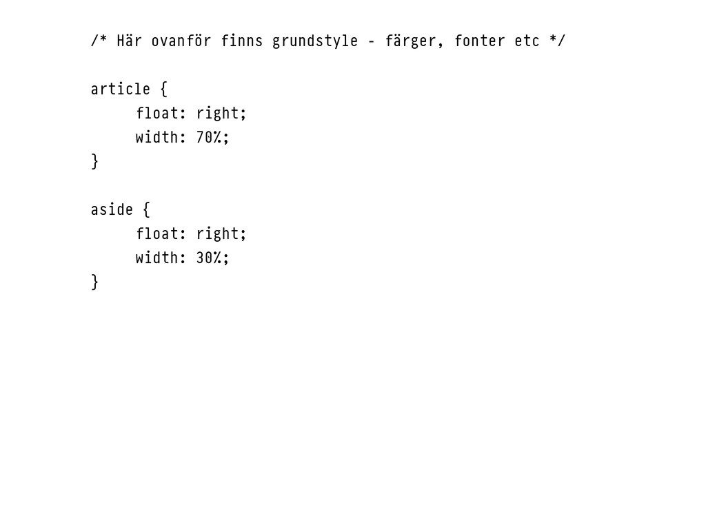
/* Här ovanför finns grundstyle - färger, fonter etc */
article { float: right; width: 70%; } aside { float: right; width: 30%; }
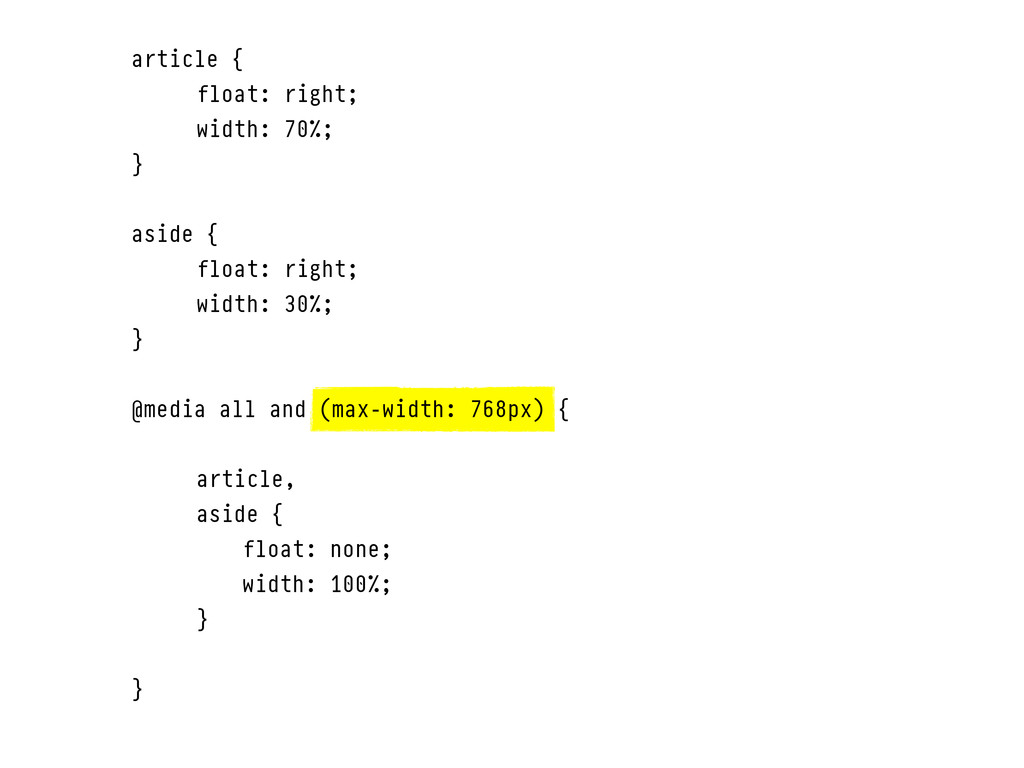
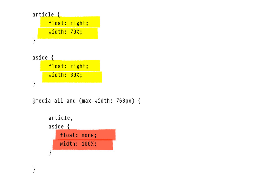
article { float: right; width: 70%; } aside { float:
right; width: 30%; } @media all and (max-width: 768px) { article, aside { float: none; width: 100%; } }
None
article { float: right; width: 70%; } aside { float:
right; width: 30%; } @media all and (max-width: 768px) { article, aside { float: none; width: 100%; } }
None
None
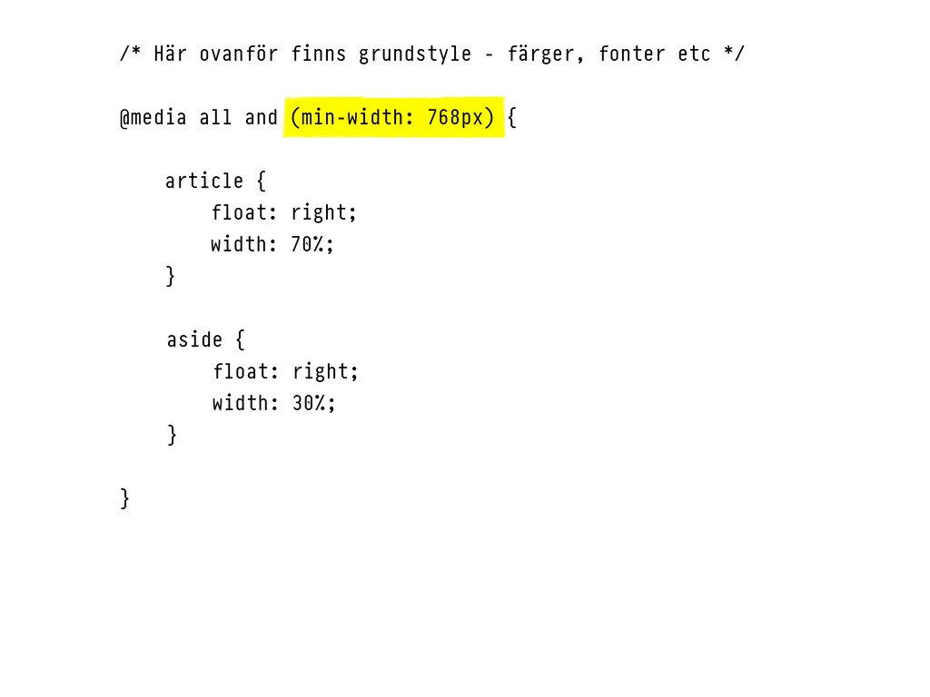
/* Här ovanför finns grundstyle - färger, fonter etc */
@media all and (min-width: 768px) { article { float: right; width: 70%; } aside { float: right; width: 30%; } }
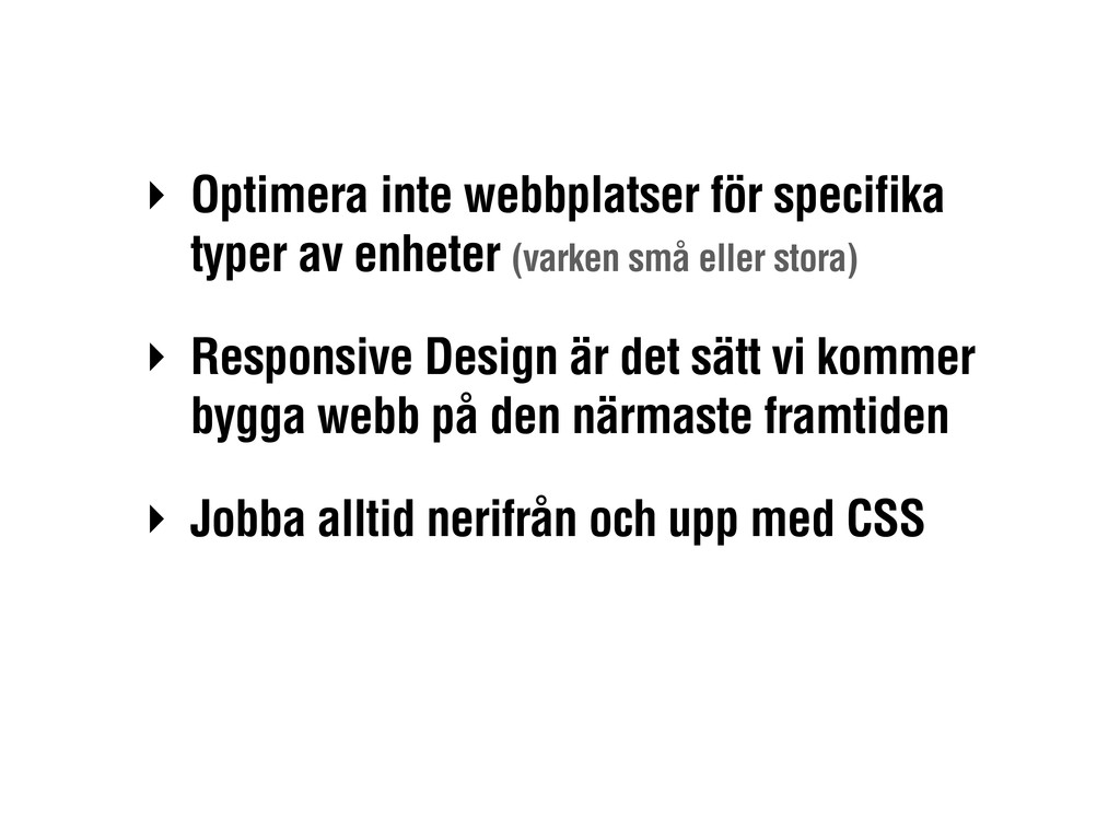
‣ Optimera inte webbplatser för specifika typer av enheter (varken
små eller stora) ‣ Responsive Design är det sätt vi kommer bygga webb på den närmaste framtiden ‣ Jobba alltid nerifrån och upp med CSS
Tack! Henrik Ekelöf, Valtech @henrikekelof
 cockscomb
 geekplus_tech
 terryu16
 mom0tomo
 simas
simas
 kkamegawa
 kazumax55
 ochtum
 jame2408
 naokihaba
 manfredsteyer
 kajitack
 danielanewman
 lynnandtonic
 akademiya2063
 cassininazir
 mayunak
 jcasabona
 destraynor
 moore
moore
 akosma
 coloredviolet
 uxyall
 mayatellez