Web offline research at THU • Touched the Internet in 1995 & got my fist email account • Learned HTML in 2007 when blog was prevalent • Learned CSS in 2008 when designed my first Wordpress theme • Learned JavaScript in 2009 to add a “scroll to top” to my blog • Learned PHP in 2010 when we began our first startup • Swimming in the UI & UX pool nowadays
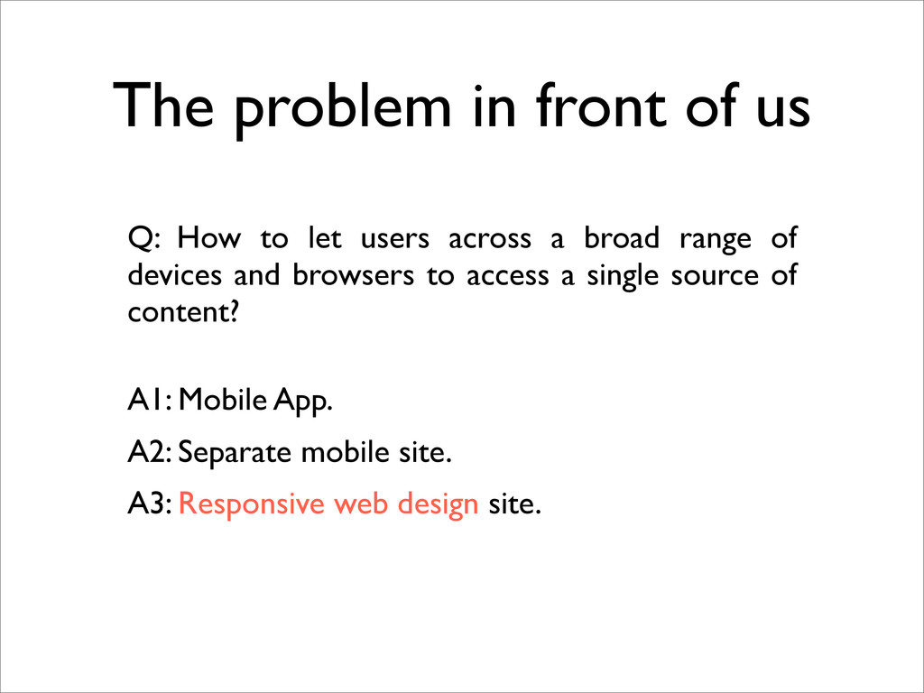
users across a broad range of devices and browsers to access a single source of content? A2: Separate mobile site. A3: Responsive web design site. A1: Mobile App.
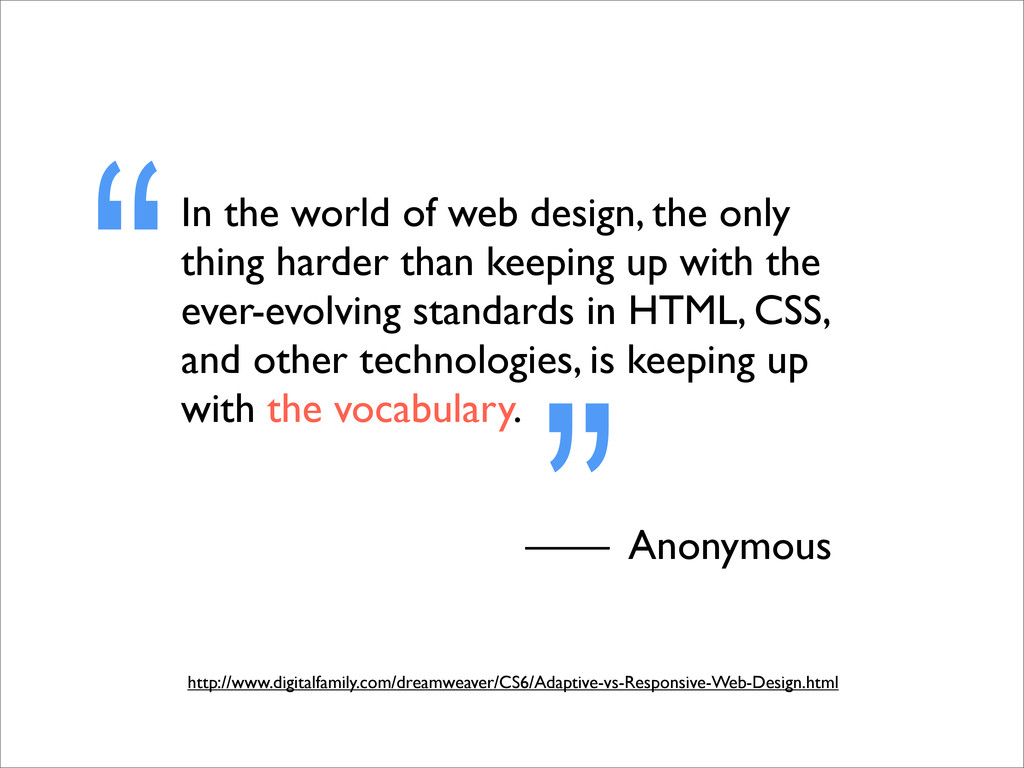
than keeping up with the ever-evolving standards in HTML, CSS, and other technologies, is keeping up with the vocabulary. “ —— Anonymous ” http://www.digitalfamily.com/dreamweaver/CS6/Adaptive-vs-Responsive-Web-Design.html
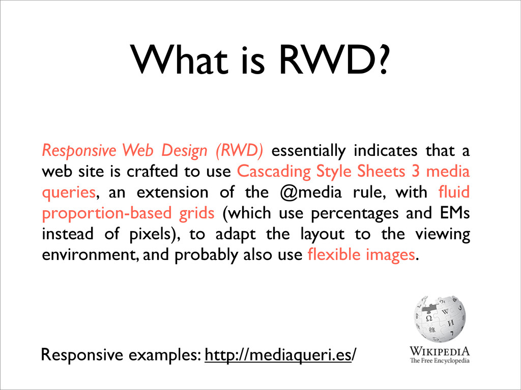
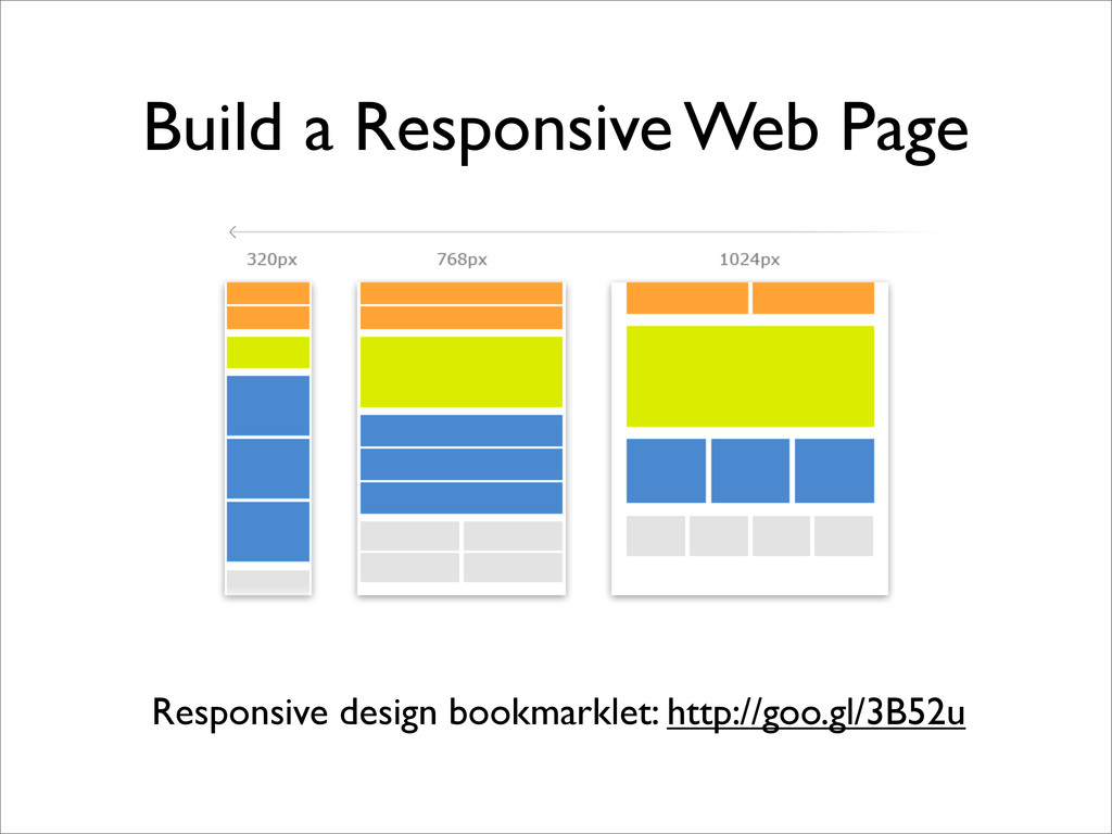
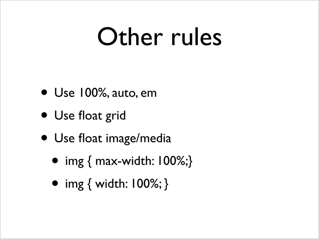
essentially indicates that a web site is crafted to use Cascading Style Sheets 3 media queries, an extension of the @media rule, with fluid proportion-based grids (which use percentages and EMs instead of pixels), to adapt the layout to the viewing environment, and probably also use flexible images.
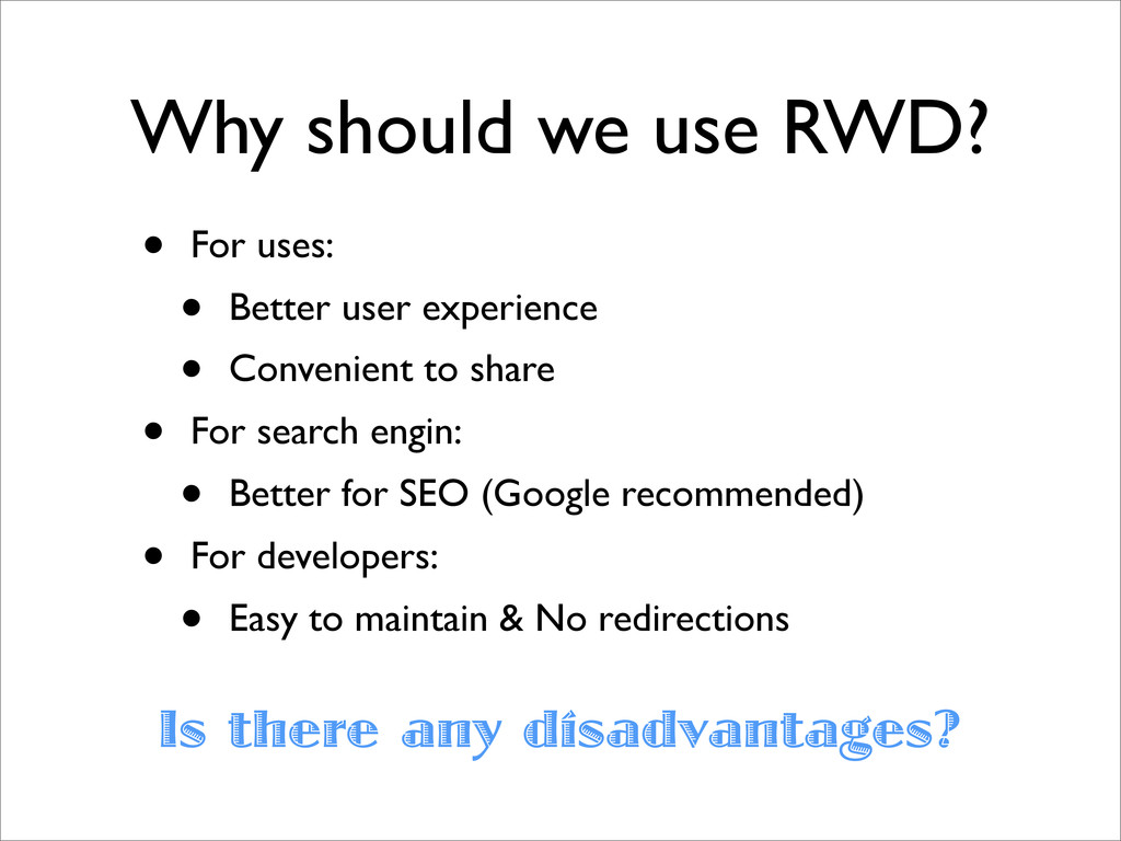
user experience • Convenient to share • For search engin: • Better for SEO (Google recommended) • For developers: • Easy to maintain & No redirections Is there any disadvantages?
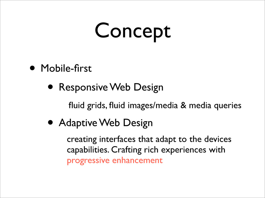
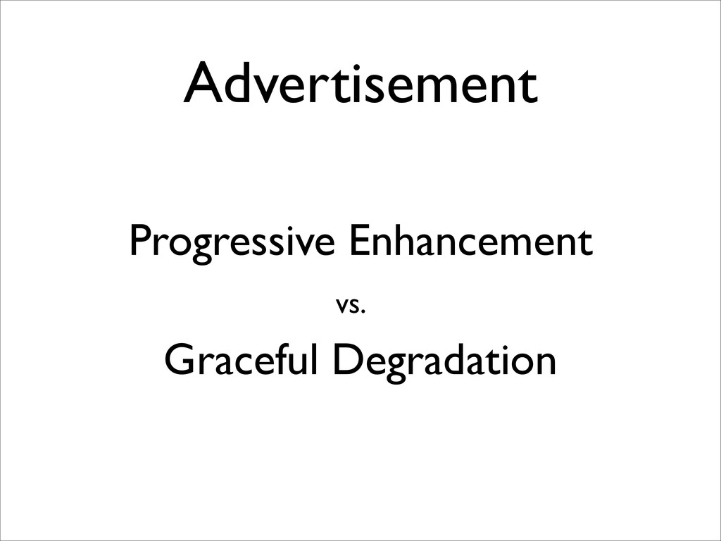
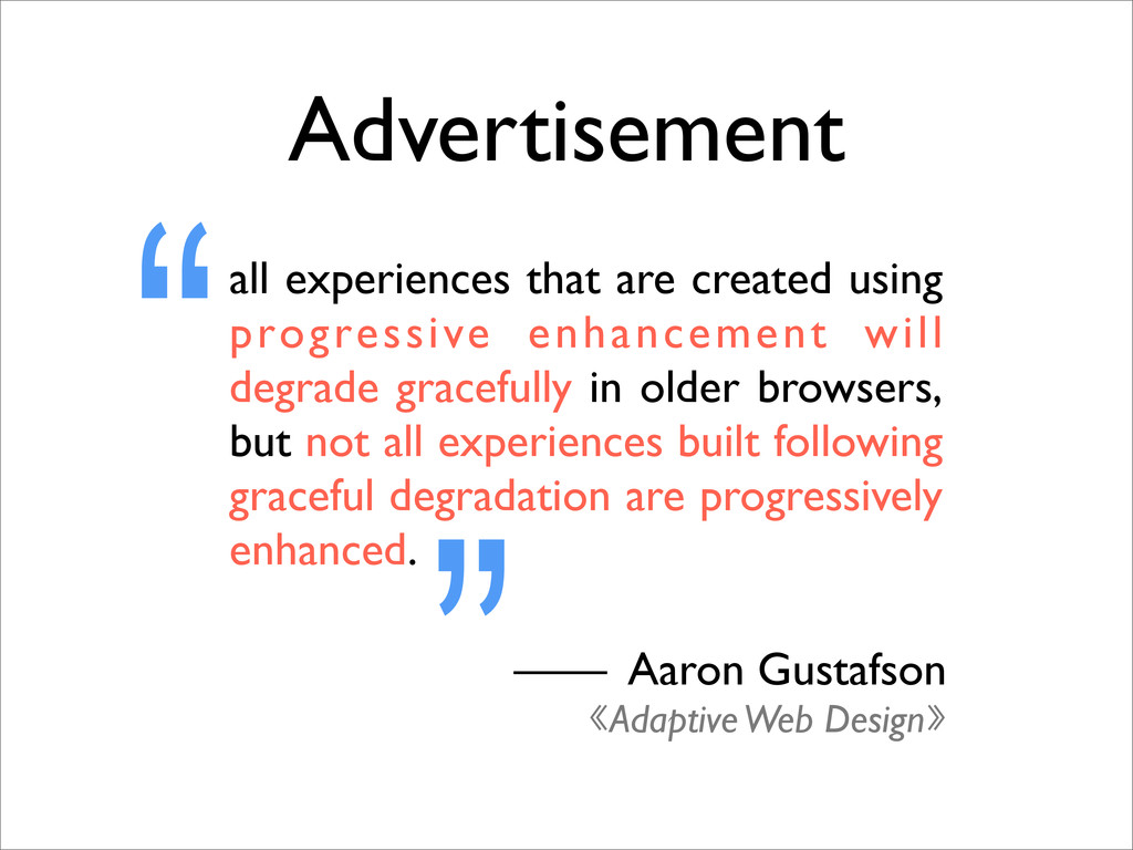
& media queries • Adaptive Web Design creating interfaces that adapt to the devices capabilities. Crafting rich experiences with progressive enhancement Concept fluid grids, fluid images/media & media queries creating interfaces that adapt to the devices capabilities. Crafting rich experiences with progressive enhancement
gracefully in older browsers, but not all experiences built following graceful degradation are progressively enhanced. “ ”—— Aaron Gustafson 《Adaptive Web Design》 Advertisement
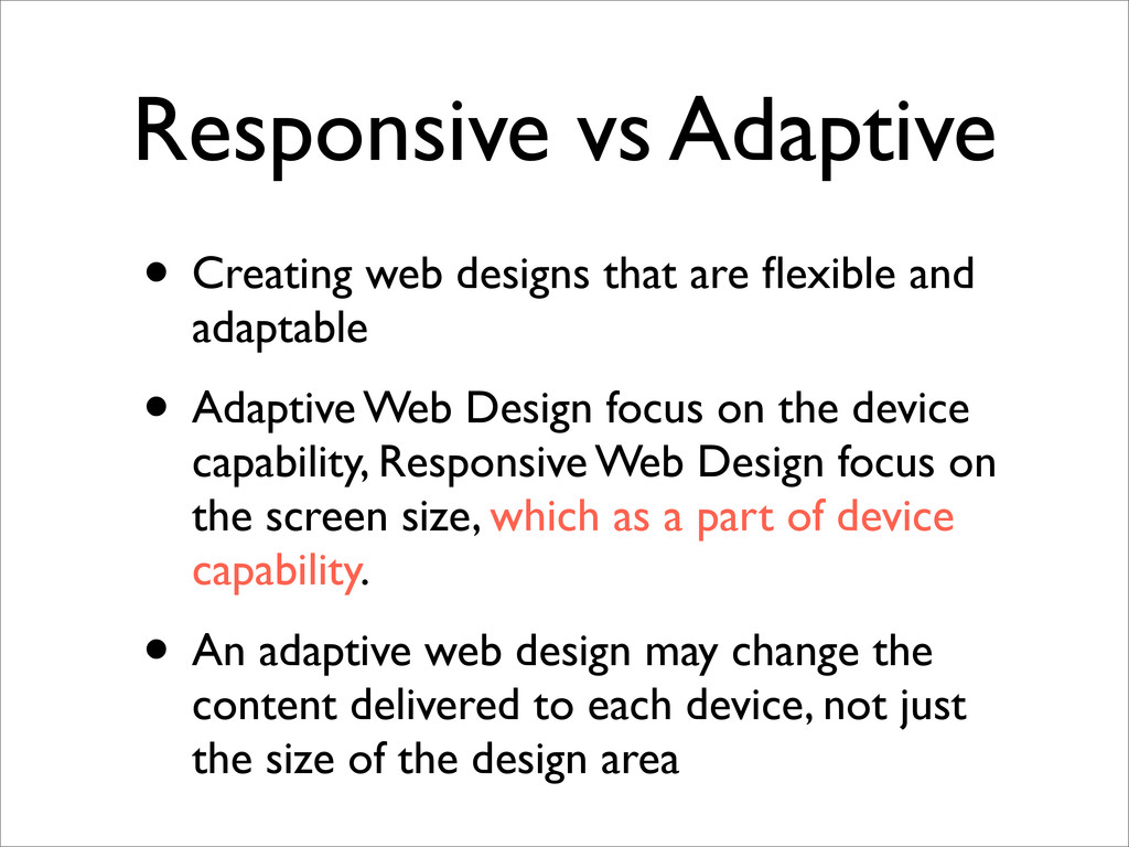
and adaptable • Adaptive Web Design focus on the device capability, Responsive Web Design focus on the screen size, which as a part of device capability. • An adaptive web design may change the content delivered to each device, not just the size of the design area
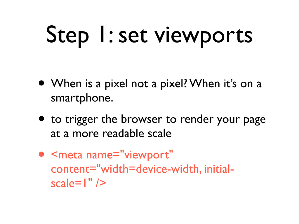
a pixel? When it’s on a smartphone. • to trigger the browser to render your page at a more readable scale • <meta name="viewport" content="width=device-width, initial- scale=1" />
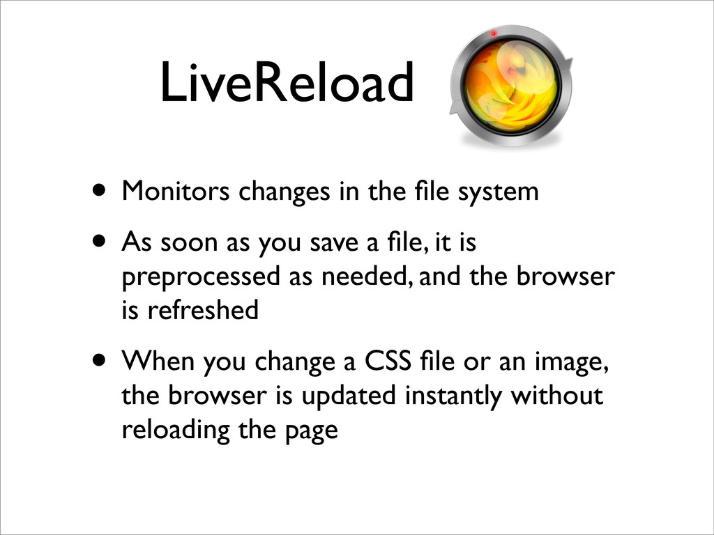
soon as you save a file, it is preprocessed as needed, and the browser is refreshed • When you change a CSS file or an image, the browser is updated instantly without reloading the page
 houhr
houhr
 rince
rince
 junki
junki
 tatsuya1970
 sh_fk2
 laysakura
 appleboy
 ks91
ks91
 mocobeta
 kubode
 saorimurooka
 vtryo
vtryo
 codingconduct
 auna
auna
 smashingmag
 skipperchong
 chriscoyier
 productmarketing
 reverentgeek
 3n
3n
 minecr
 varn
varn
 shlominoach
 baasie