Upgrade to Pro — share decks privately, control downloads, hide ads and more …

You Are Not My Type 你不是我的菜

You Are Not My Type 你不是我的菜

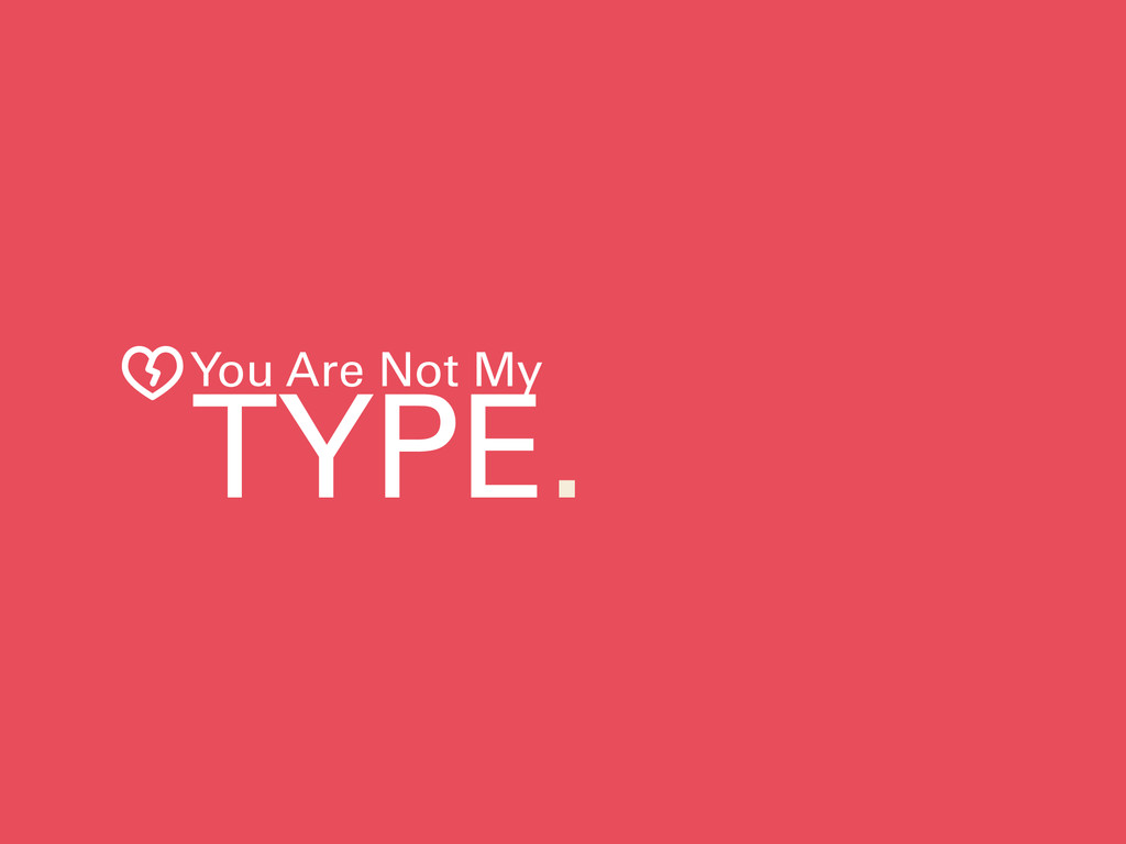
5 Point of Typography in Presentation.
簡報字體運用的五個大重點。
http://whychatchat.com/easy-keynote/you-are-not-my-type/
icons usage credits
Creative Commons – Attribution (CC BY 3.0)
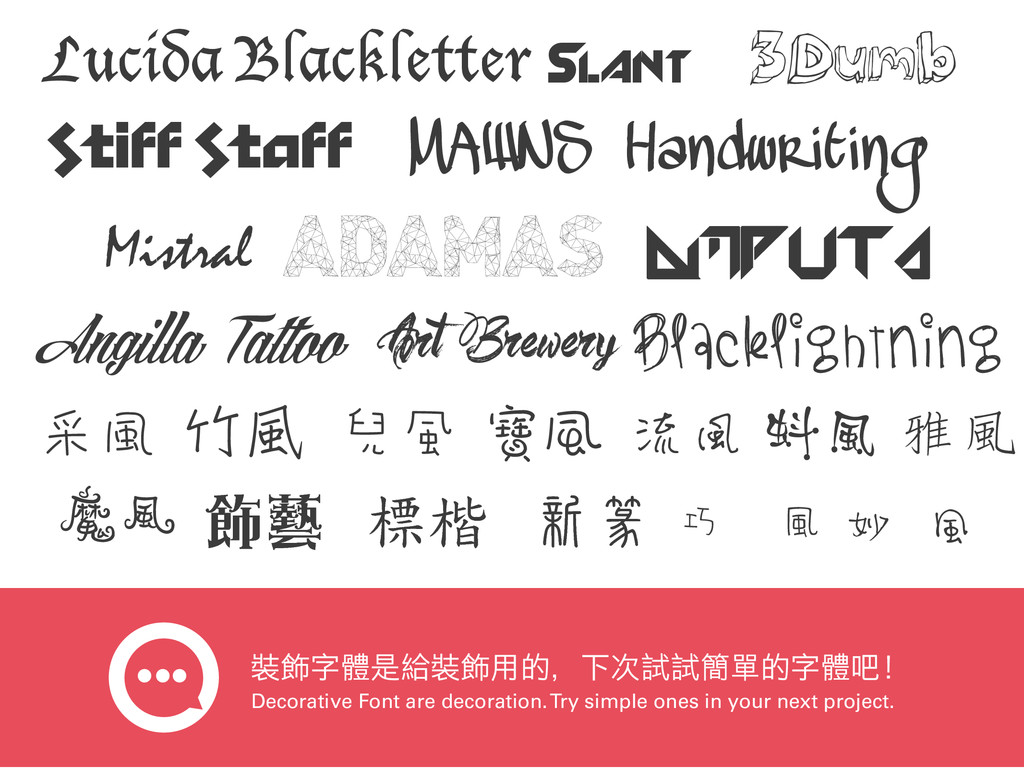
Broken Heart designed by Thomas Le Bas from the Noun Project
Lightning Bolt designed by Nate Eul from the Noun Project

WHYCHATCHAT・FEI

June 11, 2014
Tweet

More Decks by WHYCHATCHAT・FEI

Other Decks in Design

Transcript

  1. Lucida Blackletter MAWNS Handwriting Mistral Slant Stiff Staff 3Dumb ADAMAS

    Amputa Angilla Tattoo Art Brewery BlackLightning 采風 竹風 兒風 寶風 流風 蚪風 雅風 魔風 ུᖵ ᅺฺ อᇏ巧風 妙風 裝飾字體是給裝飾用的,下次試試簡單的字體吧! Decorative Font are decoration. Try simple ones in your next project.
  2. 刪除那些文字段落,只留下一句話或一兩個字很難嗎? Delete those paragraph, keep a sentence or one, two

    word. How hard is that? 如果你非得把每一段論文般的資訊放入你的簡報裡面, 不如你就用 Word 檔寫完後印成講義,發給在場的每 一個人吧!但是我想表達的其實是,就算你這樣做了, 不到 電影沒人想要看漫畫,如果有漫畫沒人想要看小說。 這件事應該沒有那 一句話,或者更棒的方法:你只要把整段文字中最精 華的一個詞或是主題留下來就好了。這就是在簡報中 如何把一段話演變成一兩個字的最實際方法。 What’s Your Point About? Power
  3. 大字要緊密而無間,小字要寬綽而有餘。—— 蘇東坡 Headline has to be tight and still. Give

    small size level words some air to breath. Y our Amazing Headline Whatever here is, they need some space to be legibility.