Upgrade to Pro
— share decks privately, control downloads, hide ads and more …
Speaker Deck
Features
Speaker Deck
PRO
Sign in
Sign up for free
Search
Search
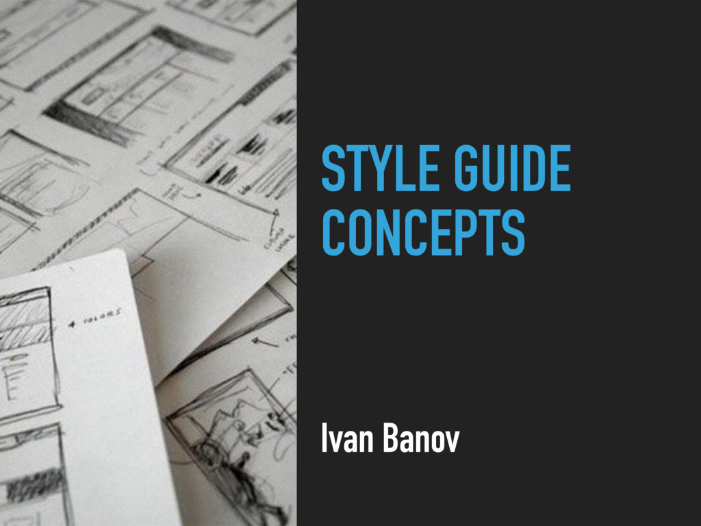
Style Guide Concepts
Search
Ivan Banov
July 01, 2016
Technology
500
6
Share
Embed
Copy iframe code
Copy JS code
Copy link
Start on current slide
Style Guide Concepts
Ivan Banov
July 01, 2016
More Decks by Ivan Banov
See All by Ivan Banov
XSS
ivanbanov
0
200
Grids Everywhere
ivanbanov
3
460
Other Decks in Technology
See All in Technology
SRE本の知られざる名シーン / The Hidden Gems of Google SRE Book
nari_ex
2
430
SREとQA 二人三脚で進めるSLO運用/sre-qa-slo
sugitak
0
1k
しくみを学んで使いこなそう GitHub Copilot app
torumakabe
2
290
シンガポールで登壇してきます
yama3133
0
250
2年前に削除したPHPクラスが、 ある日突然決済をエラーにした
ykagano
1
510
CDKで書くECSのベストプラクティス、 改めて考え直す2026 #cdkconf2026
makies
3
860
「早く出す」より「事業に効く」 ── 顧客の業務サイクルから逆算するAI時代の二重ループ開発と「変化の設計者」 / devsumi2026
rakus_dev
1
420
複数プロダクト組織のAIネイティブ化における戦略 / AICon2026_kude
rakus_dev
0
160
Oracle Base Database Service 技術詳細
oracle4engineer
PRO
15
110k
AI時代のYAGNI:「爆速で無駄になった機能」からの学び / 20260720 Naoki Takahashi
shift_evolve
PRO
3
390
ファミコンでPHPを動かす / PHP on the Famicom
tomzoh
2
500
最適な自走を最小限の支援で — M&Aで拡大する組織で少人数SREが挑んだ1年 / SRE NEXT 2026
genda
0
1.6k
Featured
See All Featured
Git: the NoSQL Database
bkeepers
PRO
432
67k
Design of three-dimensional binary manipulators for pick-and-place task avoiding obstacles (IECON2024)
konakalab
0
490
SEO for Brand Visibility & Recognition
aleyda
0
4.6k
WENDY [Excerpt]
tessaabrams
11
38k
sira's awesome portfolio website redesign presentation
elsirapls
0
300
Why Our Code Smells
bkeepers
PRO
340
58k
Noah Learner - AI + Me: how we built a GSC Bulk Export data pipeline
techseoconnect
PRO
0
220
Balancing Empowerment & Direction
lara
6
1.2k
Design in an AI World
tapps
1
260
Future Trends and Review - Lecture 12 - Web Technologies (1019888BNR)
signer
PRO
0
3.6k
Docker and Python
trallard
47
4k
Effective software design: The role of men in debugging patriarchy in IT @ Voxxed Days AMS
baasie
0
450
Transcript
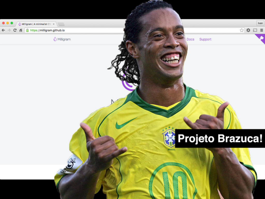
STYLE GUIDE CONCEPTS Ivan Banov
@BANKFACIL IVAN BANOV FRONTEND ENGINEER
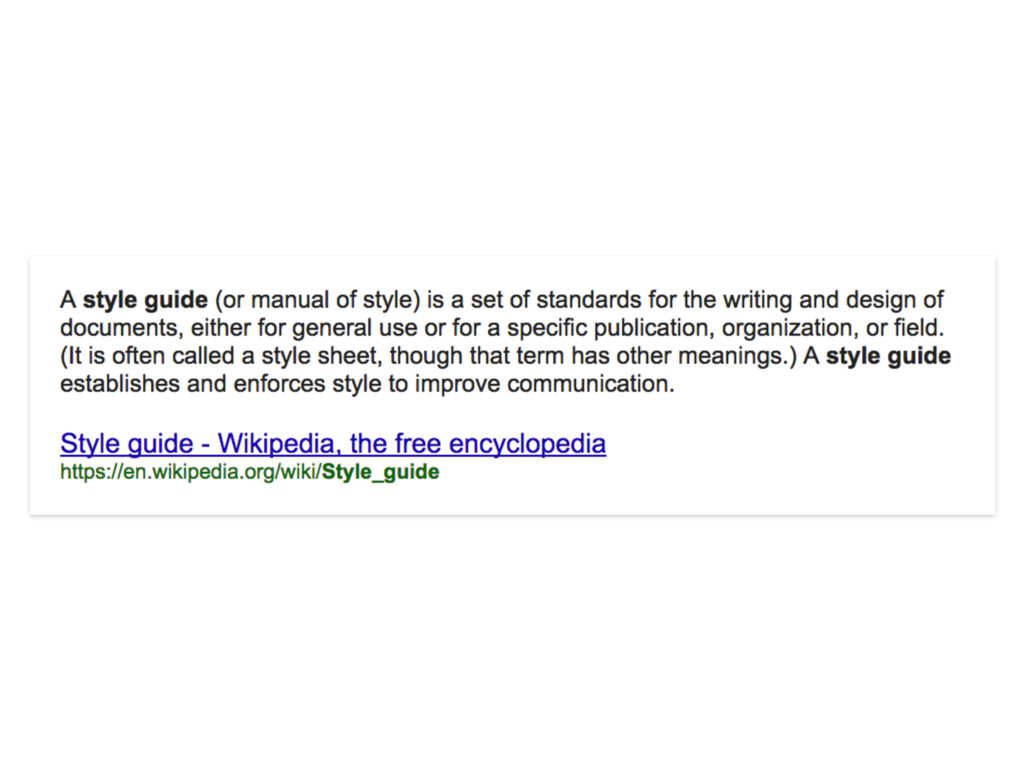
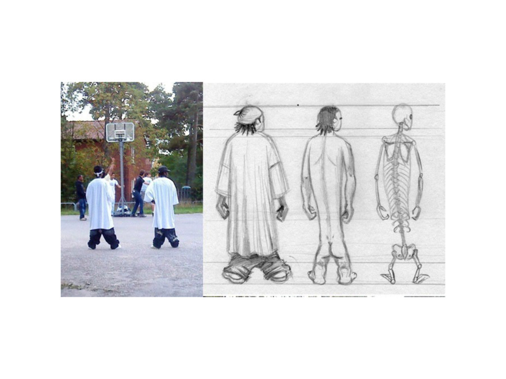
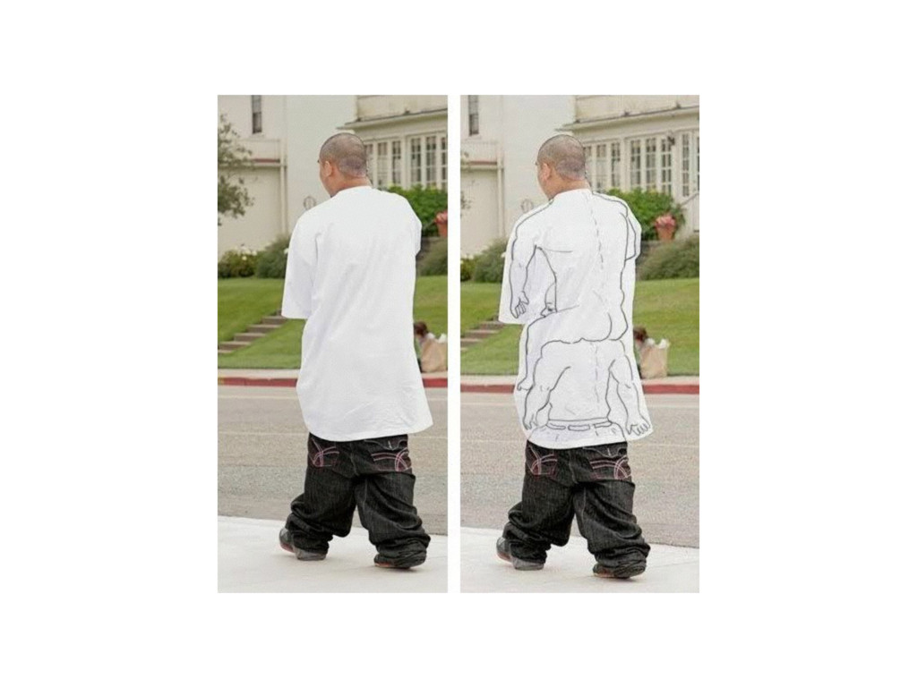
O QUE É? STYLE GUIDE
None
None
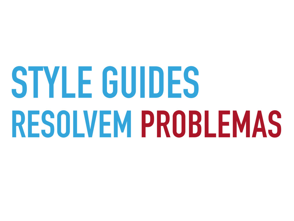
STYLE GUIDES RESOLVEM PROBLEMAS
STYLE GUIDES NÃO LIMITAM
STYLE GUIDES EVITAM PROBLEMAS
None
W H A T ?
None
None
None
None
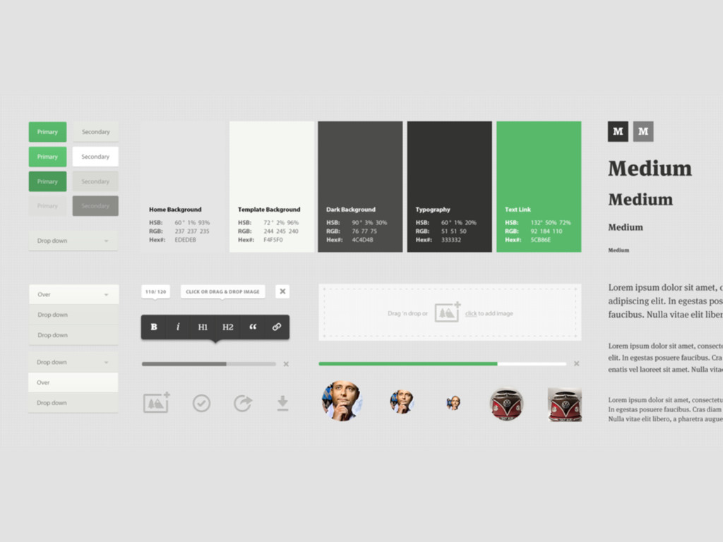
STYLE GUIDES DEFAULTS
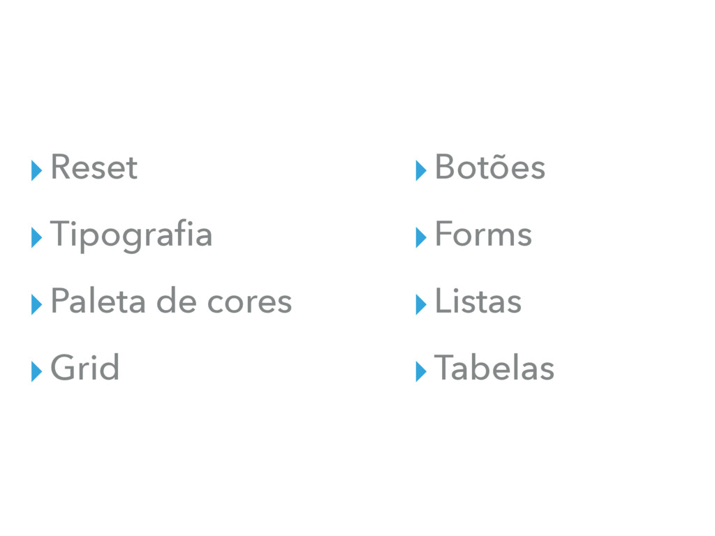
▸Reset ▸Tipografia ▸Paleta de cores ▸Grid ▸Botões ▸Forms ▸Listas ▸Tabelas
None
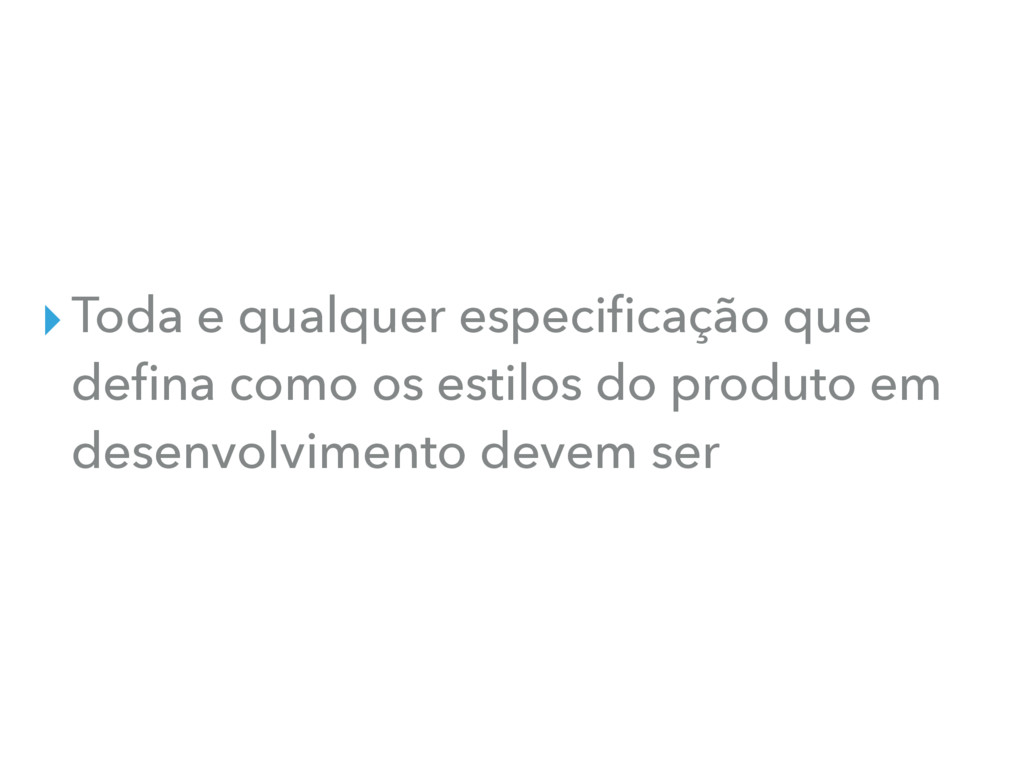
▸Toda e qualquer especificação que defina como os estilos do
produto em desenvolvimento devem ser
POR QUE? STYLE GUIDE
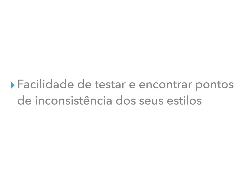
▸Facilidade de testar e encontrar pontos de inconsistência dos seus
estilos
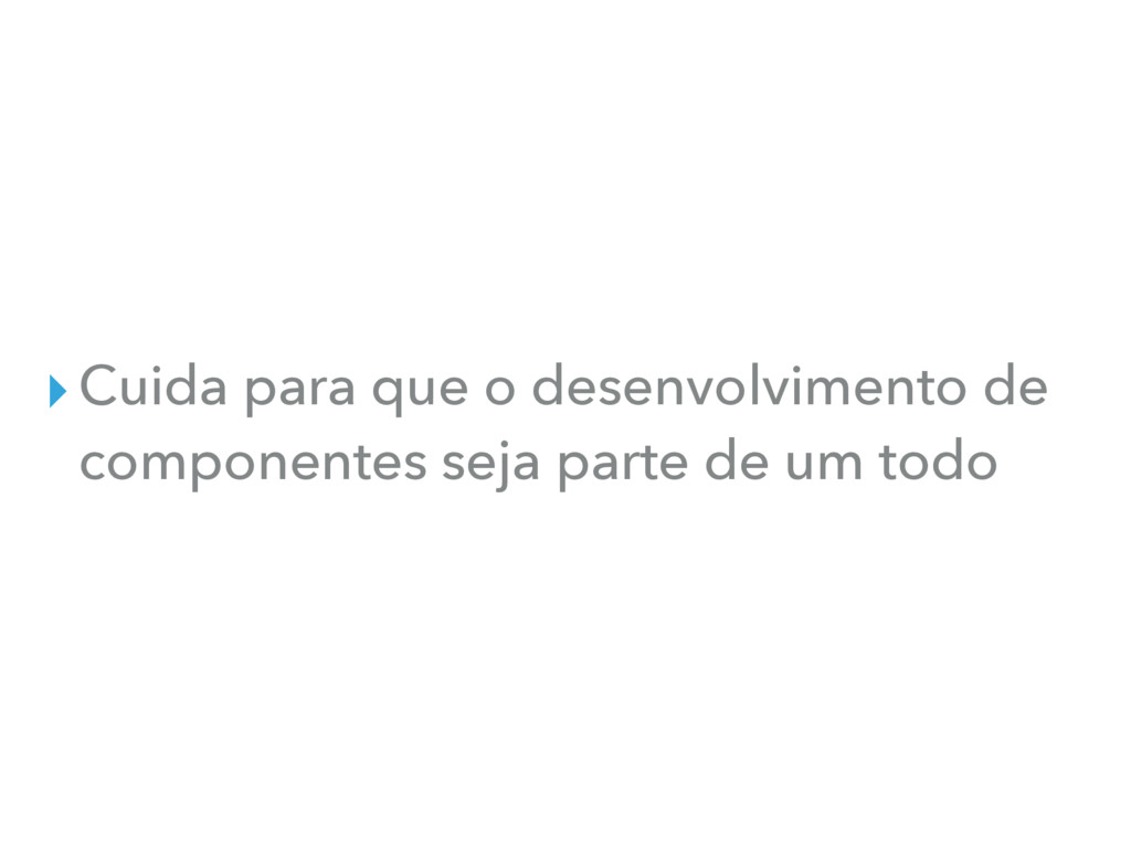
▸Cuida para que o desenvolvimento de componentes seja parte de
um todo
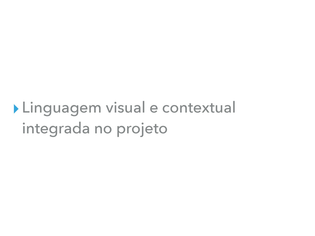
▸Linguagem visual e contextual integrada no projeto
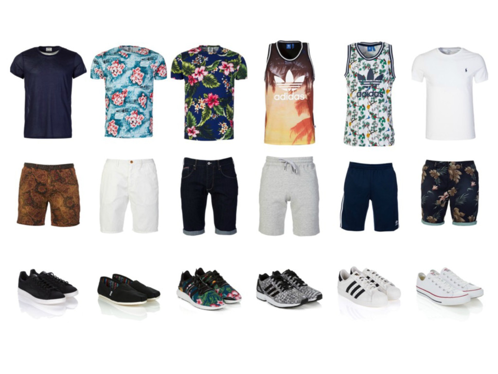
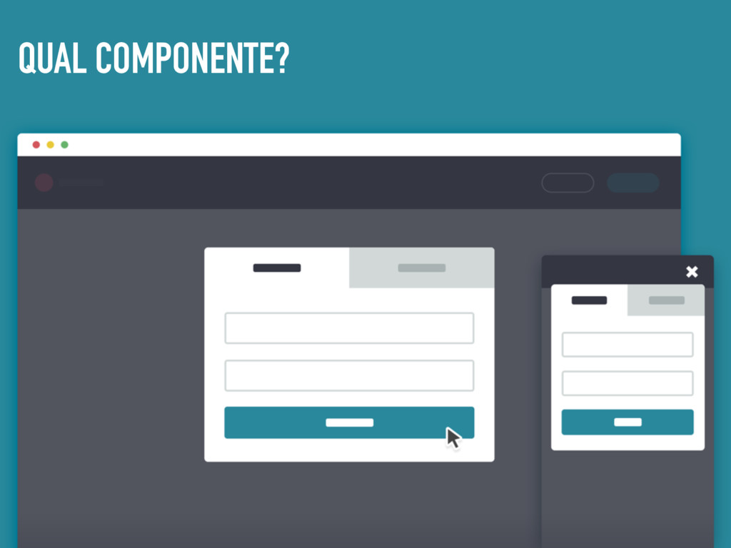
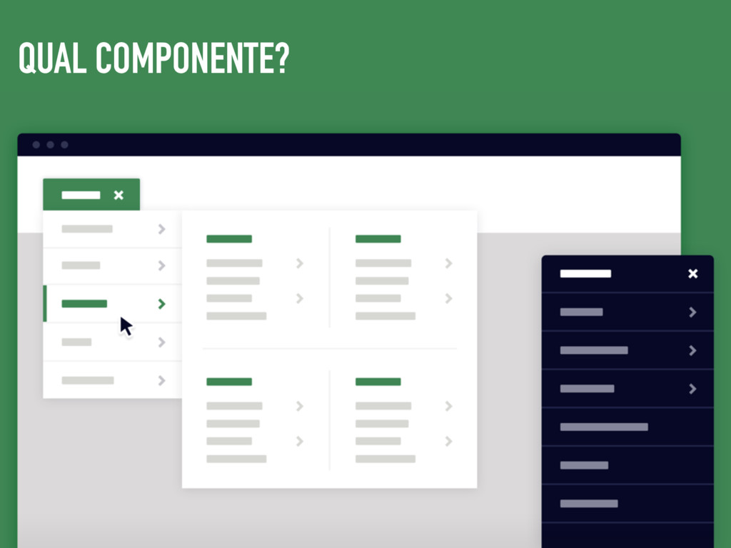
QUAL COMPONENTE?
QUAL COMPONENTE?
▸Pode ser complicado no começo, mas te trará paz a
longo prazo
None
X
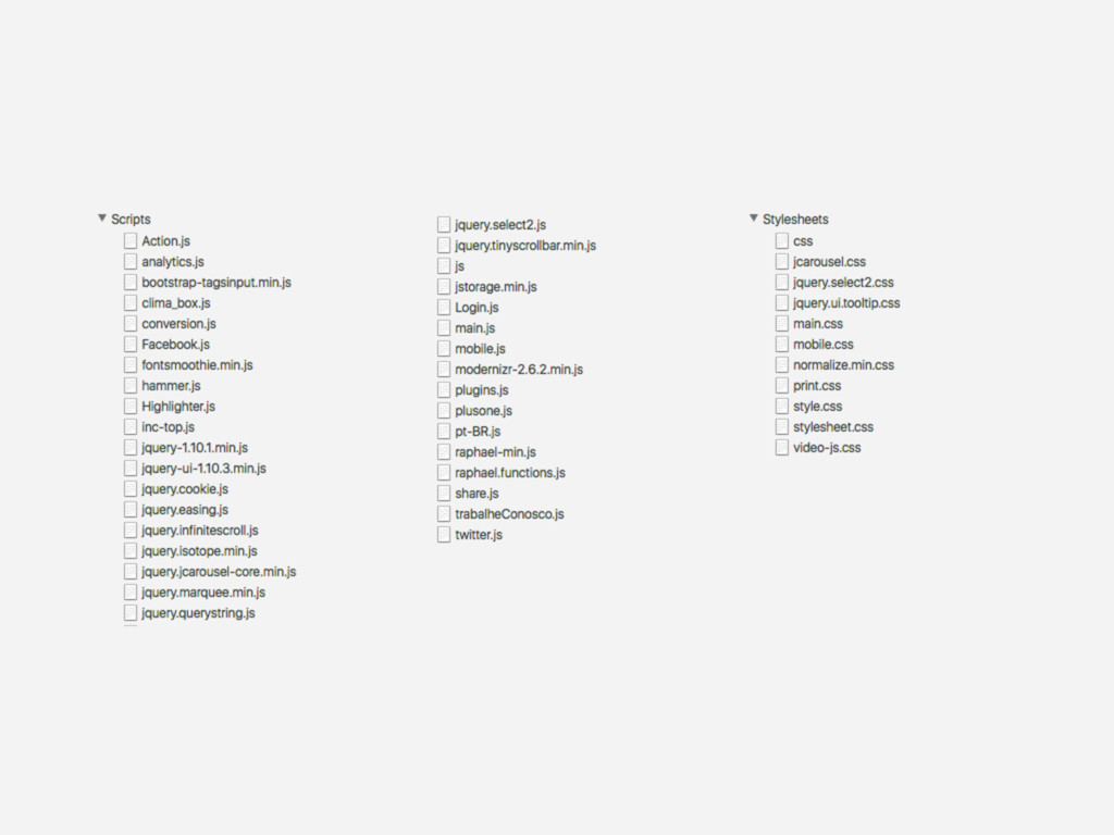
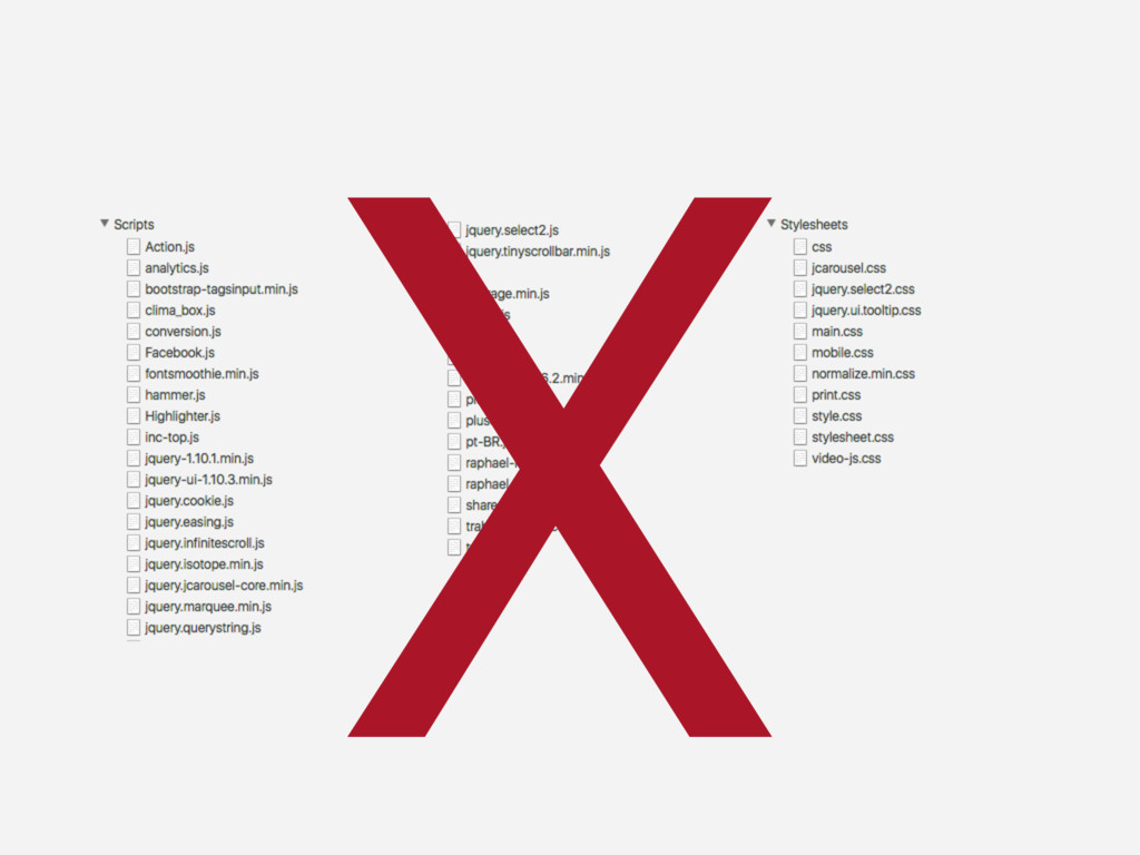
E POR ONDE EU COMEÇO? FRONTEND
None
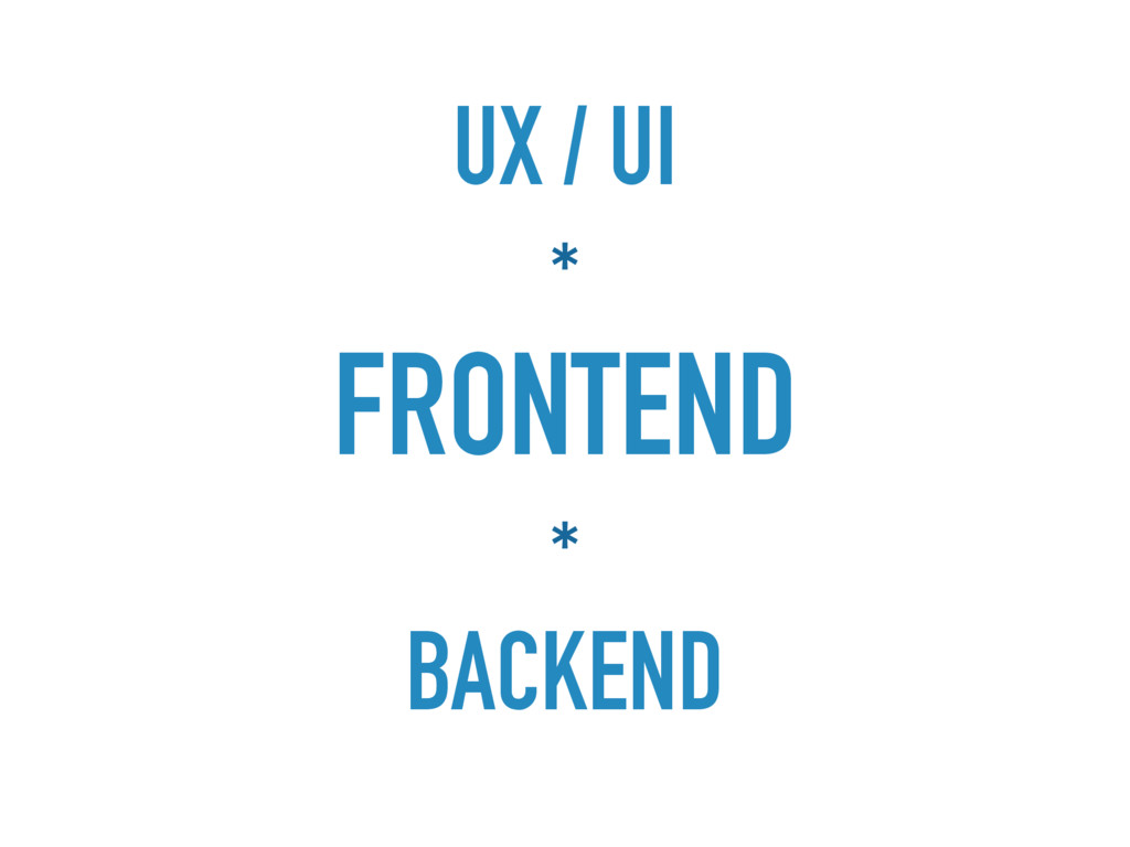
UX / UI * FRONTEND * BACKEND
FRAMEWORK FRONTEND DEVE SUPORTAR A UI
None
None
None
FRAMEWORK É O CÓDIGO DO STYLE GUIDE
ADAPTAR UM FRAMEWORK
None
None
None
None
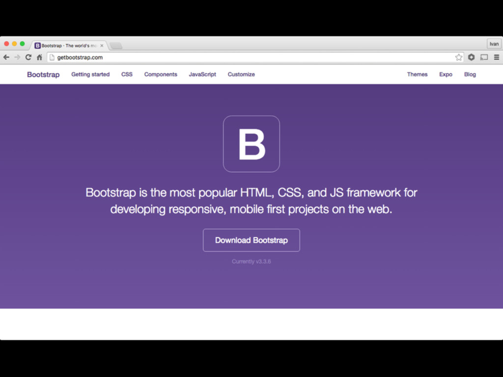
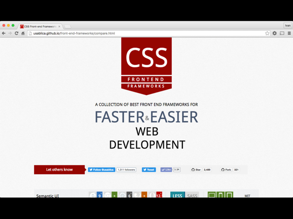
SOLUÇÃO PRONTA PRÓS
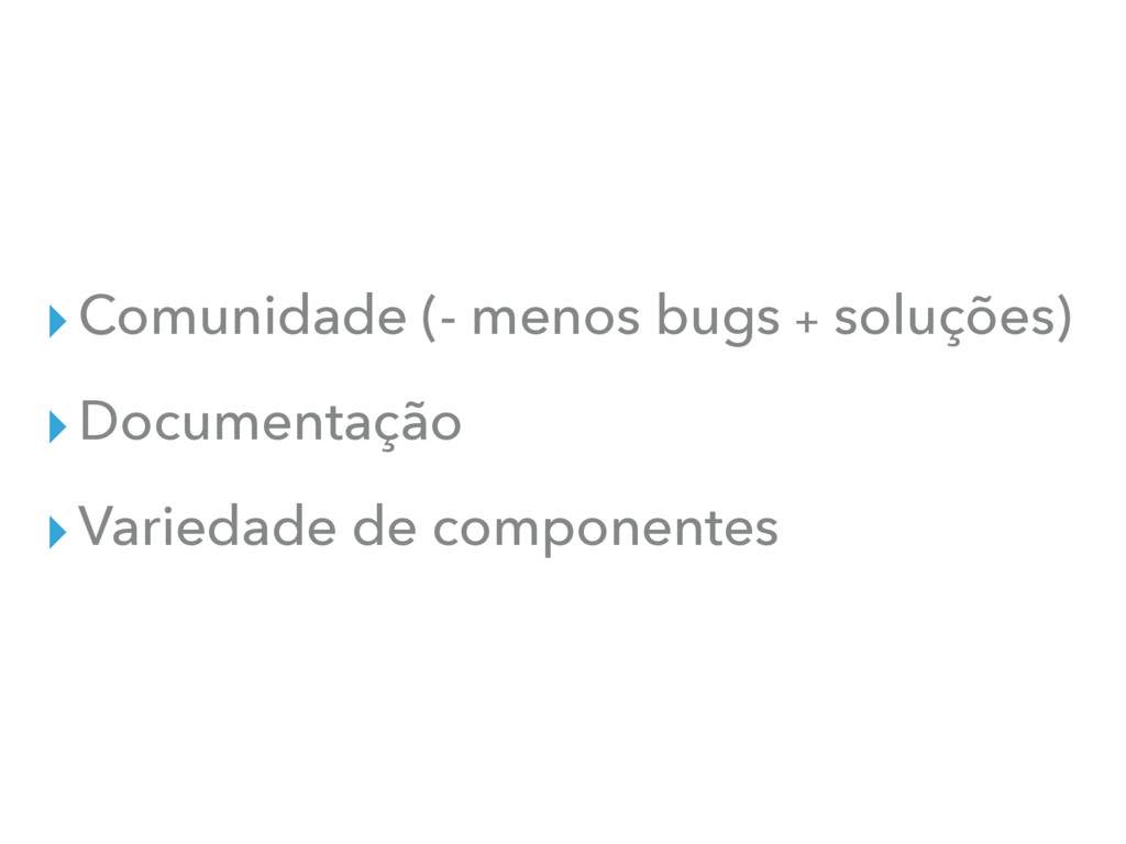
▸Comunidade (- menos bugs + soluções)
▸Comunidade (- menos bugs + soluções) ▸Documentação
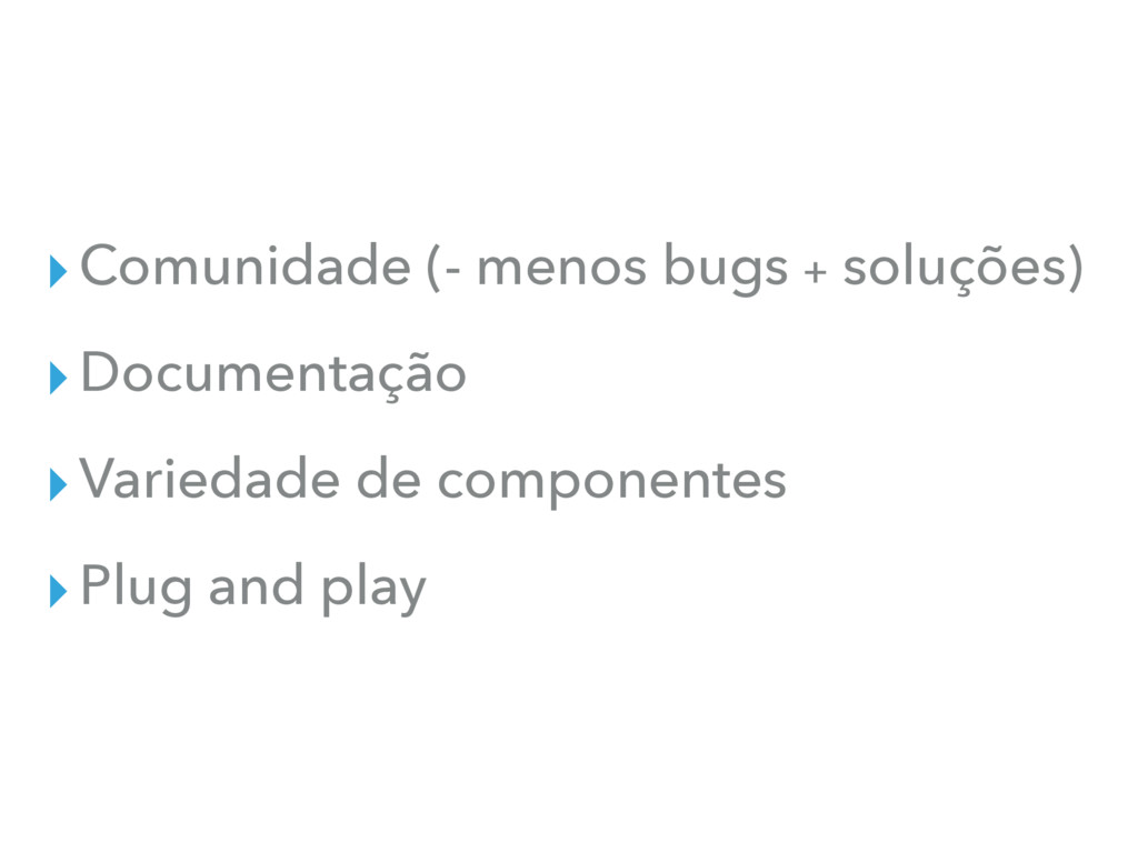
▸Comunidade (- menos bugs + soluções) ▸Documentação ▸Variedade de componentes
▸Comunidade (- menos bugs + soluções) ▸Documentação ▸Variedade de componentes
▸Plug and play
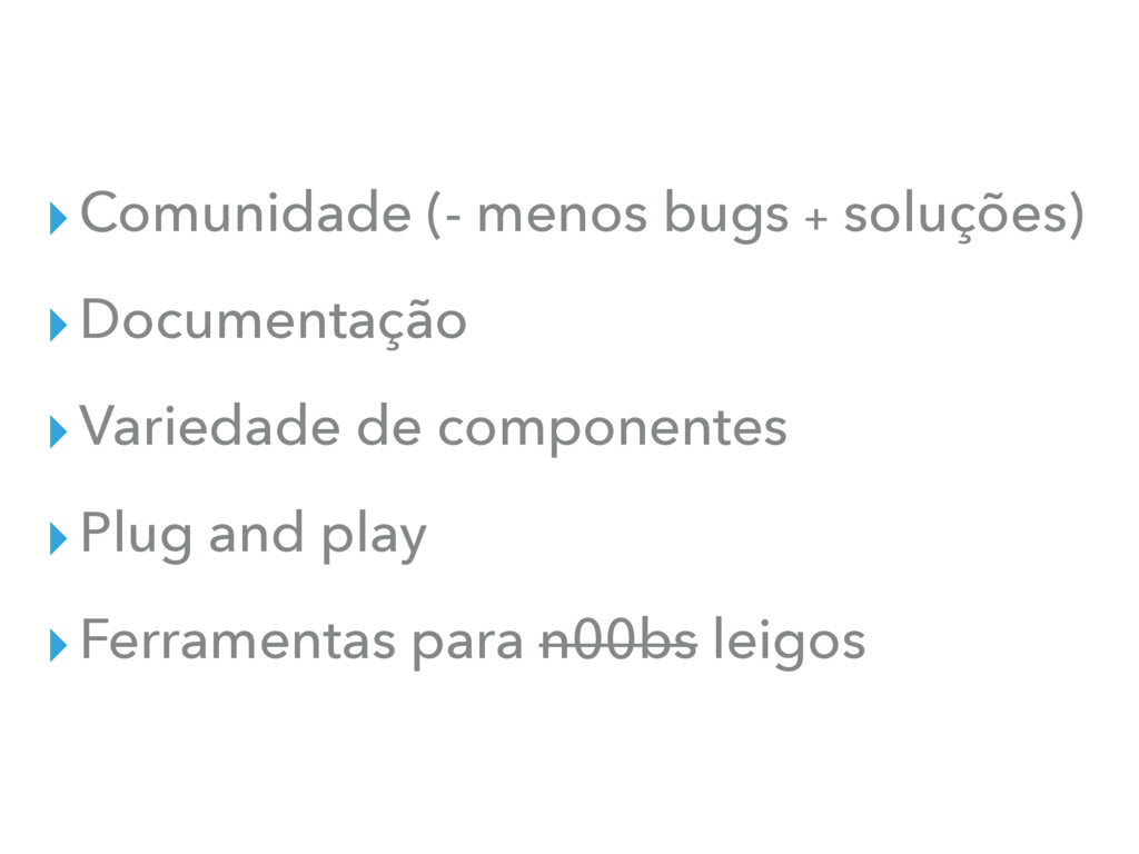
▸Comunidade (- menos bugs + soluções) ▸Documentação ▸Variedade de componentes
▸Plug and play ▸Ferramentas para n00bs leigos
None
MENOS É MAIS
None
None
SOLUÇÃO PRONTA CONTRAS
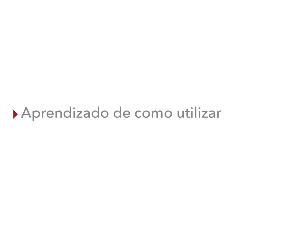
▸Aprendizado de como utilizar
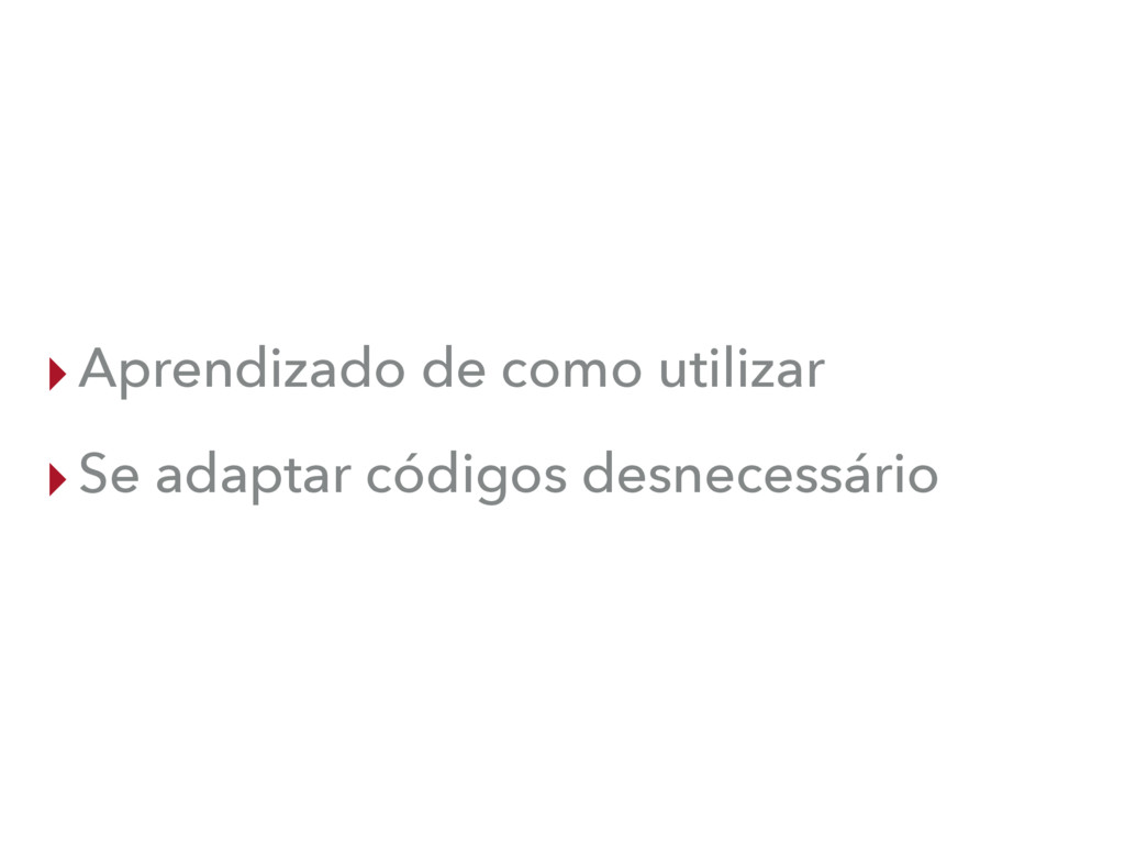
▸Aprendizado de como utilizar ▸Se adaptar códigos desnecessário
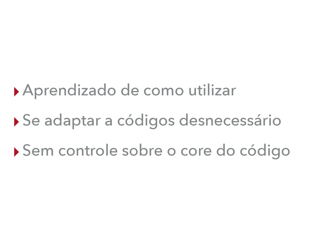
▸Aprendizado de como utilizar ▸Se adaptar a códigos desnecessário ▸Sem
controle sobre o core do código
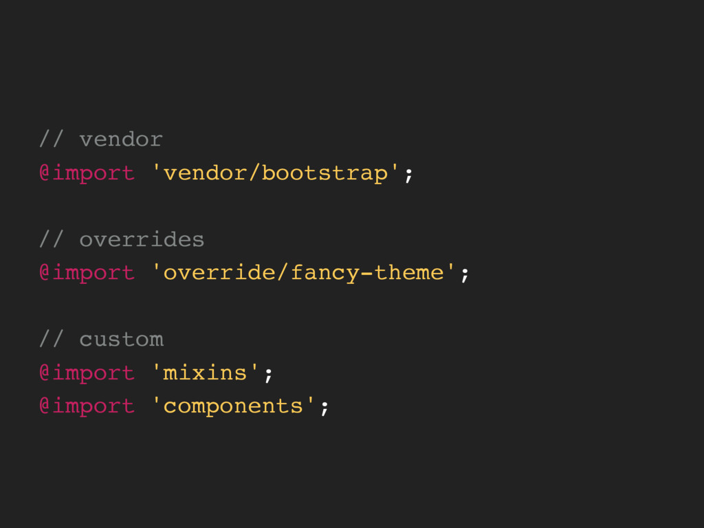
// vendor @import 'vendor/bootstrap'; // overrides @import 'override/fancy-theme'; // custom
@import 'mixins'; @import 'components';
DO IT YOURSELF
SOLUÇÃO CUSTOM PRÓS
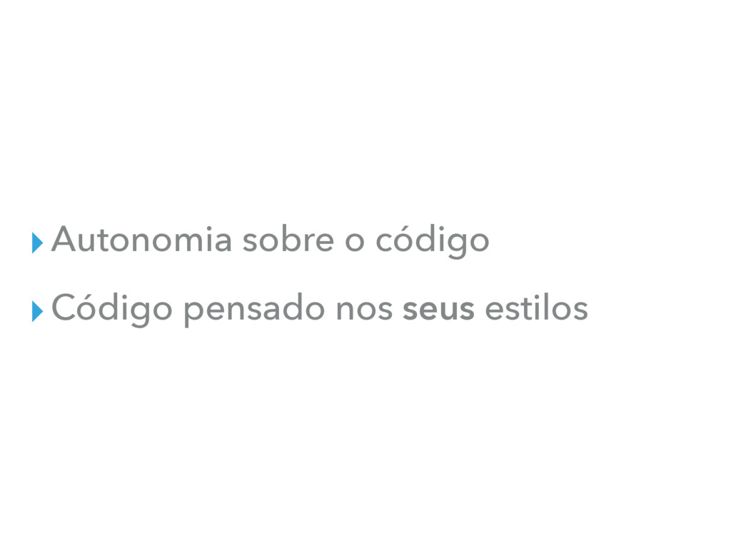
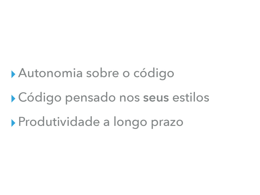
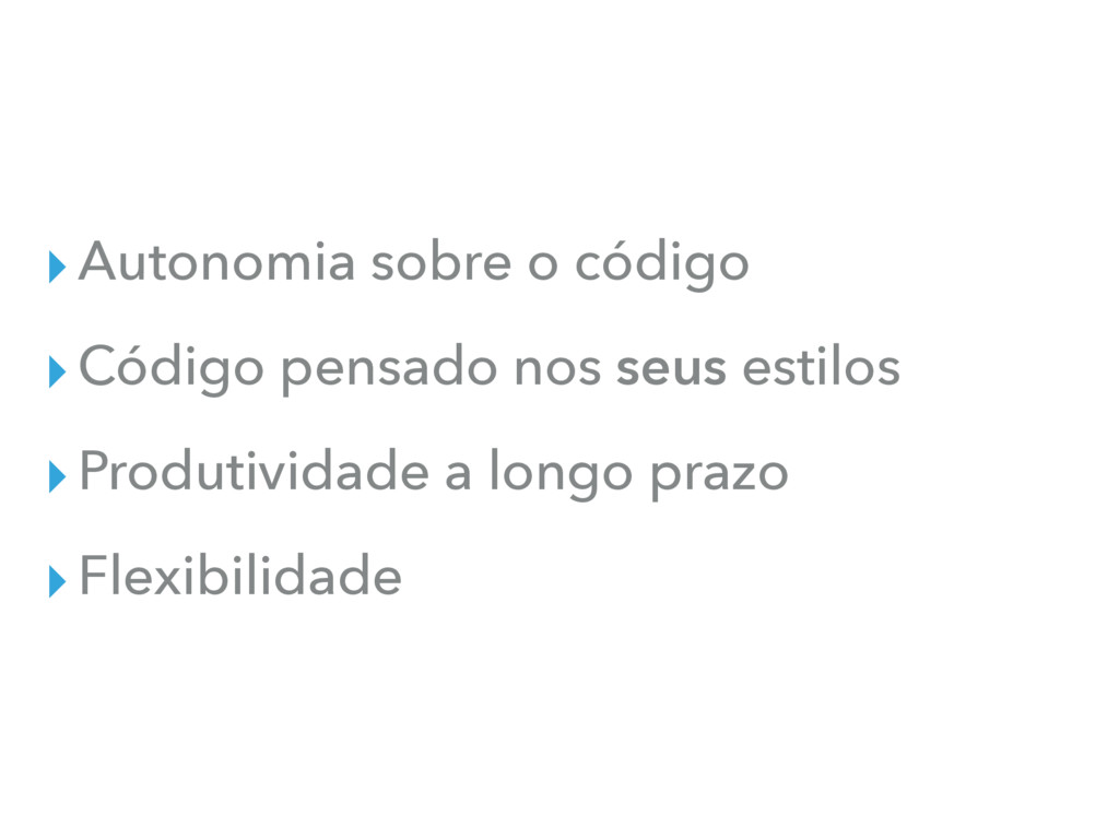
▸Autonomia sobre o código
▸Autonomia sobre o código ▸Código pensado nos seus estilos
▸Autonomia sobre o código ▸Código pensado nos seus estilos ▸Produtividade
a longo prazo
▸Autonomia sobre o código ▸Código pensado nos seus estilos ▸Produtividade
a longo prazo ▸Flexibilidade
SOLUÇÃO CUSTOM CONTRAS
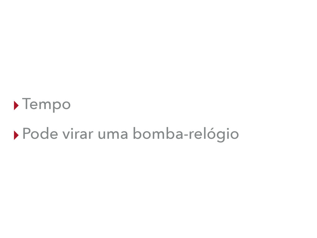
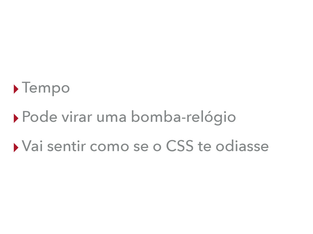
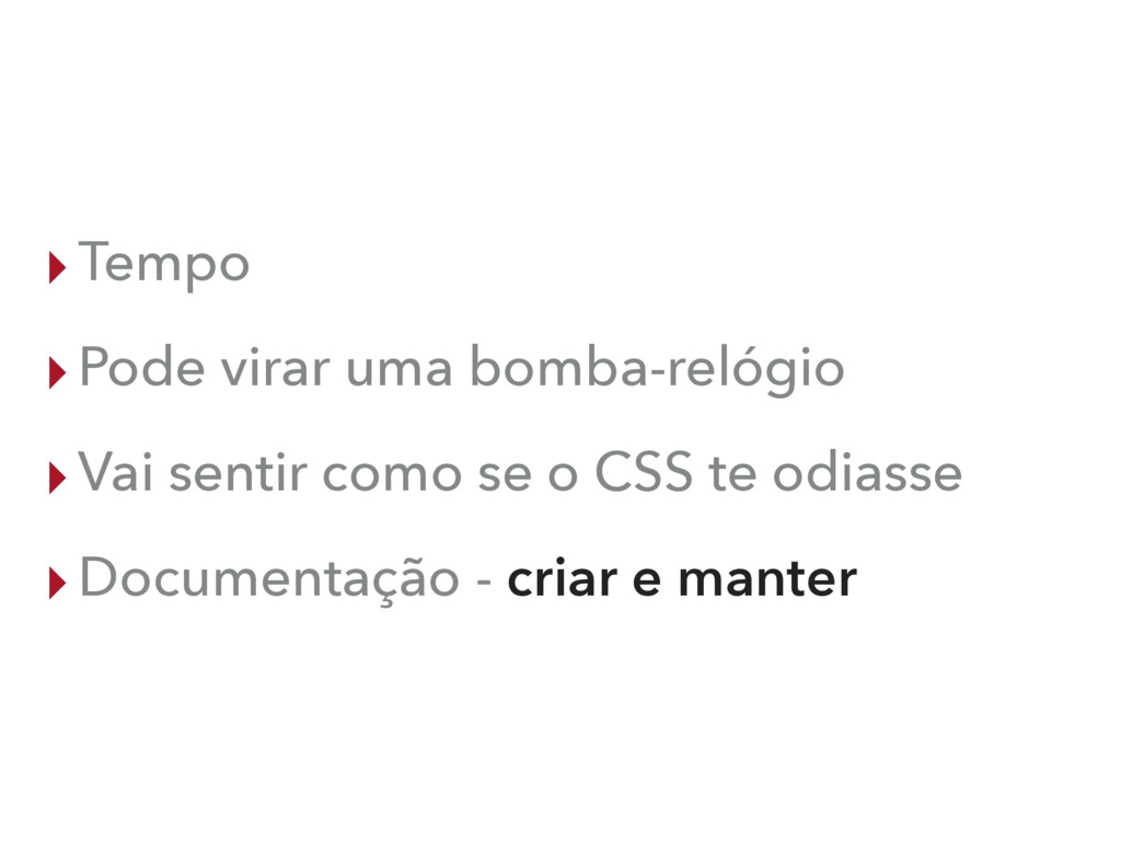
▸Tempo
▸Tempo ▸Pode virar uma bomba-relógio
▸Tempo ▸Pode virar uma bomba-relógio ▸Vai sentir como se o
CSS te odiasse
▸Tempo ▸Pode virar uma bomba-relógio ▸Vai sentir como se o
CSS te odiasse ▸Documentação - criar e manter
{ CSS } CODING
DESIGN » PROTÓTIPO » ESTRUTURA » CÓDIGO
None
TÉCNICAS E ESTRATÉGIAS
OOCSS OBJECT ORIENTED CSS
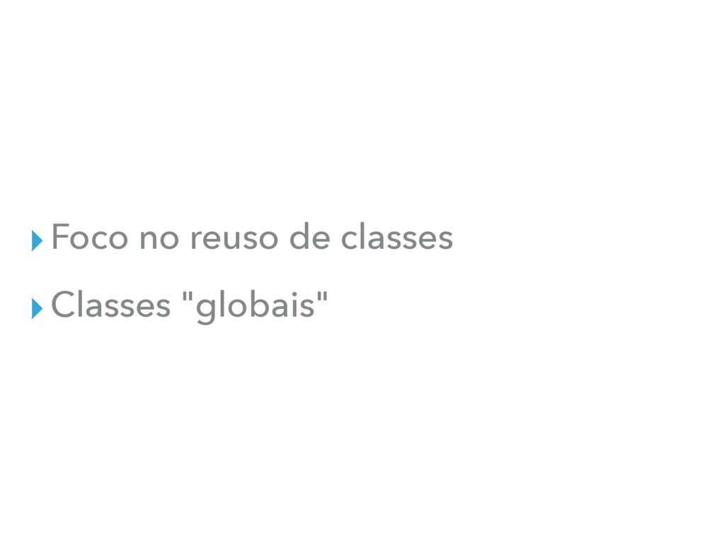
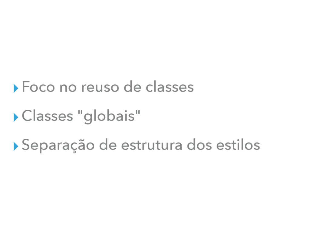
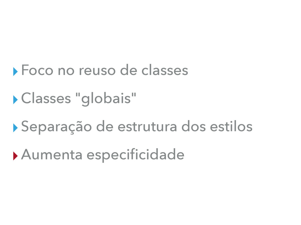
▸Foco no reuso de classes
▸Foco no reuso de classes ▸Classes "globais"
▸Foco no reuso de classes ▸Classes "globais" ▸Separação de estrutura
dos estilos
▸Foco no reuso de classes ▸Classes "globais" ▸Separação de estrutura
dos estilos ▸Aumenta especificidade
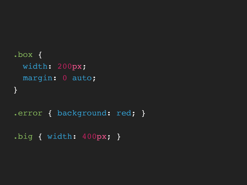
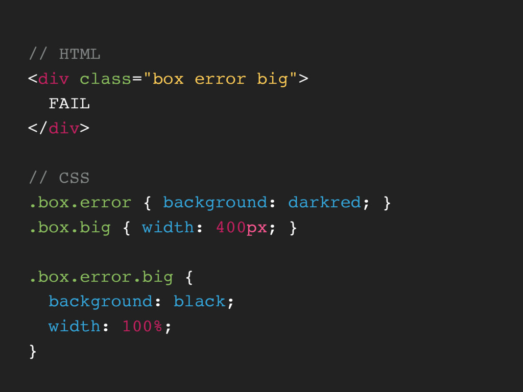
.box { width: 200px; margin: 0 auto; } .error {
background: red; } .big { width: 400px; }
// HTML <div class="box error big"> FAIL </div> // CSS
.box.error { background: darkred; } .box.big { width: 400px; } .box.error.big { background: black; width: 100%; }
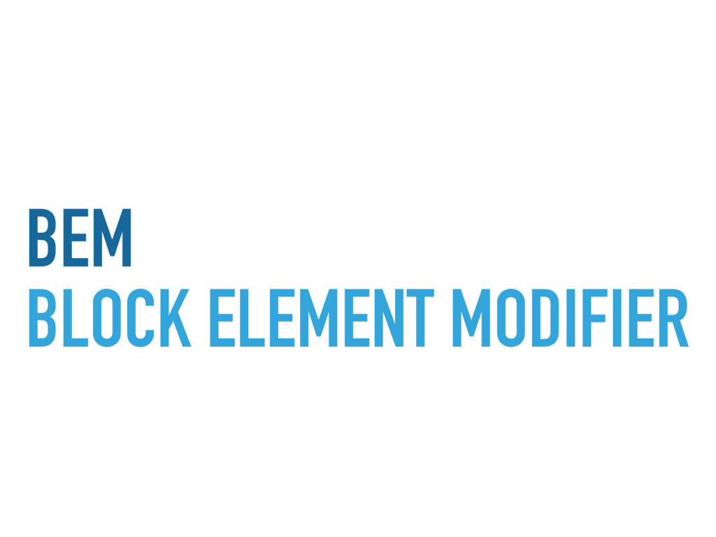
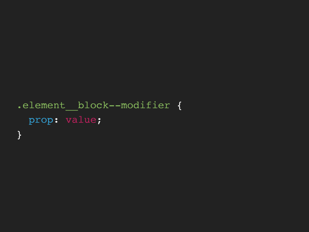
BEM BLOCK ELEMENT MODIFIER
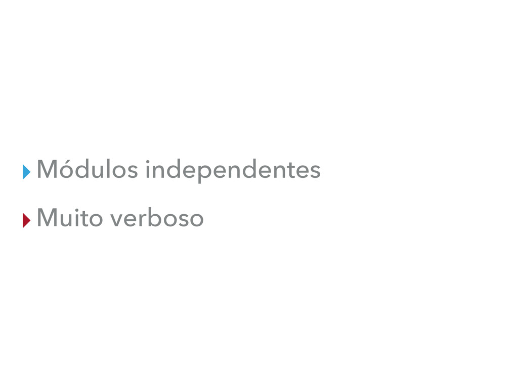
▸Módulos independentes
▸Módulos independentes ▸Muito verboso
None
.element__block--modifier { prop: value; }
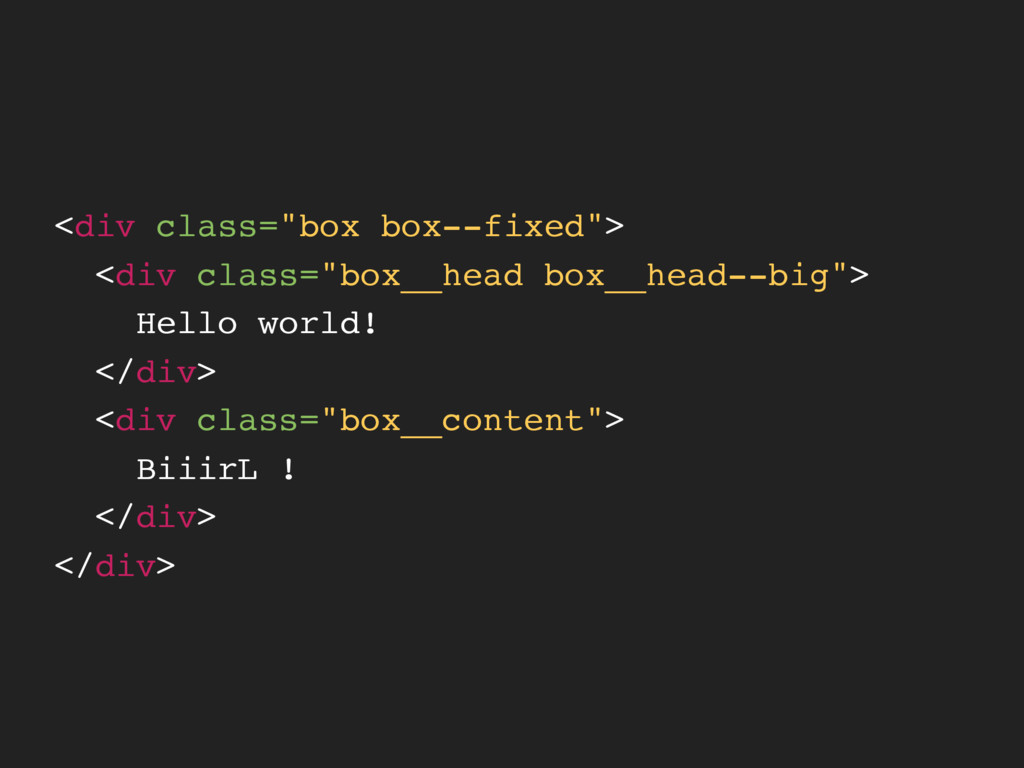
<div class="box box--fixed"> <div class="box__head box__head--big"> Hello world! </div> <div
class="box__content"> BiiirL ! </div> </div>
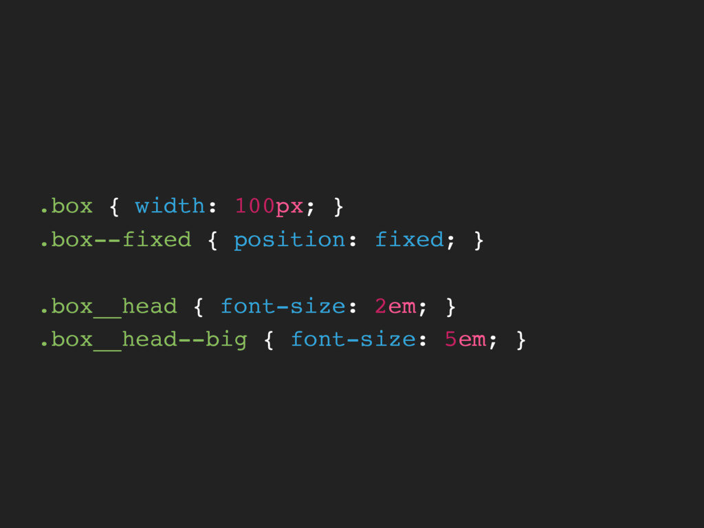
.box { width: 100px; } .box--fixed { position: fixed; }
.box__head { font-size: 2em; } .box__head--big { font-size: 5em; }
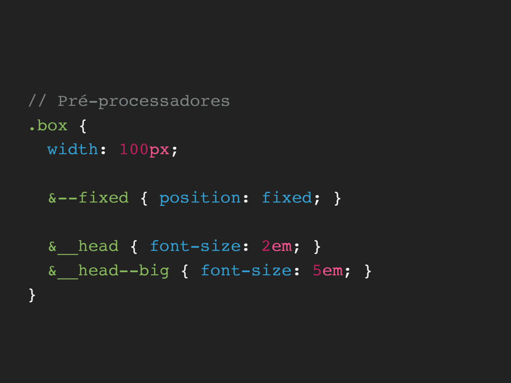
// Pré-processadores .box { width: 100px; &--fixed { position: fixed;
} &__head { font-size: 2em; } &__head--big { font-size: 5em; } }
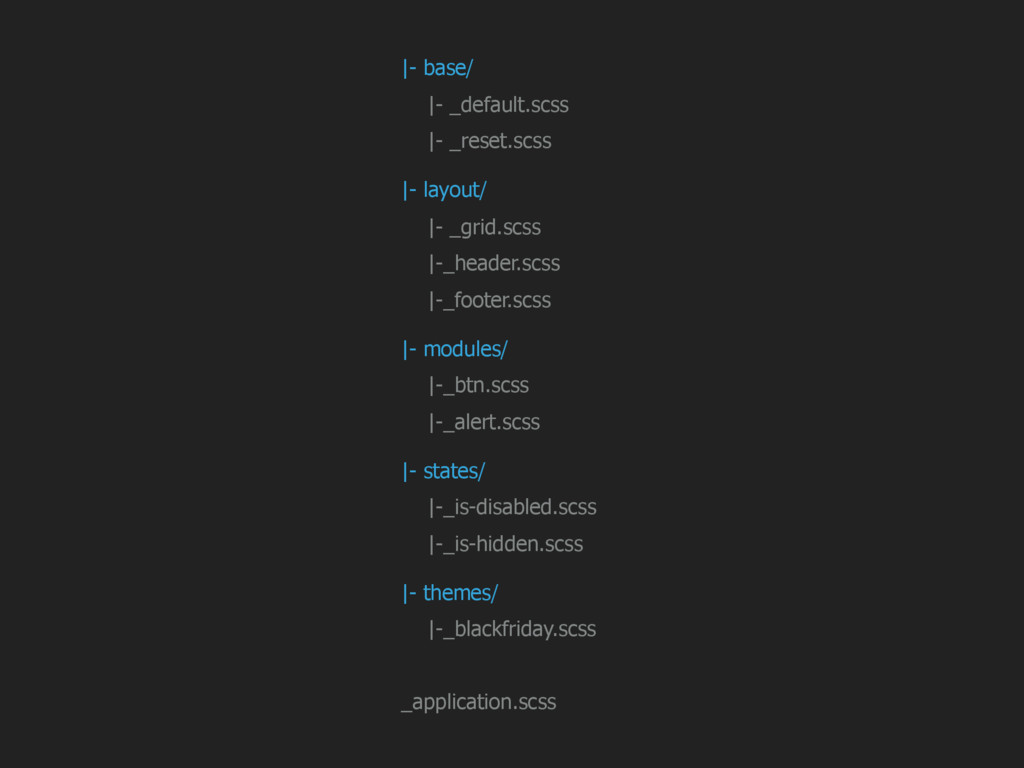
SMACSS SCALABLE AND MODULAR ARCHITECTURE FOR CSS
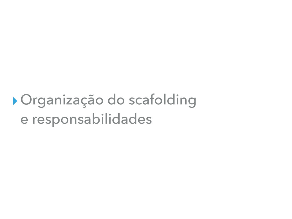
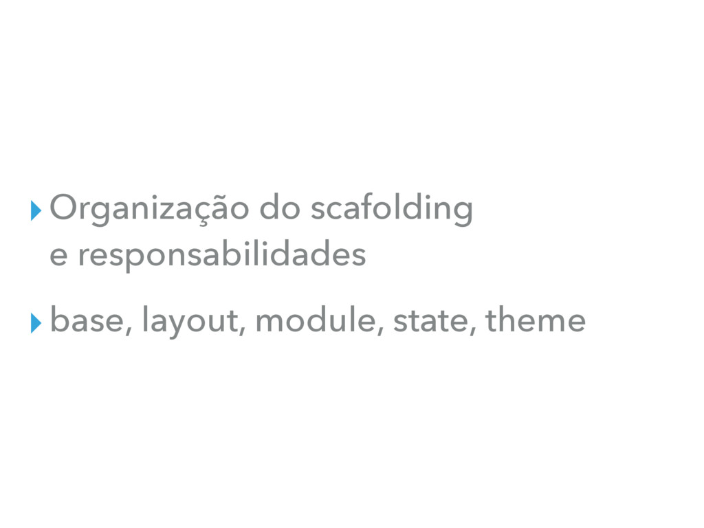
▸Organização do scafolding e responsabilidades
▸Organização do scafolding e responsabilidades ▸base, layout, module, state, theme
None
|- base/ |- _default.scss |- _reset.scss |- layout/ |- _grid.scss
|-_header.scss |-_footer.scss |- modules/ |-_btn.scss |-_alert.scss |- states/ |-_is-disabled.scss |-_is-hidden.scss |- themes/ |-_blackfriday.scss _application.scss
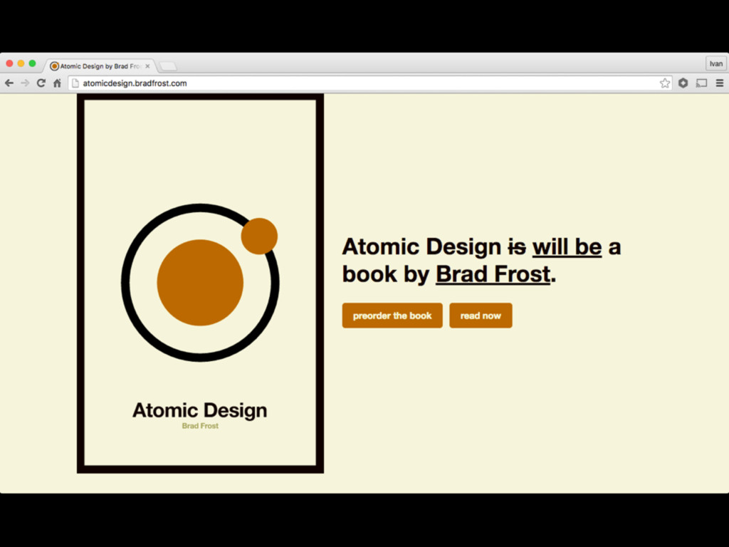
ATOMIC DESIGN
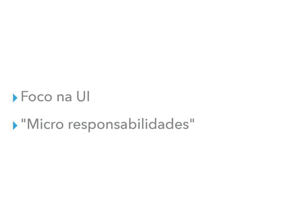
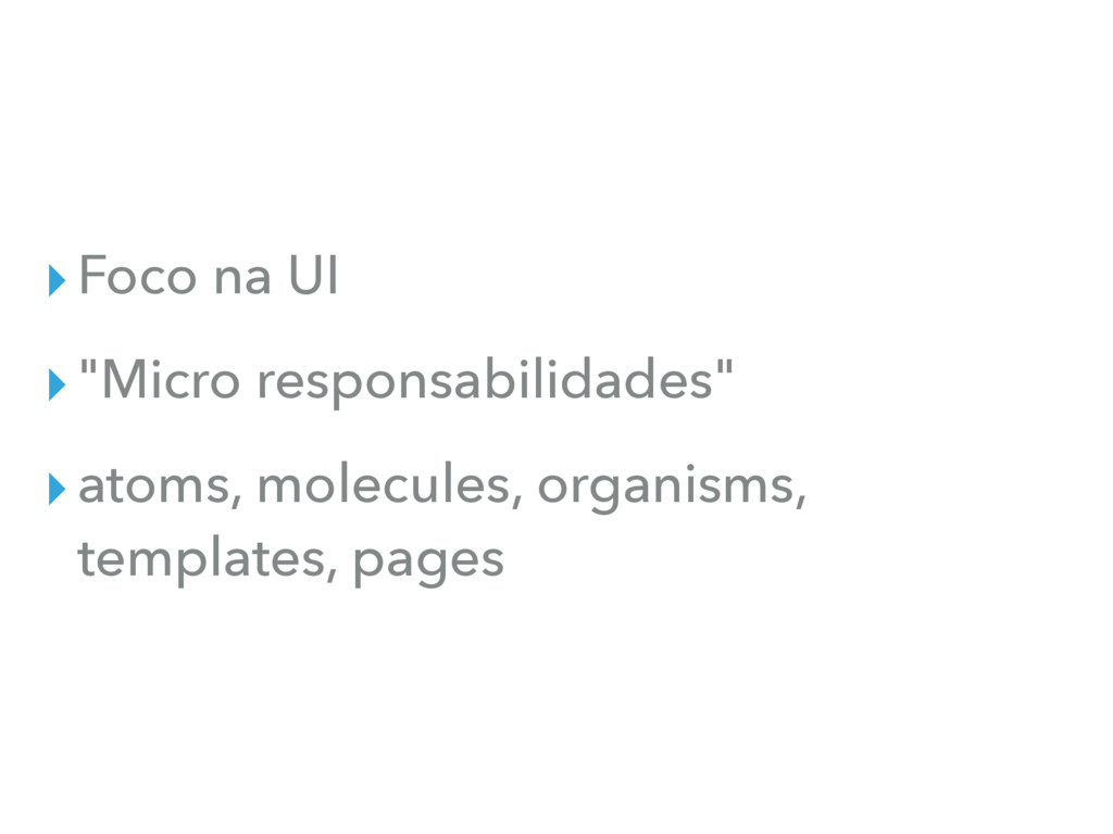
▸Foco na UI
▸Foco na UI ▸"Micro responsabilidades"
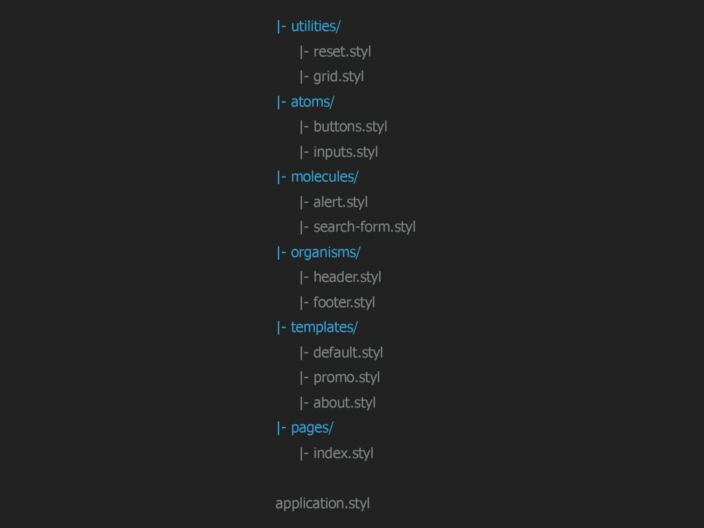
▸Foco na UI ▸"Micro responsabilidades" ▸atoms, molecules, organisms, templates, pages
None
|- utilities/ |- reset.styl |- grid.styl |- atoms/ |- buttons.styl
|- inputs.styl |- molecules/ |- alert.styl |- search-form.styl |- organisms/ |- header.styl |- footer.styl |- templates/ |- default.styl |- promo.styl |- about.styl |- pages/ |- index.styl application.styl
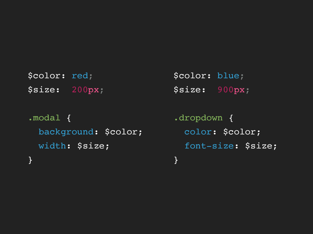
// Modal $modalColor: red; $modalSize: 200px; // Dropdown $dropdownColor: blue;
$dropdownSize: 20px;
$color: red; $size: 200px; .modal { background: $color; width: $size;
} $color: blue; $size: 900px; .dropdown { color: $color; font-size: $size; }
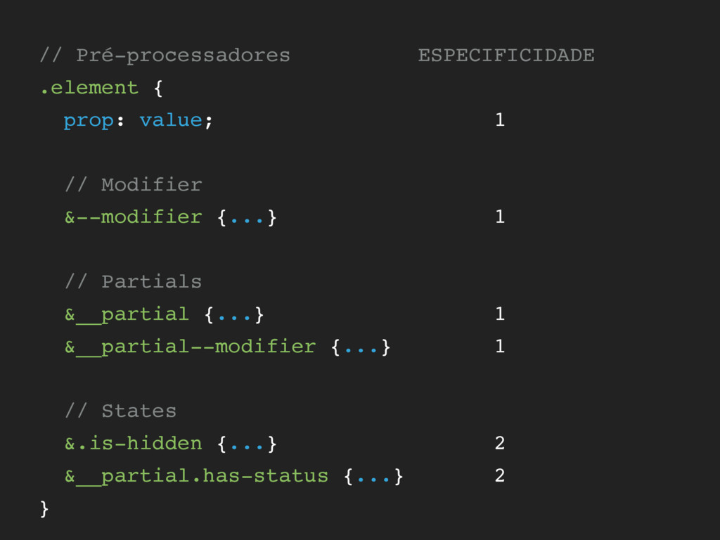
// Pré-processadores ESPECIFICIDADE .element { prop: value; 1 // Modifier
&--modifier {...} 1 // Partials &__partial {...} 1 &__partial--modifier {...} 1 // States &.is-hidden {...} 2 &__partial.has-status {...} 2 }
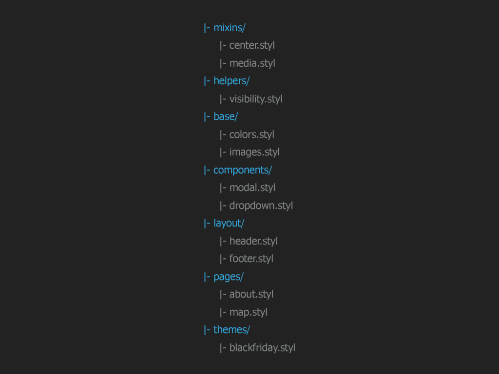
|- mixins/ |- center.styl |- media.styl |- helpers/ |- visibility.styl
|- base/ |- colors.styl |- images.styl |- components/ |- modal.styl |- dropdown.styl |- layout/ |- header.styl |- footer.styl |- pages/ |- about.styl |- map.styl |- themes/ |- blackfriday.styl
None
None
COMPONENTES CODING
None
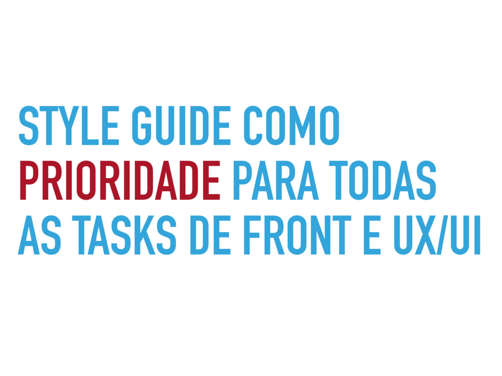
SDD STYLE GUIDE DRIVEN DEVELOPMENT
STYLE GUIDE COMO PRIORIDADE PARA TODAS AS TASKS DE FRONT
E UX/UI
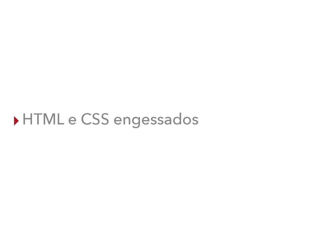
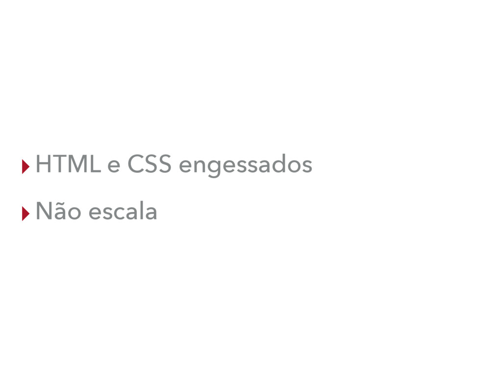
ANTES
▸HTML e CSS engessados
▸HTML e CSS engessados ▸Não escala
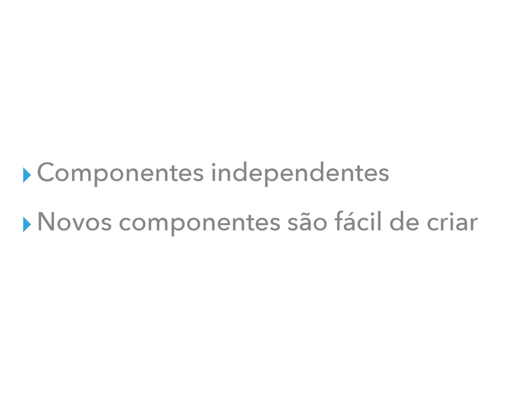
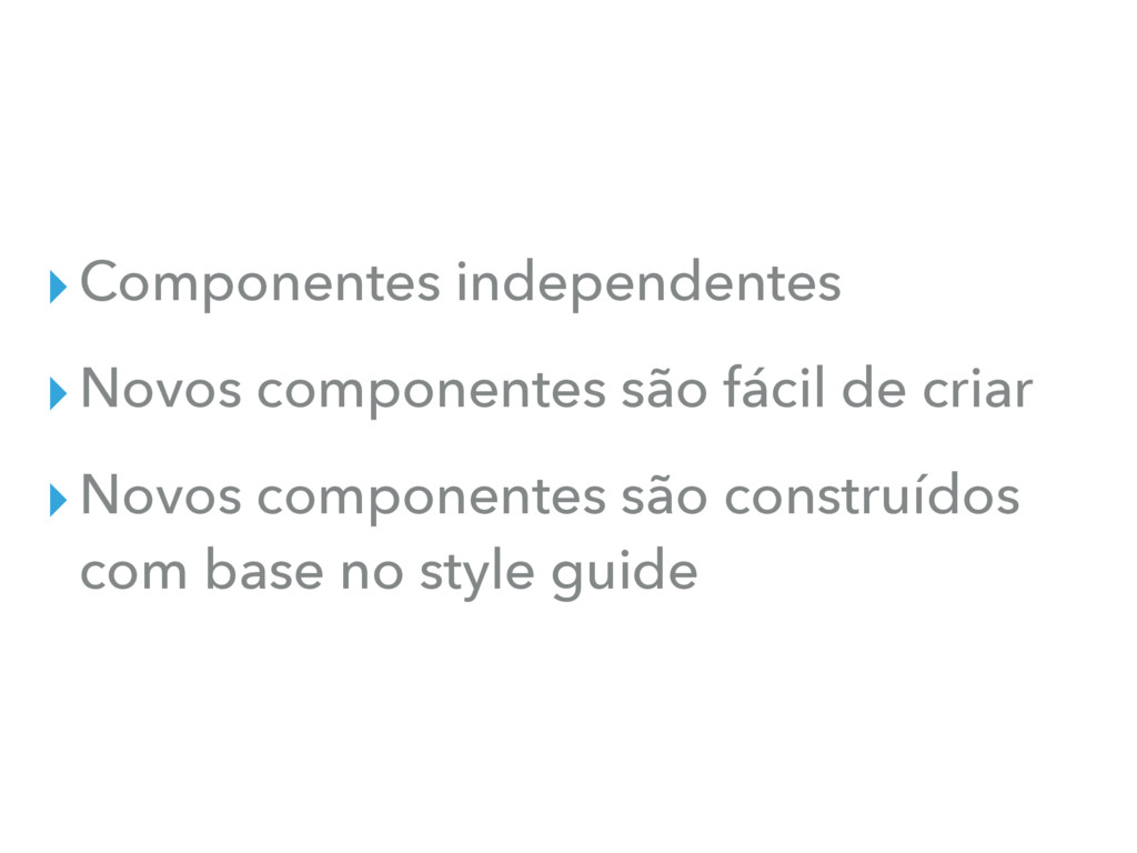
DEPOIS
▸Componentes independentes
▸Componentes independentes ▸Novos componentes são fácil de criar
▸Componentes independentes ▸Novos componentes são fácil de criar ▸Novos componentes
são construídos com base no style guide
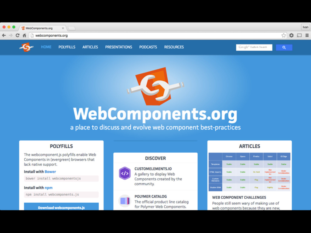
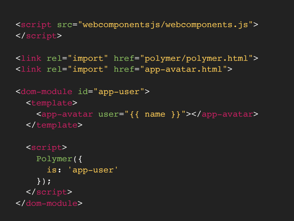
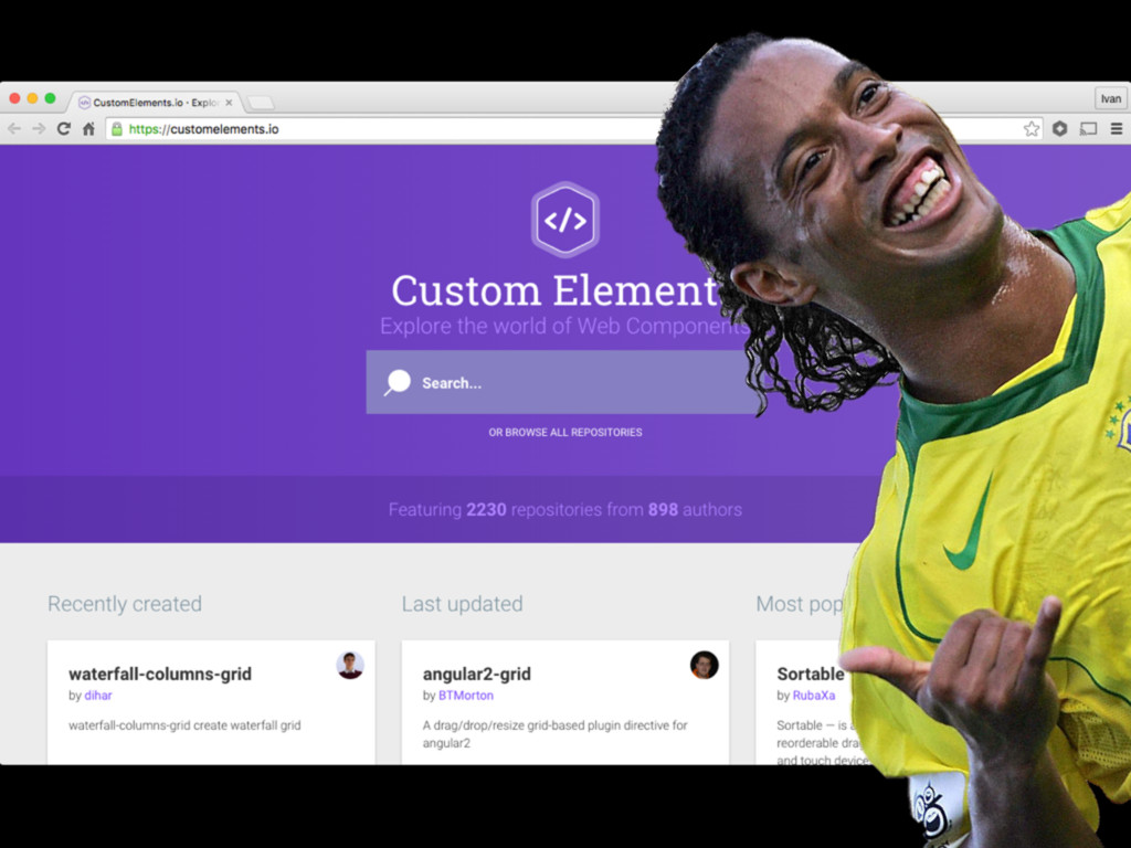
WEB COMPONENTS
None
None
<script src="webcomponentsjs/webcomponents.js"> </script> <link rel="import" href="polymer/polymer.html"> <link rel="import" href="app-avatar.html"> <dom-module
id="app-user"> <template> <app-avatar user="{{ name }}"></app-avatar> </template> <script> Polymer({ is: 'app-user' }); </script> </dom-module>
None
None
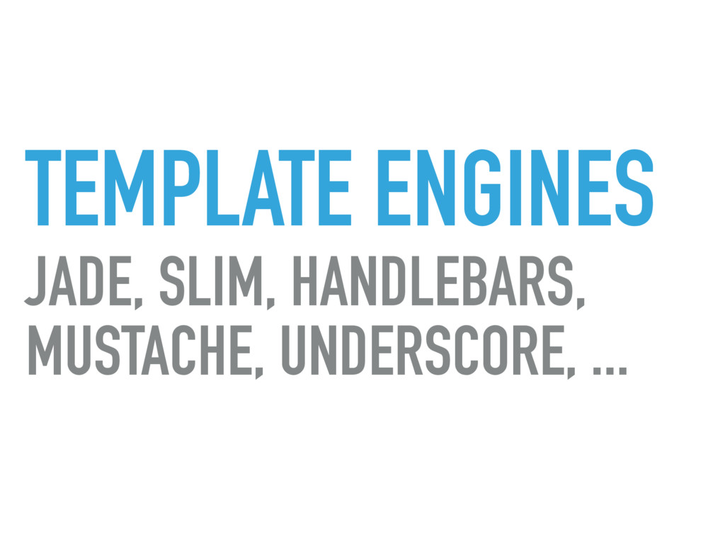
TEMPLATE ENGINES JADE, SLIM, HANDLEBARS, MUSTACHE, UNDERSCORE, ...
MV* FRAMEWORKS
None
DOCUMENTAÇÃO CODING
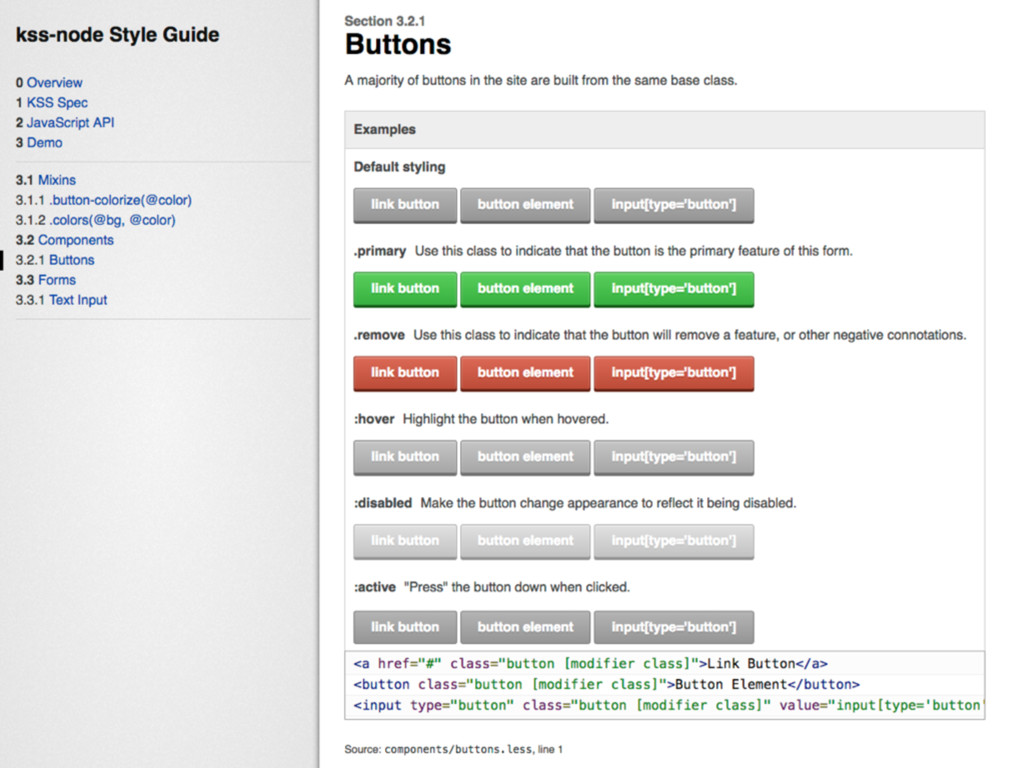
STATIC STYLE GUIDE
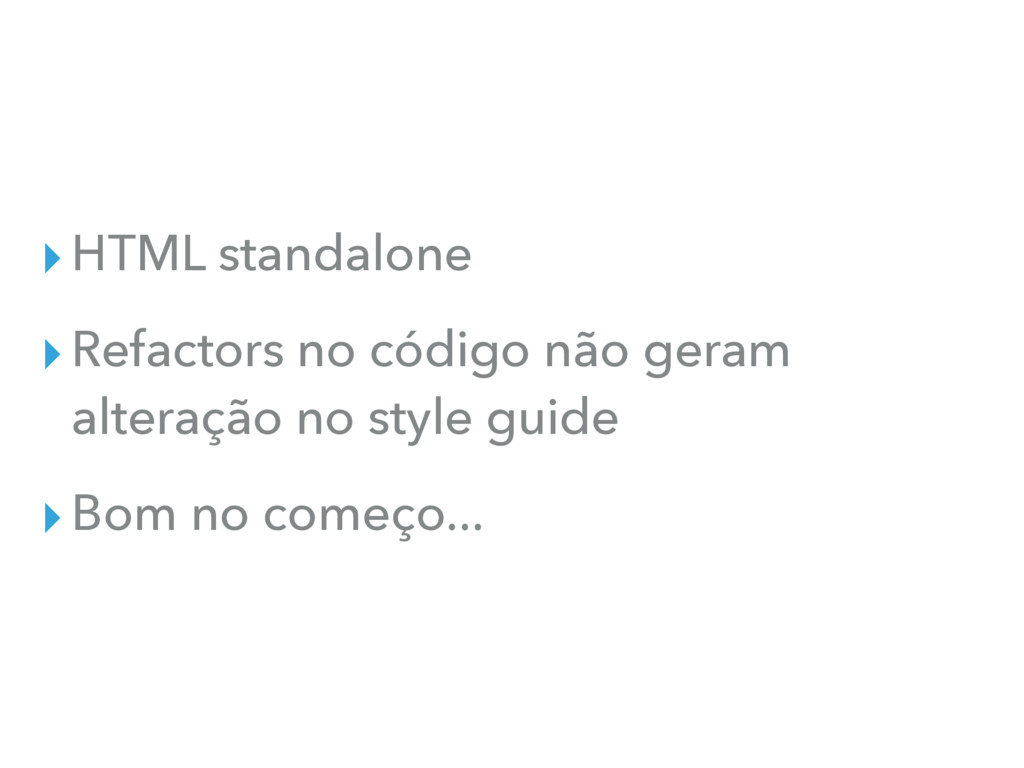
▸HTML standalone
▸HTML standalone ▸Refactors no código não geram alteração no style
guide
▸HTML standalone ▸Refactors no código não geram alteração no style
guide ▸Bom no começo...
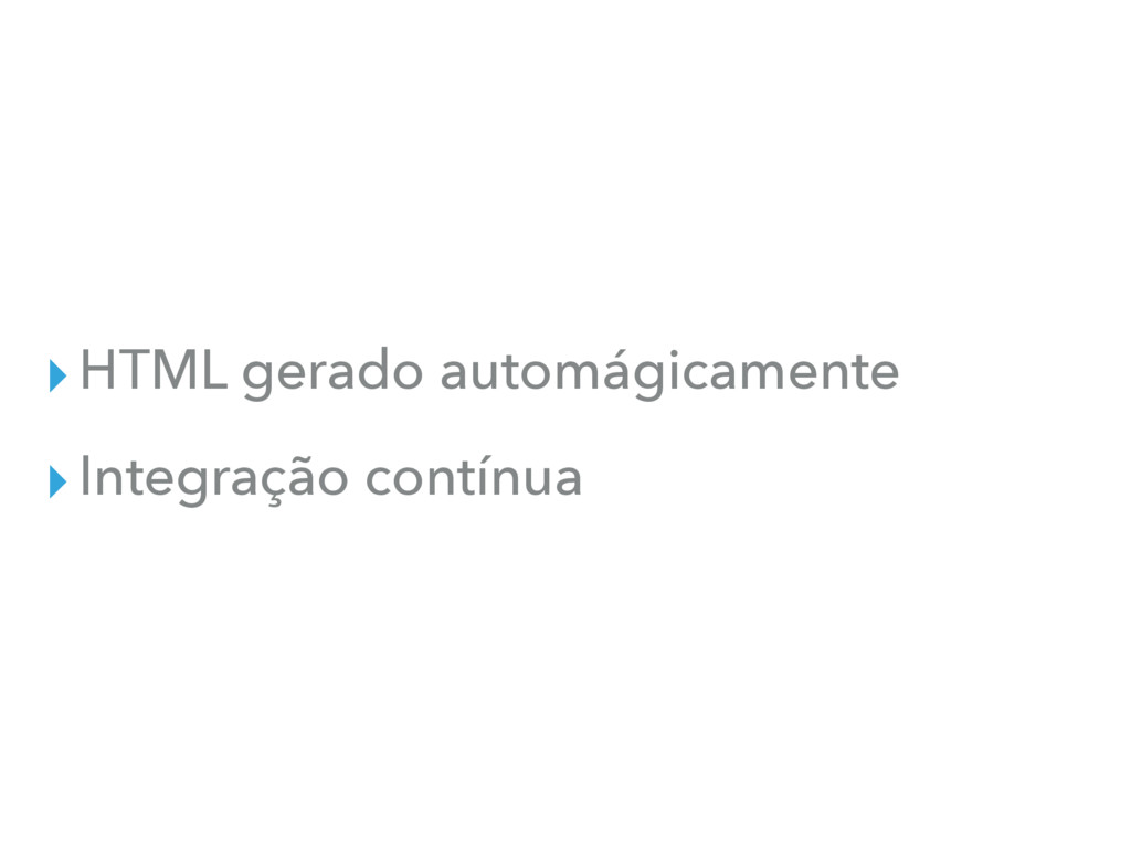
LIVING STYLE GUIDE
▸HTML gerado automágicamente
▸HTML gerado automágicamente ▸Integração contínua
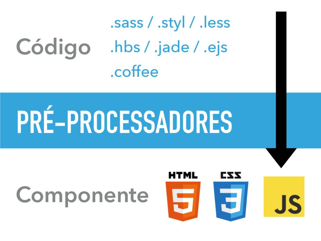
Componente PRÉ-PROCESSADORES Código .sass / .styl / .less .hbs /
.jade / .ejs .coffee
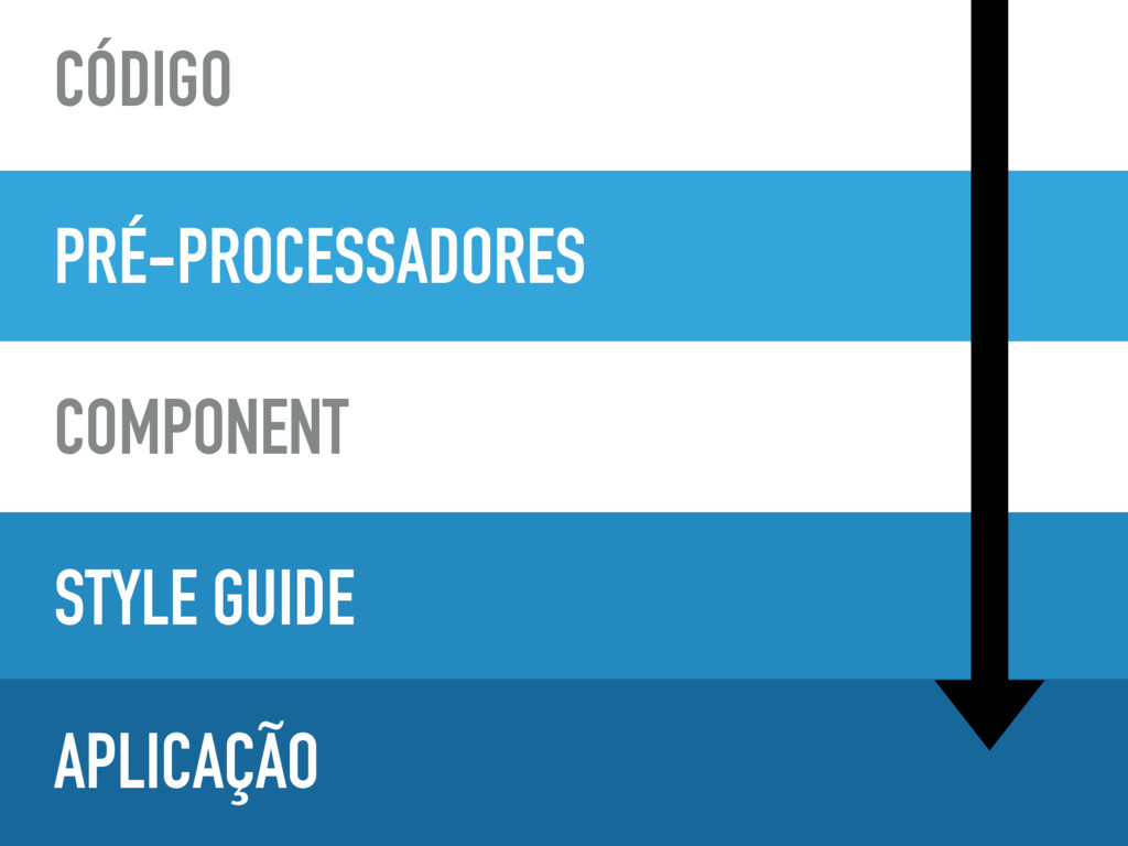
PRÉ-PROCESSADORES STYLE GUIDE APLICAÇÃO CÓDIGO COMPONENT
None
None
None
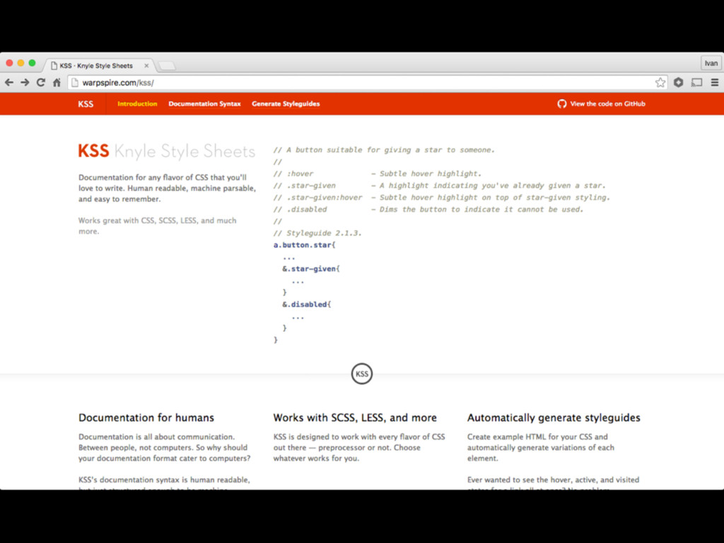
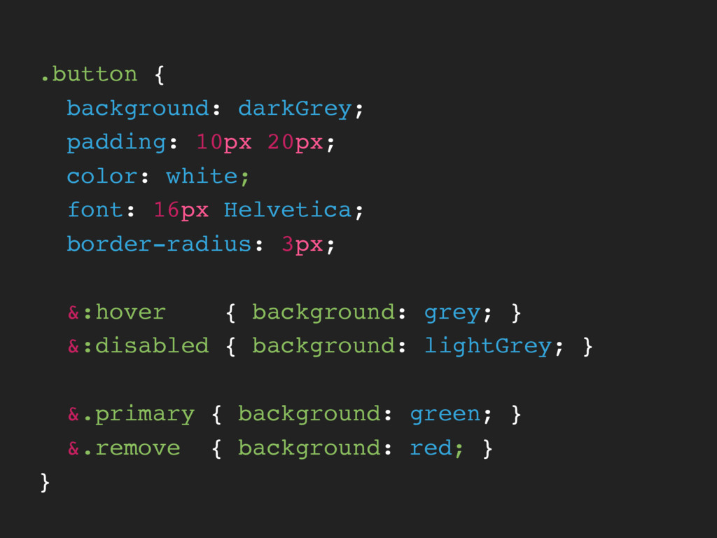
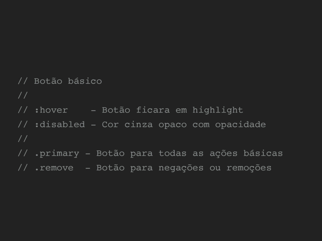
.button { background: darkGrey; padding: 10px 20px; color: white; font:
16px Helvetica; border-radius: 3px; &:hover { background: grey; } &:disabled { background: lightGrey; } &.primary { background: green; } &.remove { background: red; } }
// Botão básico // // :hover - Botão ficara em
highlight // :disabled - Cor cinza opaco com opacidade // // .primary - Botão para todas as ações básicas // .remove - Botão para negações ou remoções
None
ENTÃO...
FAÇA ACONTECER
TODOS SÃO RESPONSÁVEIS
MANTENHA ESCALÁVEL
DEIXE VISÍVEL
FAÇA SER INCRÍVEL
OBRIGADO!
 ivanbanov
 nari_ex
 sugitak
 torumakabe
 yama3133
 ykagano
 makies
 rakus_dev
 oracle4engineer
 shift_evolve
 tomzoh
 genda
genda
 bkeepers
 konakalab
 aleyda
 tessaabrams
 elsirapls
 techseoconnect
 lara
lara
 tapps
tapps
 signer
 trallard
 baasie