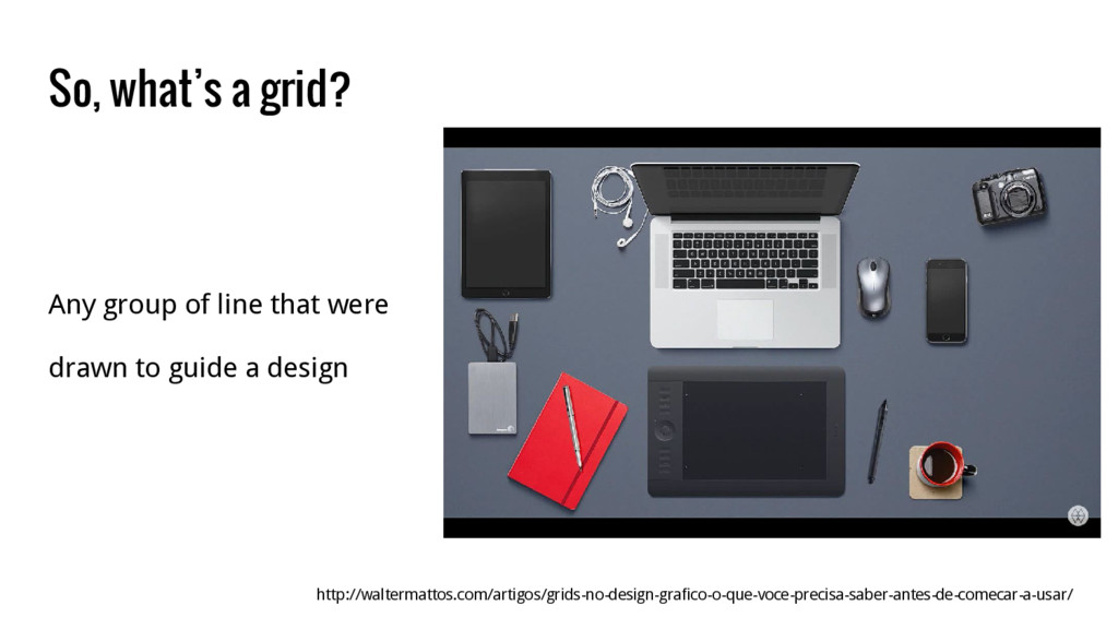
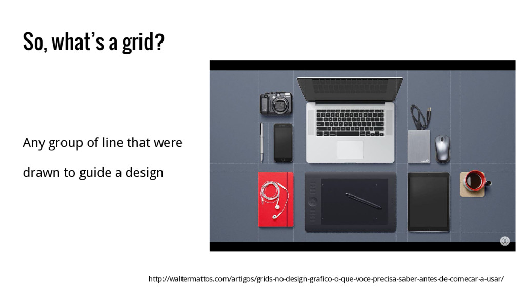
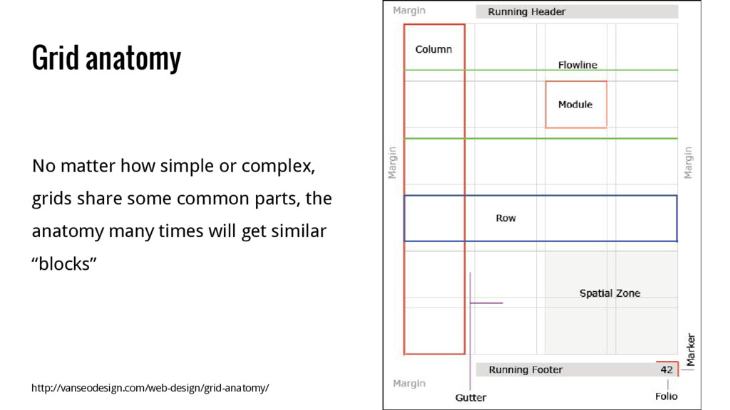
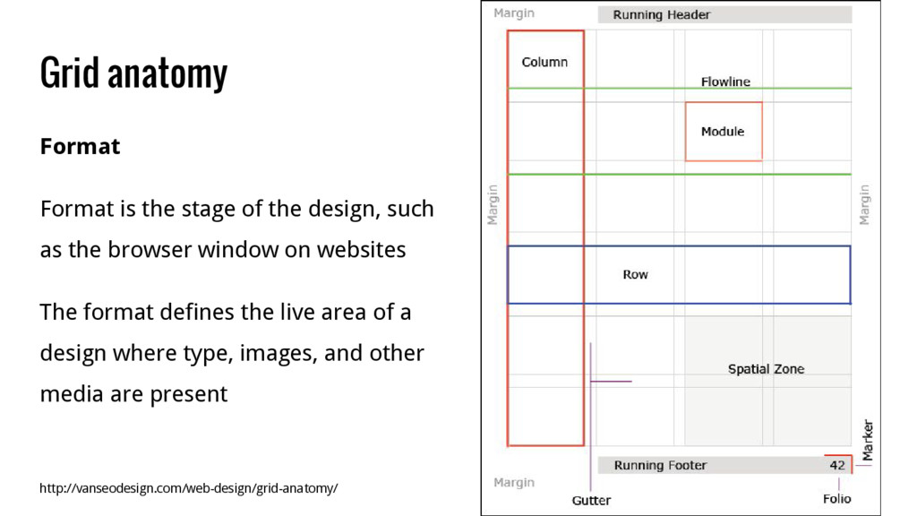
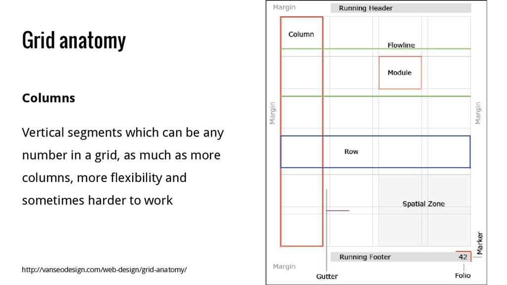
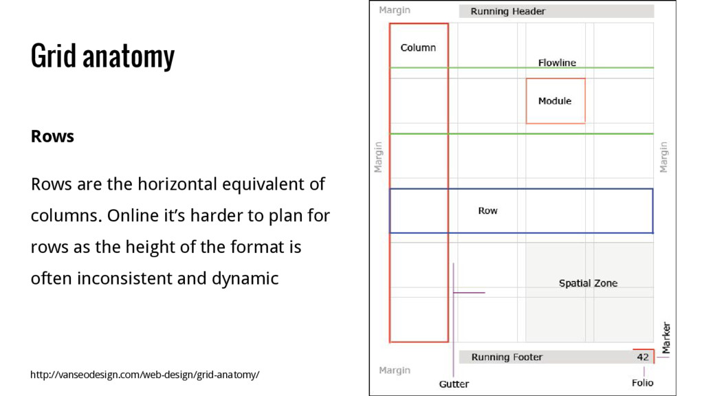
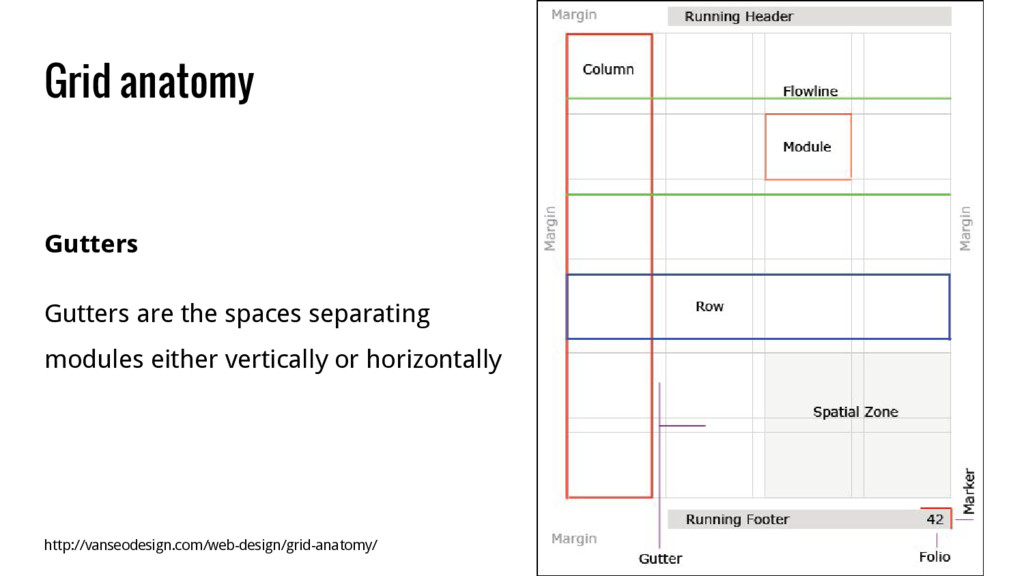
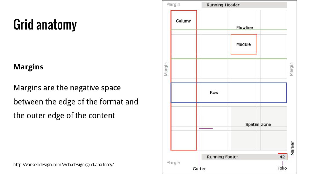
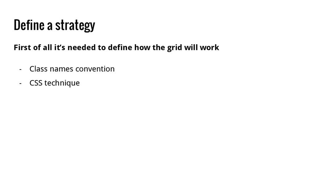
such as the browser window on websites The format defines the live area of a design where type, images, and other media are present http://vanseodesign.com/web-design/grid-anatomy/
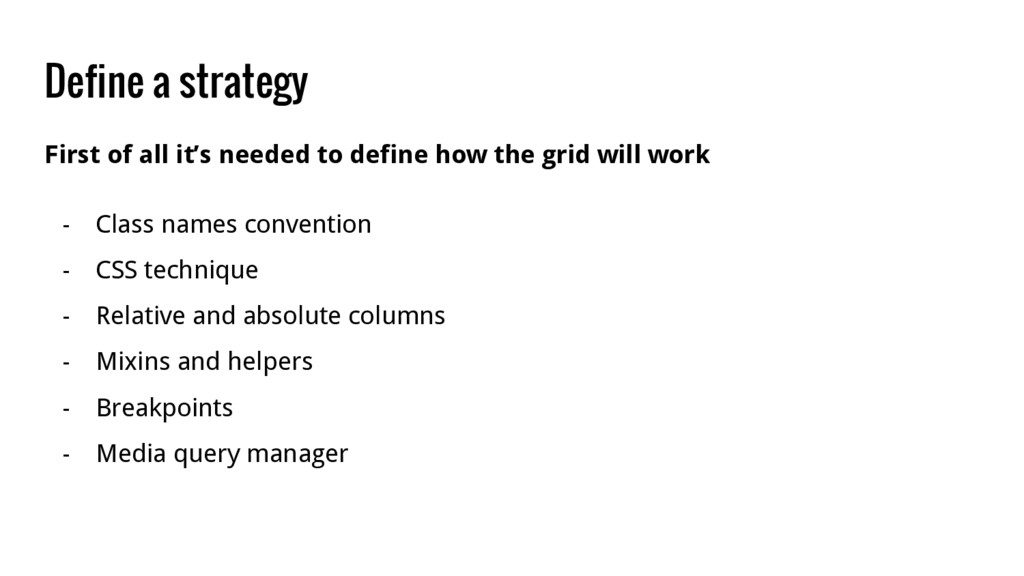
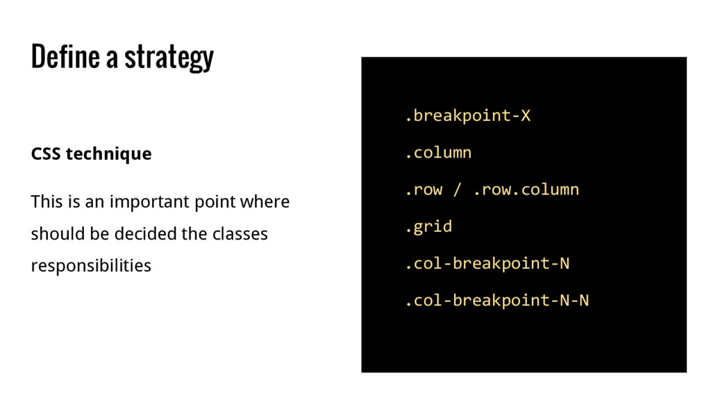
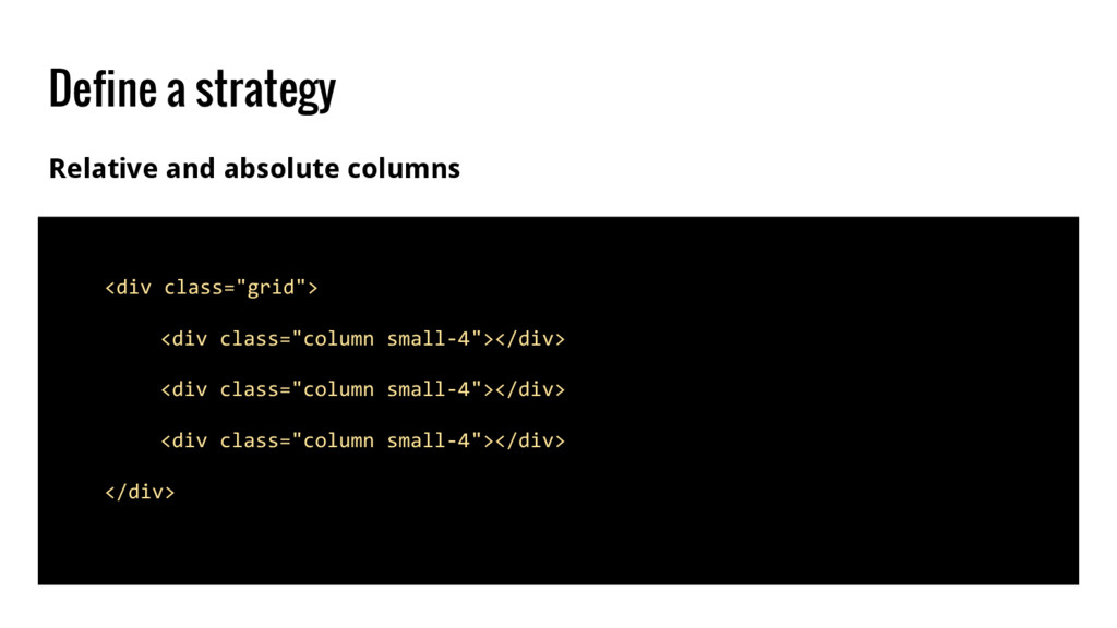
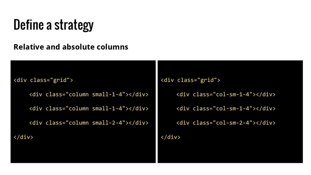
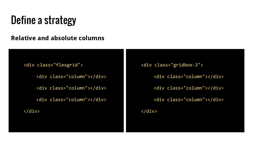
how the grid will work - Class names convention - CSS technique - Relative and absolute columns - Mixins and helpers - Breakpoints - Media query manager
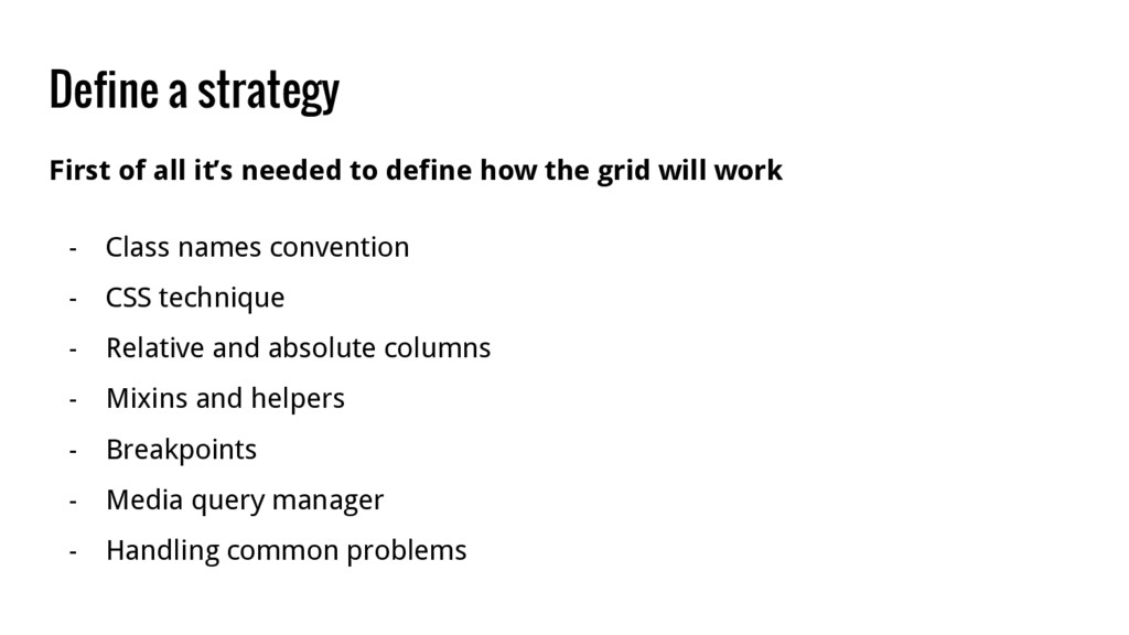
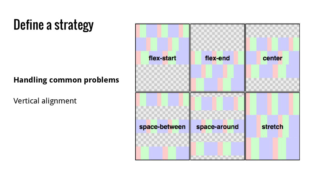
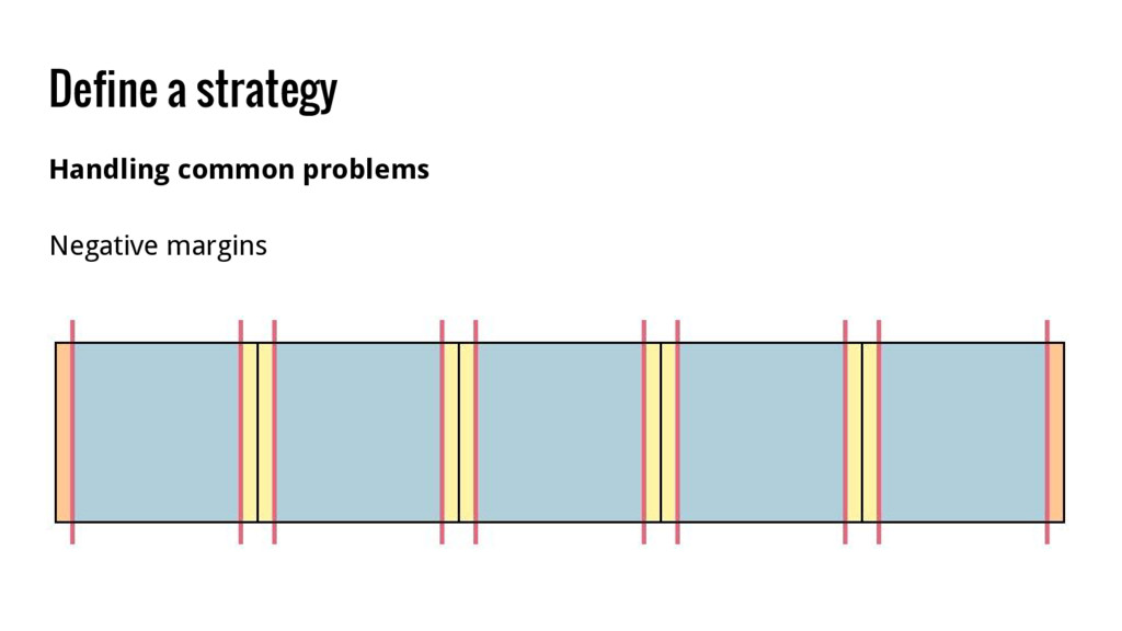
how the grid will work - Class names convention - CSS technique - Relative and absolute columns - Mixins and helpers - Breakpoints - Media query manager - Handling common problems
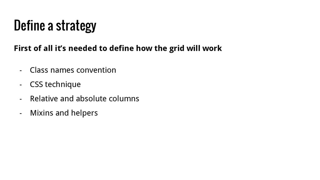
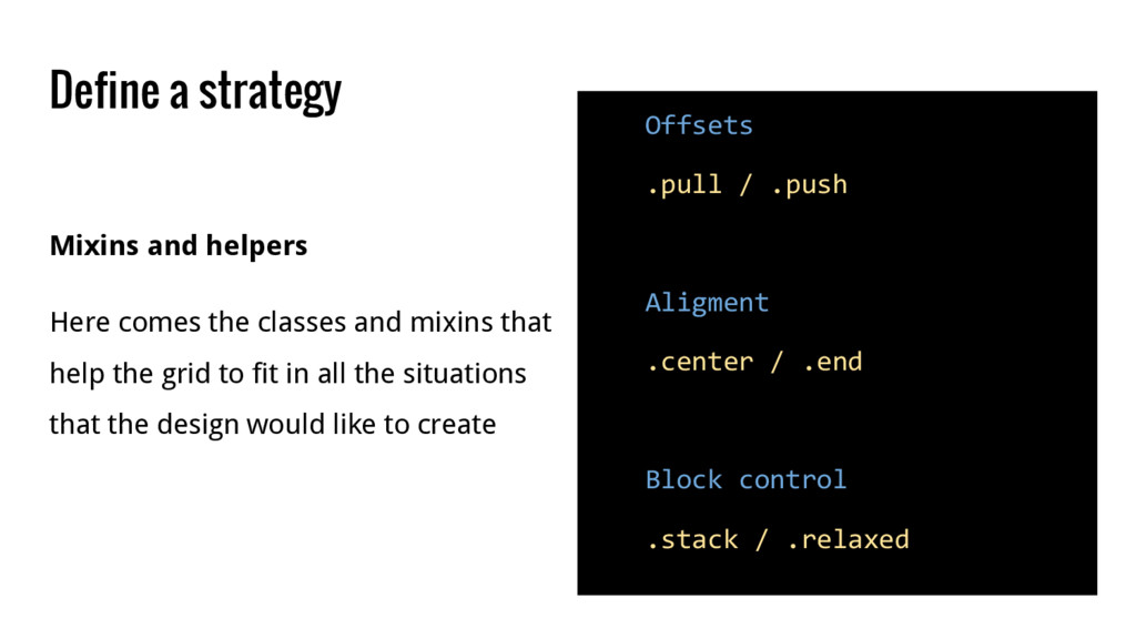
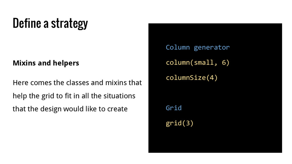
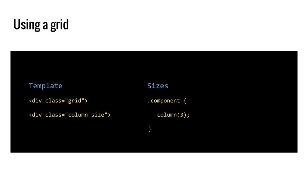
.end Block control .stack / .relaxed Mixins and helpers Here comes the classes and mixins that help the grid to fit in all the situations that the design would like to create
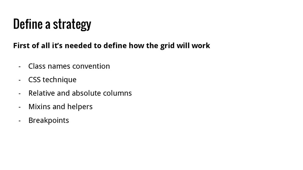
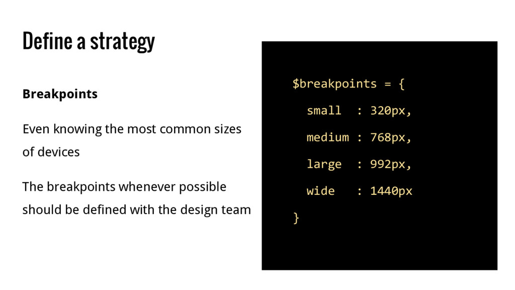
: 768px, large : 992px, wide : 1440px } Breakpoints Even knowing the most common sizes of devices The breakpoints whenever possible should be defined with the design team
 ivanbanov
 yoshimi0227
 lycorptech_jp
 ks91
ks91
 tomzoh
 watany
 ykagano
 kawauso
 fossamagna
 ming_ayami
 kamoshika
 ysknsid25
 quiver
 minecr
 nikkihalliwell
 jct
jct
 samtorres
 jacobtomlinson
 lara
lara
 techseoconnect
 szymonslowik
 trallard
 scottboms
 notwaldorf
 sferik