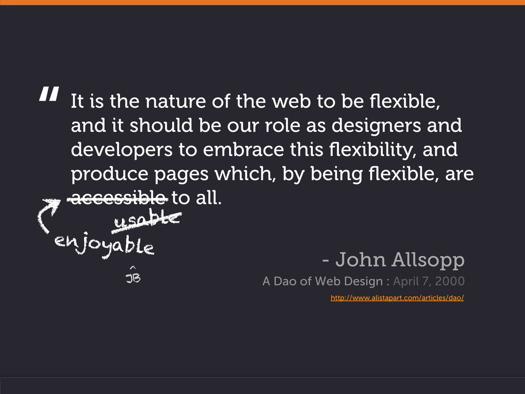
and it should be our role as designers and developers to embrace this flexibility, and produce pages which, by being flexible, are accessible to all. - John Allsopp A Dao of Web Design : April 7, 2000 http://www.alistapart.com/articles/dao/ “ usable enjoyable JB ^
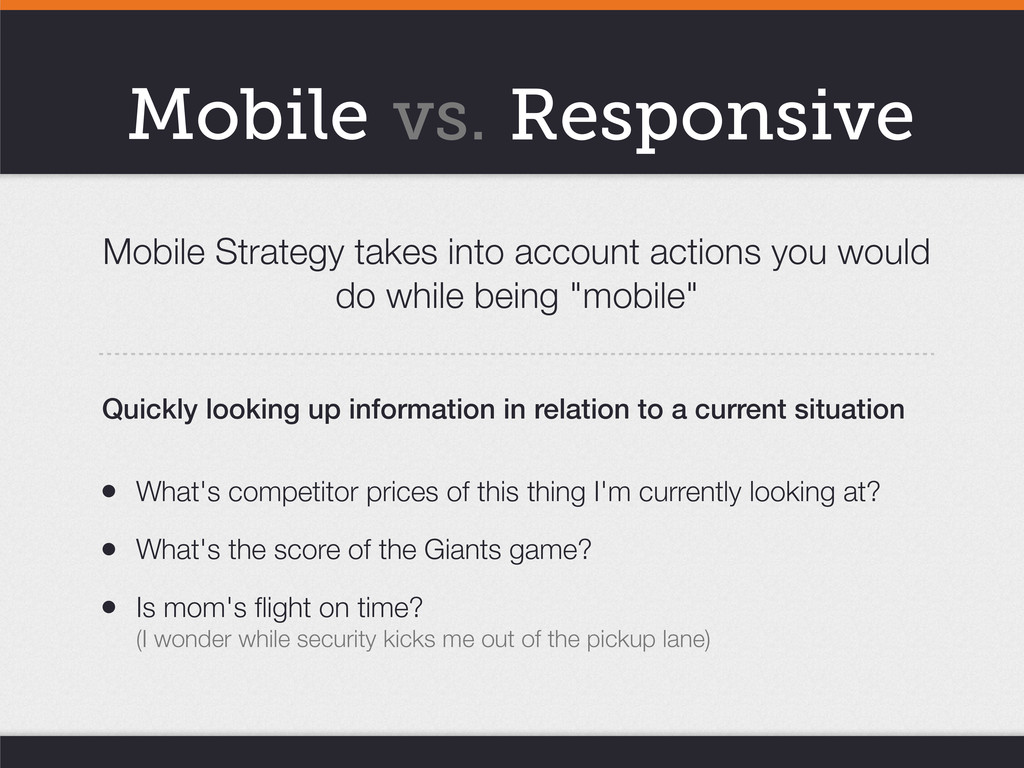
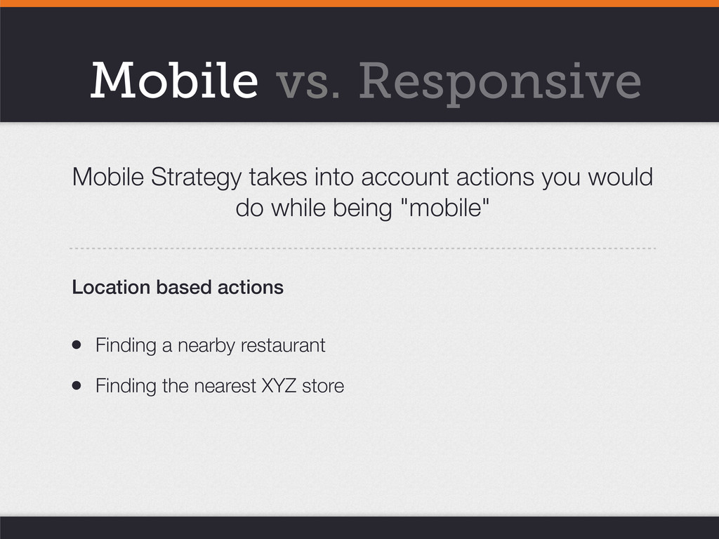
being "mobile" • What's competitor prices of this thing I'm currently looking at? • What's the score of the Giants game? • Is mom's flight on time? (I wonder while security kicks me out of the pickup lane) Quickly looking up information in relation to a current situation Mobile vs. Responsive
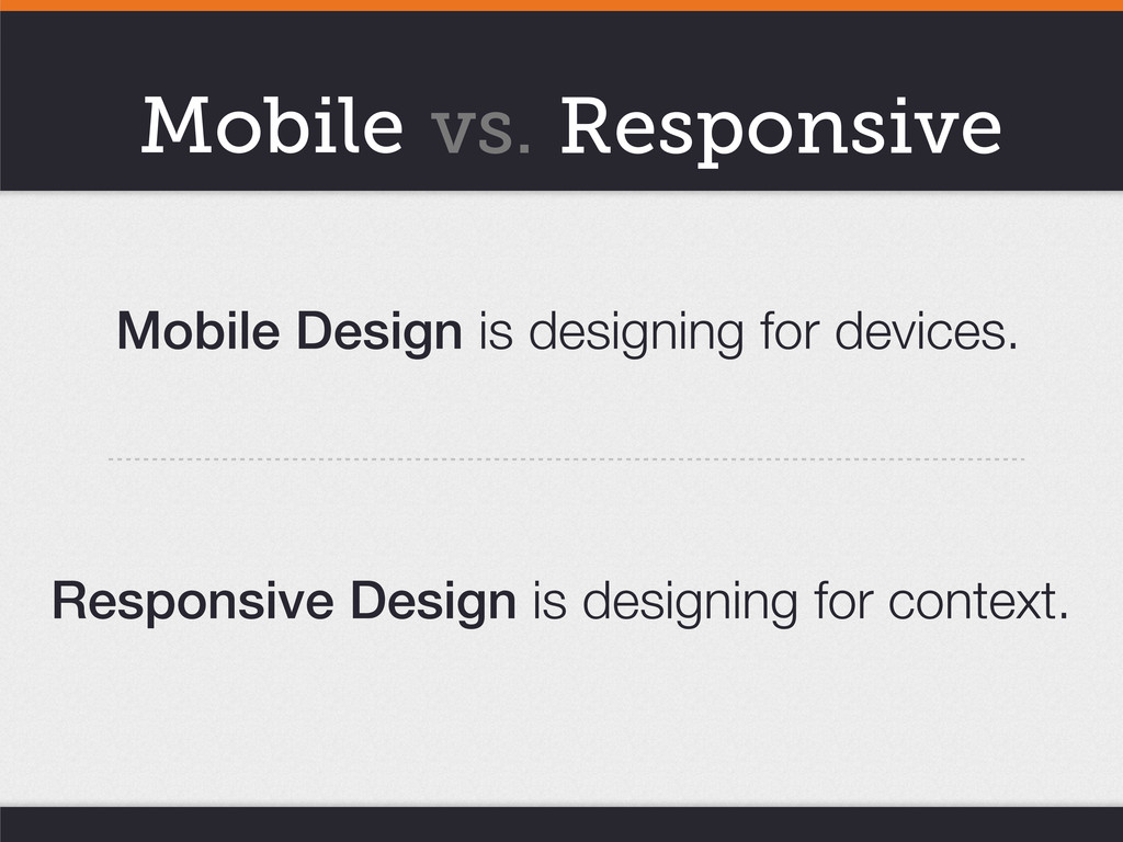
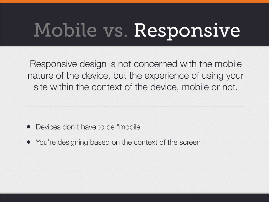
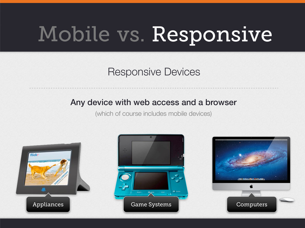
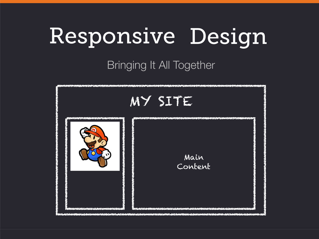
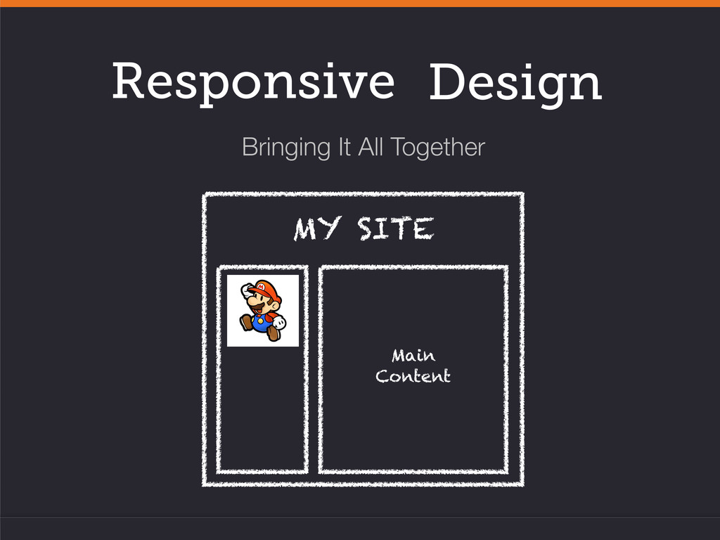
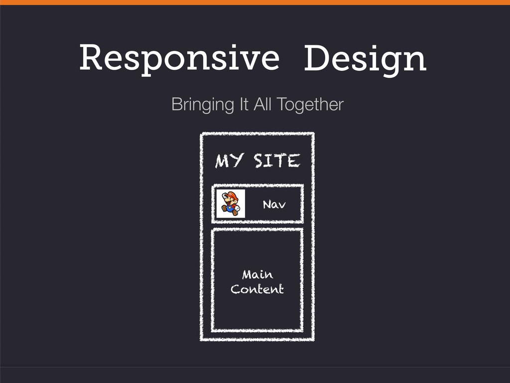
mobile nature of the device, but the experience of using your site within the context of the device, mobile or not. • Devices don't have to be "mobile" • You're designing based on the context of the screen
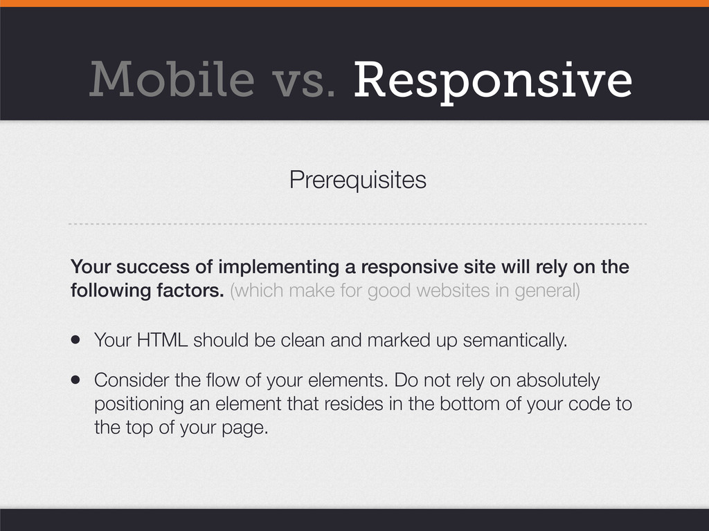
• Consider the flow of your elements. Do not rely on absolutely positioning an element that resides in the bottom of your code to the top of your page. Your success of implementing a responsive site will rely on the following factors. (which make for good websites in general) Prerequisites Mobile vs. Responsive
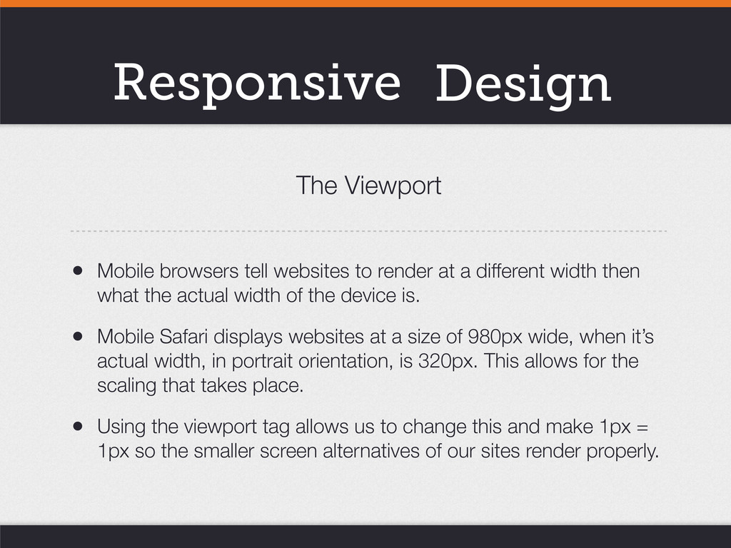
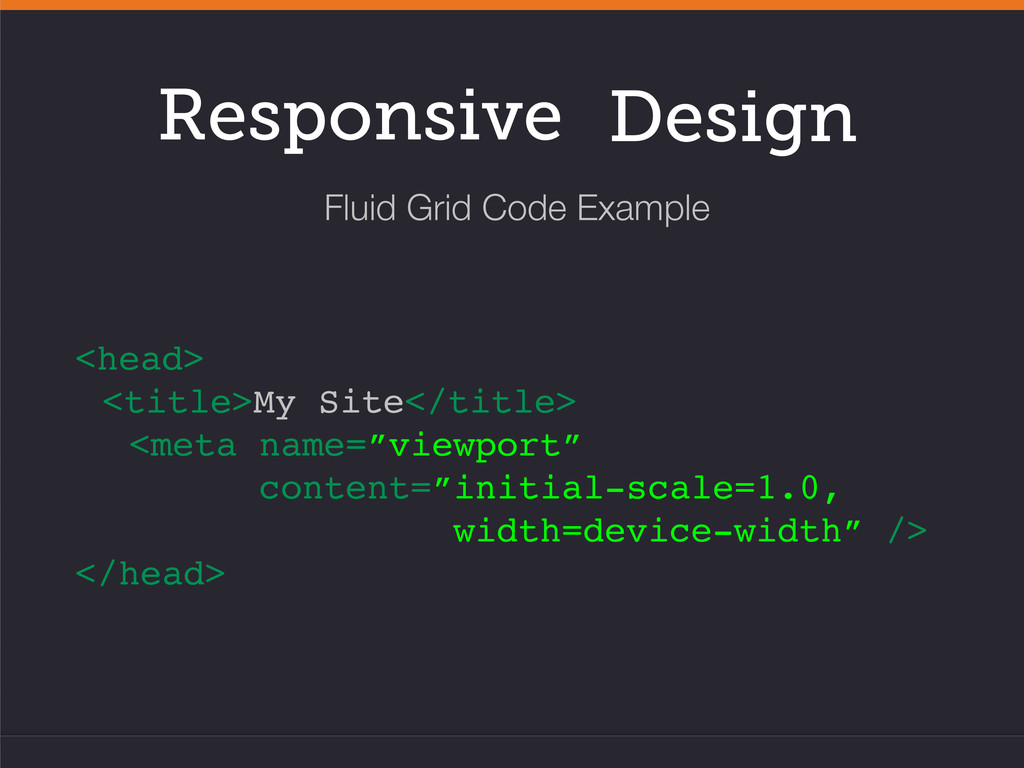
a different width then what the actual width of the device is. • Mobile Safari displays websites at a size of 980px wide, when it’s actual width, in portrait orientation, is 320px. This allows for the scaling that takes place. • Using the viewport tag allows us to change this and make 1px = 1px so the smaller screen alternatives of our sites render properly. The Viewport
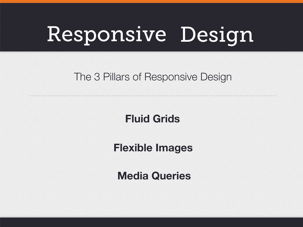
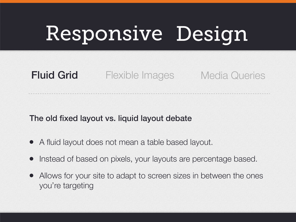
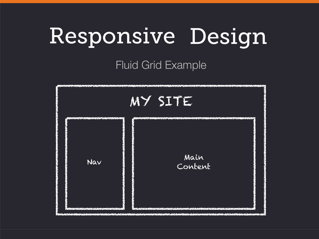
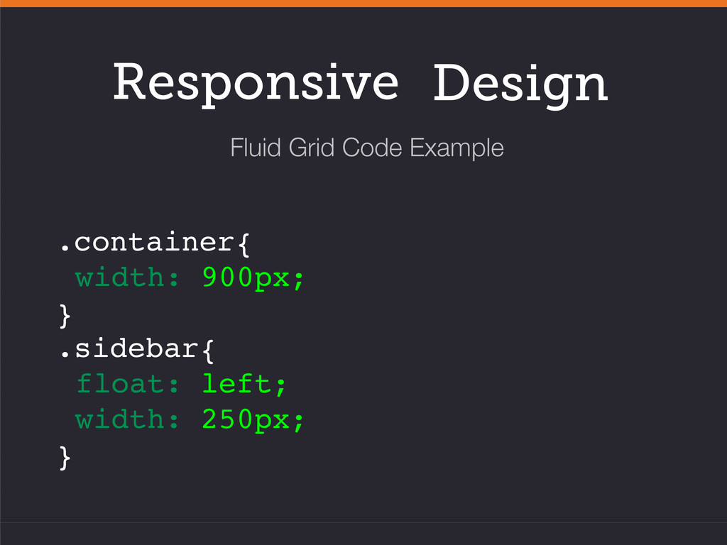
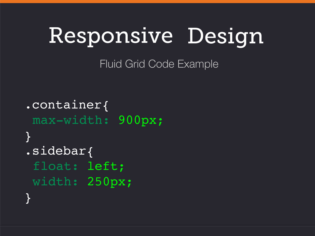
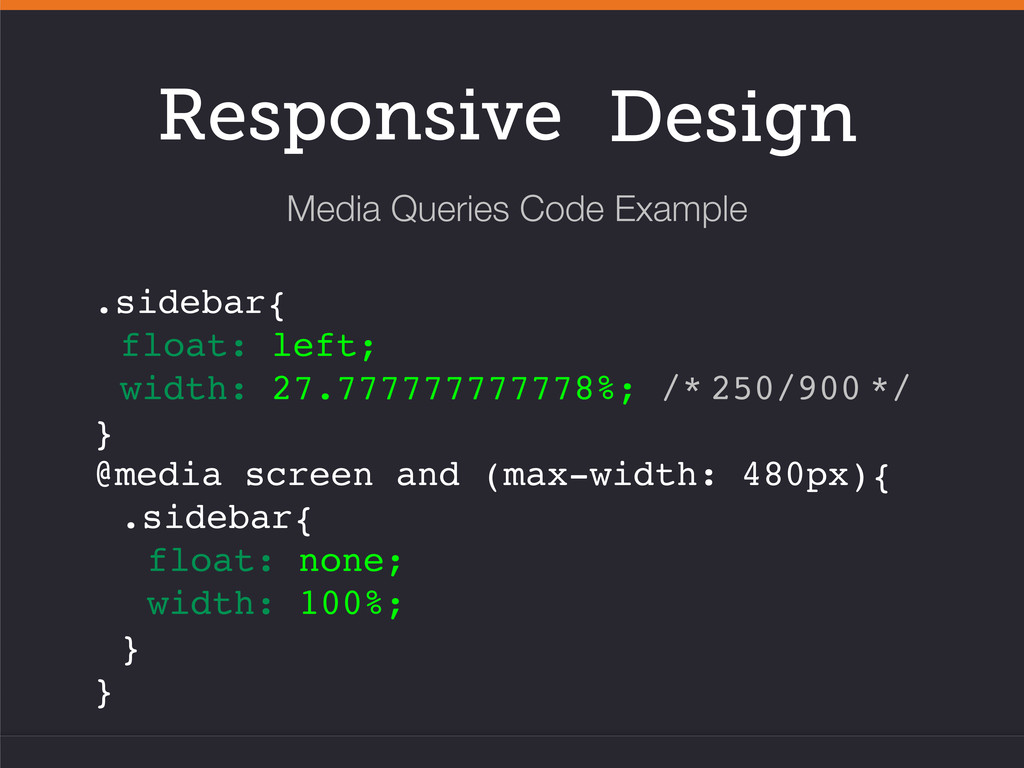
mean a table based layout. • Instead of based on pixels, your layouts are percentage based. • Allows for your site to adapt to screen sizes in between the ones you’re targeting The old fixed layout vs. liquid layout debate Flexible Images Media Queries
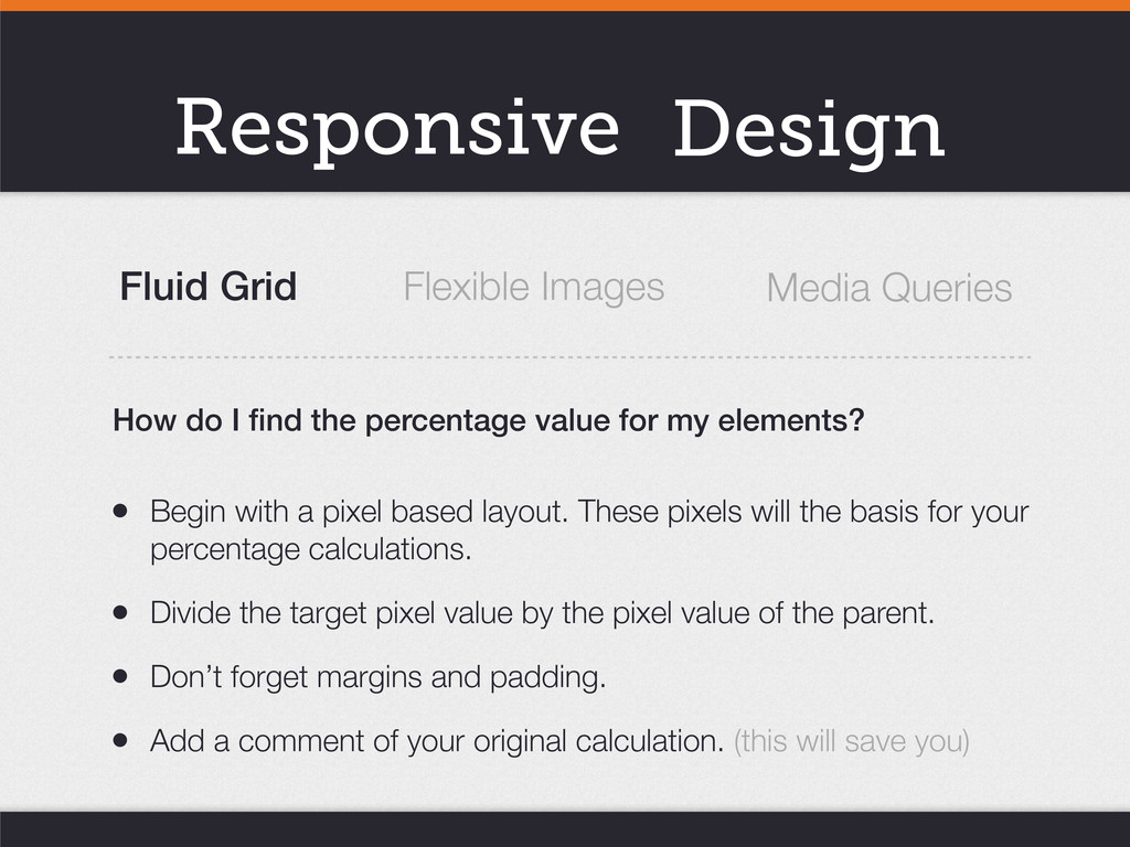
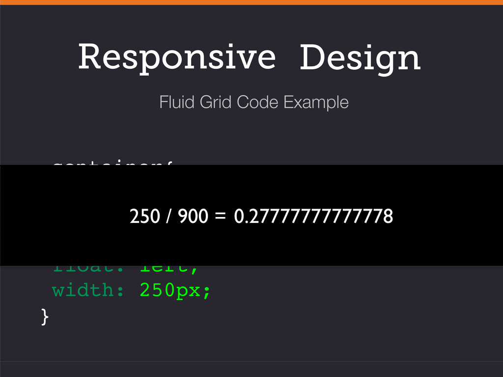
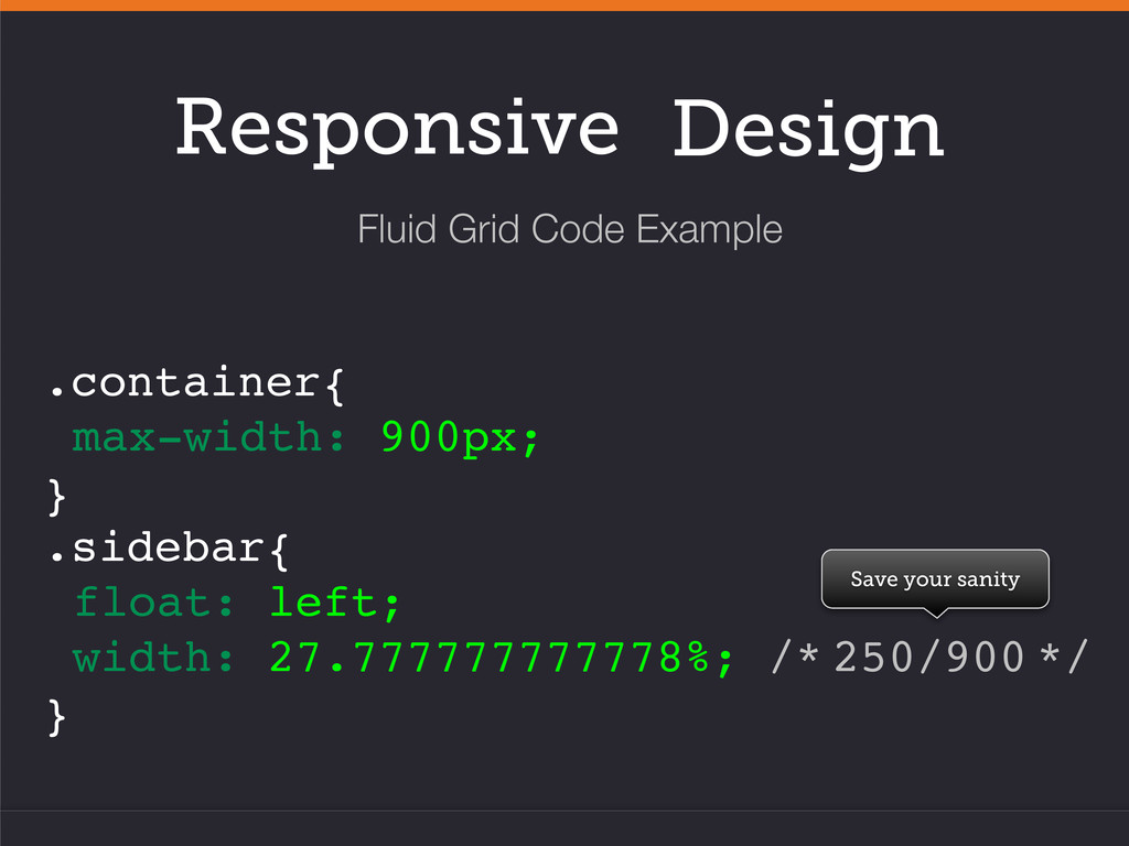
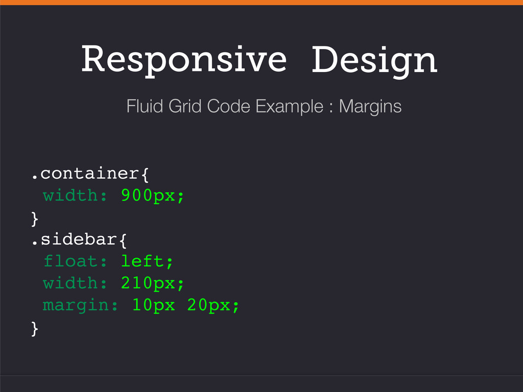
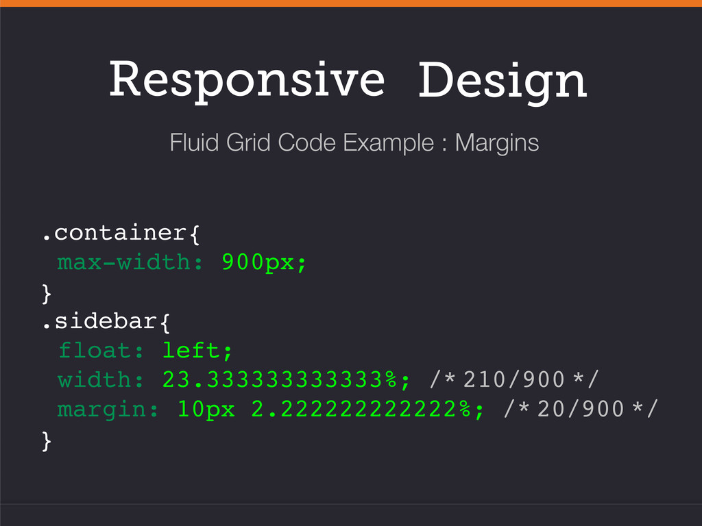
pixels will the basis for your percentage calculations. • Divide the target pixel value by the pixel value of the parent. • Don’t forget margins and padding. • Add a comment of your original calculation. (this will save you) How do I find the percentage value for my elements? Fluid Grid Flexible Images Media Queries
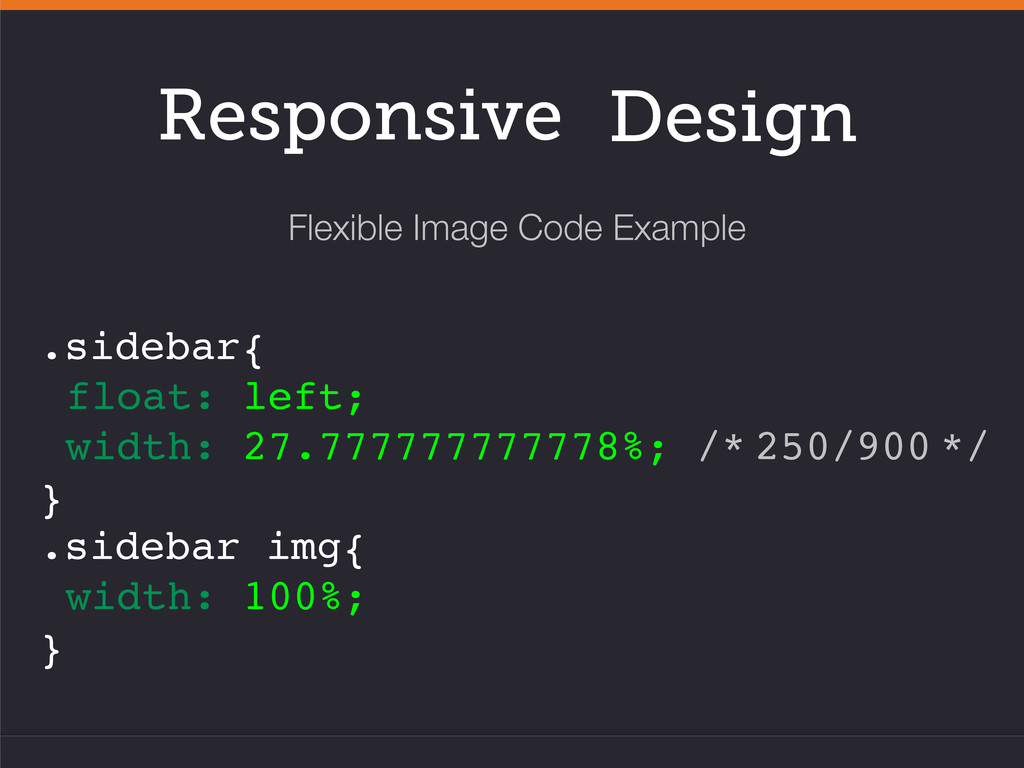
and width in the HTML • Images are sized based on the width of it’s parent container • Images are defined with a width of 100% in the CSS • This also applies to video, embed and object tags Fluid Grid Flexible Images Media Queries
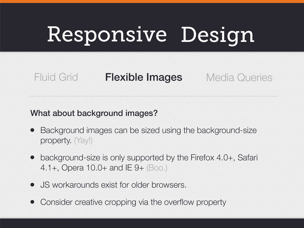
background-size property. (Yay!) • background-size is only supported by the Firefox 4.0+, Safari 4.1+, Opera 10.0+ and IE 9+ (Boo.) • JS workarounds exist for older browsers. • Consider creative cropping via the overflow property Fluid Grid Flexible Images Media Queries What about background images?
points based on various browser criteria. • We’re able to test for content width, device width, device orientation, aspect ratios and MORE! • With responsive design, we’re mostly interested in width based properties (and a dash of orientation) Fluid Grid Flexible Images Media Queries
about small screens. Consider how to take advantage of widescreen real estate as well. • Pay attention to how font sizes and leading react to your alternate layouts and when viewed in various devices. Adjustments will probably need to be made. • Fingers are bigger than mouse pointers.
awesome sites will only get you so far. • Looking for mobile? Responsive may be all they need. • HTML Wireframes & Prototypes. It’s hard to convey what responsive means to solving your clients problem via static images. Responsive design takes more time and planning, so how do you sell it to your clients?
 moco1013
 shosira
 garyuten
 shotamatsuo
 dmattsun
 kumanoayumi
 kenichiota0711
 videlvequio
 hiro93n
 bebe
bebe
 nbkouhou
 kitanosirokuma
 rakko
rakko
 kevinliebholz
 malarkey
 charlesmeaden
 destraynor
 jcasabona
 jmmastey
 akademiya2063
 tammyeverts
 mclloyd
 sachag
 apolaine