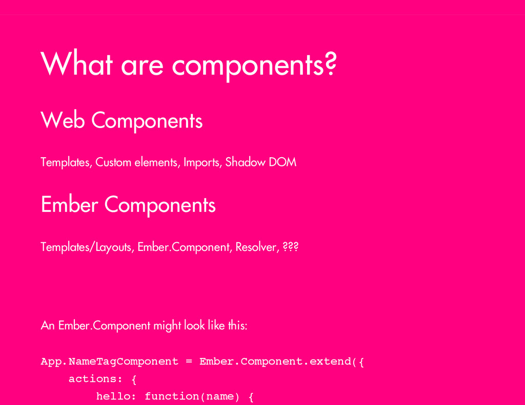
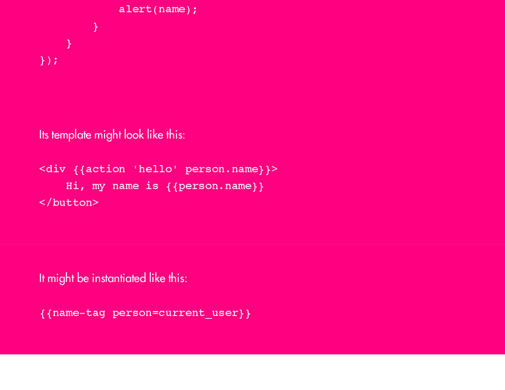
DOM Ember Components Templates/Layouts, Ember.Component, Resolver, ??? An Ember.Component might look like this: A p p . N a m e T a g C o m p o n e n t = E m b e r . C o m p o n e n t . e x t e n d ( { a c t i o n s : { h e l l o : f u n c t i o n ( n a m e ) {
) ; } } } ) ; Its template might look like this: < d i v { { a c t i o n ' h e l l o ' p e r s o n . n a m e } } > H i , m y n a m e i s { { p e r s o n . n a m e } } < / b u t t o n > It might be instantiated like this: { { n a m e - t a g p e r s o n = c u r r e n t _ u s e r } }
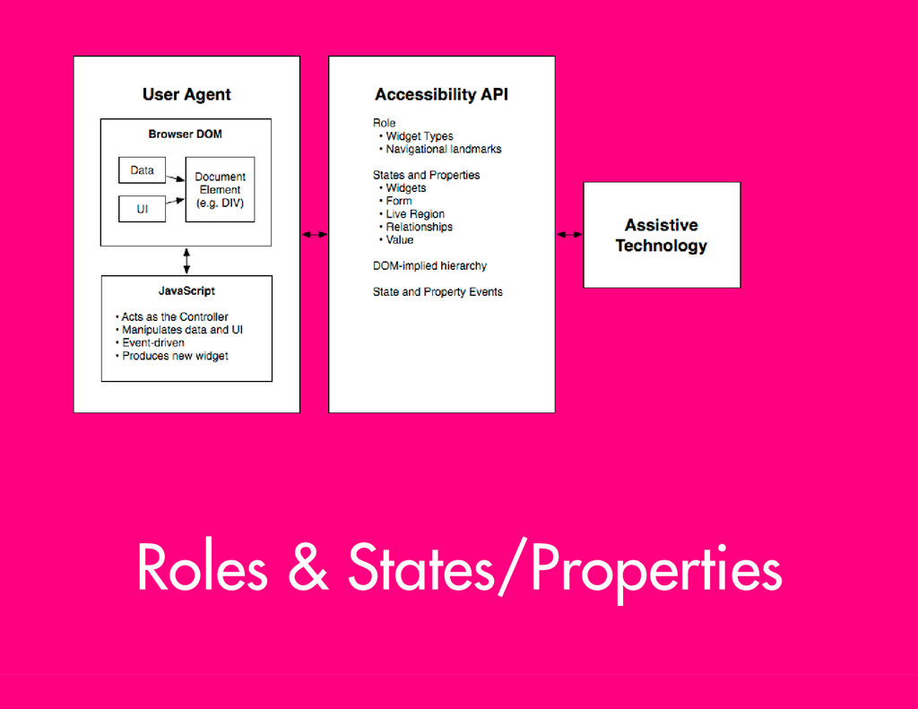
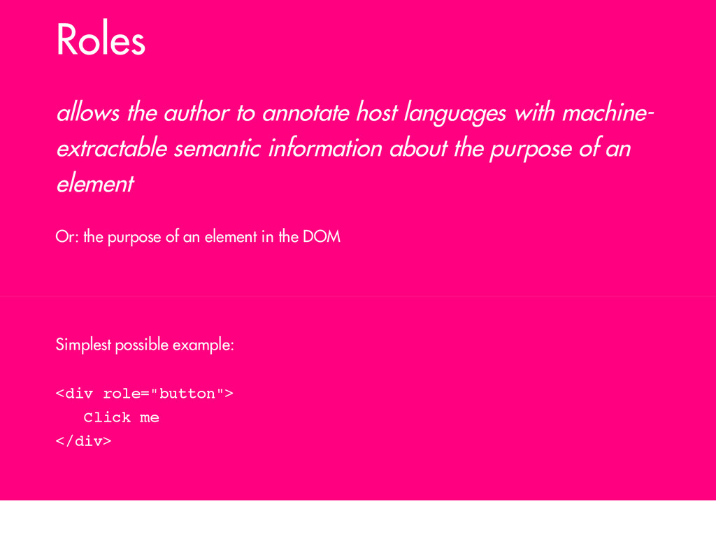
extractable semantic information about the purpose of an element Or: the purpose of an element in the DOM Simplest possible example: < d i v r o l e = " b u t t o n " > C l i c k m e < / d i v >
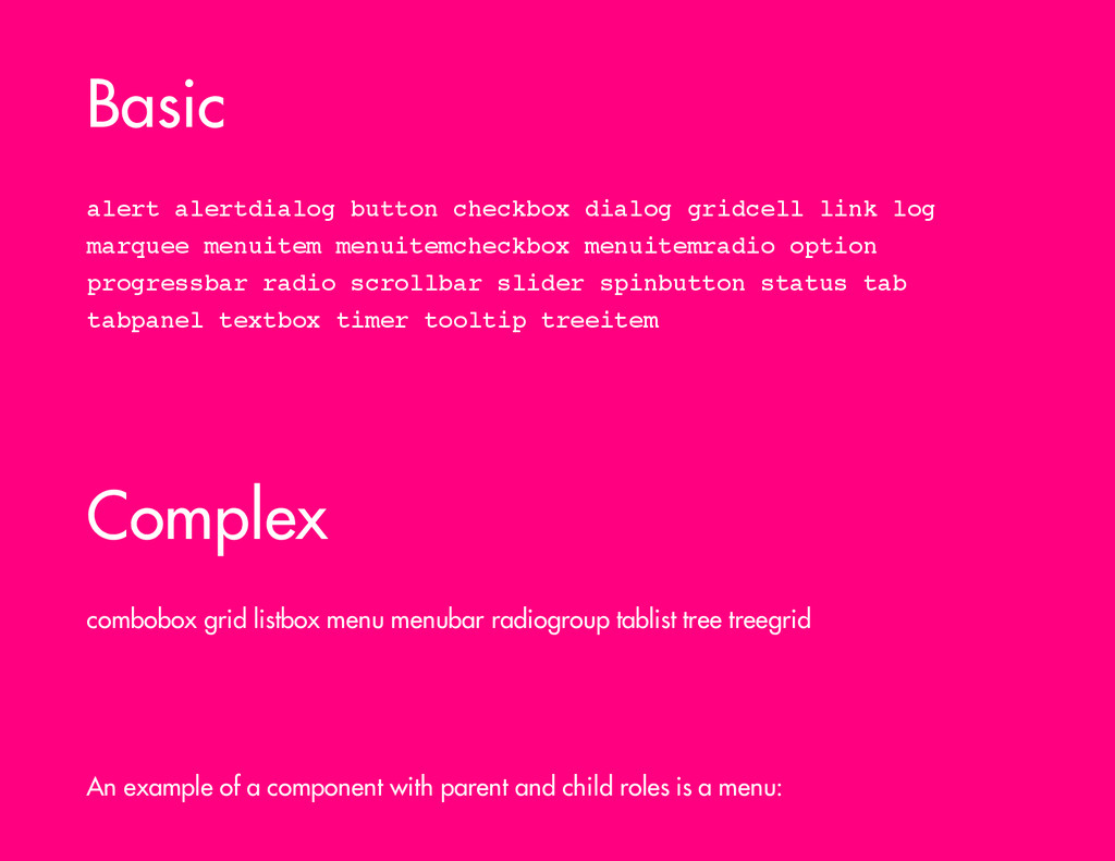
t d i a l o g b u t t o n c h e c k b o x d i a l o g g r i d c e l l l i n k l o g m a r q u e e m e n u i t e m m e n u i t e m c h e c k b o x m e n u i t e m r a d i o o p t i o n p r o g r e s s b a r r a d i o s c r o l l b a r s l i d e r s p i n b u t t o n s t a t u s t a b t a b p a n e l t e x t b o x t i m e r t o o l t i p t r e e i t e m Complex combobox grid listbox menu menubar radiogroup tablist tree treegrid An example of a component with parent and child roles is a menu:
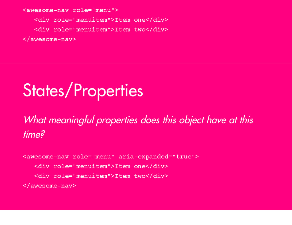
a v r o l e = " m e n u " > < d i v r o l e = " m e n u i t e m " > I t e m o n e < / d i v > < d i v r o l e = " m e n u i t e m " > I t e m t w o < / d i v > < / a w e s o m e - n a v > States/Properties What meaningful properties does this object have at this time? < a w e s o m e - n a v r o l e = " m e n u " a r i a - e x p a n d e d = " t r u e " > < d i v r o l e = " m e n u i t e m " > I t e m o n e < / d i v > < d i v r o l e = " m e n u i t e m " > I t e m t w o < / d i v > < / a w e s o m e - n a v >
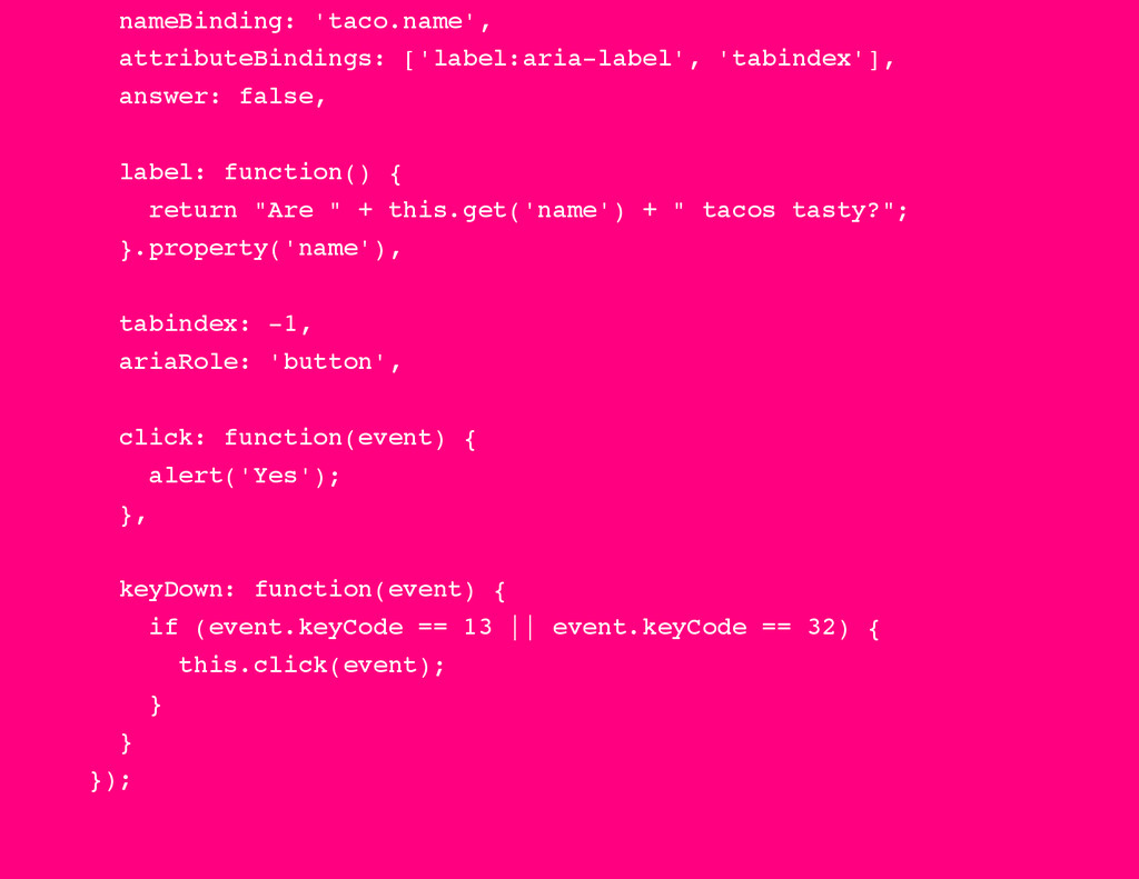
g : ' t a c o . n a m e ' , a t t r i b u t e B i n d i n g s : [ ' l a b e l : a r i a - l a b e l ' , ' t a b i n d e x ' ] , a n s w e r : f a l s e , l a b e l : f u n c t i o n ( ) { r e t u r n " A r e " + t h i s . g e t ( ' n a m e ' ) + " t a c o s t a s t y ? " ; } . p r o p e r t y ( ' n a m e ' ) , t a b i n d e x : - 1 , a r i a R o l e : ' b u t t o n ' , c l i c k : f u n c t i o n ( e v e n t ) { a l e r t ( ' Y e s ' ) ; } , k e y D o w n : f u n c t i o n ( e v e n t ) { i f ( e v e n t . k e y C o d e = = 1 3 | | e v e n t . k e y C o d e = = 3 2 ) { t h i s . c l i c k ( e v e n t ) ; } } } ) ;
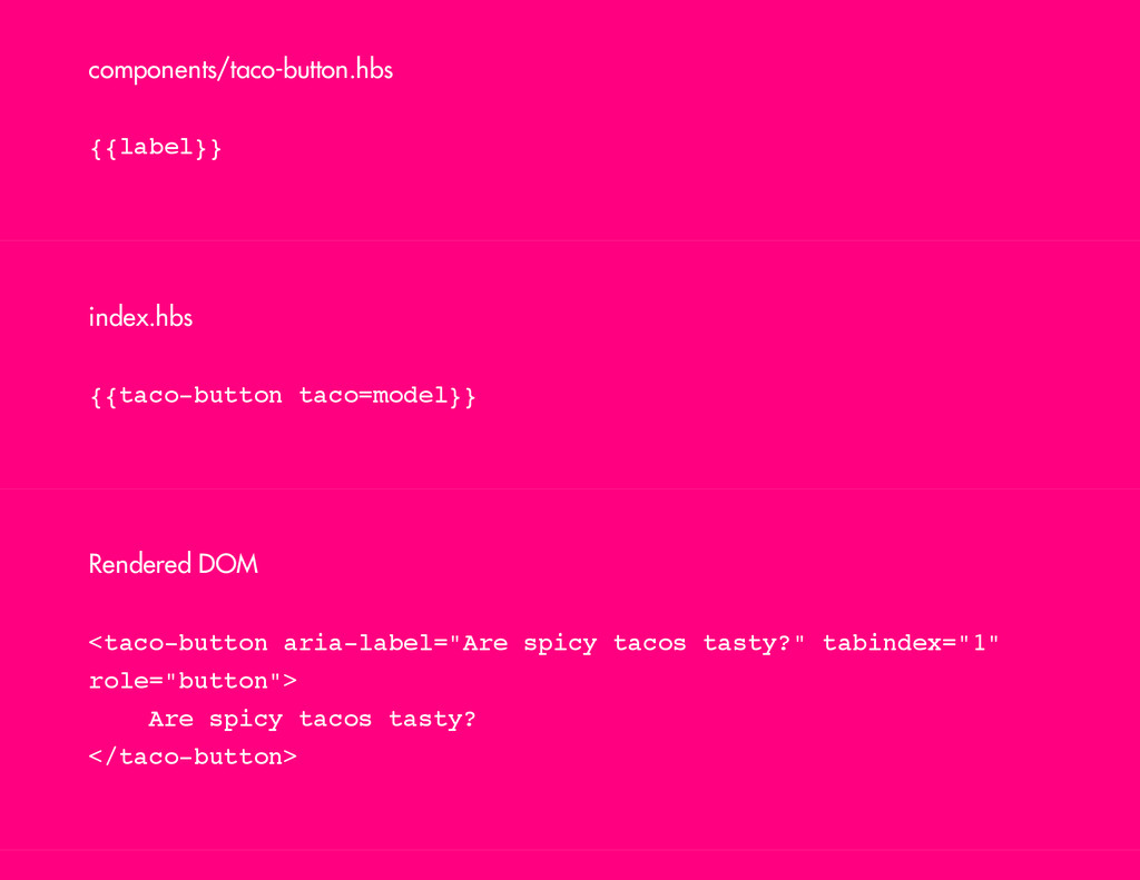
index.hbs { { t a c o - b u t t o n t a c o = m o d e l } } Rendered DOM < t a c o - b u t t o n a r i a - l a b e l = " A r e s p i c y t a c o s t a s t y ? " t a b i n d e x = " 1 " r o l e = " b u t t o n " > A r e s p i c y t a c o s t a s t y ? < / t a c o - b u t t o n >
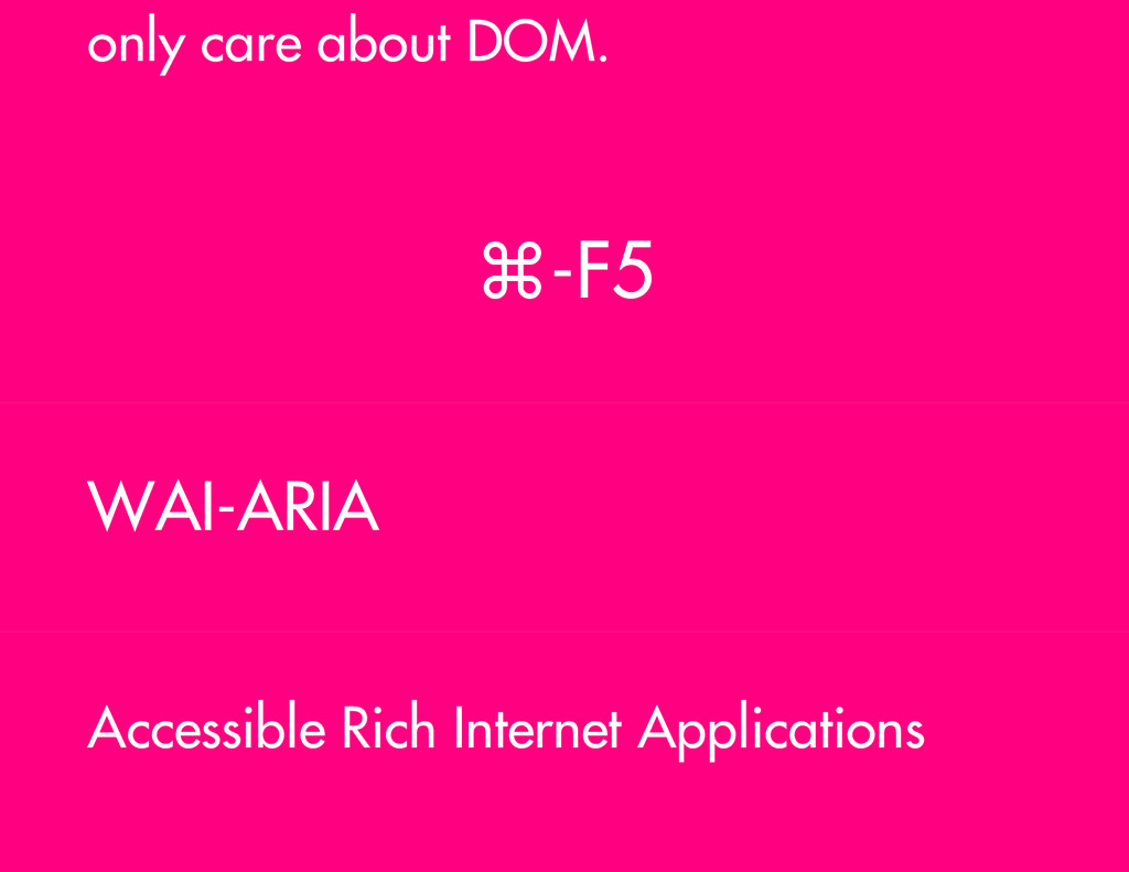
DOM? Is the Shadow DOM keyboard navigable? So when Ember Components implement Shadow DOM will they still be accessible? Thanks! Come see an expanded version of this talk at && Toronto Javascript on June 23 notes slides
 jdjkelly
 wemra
wemra
 kotaminato
 guvalif
 daitasu
 77web
77web
 uyuki234
 minodriven
 wanko_it
 rollbear
 manfredsteyer
 funnyycat
 hananouchi
 tammyeverts
 aleyda
 honzajavorek
 tammielis
 brad_frost
 garrettdimon
 jct
jct
 rasagy
 marktimemedia
 cassininazir
 rabernat
 varn
varn