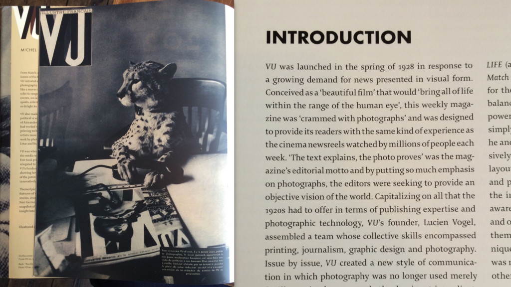
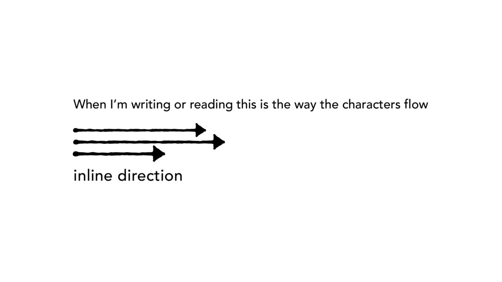
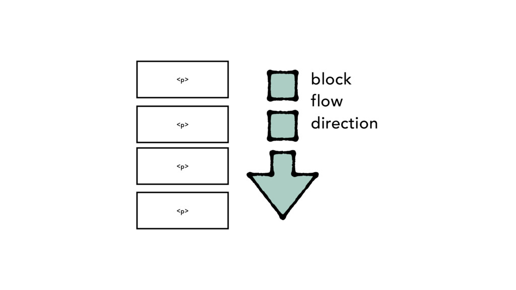
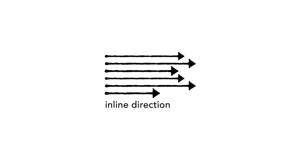
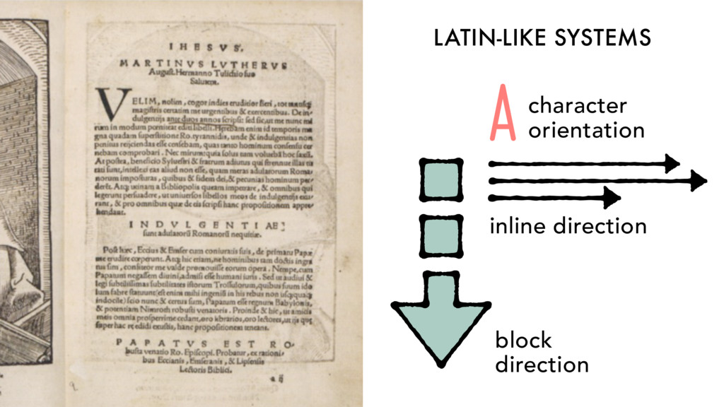
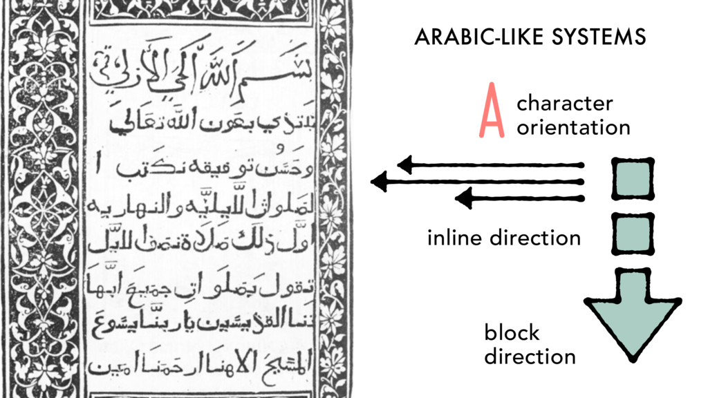
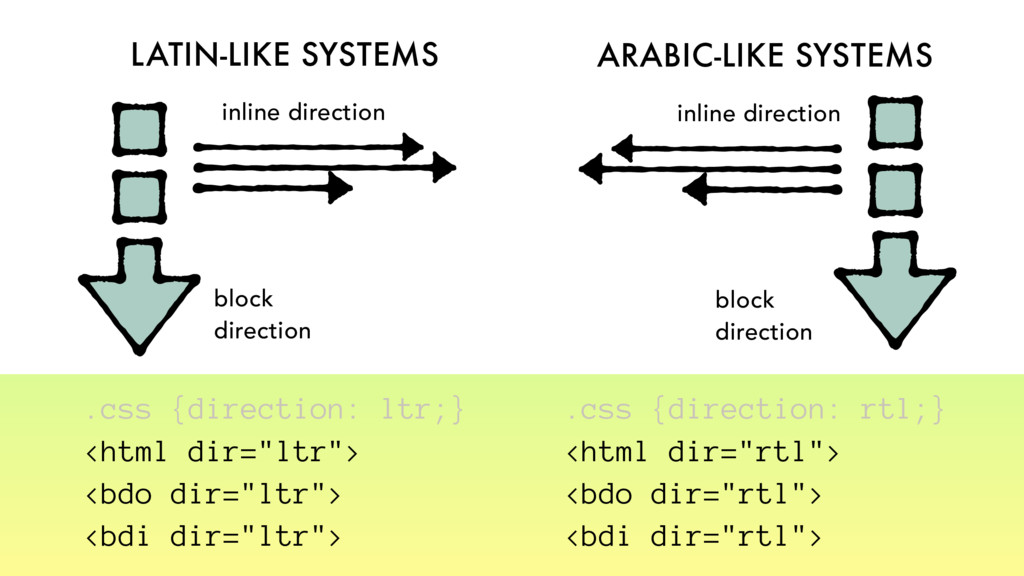
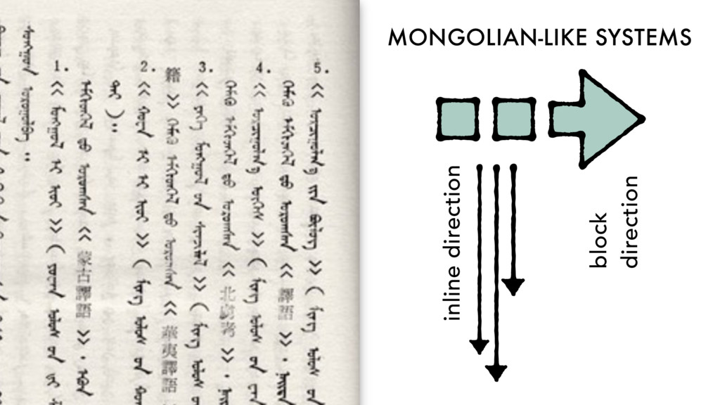
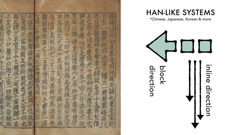
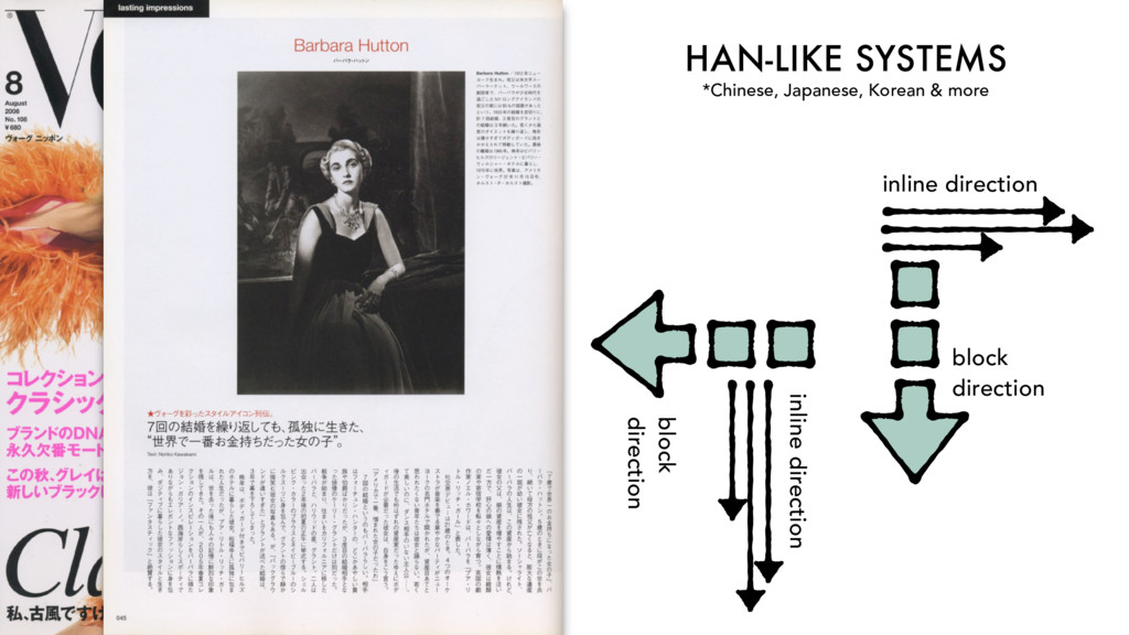
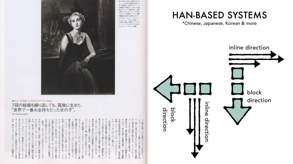
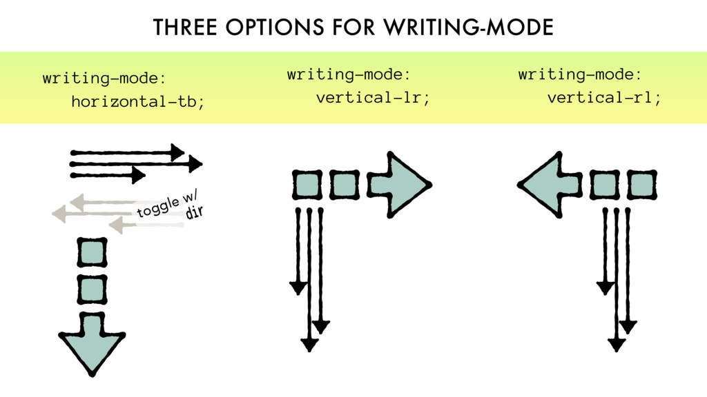
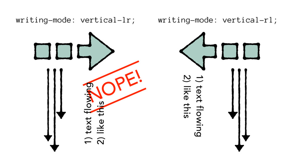
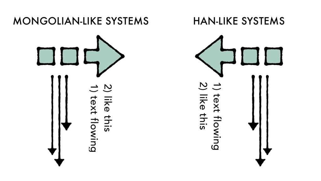
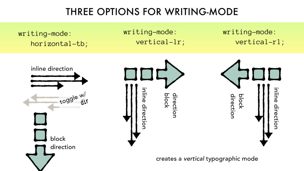
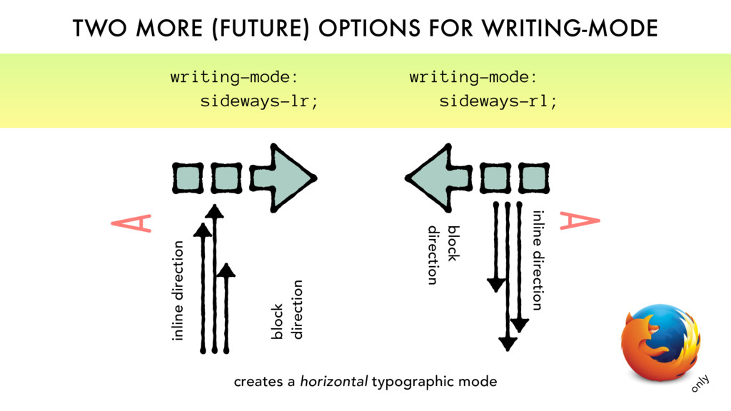
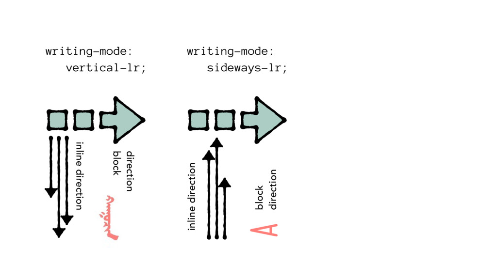
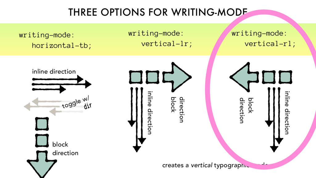
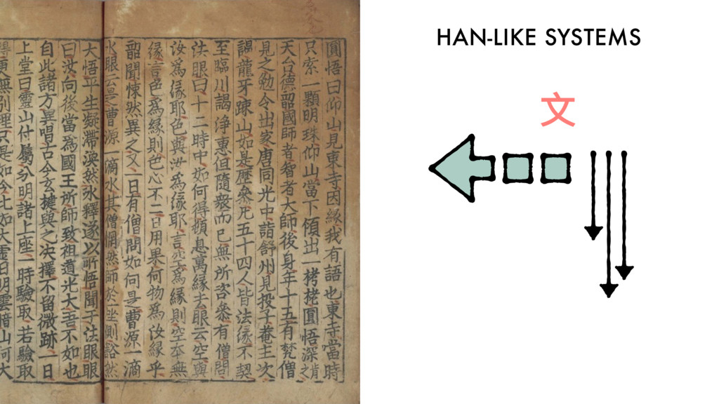
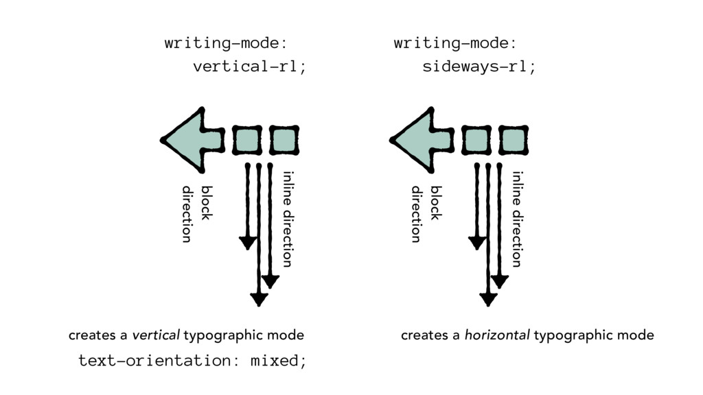
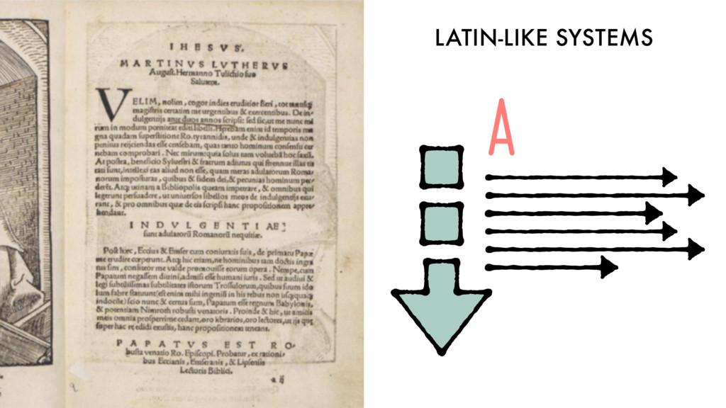
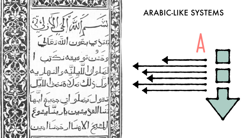
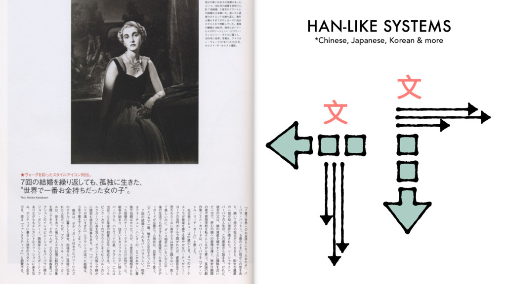
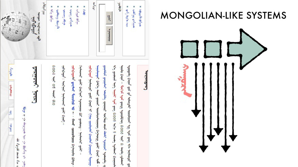
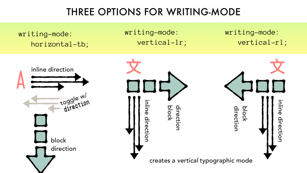
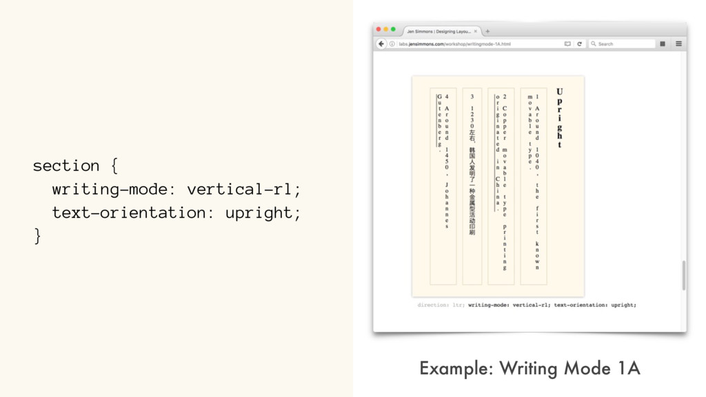
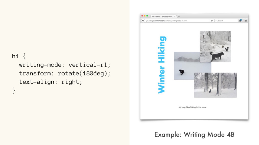
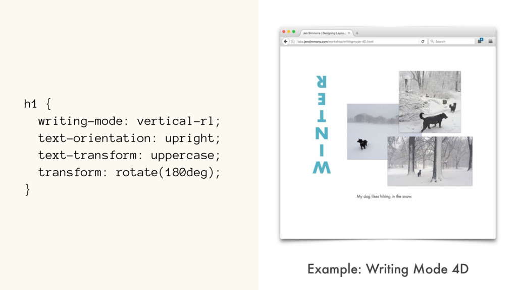
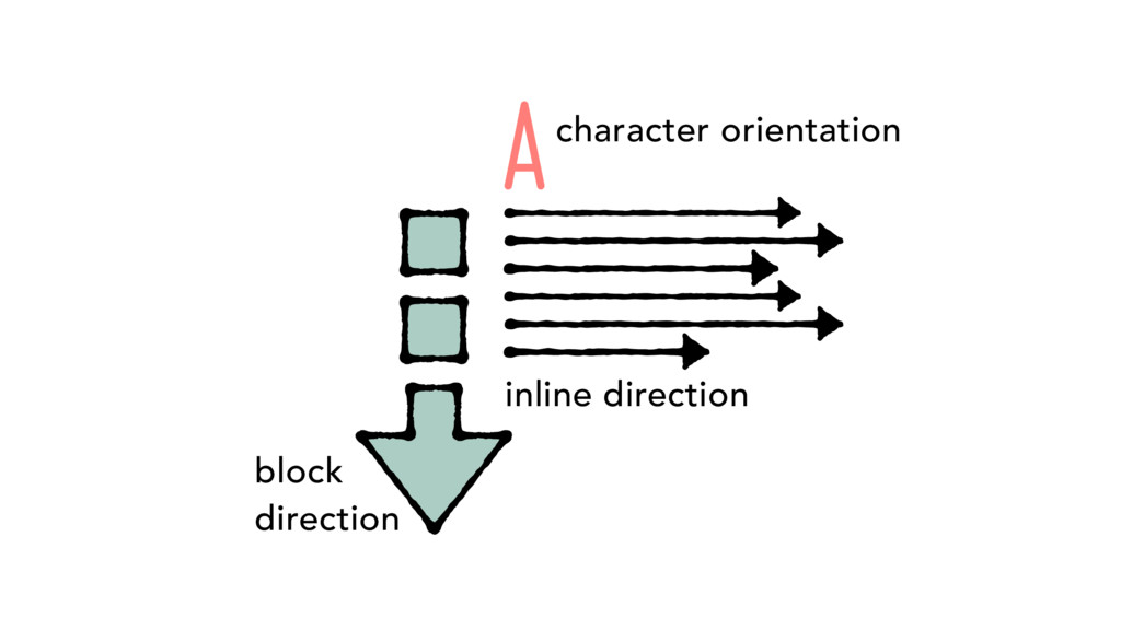
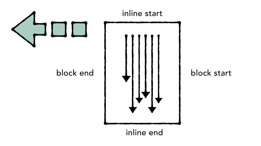
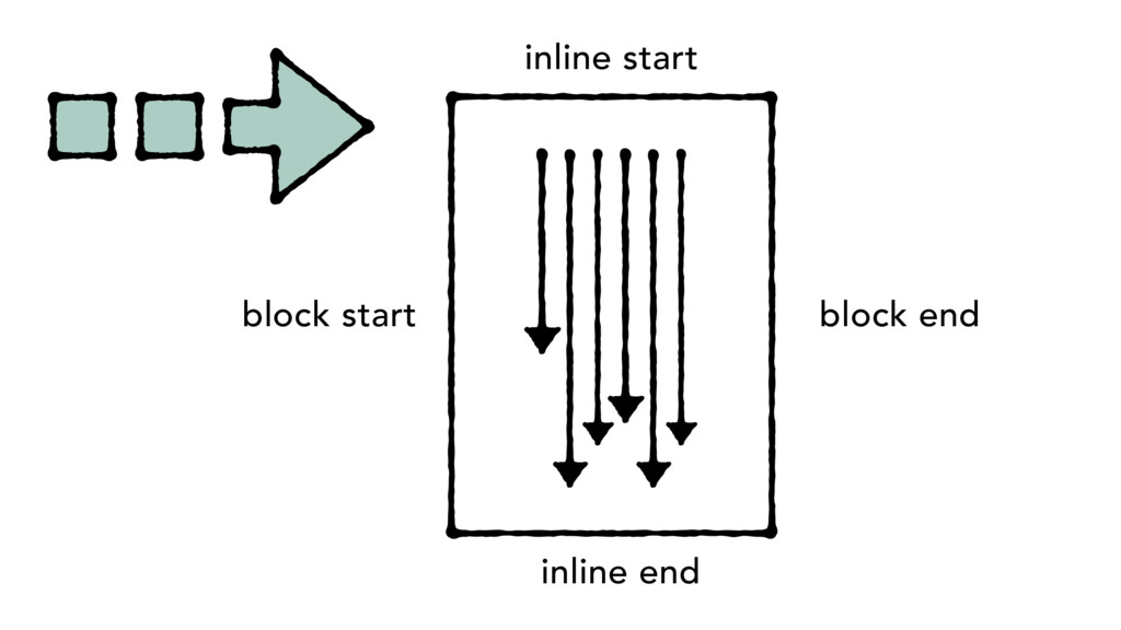
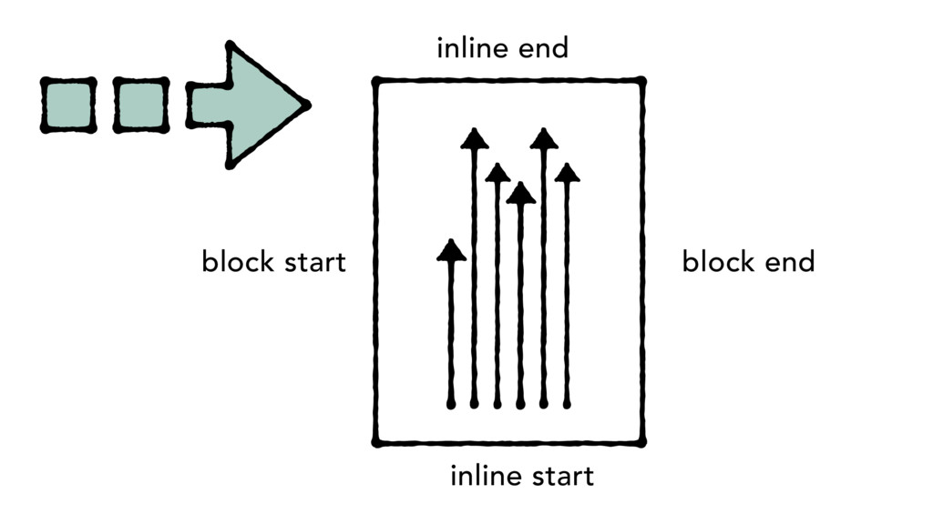
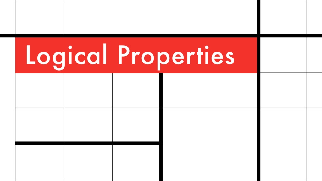
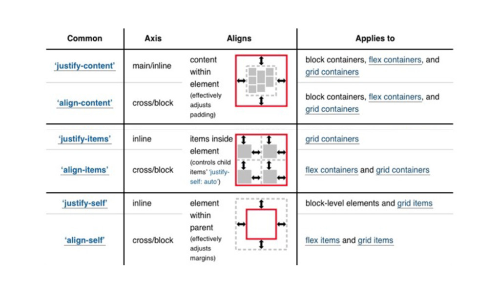
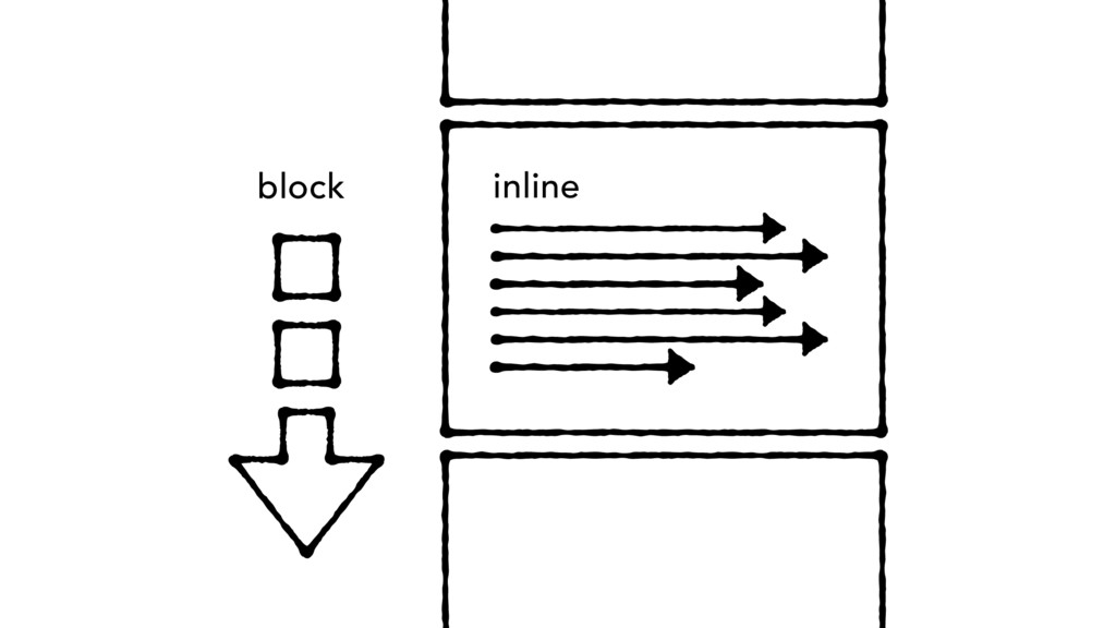
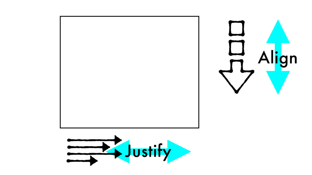
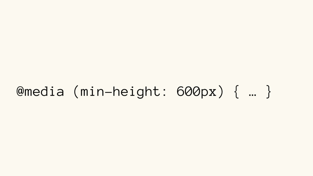
block direction inline direction writing-mode: vertical-rl; block direction inline direction toggle w/ dir writing-mode: horizontal-tb; creates a vertical typographic mode
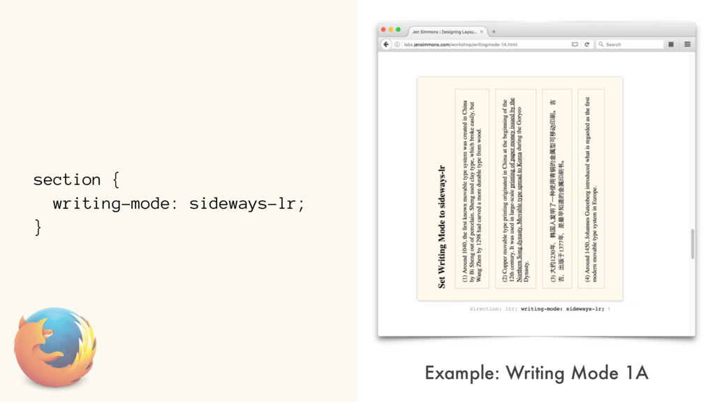
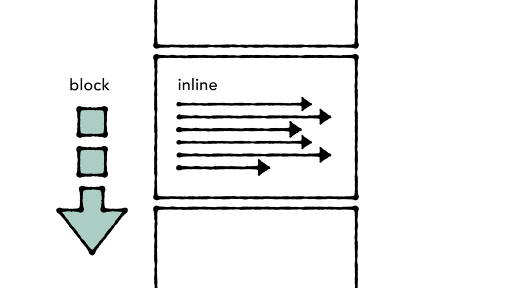
block inline direction writing-mode: vertical-lr; block direction inline direction writing-mode: vertical-rl; block direction inline direction toggle w/ dir writing-mode: horizontal-tb;
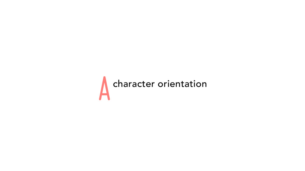
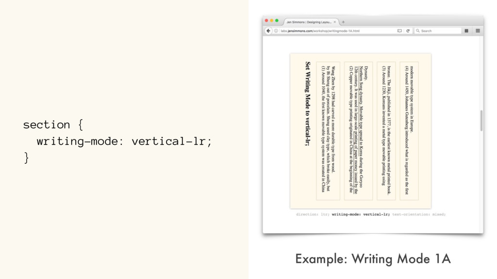
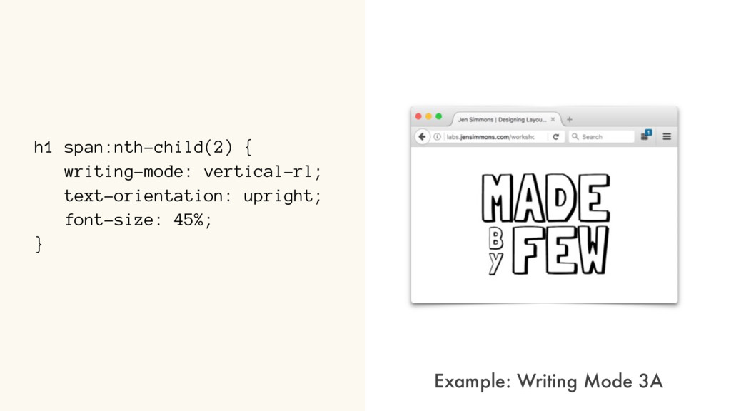
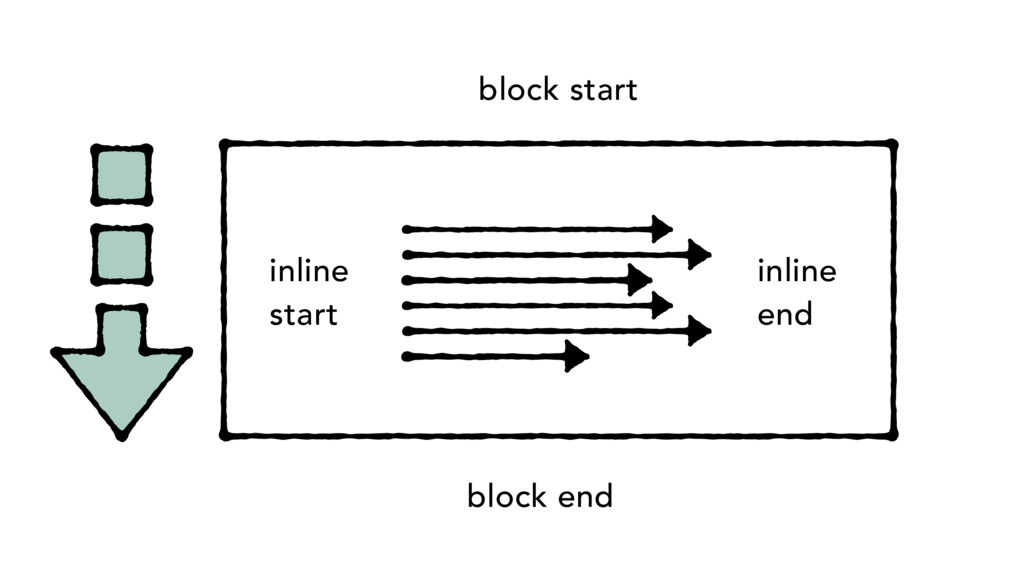
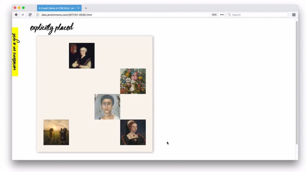
block direction inline direction writing-mode: vertical-rl; block direction inline direction toggle w/ direction writing-mode: horizontal-tb; creates a vertical typographic mode A
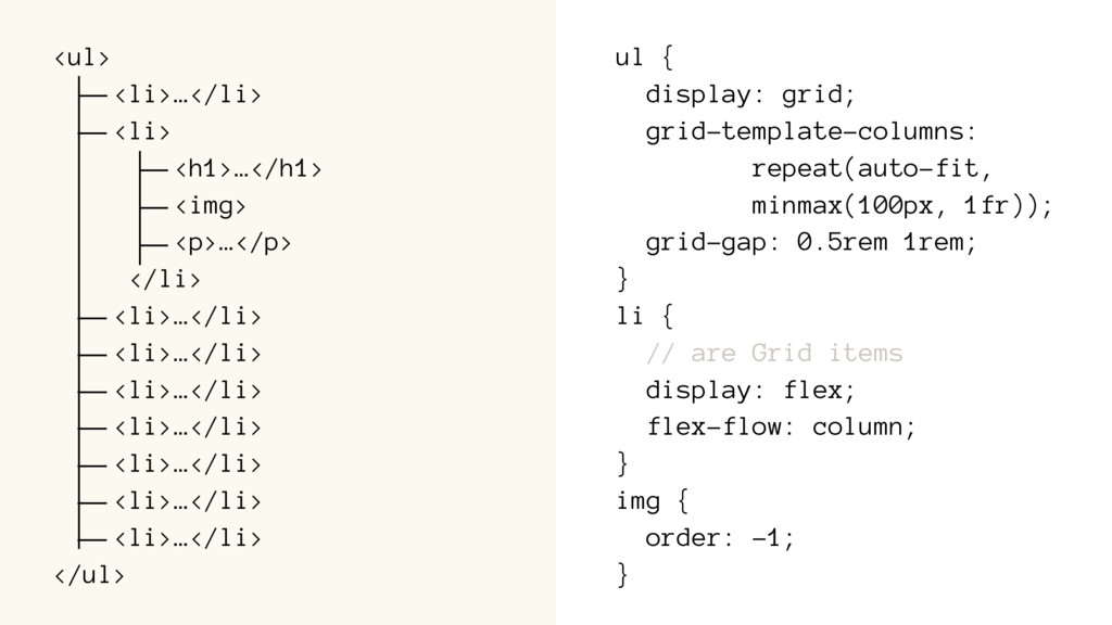
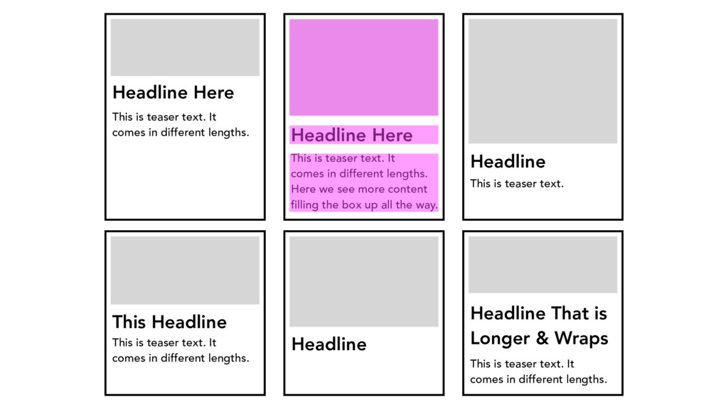
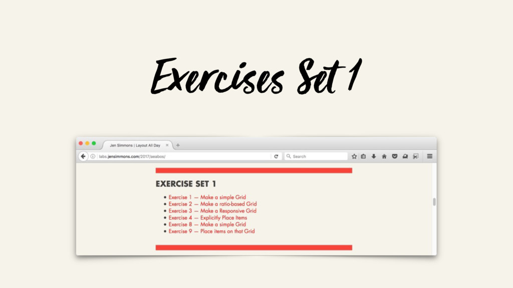
lengths. Headline Here This is teaser text. It comes in different lengths. Here we see more content filling the box up all the way. Headline This is teaser text. Headline That is Longer & Wraps This is teaser text. It comes in different lengths. Headline This Headline This is teaser text. It comes in different lengths.
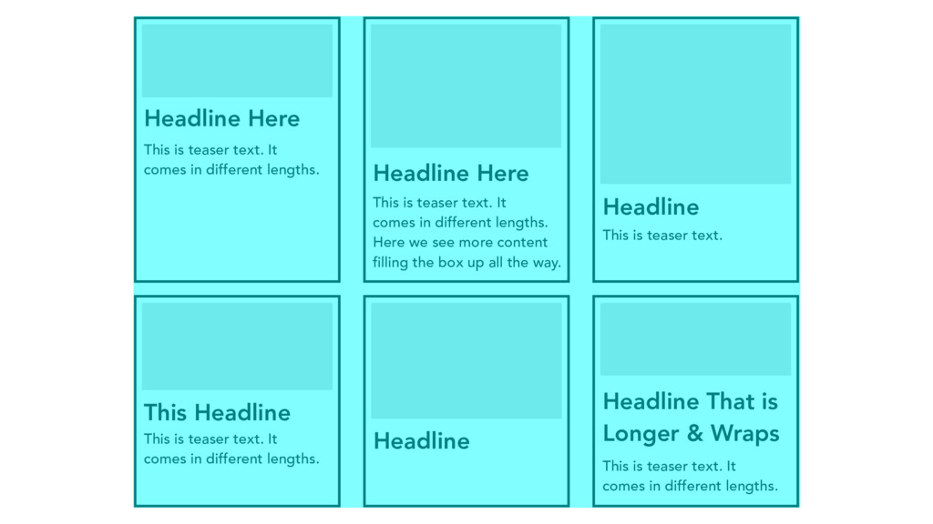
lengths. Headline Here This is teaser text. It comes in different lengths. Here we see more content filling the box up all the way. Headline This is teaser text. Headline That is Longer & Wraps This is teaser text. It comes in different lengths. Headline This Headline This is teaser text. It comes in different lengths.
lengths. Headline Here This is teaser text. It comes in different lengths. Here we see more content filling the box up all the way. Headline This is teaser text. Headline That is Longer & Wraps This is teaser text. It comes in different lengths. Headline This Headline This is teaser text. It comes in different lengths.
lengths. Headline Here This is teaser text. It comes in different lengths. Here we see more content filling the box up all the way. Headline This is teaser text. Headline That is Longer & Wraps This is teaser text. It comes in different lengths. Headline This Headline This is teaser text. It comes in different lengths.
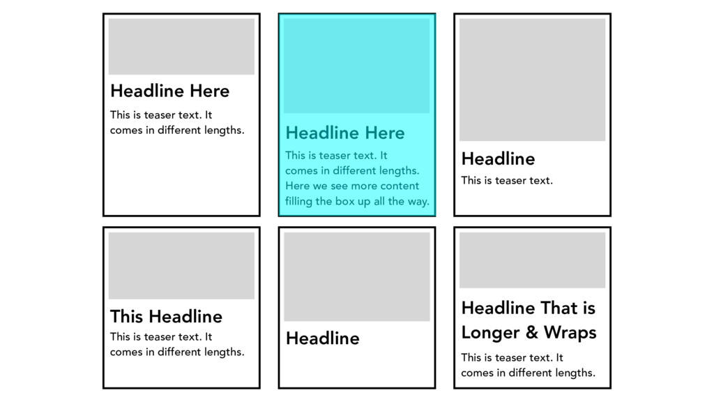
lengths. Headline Here This is teaser text. It comes in different lengths. Here we see more content filling the box up all the way. Headline This is teaser text. Headline That is Longer & Wraps This is teaser text. It comes in different lengths. Headline This Headline This is teaser text. It comes in different lengths.
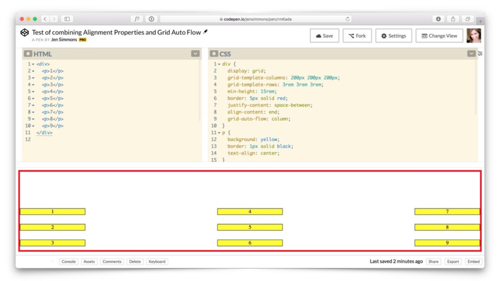
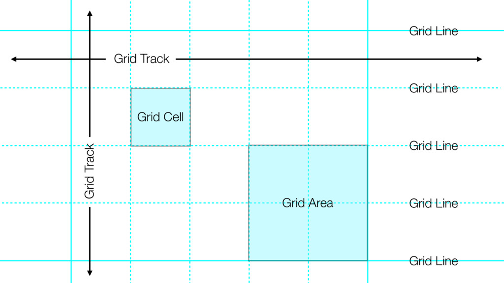
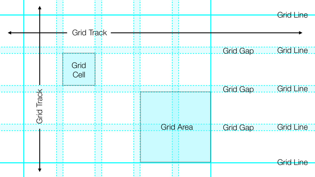
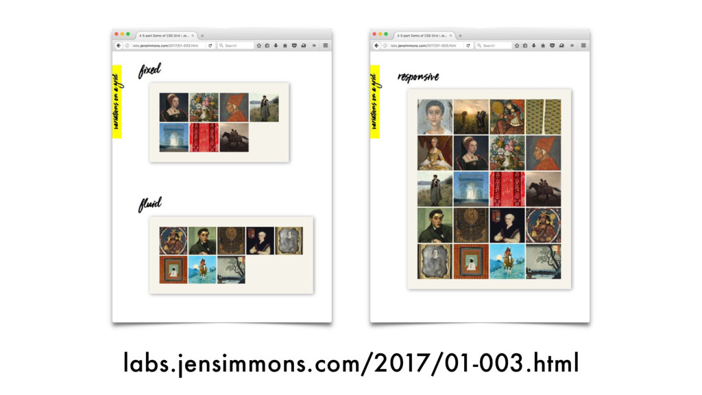
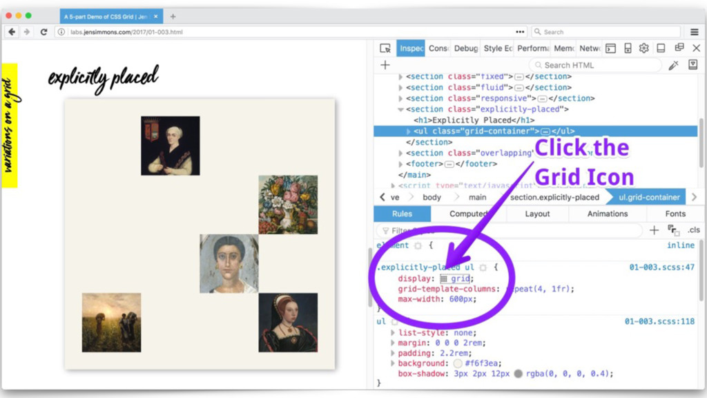
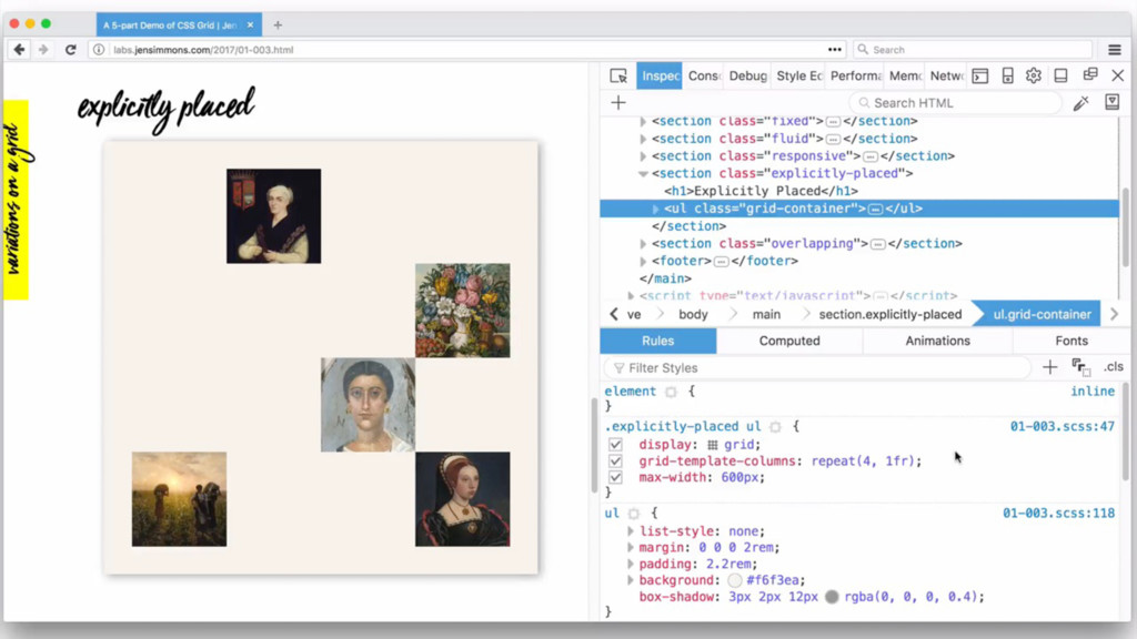
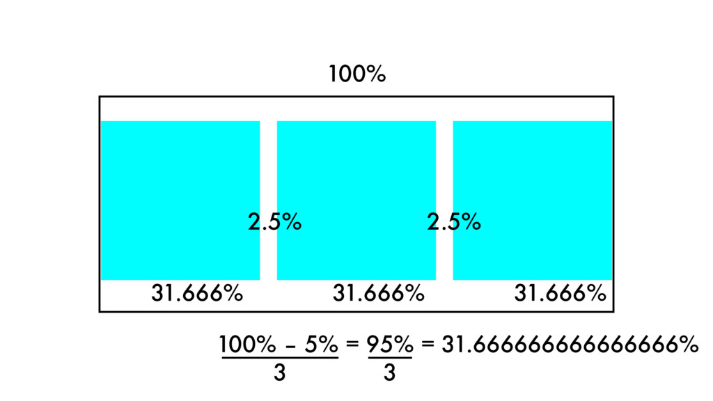
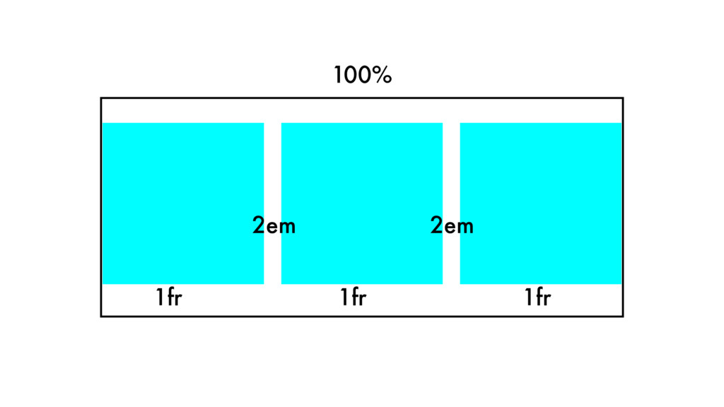
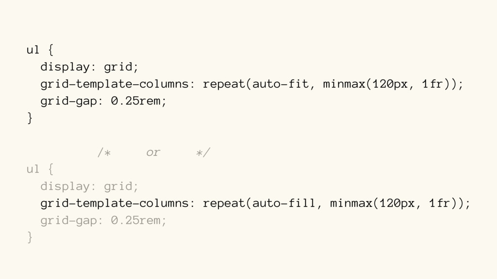
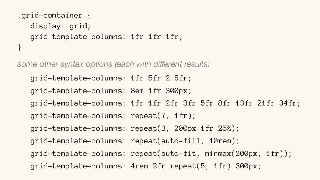
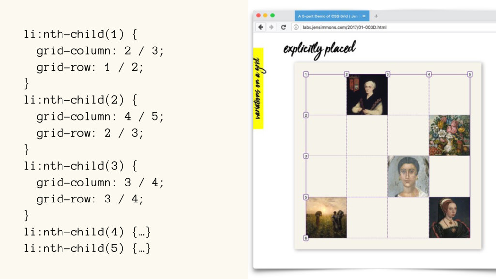
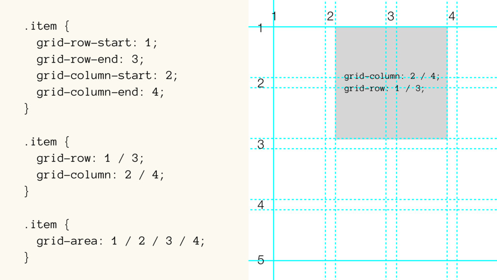
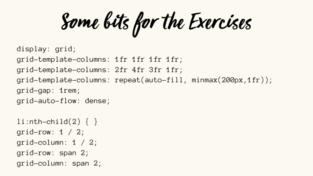
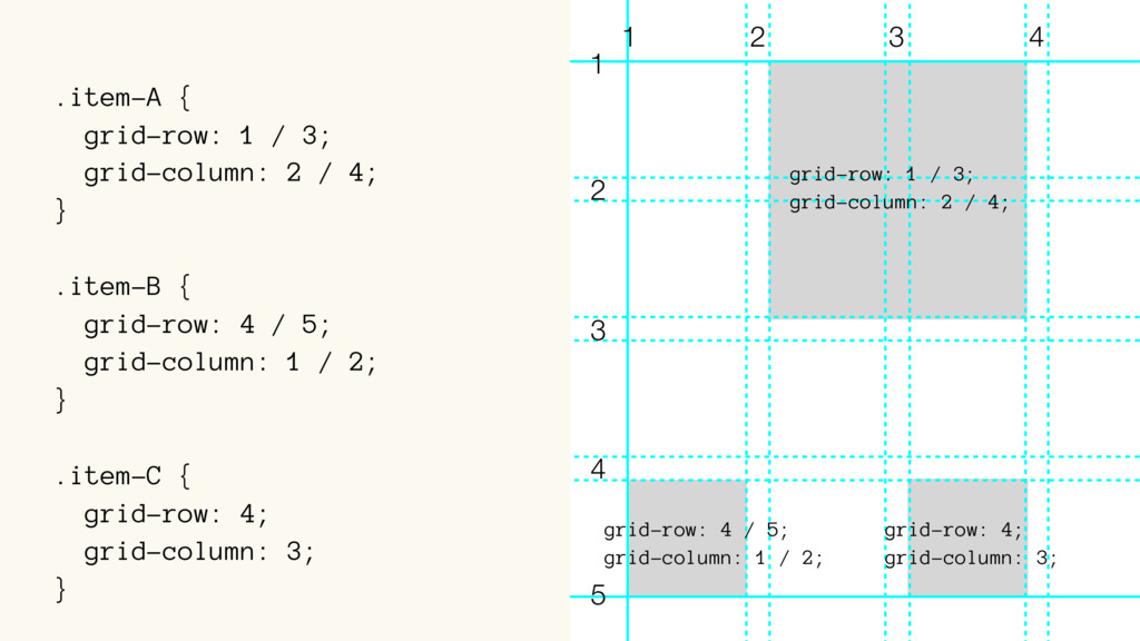
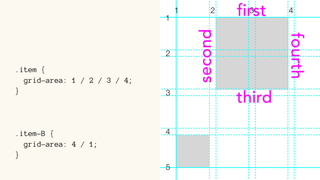
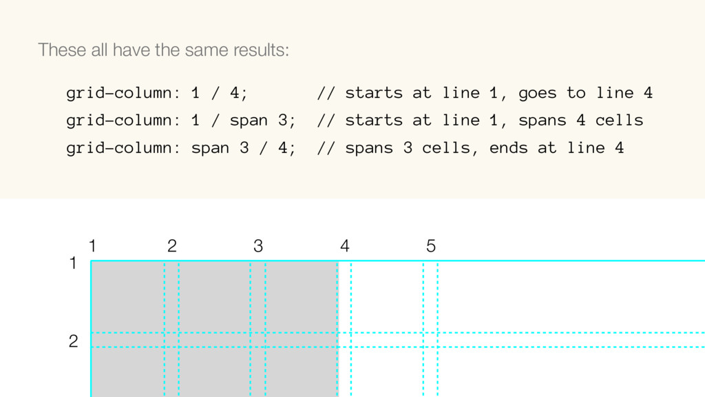
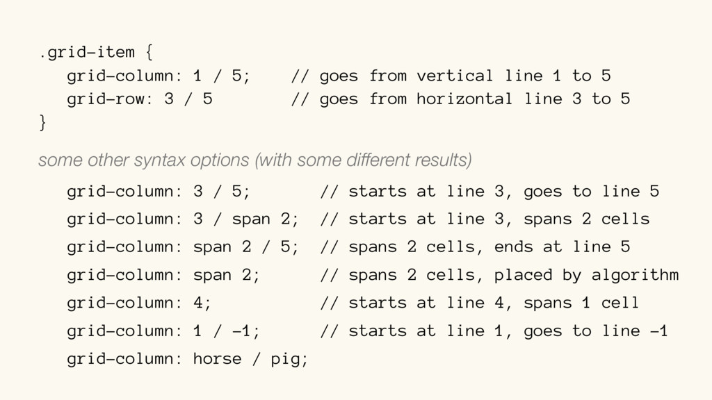
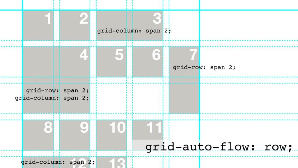
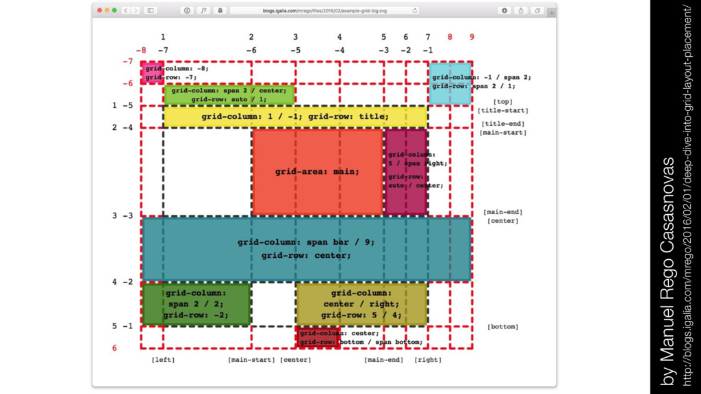
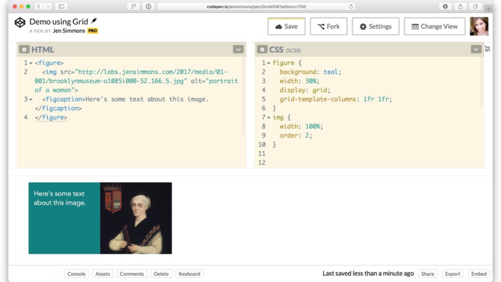
line 1 to 5 grid-row: 3 / 5 // goes from horizontal line 3 to 5 } some other syntax options (with some different results) grid-column: 3 / 5; // starts at line 3, goes to line 5 grid-column: 3 / span 2; // starts at line 3, spans 2 cells grid-column: span 2 / 5; // spans 2 cells, ends at line 5 grid-column: span 2; // spans 2 cells, placed by algorithm grid-column: 4; // starts at line 4, spans 1 cell grid-column: 1 / -1; // starts at line 1, goes to line -1 grid-column: horse / pig;
 jensimmons
 panda728
 andpad
 ganchiku
 htkym
htkym
 johnroyer
 yuzneri
 tomoyakitaura
 ivargrimstad
 handlename
 wakana0222
 lovee
lovee
 tomoyanonymous
 michaelherold
 reverentgeek
 sachag
 pwiseman
 marktimemedia
 cassininazir
 chrisshort
 keavy
keavy
 tammielis
 jeffersonlam
 eileencodes
 lfama
lfama
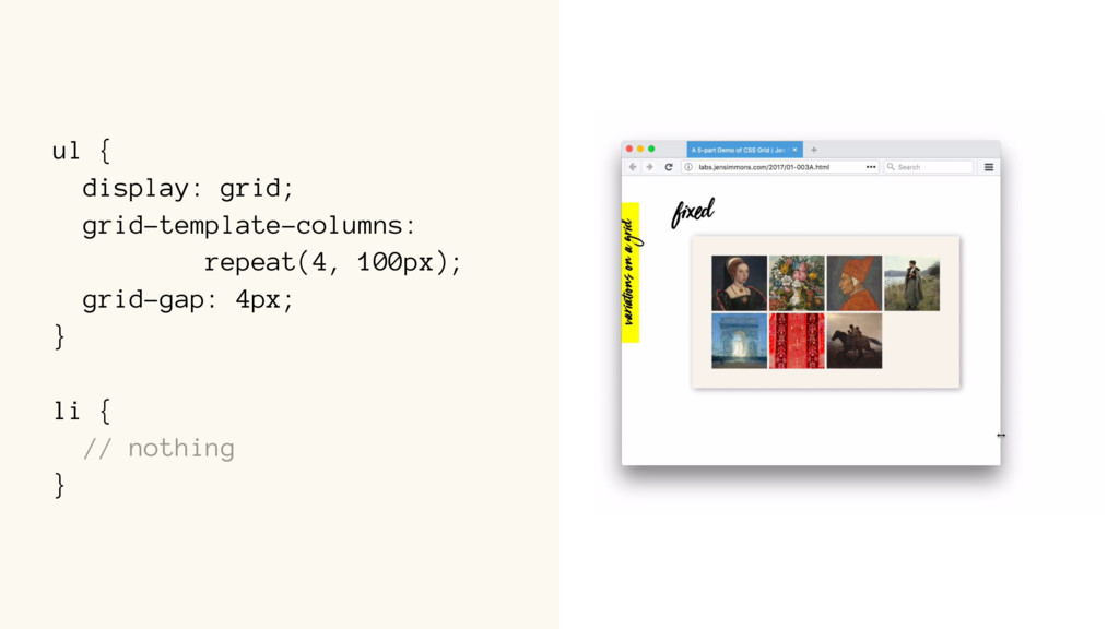
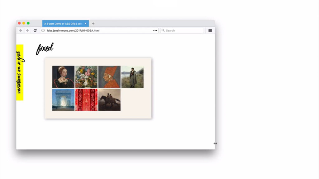
![display: grid; grid-template-columns: repeat(4, 100px); display: -ms-grid; -ms-grid-columns: (100px)[4];](https://files.speakerdeck.com/presentations/baead36a26f74f94960b3c1f86e34880/slide_256.jpg)
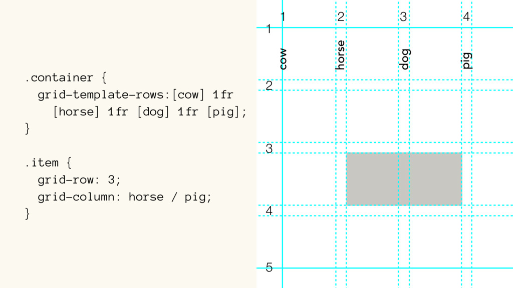
![.container { grid-template-rows:[cow] 1fr [horse] 1fr [dog] 1fr [pig]; }](https://files.speakerdeck.com/presentations/baead36a26f74f94960b3c1f86e34880/slide_381.jpg)
![grid-template-rows: 1fr 1fr 1fr; grid-template-rows:[cow] 1fr [horse] 1fr [dog] 1fr](https://files.speakerdeck.com/presentations/baead36a26f74f94960b3c1f86e34880/slide_383.jpg)
![.container { grid-template-rows:[main-start] 1fr [main-end]; }](https://files.speakerdeck.com/presentations/baead36a26f74f94960b3c1f86e34880/slide_384.jpg)