Upgrade to Pro
— share decks privately, control downloads, hide ads and more …
Speaker Deck
Features
Speaker Deck
PRO
Sign in
Sign up for free
Search
Search
Designing for Enterprise
Search
Sponsored
·
Your Podcast. Everywhere. Effortlessly.
Share. Educate. Inspire. Entertain. You do you. We'll handle the rest.
→
jina
October 06, 2014
Design
250
4
Share
Designing for Enterprise
Creative Works
jina
October 06, 2014
More Decks by jina
See All by jina
Design Systems are for People
jina
1
1k
Design Tokens in Design Systems
jina
9
28k
Designing a Design System
jina
34
7.7k
Living Design Systems
jina
42
2.5M
Lightning Design System
jina
6
690
Sass & Style Guides
jina
11
520
Refactoring Web Interfaces
jina
20
1k
In Search of the Single Source of Truth
jina
1
420
Sass Basics #1
jina
4
410
Other Decks in Design
See All in Design
Figma MCPを活用するためのデザインハンドブック
vivion
7
16k
「余白」と「欲望」を味方につける ——AI時代のデザインエンジニアリングと「越境」の作法 #KNOTS2026
koyaman
1
1.8k
Storyboard Exercise: Chase Sequence
lynteo
1
290
モビリティプラットフォームの未来を築くクラウド基盤
kossykinto
0
260
Drawing for Animation
lynteo
2
280
hicard_credential_202601
hicard
0
220
Goodpatch Tour💙 / We are hiring!
goodpatch
31
1.1M
コンテンツ作成者の体験を設計する
chiilog
0
140
次世代のクリエイティブ体験!Photoshopの最新機能で新しい未来を切り開こう
connecre
0
140
Crisp Code inc.|ブランドガイドライン - Brand guidelines
so_kotani
1
350
文化のデザイン - Soft Impact of Design
atsushihomma
0
180
結びながら、ひらく - にじむ境界のデザイン
hilokifigma
4
1.6k
Featured
See All Featured
Into the Great Unknown - MozCon
thekraken
41
2.4k
Building Better People: How to give real-time feedback that sticks.
wjessup
370
20k
How to make the Groovebox
asonas
2
2.1k
Easily Structure & Communicate Ideas using Wireframe
afnizarnur
194
17k
The untapped power of vector embeddings
frankvandijk
2
1.7k
Done Done
chrislema
186
16k
Balancing Empowerment & Direction
lara
6
1.1k
Paper Plane (Part 1)
katiecoart
PRO
0
6.7k
Public Speaking Without Barfing On Your Shoes - THAT 2023
reverentgeek
1
380
Distributed Sagas: A Protocol for Coordinating Microservices
caitiem20
333
22k
HU Berlin: Industrial-Strength Natural Language Processing with spaCy and Prodigy
inesmontani
PRO
0
320
Marketing to machines
jonoalderson
1
5.2k
Transcript
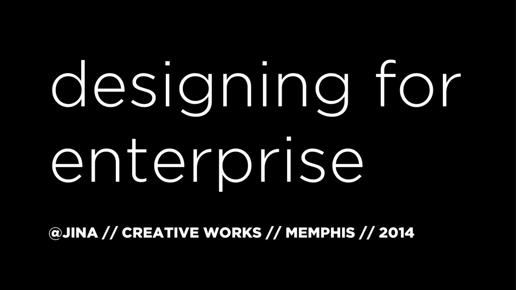
designing for enterprise @JINA // CREATIVE WORKS // MEMPHIS //
2014
@jina
HOMETOWN // NASHVILLE
COLLEGE TOWN // MEMPHIS
MEMPHIS COLLEGE OF ART
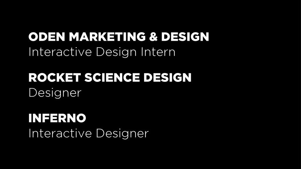
ODEN MARKETING & DESIGN Interactive Design Intern ROCKET SCIENCE DESIGN
Designer INFERNO Interactive Designer
CURRENT CITY — SAN FRANCISCO
APPLE, INC Front-end UI Developer Visual Interaction Designer CRUSH +
LOVELY Interaction Designer ENGINE YARD User Experience Designer GITHUB Designer DO.COM (formerly by Salesforce) Product Designer
SENIOR PRODUCT DESIGNER salesforce
— PAUL SAFFO “It used to be that designers made
an object and walked away. Today the emphasis must shift to designing the entire life cycle.”
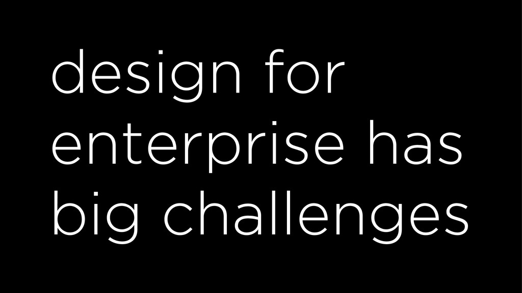
design for enterprise has big challenges
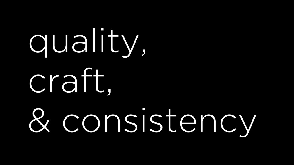
quality, craft, & consistency
tons of content & complex navigation
accessibility
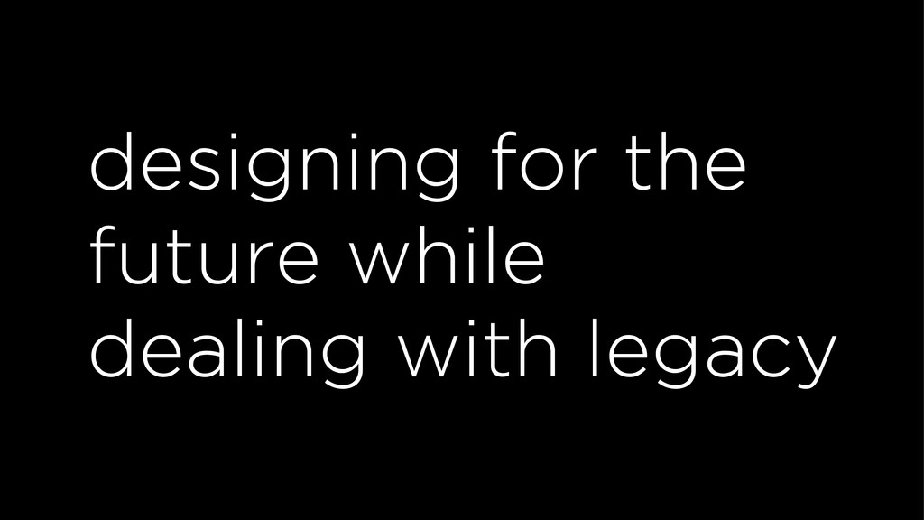
designing for the future while dealing with legacy
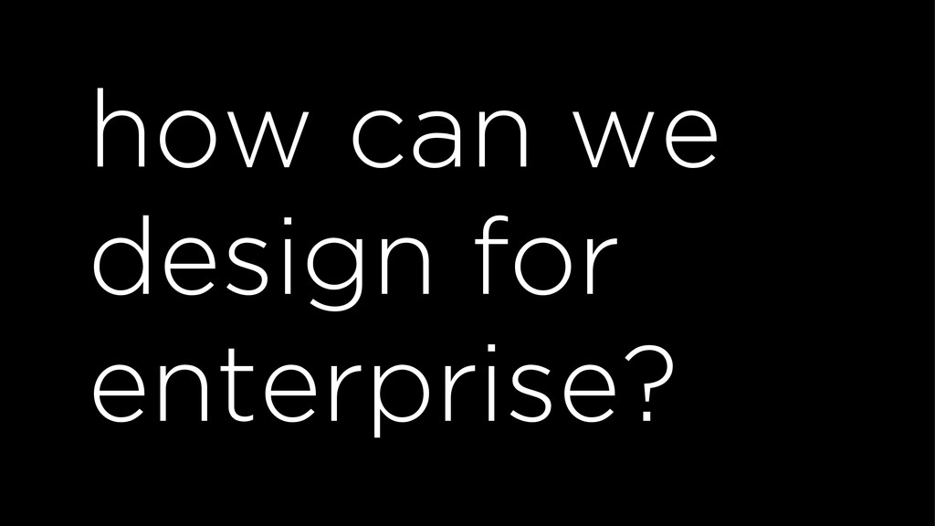
how can we design for enterprise?
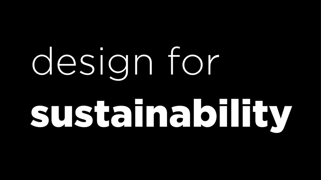
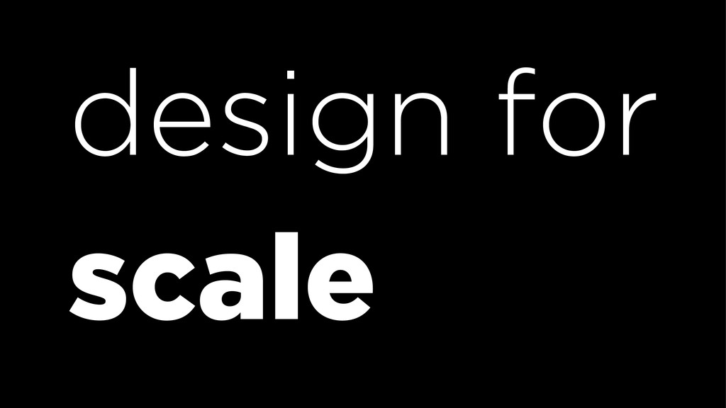
design for sustainability
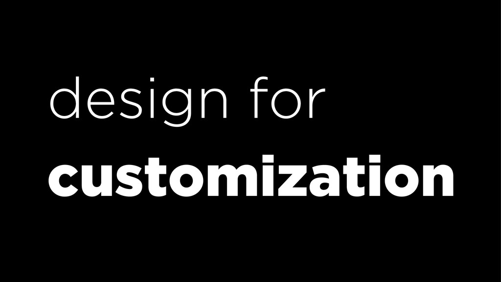
design for customization
design for scale
design pages
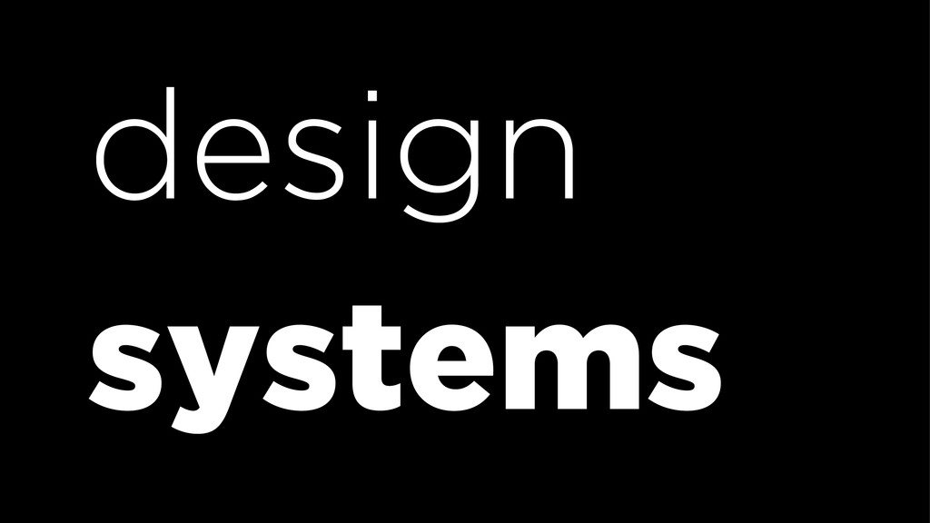
design pages
design systems
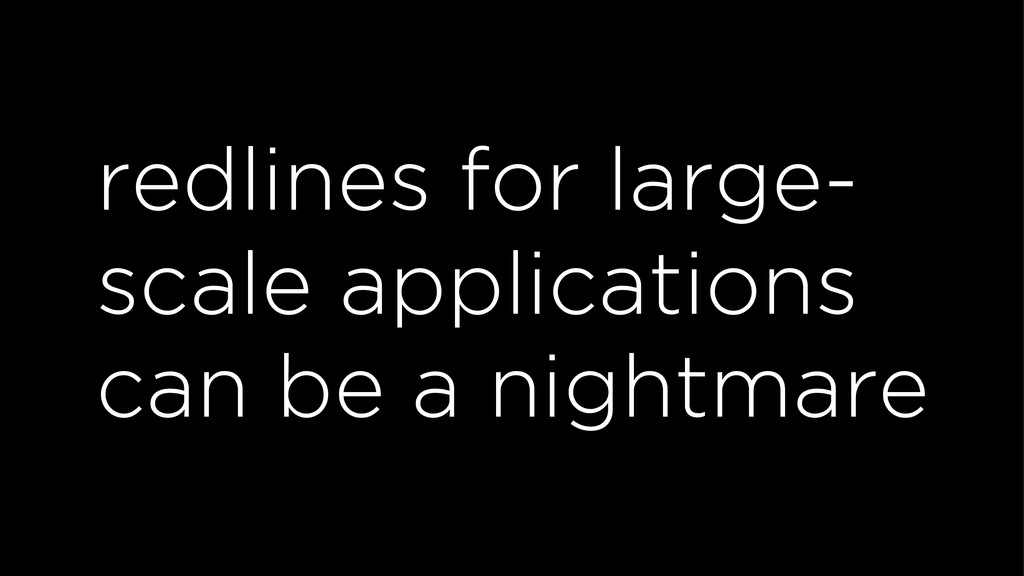
redlines?
None
redlines for large- scale applications can be a nightmare
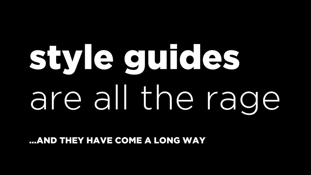
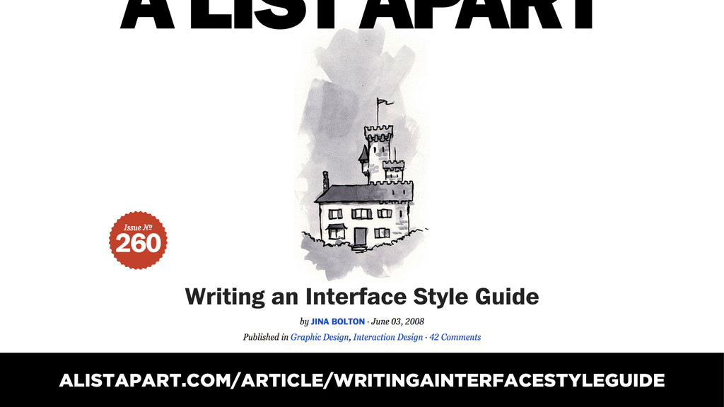
style guides are all the rage …AND THEY HAVE COME
A LONG WAY
ALISTAPART.COM/ARTICLE/WRITINGAINTERFACESTYLEGUIDE
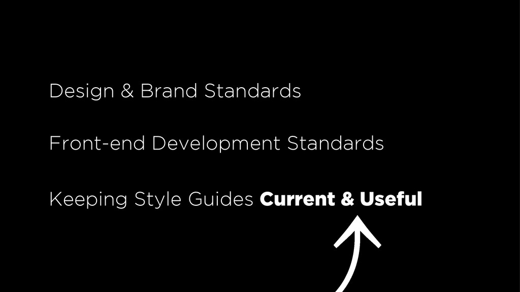
Design & Brand Standards Front-end Development Standards Keeping Style Guides
Current & Useful
when style guides aren’t current, they’re not useful
don’t create a zombie
create a living style guide
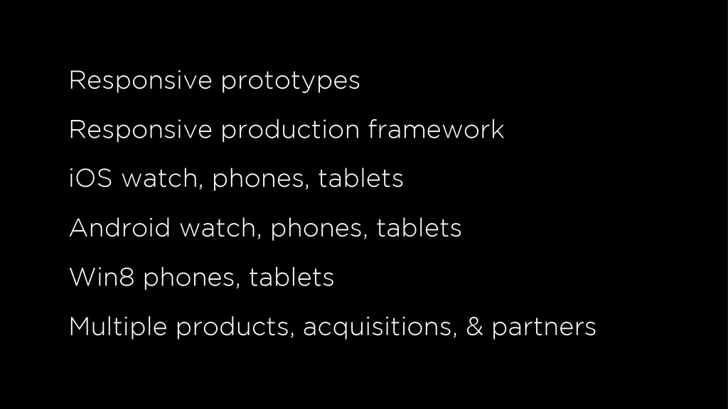
SFDC-STYLEGUIDE.HEROKUAPP.COM
Responsive prototypes Responsive production framework iOS watch, phones, tablets Android
watch, phones, tablets Win8 phones, tablets Multiple products, acquisitions, & partners
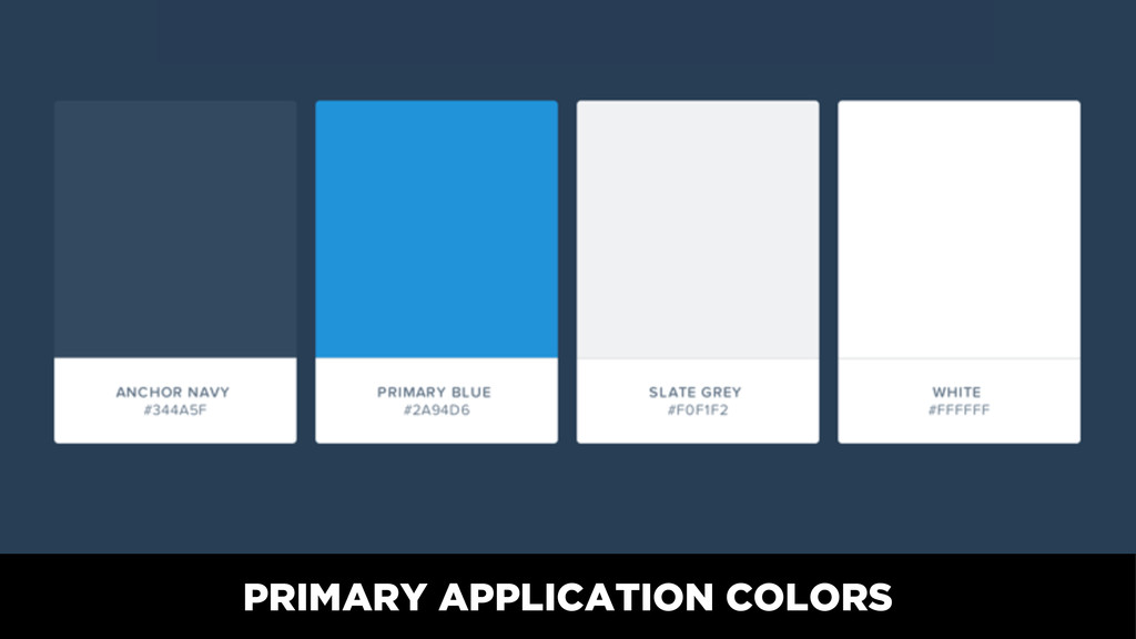
PRIMARY APPLICATION COLORS
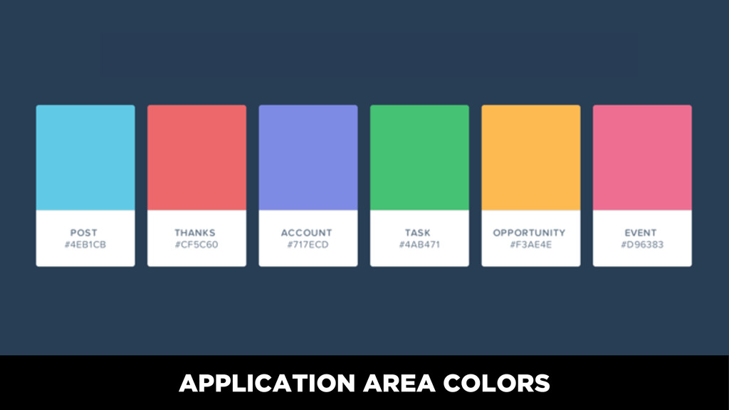
APPLICATION AREA COLORS
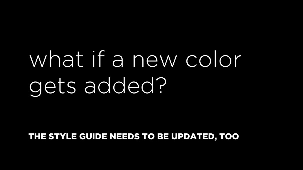
what if a new color gets added? THE STYLE GUIDE
NEEDS TO BE UPDATED, TOO
TYPEFACES
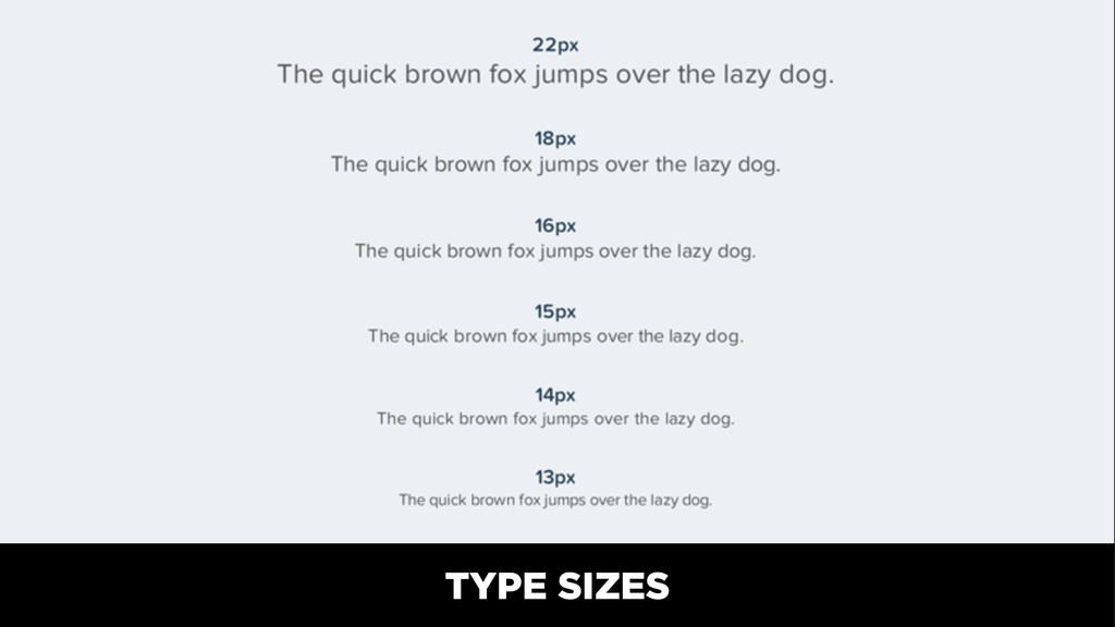
TYPE SIZES
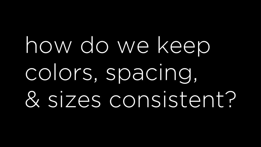
how do we keep colors, spacing, & sizes consistent?
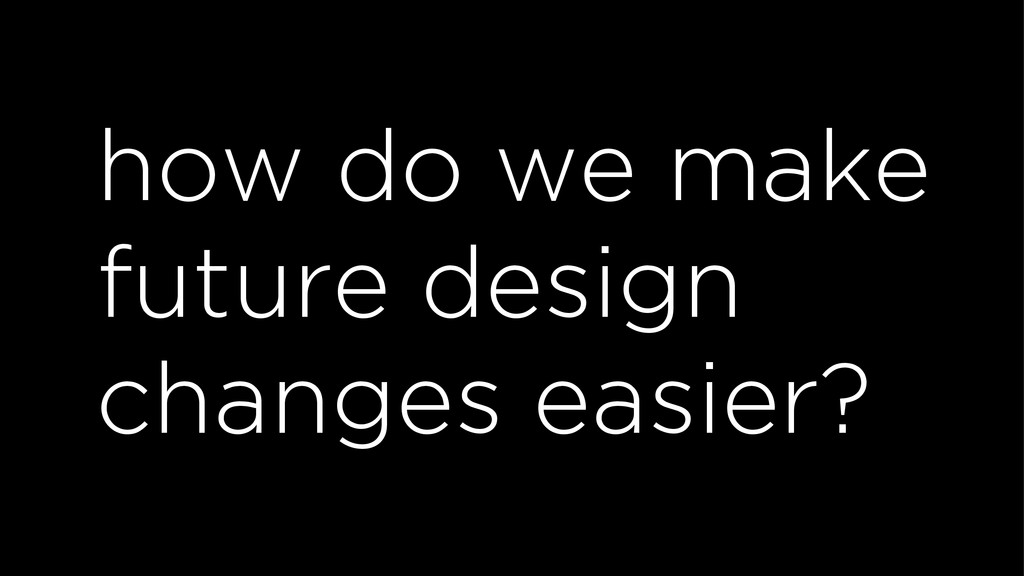
how do we make future design changes easier?
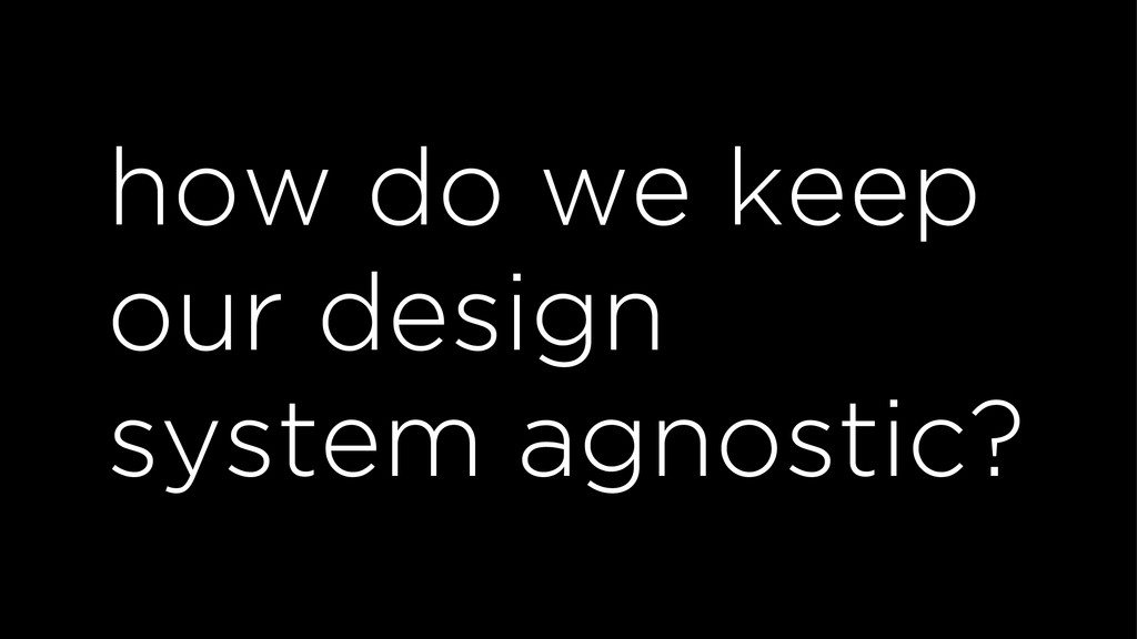
how do we keep our design system agnostic?
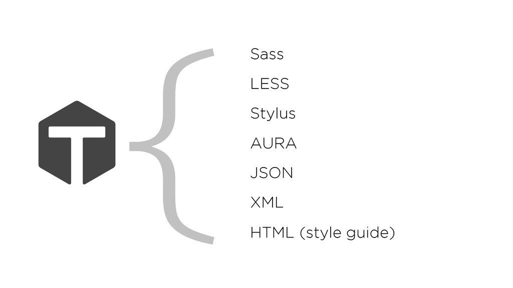
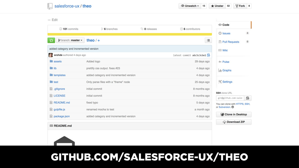
THEO: DESIGN PROPERTY CONVERTER
Sass LESS Stylus AURA JSON XML HTML (style guide) {
{ "name": "COLOR_TEXT", "value": "#444", "category": "text-color", "comment": "Body text
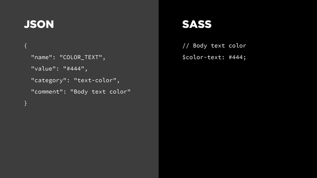
color" } // Body text color $color-text: #444; SASS JSON
{ "name": "COLOR_TEXT", "value": "#444", "category": "text-color", "comment": "Body text
color" } <!-- Body text color --> <aura:var name="colorText" value="#444" /> AURA JSON
{ "name": "COLOR_TEXT", "value": "#444", "category": "text-color", "comment": "Body text
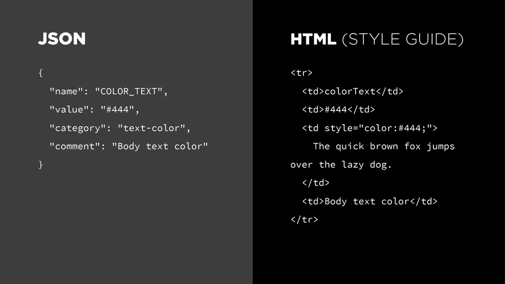
color" } <tr> <td>colorText</td> <td>#444</td> <td style="color:#444;"> The quick brown fox jumps over the lazy dog. </td> <td>Body text color</td> </tr> HTML (STYLE GUIDE) JSON
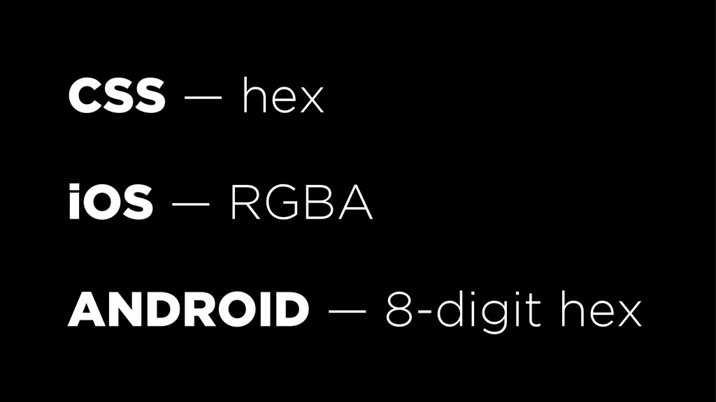
CSS — hex iOS — RGBA ANDROID — 8-digit hex
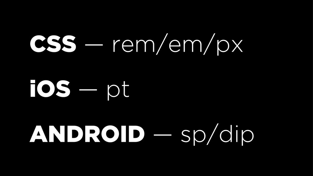
CSS — rem/em/px iOS — pt ANDROID — sp/dip
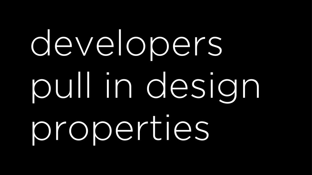
developers pull in design properties
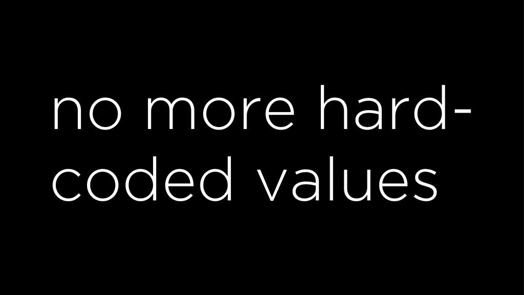
no more hard- coded values
GITHUB.COM/SALESFORCE-UX/THEO
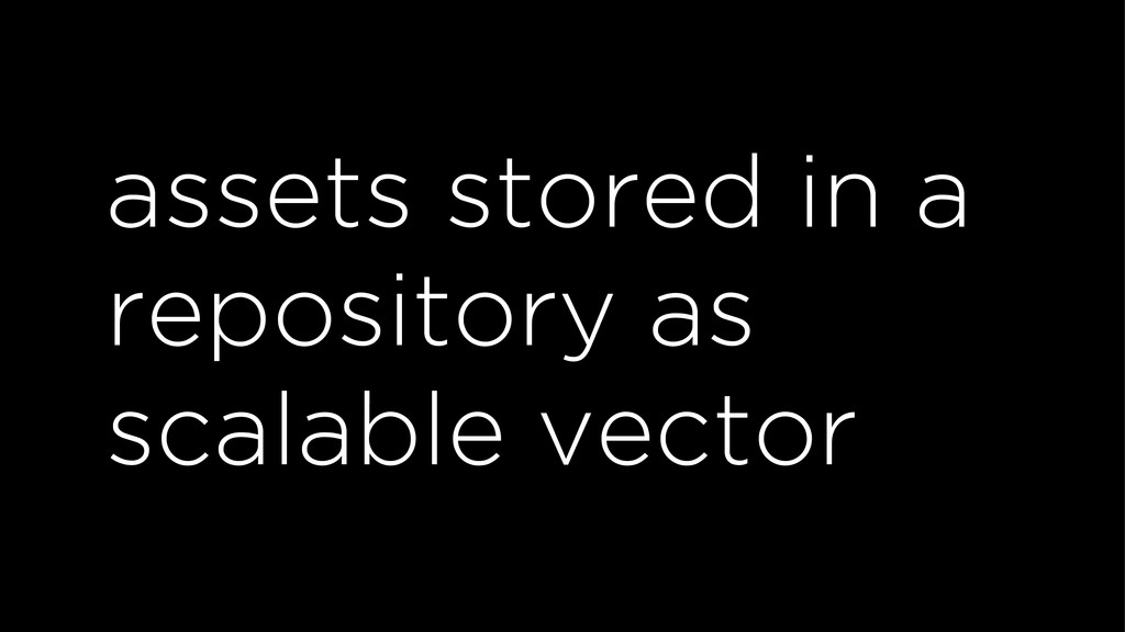
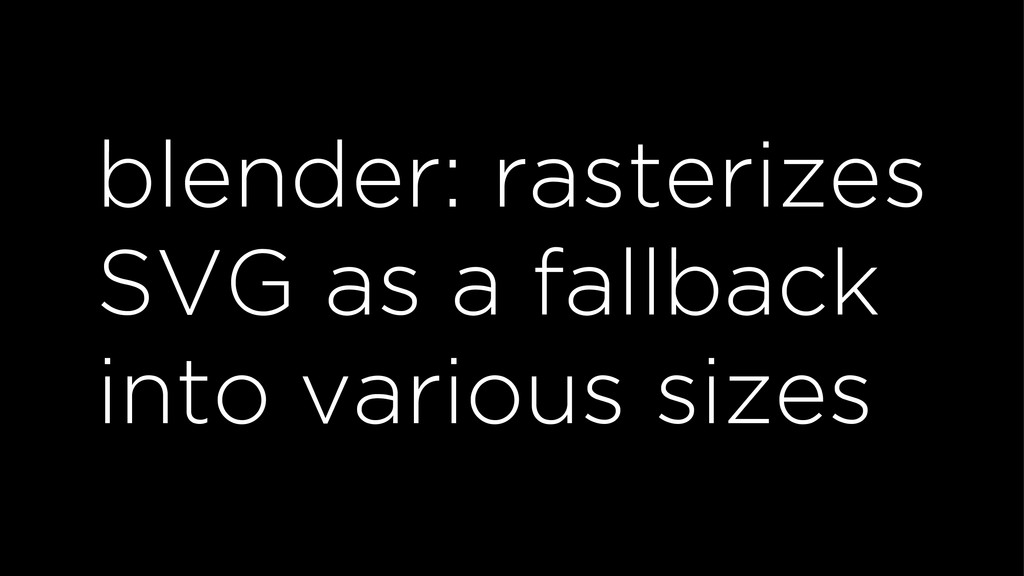
assets stored in a repository as scalable vector
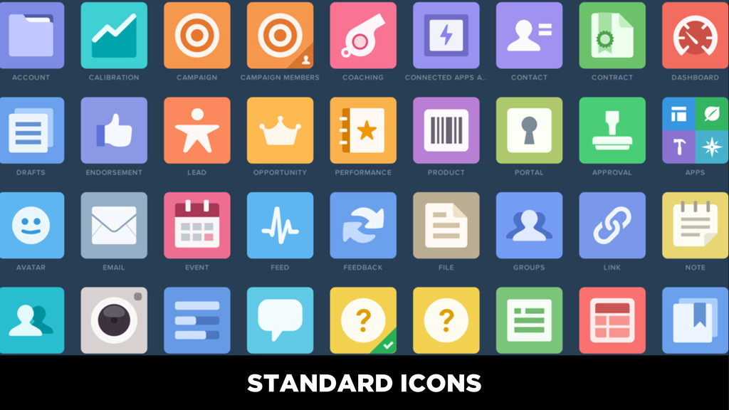
STANDARD ICONS
CUSTOM ICONS
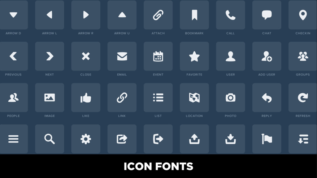
ICON FONTS
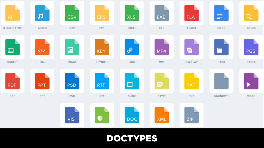
DOCTYPES
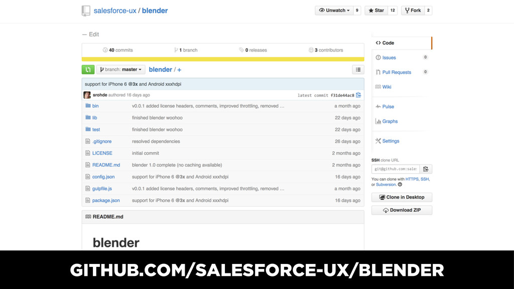
blender: rasterizes SVG as a fallback into various sizes
GITHUB.COM/SALESFORCE-UX/BLENDER
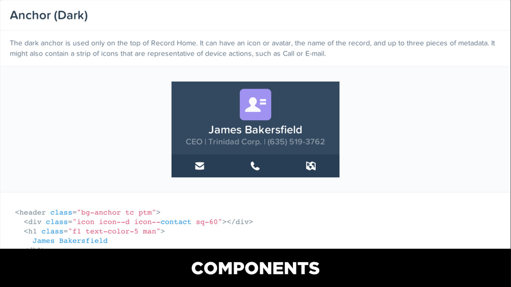
assets display in our style guide automatically
COMPONENTS
EXAMPLES
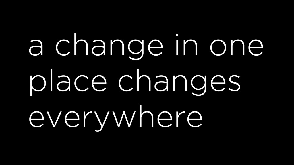
single source of truth
a change in one place changes everywhere
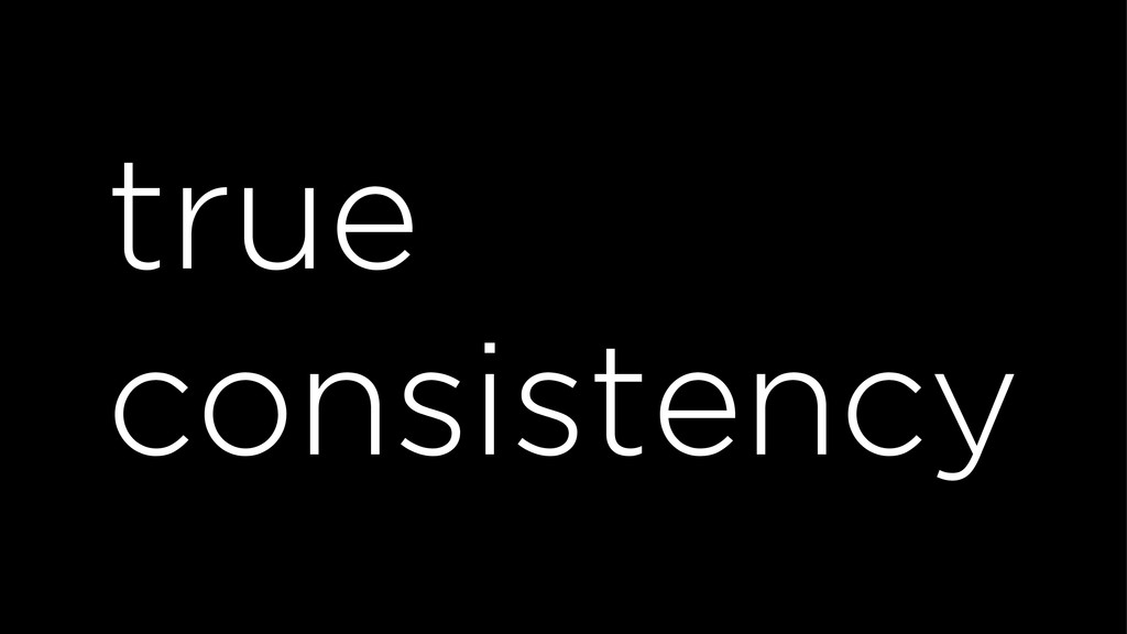
true consistency
brand customization
UX + engineering collaboration
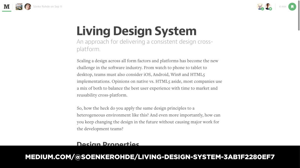
living design system A COLLABORATION WITH SALESFORCE UX + ENGINEERING
MEDIUM.COM/@SOENKEROHDE/LIVING-DESIGN-SYSTEM-3AB1F2280EF7
— GUSTAVE FLAUBERT “Be regular and orderly in your life
so that you may be violent and original in your work.”
@SALESFORCEUX
DRIBBBLE.COM/SALESFORCE
TWITTER, DRIBBBLE, INSTAGRAM, & GITHUB @jina
 jina
jina
 vivion
 koyaman
 lynteo
 kossykinto
 hicard
 goodpatch
 chiilog
 connecre
 so_kotani
 atsushihomma
 hilokifigma
 thekraken
 wjessup
 asonas
 afnizarnur
 frankvandijk
 chrislema
 lara
lara
 katiecoart
 reverentgeek
 caitiem20
 inesmontani
 jonoalderson