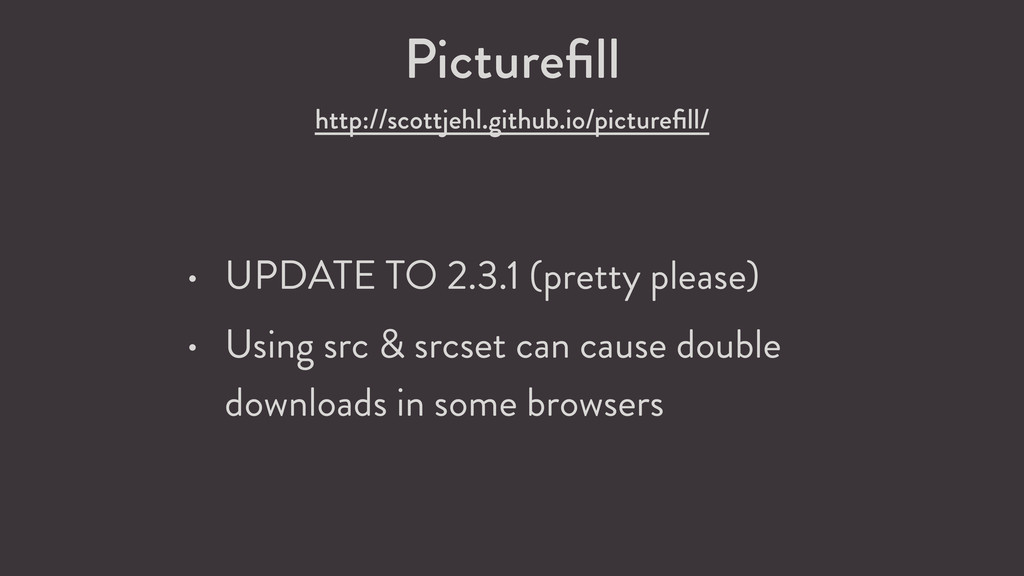
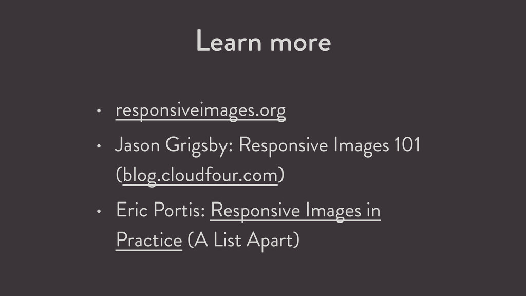
Share
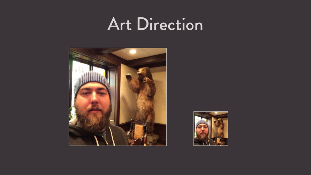
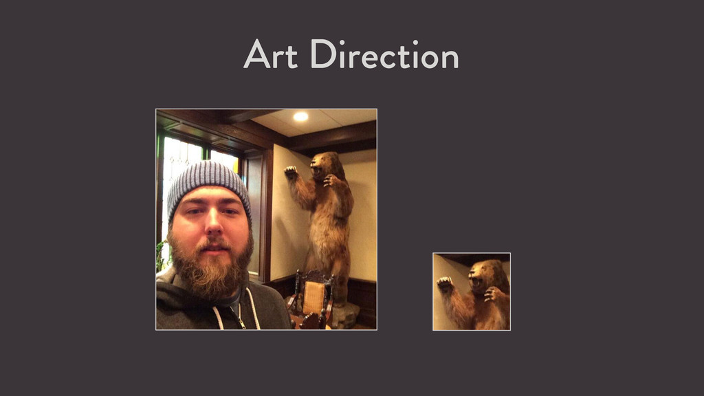
Slides from my talk at WordCamp Denver 2015, explaining the responsive image solutions that you can use today.
 joemcgill
 kanny
kanny
 prgckwb
 fruitriin
 sue445
 uhyo
uhyo
 takkuhiro
 sakajunquality
 tonkotsuboy_com
 kekke_n
 oracle4engineer
 sbspsy
 kobayashiyorimitsu
 addyosmani
 sferik
 panda_program
 afnizarnur
 sabderemane
 philnash
 jeffersonlam
 bluesmoon
 mayatellez
 lemiorhan
 greggifford
 aleyda