Optimizing Your Themes for Responsive Images in WordPress
This presentation on making use of the responsive images functionality in WordPress was given at the 2016 WordCamp St. Louis at Washington University on May 14, 2016.
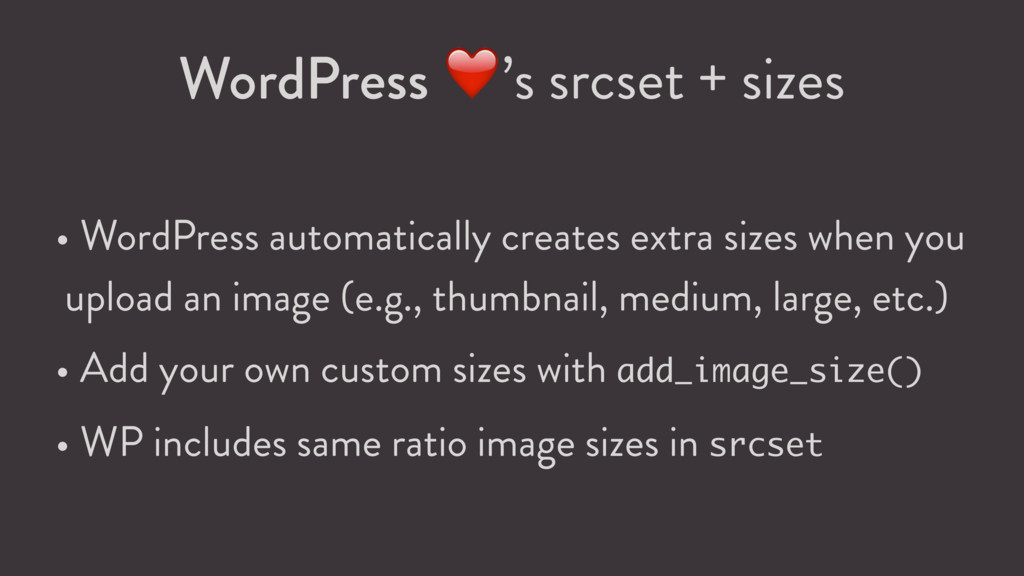
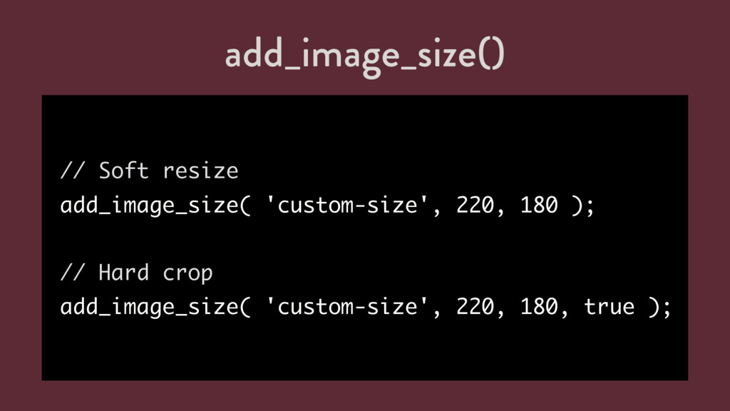
extra sizes when you upload an image (e.g., thumbnail, medium, large, etc.) • Add your own custom sizes with add_image_size() • WP includes same ratio image sizes in srcset
 joemcgill
 yokawasa
 oracle4engineer
 rakus_dev
 ynisqa1988
 kzykmyzw
 genda
genda
 yama3133
 shibuiwilliam
 yuukiyo
 kazzpapa3
 lynnandtonic
 raygrieselhuber
 tamaranovitovic
 jonyablonski
 notwaldorf
 denniskardys
 caitiem20
 lauravandoore
 kastner
 tammyeverts
 ammeep
 schroneko