http://html5boilerplate.com/ „HTML5 Boilerplate helps you build fast, robust, and adaptable web apps or sites. Kick-start your project with the combined knowledge and effort of 100s of developers, all in one little package.“ [1]
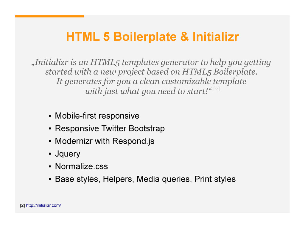
generator to help you getting started with a new project based on HTML5 Boilerplate. It generates for you a clean customizable template with just what you need to start!“ [2] [2] http://initializr.com/ • Mobile-first responsive • Responsive Twitter Bootstrap • Modernizr with Respond.js • Jquery • Normalize.css • Base styles, Helpers, Media queries, Print styles
• Semantic class & ID names • Lowercase vs. Uppercase • Be careful with new HTML5 elements (Structure) [3][4] • Get to know with WAI-ARIA (Accessibility) [5] • MicroData (Schema.org) „My best practise with naming convention is use camelCase for IDs and hyphenate for classes. In my opinion IDs look more unique and stronger that way and classes more common.“ [4] http://www.netmagazine.com/features/truth-about-structuring-html5-page/ [3] http://html5doctor.com/avoiding-common-html5-mistakes/
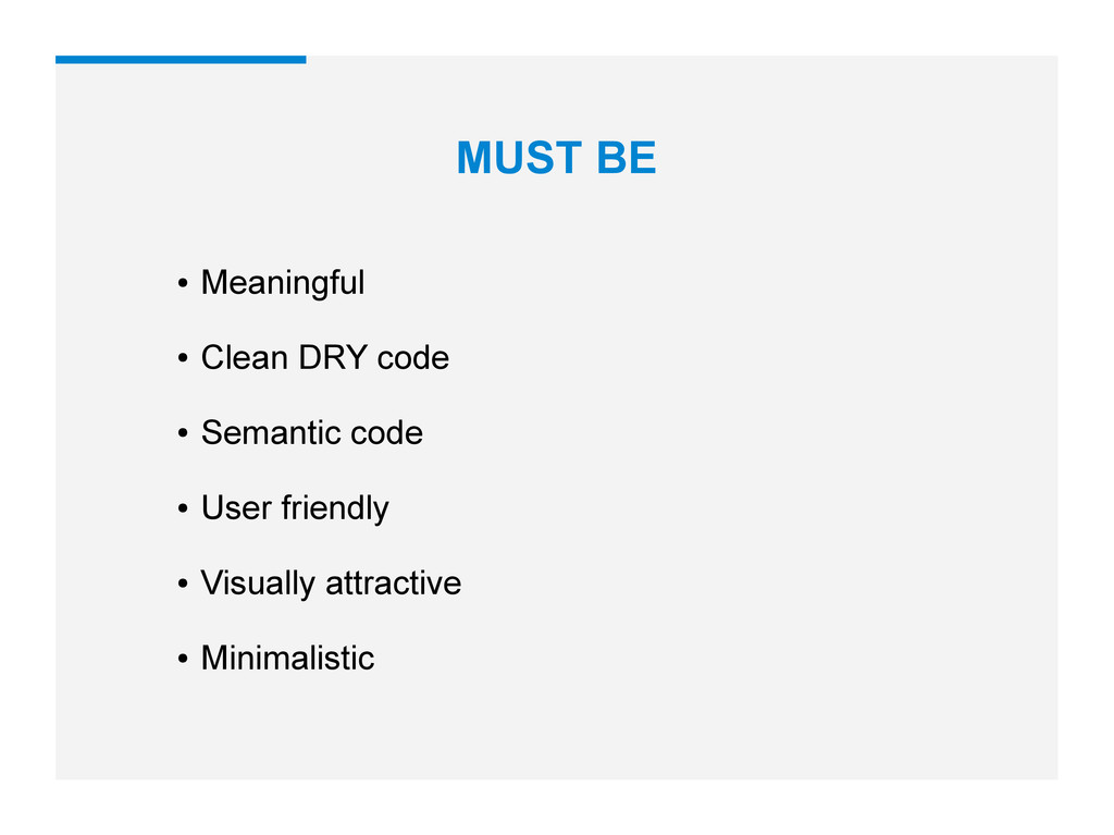
abstract → REUSABLE • Should be easily managed by a single person or a large engineering team → SCALABLE • Your CSS rules behave as you’d expect → PREDICTABLE • When adding new component X to the page shouldn’t break component Y by its mere presence → MAINTAINABLE „Software entities (classes, modules, functions, etc.) should be open for extension, but closed for modification.“ „The less the CSS needs to know about the HTML structure the better.“
isn’t sufficient any more [8] • Jquery only when needed • Launch scripts only when needed [9] • Scalability and robustness are two things you should keep in mind when beginning development [7] „Don’t be ashamed to use a Javascript library. They are there to help you. It’s estimated that 3,000 of the top 10,00 sites on the web use jQuery alone and again.“ [7] [8] http://rmurphey.com/blog/2012/04/12/a-baseline-for-front-end-developers/ [7] http://darcyclarke.me/development/javascript-applications-101/ (via @r4ms3scz, @tomasmatis)
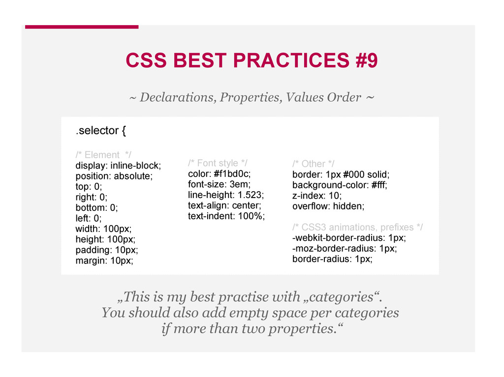
consistent, idiomatic CSS [10] • SMACSS - Scalable and Modular Architecture for CSS [11] ~ Organize Your CSS ~ [10] https://github.com/necolas/idiomatic-css/ & https://github.com/necolas/idiomatic-css/tree/master/translations/cs-CZ by @machal
are used by too many parts of the application, it becomes very scary to remove them from your HTML. Especialy on a large projects. • However, with an established convention, this problem can be completely avoided. • When you see a class in the HTML, you should be able to tell instantly what its purpose is. • Recommendation by Philip Walton is to give all non-styled classes a prefix. He use .js- for JavaScript and .supports- for Modernizr classes. • My recommendation (+SMACSS) is use .is- for state rules. ~ Use Classes For Styling And Styling Only ~
existing component needs to look slightly different in a certain context, create a modifier class to extend it. ~ Extend components with modifier classes ~ /* Bad */ .widget { } #sidebar .widget { } /* Good */ .widget { } .widget-sidebar { }
classes keeps your components self- contained and modular. • It minimizes the likelihood that an existing class will conflict, and it lowers the specificity required to style child elements. ~ Namespace your classes ~ /* High risk of style cross-contamination */ .widget { } .widget .title { } /* Low risk of style cross-contamination */ .widget { } .widget-title { }
the main reasons is that inline styles to not separate the content from the design. This can prove to make development and designing difficult. • Another reason to avoid inline CSS is because it is much harder to maintain. ~ Avoid Inline CSS ~
size body type that looks good on a phone sized screen does not look good on a widened desktop layout. • Text should be a bit bigger on large screens. • You're going to need to change font sizes for different screen sizes. Let's say you look through your stylesheet and find 50 different font-size declarations in px. That's 50 places you need to change that font size through a media query when the screen size changes. That's 50 suck points. ~ Migrate from PX EM / Percentages → ~
well as being non-reusable can never be used more than once in a page. • Use IDs in HTML for fragment identifiers and JS hooks, but never in CSS. • Don’t stop using IDs, just be aware of where they can cause you headaches and know where to sensibly circumvent them. Anyone telling you not to use them at all is not wrong, but they’re definitely not right…[16] ~ Use IDs in CSS only there is no other way ~ [16] http://csswizardry.com/2011/09/when-using-ids-can-be-a-pain-in-the-class/
HTML tags and combinators keeps your HTML squeaky clean, but it makes your CSS gross and dirty. ~ Stay away from complex selectors ~ /* Grenade → Clean HTML */ #main-nav ul li ul { } /* Sniper Rifle → Predictable CSS */ .subnav { }
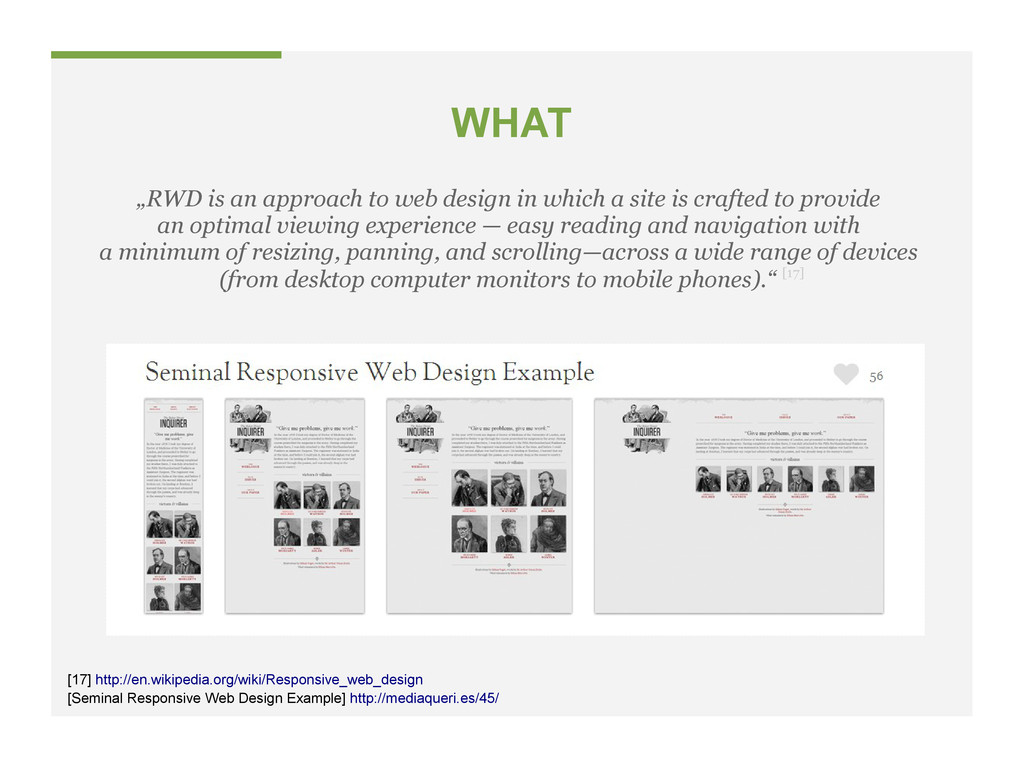
a site is crafted to provide an optimal viewing experience — easy reading and navigation with a minimum of resizing, panning, and scrolling—across a wide range of devices (from desktop computer monitors to mobile phones).“ [17] [17] http://en.wikipedia.org/wiki/Responsive_web_design [Seminal Responsive Web Design Example] http://mediaqueri.es/45/
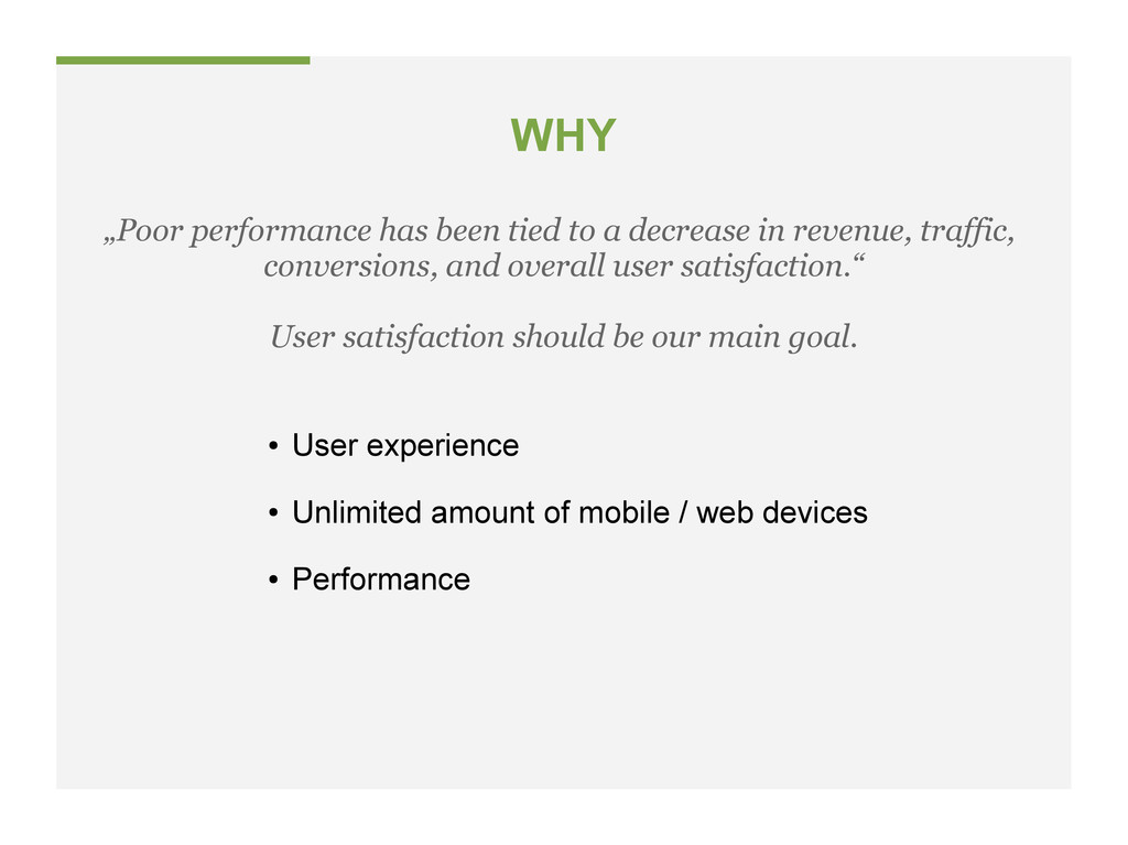
web devices • Performance „Poor performance has been tied to a decrease in revenue, traffic, conversions, and overall user satisfaction.“ User satisfaction should be our main goal.
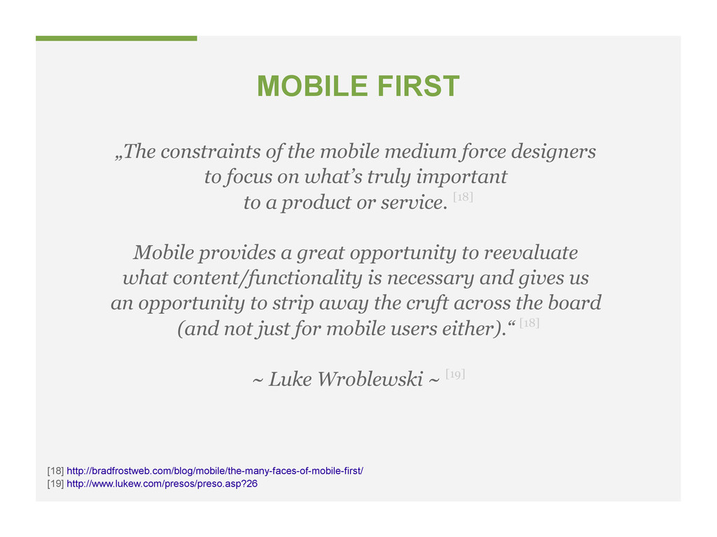
to focus on what’s truly important to a product or service. [18] Mobile provides a great opportunity to reevaluate what content/functionality is necessary and gives us an opportunity to strip away the cruft across the board (and not just for mobile users either).“ [18] ~ Luke Wroblewski ~ [19] [19] http://www.lukew.com/presos/preso.asp?26 [18] http://bradfrostweb.com/blog/mobile/the-many-faces-of-mobile-first/
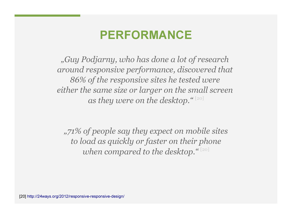
around responsive performance, discovered that 86% of the responsive sites he tested were either the same size or larger on the small screen as they were on the desktop.“ [20] „71% of people say they expect on mobile sites to load as quickly or faster on their phone when compared to the desktop.“ [20] [20] http://24ways.org/2012/responsive-responsive-design/
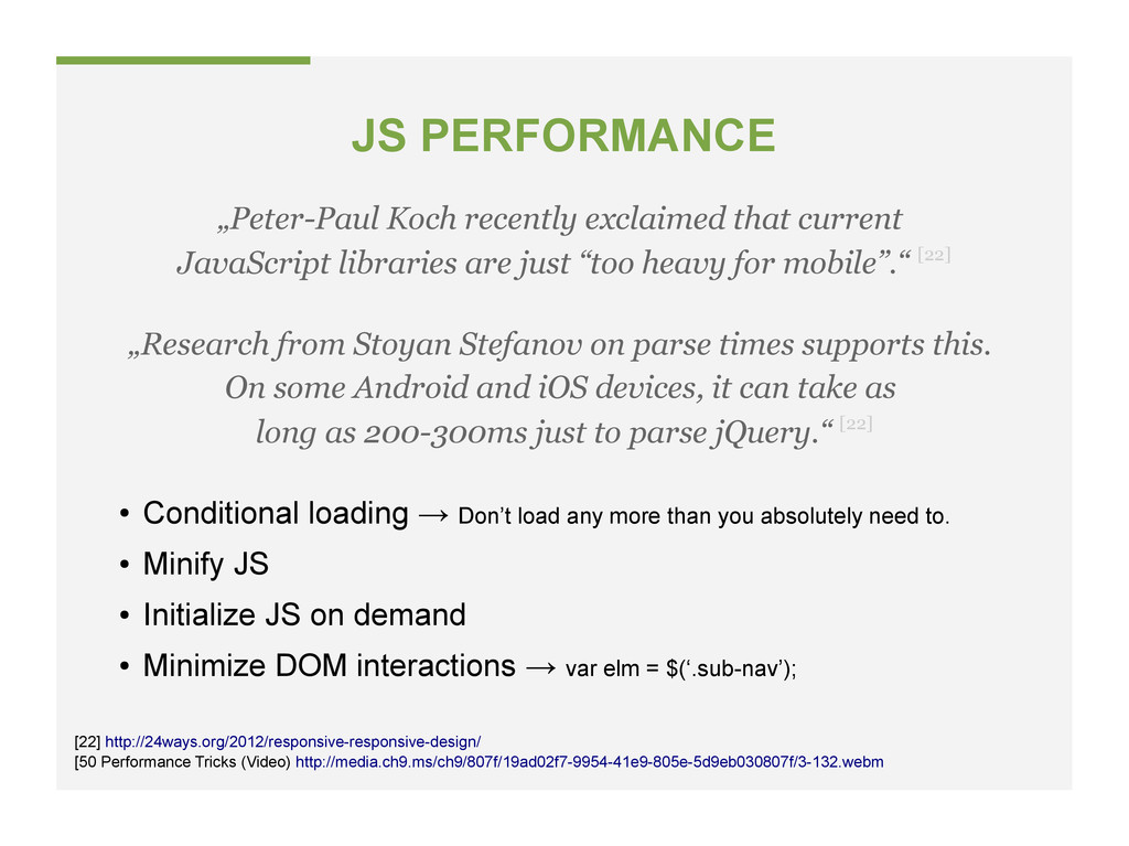
→ Don’t load any more than you absolutely need to. • Minify JS • Initialize JS on demand • Minimize DOM interactions → var elm = $(‘.sub-nav’); [22] http://24ways.org/2012/responsive-responsive-design/ „Peter-Paul Koch recently exclaimed that current JavaScript libraries are just “too heavy for mobile”.“ [22] „Research from Stoyan Stefanov on parse times supports this. On some Android and iOS devices, it can take as long as 200-300ms just to parse jQuery.“ [22]
 jonas
jonas
 mineo_matsuya
 jitera
 abnoumaru
 makies
 kawauso
 kaonavi
 _awache
 i35_267
 coborinai
 taromatsui_cccmkhd
 koukihosaka
 amanda_hinchman
 eitanlees
 jakevdp
 mayunak
 bkeepers
 scottboms
 mojombo
 tammyeverts
 schroneko
 mraible
 aki_iinuma
 gurzu
gurzu
 reverentgeek
![HTML 5 Boilerplate The web’s most popular front-end template.[1] [1]](https://files.speakerdeck.com/presentations/e8aa2c7025460130ce0f12313d181141/slide_6.jpg)
![HTML CODE [5] http://www.w3.org/TR/wai-aria/ • One language – English prefered](https://files.speakerdeck.com/presentations/e8aa2c7025460130ce0f12313d181141/slide_8.jpg)
![CSS CODE [6] [6] http://engineering.appfolio.com/2012/11/16/css-architecture/ • CSS rules should be](https://files.speakerdeck.com/presentations/e8aa2c7025460130ce0f12313d181141/slide_9.jpg)
![JAVASCRIPT CODE [9] http://metaflood.com/work-life/use-jquery-and-modernizr-to-load-javascript-conditionally-based-on-existence-of-dom-element/ • Simply knowing a JavaScript library](https://files.speakerdeck.com/presentations/e8aa2c7025460130ce0f12313d181141/slide_10.jpg)
![CSS BEST PRACTICES #10 [11] http://smacss.com/ • Principles of writing](https://files.speakerdeck.com/presentations/e8aa2c7025460130ce0f12313d181141/slide_13.jpg)
![CSS BEST PRACTICES #8 [12] [12] http://engineering.appfolio.com/2012/11/16/css-architecture/ • When classes](https://files.speakerdeck.com/presentations/e8aa2c7025460130ce0f12313d181141/slide_15.jpg)
![CSS BEST PRACTICES #7 [12] [12] http://engineering.appfolio.com/2012/11/16/css-architecture/ • When an](https://files.speakerdeck.com/presentations/e8aa2c7025460130ce0f12313d181141/slide_16.jpg)
![CSS BEST PRACTICES #6 [12] [12] http://engineering.appfolio.com/2012/11/16/css-architecture/ • Namespacing your](https://files.speakerdeck.com/presentations/e8aa2c7025460130ce0f12313d181141/slide_17.jpg)
![CSS BEST PRACTICES #5 [13] [13] http://www.onextrapixel.com/2012/06/05/15-best-css-practices-to-make-your-life-easier/ • One of](https://files.speakerdeck.com/presentations/e8aa2c7025460130ce0f12313d181141/slide_18.jpg)
![CSS BEST PRACTICES #4 [14] [14] http://css-tricks.com/why-ems/ • The same](https://files.speakerdeck.com/presentations/e8aa2c7025460130ce0f12313d181141/slide_19.jpg)
![CSS BEST PRACTICES #3 [15] [15] http://csswizardry.com/2012/11/code-smells-in-css/ • IDs, as](https://files.speakerdeck.com/presentations/e8aa2c7025460130ce0f12313d181141/slide_20.jpg)
![CSS BEST PRACTICES #2 [12] [12] http://engineering.appfolio.com/2012/11/16/css-architecture/ • Relying on](https://files.speakerdeck.com/presentations/e8aa2c7025460130ce0f12313d181141/slide_21.jpg)
![CSS BEST PRACTICES #1 [12] [12] http://engineering.appfolio.com/2012/11/16/css-architecture/ • They totally](https://files.speakerdeck.com/presentations/e8aa2c7025460130ce0f12313d181141/slide_22.jpg)
![CSS PERFORMANCE • Display: none; → It’s completely useless? [21]](https://files.speakerdeck.com/presentations/e8aa2c7025460130ce0f12313d181141/slide_30.jpg)