Upgrade to Pro — share decks privately, control downloads, hide ads and more …

Just Enough Typography

Just Enough Typography

Presented at Djangocon 2016 in Philadelphia, PA

Joni Trythall

July 19, 2016
Tweet

Other Decks in Design

Transcript

  1. Agenda Djangocon ‘16 Just Enough Typography @jonitrythall We are going

    to learn a bunch in this brief time together. But not too much.
  2. • Intro, Of Sorts • Readability And Legibility • Punctuation

    • Selecting/Pairing Typefaces • Bye Bye Agenda (Continued)
  3. What Is It Tho? Djangocon ‘16 Just Enough Typography @jonitrythall

    “Typography is what language looks like.” Beautiful words from Ellen Lupton
  4. It Matters A Lot Djangocon ‘16 Just Enough Typography @jonitrythall

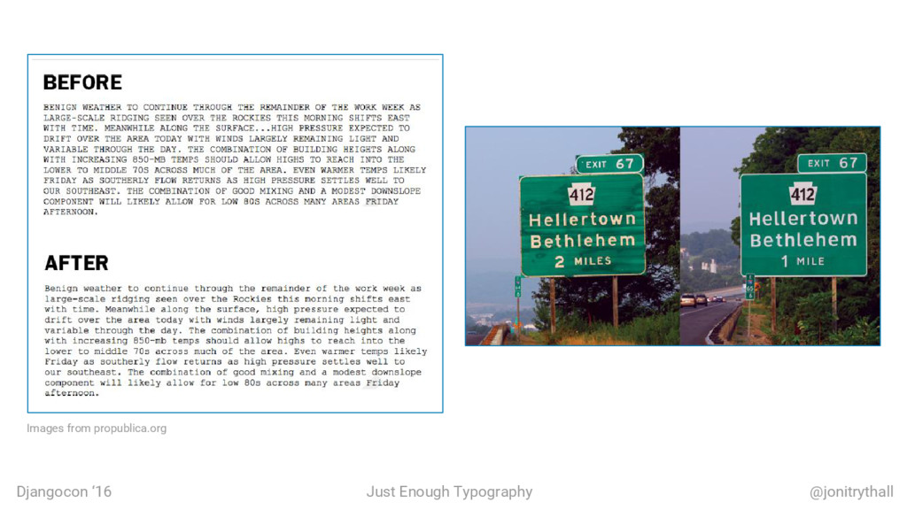
    • The National Weather Service recently stopped YELLING AT US! • NASA learned things and wrote about it • It saves lives ◦ Road signs are less terrible
  5. Djangocon ‘16 Just Enough Typography @jonitrythall It Evokes Emotion •

    The Book With No Pictures • Influencing how users feel is super powerful ◦ Correct brand impression ◦ Aids in decision making ◦ Increase motivation ◦ Creates personality ◦ Strengthen memories
  6. Size And Line Height Djangocon ‘16 Just Enough Typography @jonitrythall

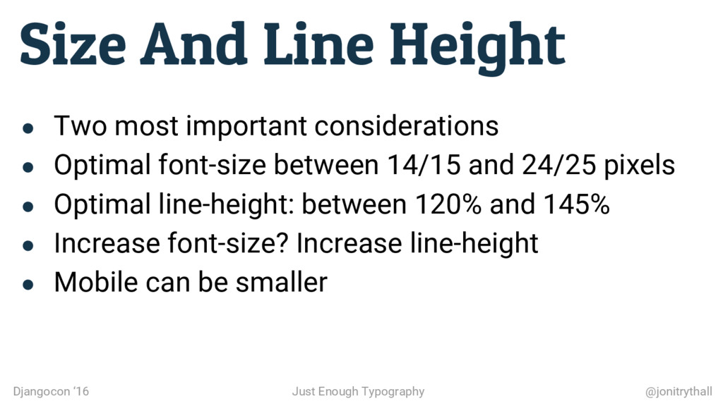
    • Two most important considerations • Optimal font-size between 14/15 and 24/25 pixels • Optimal line-height: between 120% and 145% • Increase font-size? Increase line-height • Mobile can be smaller
  7. Spacing Djangocon ‘16 Just Enough Typography @jonitrythall White Space (Continued)

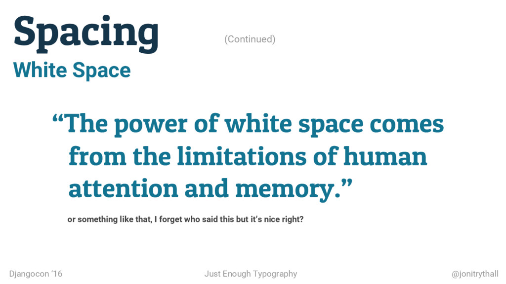
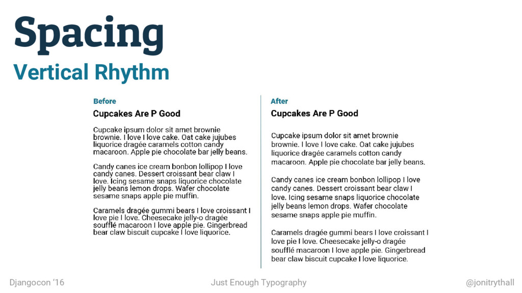
    “The power of white space comes from the limitations of human attention and memory.” or something like that, I forget who said this but it’s nice right?
  8. Hierarchy Djangocon ‘16 Just Enough Typography @jonitrythall • Visually organize

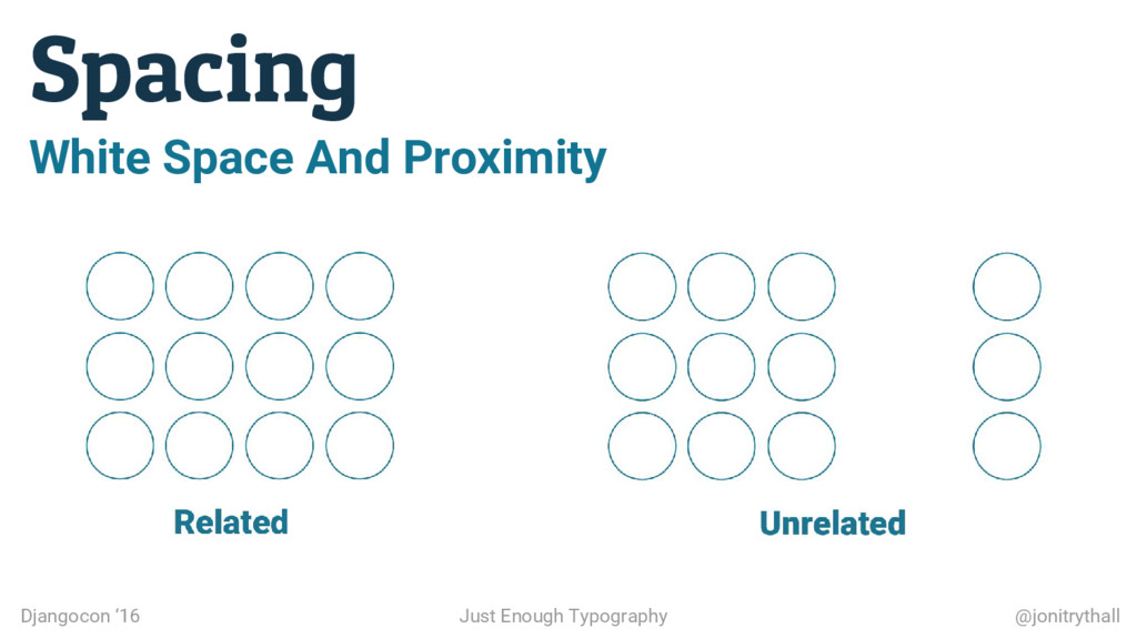
    elements by importance ◦ Size, proximity, repetition, and color • Grouping helps with understanding and scanning • Repetition and consistency allow for safe assumptions • It’s calming
  9. Contrast Djangocon ‘16 Just Enough Typography @jonitrythall • Poor contrast

    is not a neat aesthetic trick • Literally hurts • Use a checker to be safe
  10. Djangocon ‘16 Just Enough Typography @jonitrythall Emphasis • Use bold

    or italic ◦ Not underlines ◦ Not exclamation marks ◦ Bold for sans-serifs • Be careful not to overuse • Don’t format associated punctuation
  11. Ellipses Djangocon ‘16 Just Enough Typography @jonitrythall • Used to

    indicate omissions within quotes • Space before and after? Feel it out ◦ Text on 1 side only? Use non breaking space
  12. Selecting Typefaces Djangocon ‘16 Just Enough Typography @jonitrythall • Focus

    on anchor face for body copy • Read the content • Brand intentions • Voice and tone
  13. Pairing Typefaces Advice stating to use a single typeface with

    a bunch of styles is not practical. Djangocon ‘16 Just Enough Typography @jonitrythall
  14. Pairing Typefaces (Continued) • Serif with sans-serif and vice versa

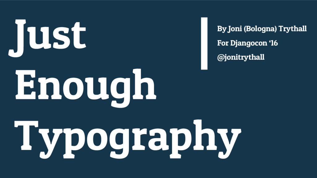
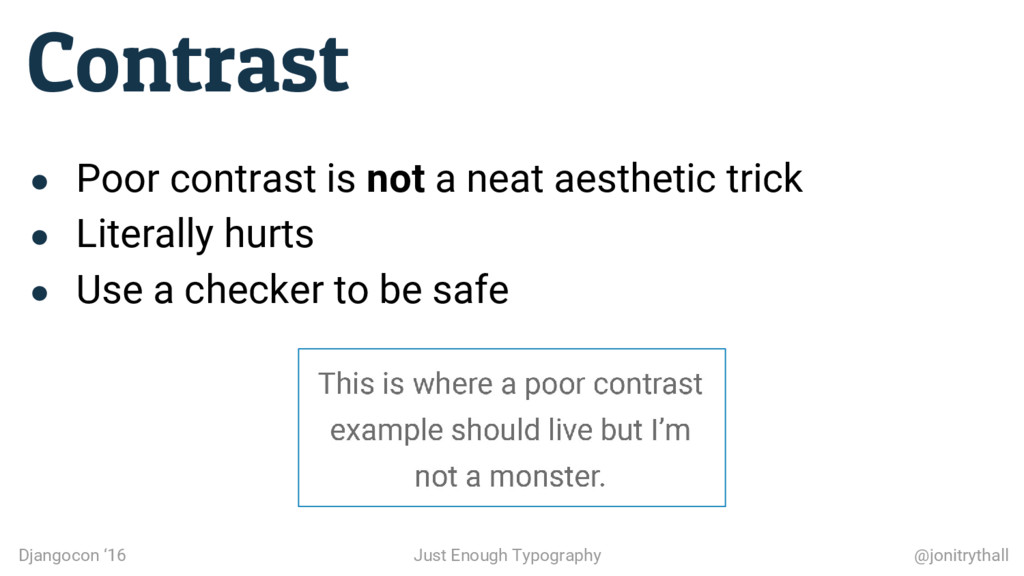
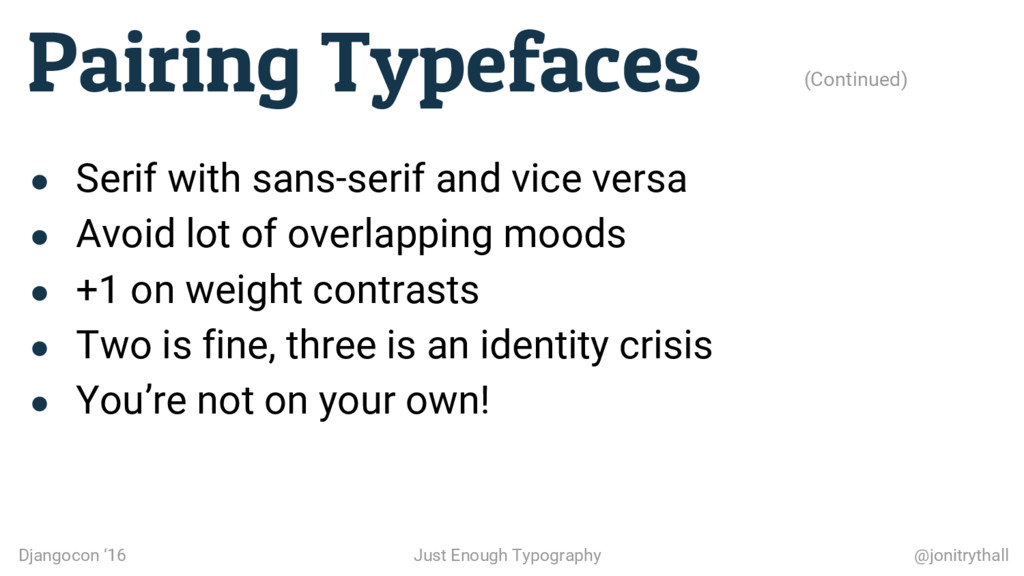
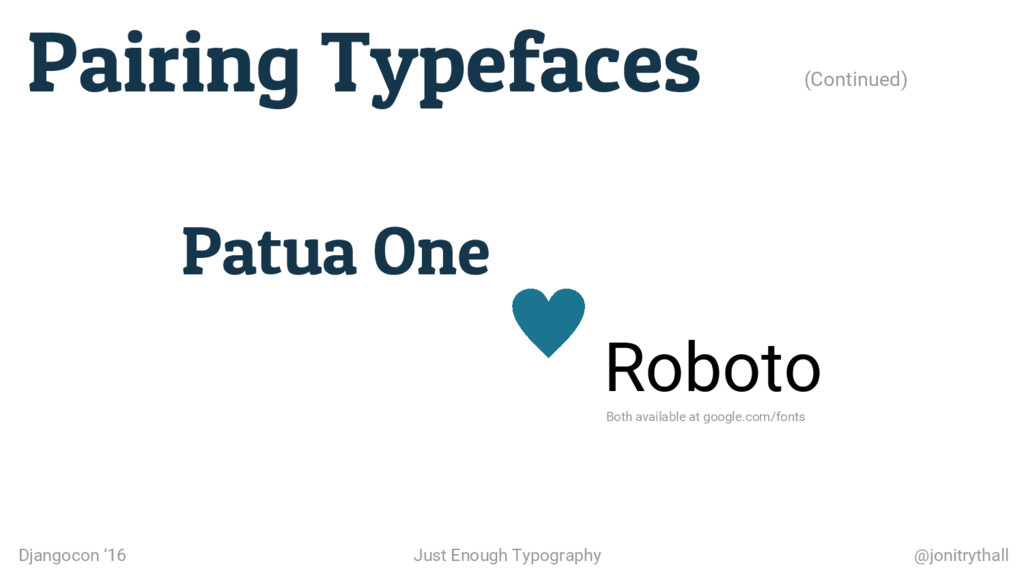
    • Avoid lot of overlapping moods • +1 on weight contrasts • Two is fine, three is an identity crisis • You’re not on your own! Djangocon ‘16 Just Enough Typography @jonitrythall
  15. Check out the reference site for this talk to get

    quick tiny tips and a complete resource list: Djangocon ‘16 Just Enough Typography @jonitrythall Resources toptentypography.tips