Upgrade to Pro — share decks privately, control downloads, hide ads and more …

Exploratory Data Analysis Part 1 - Understanding Variance

Kan Nishida
January 20, 2021

Exploratory Data Analysis Part 1 - Understanding Variance

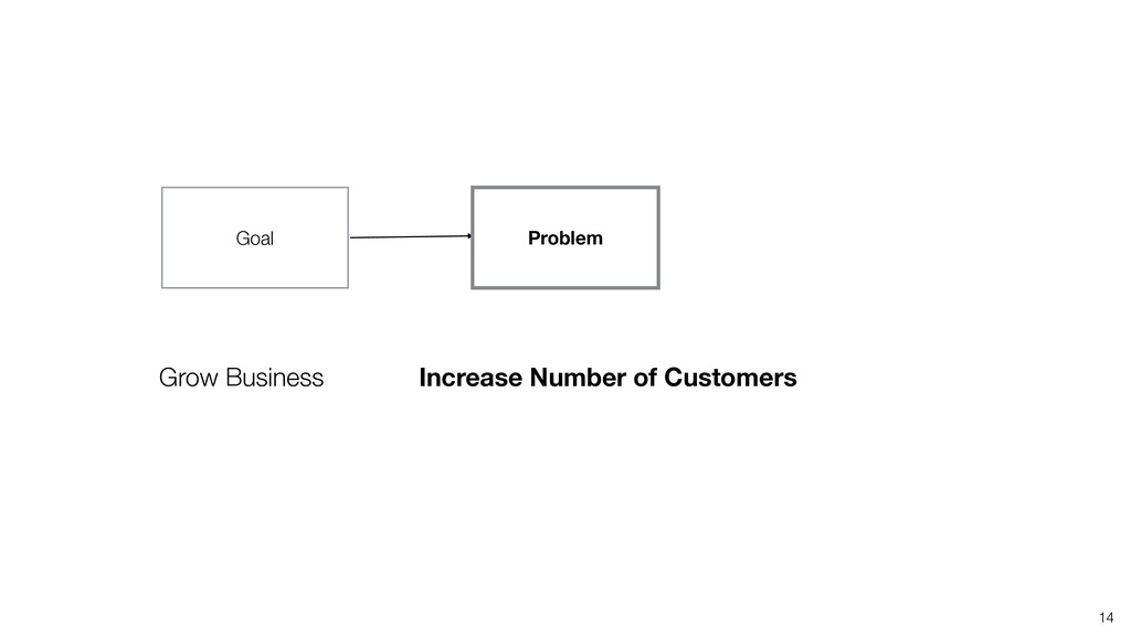
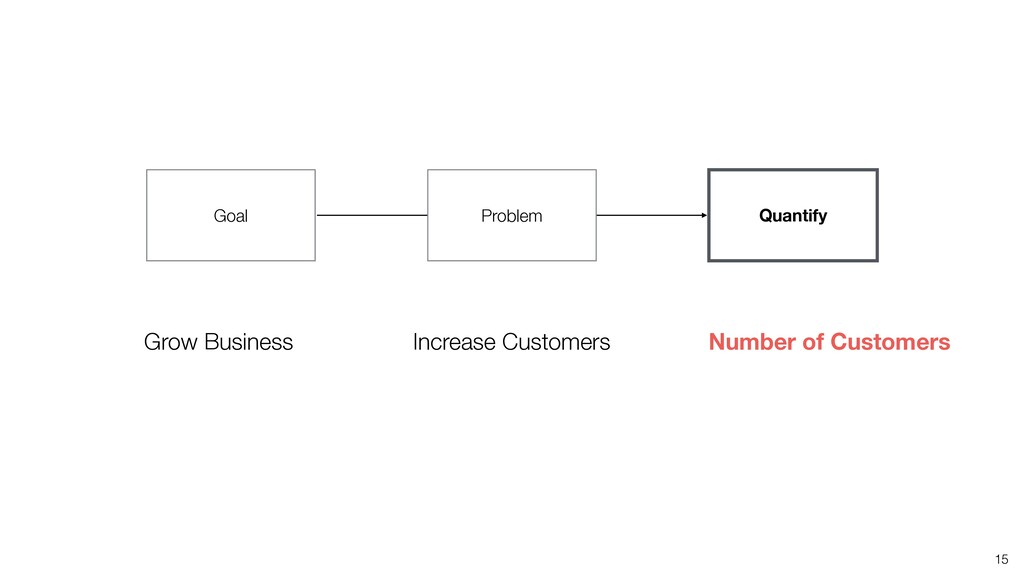
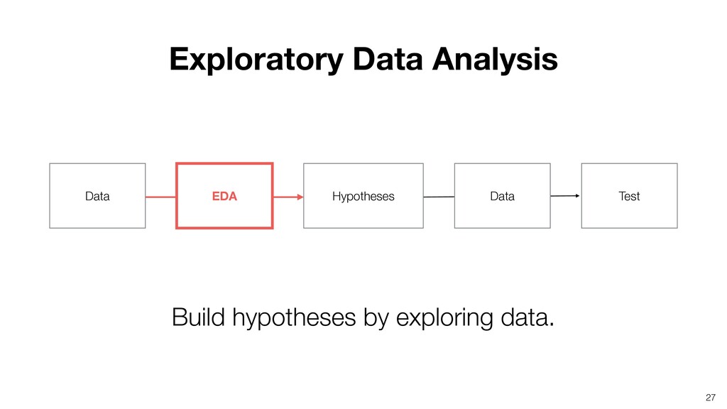
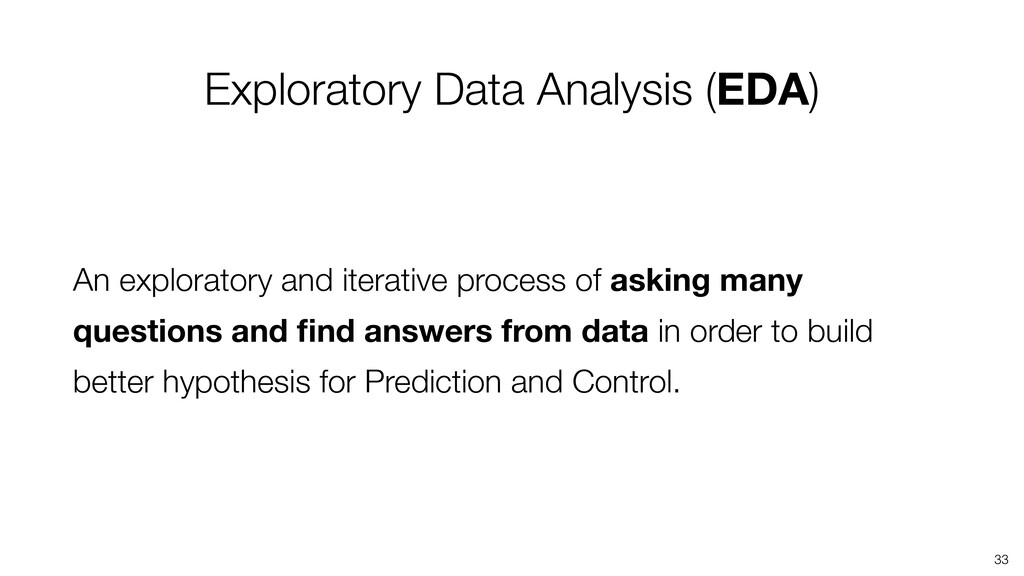
This is a part of the Exploratory Data Analysis Workshop. We'll start by introducing some of the effective methods to understand data variation.

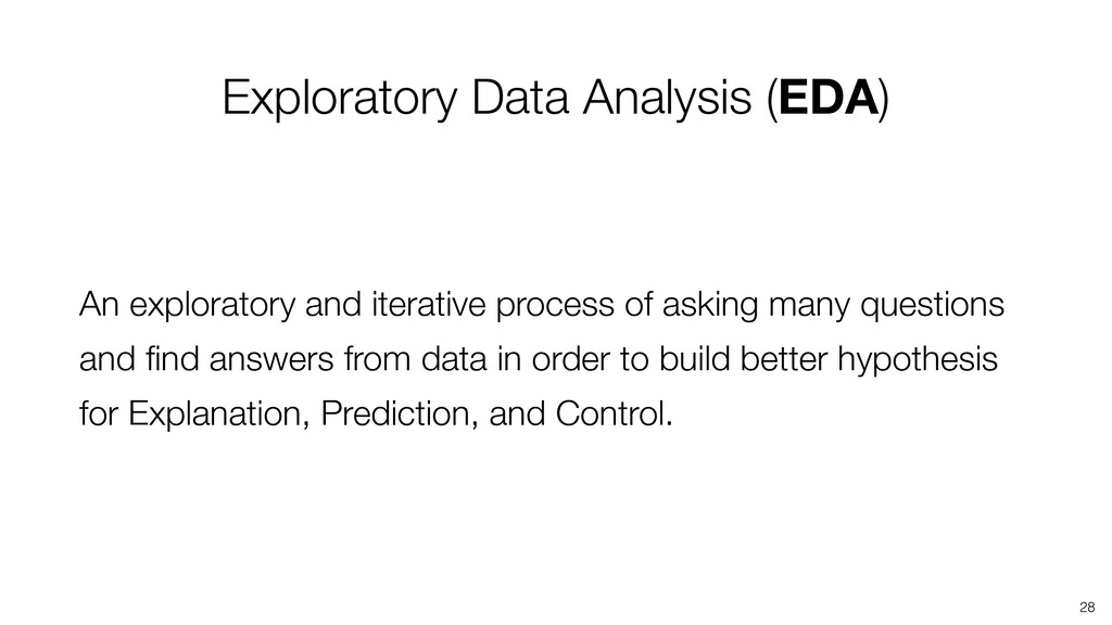
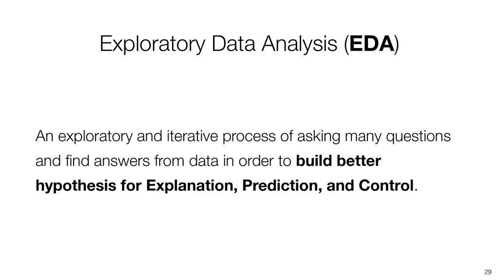
- What is EDA and Why?
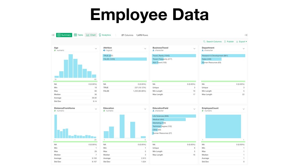
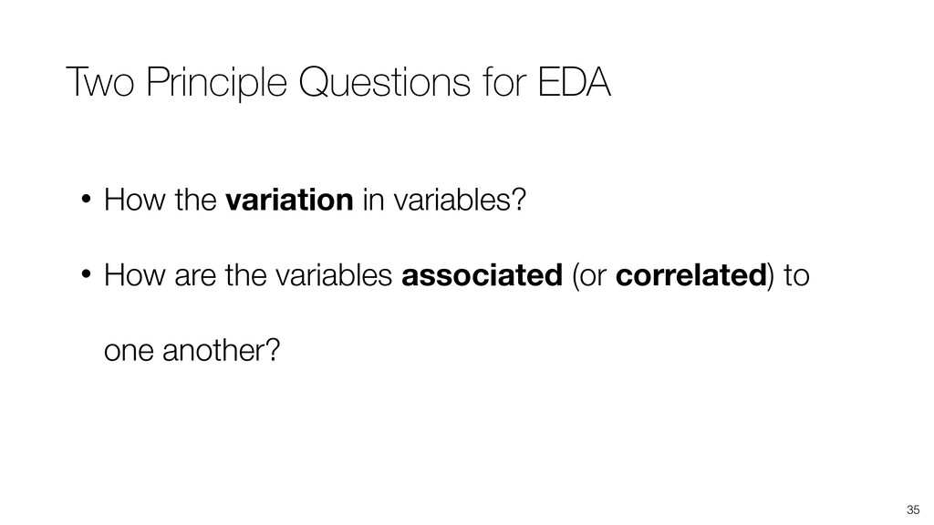
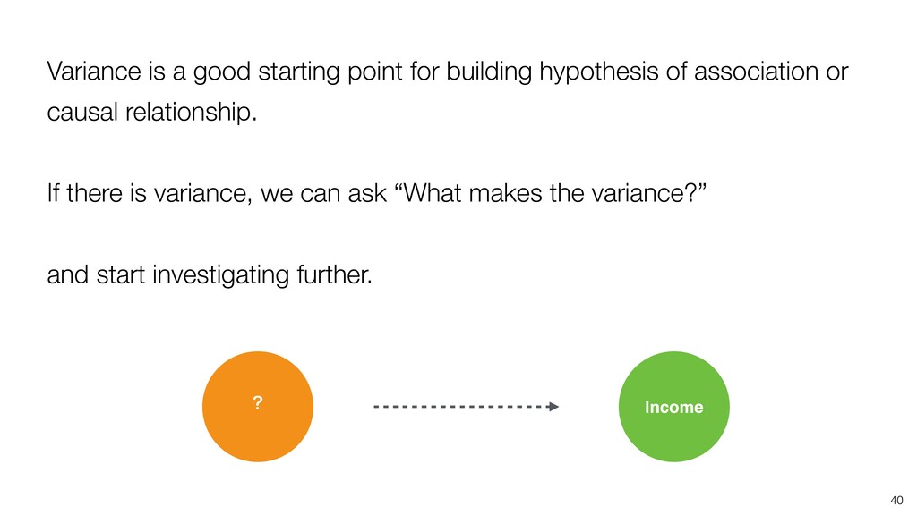
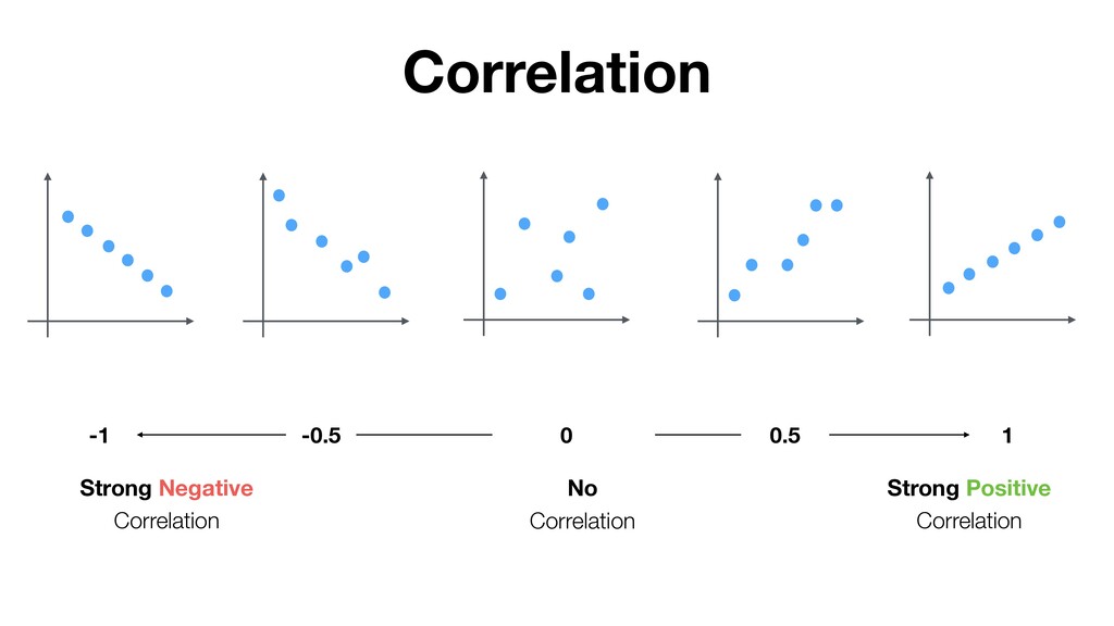
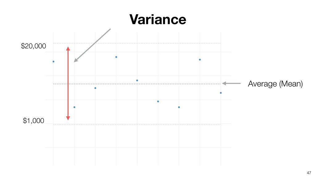
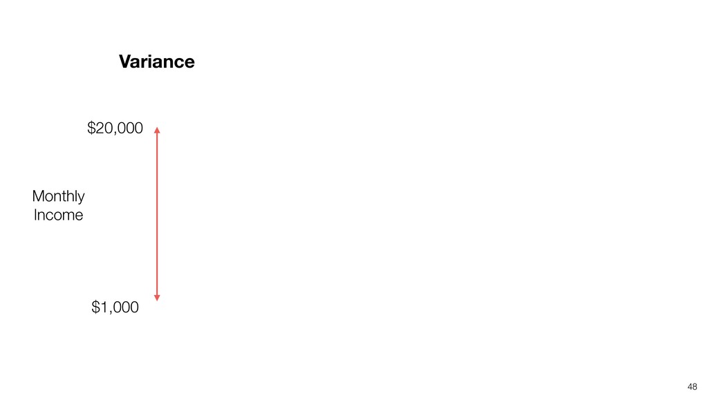
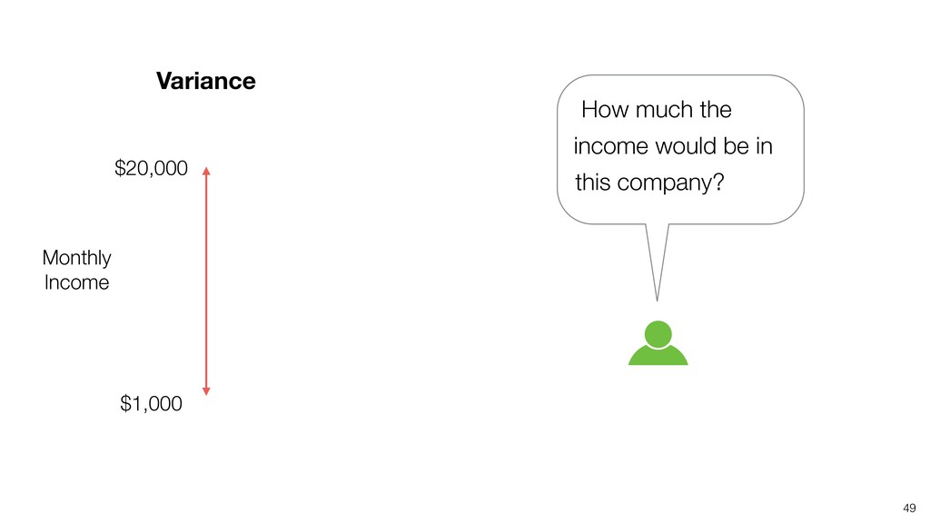
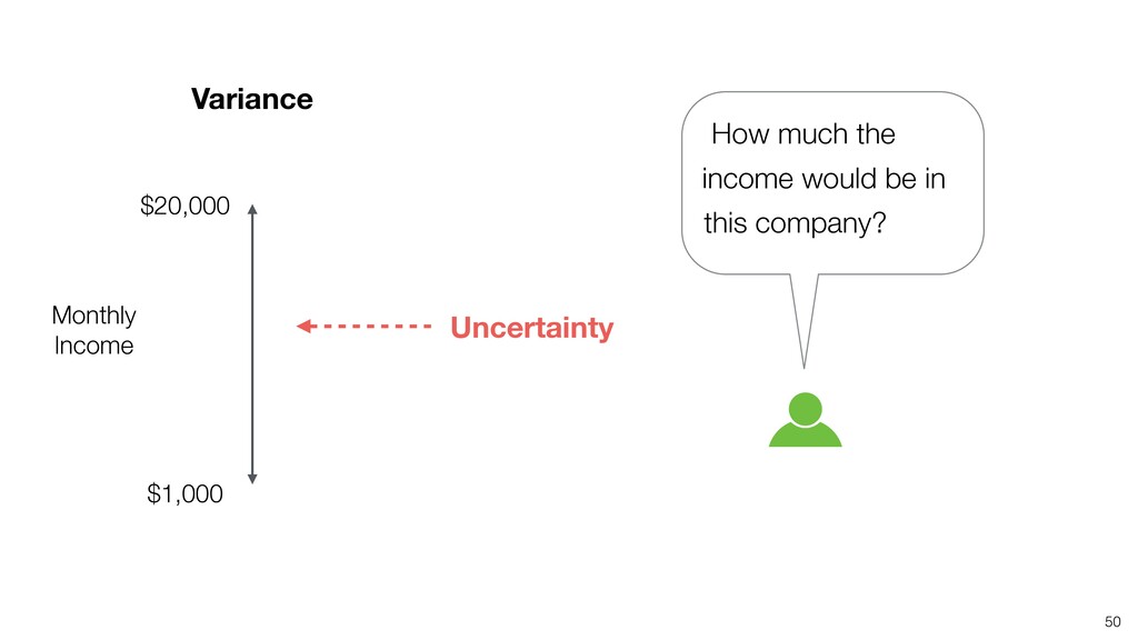
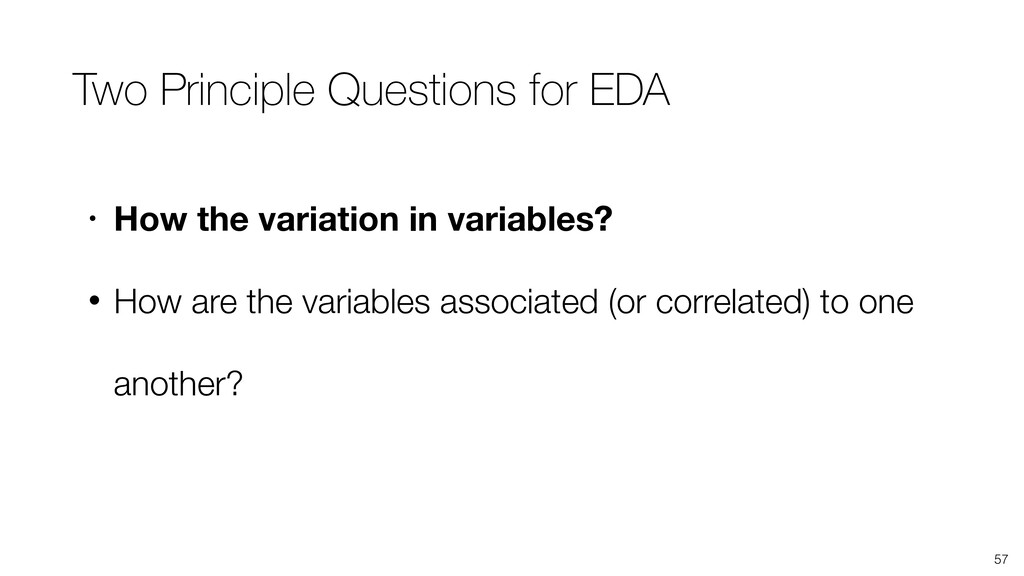
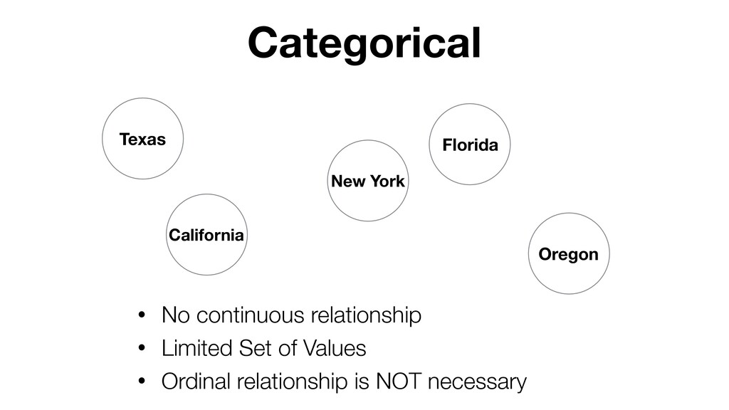
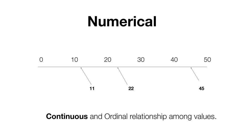
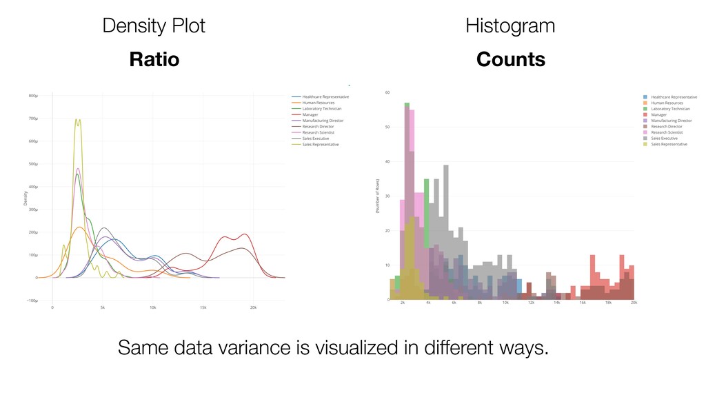
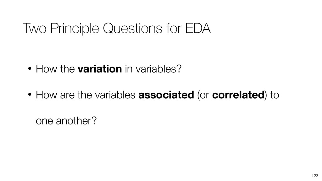
- What is Variation?
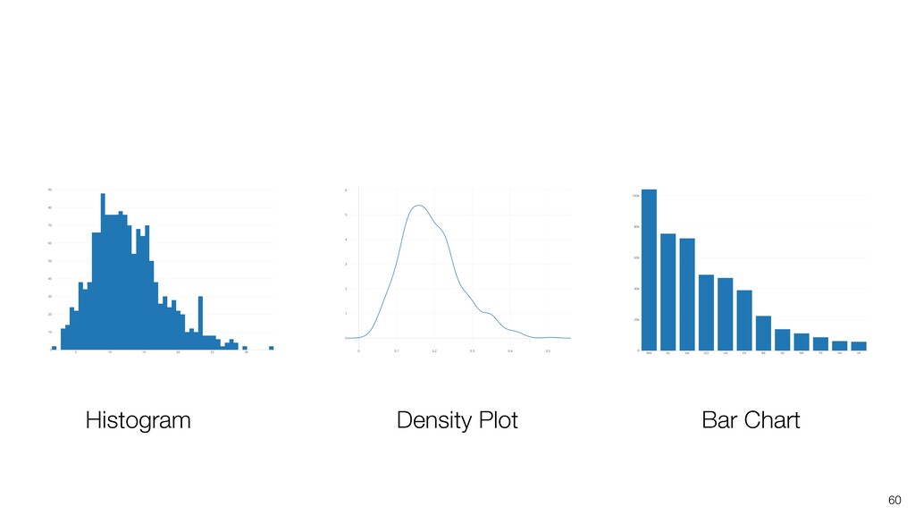
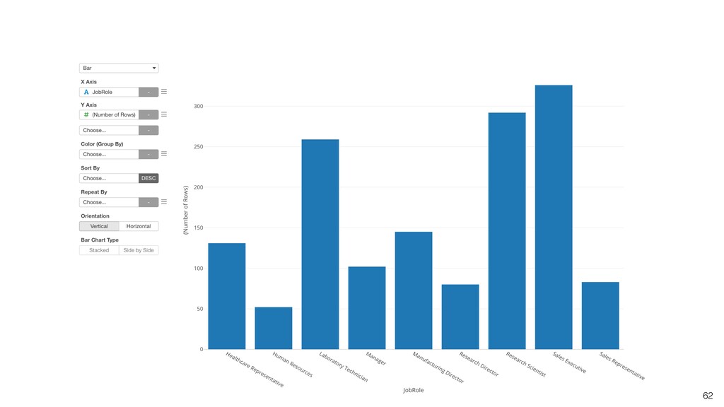
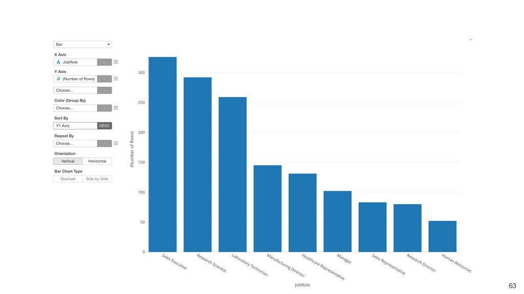
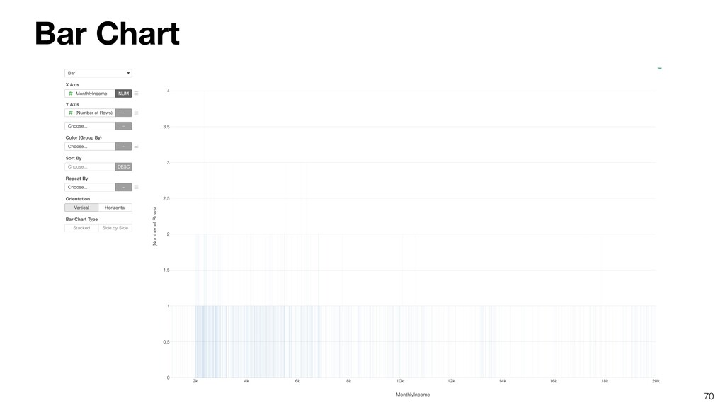
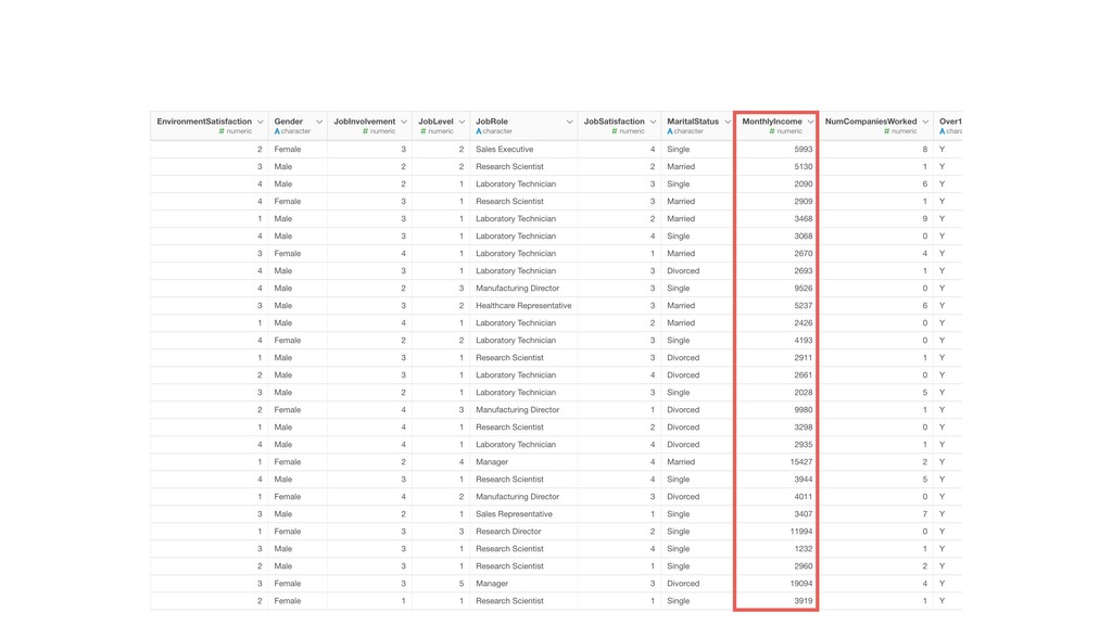
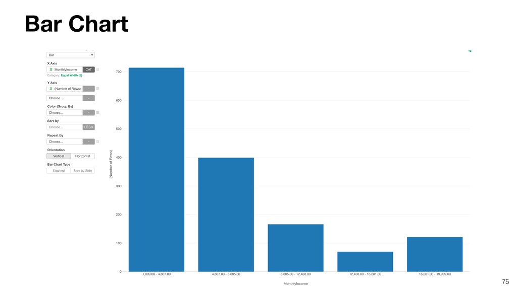
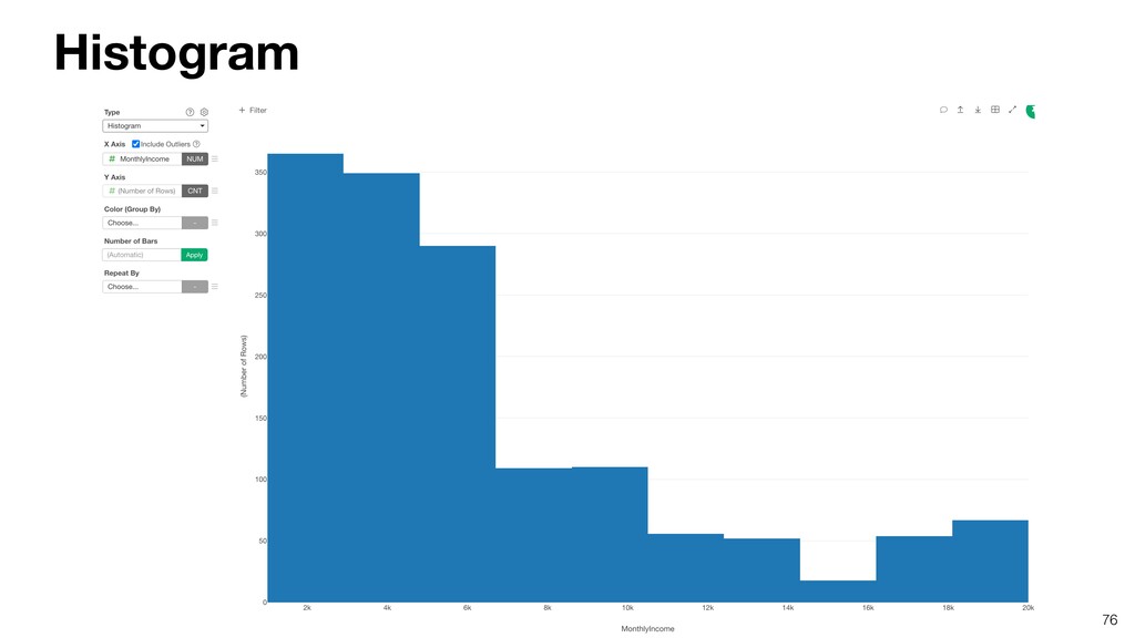
- Understanding Variation with Summary View
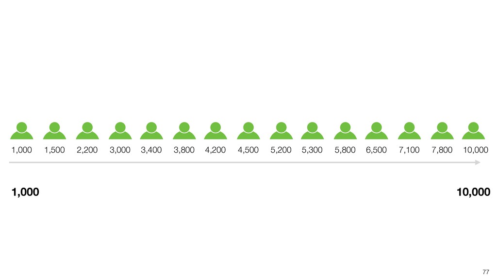
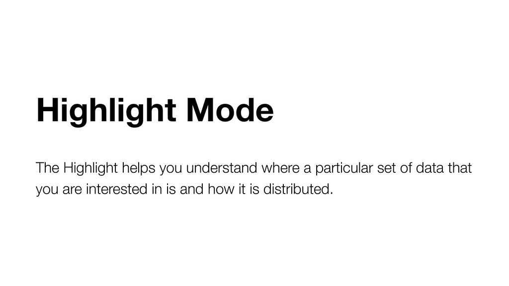
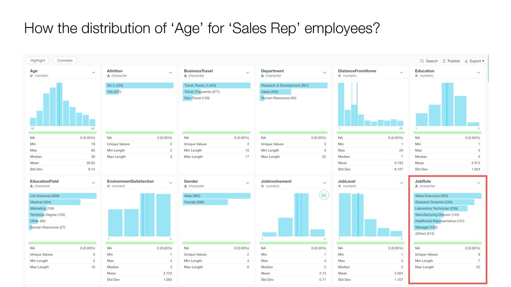
- Understanding Variation with Highlight Mode

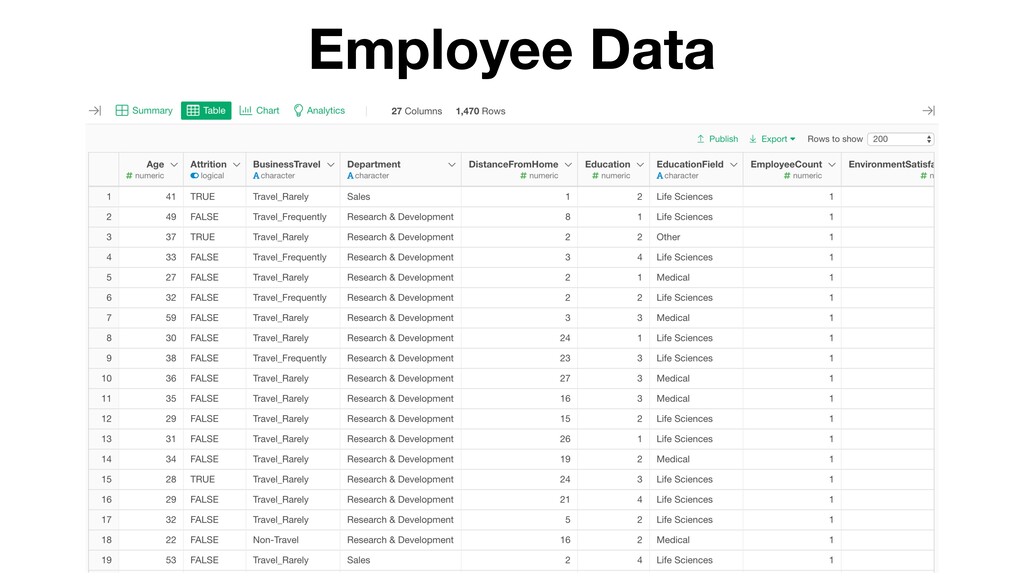
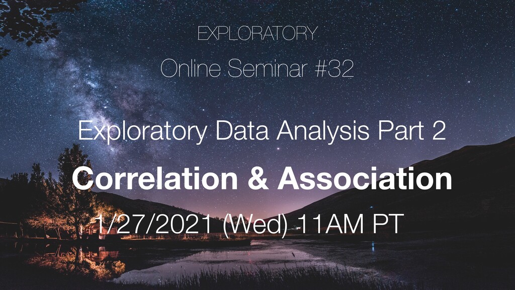
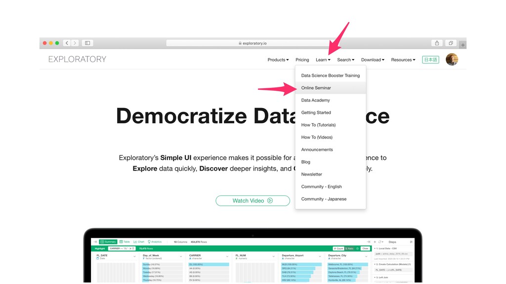
We'll use Exploratory (https://exploratory.io) to perform the demo.

Kan Nishida

January 20, 2021
Tweet

More Decks by Kan Nishida

Other Decks in Science

Transcript

  1. Kan Nishida CEO/co-founder Exploratory Summary In Spring 2016, launched Exploratory,

    Inc. to democratize Data Science. Prior to Exploratory, Kan was a director of product development at Oracle leading teams to build various Data Science products in areas including Machine Learning, BI, Data Visualization, Mobile Analytics, Big Data, etc. While at Oracle, Kan also provided training and consulting services to help organizations transform with data. @KanAugust Speaker
  2. 4 Data Science is not just for Engineers and Statisticians.

    Exploratory makes it possible for Everyone to do Data Science. The Third Wave
  3. First Wave Second Wave Third Wave Proprietary Open Source UI

    & Programming Programming 2016 2000 1976 Monetization Commoditization Democratization Statisticians Programmers Democratization of Data Science Algorithms Experience Tools Open Source UI & Automation Business Users Theme Users
  4. 6 Questions Communication Data Access Data Wrangling Visualization Analytics (Statistics

    / Machine Learning) Data Analysis Data Science Workflow
  5. 7 Questions Communication (Dashboard, Note, Slides) Data Access Data Wrangling

    Visualization Analytics (Statistics / Machine Learning) Data Analysis ExploratoryɹModern & Simple UI
  6. 10 - Wayne Gretzky “I skate to where the puck

    is going to be, not where it has been.”
  7. 11 Exploratory Data Analysis (EDA) is not just about the

    ‘playfulness’ that might come off from the name ‘Exploratory’. It is more about the method of rigorous and iterative analysis of the data at your hand.
  8. 16 Predict how many customers we will have. Prediction e.g.

    Customers will be 1000 by end of this year.
  9. 17 e.g. We want to grow Customers to 1000. What

    can we do to make that happen? Control
  10. 18 In order to control the future, you want to

    make decisions about • Provide Discount • Hire more Sales Reps. • Invest in Marketing / Advertising
  11. 19 Prediction Control Hypothesis What can we monitor to predict

    a particular outcome better? What causes a particular outcome?
  12. 20 Hypothesis If the weather will be warm, we will

    have more customers. If we offer 10% discount, we would have more customers. Prediction Control
  13. 21 Test Hypotheses by Experimenting and Collecting Data • Hypothesis

    Test • A/B Test Hypotheses Data Test Discount increases more customers
  14. 22 Test Hypotheses by Experimenting and Collecting Data • Hypothesis

    Test • A/B Test Hypotheses Data Test Discount increases more customers Confirmatory Analysis
  15. 26 John Tukey built the method and published a book

    called ‘Exploratory Data Analysis’ in 1970s.
  16. An exploratory and iterative process of asking many questions and

    find answers from data in order to build better hypothesis for Explanation, Prediction, and Control. 28 Exploratory Data Analysis (EDA)
  17. An exploratory and iterative process of asking many questions and

    find answers from data in order to build better hypothesis for Explanation, Prediction, and Control. 29 Exploratory Data Analysis (EDA)
  18. An exploratory and iterative process of asking many questions and

    find answers from data in order to build better hypothesis for Prediction and Control. 33 Exploratory Data Analysis (EDA)
  19. 34 Far better an approximate answer to the right question,

    which is often vague, than an exact answer to the wrong question, which can always be made precise. — John Tukey
  20. 35 • How the variation in variables? • How are

    the variables associated (or correlated) to one another? Two Principle Questions for EDA
  21. 40 Variance is a good starting point for building hypothesis

    of association or causal relationship. If there is variance, we can ask “What makes the variance?” and start investigating further. ʁ Income
  22. 41 A relationship where changes in one variable happen together

    with changes in another variable with a certain rule. Association and Correlation
  23. 42 Association Correlation Any type of relationship between two variables.

    A certain type of (usually linear) association between two variables
  24. 43 US UK Japan 5000 2500 Monthly Income variances are

    different among countries. Country Monthly Income 0 Association
  25. 44 Age Monthly Income The bigger the Age is, the

    bigger the Monthly Income is. Correlation
  26. 49 How much the income would be in this company?

    $20,000 $1,000 Monthly Income Variance
  27. 51 0 30 20 If we can find a correlation

    between Monthly Income and Working Years… 10 $20,000 $1,000 Working Years Monthly Income
  28. 52 0 30 20 10 $20,000 $1,000 Working Years If

    Working Years is 20 years, Monthly Income would be around $15,000. $15,000 Monthly Income
  29. 53 0 30 20 Working Years Correlation Variance $20,000 $1,000

    $15,000 Correlation reduces Uncertainty caused by Variance. Monthly Income $20,000 $1,000
  30. 55 ʁ Income If we can find strong correlations, it

    makes it easier to explain how Monthly Income changes and to predict what Monthly Income will be.
  31. Correlation is not equal to Causation. Causation is a special

    type of Correlation. If we can confirm a given Correlation is Causation, then we can control the outcome. Warning!
  32. 57 • How the variation in variables? • How are

    the variables associated (or correlated) to one another? Two Principle Questions for EDA
  33. “Since the aim of exploratory data analysis is to learn

    what seems to be, it should be no surprise that pictures play a vital role in doing it well. There is nothing better for making you think of questions you had forgotten to ask (even mentally),” - John Tukey
  34. 62

  35. 63

  36. 65

  37. Categorical California Texas New York Florida Oregon • No continuous

    relationship • Limited Set of Values • Ordinal relationship is NOT necessary
  38. Numerical 0 10 20 30 40 50 11 22 45

    Continuous and Ordinal relationship among values.
  39. 1,000 1,500 3,000 6,500 7,100 2,200 3,800 4,500 5,300 3,400

    4,200 5,200 5,800 10,000 7,800 77 1,000 10,000
  40. Salary 0 - 2,000 2,001 - 4,000 4,001 - 6,000

    6,001 - 8,000 8,001 - 10,000 Number of Rows 78
  41. 79 0 - 2,000 2,001 - 4,000 4,001 - 6,000

    6,001 - 8,000 8,001 - 10,000 Divide into a set number of buckets and show how many rows (or employees) in each bucket as the height. Salary Number of Rows
  42. 81

  43. 89 Manager’s Monthly Income range seems to be higher while

    Sales Rep & Research Scientist are lower.
  44. 92 Density Plot • Draws a smooth curve to visualize

    the distribution of data. • The height shows an estimated data density of any given point.
  45. Each dot represent each employee and they are located based

    on the Monthly Income values. 0 5,000 10,000 93 Monthly Income
  46. Assuming that the data varies, let’s draw a normal distribution

    around each data point (employee). 0 څྉ 5,000 10,000 94
  47. 98 The size under each curve is 1. And it

    shows the ratio of data at any given area of each curve.
  48. 101

  49. ‘Age’ is ranging from 18 to 60, and there are

    many employees in the range of 26 to 40 years old by looking at the height of bars of the histogram chart.
  50. ‘Attrition’ column shows that there are 237 employees who have

    already quit and that is about 16% of all employees in this data.
  51. ‘Job’ column shows that there are 9 job roles and

    ‘Sales Executive’ has the most employees of 326.
  52. Highlight Mode The Highlight helps you understand where a particular

    set of data that you are interested in is and how it is distributed.
  53. The light blue portion in each bar shows the data

    distribution for ‘Sales Rep’. Looks many of them are in the younger age buckets by looking at the first column ‘Age’.
  54. By looking at the metrics, we can see that the

    average (mean) age of the Sales Rep is 30 years old and it ranges from 18 to 53.
  55. When we look at the Department column we can see

    that they are all in ‘Sales’ department.
  56. But, only 18.61% of the people in the Sales department

    are the Sales Rep. There must be other job roles in the Sales department.
  57. The Attrition column shows that 33 Sales reps. have left

    the company and 50 Sales rep. are still with the company.
  58. There doesn’t seem to have much difference between TRUE and

    FALSE in terms of the number of Sales Representatives. But given that there are much less TRUE employees than FALSE employees in general, the Sales Rep people might have a larger percentage of all employees.
  59. Out of all emloyees who have left the company, 13.92%

    of them are Sales Rep. That’s a high percentage!
  60. Those who make greater than $5,000 are in higher Age,

    False in Attrition, higher Education, Sales in Department, higher Job Level.
  61. With the Summary View and its Highlight Mode, we can

    quickly understand how the variance of each variable is.
  62. 123 • How the variation in variables? • How are

    the variables associated (or correlated) to one another? Two Principle Questions for EDA
  63. In the next session, we are going to explore on

    how to investigate and understand the relationship - Correlation and Association - between the variables.