Upgrade to Pro — share decks privately, control downloads, hide ads and more …

Seminar #50 - Salesforce Data, Clean, Visualize, Analyze, & Dashboard

Seminar #50 - Salesforce Data, Clean, Visualize, Analyze, & Dashboard

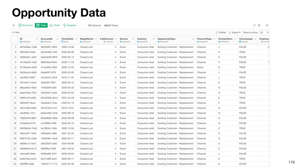
You can access Salesforce data directly inside Exploratory with the latest release (v6.6). In this seminar, Kan will demonstrate how you can access the data and introduce some of the data visualization and analysis methods to maximize the value of your Salesforce data.

- Access and Query Data
- Transform and Visualize Data
- Create Dashboard
- Forecast Leads with Prophet
- Predict for Customer Win
- Use Parameters to Interact

Subscribe ↓
https://www.youtube.com/channel/UCOVfLaSQBvMRwZCyiccq4Iw

Twitter ↓
https://twitter.com/ExploratoryData

UI Tool: Exploratory(https://exploratory.io/)
Exploratory Online Seminar: https://exploratory.io/online-seminar

Kan Nishida
PRO

June 30, 2021
Tweet

More Decks by Kan Nishida

Other Decks in Technology

Transcript

  1. EXPLORATORY
    Online Seminar #50
    X
    Get, Clean, Visualize, and Analyze Salesforce Data with Exploratory

    View Slide

  2. Kan Nishida
    CEO/co-founder
    Exploratory
    Summary
    In Spring 2016, launched Exploratory, Inc. to democratize
    Data Science.
    Prior to Exploratory, Kan was a director of product
    development at Oracle leading teams to build various Data
    Science products in areas including Machine Learning, BI,
    Data Visualization, Mobile Analytics, Big Data, etc.
    While at Oracle, Kan also provided training and consulting
    services to help organizations transform with data.
    @KanAugust
    Speaker

    View Slide

  3. 3
    Questions Communication
    Data Access
    Data Wrangling
    Visualization
    Analytics
    (Statistics / Machine
    Learning)
    Data Science Workflow

    View Slide

  4. 4
    Questions Communication
    (Dashboard, Note, Slides)
    Data Access
    Data Wrangling
    Visualization
    Analytics
    (Statistics / Machine
    Learning)
    ExploratoryɹModern & Simple UI

    View Slide

  5. EXPLORATORY
    Online Seminar #50
    X
    Get, Clean, Visualize, and Analyze Salesforce Data with Exploratory

    View Slide

  6. Agenda
    • Get Data
    • Clean and Transform Data
    • Visualize Data
    • Create, Publish, Share, and Schedule Dashboard
    • Parameterize Dashboard
    • Forecast Leads
    • Predict Win
    6

    View Slide

  7. Agenda
    • Get Data
    • Clean and Transform Data
    • Visualize Data
    • Create, Publish, Share, and Schedule Dashboard
    • Parameterize Dashboard
    • Forecast Leads
    • Predict Win
    7

    View Slide

  8. Supported Salesforce Editions
    8
    • Professional
    • Enterprise
    • Unlimited
    • Performance
    • Developer

    View Slide

  9. UI SQL
    2 Modes

    View Slide

  10. UI SQL
    2 Modes

    View Slide

  11. View Slide

  12. View Slide

  13. 13
    Select a table you want to import data for.

    View Slide

  14. 14
    Select columns.

    View Slide

  15. Use Filter to limit the data.
    15

    View Slide

  16. Once the data is imported, it automatically generates the Summary view.
    16

    View Slide

  17. UI SQL
    2 Modes

    View Slide

  18. SQL (SOQL)

    View Slide

  19. You can write SQL (SOQL) Queries to get data from Salesforce.

    View Slide

  20. Agenda
    • Get Data
    • Clean and Transform Data
    • Visualize Data
    • Create, Publish, Share, and Schedule Dashboard
    • Parameterize Dashboard
    • Forecast Leads
    • Predict Win
    20

    View Slide

  21. Clean and Transform data from the column header menu.

    View Slide

  22. You can update any of the existing data wrangling steps.
    22

    View Slide

  23. Click ‘Re-import’ button to get the latest data from Salesforce.
    23

    View Slide

  24. All the data wrangling steps will be automatically applied.
    24

    View Slide

  25. Agenda
    • Get Data
    • Clean and Transform Data
    • Visualize Data
    • Create, Publish, Share, and Schedule Dashboard
    • Parameterize Dashboard
    • Forecast Leads
    • Predict Win
    25

    View Slide

  26. Click the chart icon to quickly create a chart.
    26

    View Slide

  27. 27
    It will create a new chart under the Chart view.

    View Slide

  28. 28
    You can customize the chart by updating the column assignments and the chart
    configuration.

    View Slide

  29. But, here is one thing…

    View Slide

  30. 30
    The stage names are sorted alphabetically…

    View Slide

  31. It’s better to sort them following the natural order of the stages.
    31

    View Slide

  32. Prospecting
    Conversion
    Hearing
    32
    Proposal
    This order is confusing…
    Stages for Opportunity

    View Slide

  33. Prospecting Conversion
    Hearing
    33
    Proposal
    This is intuitive!
    Stages for Opportunity

    View Slide

  34. 1 3 4
    34
    Factor - Ordered Categories
    2
    Prospecting Conversion
    Hearing Proposal

    View Slide

  35. Stage
    Hearing
    Conversion
    Proposal
    Prospecting
    Character (Categorical)
    35
    Stage Level
    Prospecting 1
    Hearing 2
    Proposal 3
    Conversion 4
    Factor (Ordinal)

    View Slide

  36. 36

    View Slide

  37. 37

    View Slide

  38. A new data wrangling step is added to the Step pane.
    38

    View Slide

  39. 39
    The values are sorted following the level setting for the Factor data type columns.

    View Slide

  40. Open the chart and move the Pin to the latest step.
    40

    View Slide

  41. Currently, the stages are ordered from the bottom to the top.
    41

    View Slide

  42. You can change the direction of the order.
    42

    View Slide

  43. Agenda
    • Get Data
    • Clean and Transform Data
    • Visualize Data
    • Create, Publish, Share, and Schedule Dashboard
    • Parameterize Dashboard
    • Forecast Leads
    • Predict Win
    43

    View Slide

  44. 44
    Here’s a typical Dashboard in Exploratory.

    View Slide

  45. 45
    Numbers
    Analytics - Forecasting Analytics - Cohort Analysis
    Map Chart
    You can bring in various types of numbers and charts.

    View Slide

  46. 46
    You can bring in various types of data.

    View Slide

  47. 47
    And…

    View Slide

  48. Since you can create charts with different steps of Data Wrangling…

    View Slide

  49. 49
    You can bring in charts that are based on different steps.

    View Slide

  50. 50
    Create a new Dashboard.

    View Slide

  51. 51
    Add an existing chart.

    View Slide

  52. 52

    View Slide

  53. 53
    Adjust the height of each row section by drag-and-drop.

    View Slide

  54. 54
    Adjust the width of each column section by drag-and-drop.

    View Slide

  55. 55
    Click ‘Run’ button to preview the output.

    View Slide

  56. 56
    By clicking the ‘Re-Import Data’ button, you can query the latest data from Salesforce
    and apply all the data wrangling steps that are required to generate the charts.

    View Slide

  57. Publish the Dashboard to:
    1. Share
    2. Interact
    3. Schedule
    57

    View Slide

  58. Publish the Dashboard either in Private or Public mode.

    View Slide

  59. 59
    Once it’s published the Dashboard will have its own unique URL.

    View Slide

  60. 60
    Open the Dashboard in a web browser.

    View Slide

  61. 61
    You can invite specific people to share your Dashboard securely.

    View Slide

  62. 62
    Type their email addresses and write an inviting message.

    View Slide

  63. 63
    They will receive an email like the below.

    View Slide

  64. 64
    If they don’t have Exploratory accounts yet they can sign up for free ‘Viewer’
    accounts.

    View Slide

  65. Schedule your Dashboard so that the data inside the Dashboard is kept up-to-date
    automatically.
    65

    View Slide

  66. You can subscribe a notification email every time the scheduling job is run.
    66

    View Slide

  67. 67
    Other invited members can also subscribe the notification emails.

    View Slide

  68. You will receive notification emails with thumbnail images.
    68
    is updated.
    is updated.

    View Slide

  69. 69
    Dashboard
    Dashboard
    Exploratory Desktop
    Exploratory Server
    Publish
    OAuth
    OAuth
    How the scheduling works.

    View Slide

  70. 70
    Take a look at the past seminar for more details on the lifecycle of Dashboard!

    View Slide

  71. Select ‘How To (Tutorials)’.
    71

    View Slide

  72. Click on ‘Dashboard’.
    72

    View Slide

  73. Click on ‘Dashboard’.
    73

    View Slide

  74. Agenda
    • Get Data
    • Clean and Transform Data
    • Visualize Data
    • Create, Publish, Share, and Schedule Dashboard
    • Parameterize Dashboard
    • Forecast Leads
    • Predict Win
    74

    View Slide

  75. 75
    Me
    Team Mates
    I want data for
    Europe.
    I want data for
    Africa.
    I want data for
    Asia.
    Exploratory Server
    Everybody has a different interest.
    Publish

    View Slide

  76. 76
    By parameterizing the Dashboard, you can let them choose which part of the
    data they want to see.

    View Slide

  77. • Data Source Filter
    • Step Filter
    • Chart Filter
    3 Type of Filters

    View Slide

  78. You can create Filters in the data import dialog so that you can limit the
    data you query from Salesforce.
    78

    View Slide

  79. 79
    You can parameterize this Filter!

    View Slide

  80. 80
    You can create Filters on top of the imported data as data wrangling steps.

    View Slide

  81. 81
    You can parameterize the Step Filter as well!

    View Slide

  82. You can create Filters inside the Chart. This Chart Filter works only for the
    particular chart.
    82

    View Slide

  83. 83
    And, you can parameterize the Chart Filter as well!

    View Slide

  84. 84
    Click the Parameter button.

    View Slide

  85. 85
    All the parameters that are required to generate the chart data will automatically show
    up in the pane.

    View Slide

  86. For the Dashboard, all the parameters that are required to generate data for all the
    charts inside the Dashboard are automatically added to the Parameter pane.
    86

    View Slide

  87. For the published Dashboard, you can open the Parameter pane and turn
    on the interactive mode to start using the parameters.
    87

    View Slide

  88. A bit more details on how the Parameter works.

    View Slide

  89. 89
    1. Data Source
    2. Create Calculation
    3. Filter
    Created data wrangling steps and charts.
    Chart 2
    Chart 1

    View Slide

  90. 90
    Closed Date
    1. Data Source
    2. Create Calculation
    3. Filter
    Created Filters.
    Probability
    Type
    Chart 2
    Chart 1

    View Slide

  91. 91
    Closed Date
    1. Data Source
    2. Create Calculation
    3. Filter
    Created Dashboard with Chart 2.
    Dashboard 1 Probability
    Type
    Chart 2
    Chart 1

    View Slide

  92. 92
    Closed Date
    1. Data Source
    2. Create Calculation
    3. Filter
    Dashboard 1 Probability
    When you open the Parameter pane you will see‘Closed Date’ and
    ‘Probability’ parameters automatically.

    View Slide

  93. 93
    Closed Date
    1. Data Source
    2. Create Calculation
    3. Filter
    Now, we added Chart 1 to the Dashboard.
    Dashboard 1
    Probability
    Type

    View Slide

  94. Dashboard 1
    Type
    94
    Closed Date
    1. Data Source
    2. Create Calculation
    3. Filter
    When you open the Parameter pane, the ‘Stage’ parameter is automatically
    added.
    Probability

    View Slide

  95. Dashboard 1
    Type
    95
    Closed Date
    1. Data Source
    2. Create Calculation
    3. Filter
    Probability
    If we change the Probability parameter only the Chart 2 gets updated.

    View Slide

  96. Dashboard 1
    Type
    96
    Closed Date
    1. Data Source
    2. Create Calculation
    3. Filter
    Probability
    If we change the Stage parameter only the Chart 1 gets updated.

    View Slide

  97. Dashboard 1
    Type
    97
    Closed Date
    1. Data Source
    2. Create Calculation
    Probability
    If we change the Closed Date parameter all the
    steps and the charts will be updated.
    3. Filter

    View Slide

  98. You can also parameterize the SQL queries.

    View Slide

  99. 99

    View Slide

  100. 100

    View Slide

  101. 101

    View Slide

  102. 102

    View Slide

  103. Agenda
    • Get Data
    • Clean and Transform Data
    • Visualize Data
    • Create, Publish, Share, and Schedule Dashboard
    • Parameterize Dashboard
    • Forecast Leads
    • Predict Win
    103

    View Slide

  104. 104
    Can we forecast how the number of leads
    will look like in the next 12 months?

    View Slide

  105. 105
    Want to forecast the number of leads in the next 12 months.
    Actual Forecasted

    View Slide

  106. • Time interval between data has to be same throughout the data
    • Day with NA is not allowed
    • Seasonality with multiple periods (Week and Year) is hard to handle
    • Parameter tuning is hard and requires a forecasting expert level
    knowledge.
    Problems with Traditional Time Series Model

    View Slide

  107. • A ‘curve fitting’ algorithm to build time series
    forcasting models.
    • Designed for ease of use without expert
    knowledge on time series forecasting or
    statistics.
    • Built by Data Scientists (Sean J. Taylor & co.) at
    Facebook and open sourced. (https://
    facebook.github.io/prophet)
    Prophet
    Sean J. Taylor
    @seanjtaylor

    View Slide

  108. Build a model by finding a best smooth line which can be represented as
    sum of the following components.
    • Overall growth trend
    • Seasonality - Yearly, Weekly, Daily, etc.
    • Holiday effects - X’mas, New Year, July 4th, etc.
    • External Predictors
    Prophet - Additive Model

    View Slide

  109. 109
    Lead Data

    View Slide

  110. 110

    View Slide

  111. 111

    View Slide

  112. 112

    View Slide

  113. Agenda
    • Get Data
    • Clean and Transform Data
    • Visualize Data
    • Create, Publish, Share, and Schedule Dashboard
    • Parameterize Dashboard
    • Forecast Leads
    • Predict Win
    113

    View Slide

  114. 114
    Can we predict which opportunities we can win?

    View Slide

  115. 115
    Algorithm Model
    Build a Prediction Model.
    Conversion Age Time Country Industry
    TRUE 60 120 Japan Ad
    FALSE 45 55 US Medical
    FALSE 52 20 US Media
    TRUE 48 140 Japan Ad
    TRUE 53 80 UK Bank
    FALSE 35 30 Japan Media

    View Slide

  116. 116
    Predict
    Conversion Age Time Country Industry
    TRUE 25 120 Japan Ad
    FALSE 23 55 US Media
    FALSE 40 150 US Ad
    Conversion Age Time Country Industry
    ? 25 120 Japan Ad
    ? 23 55 US Media
    ? 40 150 US Ad
    Algorithm Model
    Conversion Age Time Country Industry
    TRUE 60 120 Japan Ad
    FALSE 45 55 US Medical
    FALSE 52 20 US Media
    TRUE 48 140 Japan Ad
    TRUE 53 80 UK Bank
    FALSE 35 30 Japan Media

    View Slide

  117. 117
    A model is a definition of a pattern the algorithm
    has captured in the data.
    Algorithm Model
    Conversion Age Time Country Industry
    TRUE 60 120 Japan Ad
    FALSE 45 55 US Medical
    FALSE 52 20 US Media
    TRUE 48 140 Japan Ad
    TRUE 53 80 UK Bank
    FALSE 35 30 Japan Media

    View Slide

  118. 118
    Not just for the prediction, we can also use it to learn a lot
    about the patterns in data.
    Insight
    • Which variables have stronger relationship with the target variable.
    • How are they related?
    • Are they significant?
    • What is the quality if we used this model to predict?
    Algorithm Model

    View Slide

  119. 119
    Opportunity Data

    View Slide

  120. 120
    The StageName column indicates whether we have won a given opportunity or not.

    View Slide

  121. 121
    What are the characteristics of these ‘Won’ opportunities?

    View Slide

  122. In order to use the Correlation Mode and build a prediction model, we need to
    convert the StageName variable to Logical (True / False) data type.
    122

    View Slide

  123. Create a calculation that returns TRUE if a given value is ‘Closed Won’.
    123

    View Slide

  124. 124

    View Slide

  125. 125
    11.7% of the existing opportunities are ‘Closed Win’.

    View Slide

  126. 126
    Click ‘Correlate’ button to open the Correlation mode.

    View Slide

  127. Select ‘Is_Won’ variable as the target variable.

    View Slide

  128. It shows the relationship between the Is_Win and all other variables with the
    charts along with metrics.

    View Slide

  129. Sort the columns based on the AUC values, which indicate the strength of
    the relationship.
    129

    View Slide

  130. The ‘CallAmount’ has a strong relationship with the ‘Is_Won’.
    130

    View Slide

  131. We want to build a prediction model, but which one?

    View Slide

  132. Numeric TRUE/FALSE TRUE/FALSE + Time
    Linear
    Regression
    Random Forest
    / XGBoost
    Statistical
    Learning
    Machine
    Learning
    Logistic
    Regression
    Cox
    Regression
    Survival Forest
    132
    Regression
    Model
    Classification
    Model
    Survival Model
    Data Type
    Statistical
    Learning
    Machine
    Learning
    Statistical
    Learning
    Machine
    Learning
    Random Forest
    / XGBoost

    View Slide

  133. Let’s try with Logistic Regression model.

    View Slide

  134. Select multiple variables and select one of the prediction model algorithms.
    134

    View Slide

  135. 135
    A logistic regression model is created to predict the probability of winning.

    View Slide

  136. Under the ‘Prediction’ tab, you can see how the probability of winning
    changes as the values in a given variable change.
    136

    View Slide

  137. 137
    Under the Importance tab, you can see which variables are more important to
    predict the probability of winning.

    View Slide

  138. 138
    Under the Summary tab, you can see the quality of the prediction model.

    View Slide

  139. 139
    Under the Data tab, you can see the predicted result for all the existing accounts.

    View Slide

  140. 140
    This prediction result is for the existing data for which we know the answer already.

    View Slide

  141. But, we want to predict the probability of winning for the
    future opportunities, not the past opportunities.

    View Slide

  142. You can predict for the future opportunities by using the
    model we have just created.

    View Slide

  143. 143
    Import a new opportunity data.

    View Slide

  144. 144

    View Slide

  145. 145
    Select the model we have just created under the Analytics view.

    View Slide

  146. 146
    A set of new columns is added as the prediction values.

    View Slide

  147. That’s it for today!

    View Slide

  148. Next Seminar

    View Slide

  149. EXPLORATORY
    Online Seminar #52
    7/7/2021 (Wed) 11AM PT
    Machine Learning -
    Variable Importance

    View Slide

  150. View Slide

  151. Information
    Email
    [email protected]
    Website
    https://exploratory.io
    Twitter
    @ExploratoryData
    Seminar
    https://exploratory.io/online-seminar

    View Slide

  152. Q & A
    152

    View Slide

  153. EXPLORATORY
    153

    View Slide