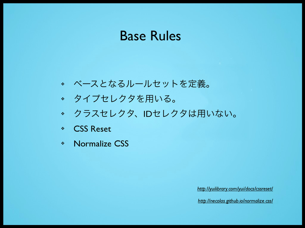
not simple to use or maintain.” ʮCSS୯७Ͱཧղ͍͕͢͠ɺͬͨΓϝϯς ͨ͠Γ͢ΔͷγϯϓϧͰͳ͍ɻʯ http://chriseppstein.github.io/blog/2009/09/20/why-stylesheet-abstraction-matters/ -Chris Eppstein
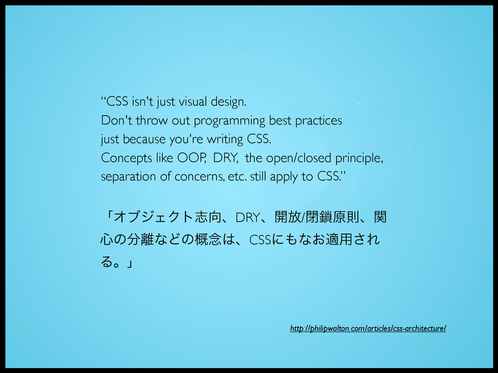
practices just because you're writing CSS. Concepts like OOP, DRY, the open/closed principle, separation of concerns, etc. still apply to CSS.” ʮΦϒδΣΫτࢤɺDRYɺ։์/ดݪଇɺؔ ৺ͷͳͲͷ֓೦ɺCSSʹͳ͓ద༻͞Ε Δɻʯ http://philipwalton.com/articles/css-architecture/
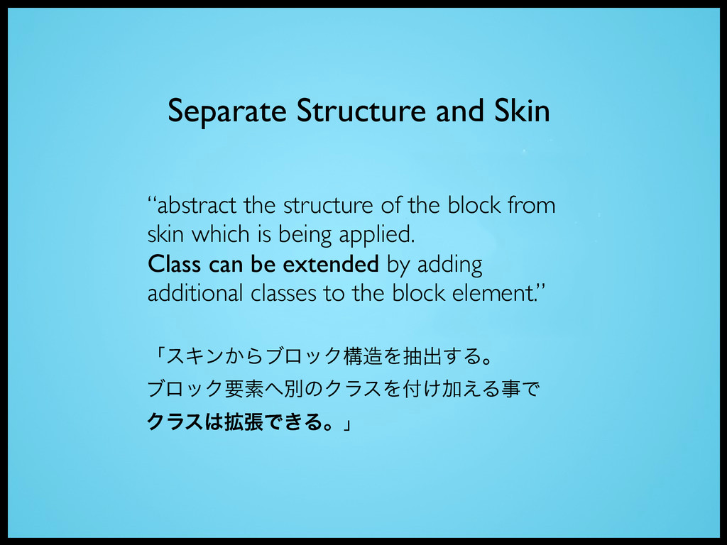
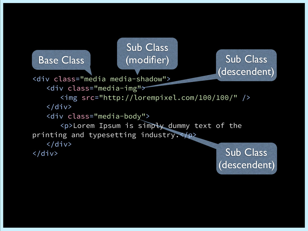
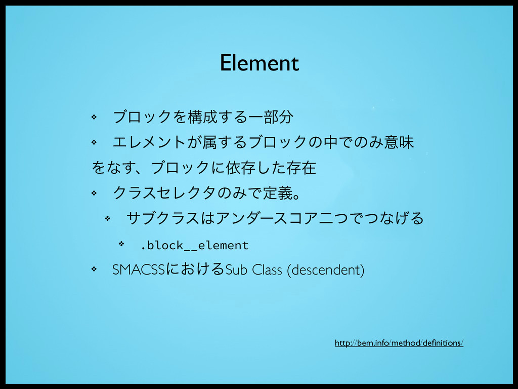
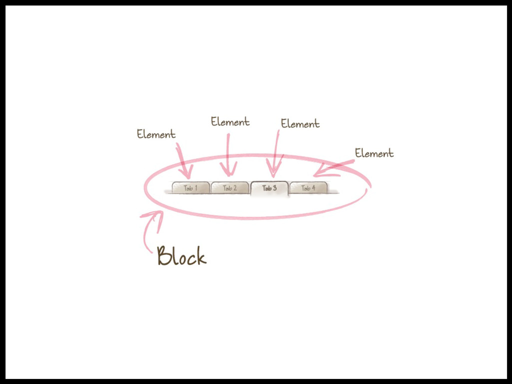
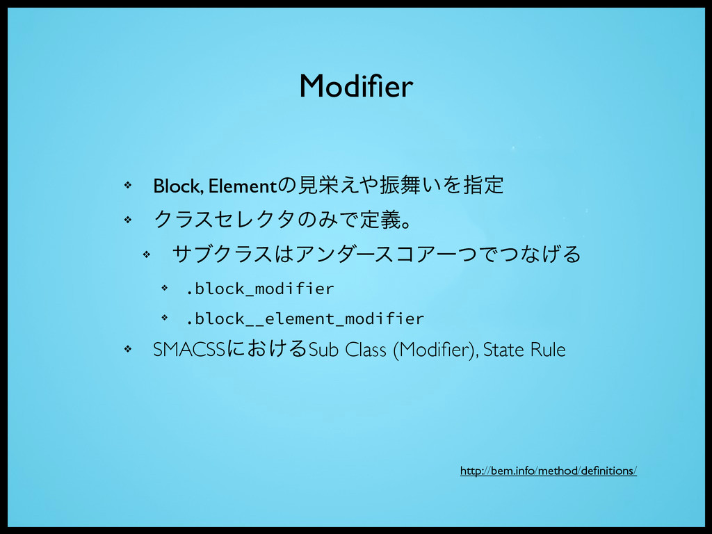
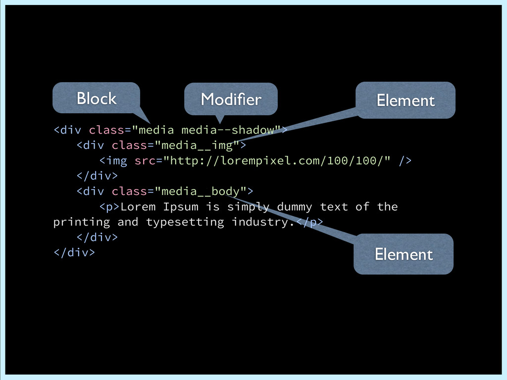
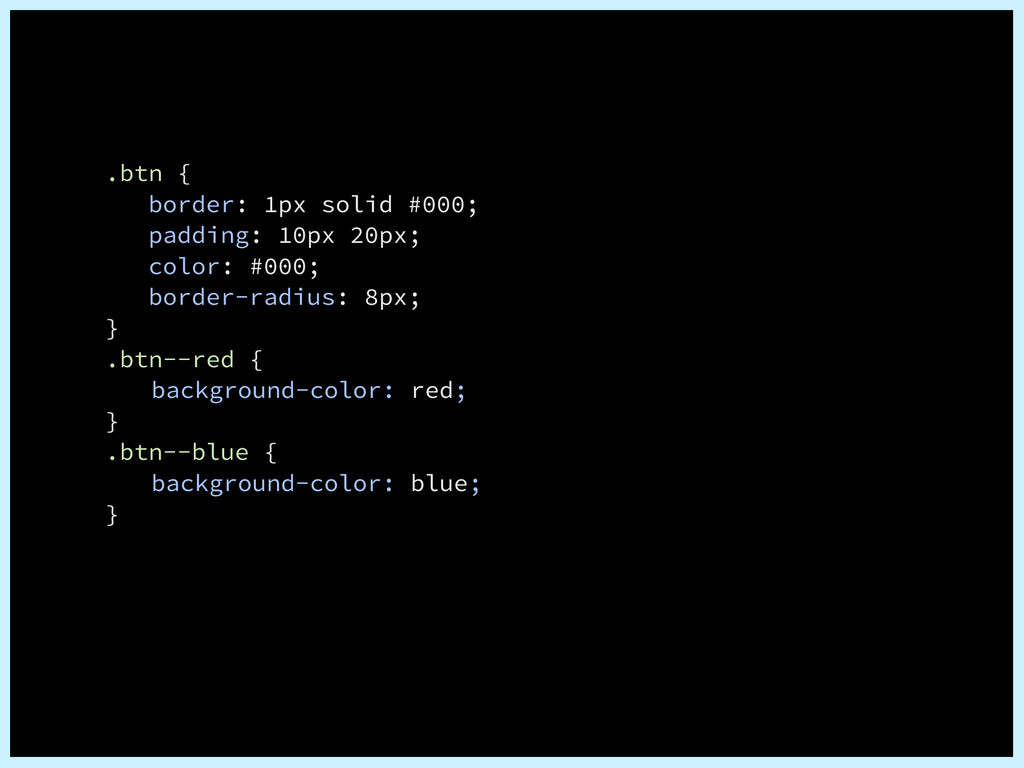
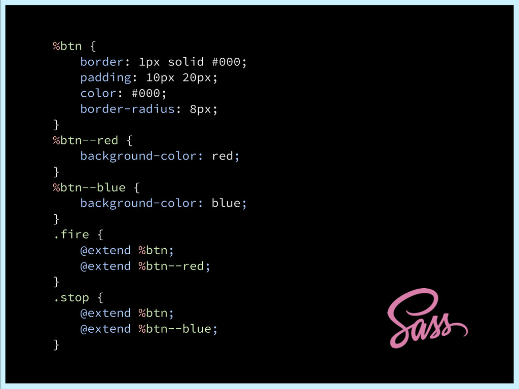
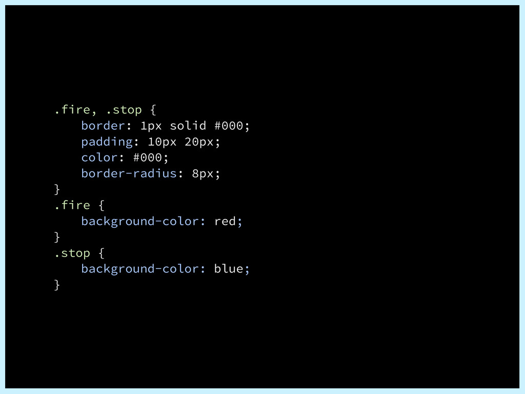
being applied. Class can be extended by adding additional classes to the block element.” ʮεΩϯ͔ΒϒϩοΫߏΛநग़͢Δɻ ϒϩοΫཁૉผͷΫϥεΛ͚Ճ͑ΔࣄͰ Ϋϥε֦ுͰ͖Δɻʯ Separate Structure and Skin
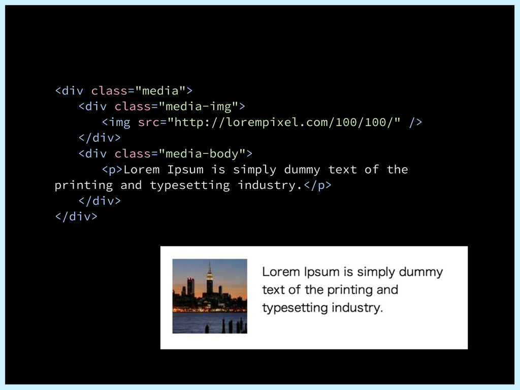
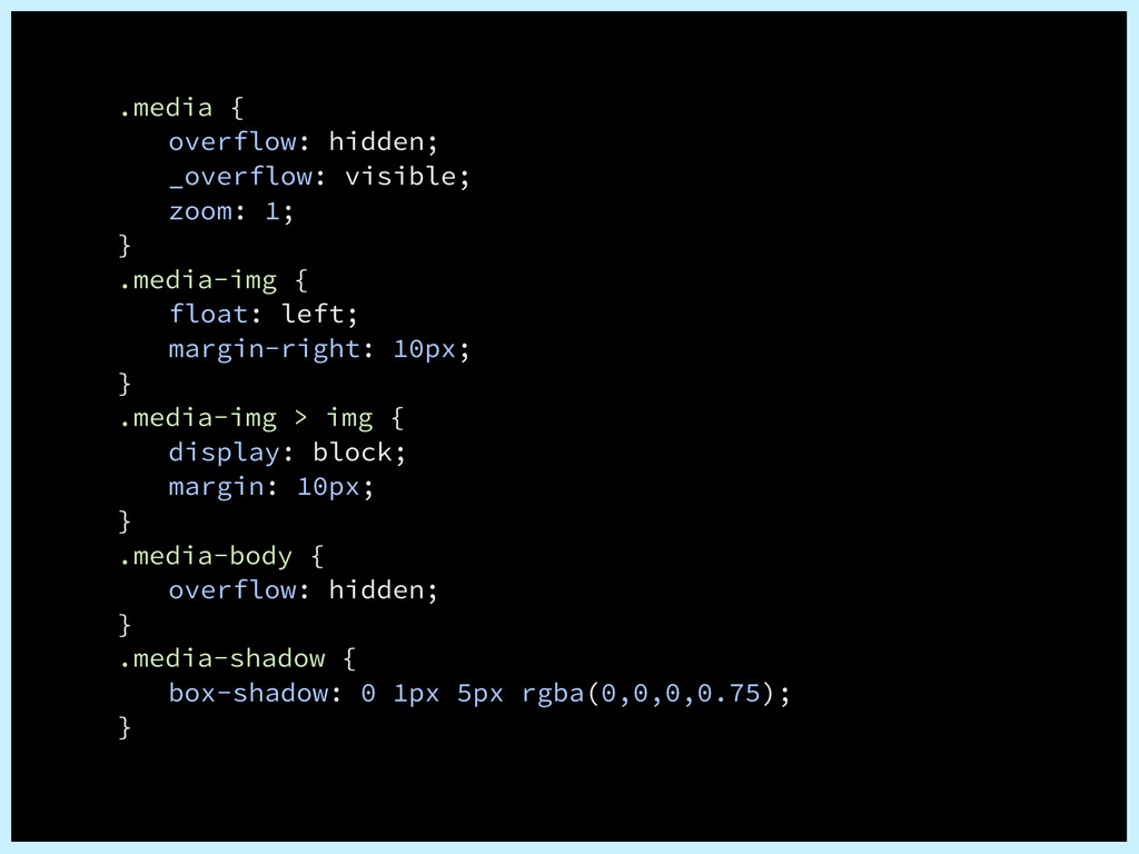
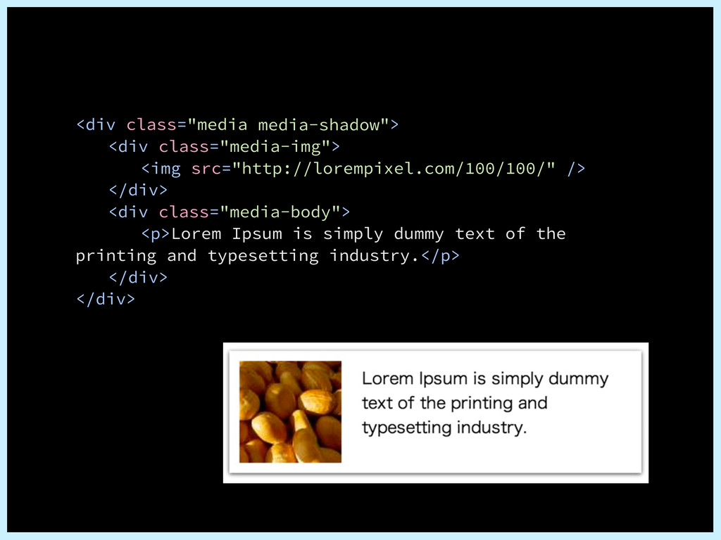
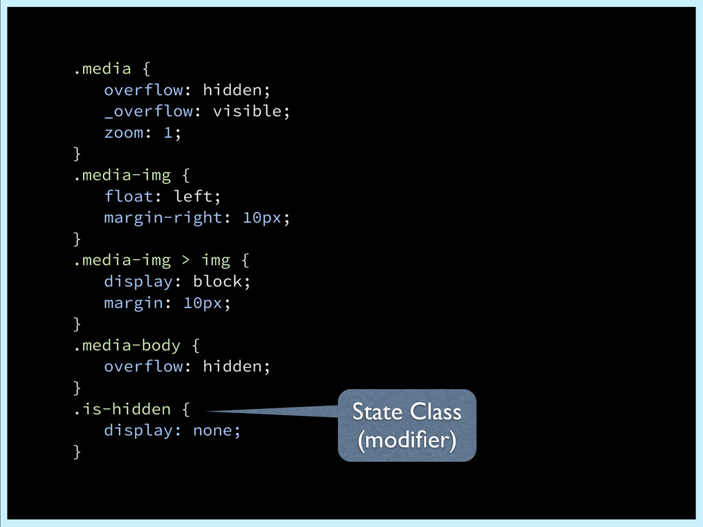
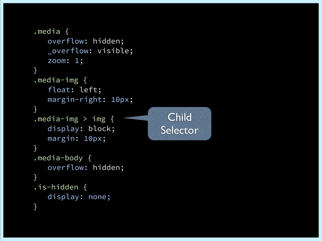
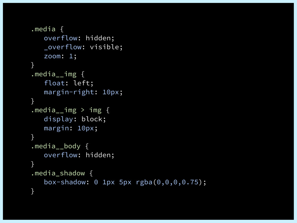
<div class="media-img"> <img src="http://lorempixel.com/100/100/" /> </div> <div class="media-body"> <p>Lorem Ipsum is simply dummy text of the printing and typesetting industry.</p> </div> </div> Base Class Sub Class (modifier)
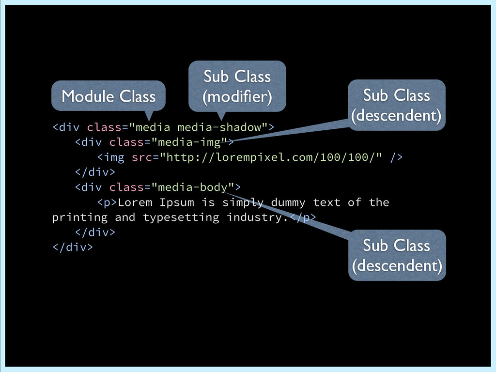
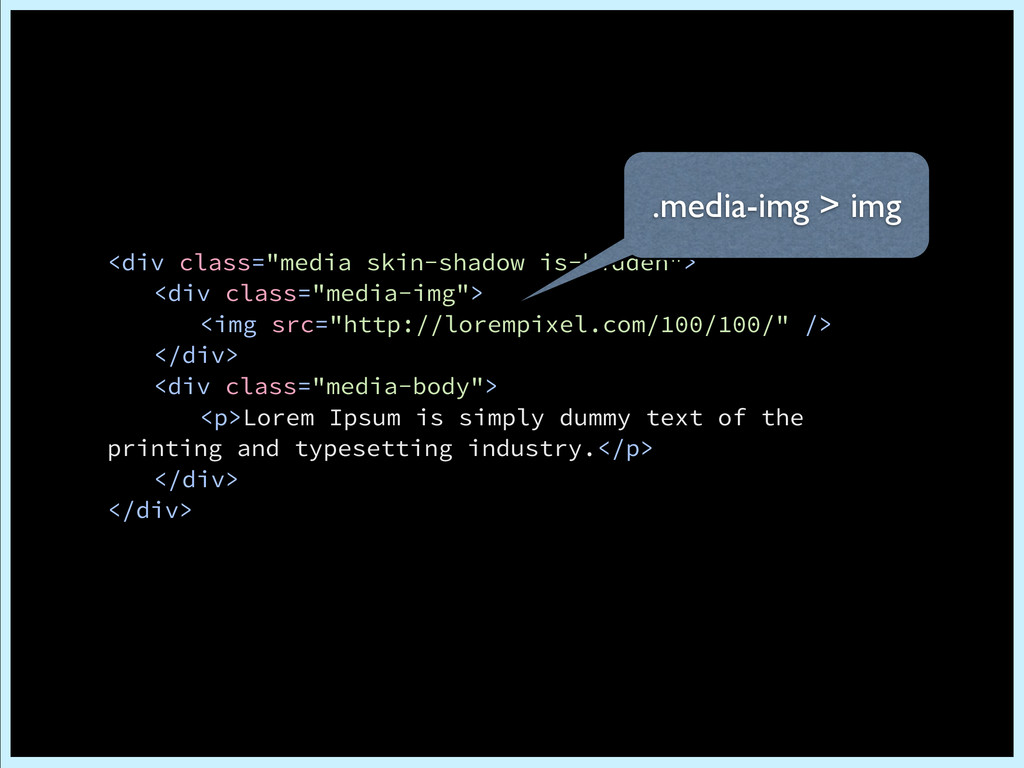
<div class="media-img"> <img src="http://lorempixel.com/100/100/" /> </div> <div class="media-body"> <p>Lorem Ipsum is simply dummy text of the printing and typesetting industry.</p> </div> </div> Module Class Sub Class (modifier)
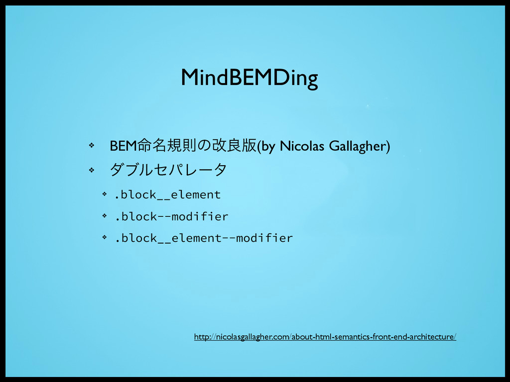
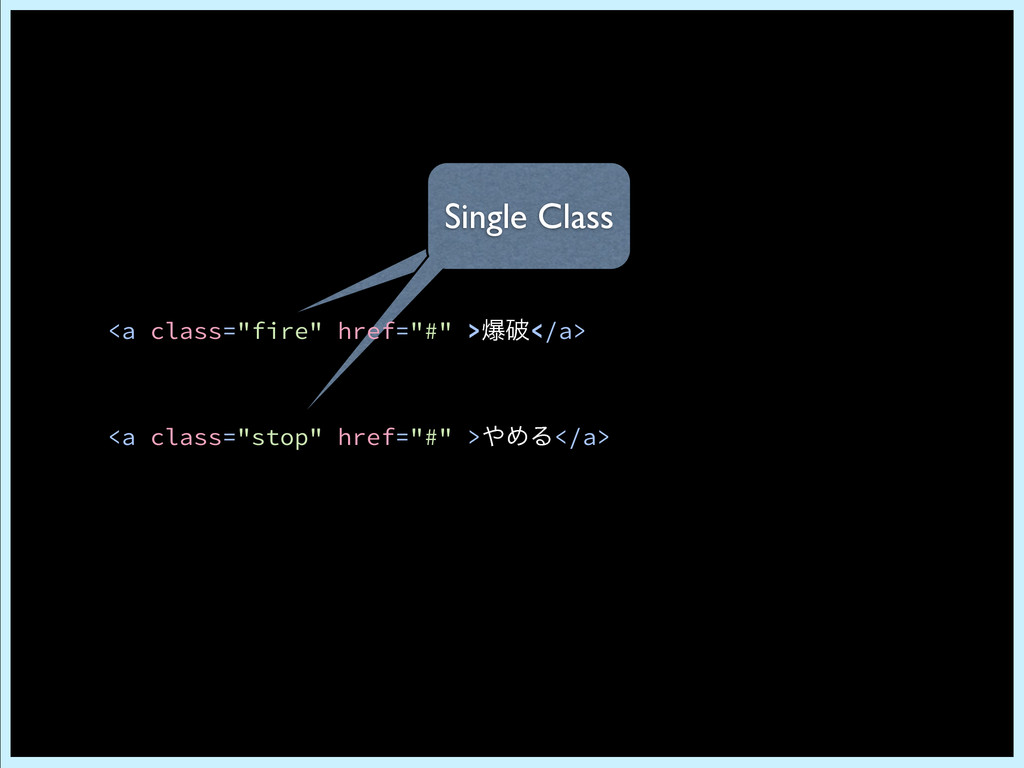
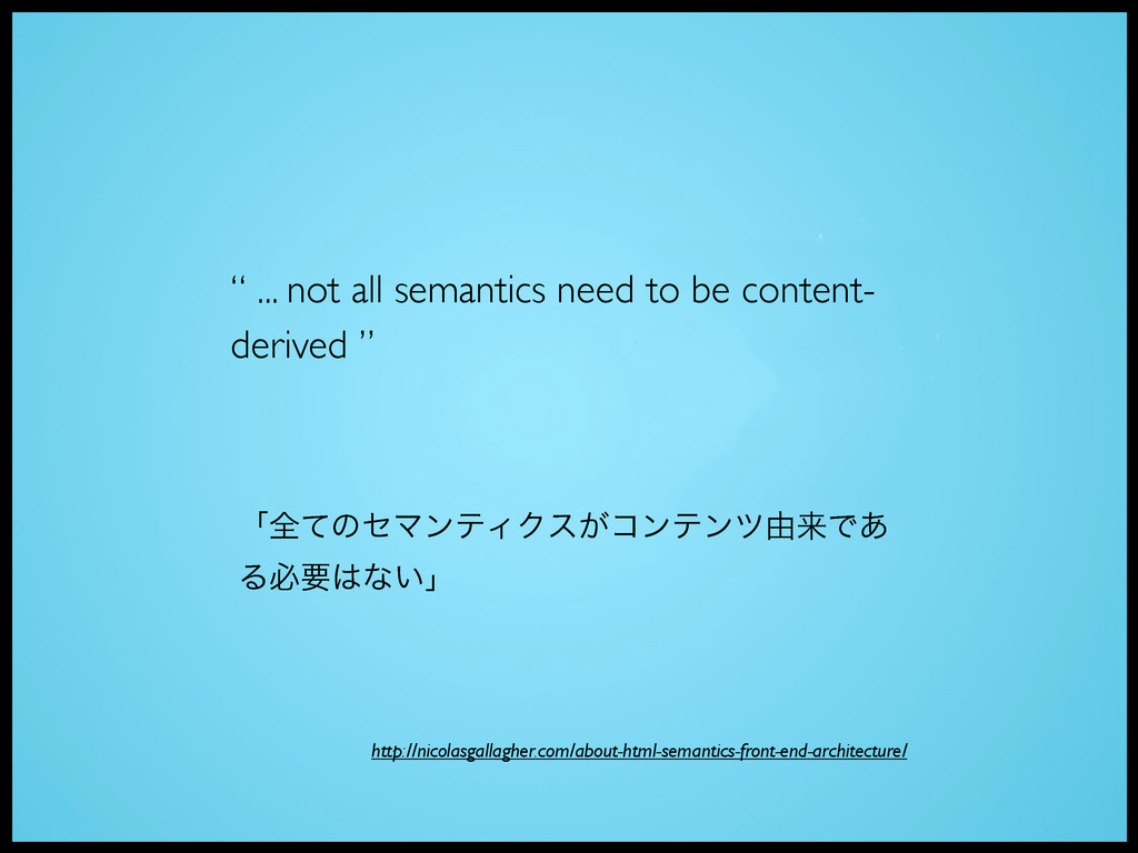
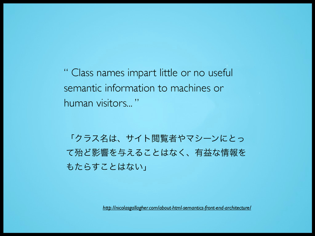
to machines or human visitors... ” ʮΫϥε໊ɺαΠτӾཡऀϚγʔϯʹͱͬ ͯຆͲӨڹΛ༩͑Δ͜ͱͳ͘ɺ༗ӹͳใΛ ͨΒ͢͜ͱͳ͍ʯ http://nicolasgallagher.com/about-html-semantics-front-end-architecture/
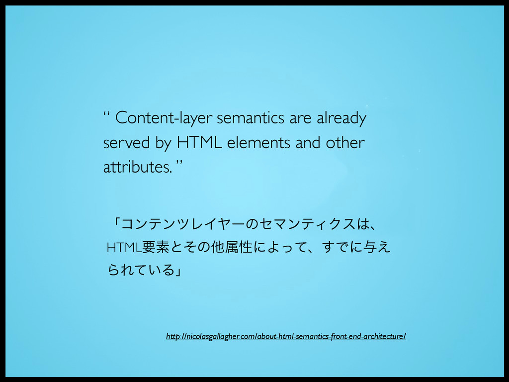
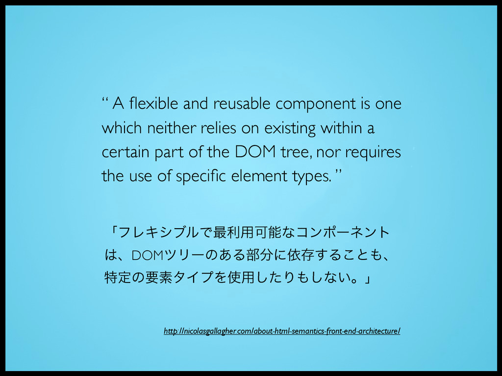
relies on existing within a certain part of the DOM tree, nor requires the use of specific element types. ” http://nicolasgallagher.com/about-html-semantics-front-end-architecture/ ʮϑϨΩγϒϧͰ࠷ར༻Մೳͳίϯϙʔωϯτ ɺDOMπϦʔͷ͋Δ෦ʹґଘ͢Δ͜ͱɺ ಛఆͷཁૉλΠϓΛ༻ͨ͠Γ͠ͳ͍ɻʯ
 katsunoritanaka
 tomoyanonymous
 naoya
naoya
 ivargrimstad
 manfredsteyer
 thasu0123
 handlename
 kazuhiro1982
 pluu
pluu
 okumin
 monochromegane
 har1101
 kentaroutakeda
 deanohume
 sachag
 nikkihalliwell
 hannesfritz
 techseoconnect
 thoeni
 eitanlees
 shlominoach
 ipullrank
 brettharned
 chriscoyier
 shpigford