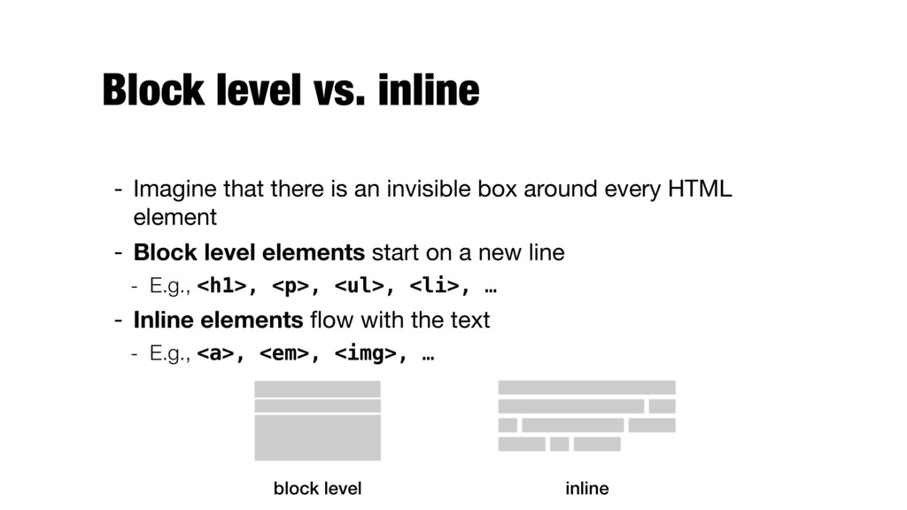
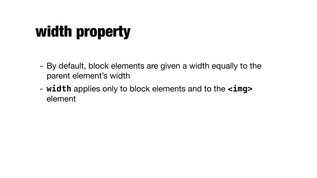
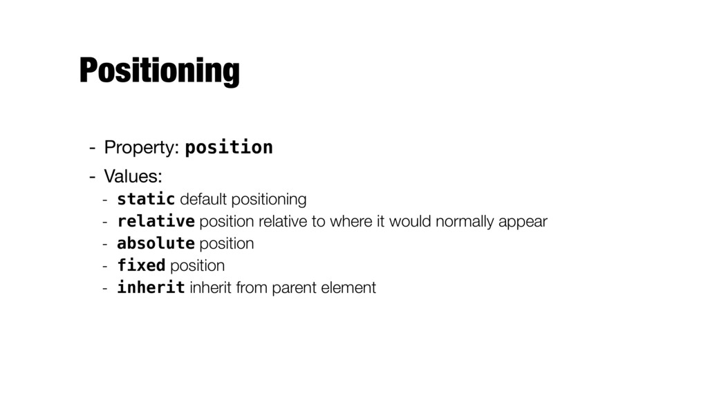
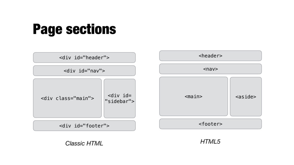
invisible box around every HTML element - Block level elements start on a new line - E.g., <h1>, <p>, <ul>, <li>, … - Inline elements flow with the text - E.g., <a>, <em>, <img>, … block level inline
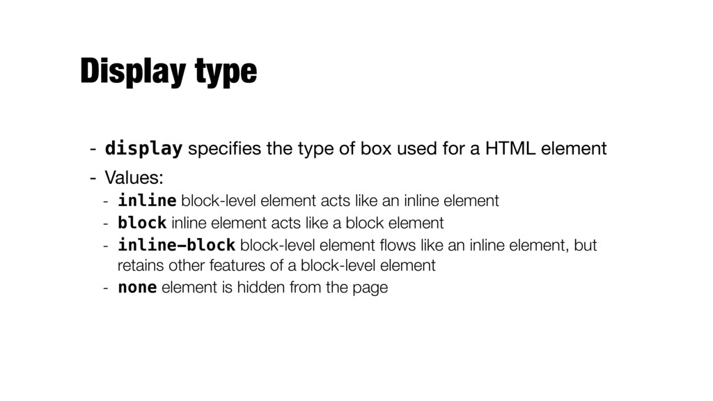
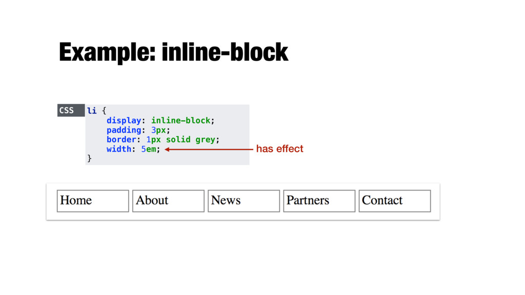
for a HTML element - Values: - inline block-level element acts like an inline element - block inline element acts like a block element - inline-block block-level element flows like an inline element, but retains other features of a block-level element - none element is hidden from the page
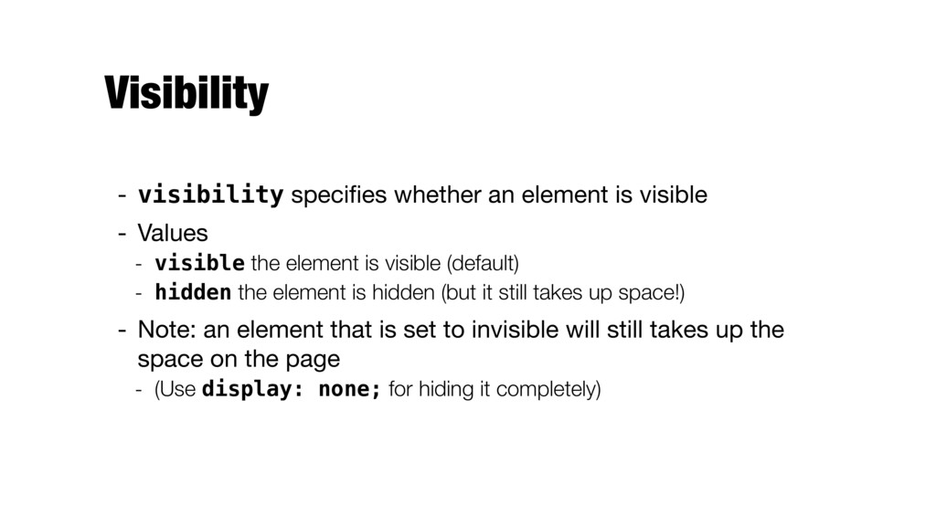
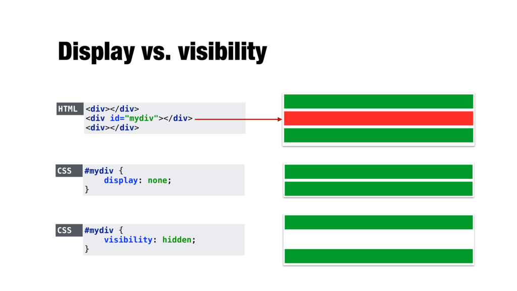
Values - visible the element is visible (default) - hidden the element is hidden (but it still takes up space!) - Note: an element that is set to invisible will still takes up the space on the page - (Use display: none; for hiding it completely)
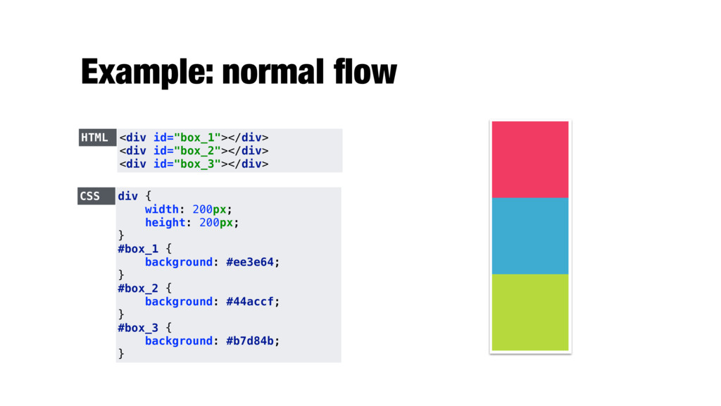
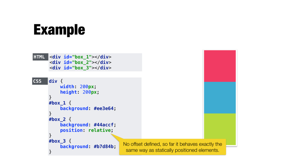
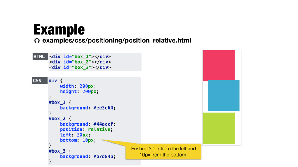
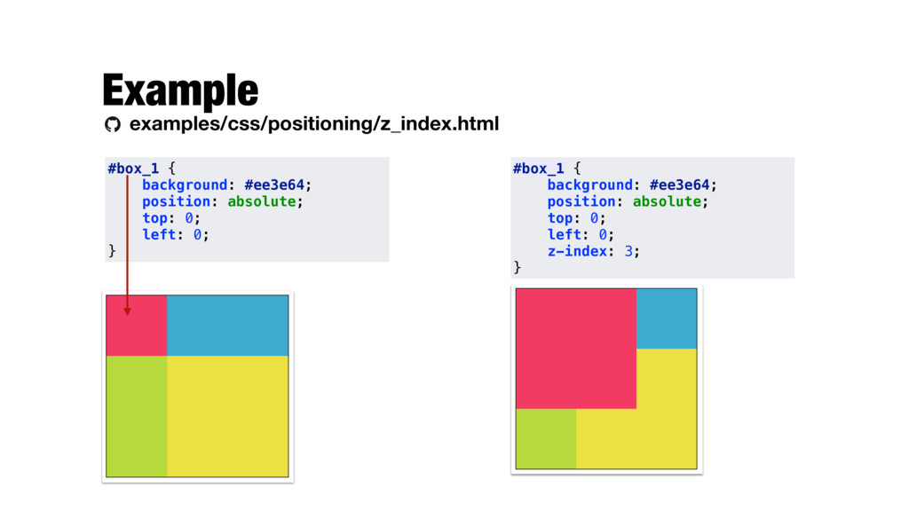
{ width: 200px; height: 200px; } #box_1 { background: #ee3e64; } #box_2 { background: #44accf; position: relative; } #box_3 { background: #b7d84b; } No offset defined, so far it behaves exactly the same way as statically positioned elements.
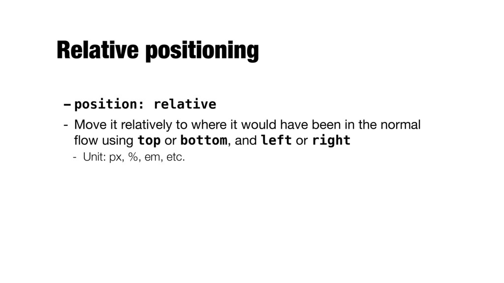
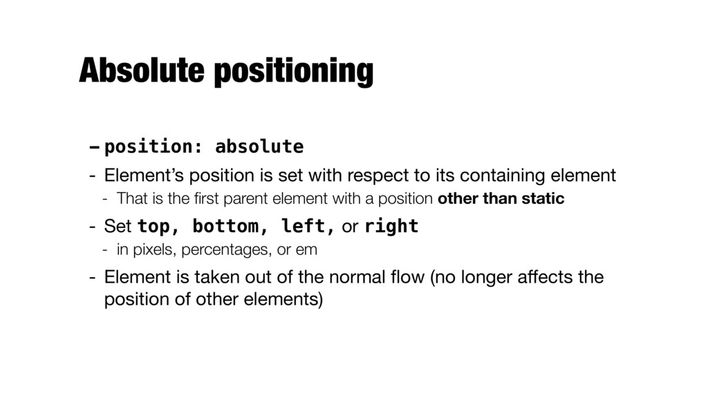
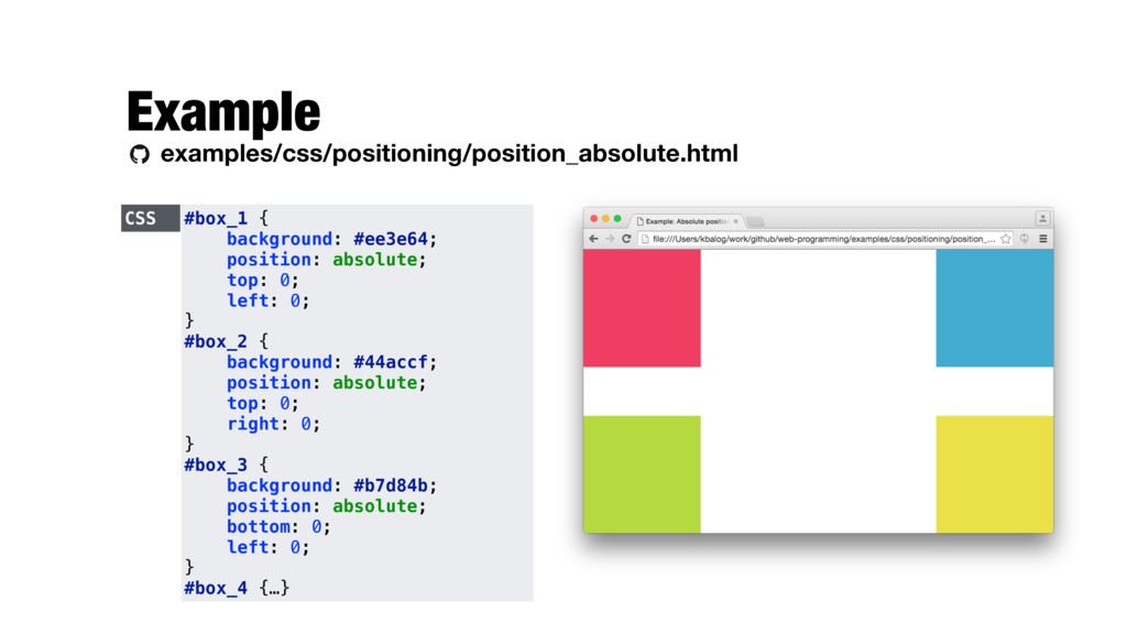
with respect to its containing element - That is the first parent element with a position other than static - Set top, bottom, left, or right - in pixels, percentages, or em - Element is taken out of the normal flow (no longer affects the position of other elements)
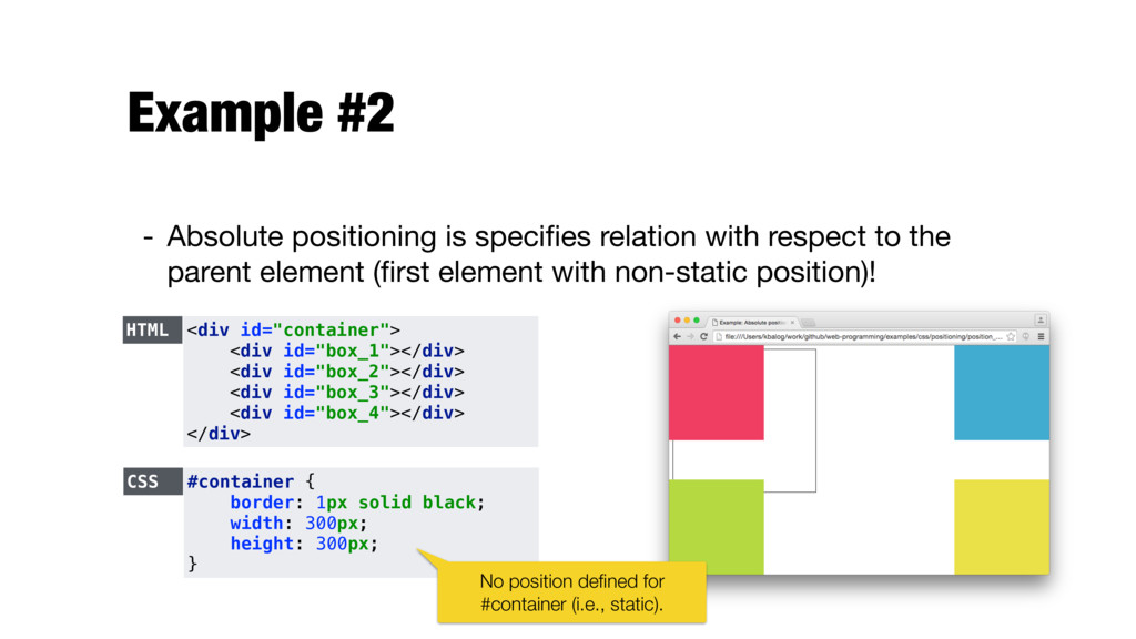
to the parent element (first element with non-static position)! HTML <div id="container"> <div id="box_1"></div> <div id="box_2"></div> <div id="box_3"></div> <div id="box_4"></div> </div> CSS #container { border: 1px solid black; width: 300px; height: 300px; } No position defined for #container (i.e., static).
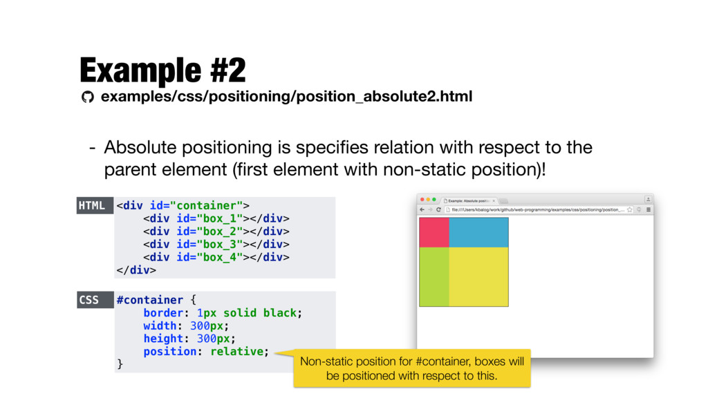
respect to the parent element (first element with non-static position)! HTML <div id="container"> <div id="box_1"></div> <div id="box_2"></div> <div id="box_3"></div> <div id="box_4"></div> </div> CSS #container { border: 1px solid black; width: 300px; height: 300px; position: relative; } Non-static position for #container, boxes will be positioned with respect to this.
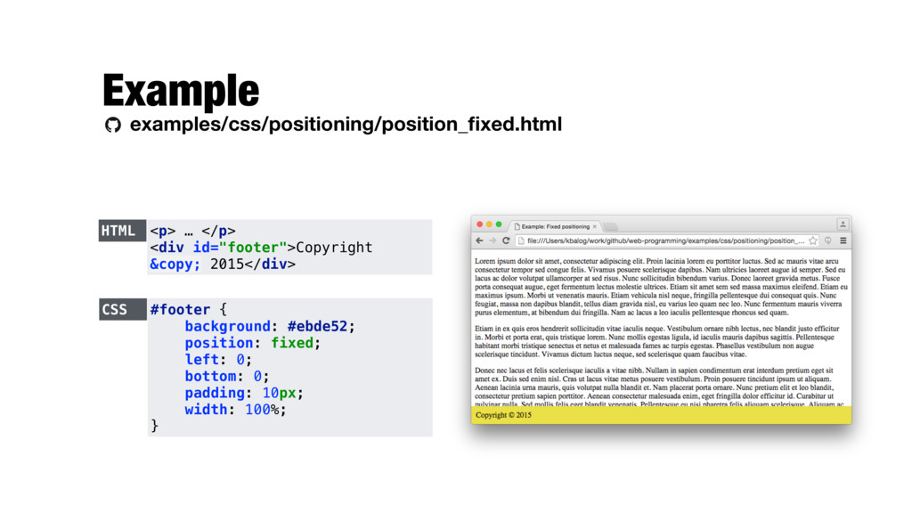
with respect to the browser window - Remains there even when the user scrolls - Set top, bottom, left, or right - in pixels, percentages, or em - Element is taken out of the normal flow (no longer affects the position of other elements)
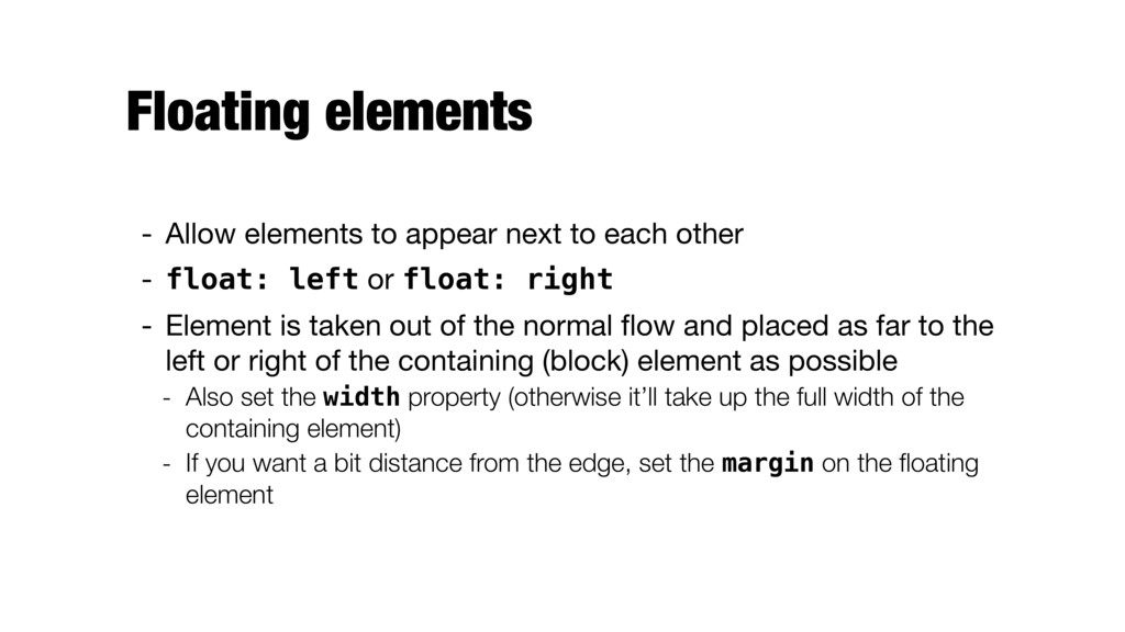
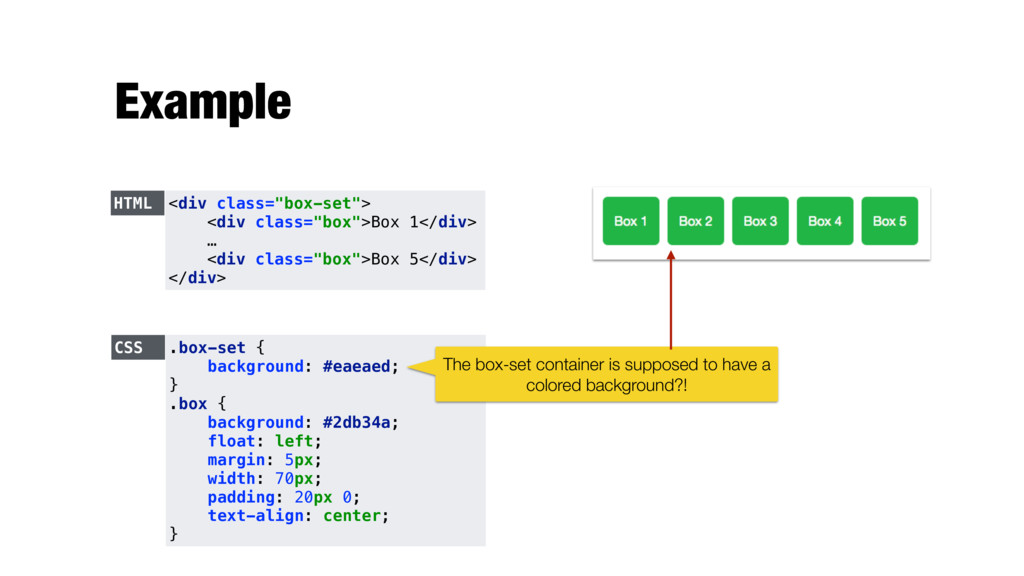
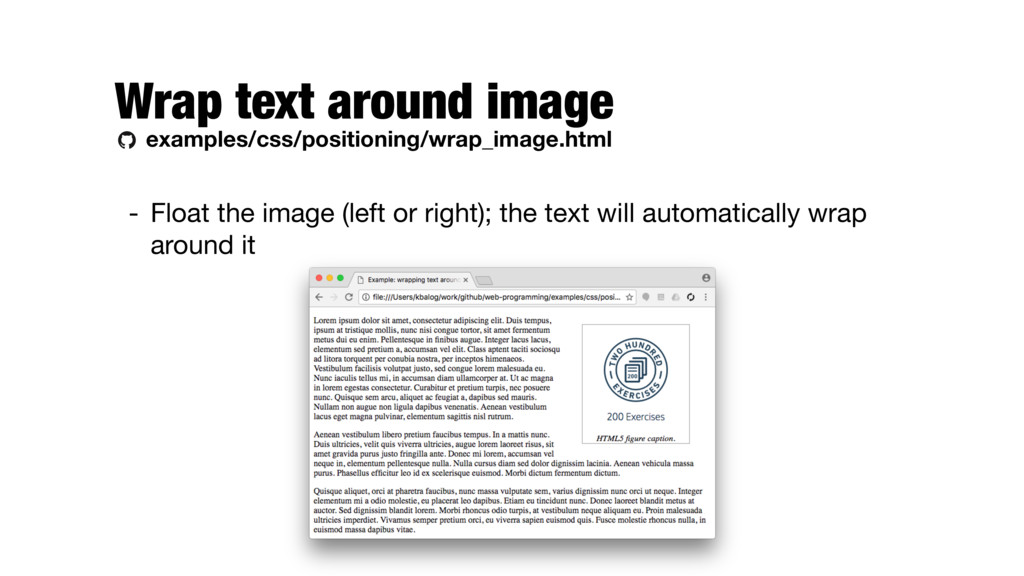
other - float: left or float: right - Element is taken out of the normal flow and placed as far to the left or right of the containing (block) element as possible - Also set the width property (otherwise it’ll take up the full width of the containing element) - If you want a bit distance from the edge, set the margin on the floating element
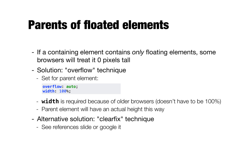
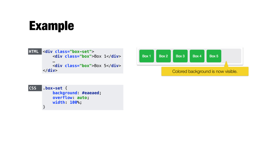
only floating elements, some browsers will treat it 0 pixels tall - Solution: "overflow" technique - Set for parent element: - width is required because of older browsers (doesn’t have to be 100%) - Parent element will have an actual height this way - Alternative solution: "clearfix" technique - See references slide or google it overflow: auto; width: 100%;
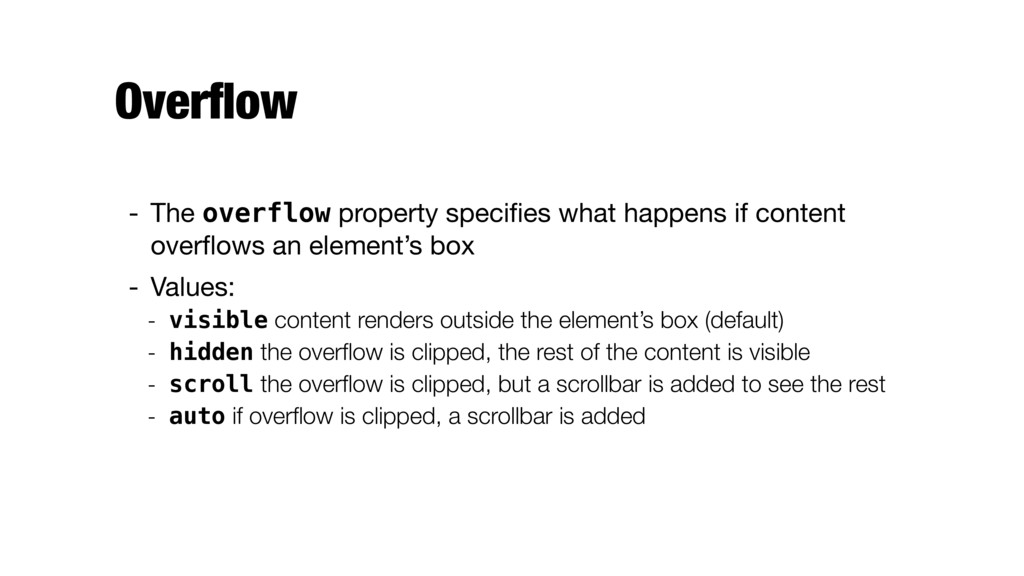
overflows an element’s box - Values: - visible content renders outside the element’s box (default) - hidden the overflow is clipped, the rest of the content is visible - scroll the overflow is clipped, but a scrollbar is added to see the rest - auto if overflow is clipped, a scrollbar is added
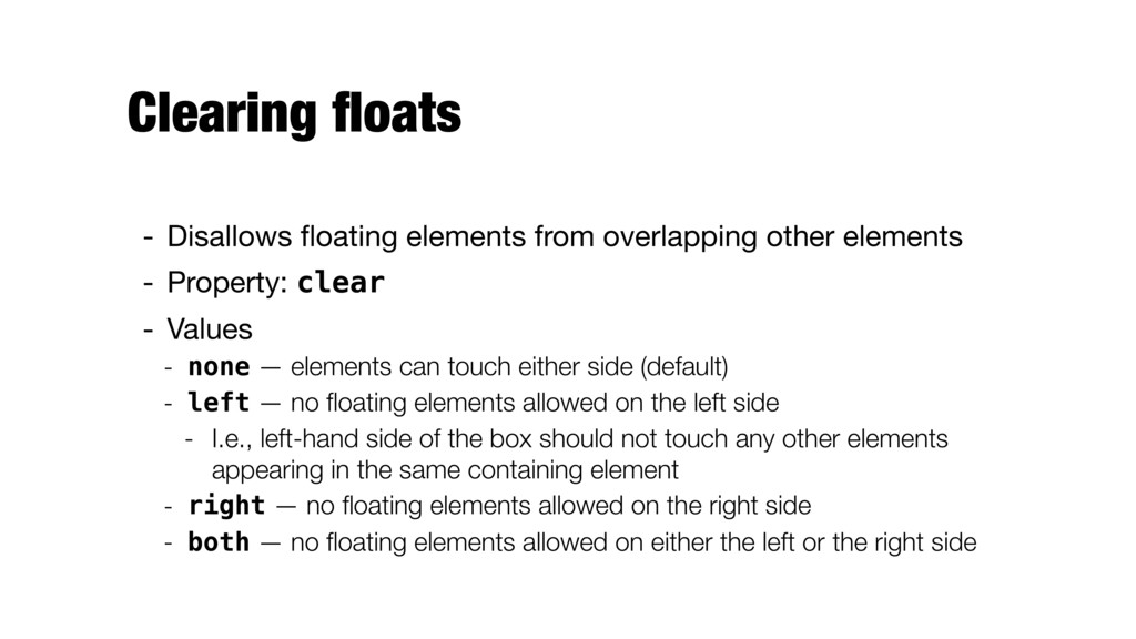
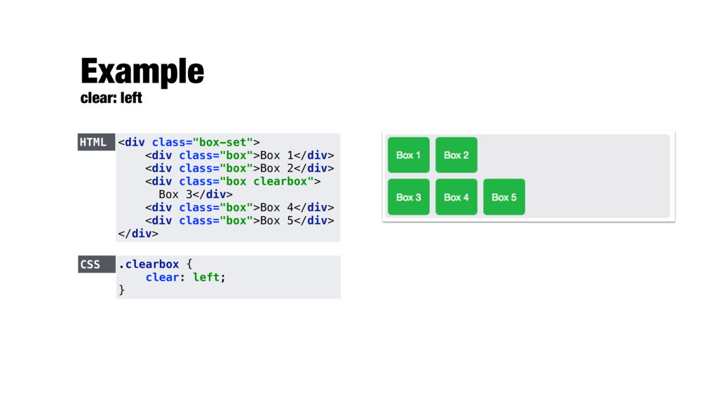
- Property: clear - Values - none — elements can touch either side (default) - left — no floating elements allowed on the left side - I.e., left-hand side of the box should not touch any other elements appearing in the same containing element - right — no floating elements allowed on the right side - both — no floating elements allowed on either the left or the right side
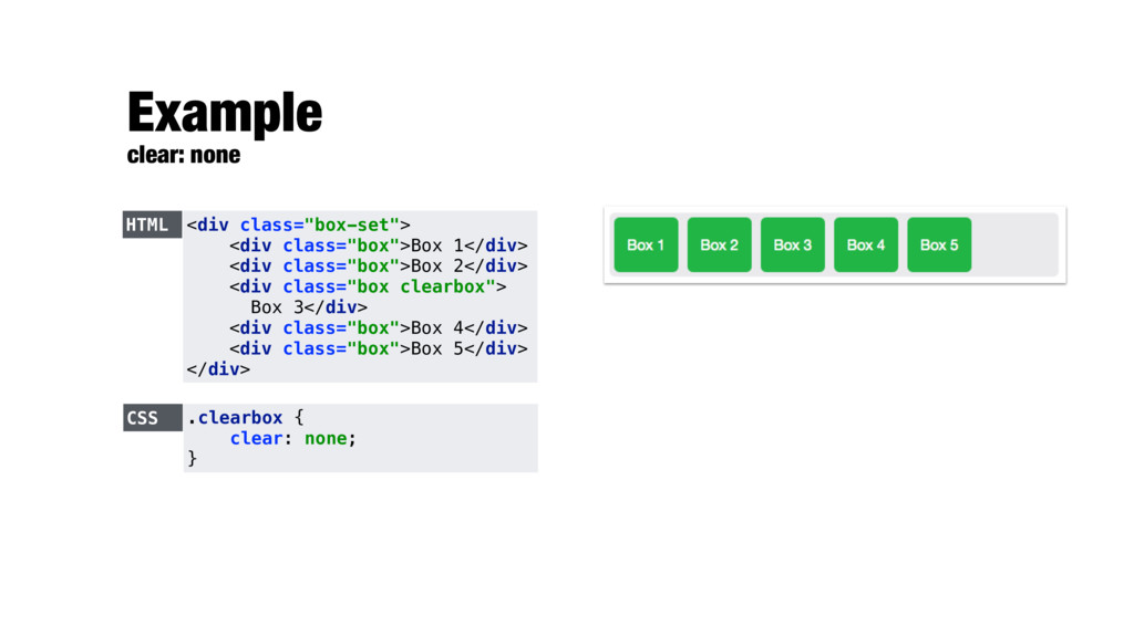
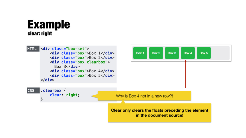
class="box">Box 2</div> <div class="box clearbox"> Box 3</div> <div class="box">Box 4</div> <div class="box">Box 5</div> </div> CSS .clearbox { clear: right; } Why is Box 4 not in a new row?! Clear only clears the floats preceding the element in the document source!
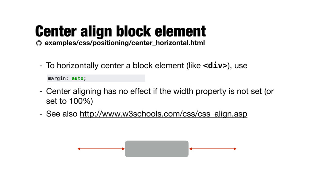
block element (like <div>), use - Center aligning has no effect if the width property is not set (or set to 100%) - See also http://www.w3schools.com/css/css_align.asp margin: auto;
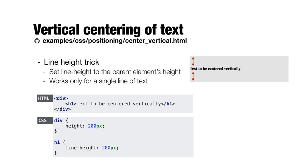
Set line-height to the parent element’s height - Works only for a single line of text HTML <div> <h1>Text to be centered vertically</h1> </div> CSS div { height: 200px; } h1 { line-height: 200px; }
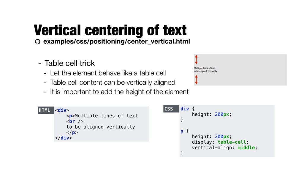
Let the element behave like a table cell - Table cell content can be vertically aligned - It is important to add the height of the element HTML <div> <p>Multiple lines of text <br /> to be aligned vertically </p> </div> CSS div { height: 200px; } p { height: 200px; display: table-cell; vertical-align: middle; }
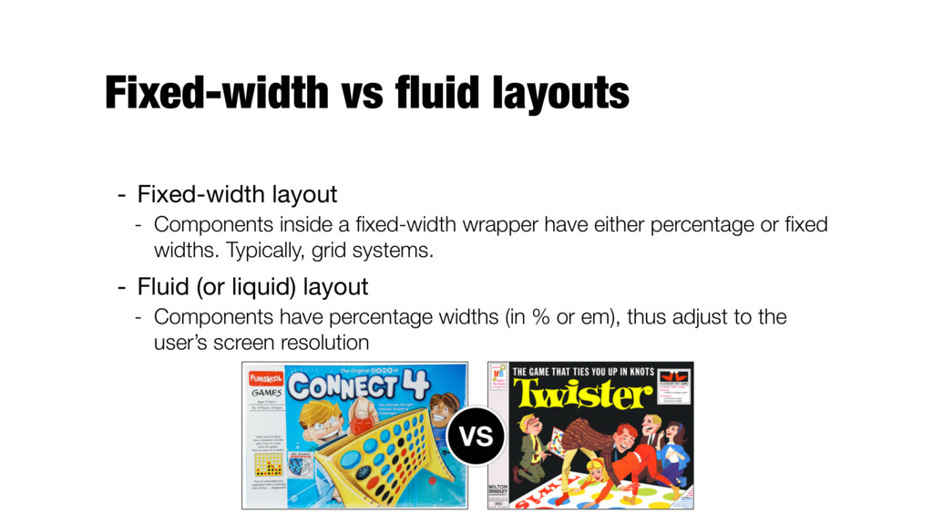
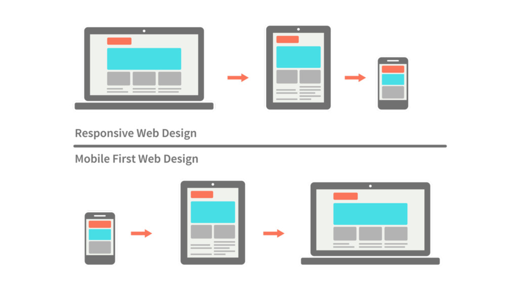
a fixed-width wrapper have either percentage or fixed widths. Typically, grid systems. - Fluid (or liquid) layout - Components have percentage widths (in % or em), thus adjust to the user’s screen resolution
screen - E.g., three column layout for desktops, a two column layout for tablets, and a single column layout on smartphones - Using a fluid grid and media queries in CSS
Uses the @media rule to include a block of CSS property only if a certain condition is true - width and height of the viewport - width and height of the device - orientation (is the tablet/phone in landscape or portrait mode?) - resolution - … @media mediatype and|not|only (media feature) {…}
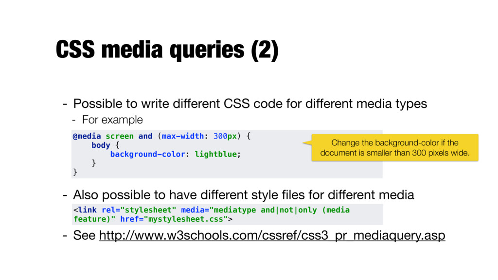
code for different media types - For example - Also possible to have different style files for different media - See http://www.w3schools.com/cssref/css3_pr_mediaquery.asp <link rel="stylesheet" media="mediatype and|not|only (media feature)" href="mystylesheet.css"> @media screen and (max-width: 300px) { body { background-color: lightblue; } } Change the background-color if the document is smaller than 300 pixels wide.
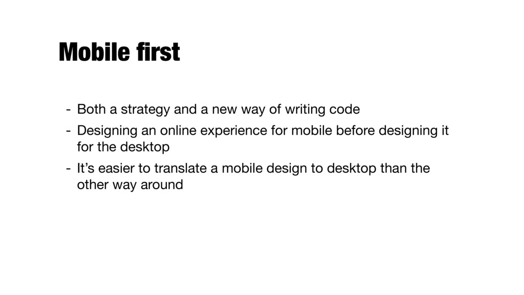
of writing code - Designing an online experience for mobile before designing it for the desktop - It’s easier to translate a mobile design to desktop than the other way around
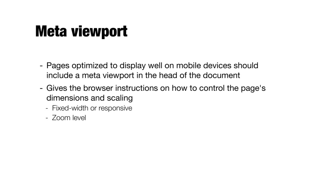
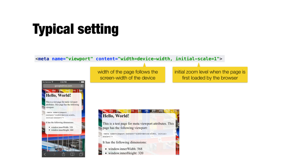
devices should include a meta viewport in the head of the document - Gives the browser instructions on how to control the page's dimensions and scaling - Fixed-width or responsive - Zoom level
 kbalog
 kotaminato
 kazumax55
 kajitack
 codeegg
 tomoyk
 elenatanasoiu
 yukikurage
 tk3fftk
 iidatakuma
 har1101
.png) takahirom
takahirom
 panda728
 tessaabrams
 jonoalderson
 chrislema
 marcoroth
 lauravandoore
 techseoconnect
 joshbly
 sferik
 inesmontani
 aleyda
 ryanjones
 codingconduct