Presentation given at High Ed Web (#heweb14) by Kelly Anne Pipe in the MCS track. #heweb14 #mcs1
Slide: 1
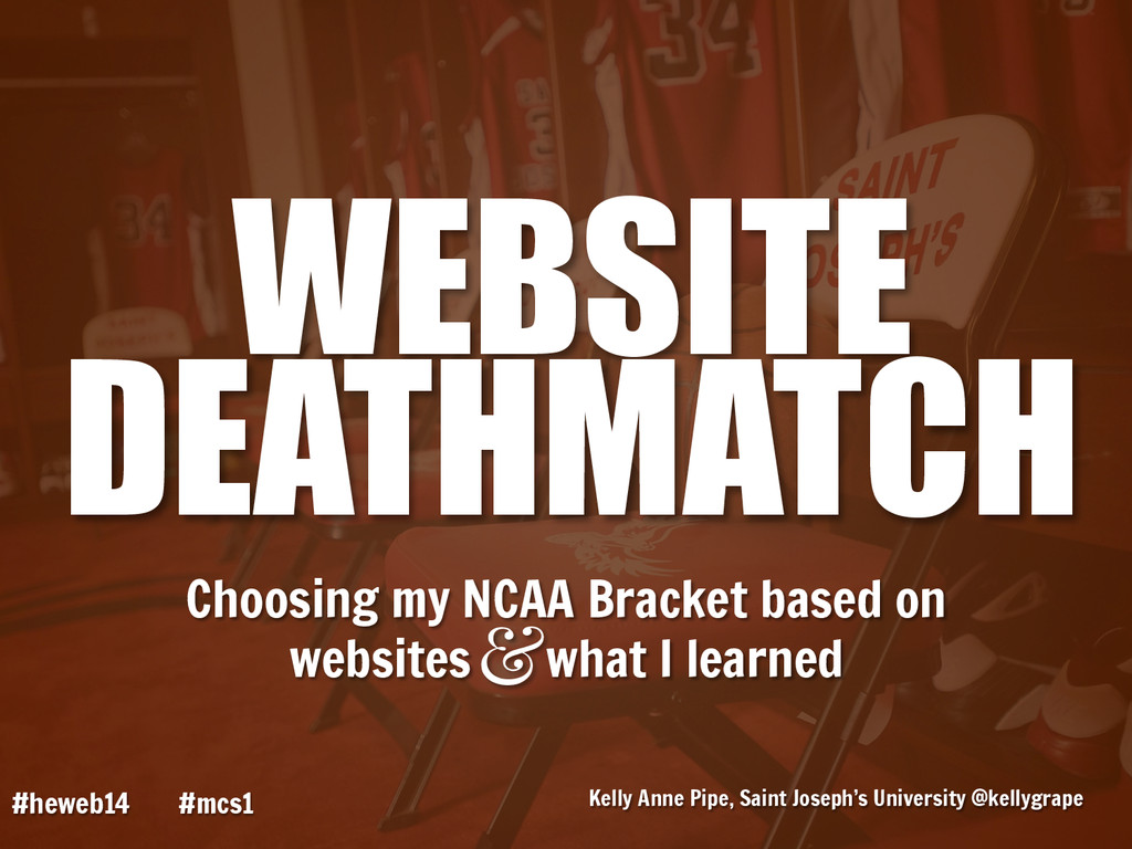
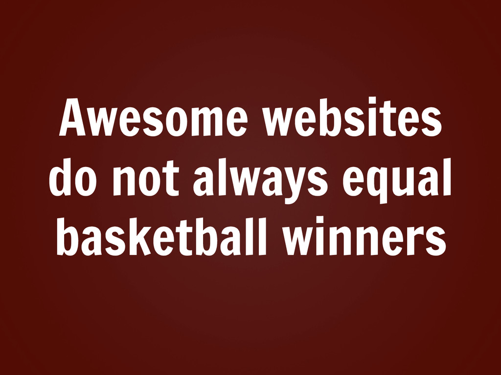
Hello everybody, and welcome to Website Deathmatch – choosing my NCAA Bracket based on websites, and what I learned doing so.
Slide: 1
1
Slide: 2
My name is Kelly Anne Pipe. I work as the Assistant Director for Web Technology and Development at Saint Joseph’s University in Philadelphia. I’ve been working at SJU for eight years, and working on the web team for three.
Slide: 2
2
Slide: 3
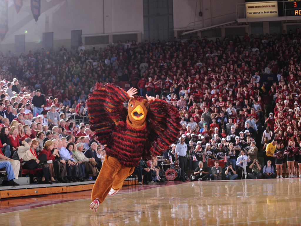
For those of you familiar with college sports, you may have heard of the Saint Joe’s Hawk. He’s been voted the best college mascot numerous times by multiple sources, and is most renowned for constantly flapping his wings – even during half time. At Saint Joseph’s we have a lot of pride in all of our sports teams, especially our basketball team. The SJU Mens Hawks frequently take part in the NCAA Division One Championship, which takes place in March.
Slide: 3
3
Slide: 4
If you’re familiar with college basketball, you may have heard of March Madness – the frenzy of activity that surrounds the NCAA Championship games. Each year, millions of Americans rank who they think will win by filling out a bracket – which makes March Madness into something more like Bracket Madness.
Slide: 4
4
Slide: 5
Now, it’s bracket madness for a reason. There are a lot of schools….
Slide: 5
5
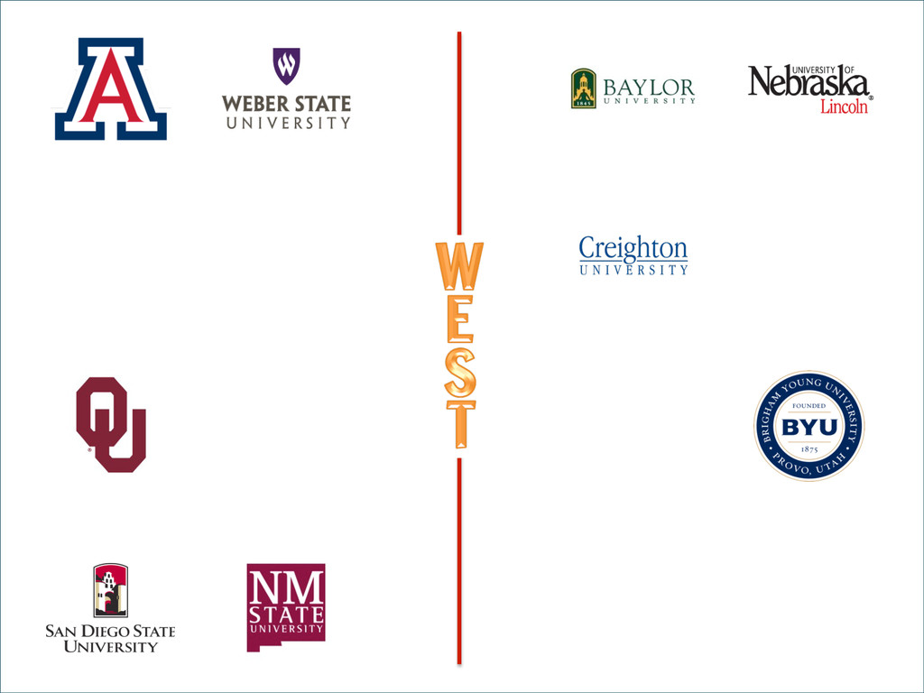
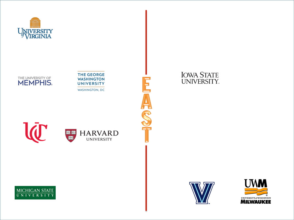
Slide: 6
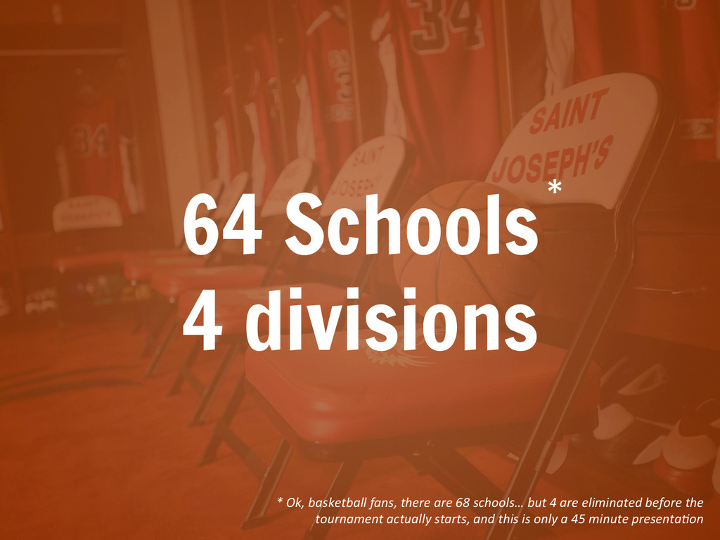
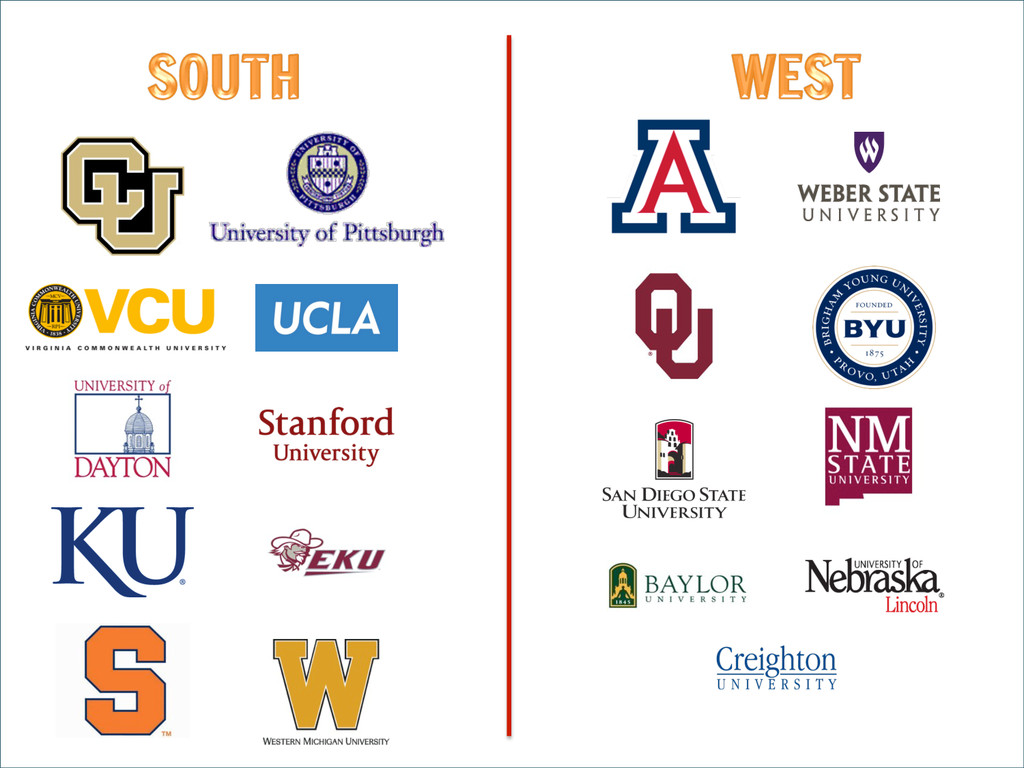
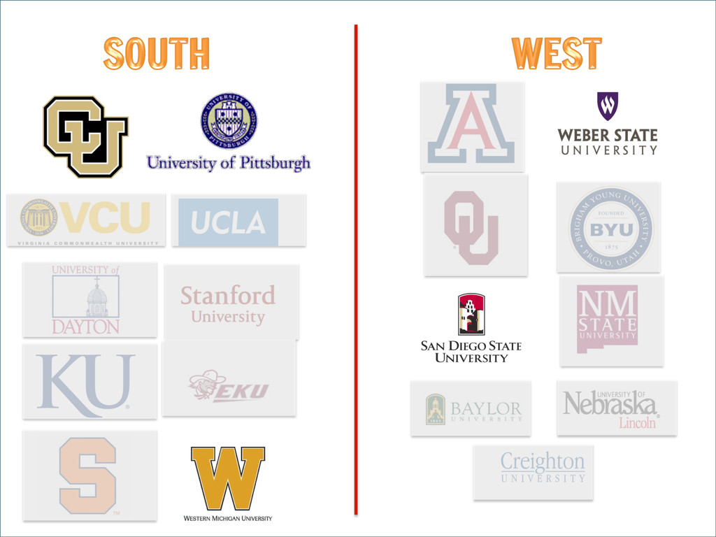
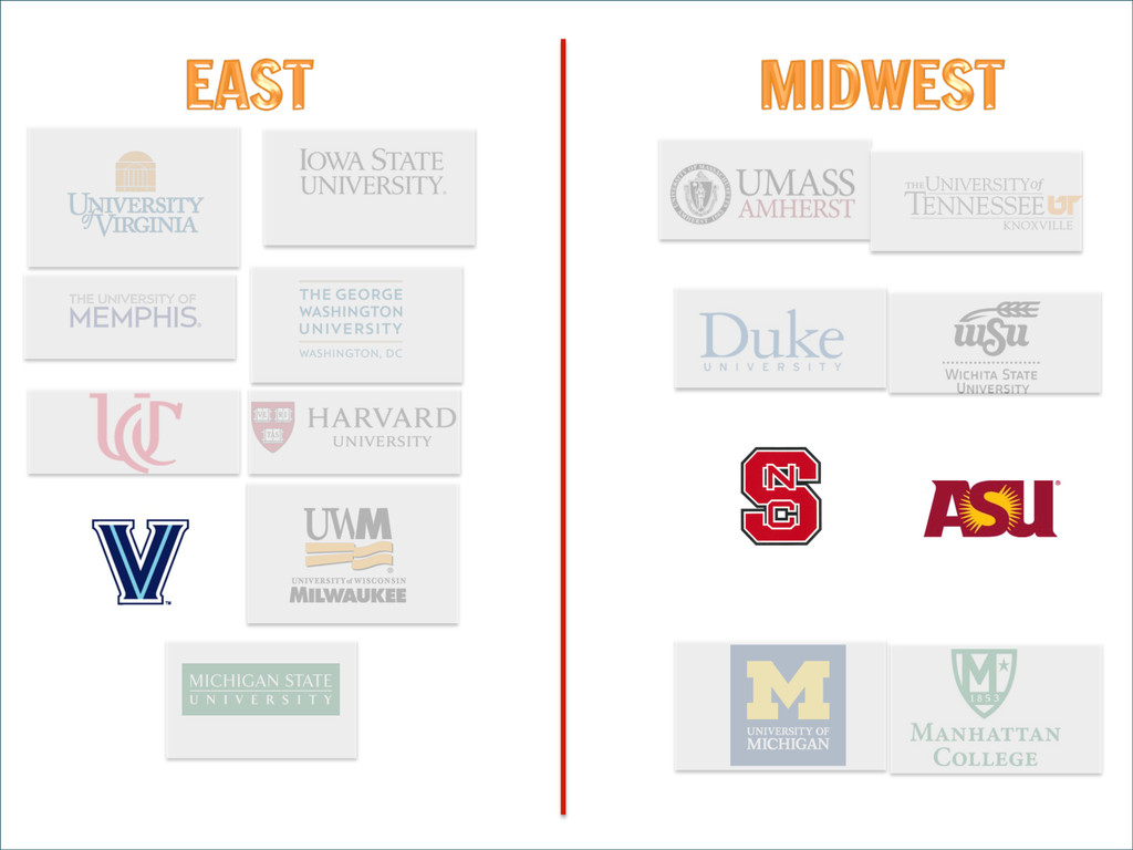
64 to be precise. These 64 schools are split into four divisions – South, East, West, and Northwest.
Slide: 6
6
Slide: 7
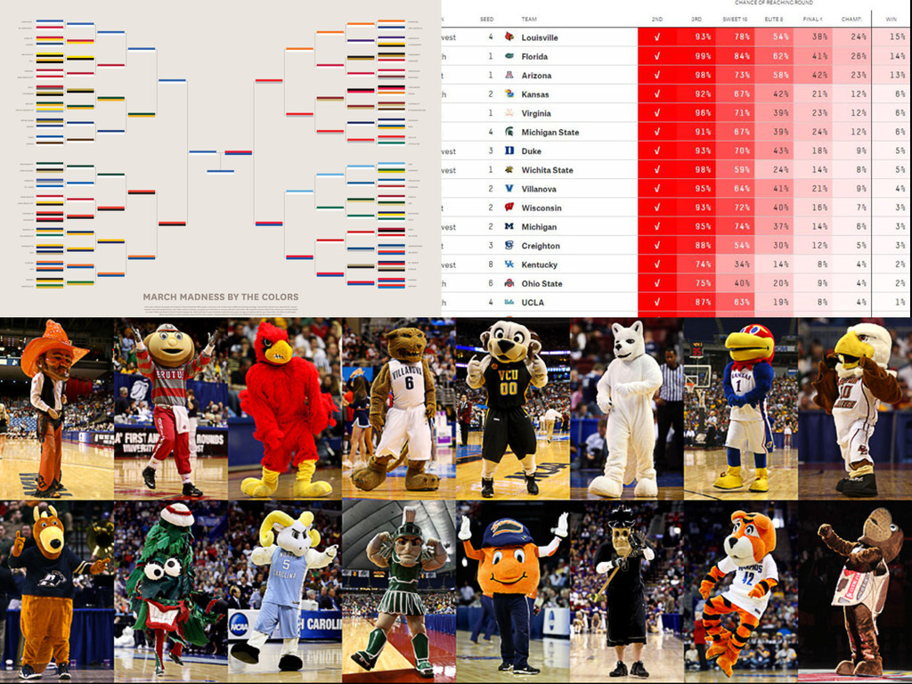
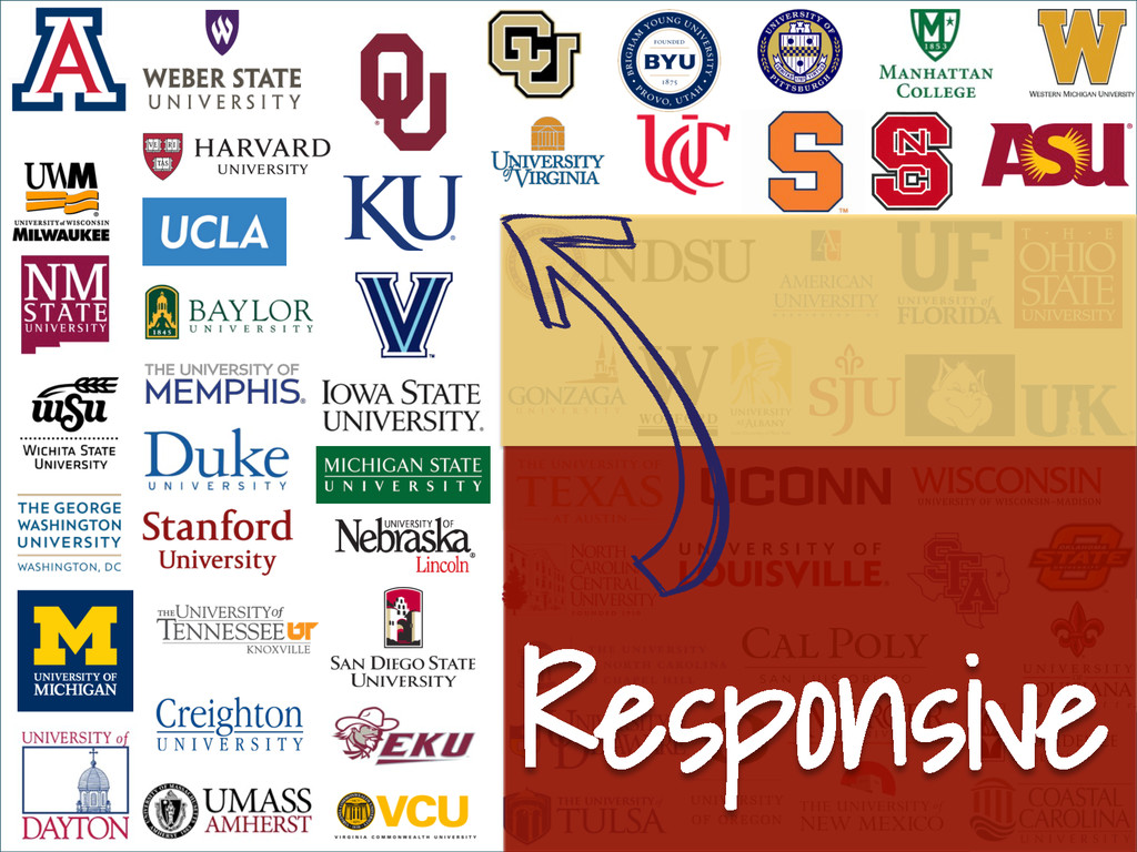
Here are all the schools – we’ll come back to this later.
Slide: 7
7
Slide: 8
With so many schools to choose from, people can take many different strategies while choosing their winners. I’ve known people to choose by color, by mascot, or even by real-life statistics! For me, however, the choice was easy – I decided to choose my NCAA bracket winners based on websites.
Slide: 8
8
Slide: 9
Raise your hand if your school was one of the teams in March Madness. Ok, in advance, I want to say – sorry. There is a high likelihood I will insult your school – probably unintentionally – during this presentation. Every single website I’ve viewed is a testament to people like us who work day-in and day-out to create engaging digital experiences for their schools. With campus politics, never-ending silos, and the challenges of having to do too much with far too little, it’s amazing the things we are able to create. There is no way that I could accurately understand the ways that every single website perfectly (or imperfectly) meets the needs of the varied audiences. By necessity, my methods of comparison are very limited.
And in case you’re thinking that I hold some kind of bias, I’ll give you a little spoiler alert – my own school doesn’t survive the first round of eliminations.
With that said, the point of this talk is to compare sites. So, let me talk about the ways that I ranked school websites.
Slide: 9
9
Slide: 10
I’ve ranked the websites based on three different variables – mobile-readiness, page weight, and content experience. I’ll discuss each of these in turn.
Slide: 10
10
Slide: 11
First, let’s focus on mobile.
Slide: 11
11
Slide: 12
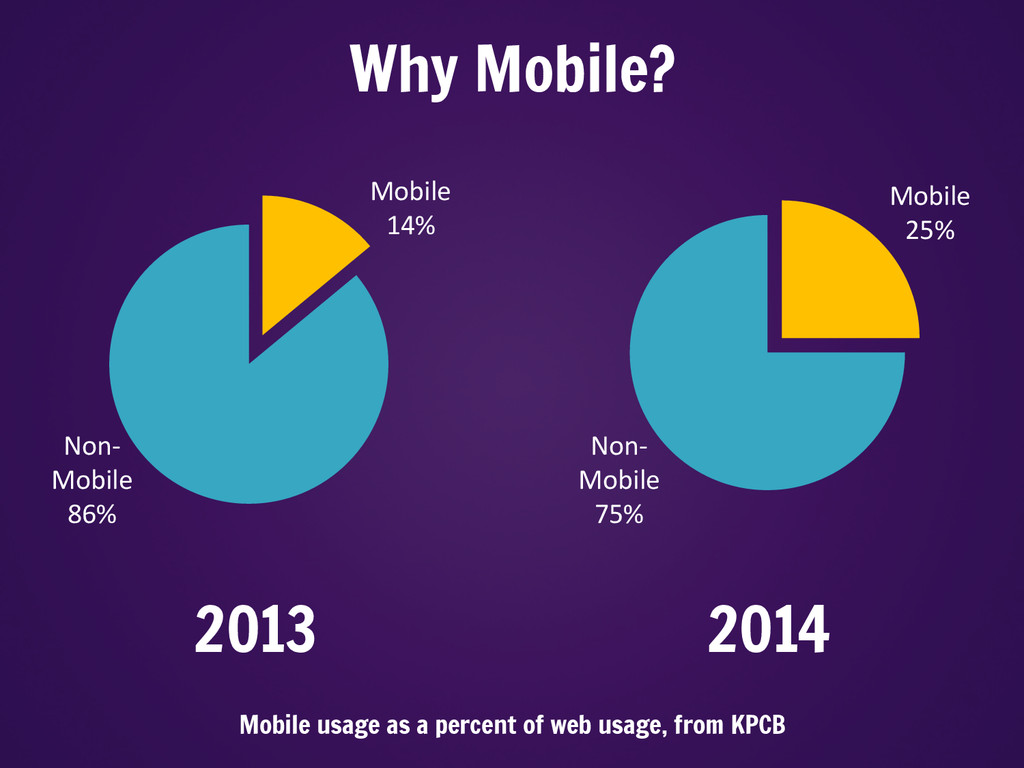
The past few years have seen a huge rise in the amount of mobile traffic to websites. KPCB’s numbers for 2014 (released in May) show that global mobile usage as a percentage of internet traffic has nearly doubled since last year. In 2012 (not on this chart), the mobile share of traffic was 10%, and in 2011 it was 6%. Colleges and universities need to respond to this rise in mobile usage if we want to meet the needs of our customers.
Slide: 12
12
Slide: 13
And in case you were thinking those numbers only applied to the global internet, here is data from this September looking at JUST colleges and universities.
Slide: 13
13
Slide: 14
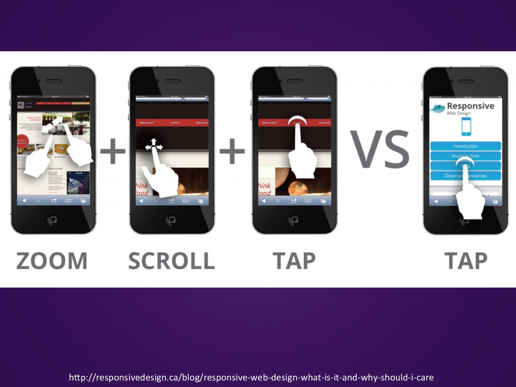
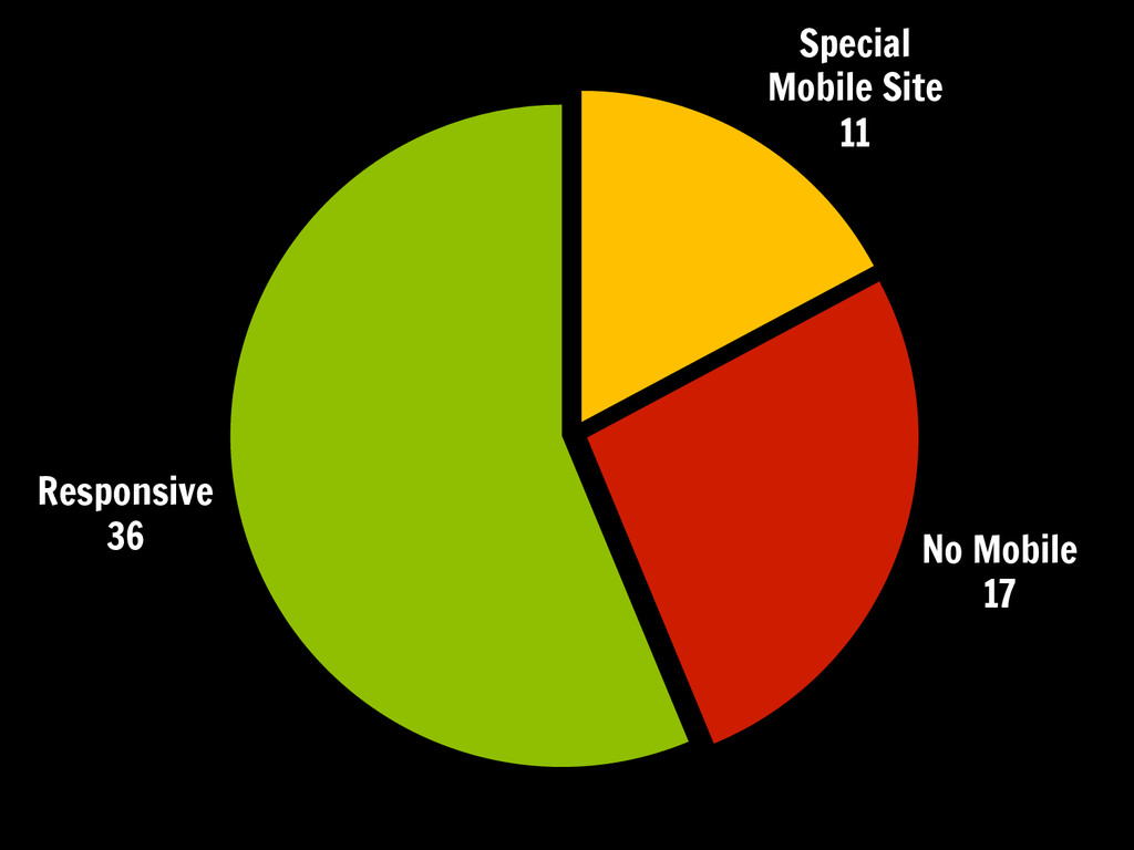
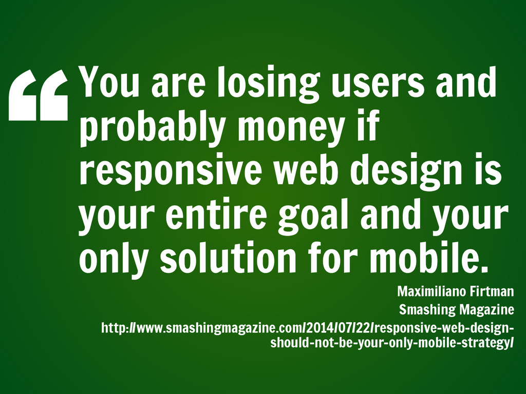
With the rise of smartphones, more and more websites are being visited on mobile devices. Many companies have begun to optimize their websites for viewing on mobile devices. Among university websites, there are two main ways of accomplishing this – by creating a separate mobile website, or by implementing responsive web design
Slide: 14
14
Slide: 15
Yep, it’s 10 minutes into HEWEB14 and someone already mentioned responsive web design. Responsive design has really exploded over the past few years, ever since Ethan Marcotte’s article coining the phrase that was published in A List Apart in 2010. Two years ago, when I came to HEWeb, there was a special conference app. Now? The conference website is responsive! We’ve come a long way in two short years.
Slide: 15
15
Slide: 16
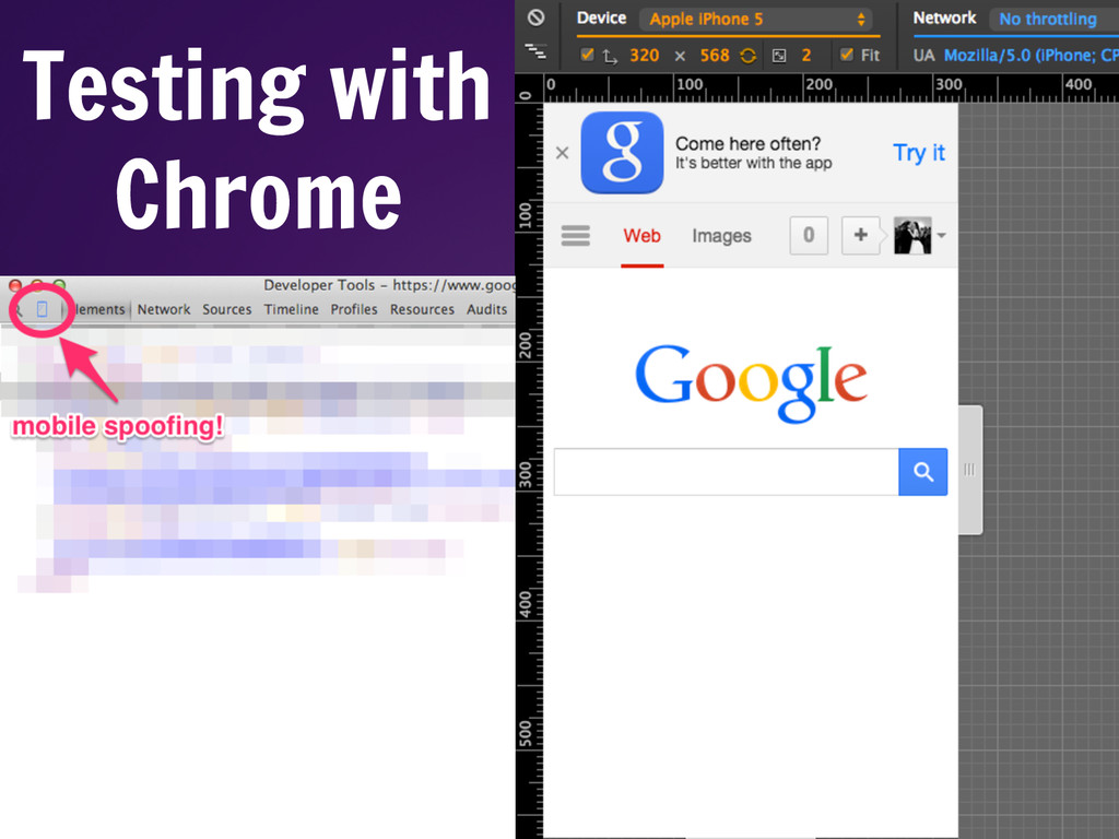
Testing responsive websites is easy – you can do a simple test just by resizing your browser. However, there is a lot more to mobile websites than just browser size. Chrome’s developer tools continue to improve and now allow users to do more exact mobile device spoofing. This is actually a newer feature (or at least easier to access) – Chrome’s developer tools has a built-in mobile testing feature. You can spoof a user agent, set the screen size, and even test loading time by setting the network to levels similar to what users would access over a 3G connection.
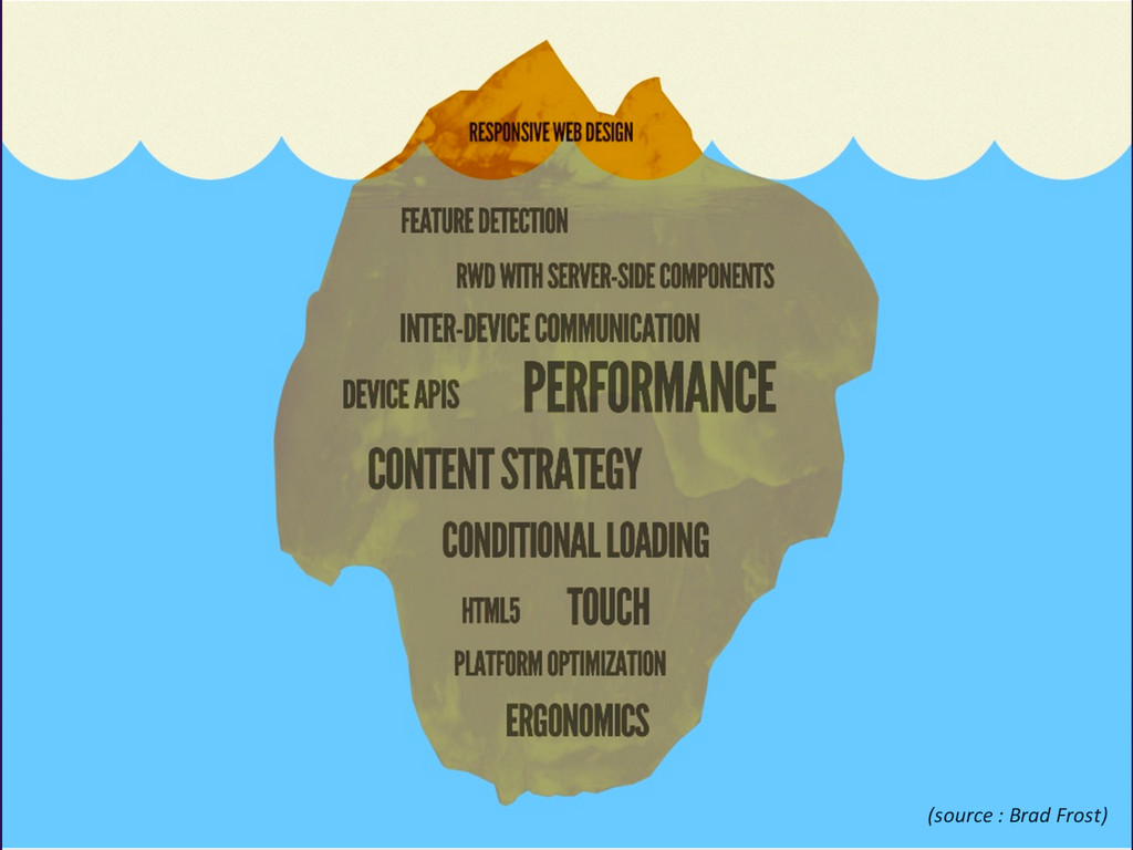
Slide: 33
Responsive design is just the tip of the iceberg when it comes to mobile browsing considerations.
http://www.slideshare.net/bradfrostweb/beyond-squishy-the-principles-of-adaptive-design-17070713
Slide: 33
33
Slide: 34
There is a lot more to take into consideration. Ergonomics, touch and interactivity, optimization for different platforms, and more. Let me talk about the biggest thing on this iceberg, performance.
Slide: 34
34
Slide: 35
Performance considerations can have a huge impact on your mobile websites.
Slide: 35
35
Slide: 36
Everyone likes to go fast – it’s the worst feeling when you’re trying to load a website on your phone and it’s just crawling along.
Slide: 36
36
Slide: 37
And studies have shown that a one second delay in loading time can result in a 7% reduction in conversions. The impact of this can be huge on a company’s bottom line.
Slide: 37
37
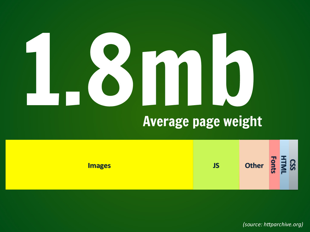
Slide: 38
The average weight of mobile sites can be part of the issue. The average page weight for a website is 1.8 megabytes. That’s a lot to download!
Slide: 38
38
Slide: 39
78% of that 1.8 megs is data from images and javascript.
Slide: 39
39
Slide: 40
For comparison sake, four years ago the average page weight was somewhere around 700 kilobytes. That represents a 250% increase in page size since 2010.
Slide: 40
40
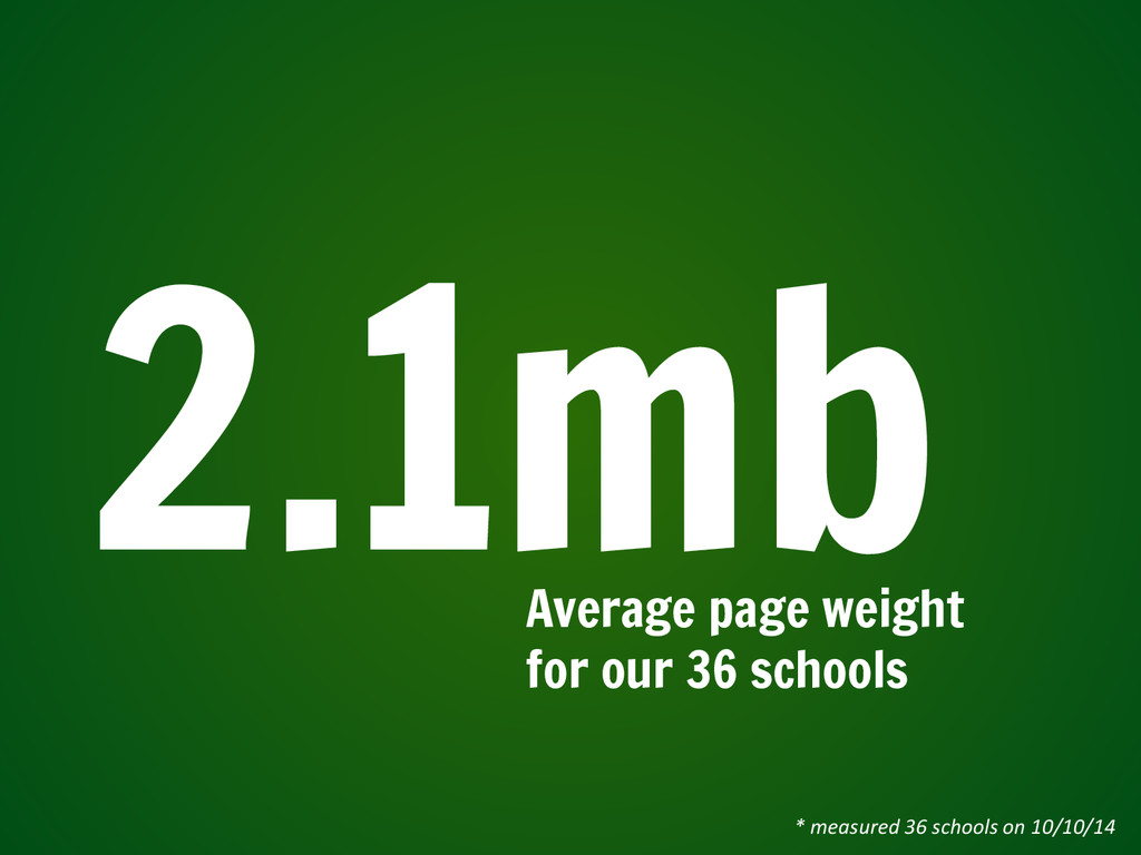
Slide: 41
I measured the page weight of our 36 schools with responsive homepages. The average page weight is 2.1mb.
Slide: 41
41
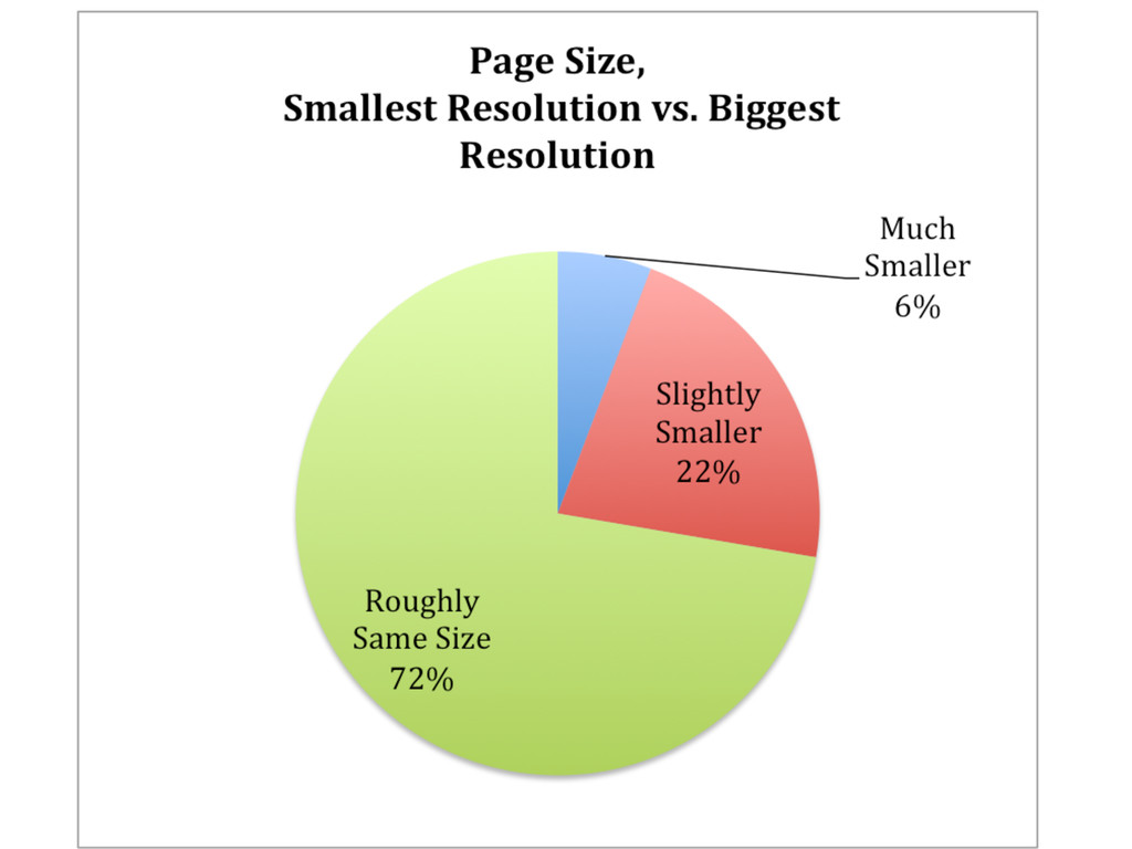
Slide: 42
In 2013, Guy Podjarny did a study on the size of mobile websites vs their desktop equivalents, and found the following.
Slide: 42
42
Slide: 43
And I did the same with our sample group of university websites. This falls in line with other industry comparisons – so, despite our incredibly small sample size, this is fairly representative of the state of responsive web design.
Slide: 43
43
Slide: 44
For you and your users. While unlimited data plans are more-and-more becoming the norm, data caps do still exist. And keeping your site light keeps your users from having to unnecessarily tap into data limits – meaning they can download just one more video from snapchat or share one more instagram photo of your campus.
Slide: 44
44
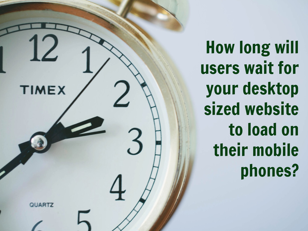
Slide: 45
Some statistics suggest that 73% of users will leave a website if it takes more than 5 seconds to load. So, when it comes to performance, the clock is ticking – and it’s ticking fast!
Slide: 46
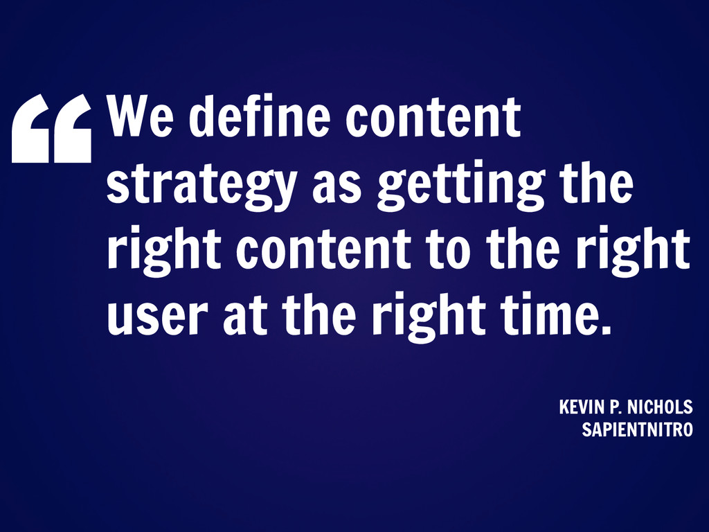
What is content strategy? How to determine what content is most important for your visitors?
Slide: 47
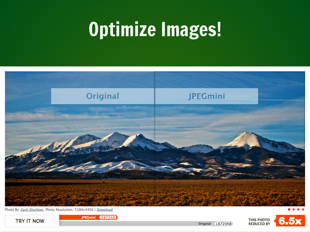
There are tons of ways that you can control the weight of your site and what you’re costing your users in data downloading. The first is making sure that you’ve coded your site so that only the necessary elements are loading – if you’ve got a site with a huge video that you don’t want showing in mobile, make sure it doesn’t get loaded in mobile until needed!
One no-brainer way to lower the page weight is by optimizing images. Everyone loves a big splashy photo that showcases your amazing campus and awesome students, but there are ways to still have this without hurting your performance. The first is to make sure your images are optimized – make sure that you aren’t loading a 5000x3000 full-quality jpg when a 100x200 thumbnail will do.
Slide: 48
In general, testing out site weight is pretty easy with the tool yslow, which is available as a Chrome extension. Google also offers Page Speed analysis. These tools analyze your website and give you recommendations on how to improve page speed.
Slide: 49
You can also run your images through an optimizer tool – whether it’s built into photoshop or it’s a secondary tool.
Slide: 50
The full solution to responsive images is still being worked out, but it may be worth trying to implement some type of responsive image solution for some of your largest images.
http://www.smashingmagazine.com/2014/05/12/picturefill-2-0-responsive-images-and-the-perfect-polyfill/
http://blog.cloudfour.com/dont-use-picture-most-of-the-time/
http://css-tricks.com/responsive-images-youre-just-changing-resolutions-use-srcset/
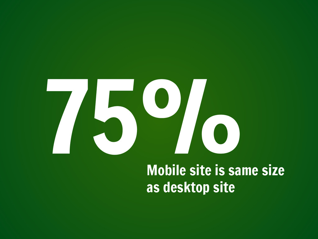
Slide: 51
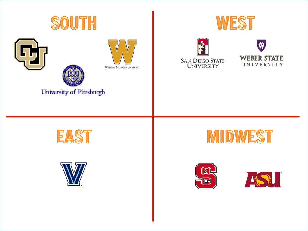
To keep this manageable, I’m going to eliminate schools that have not optimized their sites – all schools where the mobile version is the same size (or larger than!) the desktop version.
Slide: 55
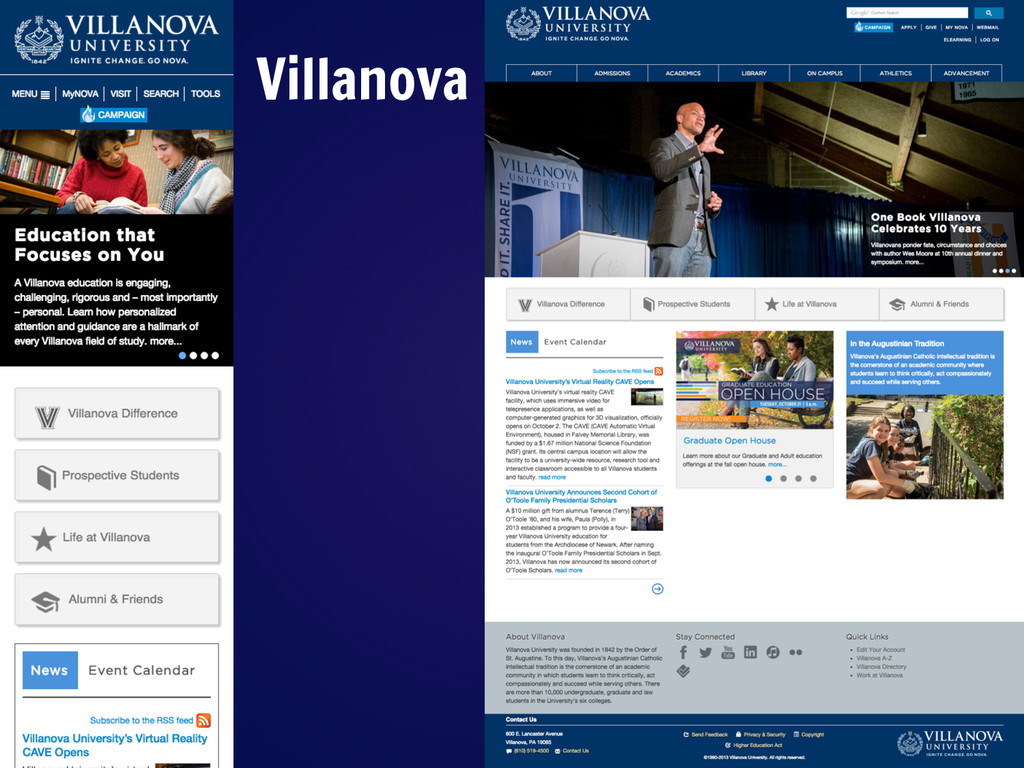
It pains me a little bit, eliminating the East down to just Villanova.
Slide: 56
So, that brings us down to eight schools. Let’s look at my last measurement, which is a bit harder to measure — content parity and experience of that content.
Slide: 57
So with that in mind, let’s talk a little bit about content and content parity.
Slide: 58
There are lots of things that a university website can be trying to accomplish. Often, we find that we’re trying to accomplish too many things at once. However, I think we can all agree that we do share some similar goals
1) recruiting students
2) interacting with alumni
3) allowing our communities to access resources
Slide: 59
No matter how pretty our websites look on all the different devices, they are never going to be successful if there is not content to back it up.
Slide: 60
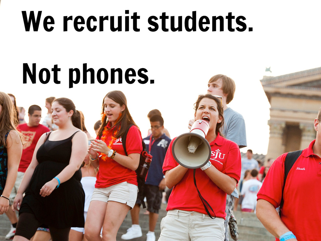
We recruit students, not phones – so we need to design for people, not devices. We need to make sure our content is accessible and is meeting the needs of our users.
Slide: 61
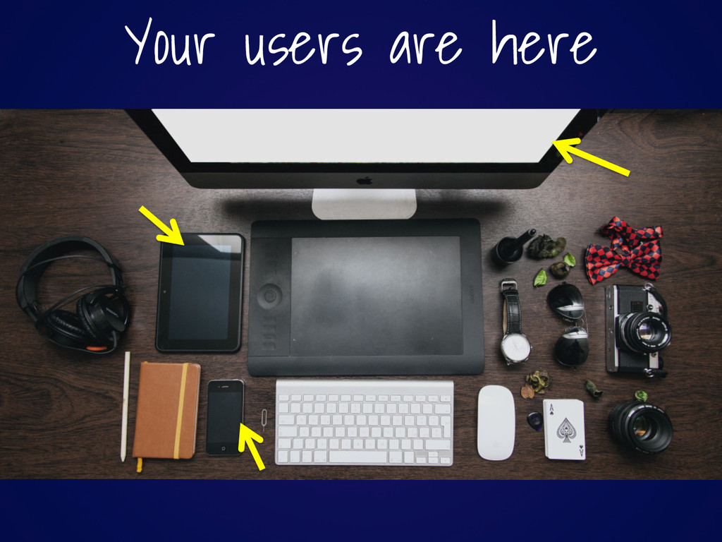
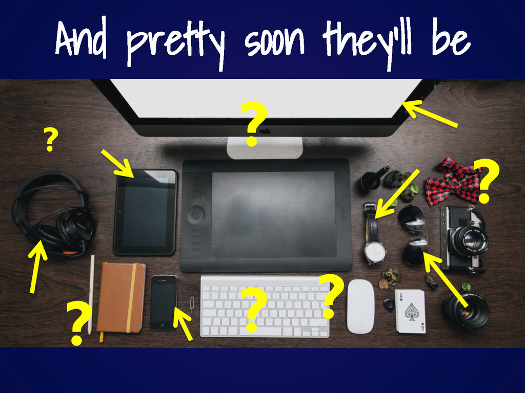
You don’t get to decide where your users will interact with your content. Sure, your users are here today, but pretty soon they may be lots more places.
Slide: 64
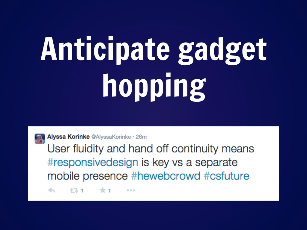
Design for people not devices – the content you deliver should not changed dramatically based on the device the user is current using. Anticipate that your users will hop from gadget to gadget – sometimes even mid-task! You need to provide assurances that the user will be able to find what they need no matter what device they are using.
Slide: 65
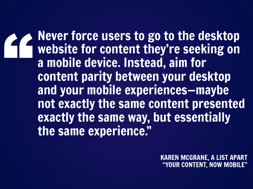
Here’s a great quote from an article on one of my favorite resources, A List Apart. (read the quote)
Slide: 66
Let me repeat that – you want to aim for content parity.
How many people have switched devices mid-task?
Slide: 67
You don’t get to decide how your users interact with your content. You just get to decide what content you are going to deliver to them.
Slide: 68
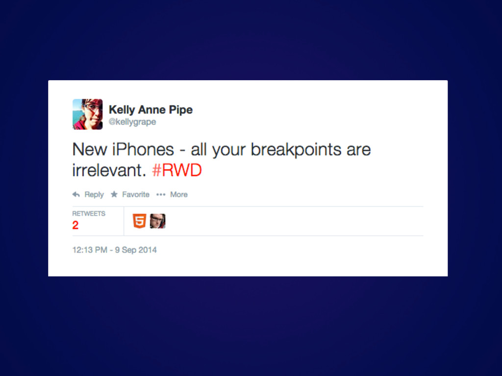
https://twitter.com/zeldman/statuses/804159148
Slide: 74
What is content choreography?
Slide: 76
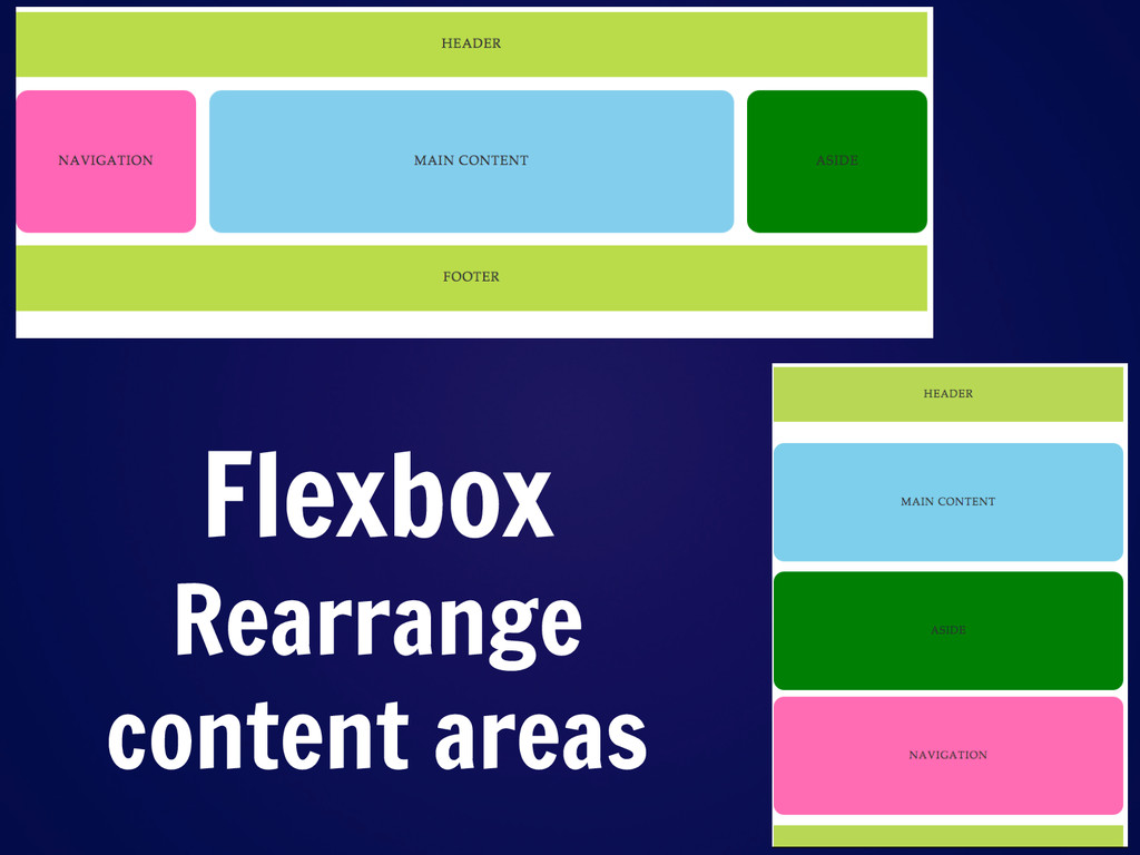
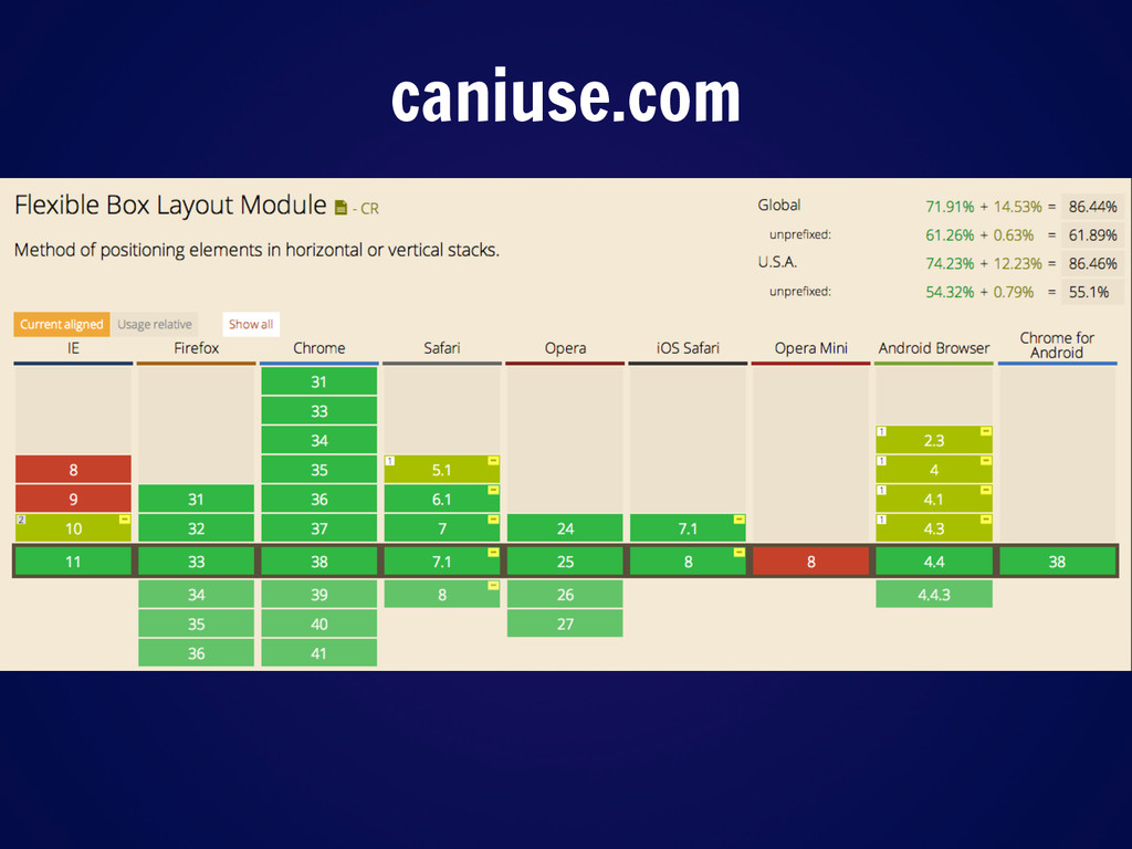
Not many universities have the luxury of only supporting the most recent version of browsers, and if you do I’m really jealous. However, it’s nice to know that flexbox support is out there and growing. If you haven’t explored it and you are involved in front-end development, now is the time to get started!
Slide: 77
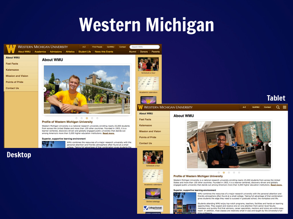
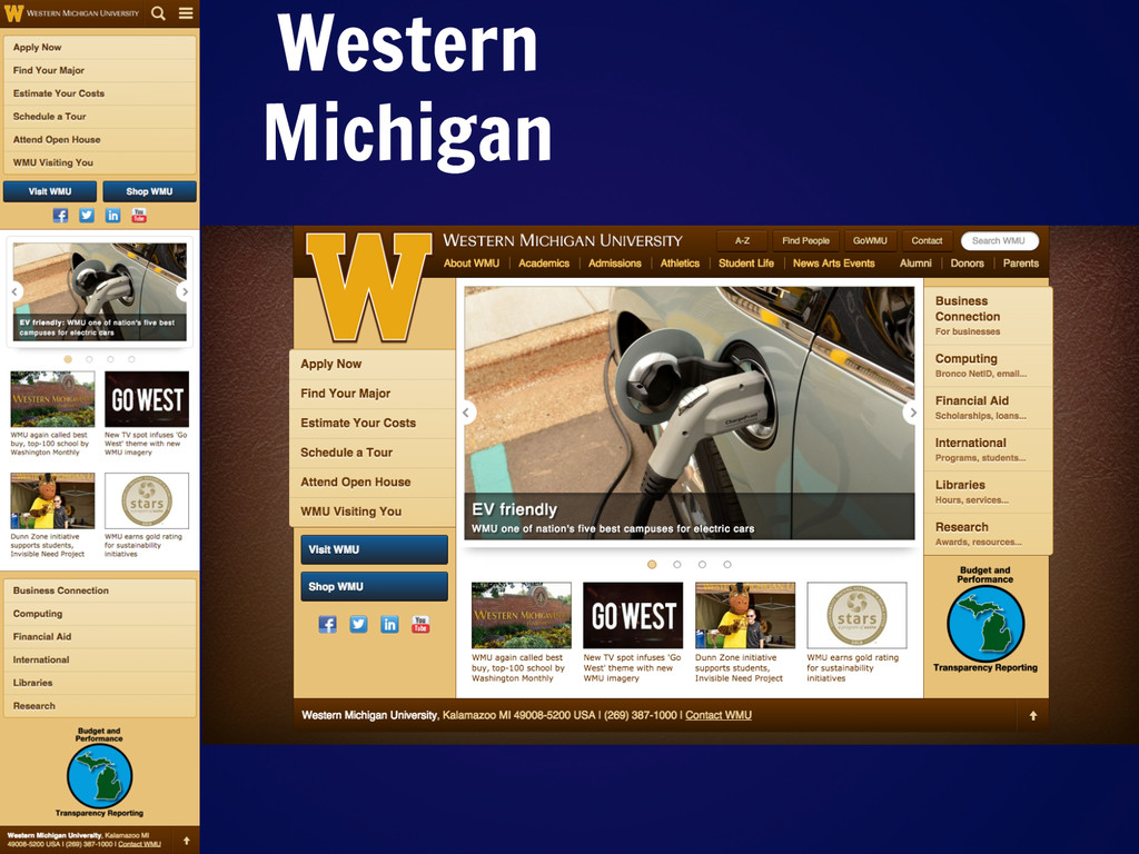
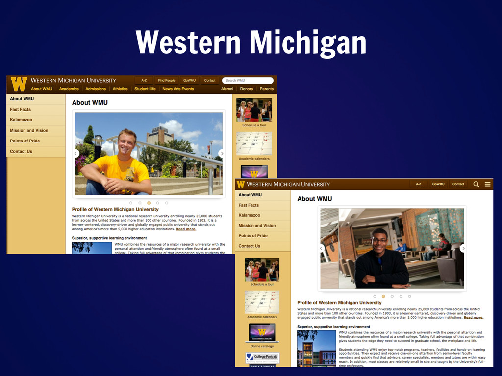
Let’s take a look at one of our finalists, Western Michigan University, and see how they have implemented some really interesting content choreography. On desktop, this sidebar with photos is on the right of the content, while on tablet it flies to the left of the content. And in mobile, both sidebars appear under the main content block.
Slide: 78
Let’s look at our finalists.
Slide: 88
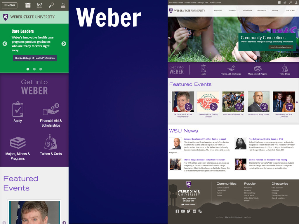
We have eight schools left. This was really hard to eliminate – I feel that many of the schools approached their content delivery in a different way, and what has worked for one school may not work at all for another school.
However, there are some standouts.
Slide: 89
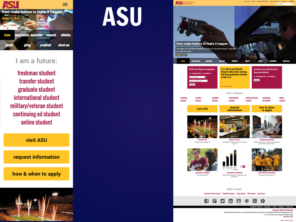
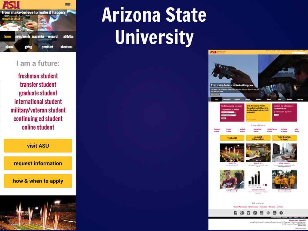
A strong runner-up is Arizona State University. They have clear calls-to-action on both desktop and mobile. And one of the coolest things is the fact that in desktop there is a video playing in the background of the header!
Slide: 90
Western Michigan is our second-place winner. They do fabulously when it comes to lightweight website – and the content choreography is astounding. For example, on inside pages such as their About page, the sidebars actually completely change locations depending on your screen size. http://www.wmich.edu/about
Slide: 91
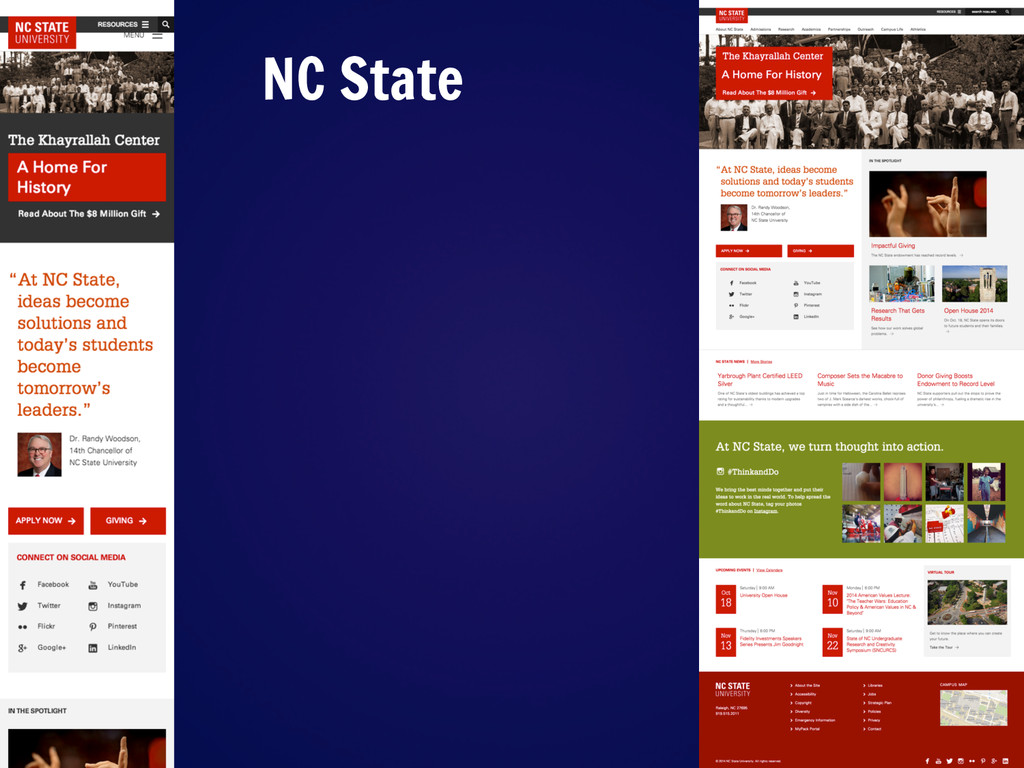
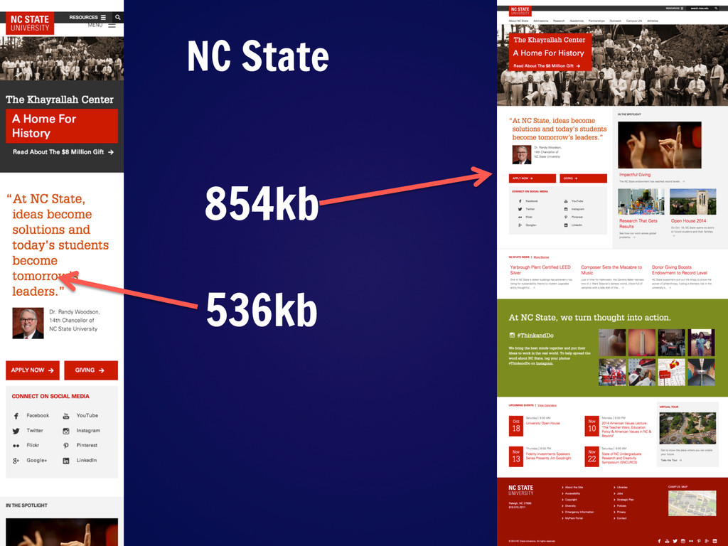
NC State our champion. With lots of bold color and some great visuals, it’s amazing the amount of impact that their website has considering that even the DESKTOP version is under a megabyte. Their inner pages are also really nice, with the blocks of color and large text that we see on the homepage continuing through other landing pages (like the Admissions site).
Slide: 95
Yeah, this is a pretty terrible way to choose a bracket.
Slide: 96
(carleton - http://vimeo.com/108970526)
Slide: 104
Go and learn! Any questions?
 iotcomjpadmin
 masayoshimaezawa
 isaoshimizu
 yamasatimi
 sugupoko
 hiroramos4
 laysakura
 takafumisu2uk1
 nealle
 ks91
ks91
 daitak
 ymhiroki
 honzajavorek
 jlugia
 mayunak
 axbom
axbom
 stephaniewalter
 rakko
rakko
 portentint
 michielstock
 thoeni
 denniskardys
 dougneiner
 matthewcrist