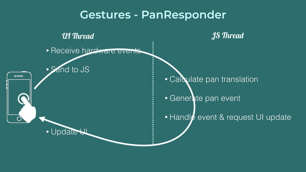
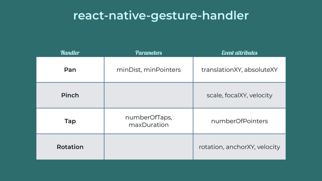
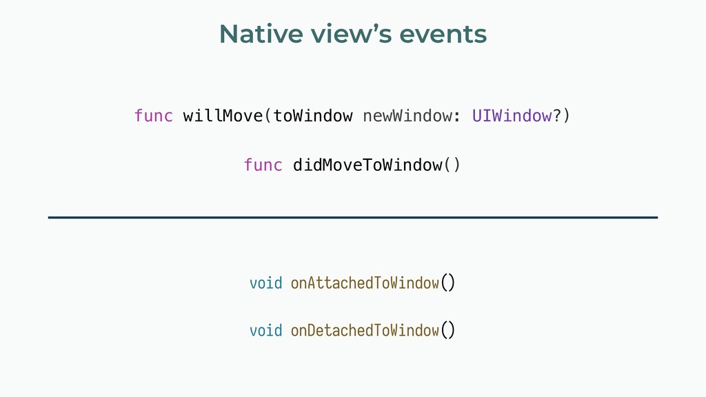
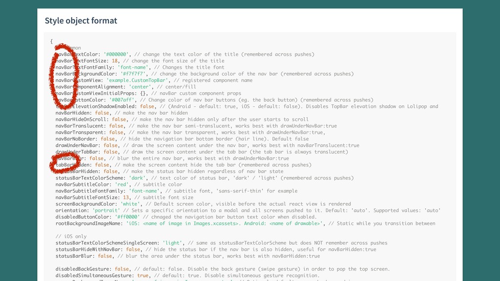
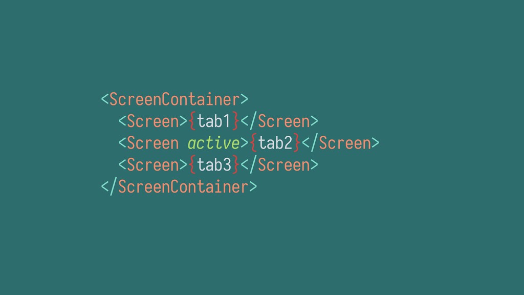
the text color of the title (remembered across pushes) navBarTextFontSize: 18, // change the font size of the title navBarTextFontFamily: 'font-name', // Changes the title font navBarBackgroundColor: '#f7f7f7', // change the background color of the nav bar (remembered across pushes) navBarCustomView: 'example.CustomTopBar', // registered component name navBarComponentAlignment: 'center', // center/fill navBarCustomViewInitialProps: {}, // navBar custom component props navBarButtonColor: '#007aff', // Change color of nav bar buttons (eg. the back button) (remembered across pushes) topBarElevationShadowEnabled: false, // (Android - default: true, iOS - default: false). Disables TopBar elevation shadow on Lolipop and navBarHidden: false, // make the nav bar hidden navBarHideOnScroll: false, // make the nav bar hidden only after the user starts to scroll navBarTranslucent: false, // make the nav bar semi-translucent, works best with drawUnderNavBar:true navBarTransparent: false, // make the nav bar transparent, works best with drawUnderNavBar:true, navBarNoBorder: false, // hide the navigation bar bottom border (hair line). Default false drawUnderNavBar: false, // draw the screen content under the nav bar, works best with navBarTranslucent:true drawUnderTabBar: false, // draw the screen content under the tab bar (the tab bar is always translucent) navBarBlur: false, // blur the entire nav bar, works best with drawUnderNavBar:true tabBarHidden: false, // make the screen content hide the tab bar (remembered across pushes) statusBarHidden: false, // make the status bar hidden regardless of nav bar state statusBarTextColorScheme: 'dark', // text color of status bar, 'dark' / 'light' (remembered across pushes) navBarSubtitleColor: 'red', // subtitle color navBarSubtitleFontFamily: 'font-name', // subtitle font, 'sans-serif-thin' for example navBarSubtitleFontSize: 13, // subtitle font size screenBackgroundColor: 'white', // Default screen color, visible before the actual react view is rendered orientation: 'portrait' // Sets a specific orientation to a modal and all screens pushed to it. Default: 'auto'. Supported values: 'auto' disabledButtonColor: '#ff0000' // chnaged the navigation bar button text color when disabled. rootBackgroundImageName: 'iOS: <name of image in Images.xcassets>. Android: <name of drawable>', // Static while you transition between // iOS only statusBarTextColorSchemeSingleScreen: 'light', // same as statusBarTextColorScheme but does NOT remember across pushes statusBarHideWithNavBar: false, // hide the status bar if the nav bar is also hidden, useful for navBarHidden:true statusBarBlur: false, // blur the area under the status bar, works best with navBarHidden:true disabledBackGesture: false, // default: false. Disable the back gesture (swipe gesture) in order to pop the top screen. disabledSimultaneousGesture: true, // default: true. Disable simultaneous gesture recognition.
 kmagiera
 shift_evolve
 nstock
 yuksew
 abnoumaru
 geekplus_tech
 yoshiyama_hana
 taromatsui_cccmkhd
 smt7174
 watany
 oracle4engineer
 ichimichi
 yutakaosada
 tammyeverts
 frankvandijk
 philnash
 brad_frost
 aleyda
 tmiket
 coloredviolet
 codingconduct
 ammeep
 smashingmag
![<RotationGestureHandler onGestureEvent={Animated.event( [{ nativeEvent: { rotation: this.rotationValue } }], {](https://files.speakerdeck.com/presentations/20d216ecba894c30aae29e5a3751d5df/slide_13.jpg)
![Thank you! Krzysztof Magiera [email protected] @kzzzf](https://files.speakerdeck.com/presentations/20d216ecba894c30aae29e5a3751d5df/slide_33.jpg)