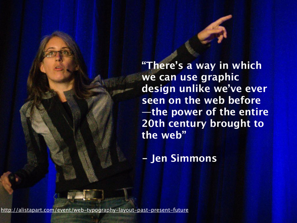
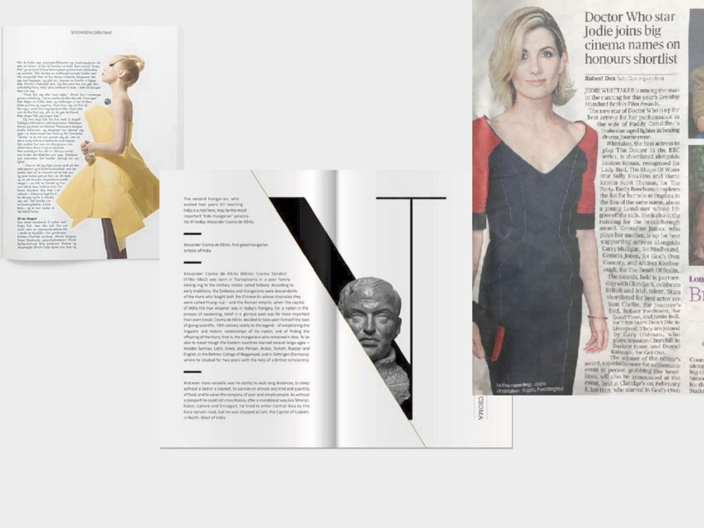
unlike we’ve ever seen on the web before —the power of the entire 20th century brought to the web” - Jen Simmons http://alistapart.com/event/web-typography-layout-past-present-future
unlike we’ve ever seen on the web before —the power of the entire 20th century brought to the web” - Jen Simmons http://alistapart.com/event/web-typography-layout-past-present-future
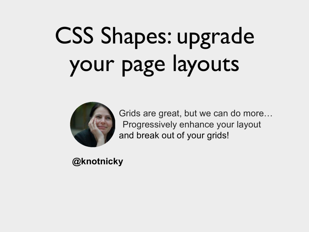
 knotnicky
 i35_267
 watany
 sakajunquality
 yukiogawa
 muziyoshiz
 kaminashi
 miyukki
 k_adachi_01
 diggymo
 miyukichi_ospf
 hiroyaonoe
 sue445
 inesmontani
 irinanazarova
 trallard
 axbom
axbom
 davetheseo
 katiecoart
 szymonslowik
 eileencodes
 nonsquared
 codingconduct
 mongodb
 lauravandoore