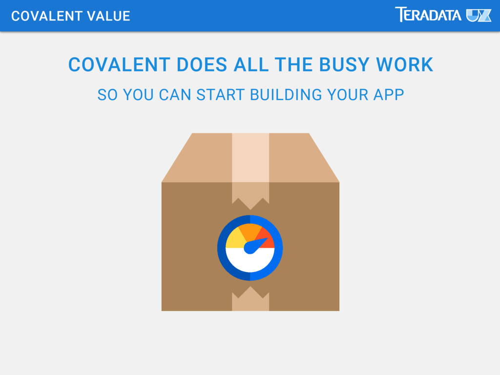
Rapidly Build Enterprise Apps in Angular 2 with Covalent
created for the Austin AngularJS Meetup, this deck walks through what Covalent is, why we made it and how to rapidly build an app staring with our Angular 2.0 Material Design quickstart
COMPLETE CODE FRAMEWORK (that we get for “free”) GLOBAL DEV ADOPTION GLOBAL FAMILIARITY FANTASTIC ACCESSIBILITY EXTREMELY AGILE CYCLES WE FOCUS ON PRODUCT FEATURES & EASE OF USE IS OUR BRAND
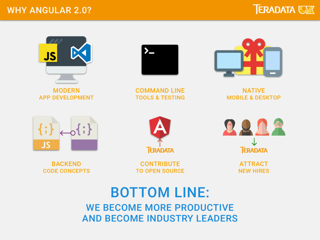
LINE TOOLS & TESTING CONTRIBUTE TO OPEN SOURCE NATIVE MOBILE & DESKTOP ATTRACT NEW HIRES BOTTOM LINE: WE BECOME MORE PRODUCTIVE AND BECOME INDUSTRY LEADERS
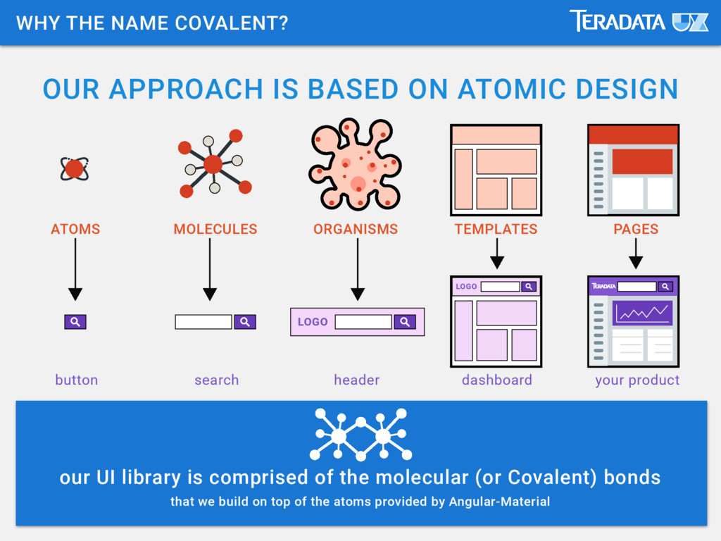
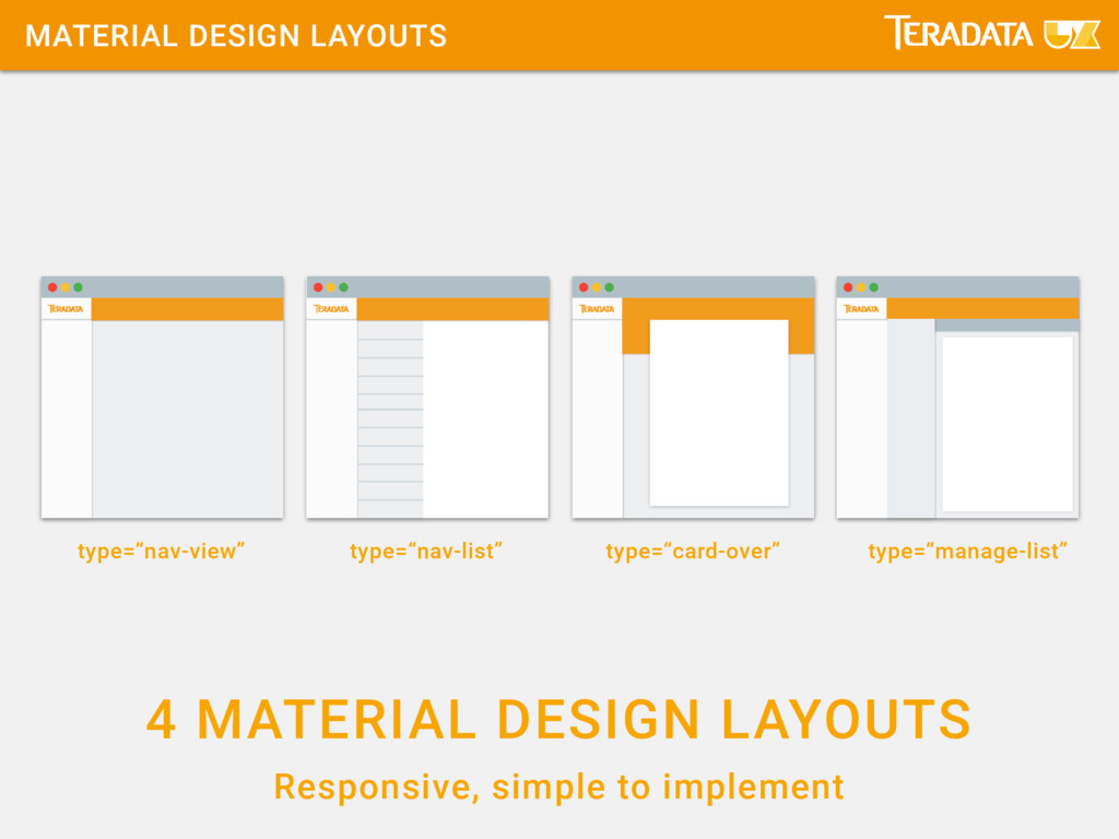
button MOLECULES search ORGANISMS header TEMPLATES dashboard PAGES your product our UI library is comprised of the molecular (or Covalent) bonds that we build on top of the atoms provided by Angular-Material WHY THE NAME COVALENT?
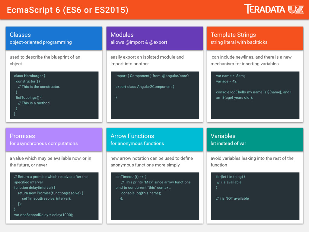
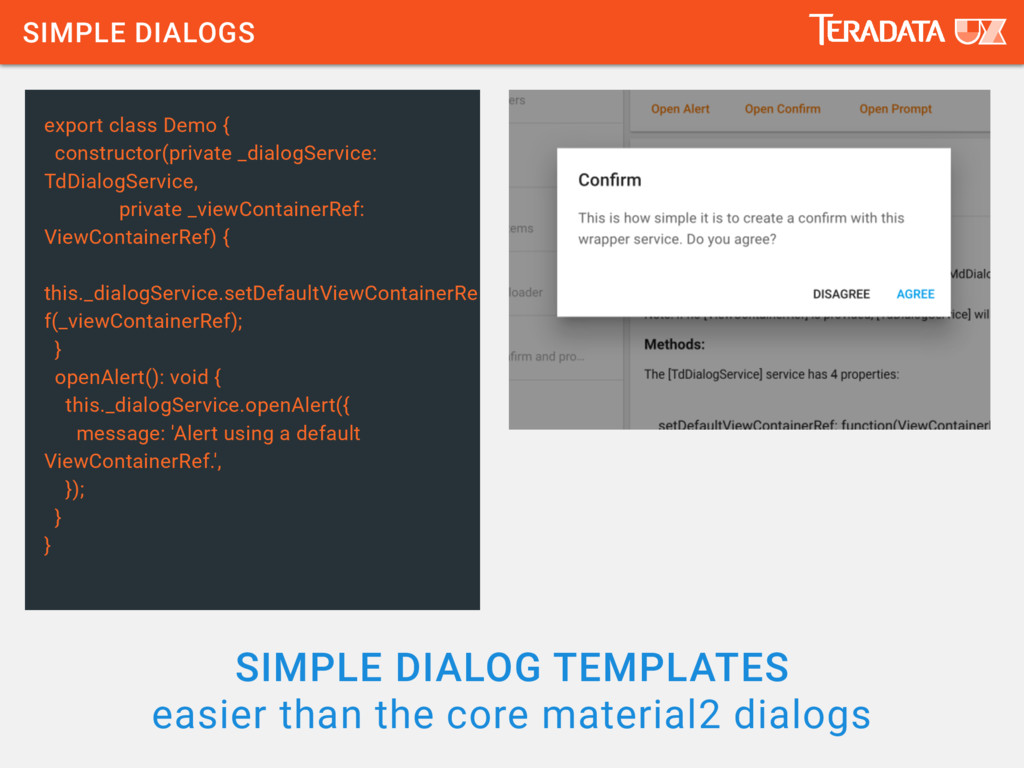
// This is the constructor. } listToppings() { // This is a method. } } // Return a promise which resolves after the specified interval function delay(interval) { return new Promise(function(resolve) { setTimeout(resolve, interval); }); } var oneSecondDelay = delay(1000); import { Component } from '@angular/core'; export class Angular2Component { } setTimeout(() => { // This prints "Max" since arrow functions bind to our current "this" context. console.log(this.name); }); var name = 'Sam'; var age = 42; console.log(`hello my name is ${name}, and I am ${age} years old`); for(let i in thing) { // i is available } // i is NOT available Classes Promises Modules Arrow Functions Template Strings Variables object-oriented programming for asynchronous computations allows @import & @export for anonymous functions string literal with backticks let instead of var let instead of var used to describe the blueprint of an object a value which may be available now, or in the future, or never easily export an isolated module and import into another new arrow notation can be used to define anonymous functions more simply can include newlines, and there is a new mechanism for inserting variables avoid variables leaking into the rest of the function
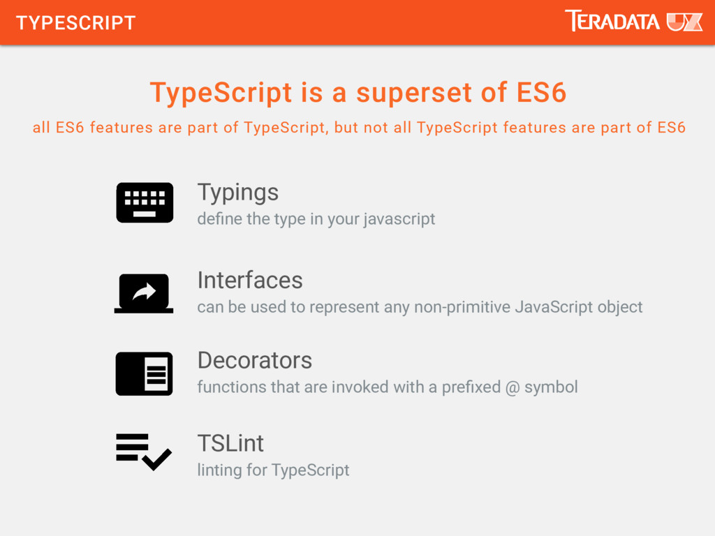
are part of TypeScript, but not all TypeScript features are part of ES6 define the type in your javascript can be used to represent any non-primitive JavaScript object functions that are invoked with a prefixed @ symbol linting for TypeScript Typings Interfaces Decorators TSLint
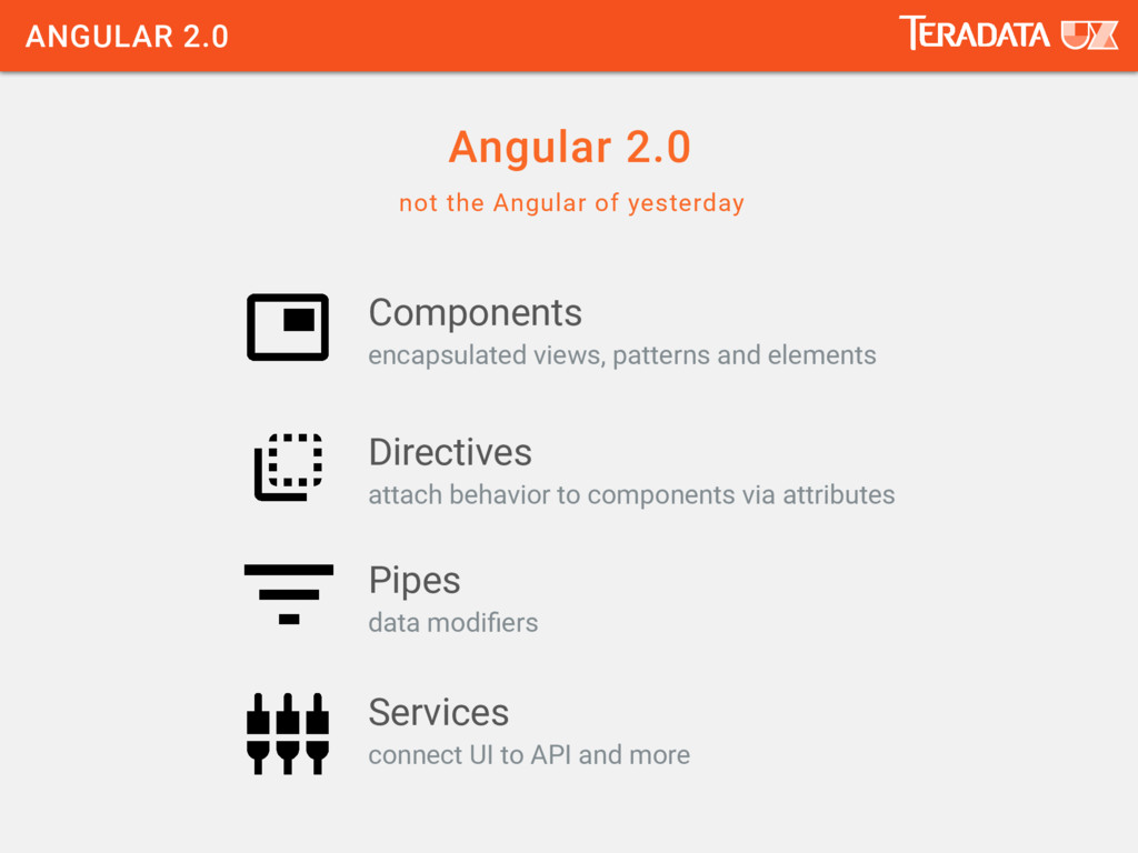
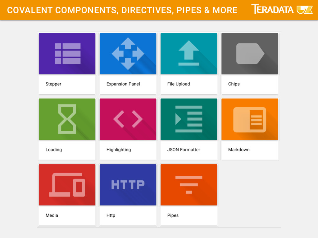
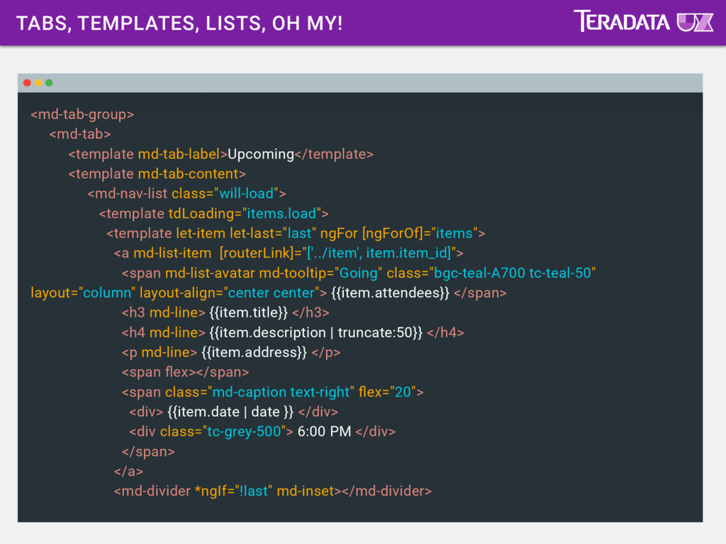
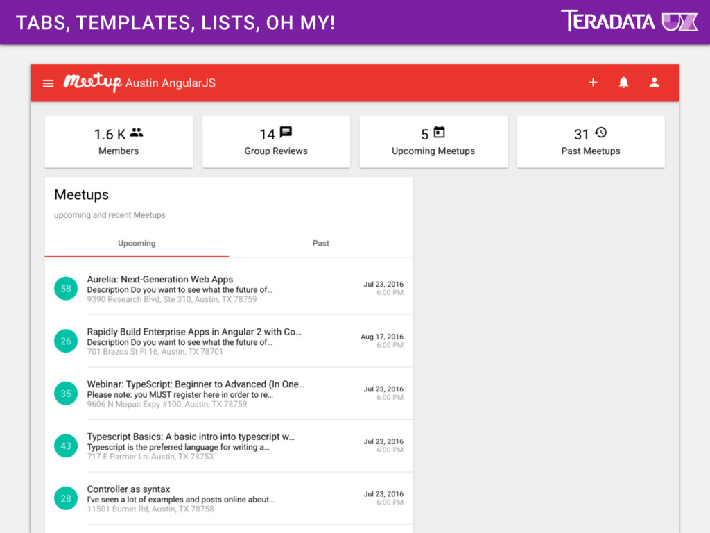
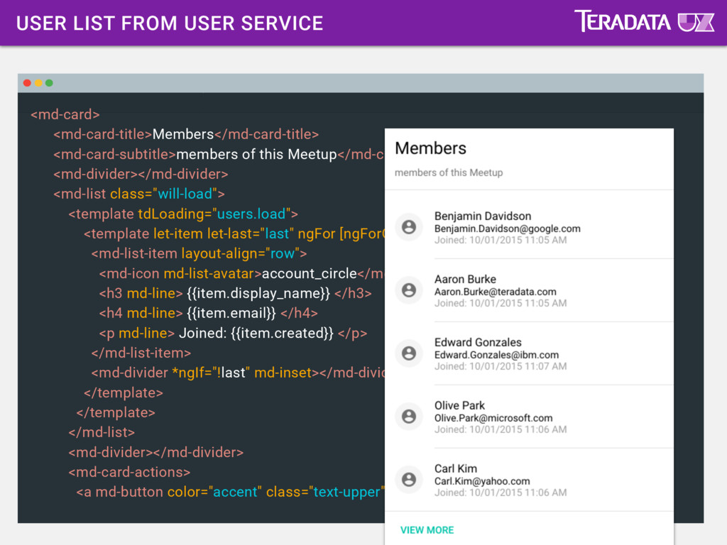
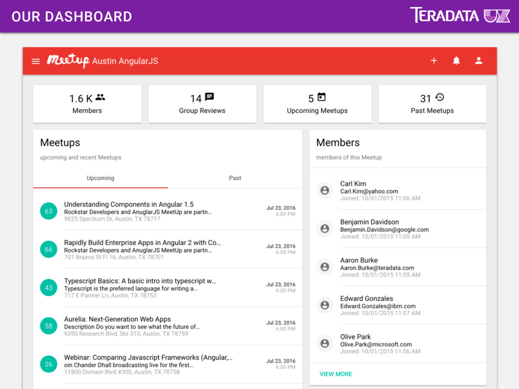
views, patterns and elements attach behavior to components via attributes data modifiers connect UI to API and more Components Directives Pipes Services
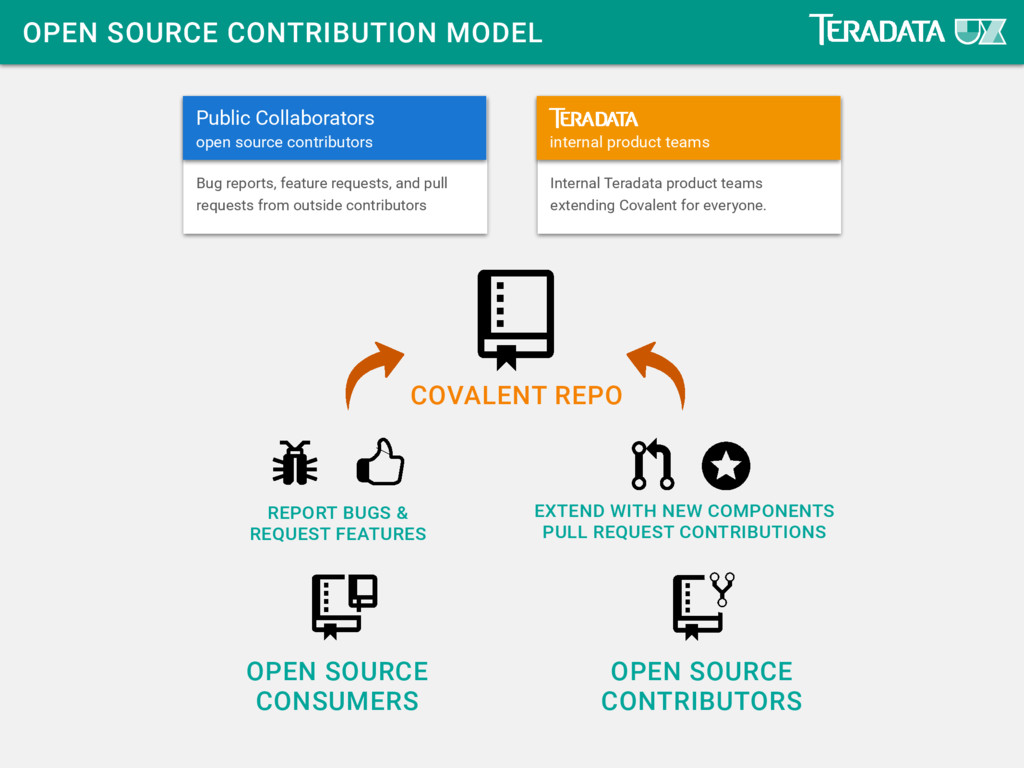
SOURCE CONTRIBUTORS REPORT BUGS & REQUEST FEATURES EXTEND WITH NEW COMPONENTS PULL REQUEST CONTRIBUTIONS Public Collaborators open source contributors Bug reports, feature requests, and pull requests from outside contributors internal product teams Internal Teradata product teams extending Covalent for everyone.
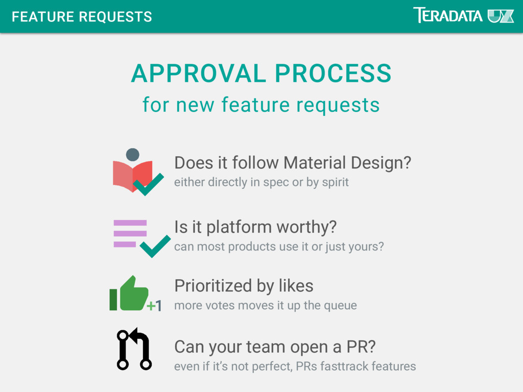
in spec or by spirit can most products use it or just yours? more votes moves it up the queue even if it’s not perfect, PRs fasttrack features Does it follow Material Design? Is it platform worthy? Prioritized by likes Can your team open a PR?
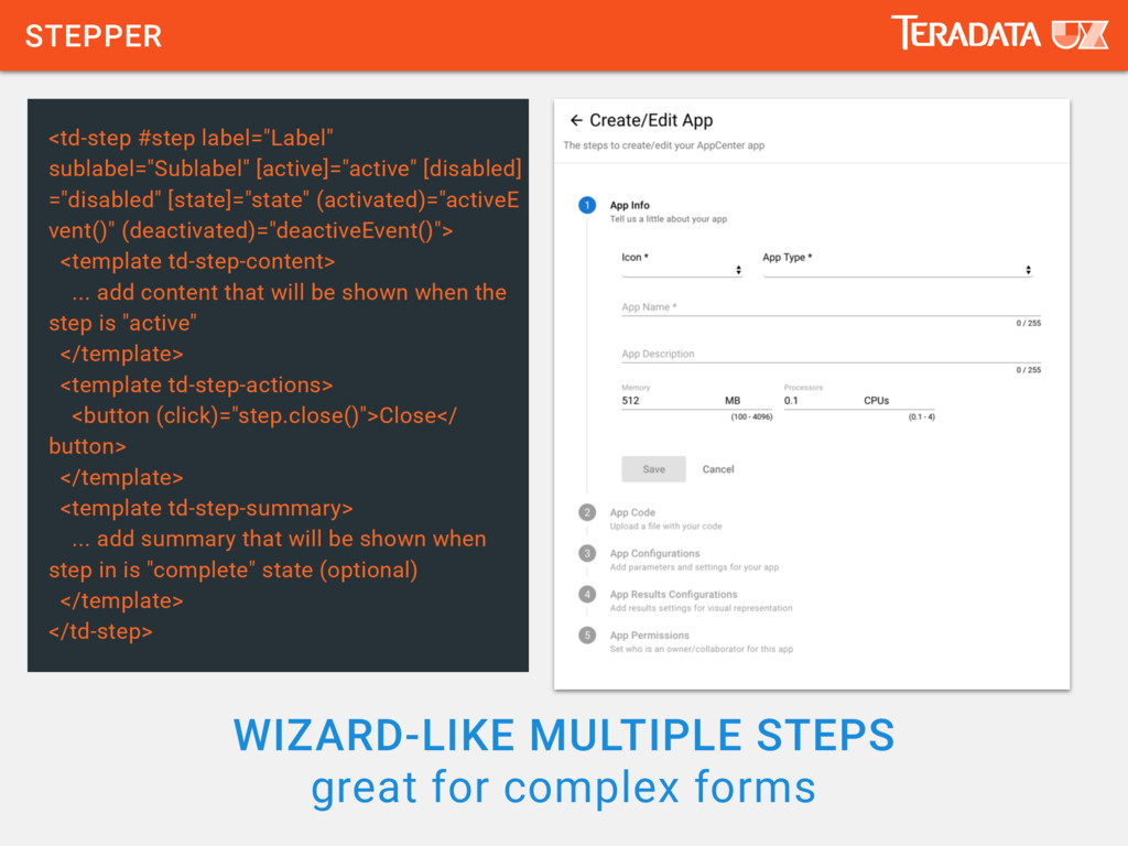
label="Label" sublabel="Sublabel" [active]="active" [disabled] ="disabled" [state]="state" (activated)="activeE vent()" (deactivated)="deactiveEvent()"> <template td-step-content> ... add content that will be shown when the step is "active" </template> <template td-step-actions> <button (click)="step.close()">Close</ button> </template> <template td-step-summary> ... add summary that will be shown when step in is "complete" state (optional) </template> </td-step>
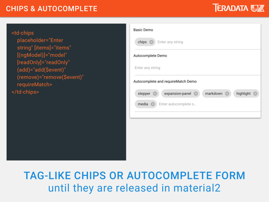
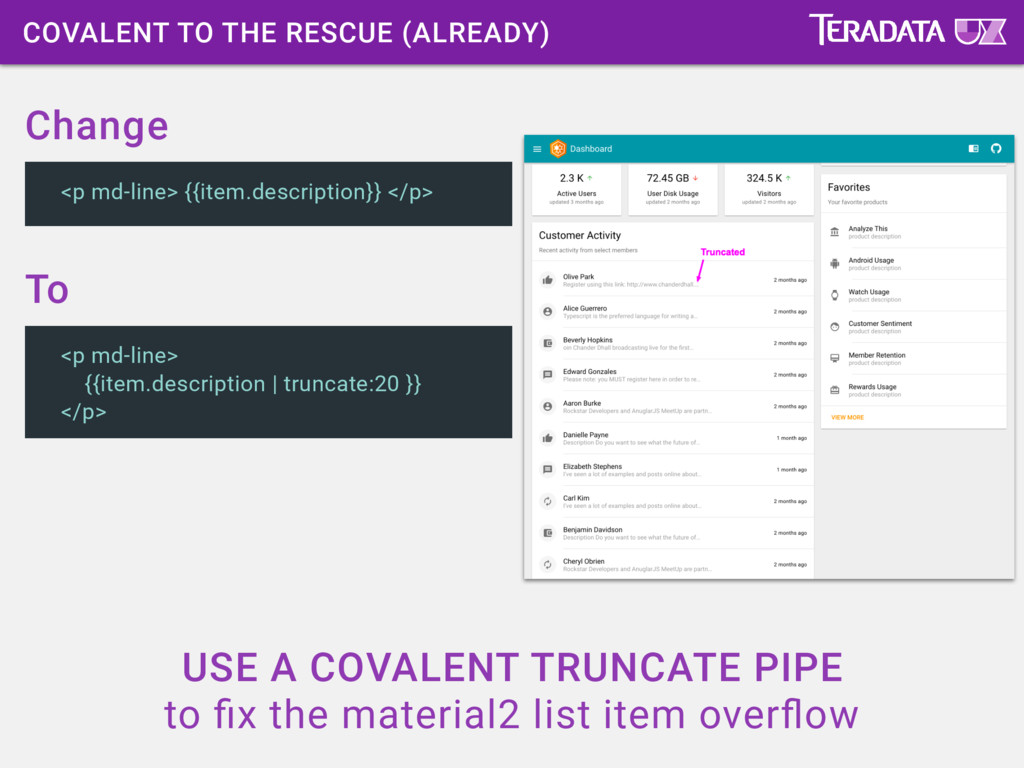
are released in material2 <td-chips placeholder="Enter string" [items]="items" [(ngModel)]="model" [readOnly]="readOnly" (add)="add($event)" (remove)="remove($event)" requireMatch> </td-chips>
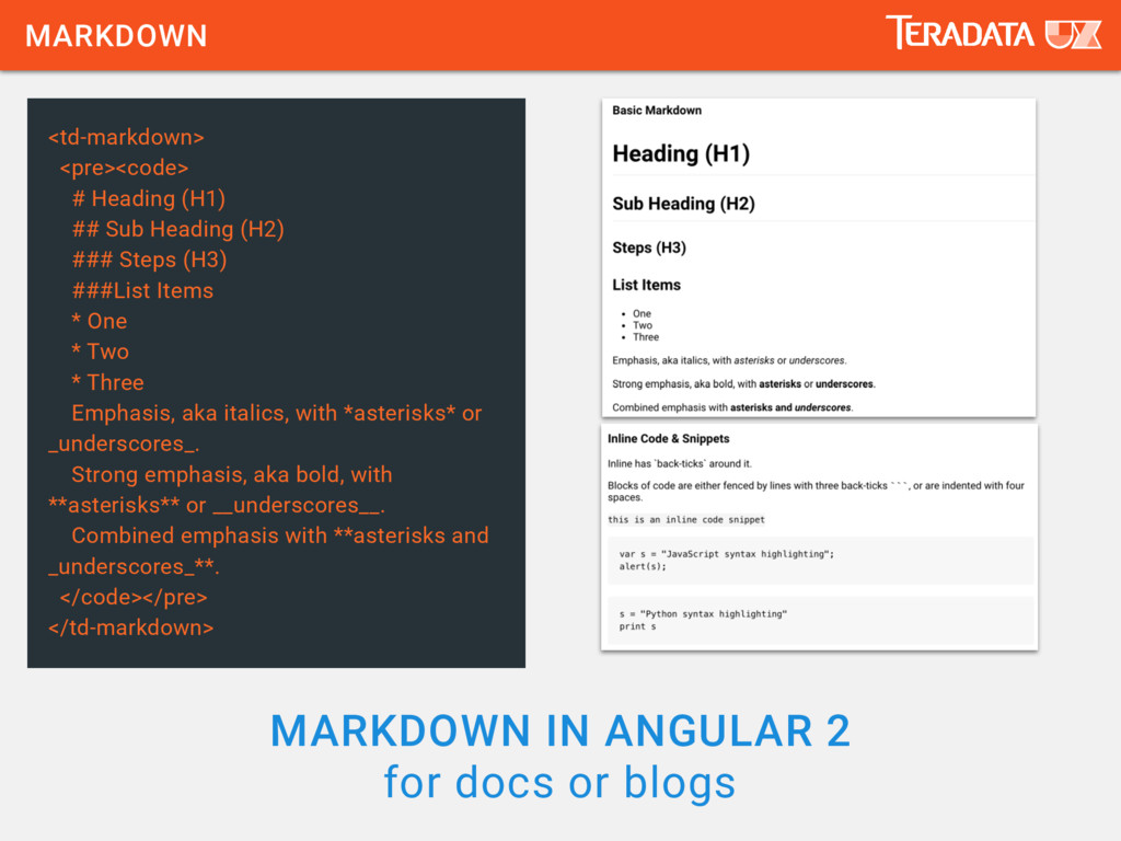
<pre><code> # Heading (H1) ## Sub Heading (H2) ### Steps (H3) ###List Items * One * Two * Three Emphasis, aka italics, with *asterisks* or _underscores_. Strong emphasis, aka bold, with **asterisks** or __underscores__. Combined emphasis with **asterisks and _underscores_**. </code></pre> </td-markdown>
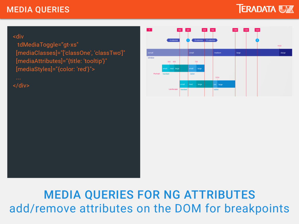
the DOM for breakpoints <div tdMediaToggle=“gt-xs" [mediaClasses]="['classOne', 'classTwo']" [mediaAttributes]="{title: 'tooltip'}" [mediaStyles]="{color: 'red'}"> ... </div>
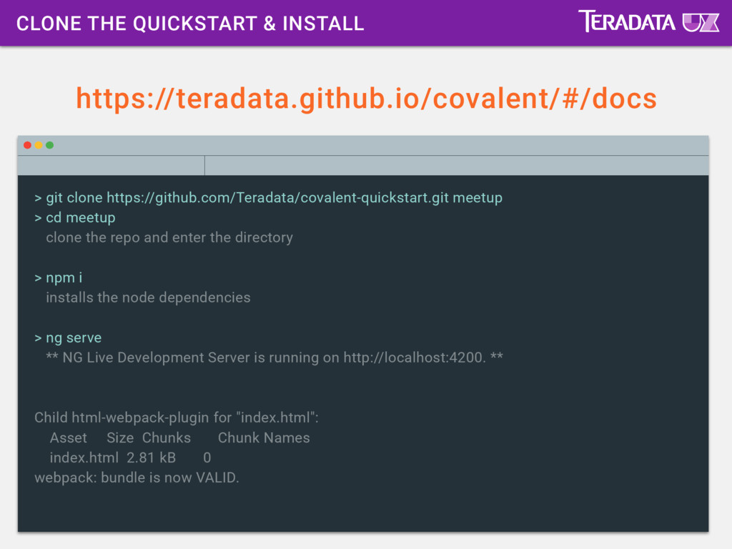
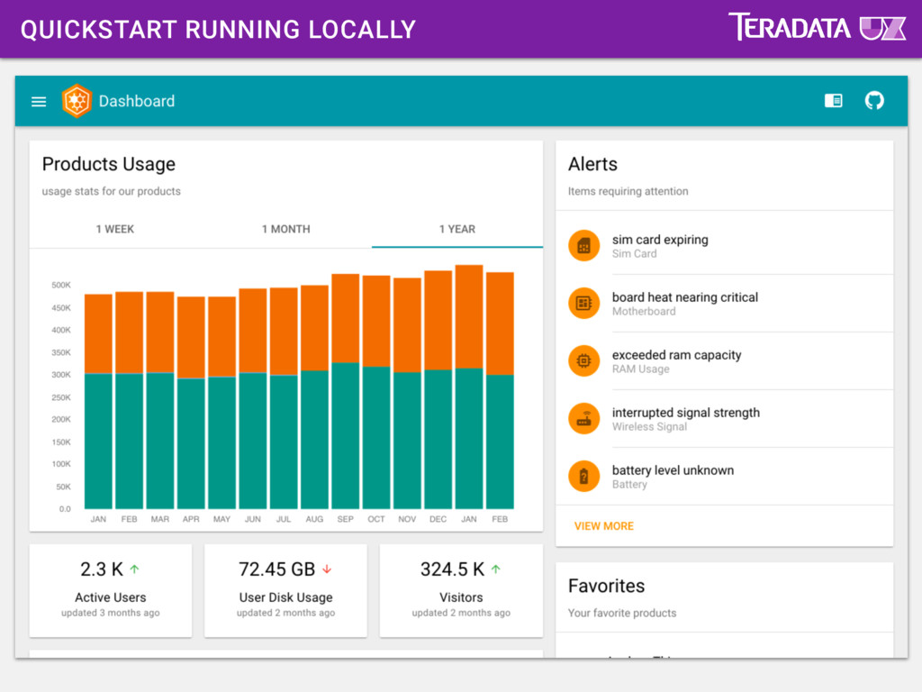
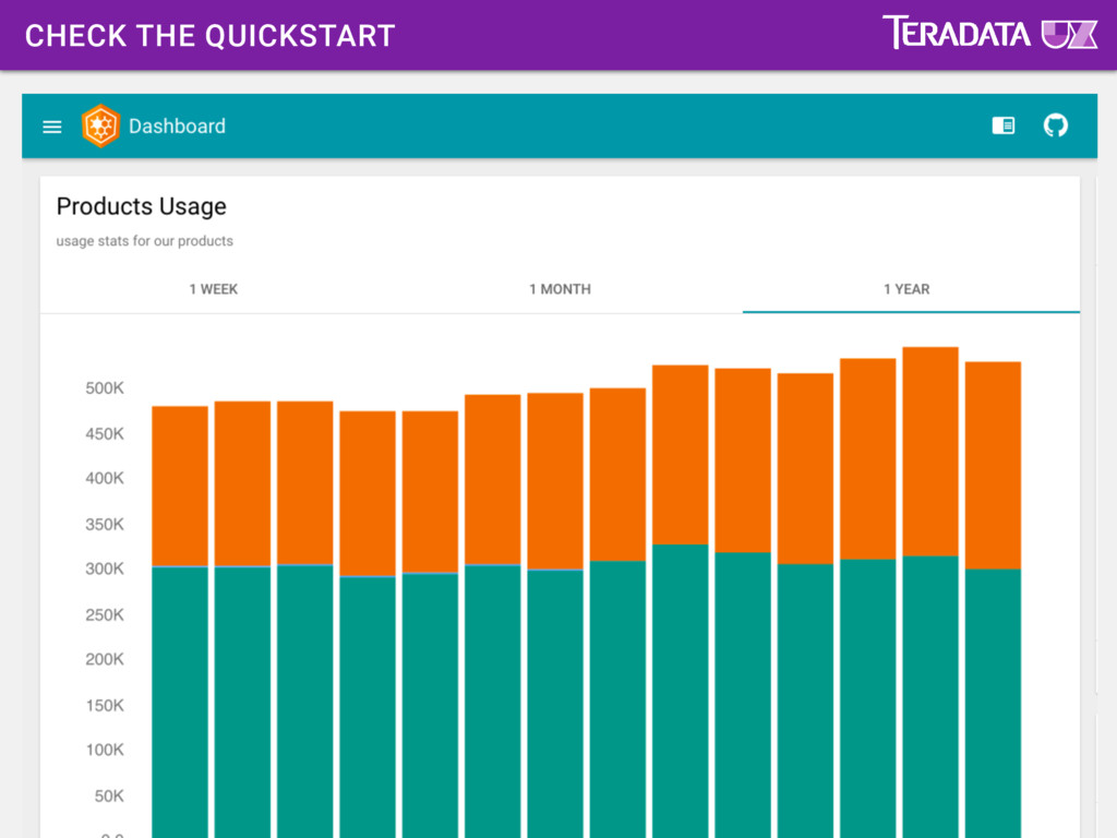
meetup > cd meetup clone the repo and enter the directory > npm i installs the node dependencies > ng serve ** NG Live Development Server is running on http://localhost:4200. ** Child html-webpack-plugin for "index.html": Asset Size Chunks Chunk Names index.html 2.81 kB 0 webpack: bundle is now VALID.
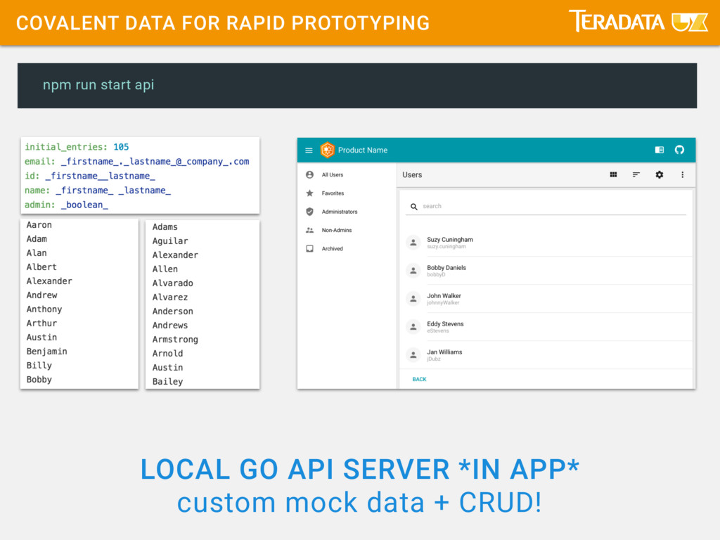
################################################################## INFO[0000] ######## ######## INFO[0000] ######## Teradata Covalent Atomic Data mock API server ######## INFO[0000] ######## Copyright 2016 by Teradata. All rights reserved. ######## INFO[0000] ######## This software is covered under the MIT license. ######## INFO[0000] ######## ######## INFO[0000] ################################################################## (in a new Terminal tab)
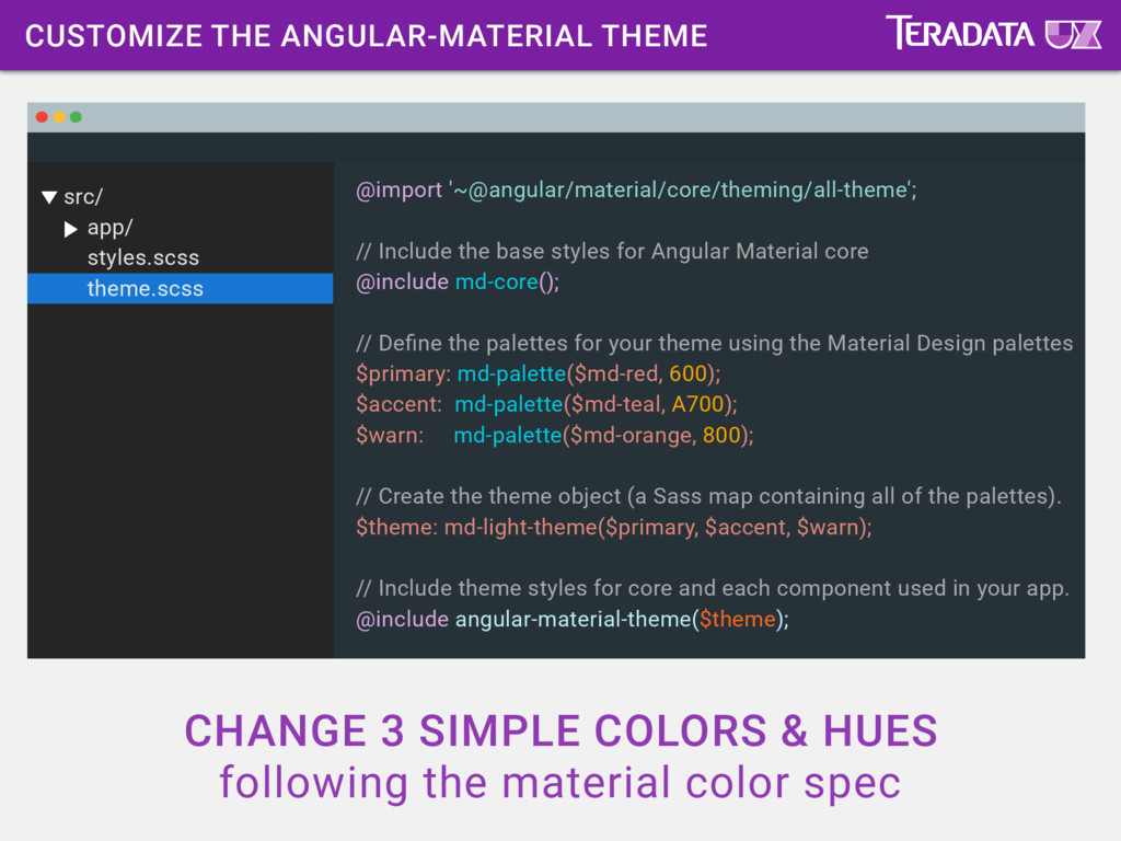
following the material color spec src/ app/ styles.scss theme.scss @import '~@angular/material/core/theming/all-theme'; // Include the base styles for Angular Material core @include md-core(); // Define the palettes for your theme using the Material Design palettes $primary: md-palette($md-red, 600); $accent: md-palette($md-teal, A700); $warn: md-palette($md-orange, 800); // Create the theme object (a Sass map containing all of the palettes). $theme: md-light-theme($primary, $accent, $warn); // Include theme styles for core and each component used in your app. @include angular-material-theme($theme);
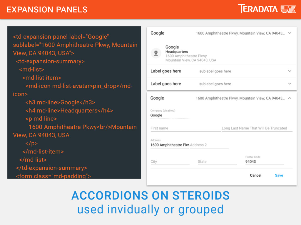
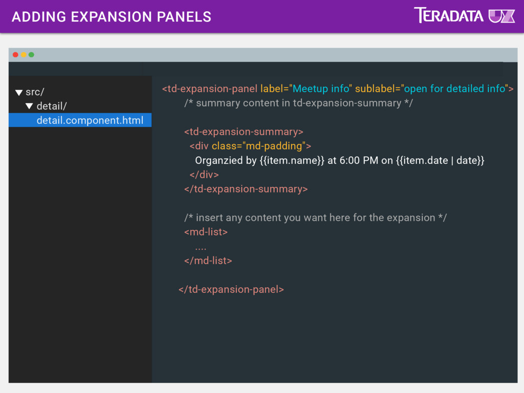
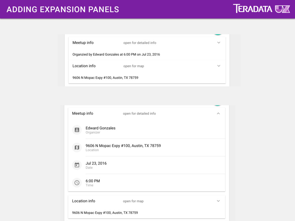
for detailed info"> /* summary content in td-expansion-summary */ <td-expansion-summary> <div class="md-padding"> Organzied by {{item.name}} at 6:00 PM on {{item.date | date}} </div> </td-expansion-summary> /* insert any content you want here for the expansion */ <md-list> .... </md-list> </td-expansion-panel>
 kyleledbetter
 taka_aki
 zozotech
 hageyahhoo
 shirouz
 kaminashi
 shinyasaita
 yama3133
 fruitriin
 takkuhiro
 yanzm
yanzm
 alchemy1115
 nishiuma
 codingconduct
 livdayseo
 kneath
 honzajavorek
 jlugia
 baasie
 jct
jct
 asonas
 tenderlove
 watany
 cassininazir
 kimpetersen
![RUN COVALENT DATA API SERVER > npm run start-api INFO[0000]](https://files.speakerdeck.com/presentations/aaaf31bc13b042188e8d943ff9ab4859/slide_54.jpg)
![UPDATE MAIN COMPONENT CLASS src/ app/ main/ main.component.ts routes: Object[]](https://files.speakerdeck.com/presentations/aaaf31bc13b042188e8d943ff9ab4859/slide_69.jpg)