Upgrade to Pro — share decks privately, control downloads, hide ads and more …

Lean DUS: Mobile Viewports von Peter-Paul Koch

Lean DUS
December 09, 2014
1k

Lean DUS: Mobile Viewports von Peter-Paul Koch

Welche Rolle spielen Viewports bei der Umsetzung mobiler Webseiten?

Lean DUS

December 09, 2014
Tweet

Transcript

  1. A pixel is not a pixel • CSS pixels •

    Device pixels You already know what they are. You just don’t realise it.
  2. CSS pixels • CSS pixels are the ones we use

    in declarations such as width: 190px or padding-left: 20px • They are an abstract construct • Their size increases or decreases when the user zooms
  3. Device pixels • Device pixels are the physical pixels on

    the device • There’s a fixed amount of them that depends on the device
  4. What kind of pixels? In general, almost all pixels you

    use in your code will be CSS pixels. The only exception is screen.width … but screen.width is a serious problem that we’ll study later
  5. Viewports • The 34% is calculated relative to its container:

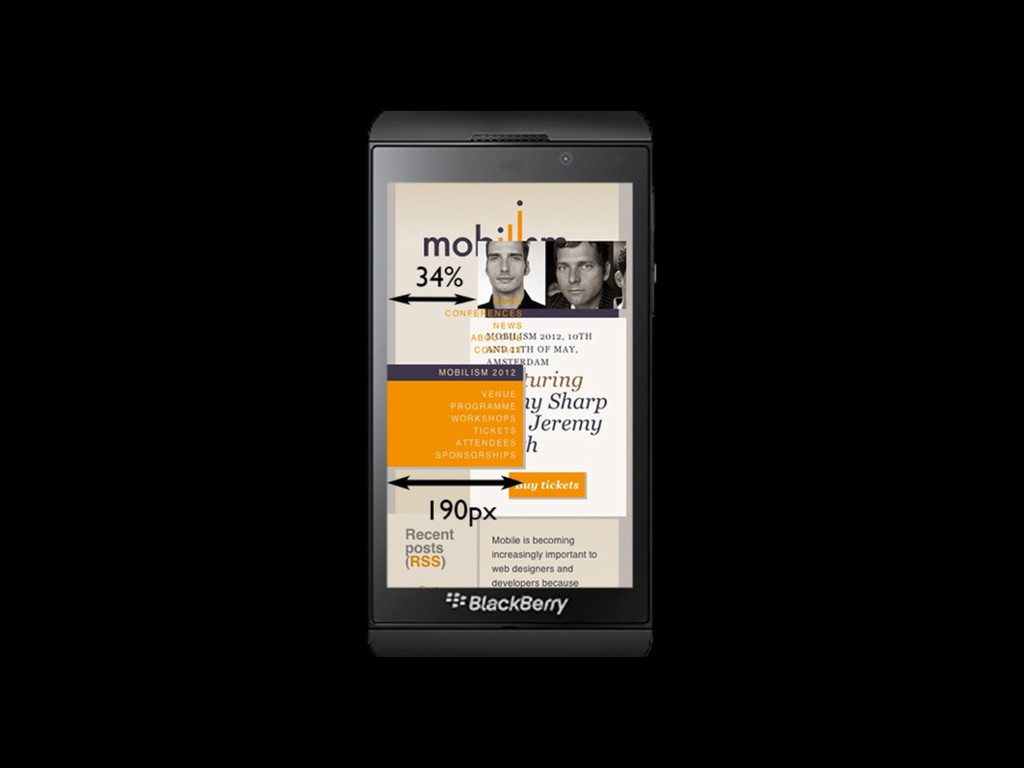
    the <body>. • Every block-level element, including <html> and <body>, has an implicit width: 100%. • So we get 34% of the <body> width of 100%. • 100% of what? Of the <html> width, which is again 100%.
  6. Viewports • The <html> element’s width is calculated relative to

    the viewport. • Also called the initial containing block. • On desktop it’s equal to the browser window width. • On mobile it’s more complicated.
  7. Viewports • When you zoom in, you enlarge the CSS

    pixels • and as a result less of them fit on the browser screen • Thus the viewport becomes smaller
  8. Viewports • On mobile it’s quite a bit more complicated

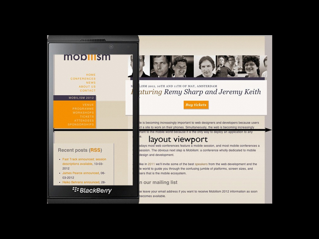
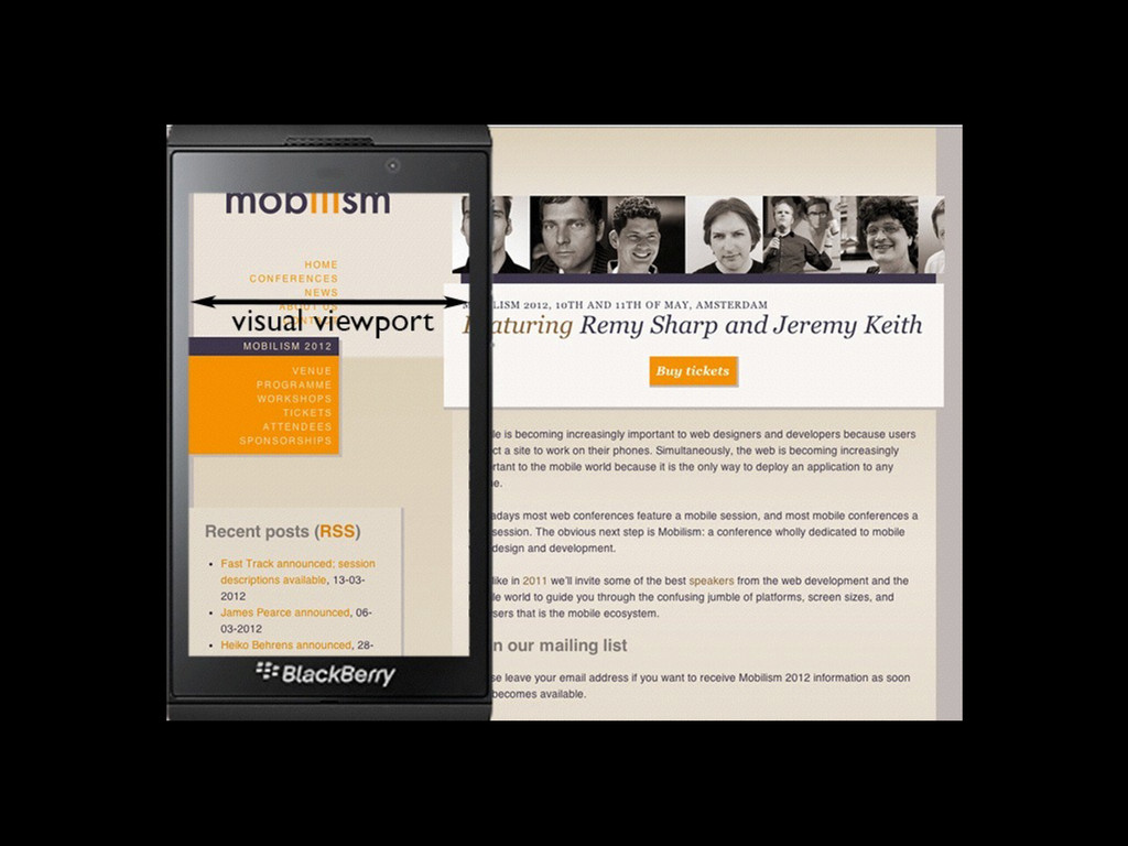
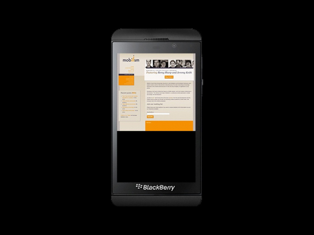
    • Mobile browsers must render all sites correctly, even if they haven’t been mobile- optimized • If the (narrow) browser window were to be the viewport, many sites would be squeezed to death
  9. Viewports • That’s why the mobile browser vendors changed the

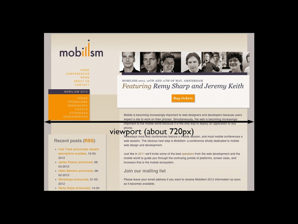
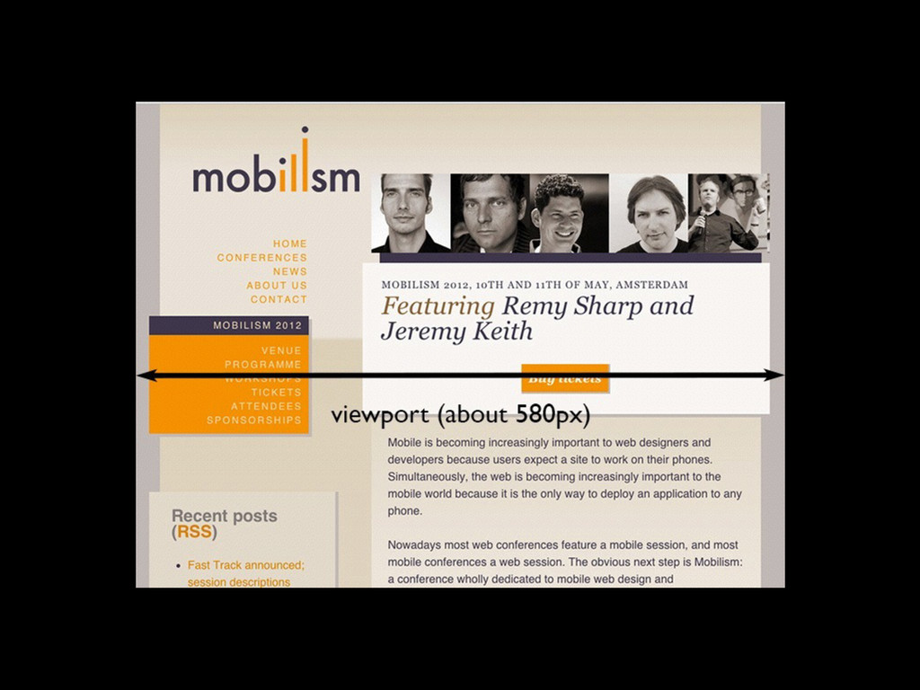
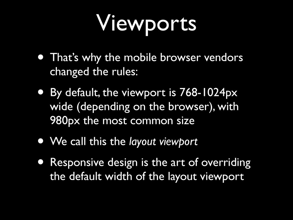
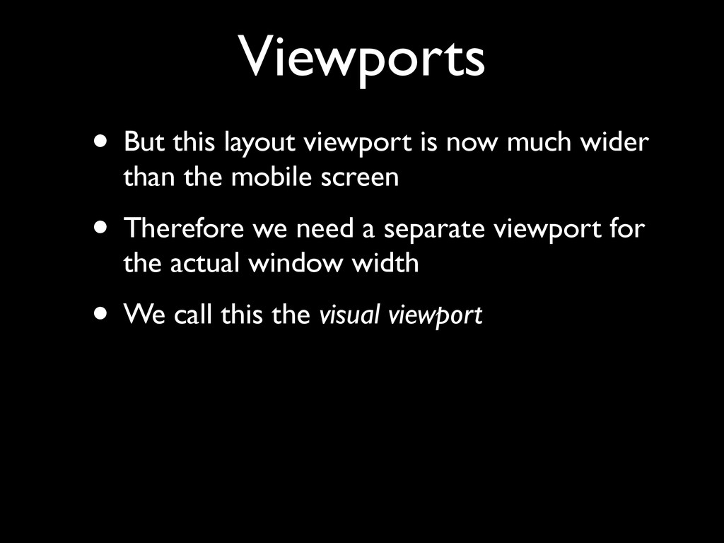
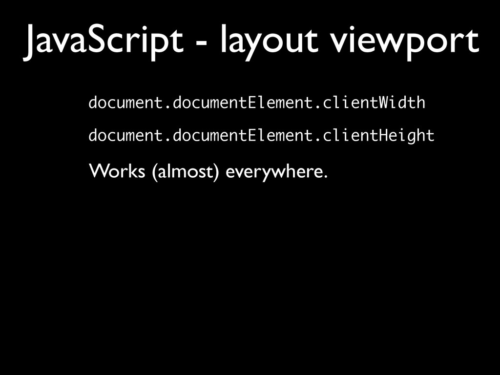
    rules: • By default, the viewport is 768-1024px wide (depending on the browser), with 980px the most common size • We call this the layout viewport • Responsive design is the art of overriding the default width of the layout viewport
  10. Viewports • But this layout viewport is now much wider

    than the mobile screen • Therefore we need a separate viewport for the actual window width • We call this the visual viewport
  11. Viewports • layout viewport • visual viewport ! ! •

    ideal viewport So the desktop viewport has been split into two: ! ! But there’s a third mobile viewport that has no equivalent on the desktop:
  12. Ideal viewport • What mobile browser vendors want is to

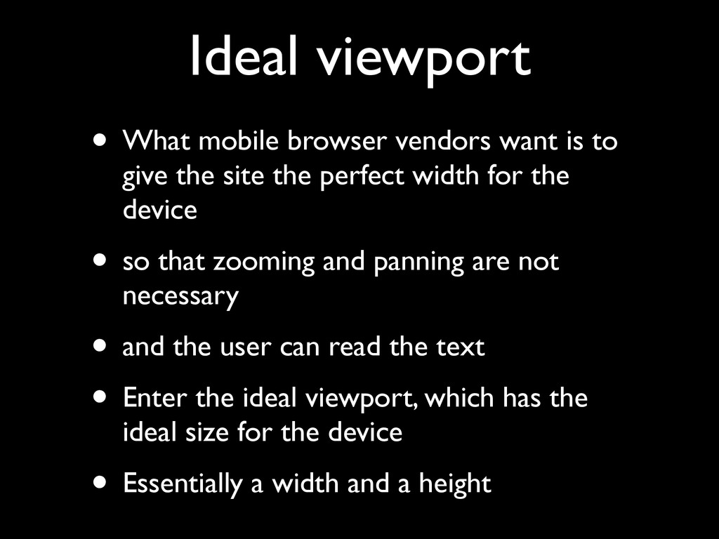
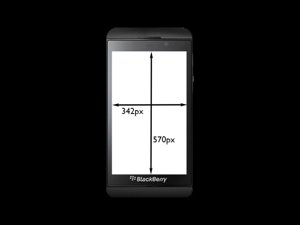
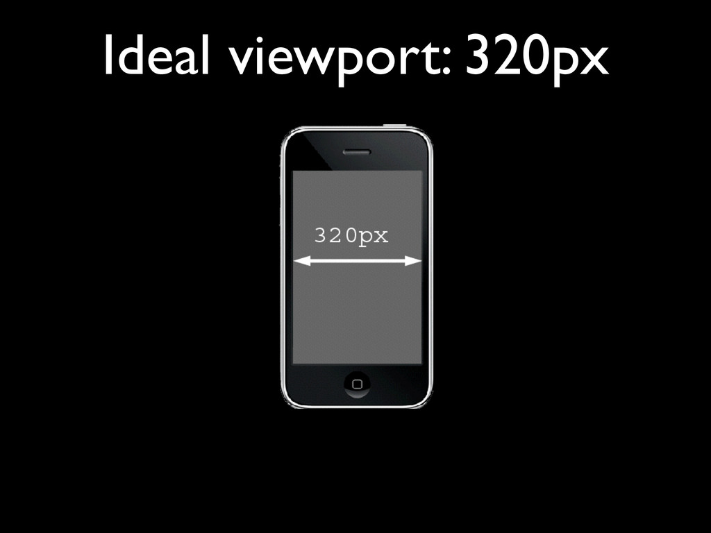
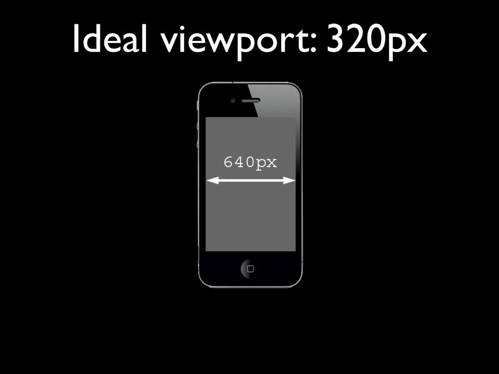
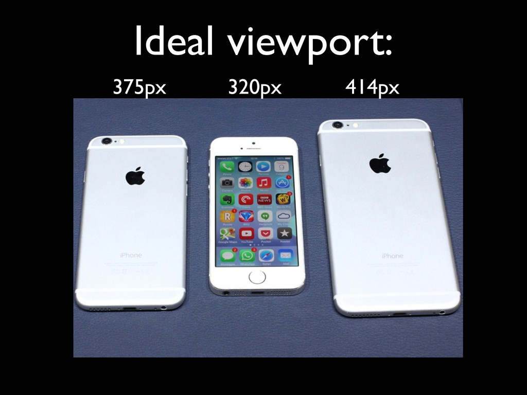
    give the site the perfect width for the device • so that zooming and panning are not necessary • and the user can read the text • Enter the ideal viewport, which has the ideal size for the device • Essentially a width and a height
  13. Ideal viewport • There are no wrong dimensions for the

    ideal viewport. • They’re what they need to be for the device they run on. • (Admittedly, there are weird values. But they’re not wrong.)
  14. screen.width screen.height UNRELIABLE! Some browsers define screen.width and screen.height as

    the dimensions of the ideal viewport while others define them as the number of device pixels JavaScript - ideal viewport
  15. Meta viewport • In order to create a responsive design

    we must set the layout viewport dimensions to the ideal viewport dimensions. • How?
  16. Meta viewport <meta name=”viewport” content=”width = device-width”> • By default,

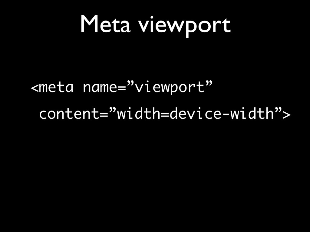
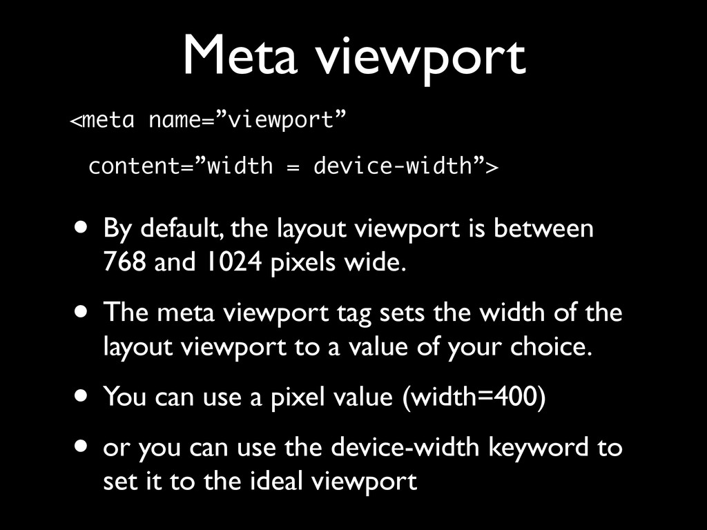
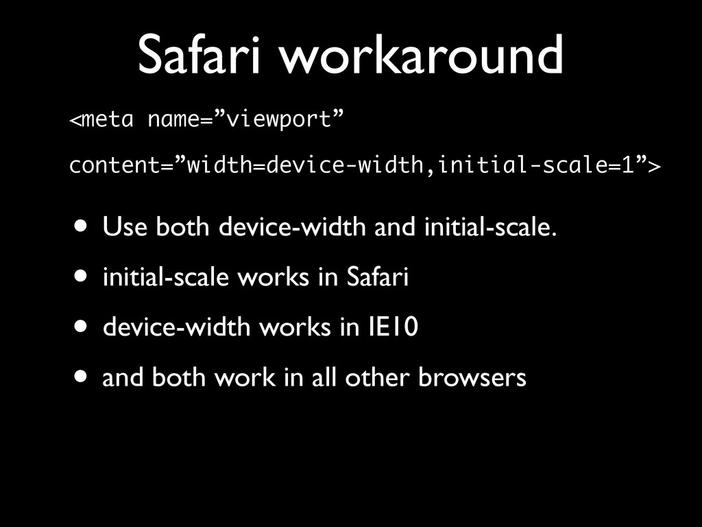
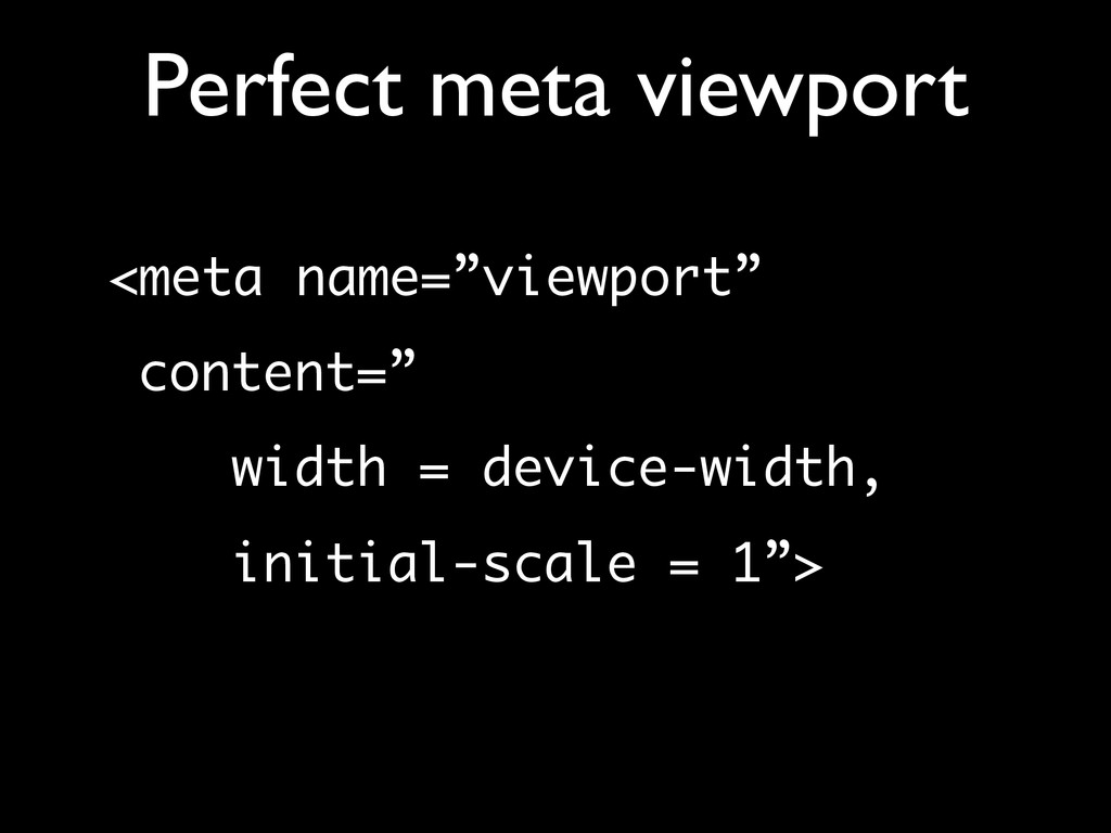
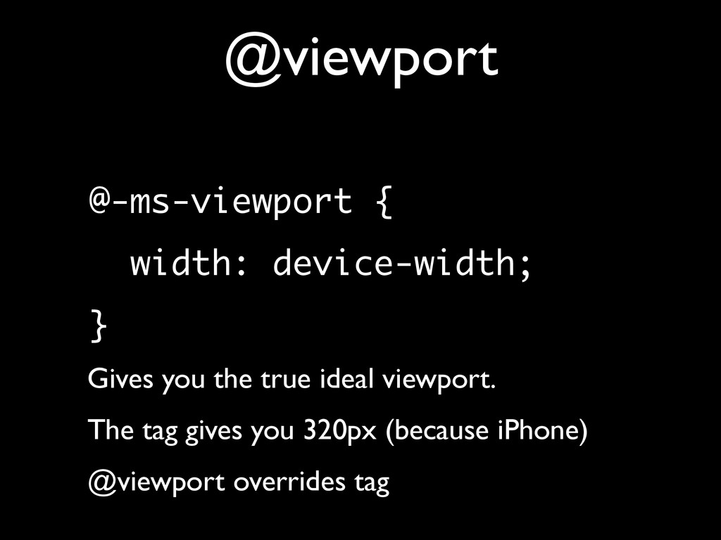
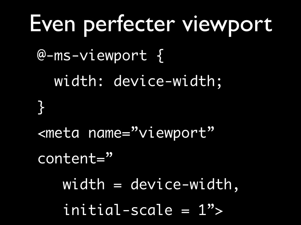
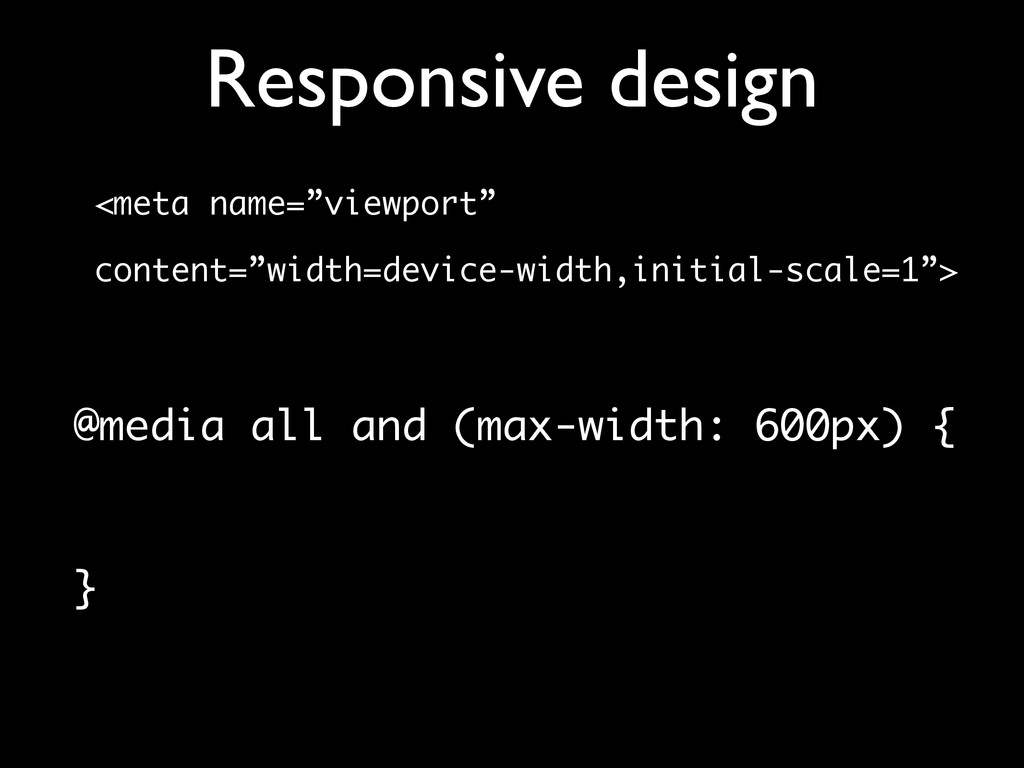
    the layout viewport is between 768 and 1024 pixels wide. • The meta viewport tag sets the width of the layout viewport to a value of your choice. • You can use a pixel value (width=400) • or you can use the device-width keyword to set it to the ideal viewport
  17. Meta viewport <meta name=”viewport” content=”width = device-width”> • I’m assuming

    this does not come as a surprise • But … • did you know that the following does exactly the same?
  18. Meta viewport <meta name=”viewport” content=”initial-scale = 1”> • In theory,

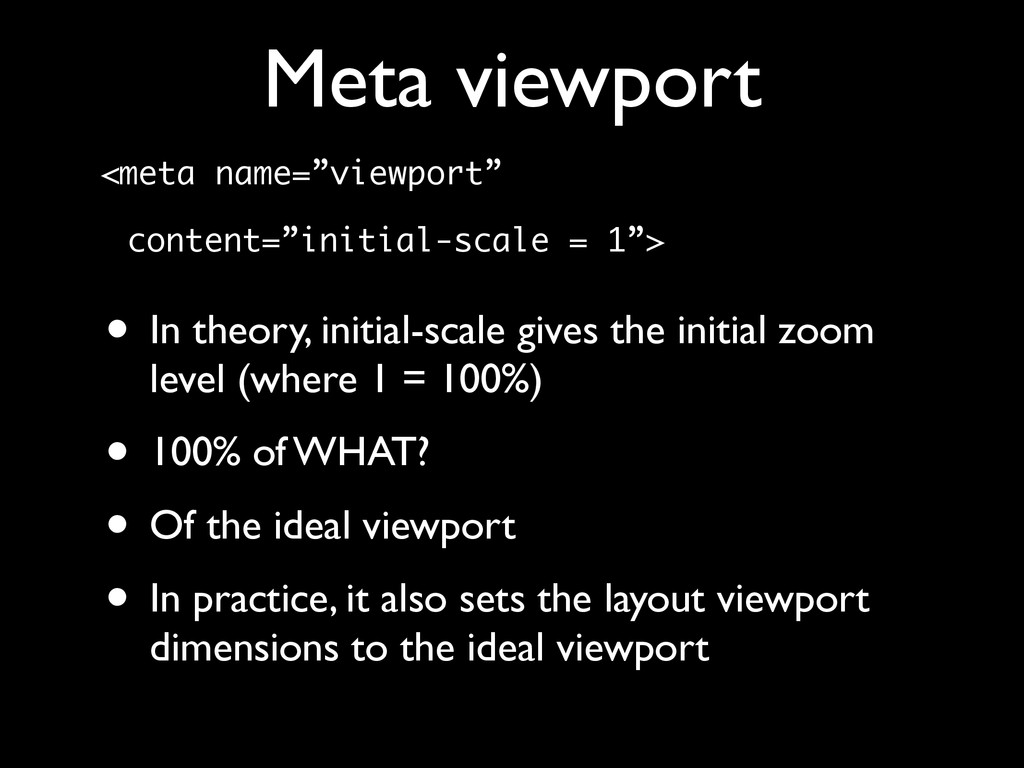
    initial-scale gives the initial zoom level (where 1 = 100%) • 100% of WHAT? • Of the ideal viewport • In practice, it also sets the layout viewport dimensions to the ideal viewport
  19. Meta viewport <meta name=”viewport” content=”initial-scale = 2”> • In theory,

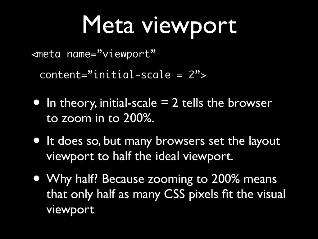
    initial-scale = 2 tells the browser to zoom in to 200%. • It does so, but many browsers set the layout viewport to half the ideal viewport. • Why half? Because zooming to 200% means that only half as many CSS pixels fit the visual viewport
  20. Meta viewport <meta name=”viewport” content=”initial-scale = 1”> • And yes,

    this is weird. • I wonder what Apple was smoking when it set these rules. I want some.
  21. Meta viewport <meta name=”viewport” content=”width = 400,initial-scale = 1”> •

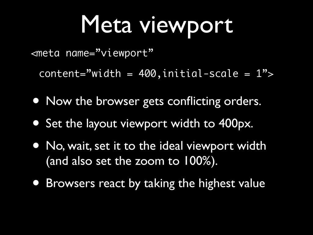
    Now the browser gets conflicting orders. • Set the layout viewport width to 400px. • No, wait, set it to the ideal viewport width (and also set the zoom to 100%). • Browsers react by taking the highest value
  22. Min-width viewport <meta name=”viewport” content=”width = 400,initial-scale = 1”> •

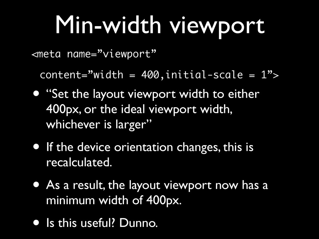
    “Set the layout viewport width to either 400px, or the ideal viewport width, whichever is larger” • If the device orientation changes, this is recalculated. • As a result, the layout viewport now has a minimum width of 400px. • Is this useful? Dunno.
  23. Safari workaround <meta name=”viewport” content=”width = device-width”> • Safari always

    takes the portrait width (320 on iPhone 5-, 768 on iPad). • Sometimes this is what you want; at other times it isn’t. • How to solve this?
  24. Safari workaround <meta name=”viewport” content=”initial-scale = 1”> • Now Safari

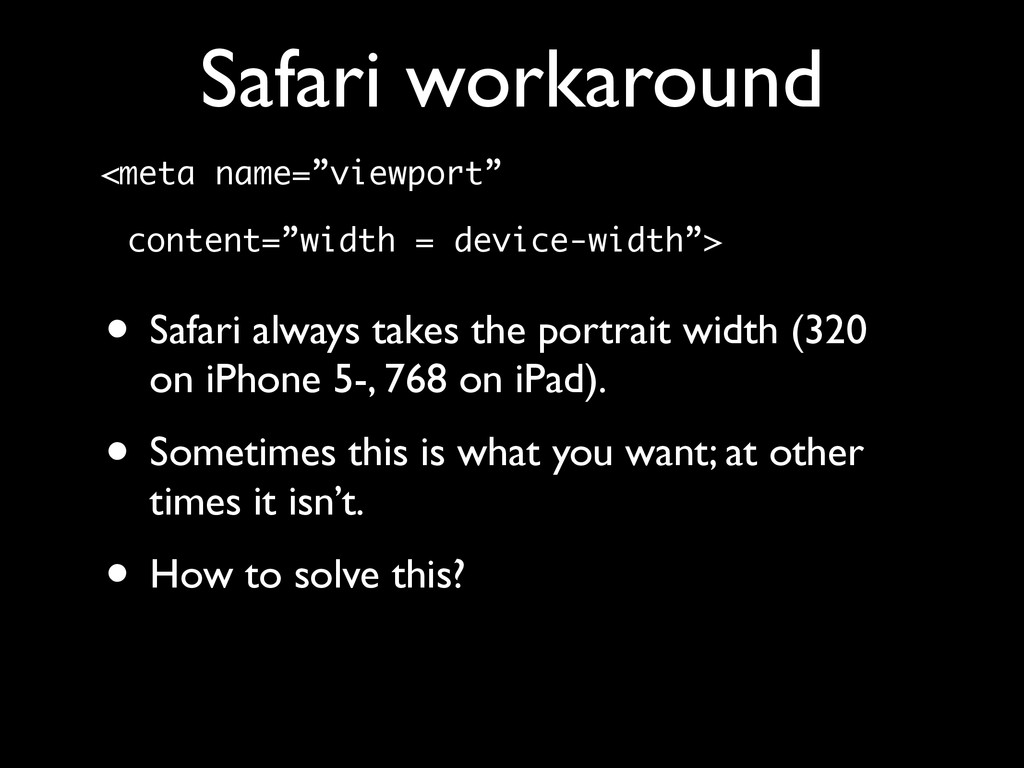
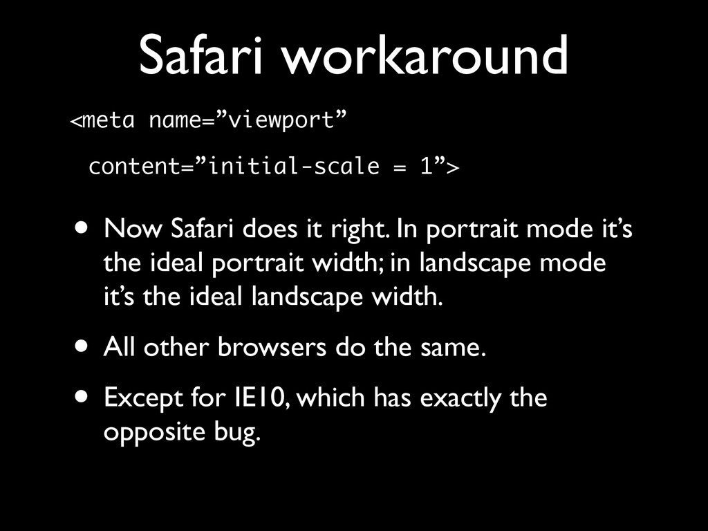
    does it right. In portrait mode it’s the ideal portrait width; in landscape mode it’s the ideal landscape width. • All other browsers do the same. • Except for IE10, which has exactly the opposite bug.
  25. Safari workaround <meta name=”viewport” content=”width=device-width,initial-scale=1”> • Use both device-width and

    initial-scale. • initial-scale works in Safari • device-width works in IE10 • and both work in all other browsers
  26. @viewport @-ms-viewport { width: device-width; } Gives you the true

    ideal viewport. The tag gives you 320px (because iPhone) @viewport overrides tag
  27. Media queries • There are two important media queries: •

    width (min-width and max-width) • device-width (min-device-width and max- device-width) • width is the one you want
  28. Media queries - device-width • device-width media query is always

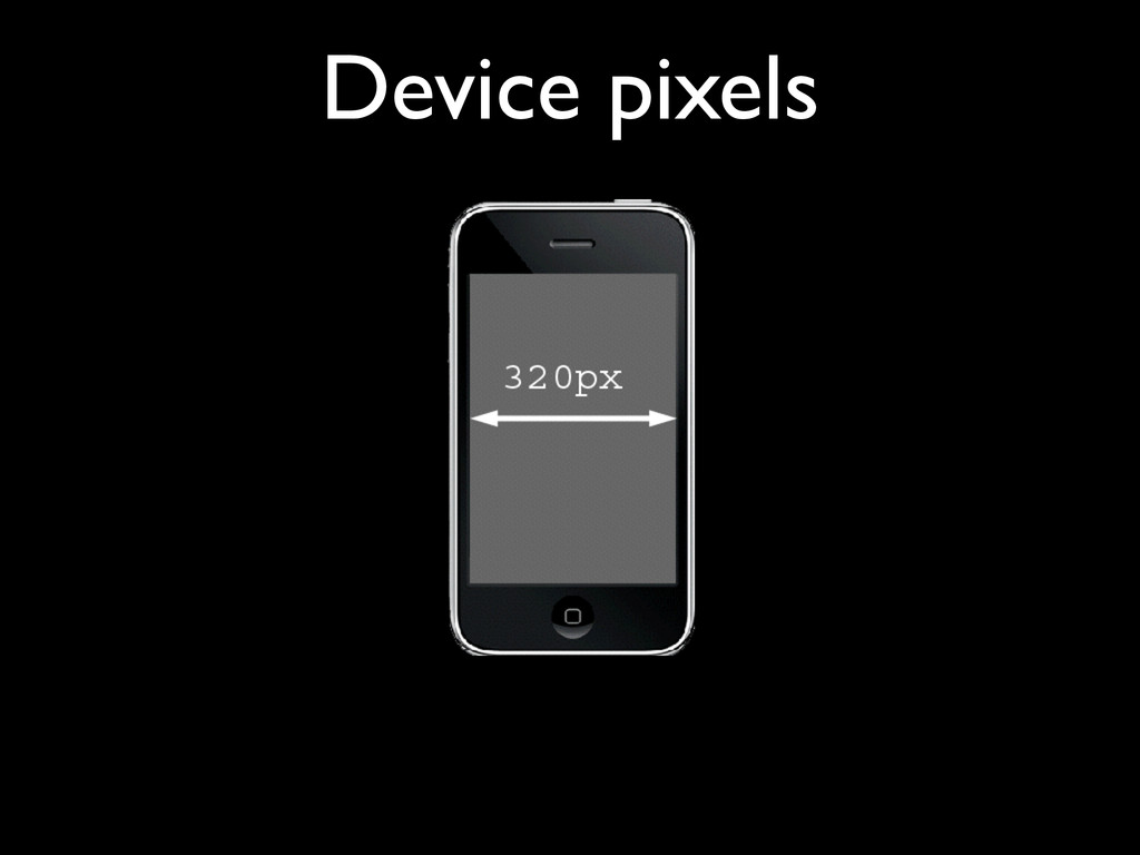
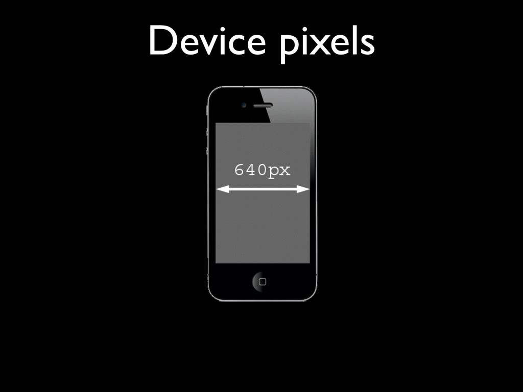
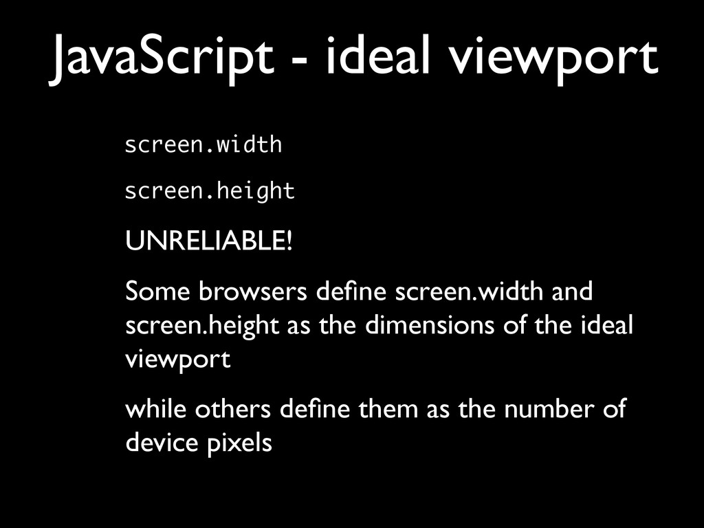
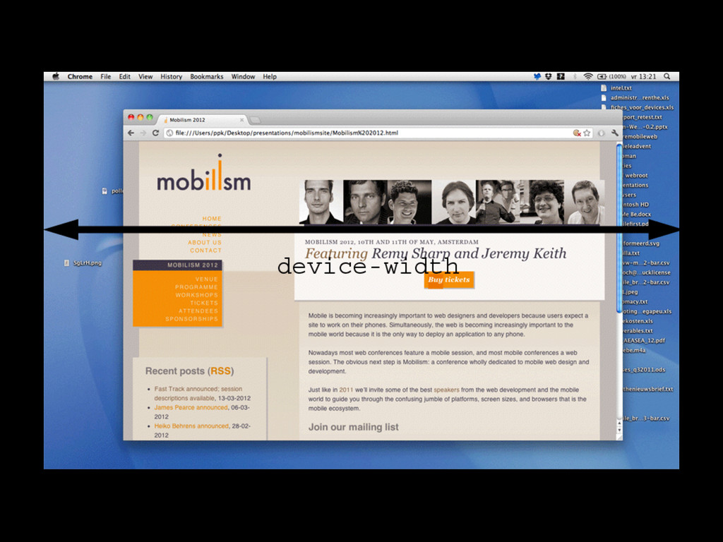
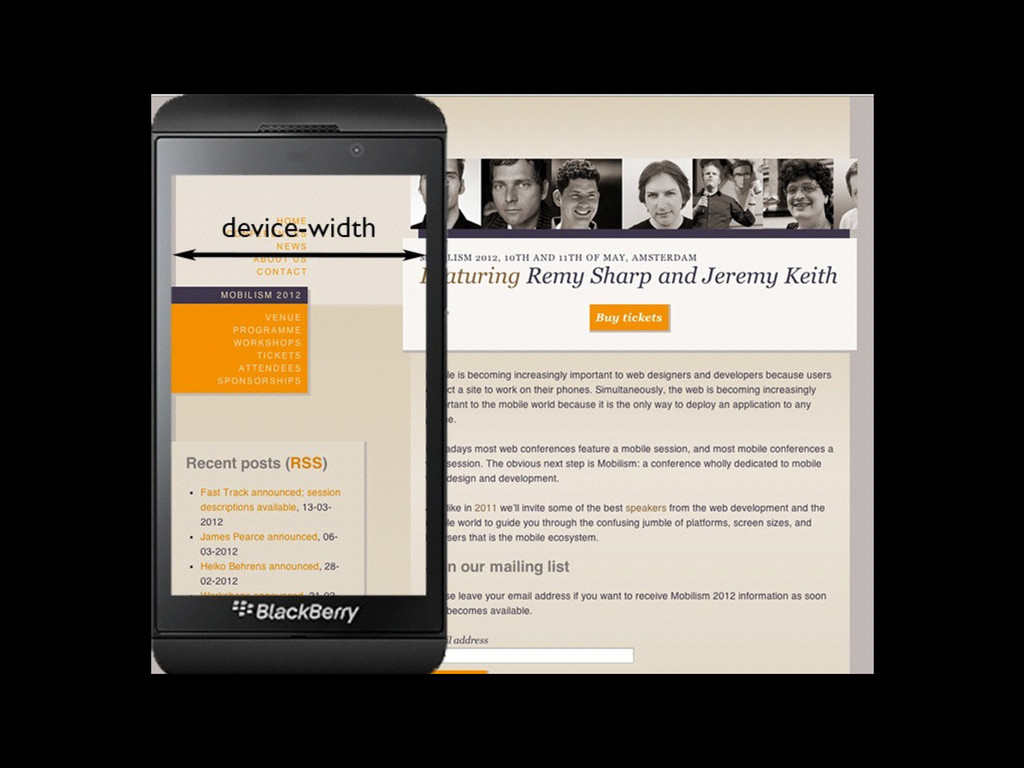
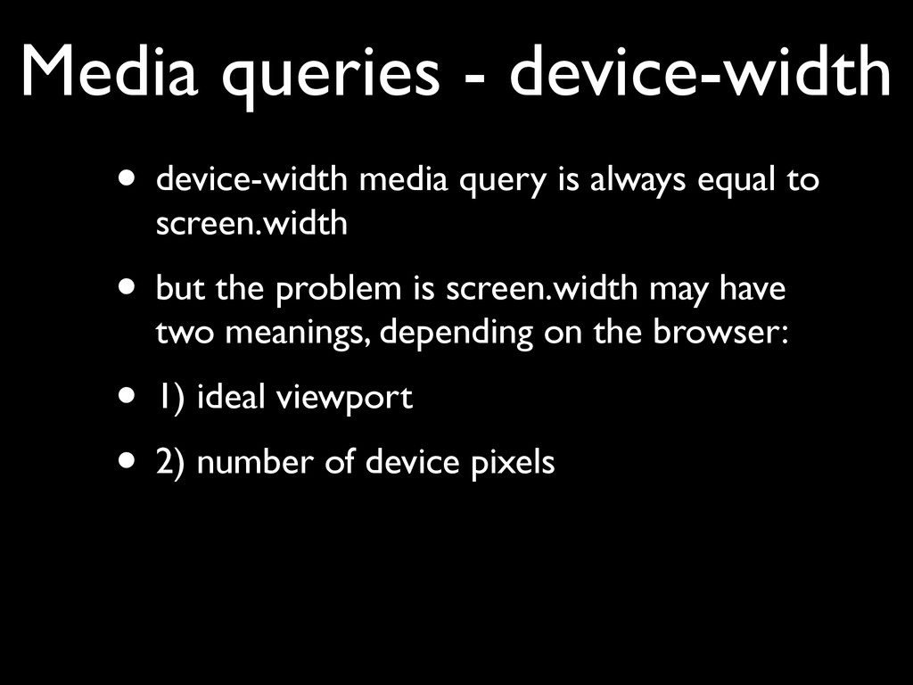
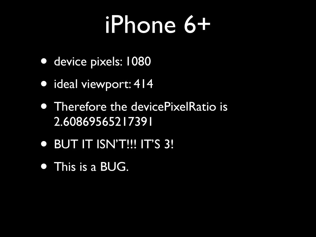
    equal to screen.width • but the problem is screen.width may have two meanings, depending on the browser: • 1) ideal viewport • 2) number of device pixels
  29. Media queries - width • width gives the width of

    the layout viewport • This is what you want to know • Works always and everywhere
  30. Responsive design • Set the layout viewport width to the

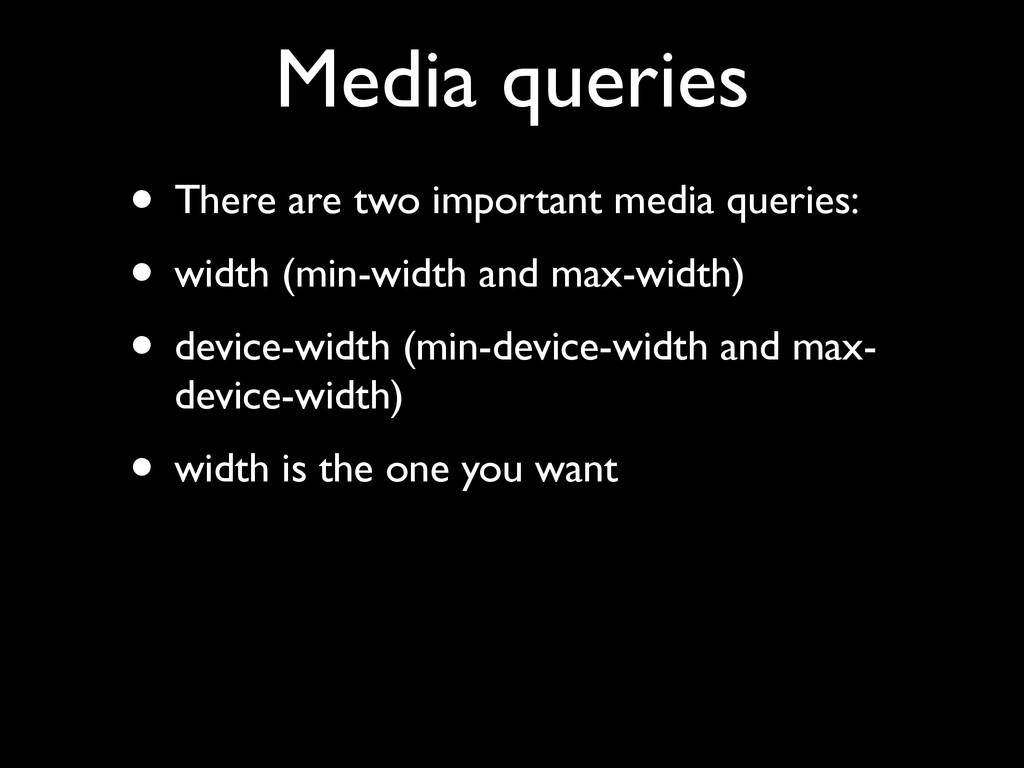
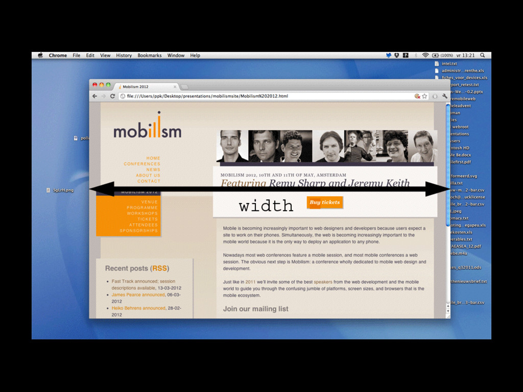
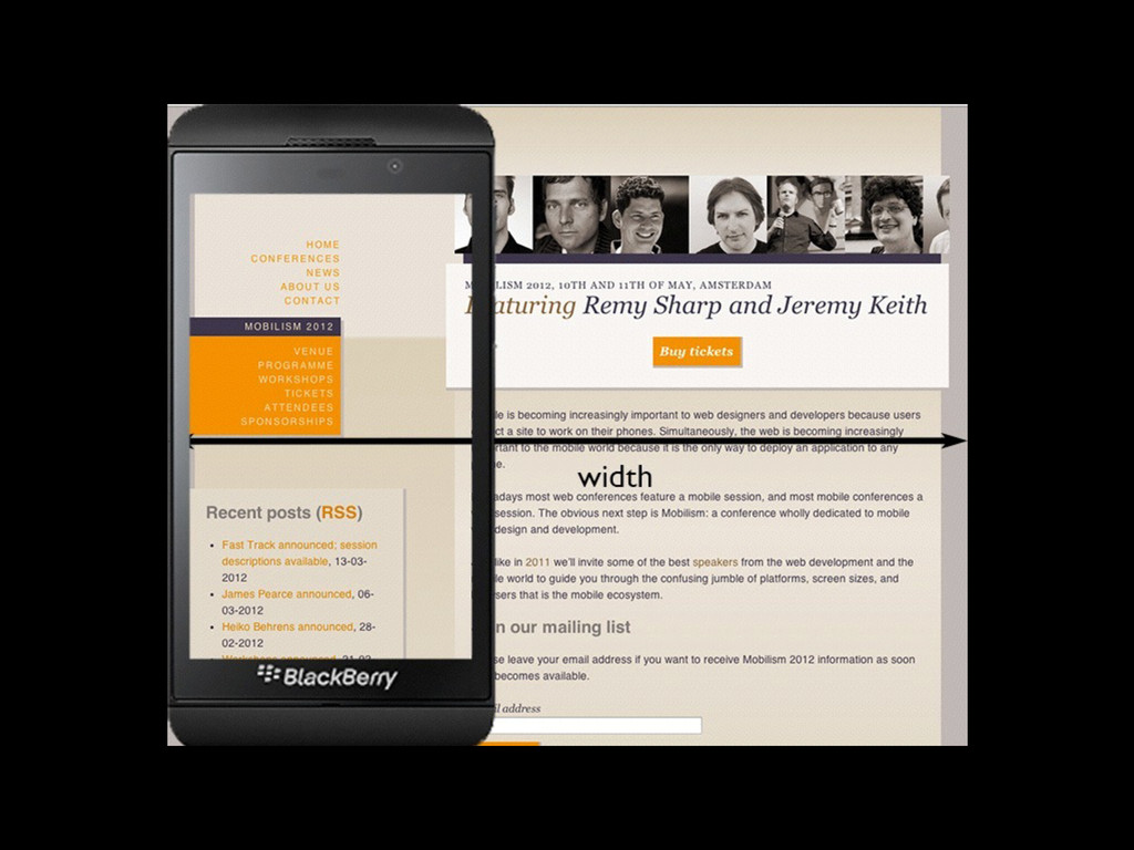
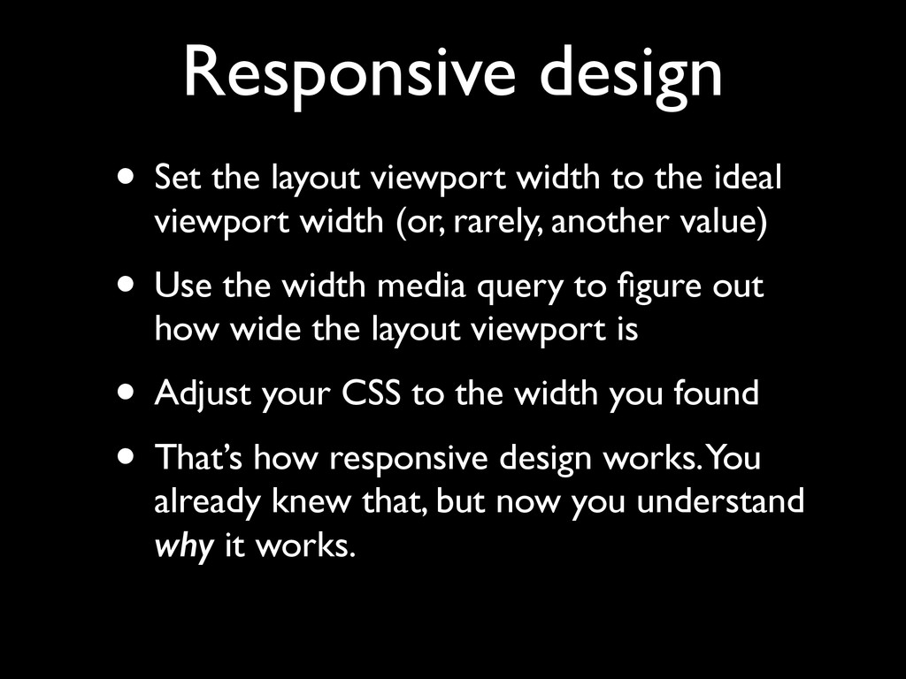
    ideal viewport width (or, rarely, another value) • Use the width media query to figure out how wide the layout viewport is • Adjust your CSS to the width you found • That’s how responsive design works. You already knew that, but now you understand why it works.
  31. Media queries • Always use min- or max-width. • Thus

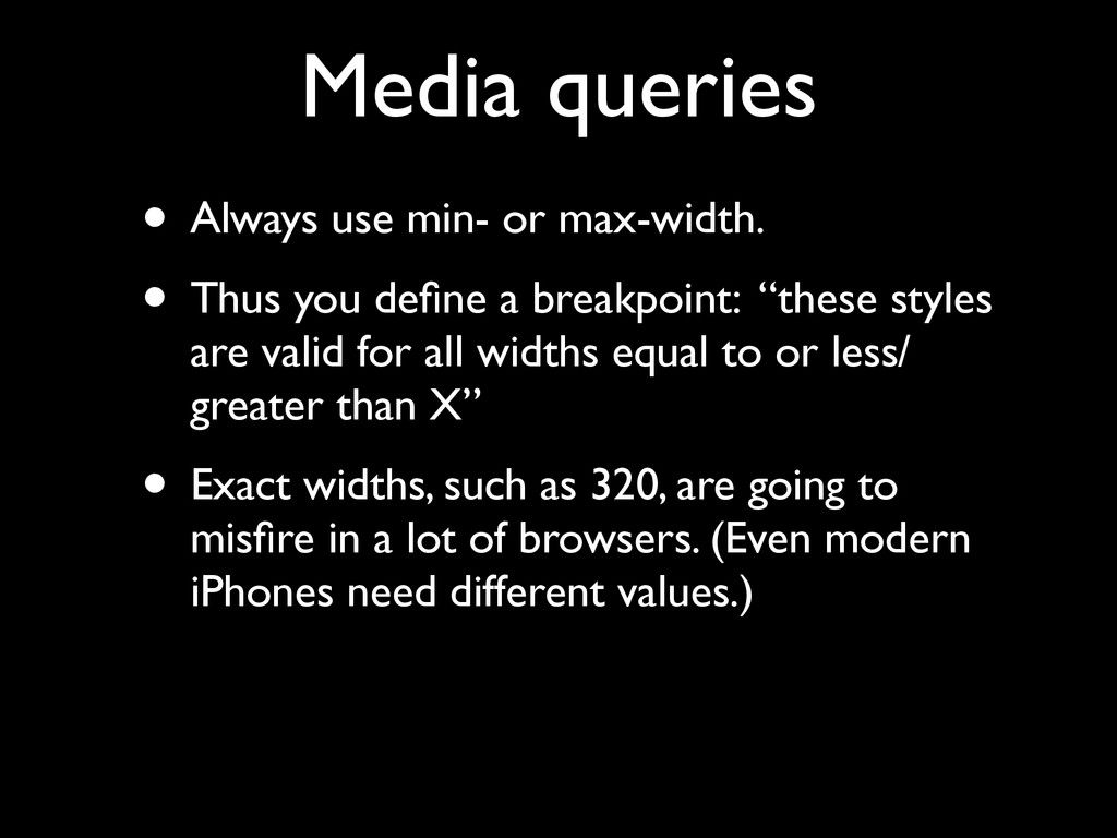
    you define a breakpoint: “these styles are valid for all widths equal to or less/ greater than X” • Exact widths, such as 320, are going to misfire in a lot of browsers. (Even modern iPhones need different values.)
  32. Responsive design • But we’d like to make our design

    respond to the physical width of the device, too. • For instance, by setting a min-width: 25mm on our navigation items • Tough luck • You can’t
  33. CSS units • width: 25mm does not mean the element

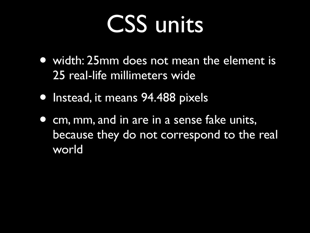
    is 25 real-life millimeters wide • Instead, it means 94.488 pixels • cm, mm, and in are in a sense fake units, because they do not correspond to the real world
  34. CSS units • 1 inch is defined as 96 CSS

    pixels • If you zoom, the CSS pixels become larger, • and your inches become larger, too. • It has nothing to do with the real world.
  35. CSS units • 1 inch is defined as 96 CSS

    pixels • 1 inch is defined as 2.54 cm • 1 cm is defined as 10 mm • 1 inch is defined as 72 points • 1 pica is defined as 12 points
  36. CSS units • I used to think this is a

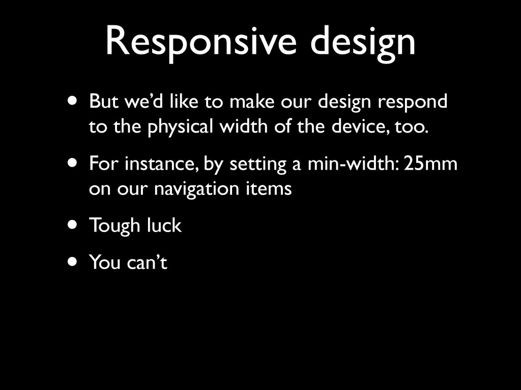
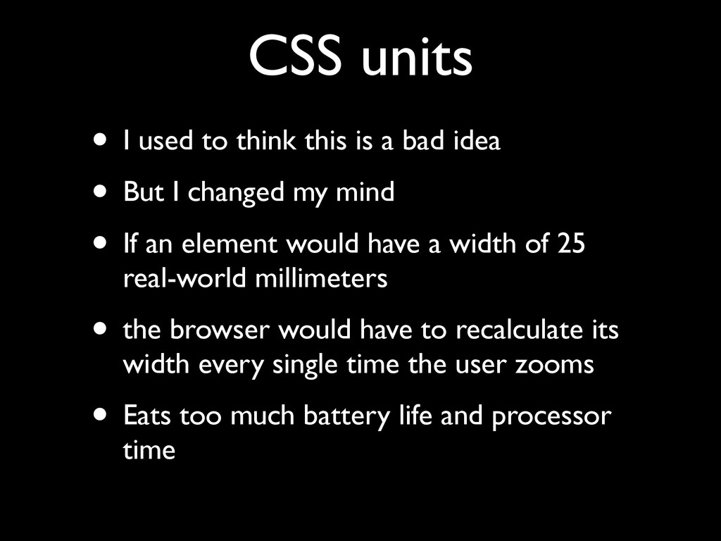
    bad idea • But I changed my mind • If an element would have a width of 25 real-world millimeters • the browser would have to recalculate its width every single time the user zooms • Eats too much battery life and processor time
  37. Resolution if (window.devicePixelRatio >= 2) ! @media all and (

    (-webkit-min—device-pixel-ratio: 2), (min-resolution: 192dpi) )
  38. Resolution • What is device pixel ratio? • It’s the

    ratio of screen size in device pixels and ideal viewport size
  39. iPhone 3G • device pixels: 320 • ideal viewport: 320

    • Therefore the devicePixelRatio is 1
  40. iPhone 4S • device pixels: 640 • ideal viewport: 320

    • Therefore the devicePixelRatio is 2
  41. Samsung Galaxy Pocket • device pixels: 240 • ideal viewport:

    320 • Therefore the devicePixelRatio is 0.75
  42. BlackBerry Z10 • device pixels: 768 • ideal viewport: 342

    • Therefore the devicePixelRatio is 2.24561403508772 • (Weird, but not wrong)
  43. iPhone 6+ • device pixels: 1080 • ideal viewport: 414

    • Therefore the devicePixelRatio is 2.60869565217391 • BUT IT ISN’T!!! IT’S 3! • This is a BUG.
  44. Thank you I’ll put these slides online Questions? Peter-Paul Koch

    http://quirksmode.org http://twitter.com/ppk Lean DUS, 27 November 2014