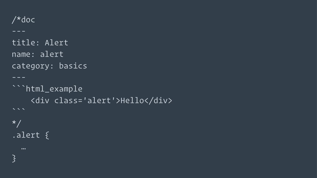
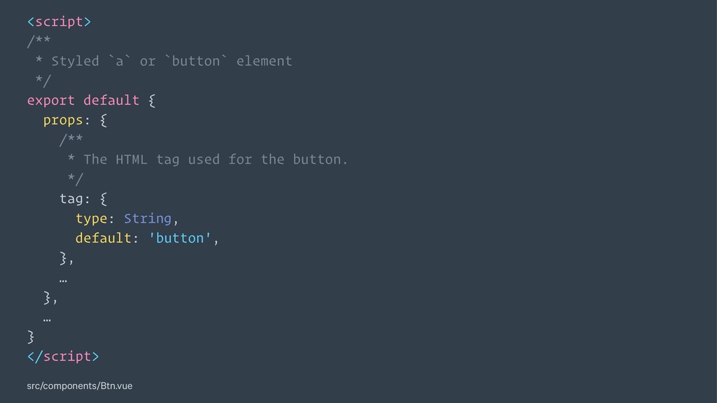
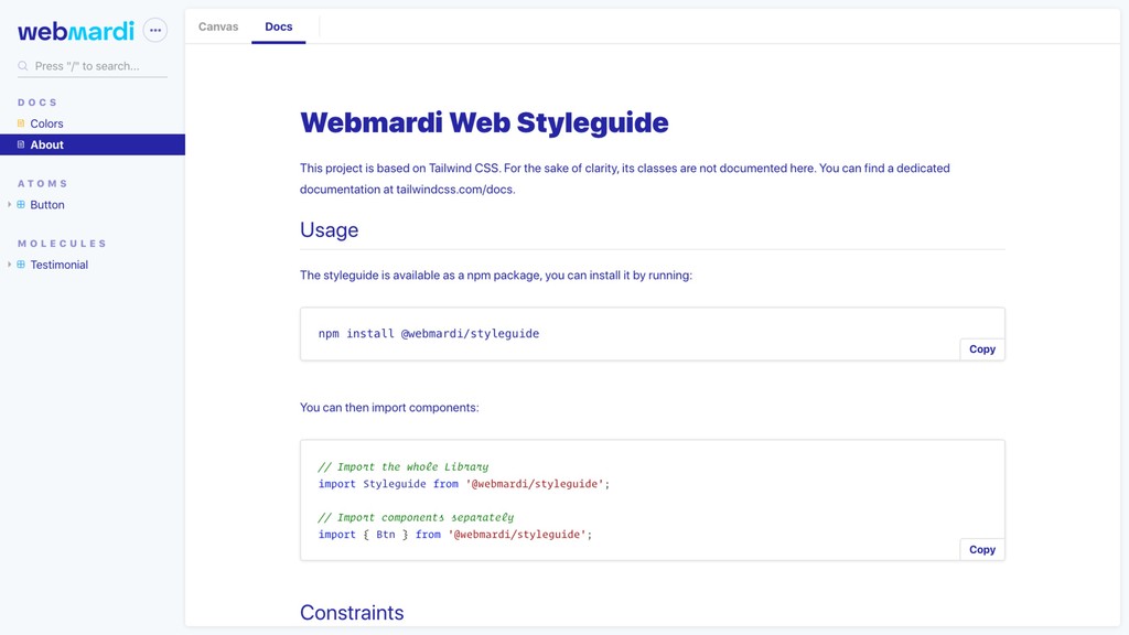
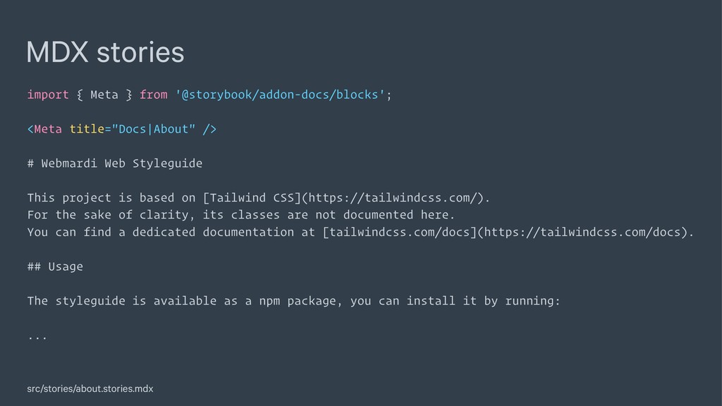
/> # Webmardi Web Styleguide This project is based on [Tailwind CSS](https://tailwindcss.com/). For the sake of clarity, its classes are not documented here. You can find a dedicated documentation at [tailwindcss.com/docs](https://tailwindcss.com/docs). ## Usage The styleguide is available as a npm package, you can install it by running: ... src/stories/about.stories.mdx
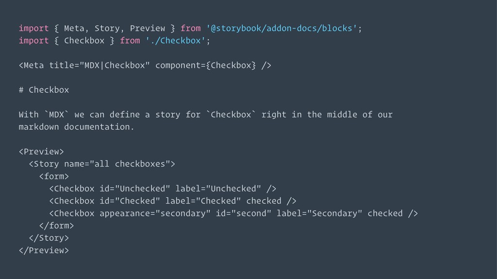
Checkbox } from './Checkbox'; <Meta title="MDX|Checkbox" component={Checkbox} /> # Checkbox With `MDX` we can define a story for `Checkbox` right in the middle of our markdown documentation. <Preview> <Story name="all checkboxes"> <form> <Checkbox id="Unchecked" label="Unchecked" /> <Checkbox id="Checked" label="Checked" checked /> <Checkbox appearance="secondary" id="second" label="Secondary" checked /> </form> </Story> </Preview>
 leben
leben
 kashioka
 yuzneri
 mshibuya
 cockscomb
 pizzacat83
 hayama17
 ganchiku
 oku053
.png) yuriko1211
yuriko1211
 tomoyanonymous
 jsoizo
 cottpan
 davidcarrasco
 livdayseo
 dougneiner
 varn
varn
 oripsolob
 stephaniewalter
 katiecoart
 eileencodes
 tanoku
 akihiro_kokubo
 chriscoyier
 smashingmag
![module.exports = [ '@storybook/addon-docs/react/preset', ... ]; .storybook/presets.js](https://files.speakerdeck.com/presentations/2555da7533ab46b5890676f249d3c5ec/slide_35.jpg)