Upgrade to Pro — share decks privately, control downloads, hide ads and more …

Responding to Responsive

Responding to Responsive

Talk given to the dotCMS Bootcamp 2013 about how to respond to the responsive design movement and make your dotCMS site Mobile First

Lou Griffith

October 29, 2013
Tweet

More Decks by Lou Griffith

Other Decks in Technology

Transcript

  1. • Mobile First • 2013: The Year of Responsive •

    CSS Frameworks are your friend • Harness the power of dotCMS • Real World Example : lebonheur.org • Tools & Takeaways • Q & A
  2. • Reach more people
 (61% of American’s own a smartphone

    ) • Less is More
 (What happens when cut off 80% of your display ) • Do something innovative
 (Holding a box of sensors) Link Source: Mobile First
  3. • Fluid grids that resize and flow with a device’s

    screen size. • Images resize and media stays intact device independent • Media Queries allow you to create breakpoints which help target displays. Link Source: Responsive Design
  4. Start with the most basic website and as the user’s

    technology increases so should the site’s experience. LInk Source: Progressive Enhancement
  5. Data Time it took to reach 50 Million Users Days

    96 1,277 1,460 4,475 13,870 Radio TV Internet Facebook Draw Something Source:
  6. • 1 Billion Desktops powered by Windows • Andriod reached

    1 Billion in July 2013 • Apple reached 600 million and will reach 1 Billion next year Data Source:
  7. Data -14% -7% 0% 7% 2012 Q1 2012 Q2 2012

    Q3 2012 Q4 2013 Q1 -13.9% -8.3% -8.1% 1.6% 4.3% Worst PC sales drop in history Source:
  8. • Mac and PC • Add a class and perform

    jQuery magic • Responsive right out of the box • Customizable and modular • SAVES YOU TIME! Link Source:
  9. • There are several hundred frameworks • You can even

    create your own • Two commonly used: 
 Bootstrap and Foundation
  10. • Built by Twitter employees • Used by NASA and

    MSNBC • v3 support Mobile First http://getbootstrap.com Image Source Bootstrap Source:
  11. • Built by ZURB • Worked with LukeW on Mobile

    First • Doesn’t support IE8 foundation.zurb.com foundation.zurb.com/ Foundation Source:
  12. • Proceed with caution • Customize and make it your

    own • Bootstrap Effect hurts Image Source Source:
  13. • dotCMS template system is incredible! • dotCMS template system

    is incredible! • Other systems will have you jump through hoops • dotCMS content and display are separate
  14. • Creating a theme is easy, turning over to your

    content folks is easier • You don’t need to cringe • With CSS frameworks, you can actually provide a style guide
  15. • Le Bonheur Children’s Hospital ranked one of the nation’s

    best children’s hospitals. • Provide a responsive site so patient parents, visitors, and physicians can get the information they need easier.
  16. • Met with the team and gave each member a

    pad that looked like a iPhone • “As a parent, what do you want to see on here”
  17. • Surfaced navigation for mobile view • Mobile view also

    allows for buttons not seen on the desktop or tablet view
  18. • Desktop view saw the removal of unnecessary navigation buttons

    • Reduced the images and overall load time
  19. • Once the mockups were approved the code is written

    and the theme for dotCMS is done. • Uploaded to dotCMS • Created custom templates since nested rows wasn’t quite ready.
  20. • Used containers to inject reusable parts of code. (Head,

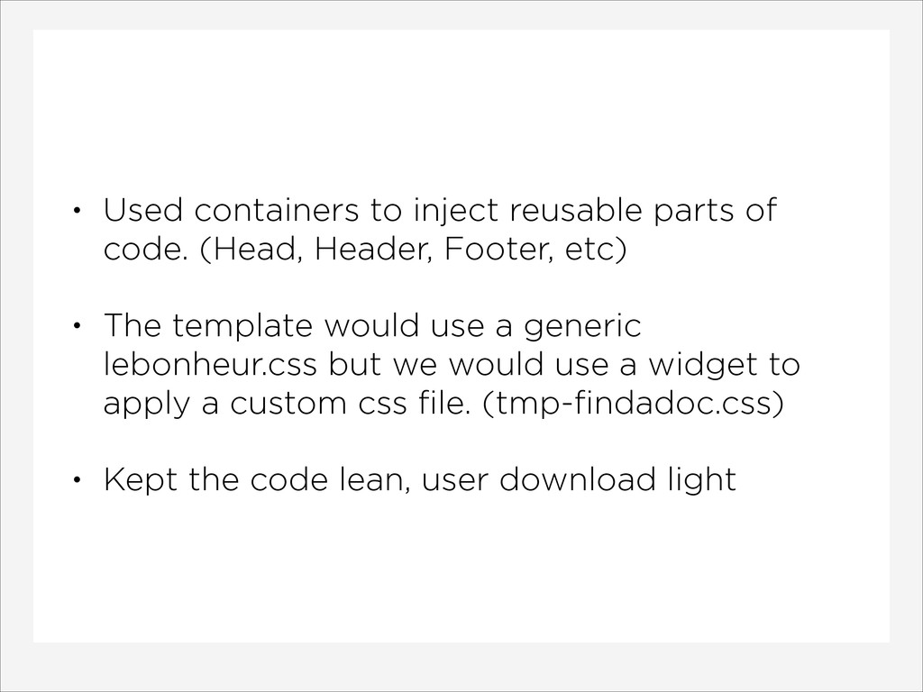
    Header, Footer, etc) • The template would use a generic lebonheur.css but we would use a widget to apply a custom css file. (tmp-findadoc.css) • Kept the code lean, user download light
  21. • Stephen Hay’s
 Responsive Design Workflow • Ethan Marcotte’s
 Responsive

    Web Design • Luke Wroblewski’s
 Mobile First Read
  22. • Chris Coyier & Dave Rupert
 Shop Talk Show •

    Jeffery’s Zeldman
 The Big Web Show • TWiT
 This Week In Google Listen