Upgrade to Pro — share decks privately, control downloads, hide ads and more …

Designing Inspired Style Guides

Andy Clarke
January 10, 2017

Designing Inspired Style Guides

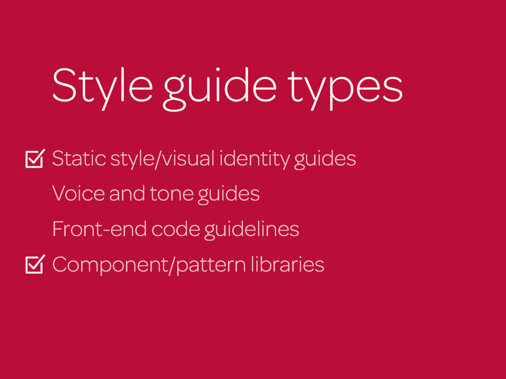
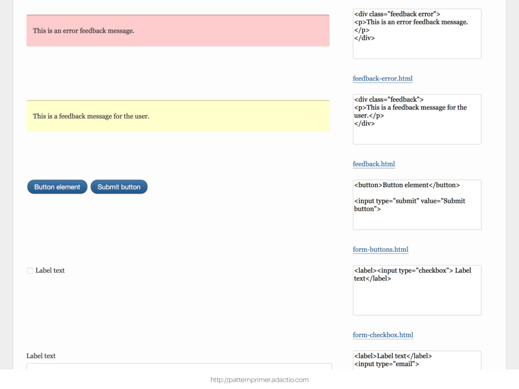
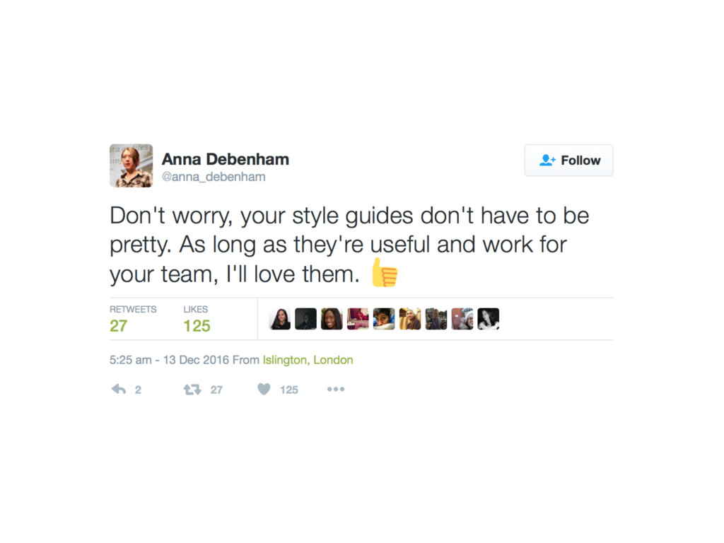
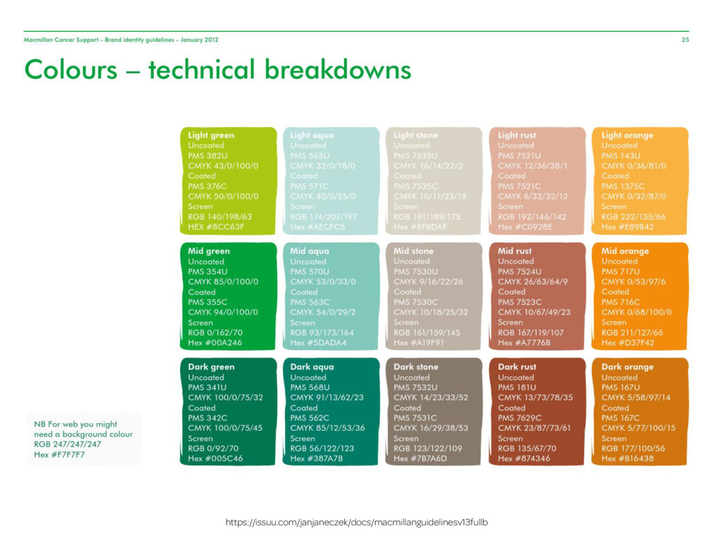
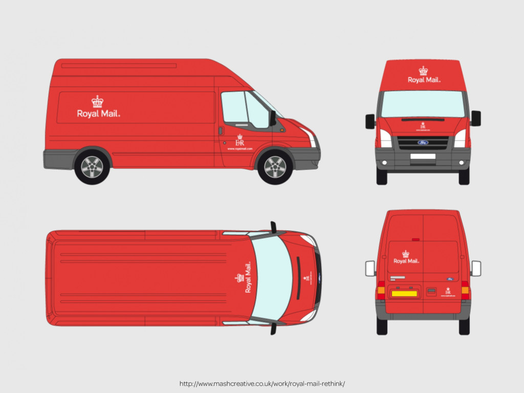
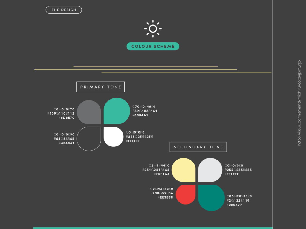
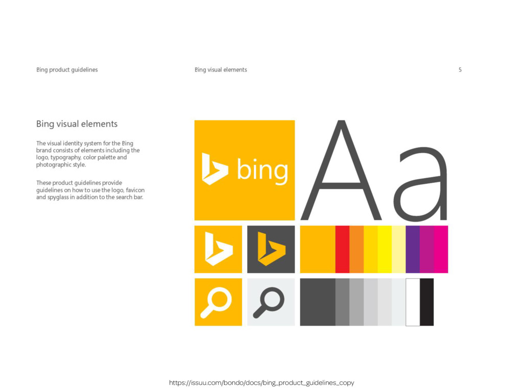
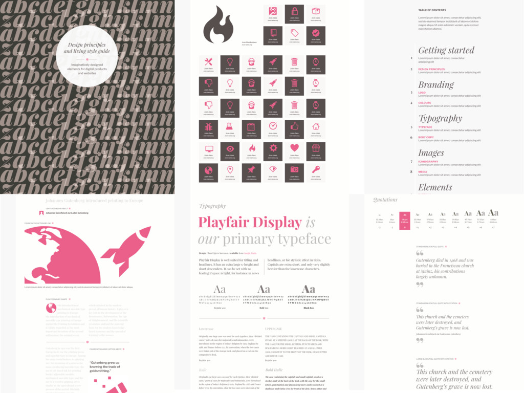
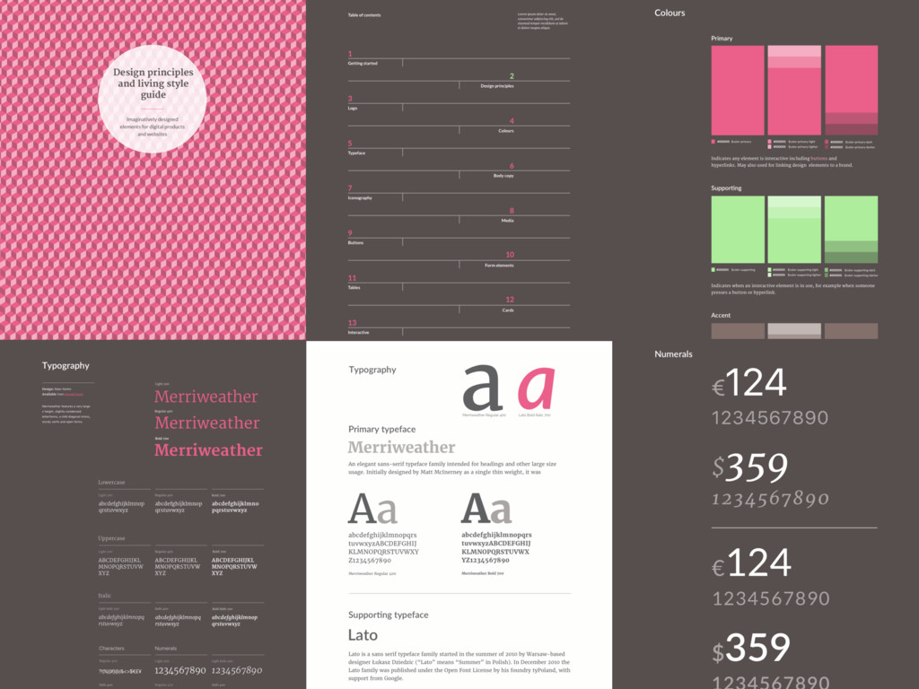
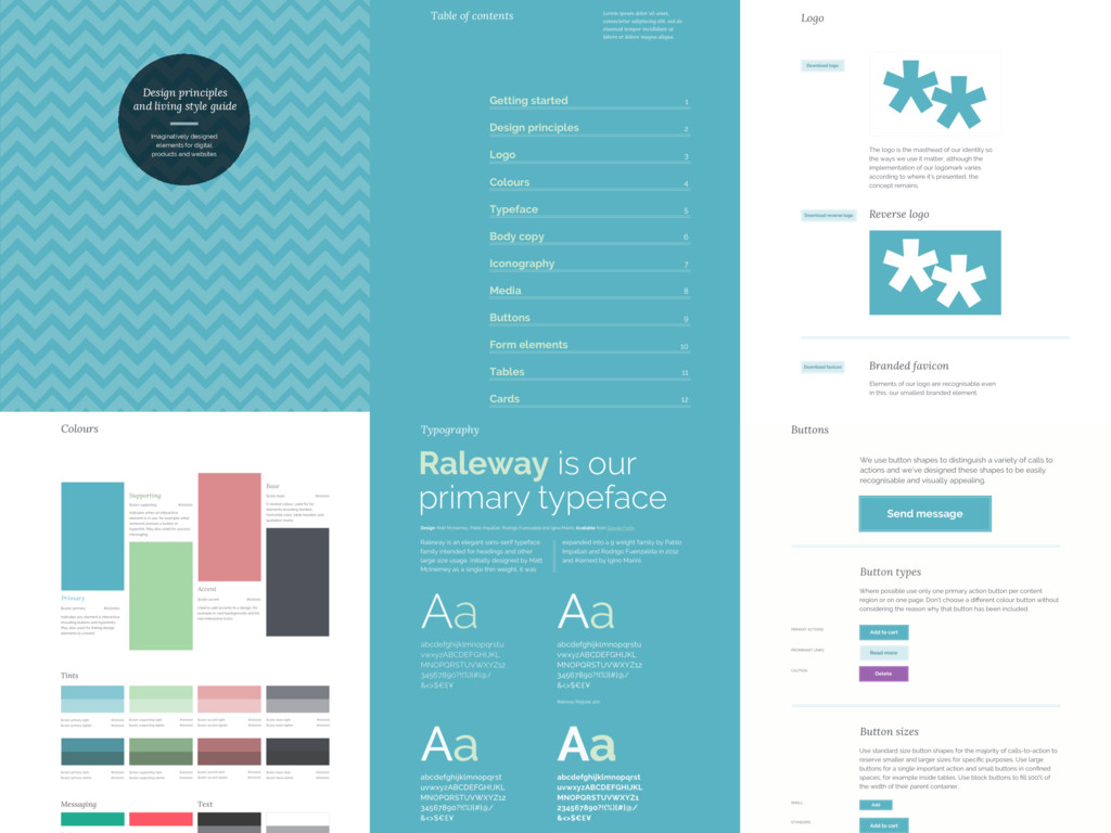
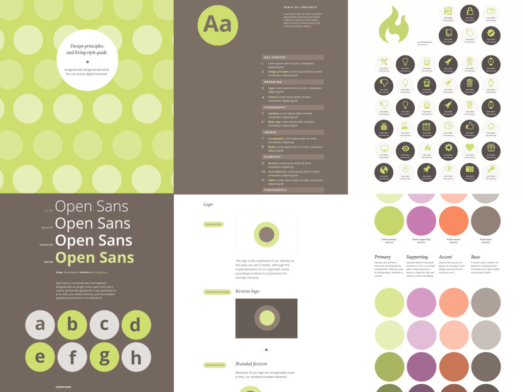
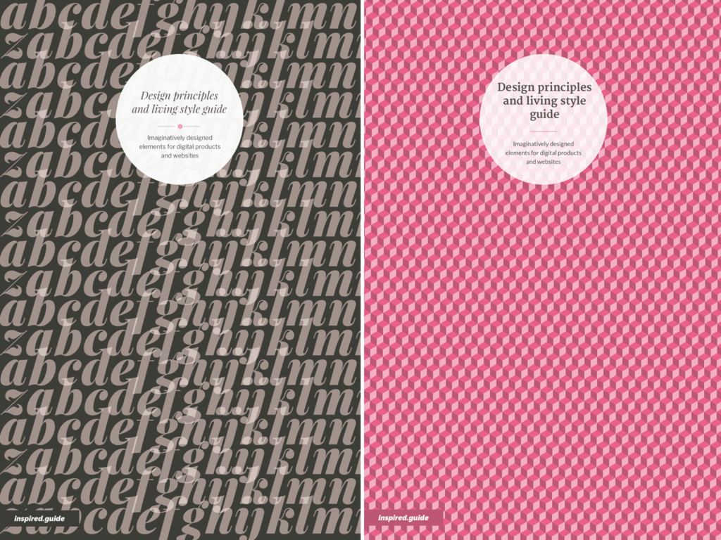
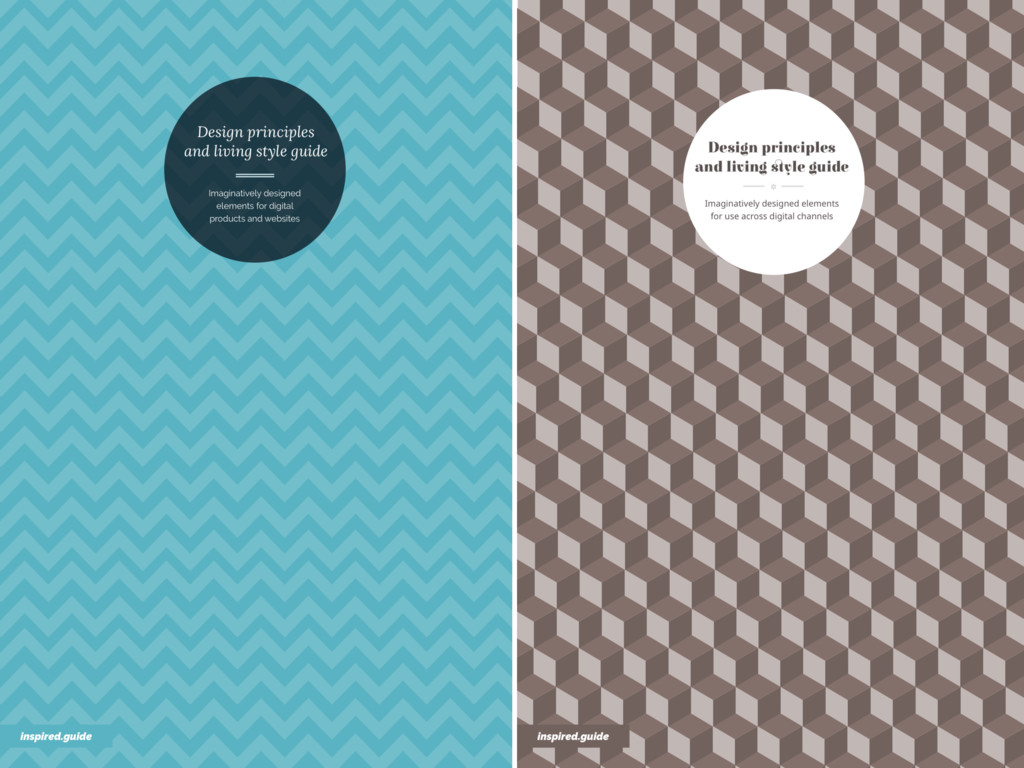
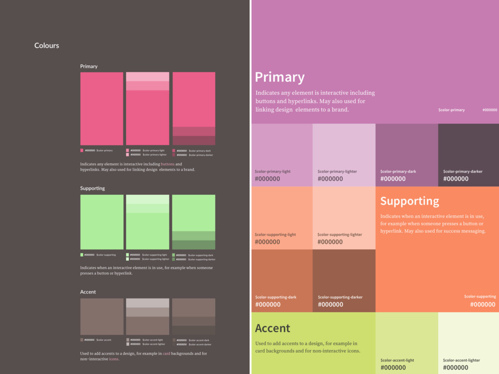
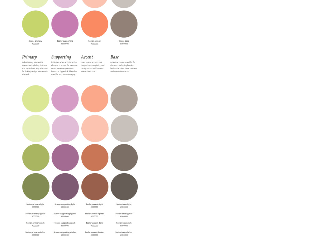
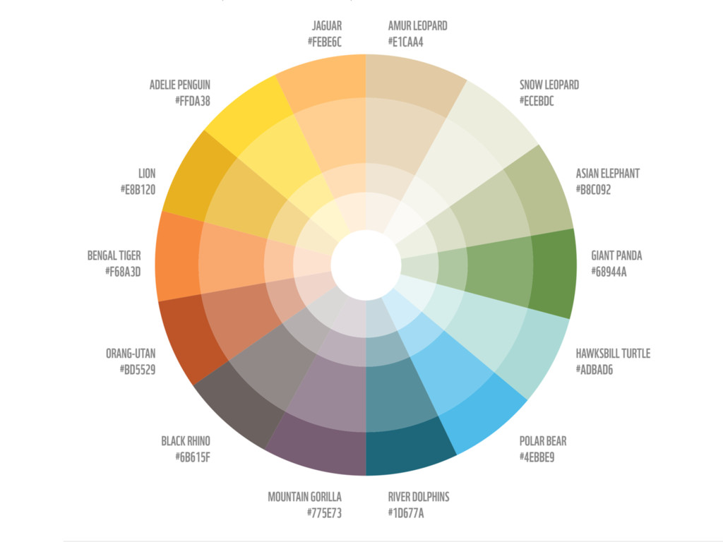
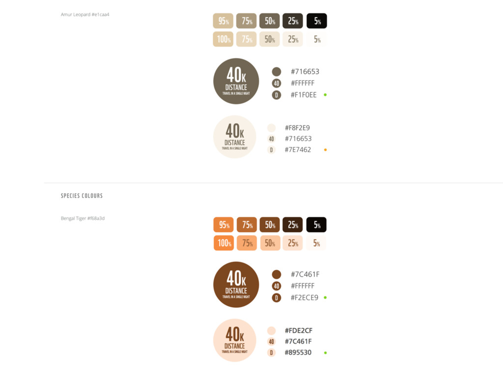
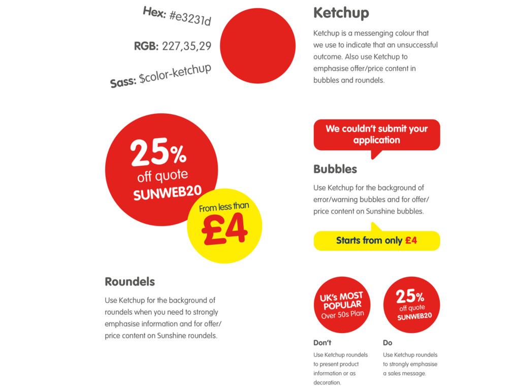
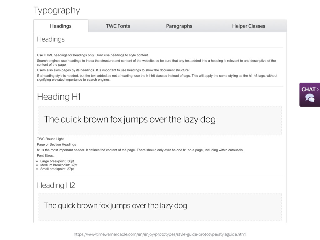
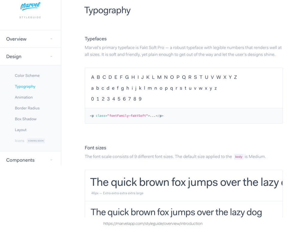
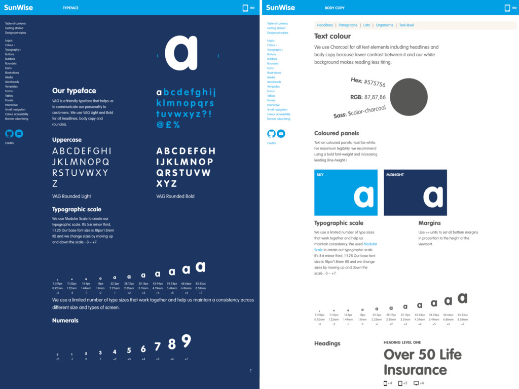
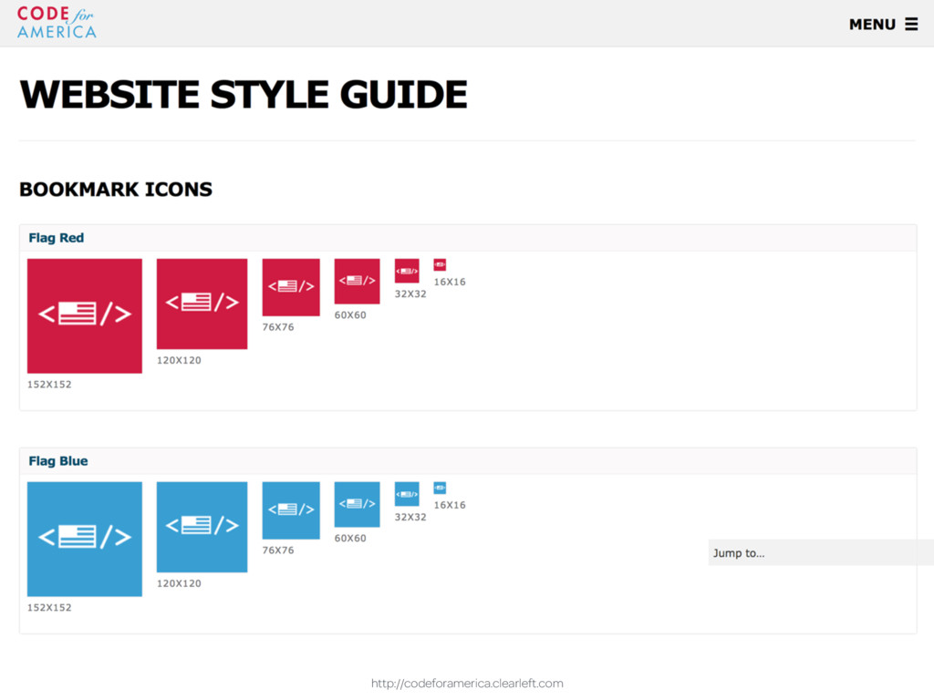
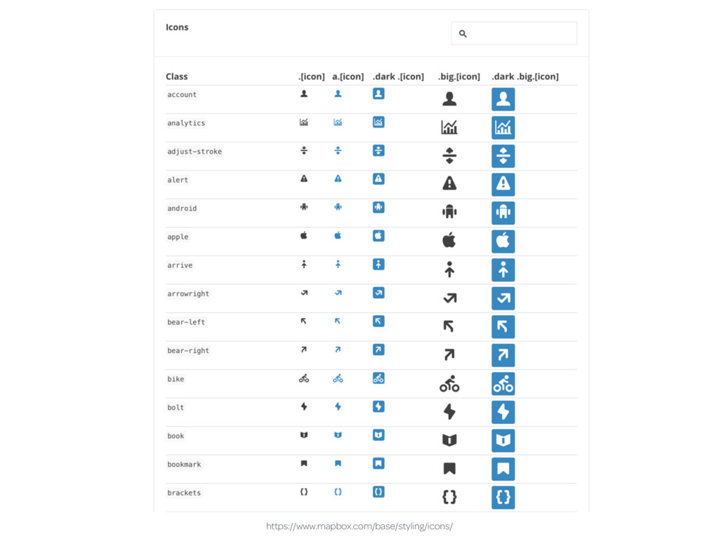
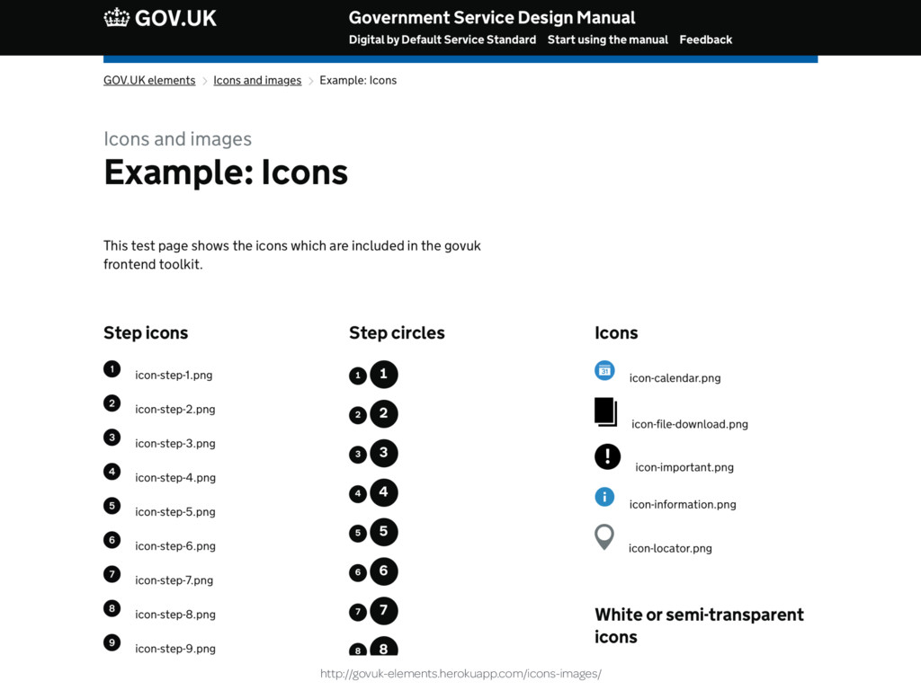
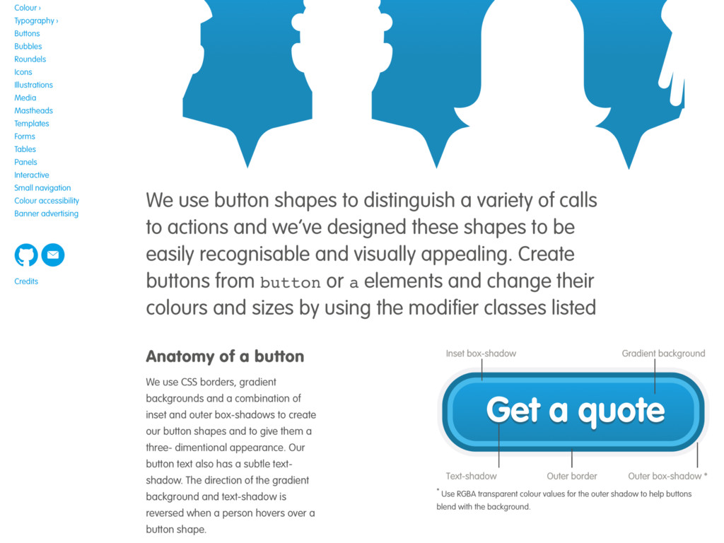
“Style guide” is an umbrella term for several types of design documentation; static style or visual identity guides, voice and tone, front-end code guidelines or component/pattern libraries. These all offer something different but often have something in common. They look ugly enough to have been designed by someone who enjoys configuring a router. In this fast-paced talk, Andy demonstrates ways to improve how style guides look and make them better at communicating design information to creatives without it getting in the way of what technical people need.

Andy Clarke

January 10, 2017
Tweet

More Decks by Andy Clarke

Other Decks in Design

Transcript

  1. To Andy Clarke, who’s 
 been talking about 
 design

    systems and 
 atoms before it was the 
 hip thing to do. Thank you for all your writing and thinking, but you’re still not getting my dog. Brad Frost http://atomicdesign.bradfrost.com
  2. Style guide types • Static style/visual identity guides • Voice

    and tone guides • Front-end code guidelines • Component/pattern libraries
  3. Style guide types Static style/visual identity guides Voice and tone

    guides Front-end code guidelines Component/pattern libraries
  4. Use colour as a presentation element for either decorative purposes

    or to convey information. Government of Canada’s 
 Web Experience Toolkit http://wet-boew.github.io/wet-boew-styleguide/v4/design/colour-en.html
  5. The corporate color system reflects a rich, dynamic, multi-dimensional Adobe.

    Adobe is no longer simply a one-dimensional “red” company. Adobe corporate brand guidelines https://issuu.com/bellfrog/docs/adobe-corporate-rand-guidelines
  6. A flexible, yet distinctly American palette designed to communicate warmth

    and trustworthiness while meeting the highest standards of 508 color contrast requirements. Draft U.S. web design standards https://standards.usa.gov/colors/
  7. The (dark) Oxford blue is used primarily in general page

    furniture such as the backgrounds on the header and footer. This makes for a strong brand presence throughout the site. Because it features so strongly in these areas, it is not recommended to use it in large areas elsewhere. The University of Oxford https://www.ox.ac.uk/public-affairs/style-guide/digital-style-guide?wssl=1
  8. https://issuu.com/bondo/docs/foursquare © 2011 FOURSQUARE LABS FOURSQUARE BRAND BOOK | 8

    Our colors are what gives us our personality. We’re bright, bold and colorful. 1. LOGO COLORS These are our logo colors. Use these sparingly so as not to outshine our logo. 2. SUPPORTING COLOR PALETTE These make up our core color palette. 3. PERCENTAGES Use the supporting color palette in the outlined percentages in all marketing material. COLORS FOURSQUARE LOGO BLUE PMS 307 CMYK 100, 45, 16, 1 RGB 0, 114, 177 HEX # 0072b1 BLUE PMS 312C CMYK 0, 0, 0, 62 RGB 0, 170, 210 HEX # 0cbadf 60% 15% 10% 5% 10% FOURSQUARE LOGO YELLOW PMS 600 CMYK 7, 2, 40, 0 RGB 238, 235, 172 HEX # eeebac GREEN PMS 375C CMYK 48, 0, 100, 0 RGB 143, 212, 0 HEX #8fd400 ORANGE PMS 151 C CMYK 0, 65, 100, 0 RGB 255, 121, 0 HEX # ff7900 YELLOW PMS 116C CMYK 0, 19, 100, 0 RGB 255, 203, 0 HEX # ffcb00 GRAY PMS 427C CMYK 17, 11, 13, 0 RGB 209, 212, 211 HEX # d1d4d3 1 2 3
  9. https://www.behance.net/gallery/2341732/STIHL-Making-It-Easy-Brand-Guidelines ALL USAGE COLOUR LOGO Use this colour with this

    colour 51 50 Making Colour Easy™ Making Colour Easy™ Pantone® 165 Pantone® 428 CMYK 0/65/100/0 CMYK 0/0/0/20 RGB 243/122/31 RGB 180/180/180
  10. https://www.behance.net/gallery/2341732/STIHL-Making-It-Easy-Brand-Guidelines Mostly on this colour and this colour 52 53

    COLOUR COLOUR Making Colour Easy™ Making Colour Easy™ Pantone® 165 Pantone® 428 CMYK 0/65/100/0 CMYK 0/0/0/20 RGB 243/122/31 RGB 180/180/180
  11. CORPORATE IDENTITY MANUAL THE GOVERNMENT OF ALBERTA | CORPORATE IDENTITY

    MANUAL | EDITION 21 | 02.2016 E-mail [email protected] for more information or guidance. Corporate Identity Elements Colour is a strong and communicative element to any corporate identity. The Alberta Corporate Colour Pallette is bold and dynamic and takes its inspiration from the richness and diversity of our landscape. The harmonious blend of colours provides great flexibility and will bring vibrance to all communication materials. PRAIRIE PANTONE 7406 DUSK PANTONE 226 SUNSET PANTONE 151 PASTURE PANTONE 376 SKY PANTONE 312 STONE PANTONE 431 1.4.1 Colour https://corporateidentity.alberta.ca/downloads/Alberta_Corporate_Identity_Manual.pdf
  12. CORPORATE IDENTITY MANUAL THE GOVERNMENT OF ALBERTA | CORPORATE IDENTITY

    MANUAL | EDITION 21 | 02.2016 E-mail [email protected] for more information or guidance. Corporate Identity Elements 1.4.2 Corporate colours - Primary Palette DUSK STONE PANTONE COATED pantone 431C PANTONE UNCOATED pantone 431U CMYK 11C/1M/0Y/64K RGB 106R/115G/123B HEXADECIMAL # 5f6a72 PANTONE COATED pantone 226C PANTONE UNCOATED pantone 226U CMYK 0C/99M/0Y/0K RGB 212R/0G/114B HEXADECIMAL # d40072 PANTONE COATED pantone 151C PANTONE UNCOATED pantone 151U CMYK 0C/48M/95Y/0K RGB 255R/121G/0B HEXADECIMAL # ff7900 PANTONE COATED pantone 7406C PANTONE UNCOATED pantone 7406U CMYK 0C/18M/100Y/0K RGB 237R/183G/10B HEXADECIMAL # edb700 PANTONE COATED pantone 376C PANTONE UNCOATED pantone 382U CMYK 50C/0M/100Y/0K RGB 119R/184G/0B HEXADECIMAL # 77b800 SUNSET PRAIRIE PASTURE SKY PANTONE COATED pantone 312C PANTONE UNCOATED pantone 312U CMYK 96C/0M/11Y/0K RGB 0R/170G/210B HEXADECIMAL # 00aad2 The Alberta Corporate Primary Colour Palette is bold and vibrant, made up of the six colours used in the Alberta Signature. These colours reflect our diverse landscape. The consistent use of these core colours defines and reinforces our distinctive character and should be used on all communications and promotional materials. We have enlisted the standards of the Pantone Matching System (PMS), which is a universally recognized colour matching system based on lithography printing inks. The colour palettes include specific spot colour references for both coated and uncoated paper stocks (please note that these numbers may differ due to the way inks appear on different stocks) and process match breakdowns (CMYK) for printing applications with limited budgets. Also included are RGB equivalents for use in word processing and presentation software as well as hexadecimal equivalents for emitted light and web applications. https://corporateidentity.alberta.ca/downloads/Alberta_Corporate_Identity_Manual.pdf
  13. CORPORATE IDENTITY MANUAL THE GOVERNMENT OF ALBERTA | CORPORATE IDENTITY

    MANUAL | EDITION 21 | 02.2016 E-mail [email protected] for more information or guidance. Corporate Identity Elements Reaching our full Potential. Reaching our full Potential. Reaching our full Potential. Reaching our full Potential. Reaching our full Potential. Reaching our full Potential. Reaching our full Potential. Reaching our full Potential. Reaching our full Potential. Reaching our full Potential. Reaching our full Potential. Reaching our full Potential. Colour is used as one of the key elements to define the look of our Corporate Identity. We use a tone-on-tone approach of compatible colour combinations. They are neighbours on the colour wheel and live harmoniously. 1.4.4 Colour - Tone on Tone https://corporateidentity.alberta.ca/downloads/Alberta_Corporate_Identity_Manual.pdf
  14. 2 1

  15. 10 9 Strategy Arts without boundaries This is the guiding

    principle that defines our brand and drives our activities. It is what makes the Barbican distinctive and is the starting point for all our visual communications. Proposition http://www.barbican.org.uk/branding/
  16. http://www.barbican.org.uk/branding/ 52 51 Rules and tools Celebrate our flexibility and

    creativity There’s a lot you can do with our carrier. So do it. Experiment with its form and scale. Is there a new way you can apply it, position it, repeat it, or use it to represent an idea such as music or movement or the passage of time? Play with flat colour and gradients or place images within it. Don’t be systematic or samey. Explore, experiment. There’s only one rule. Don’t reduce the carrier to just decoration; always give it a function, a meaning. Whether you use it to hold information, an image or to add flow to a composition, always try to relate its use to the content. But while the carrier is an important part of our visual identity, don’t feel you have to use it in every communication. If it doesn’t add anything meaningful or starts to look like decoration, leave it out. We recommend using no more than three carriers in a single communication. Carrier
  17. 25 Adobe Corporate Brand Guidelines | Adobe Confidential | 25

    October 2010 Primary typeface - Adobe Clean ABCDEFGHIJKLMNOPQRSTUVWXYZ abcdefghijklmnopqrstuvwxyz 01234567890 =~!@#$%^&*()+[]\{}|:;’:”<>?,./ Adobe Clean should be used for headlines and may be used for copy. Short headlines or labels can be all caps, otherwise headlines and subheads are sentence case. The introduction of the proprietary typeface Adobe Clean in April 2009 was to help differentiate Adobe in the marketplace. It replaces the previous sans serif corporate font, Myriad Pro. It will not be available for license to the general public. To use Adobe Clean well along side the corporate logo, which continues to use Myriad Pro, avoid condensed or extended type. Adobe Clean Light Adobe Clean Light Italic Adobe Clean Regular Adobe Clean Italic Adobe Clean Bold Adobe Clean Bold Italic Adobe Clean SemiCondensed Adobe Clean SemiCondensed Italic Adobe Clean Bold SemiCondensed Adobe Clean Bold SemiCondensed Italic Note: Alternate glyphs are available for the letter “g” and number “1” in Adobe Clean Regular. Secondary type face - Minion Pro ABCDEFGHIJKLMNOPQRSTUVWXYZ abcdefghijklmnopqrstuvwxyz 01234567890 =~!@#$%^&*()+[]\{}|:;’:”<>?,./ Minion Pro should be used primarily for extended running body copy in longer, multiple-page documents, such as brochures and datasheets. Avoid using weights other than Minion Pro Regular. Use Minion Pro SemiCondensed Bold for emphasis when needed. Avoid using Minion smaller than 9pt. Use standard numerals; do not use Minion’s Old Style numerals. Minion Pro Semibold Condensed Minion Pro Semibold Condensed Italic Minion Pro Regular Minion Pro Italic Minion Pro Semibold Minion Pro Semibold Italic Minion Pro Bold Minion Pro Bold Italic Typography: Corporate typefaces As with our logo, consistent use of our corporate typefaces—Adobe Clean and Minion® Pro—reinforces Adobe’s brand identity. Both are OpenType™, a cross-platform format that provides richer linguistic support through widely expanded character sets and advanced layout features. Both fonts are available for download from Marketing Hub under Corporate > Corporate Fonts.