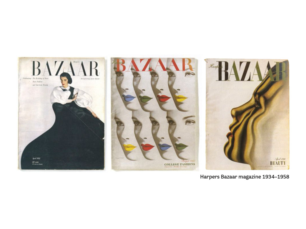
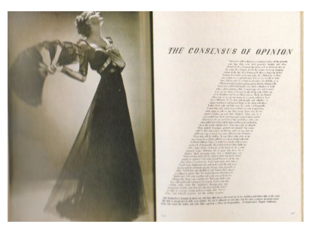
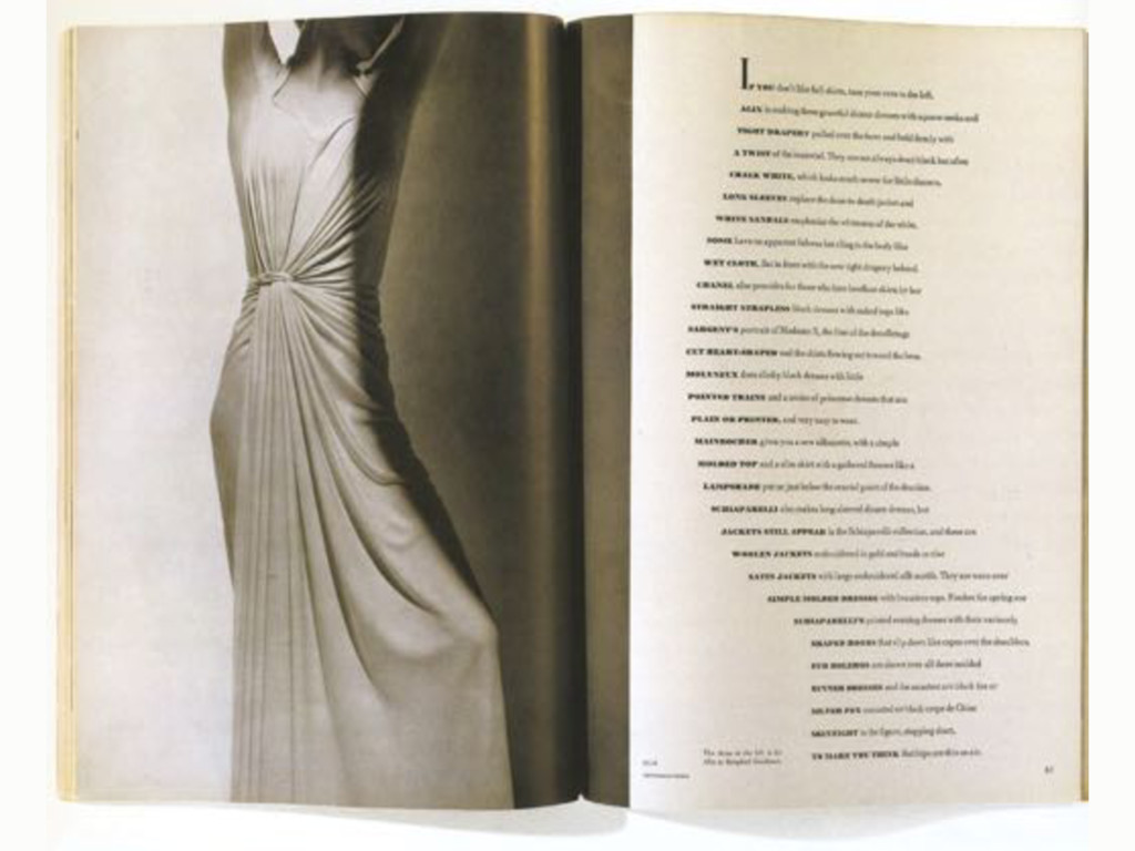
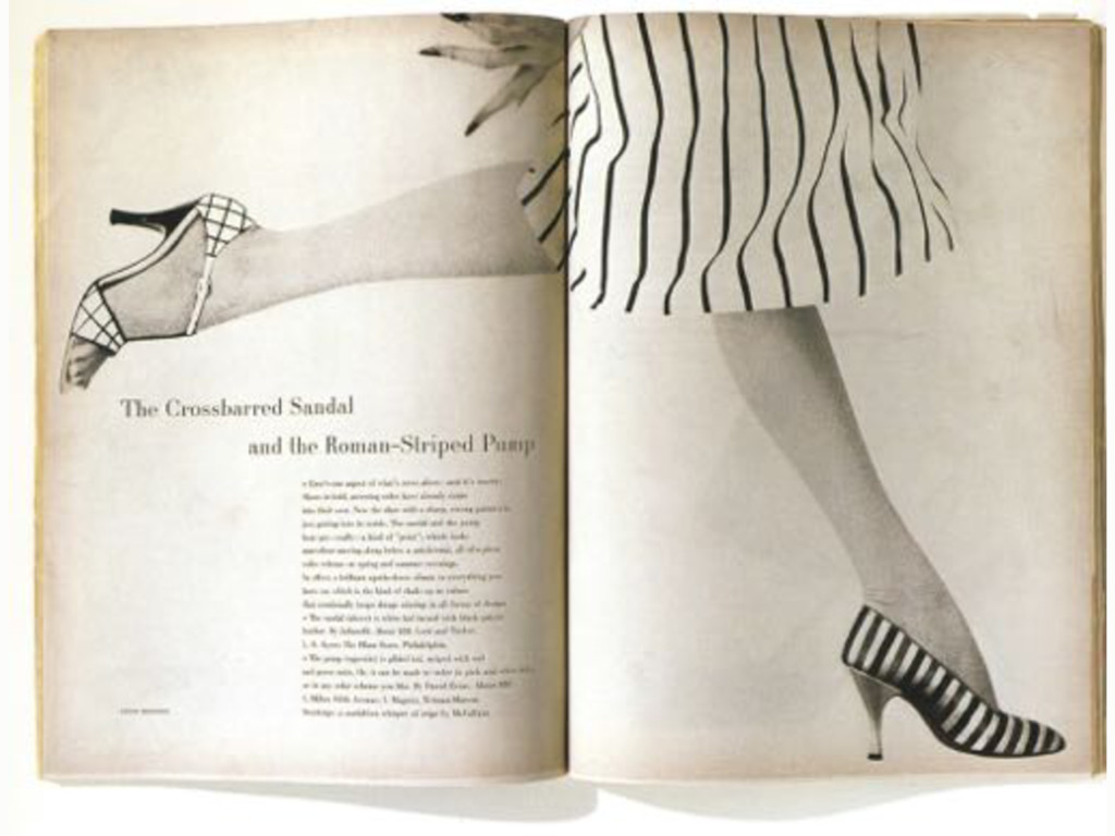
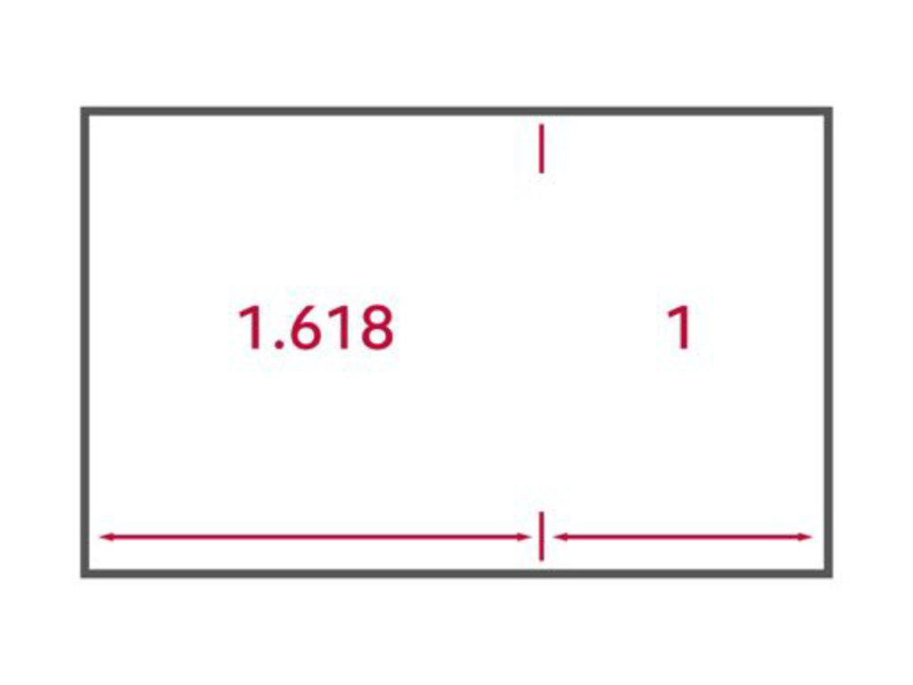
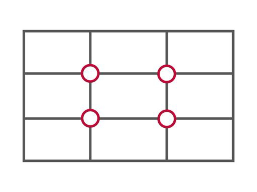
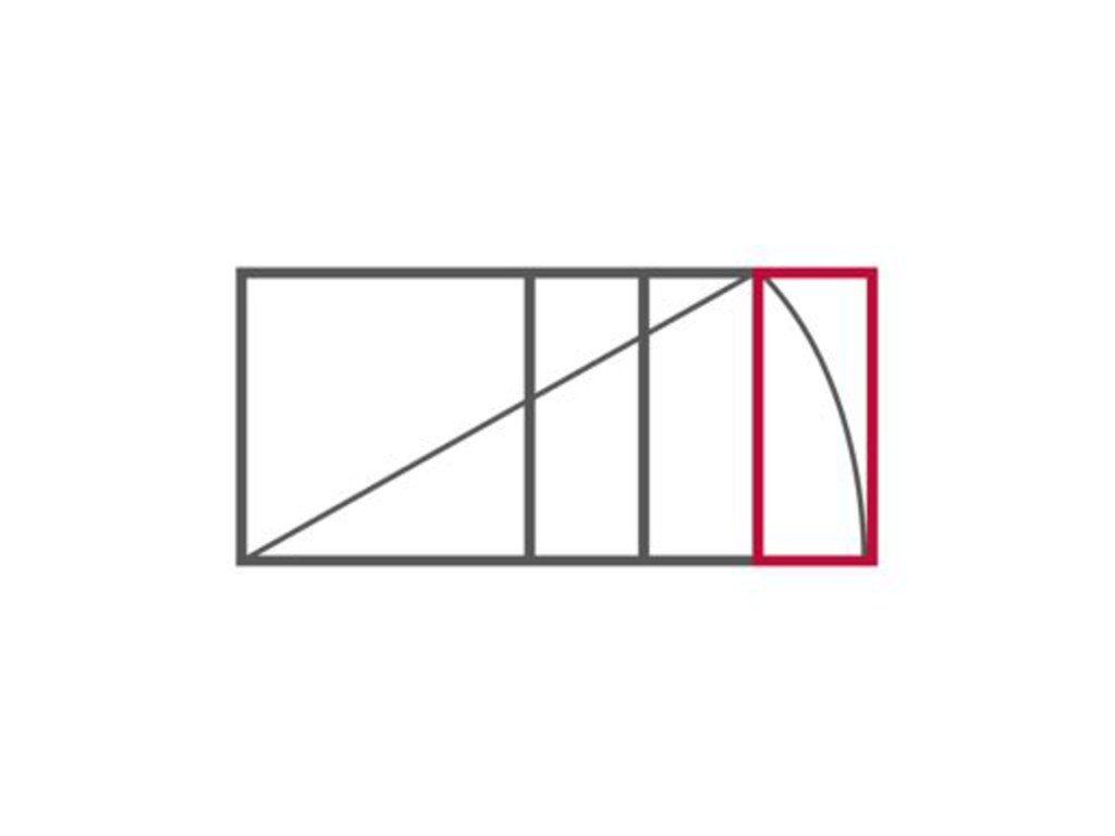
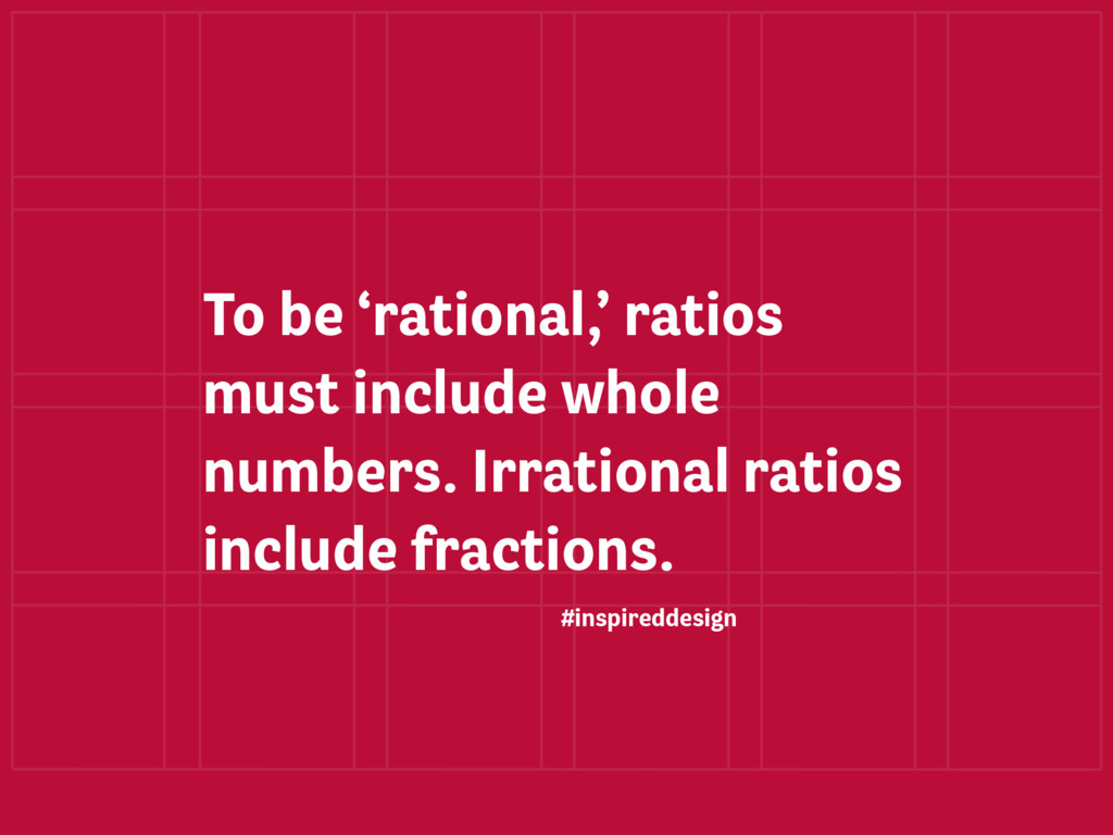
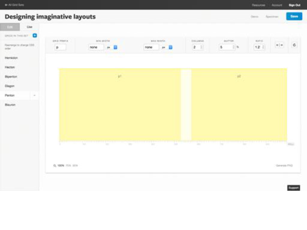
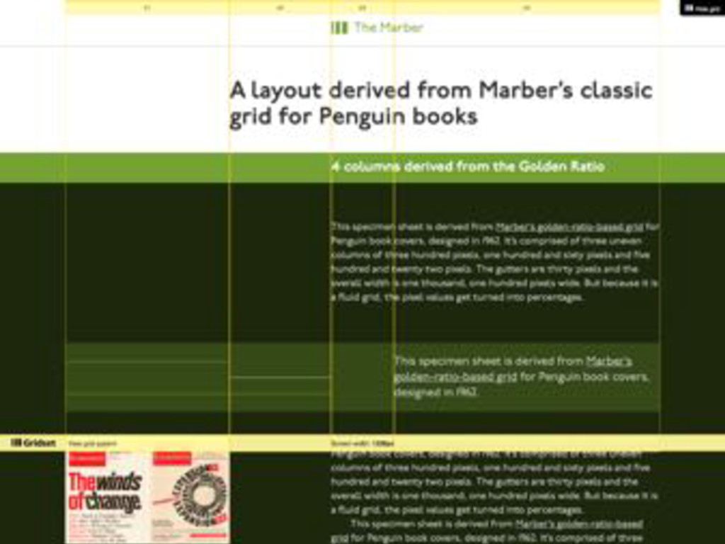
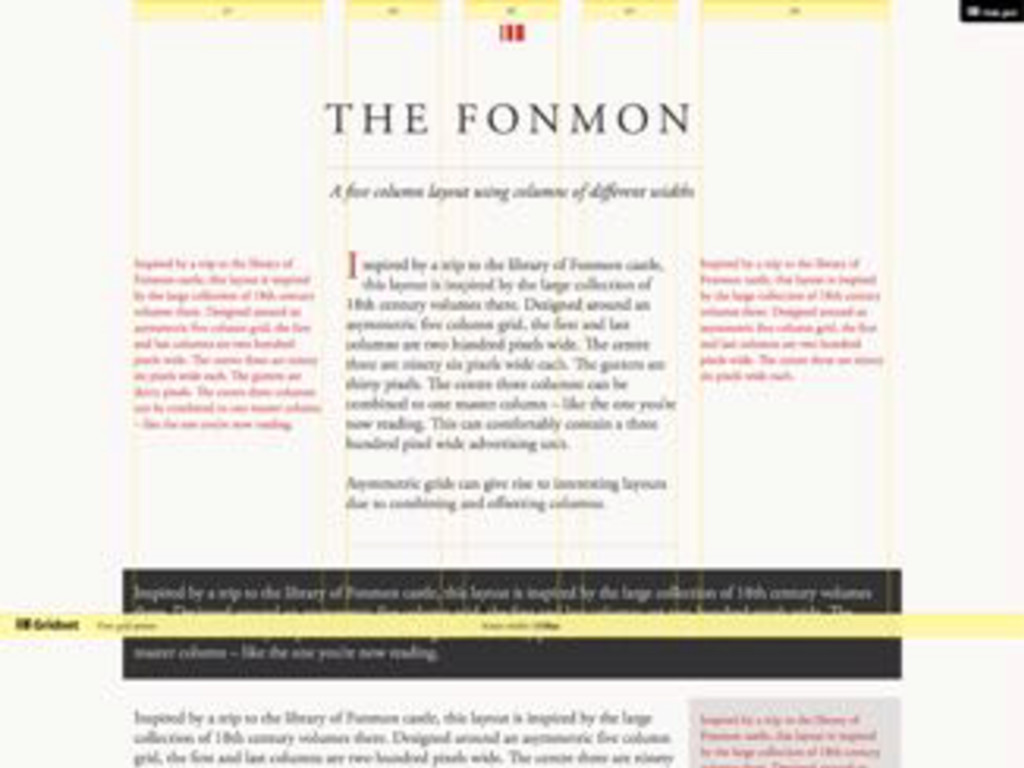
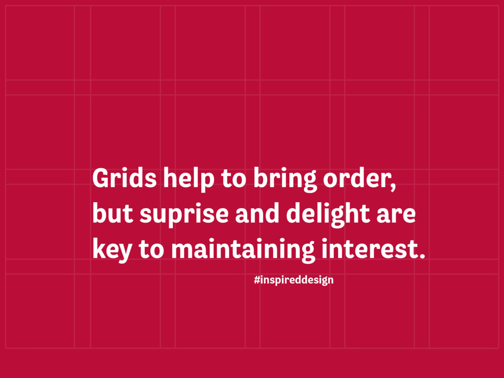
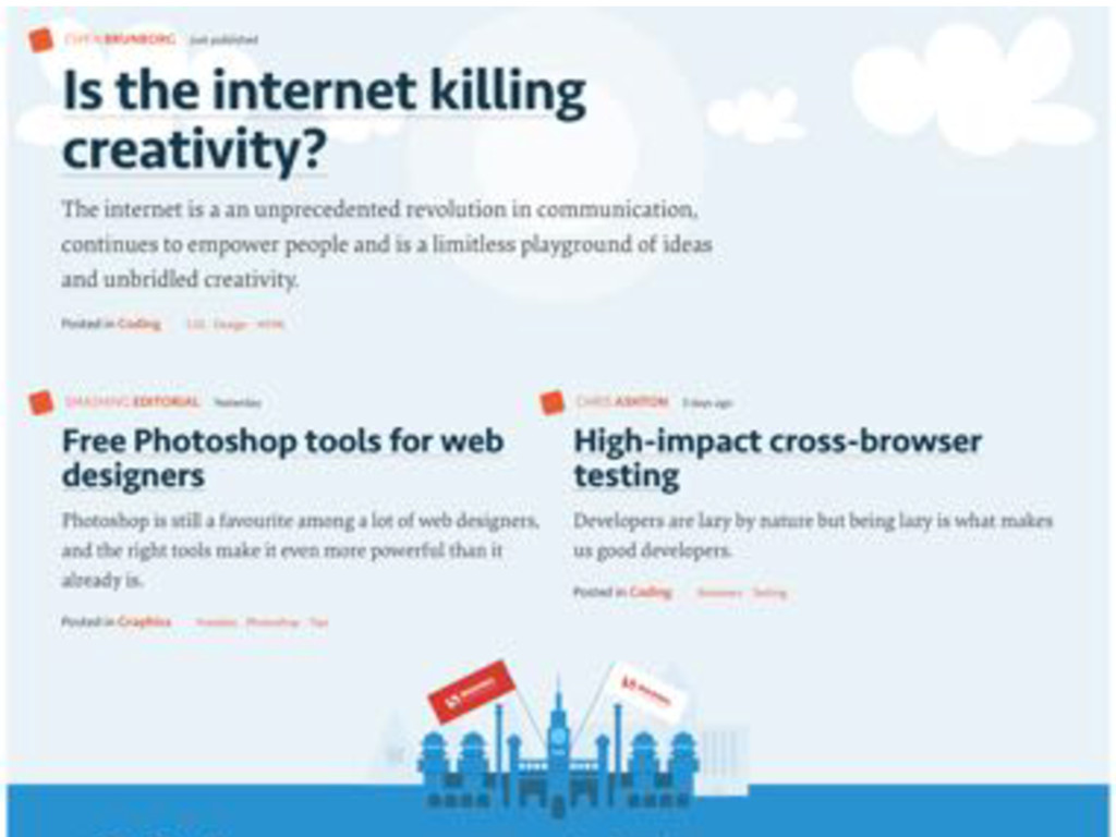
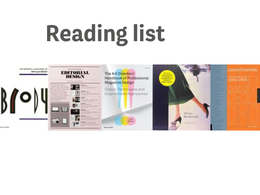
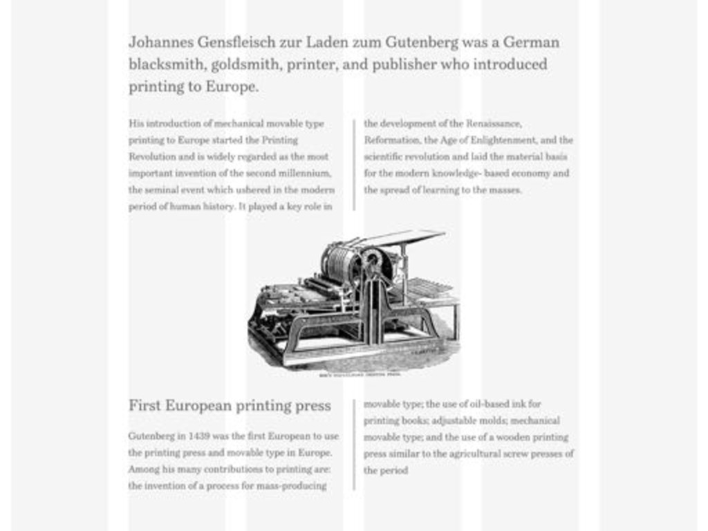
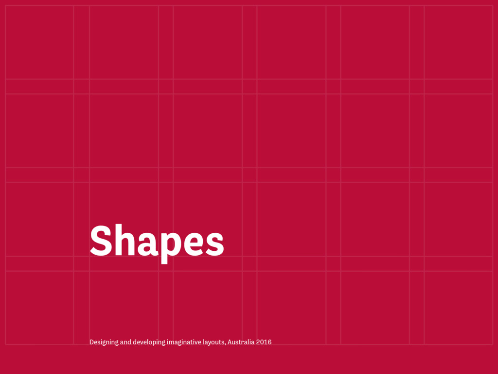
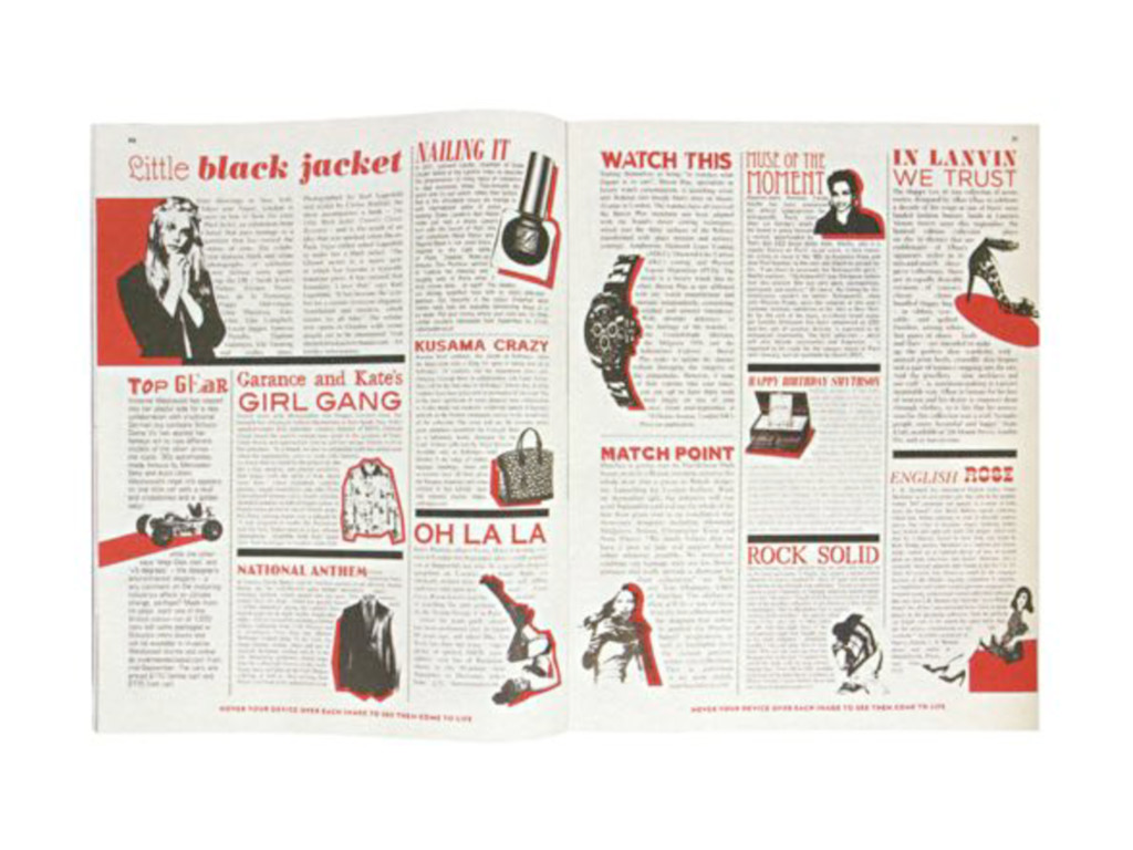
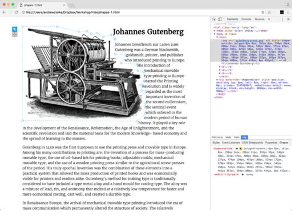
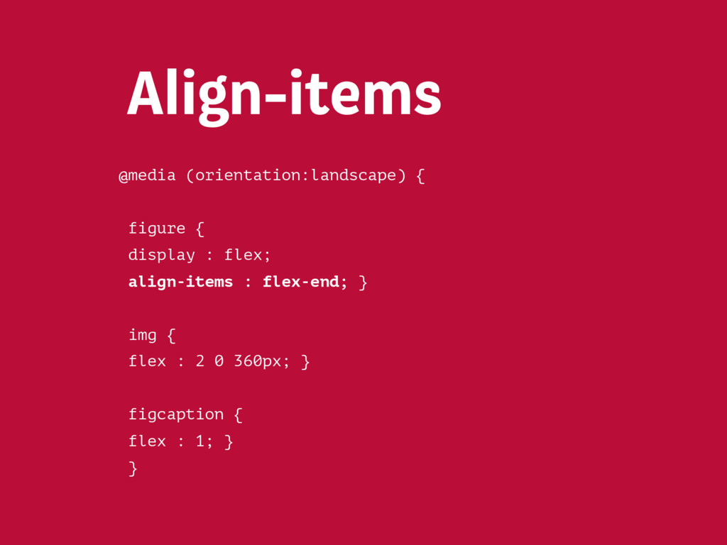
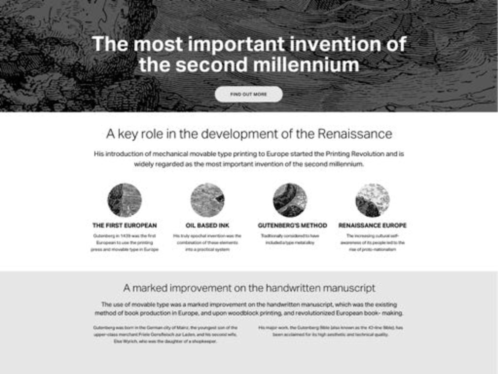
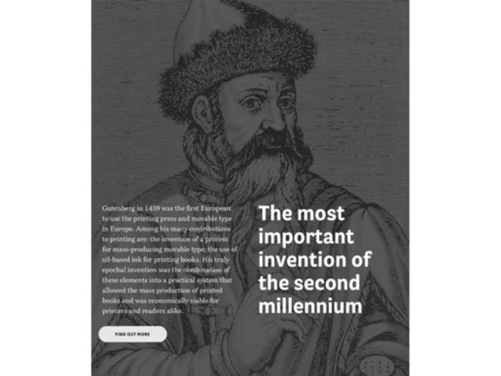
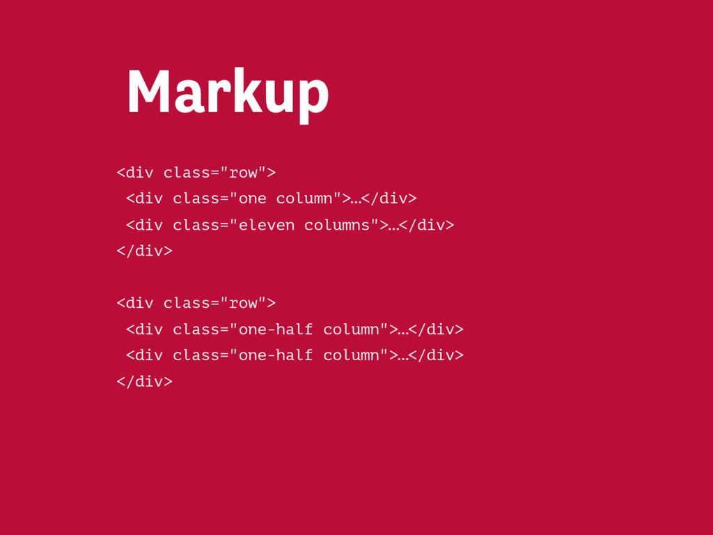
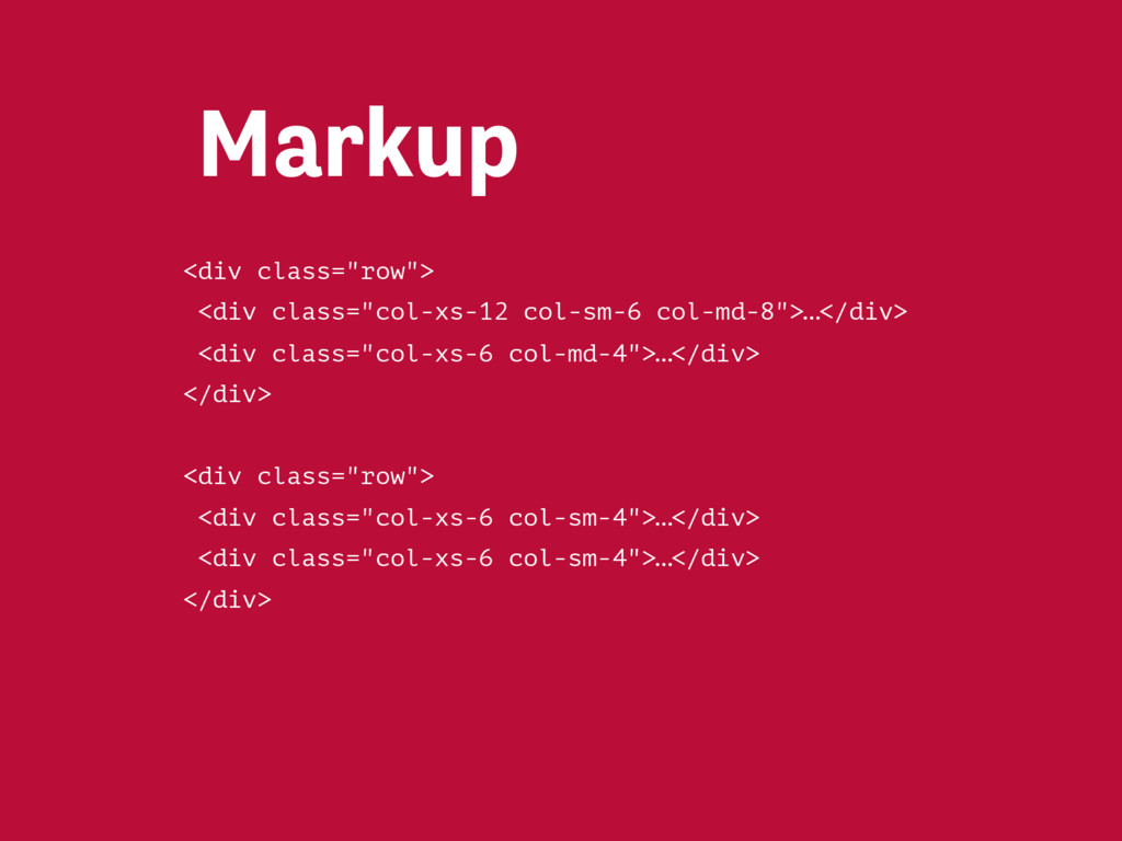
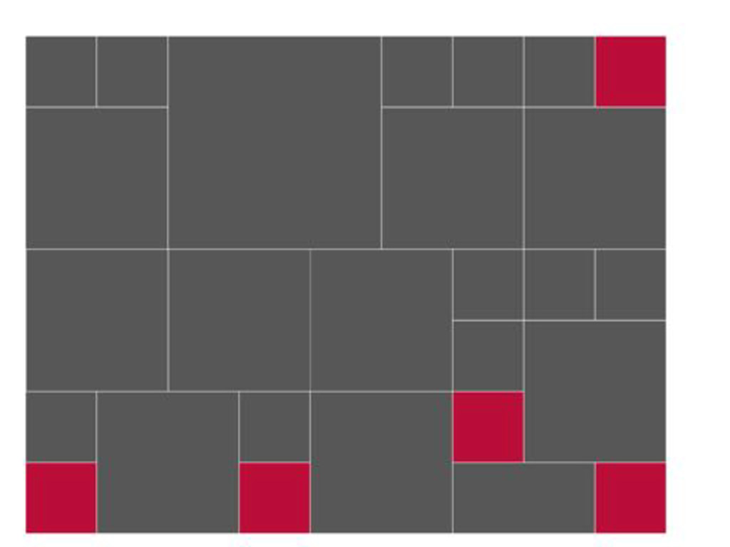
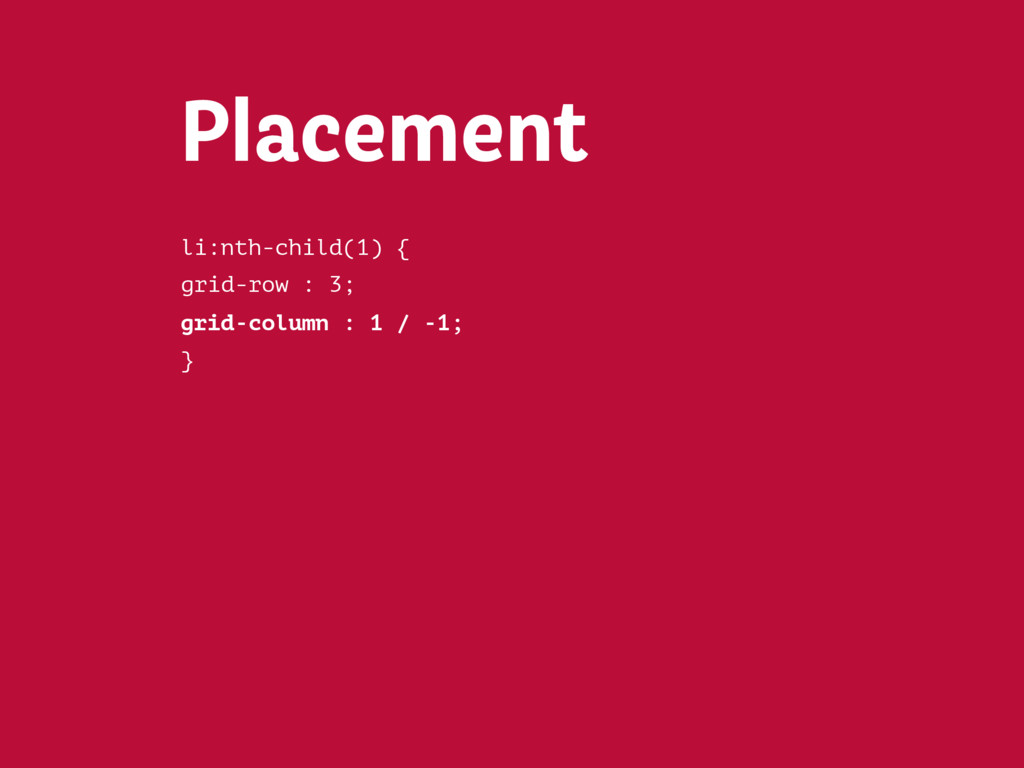
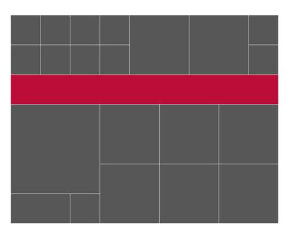
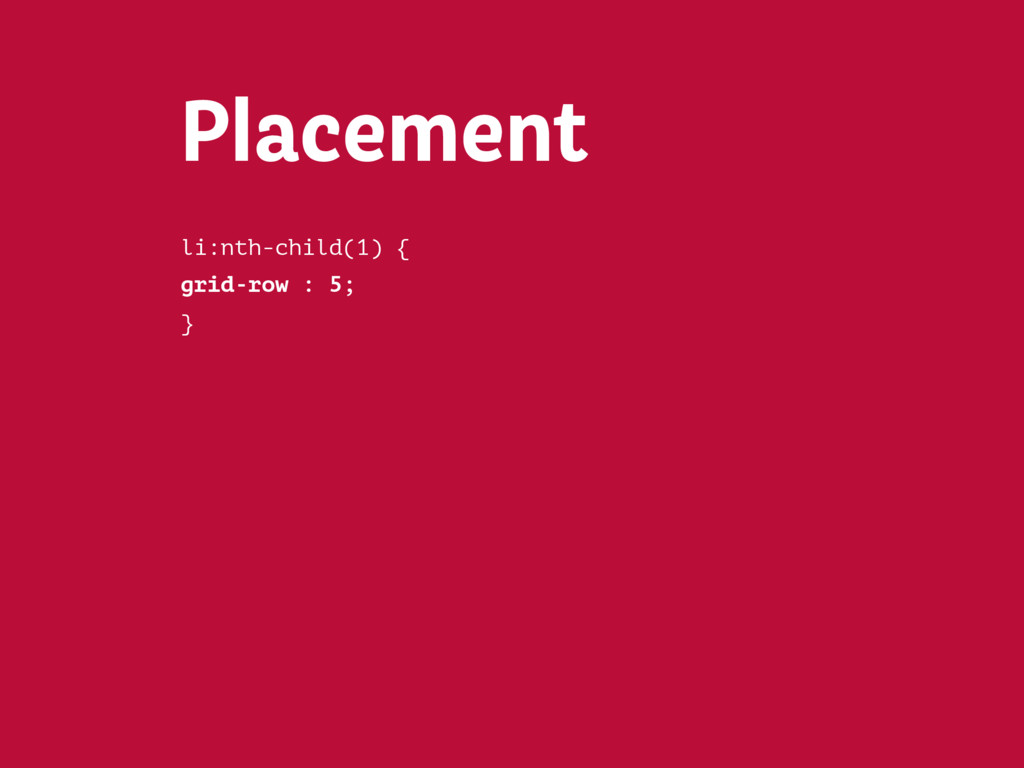
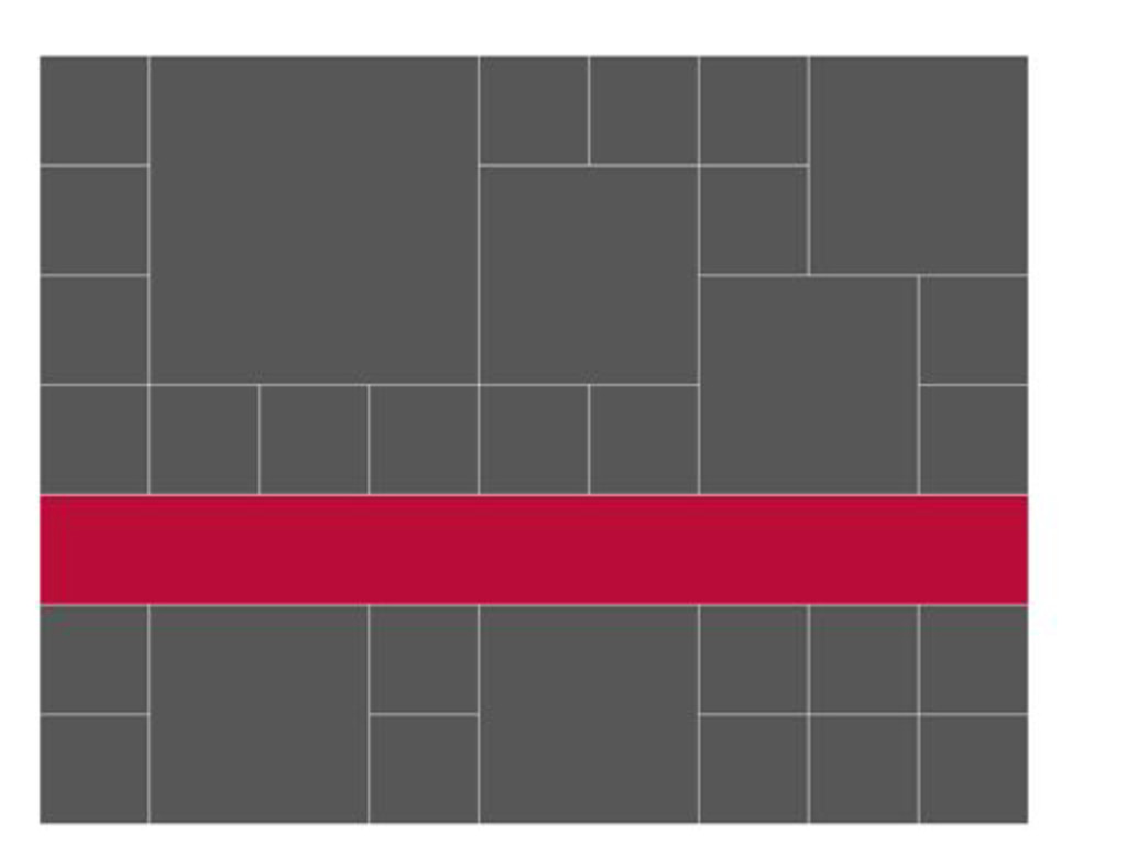
With more and more websites following the same tired layout patterns, it’s time be bring imagination back to our digital products and websites. This workshop will teach you how to design inspired layouts, without compromising accessibility, responsiveness or user experience.
 malarkey
 uxman
uxman
 ajstarks
 lynteo
 ncdc
ncdc
 satosio
 signull
 hiro0218
 terencebasart
 nttcom
 aonomasahiro
 saki822
 spacemarket
 stephenakadiri
 davidcarrasco
 honzajavorek
 auna
auna
 chrisshort
 axbom
axbom
 mlcsv
mlcsv
 aleyda
 ryanjones
.png) helenjbeal
helenjbeal
 ipullrank
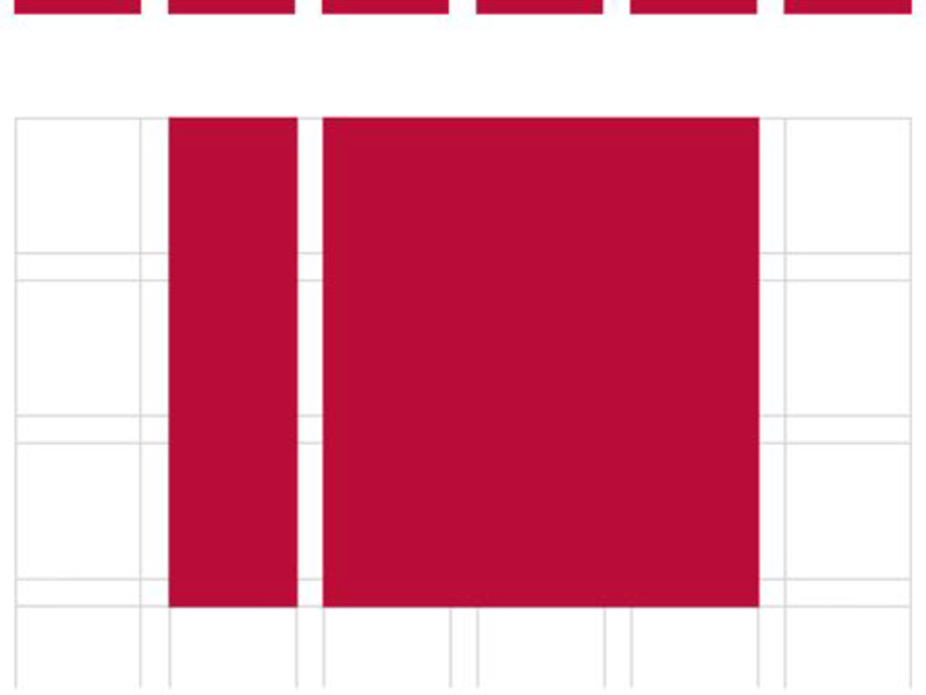
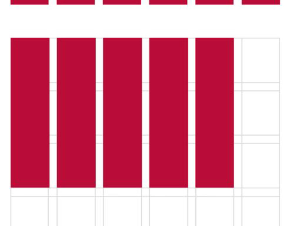
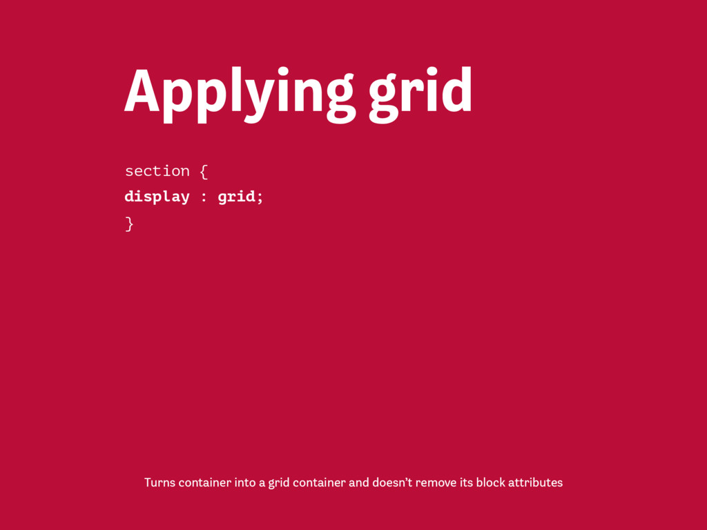
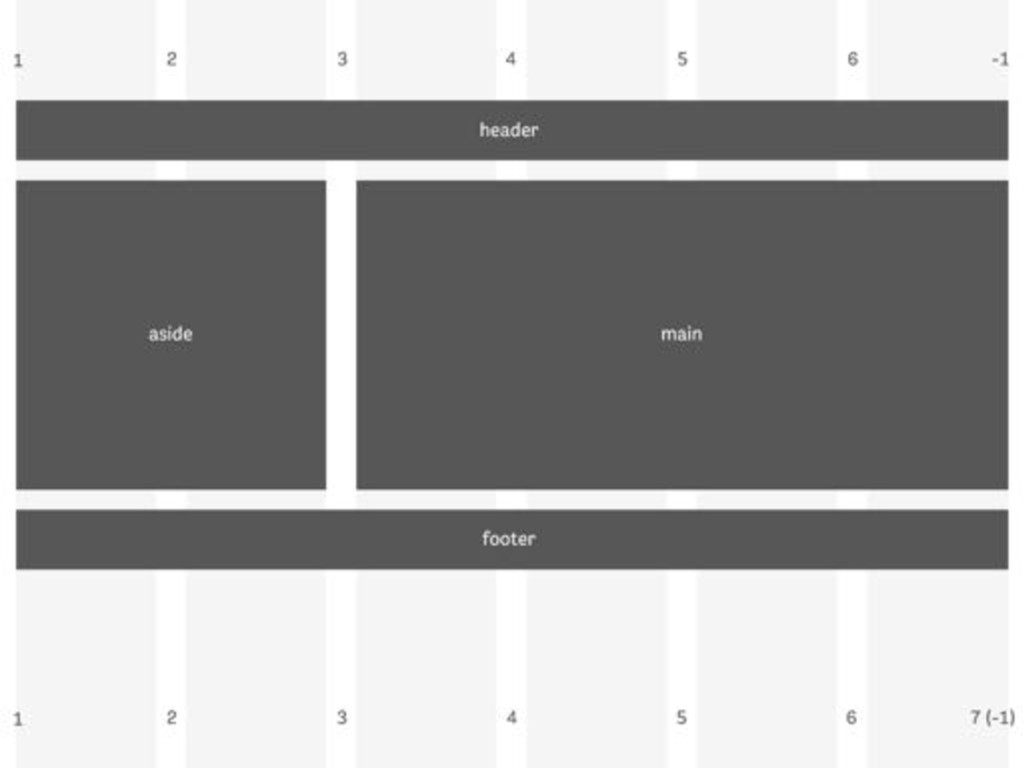
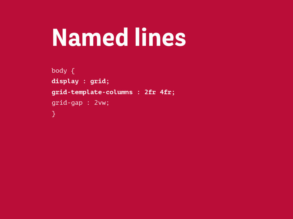
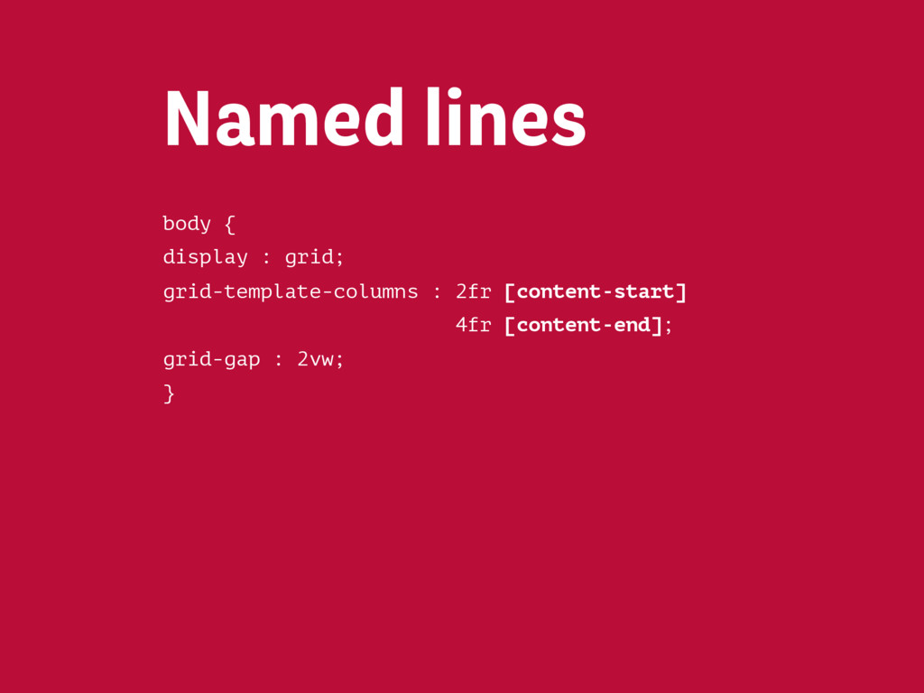
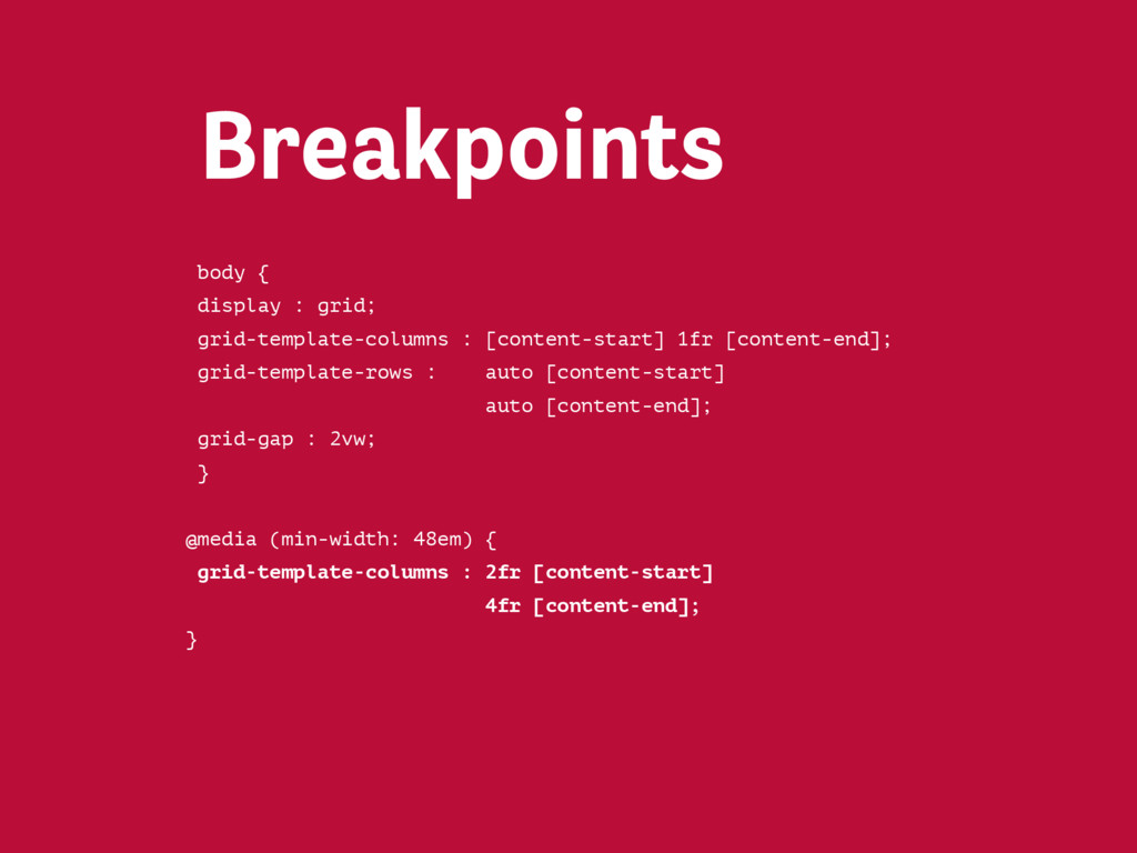
![body { display : grid; grid-template-columns : 2fr [content-start]](https://files.speakerdeck.com/presentations/bdba4b9a3b2440179006097759c7d25c/slide_438.jpg)
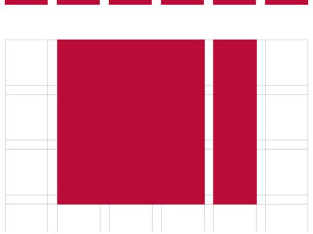
![body { display : grid; grid-template-columns : 2fr [content-start]](https://files.speakerdeck.com/presentations/bdba4b9a3b2440179006097759c7d25c/slide_439.jpg)
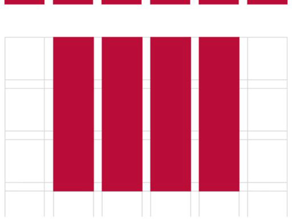
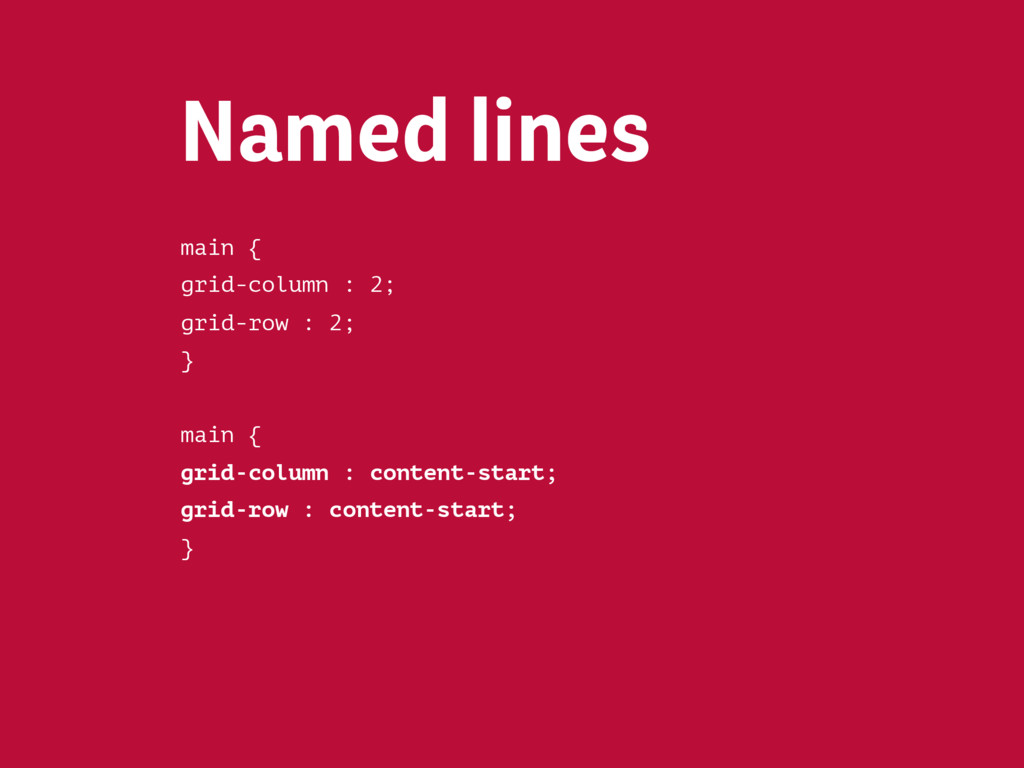
![body { display : grid; grid-template-columns : [content-start] 1fr [content-end];](https://files.speakerdeck.com/presentations/bdba4b9a3b2440179006097759c7d25c/slide_441.jpg)