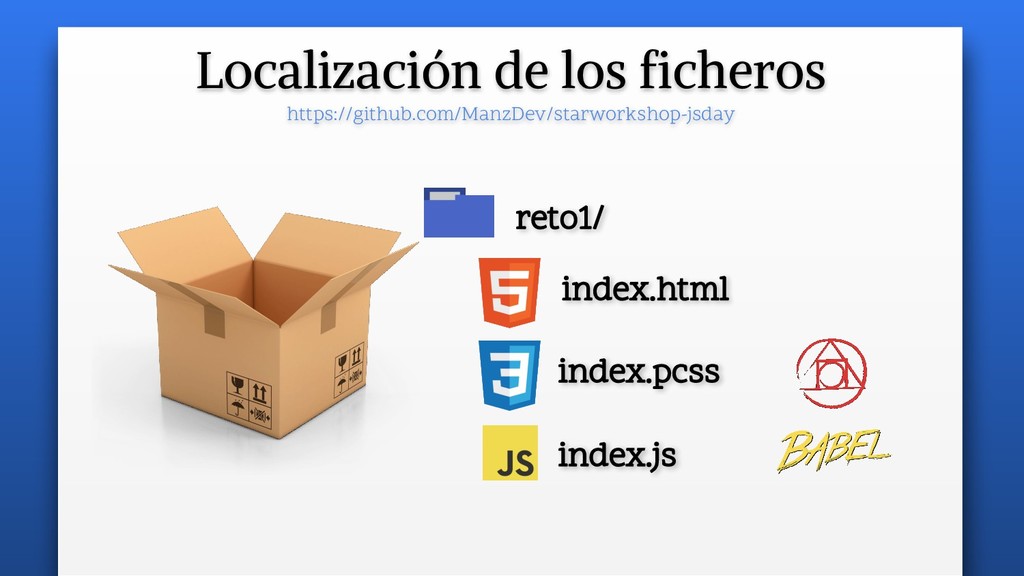
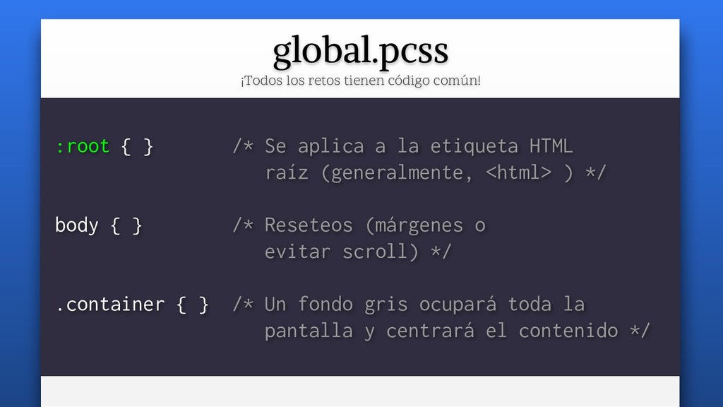
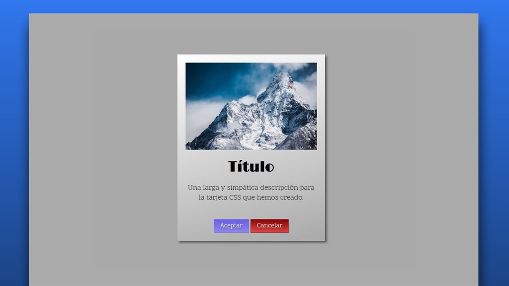
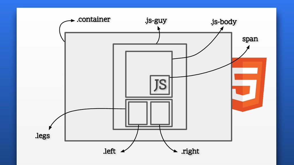
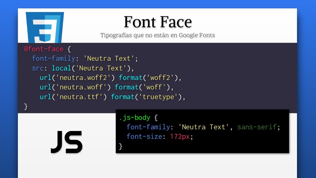
/* Se aplica a la etiqueta HTML raíz (generalmente, <html> ) */ body { } /* Reseteos (márgenes o evitar scroll) */ .container { } /* Un fondo gris ocupará toda la pantalla y centrará el contenido */
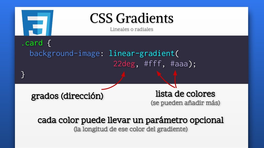
(se pueden añadir más) .card { background-image: linear-gradient( 22deg, #fff, #aaa); } cada color puede llevar un parámetro opcional (la longitud de ese color del gradiente)
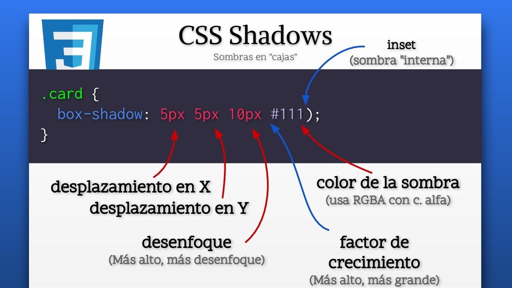
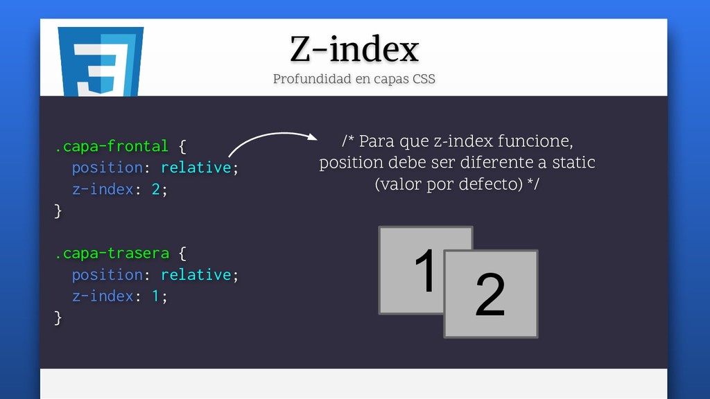
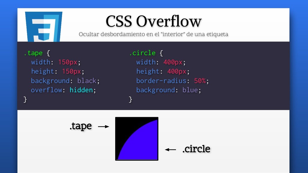
la sombra (usa RGBA con c. alfa) .card { box-shadow: 5px 5px 10px #111); } desenfoque (Más alto, más desenfoque) desplazamiento en Y inset (sombra "interna") factor de crecimiento (Más alto, más grande)
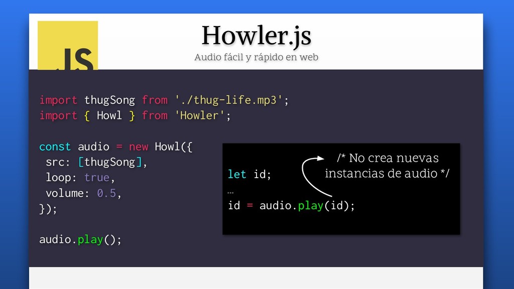
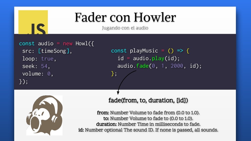
new Howl({ src: [timeSong], loop: true, seek: 54, volume: 0, }); const playMusic = () => { id = audio.play(id); audio.fade(0, 1, 2000, id); }; fade(from, to, duration, [id]) from: Number Volume to fade from (0.0 to 1.0). to: Number Volume to fade to (0.0 to 1.0). duration: Number Time in milliseconds to fade. id: Number optional The sound ID. If none is passed, all sounds.
 manz
manz
 ryugen04
 kotetuco
 johnroyer
 pkshadeck
 manfredsteyer
 tooppoo
 sushichan044
 shogogg
 hjmkth
 tk3fftk
 har1101
 minodriven
 skipperchong
 tammyeverts
 colly
colly
 sarafernandez
 jct
jct
 konakalab
 marcoroth
 sabderemane
 jonoalderson
 eileencodes
 greggifford
 asonas
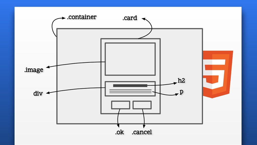
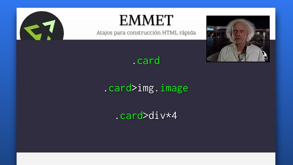
![EMMET Atajos para construcción HTML rápida .card>img.image+(div>h2+p)+button.ok+button.cancel img.image[src="./mountain.jpg" alt="A mountain"]](https://files.speakerdeck.com/presentations/0170e316c1dc445da62a2e2e75c804ca/slide_15.jpg)
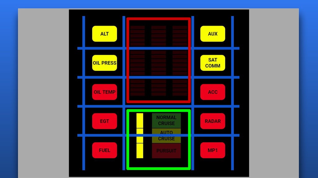
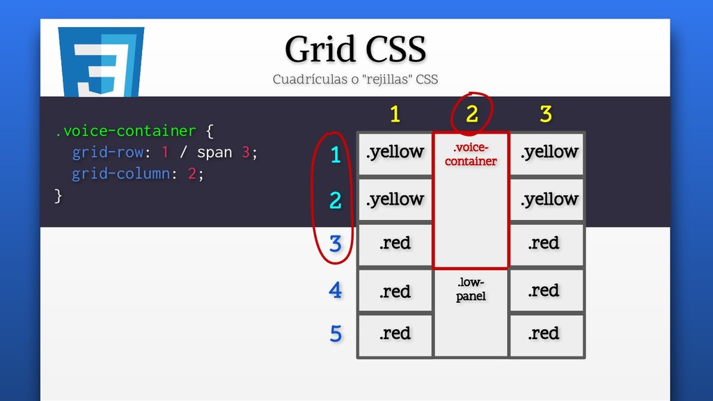
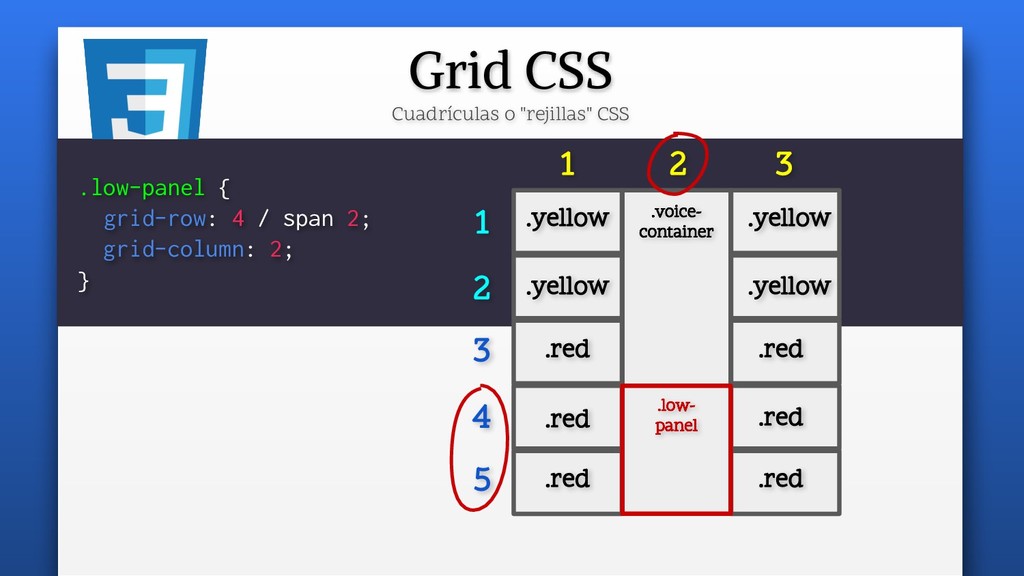
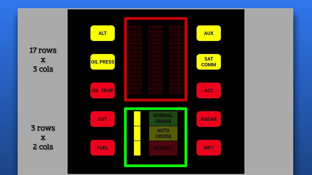
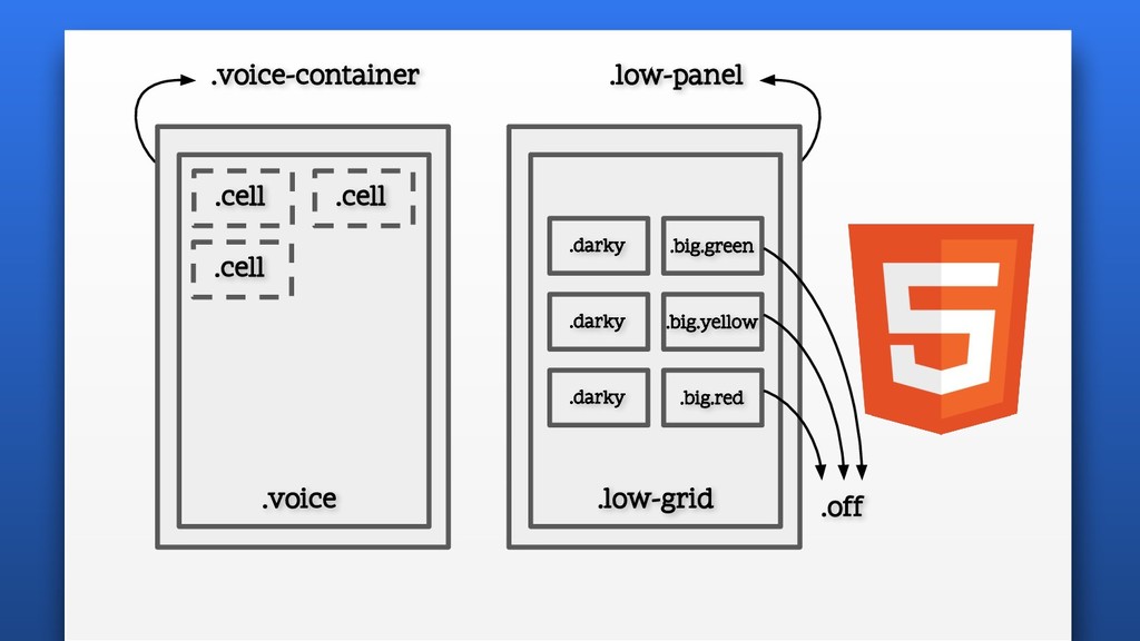
![Kitt cells Celdas del simulador de voz de Kitt .cell[data-color="0"]](https://files.speakerdeck.com/presentations/0170e316c1dc445da62a2e2e75c804ca/slide_66.jpg)