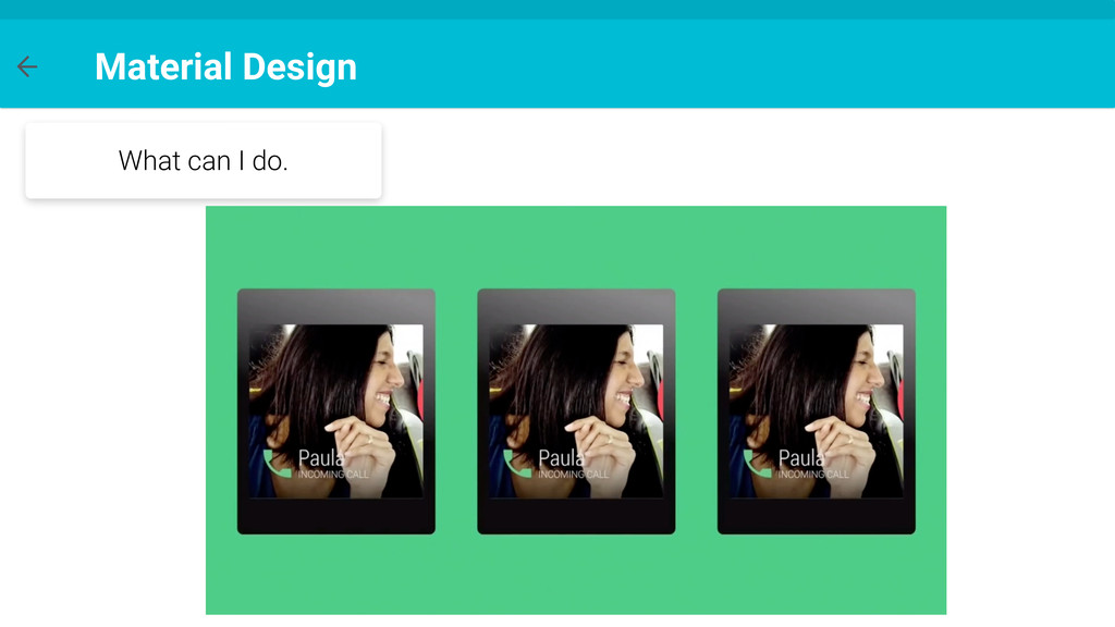
start using some applications and stop using others, not based in functionalities or my needs, but actually based on how easy it was to use it and how fast I could get things done
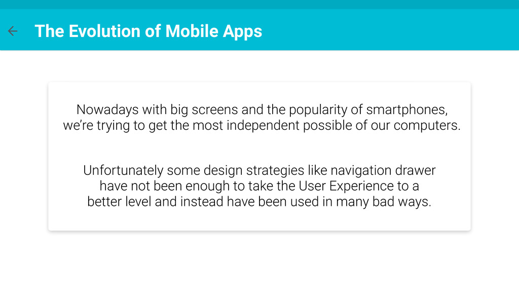
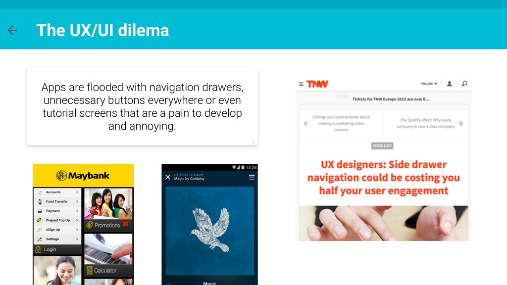
the popularity of smartphones, we’re trying to get the most independent possible of our computers. Unfortunately some design strategies like navigation drawer have not been enough to take the User Experience to a better level and instead have been used in many bad ways.
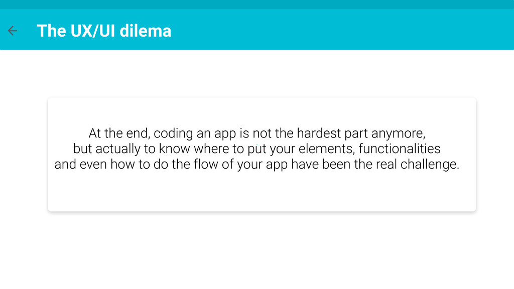
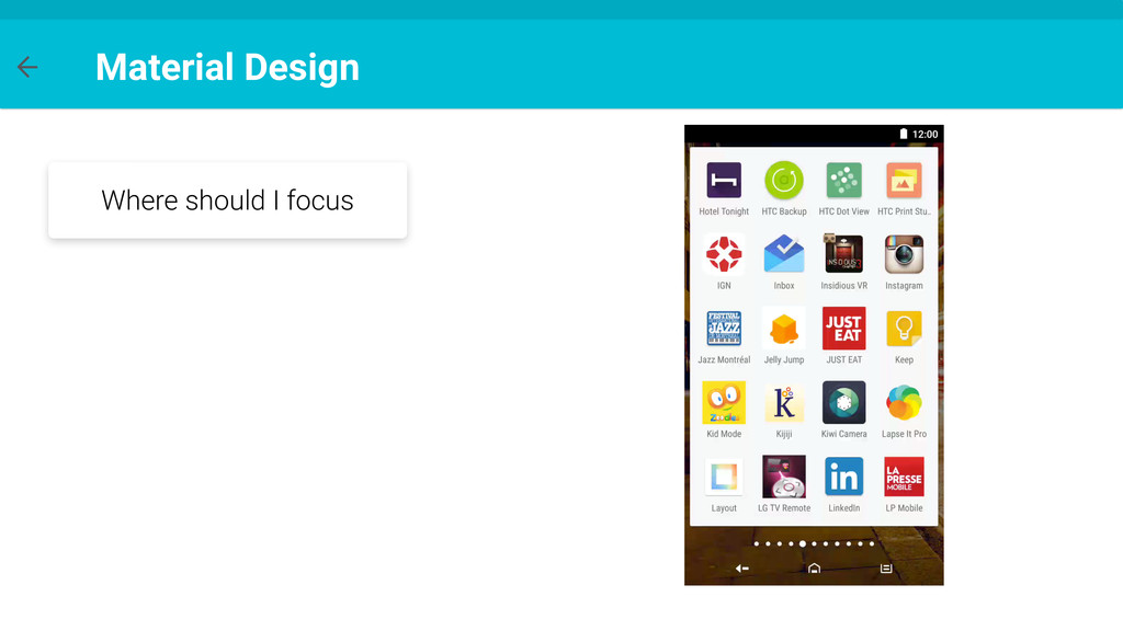
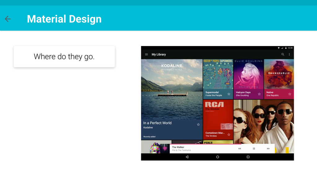
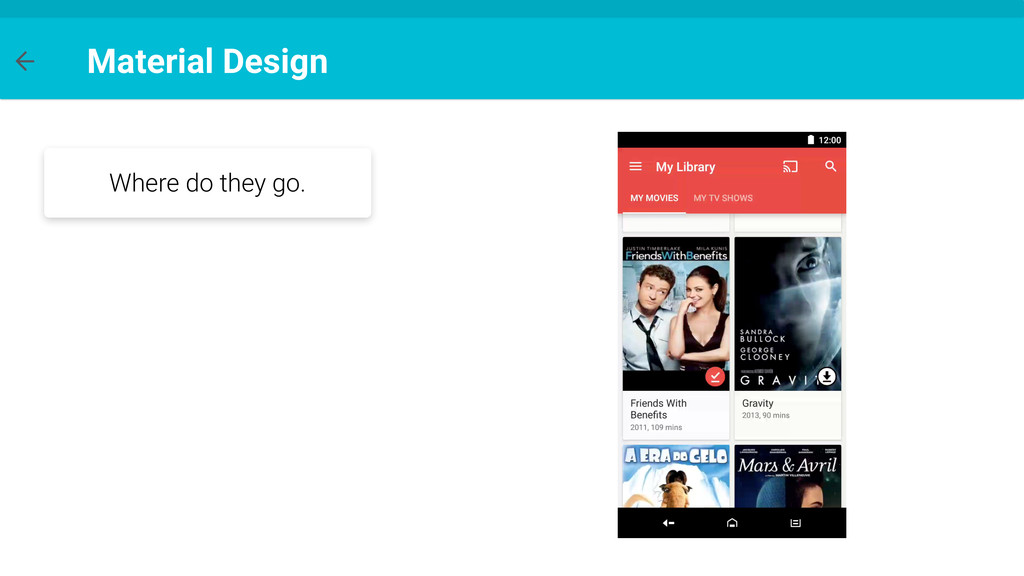
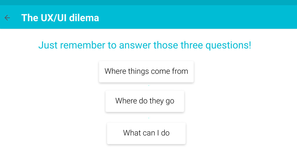
not the hardest part anymore, but actually to know where to put your elements, functionalities and even how to do the flow of your app have been the real challenge.
of drawables so we can reduce the amount of resources in our application. Also we will see cases where a drawable could easily replace views, making our app more clean and faster. Objective
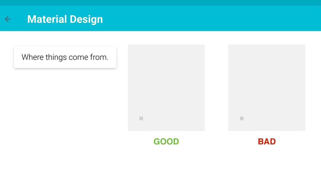
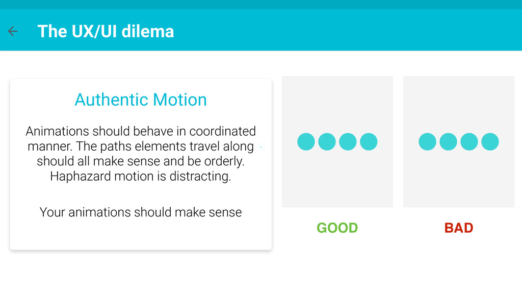
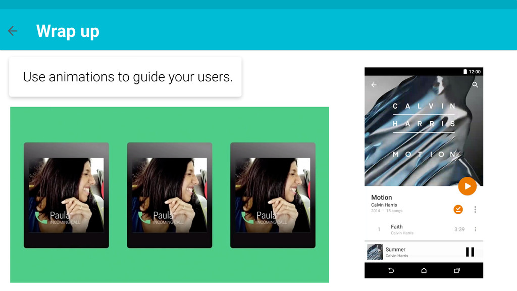
manner. The paths elements travel along should all make sense and be orderly. Haphazard motion is distracting. GOOD BAD Your animations should make sense
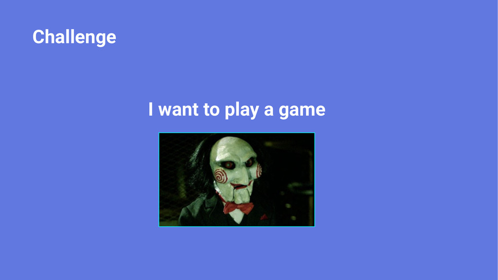
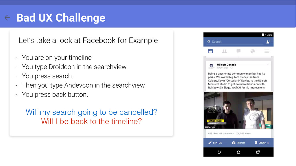
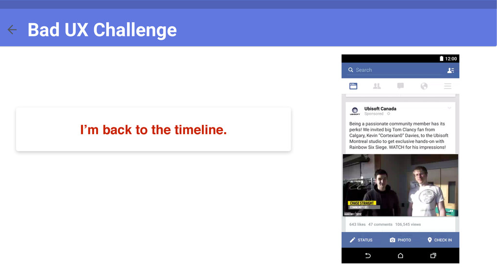
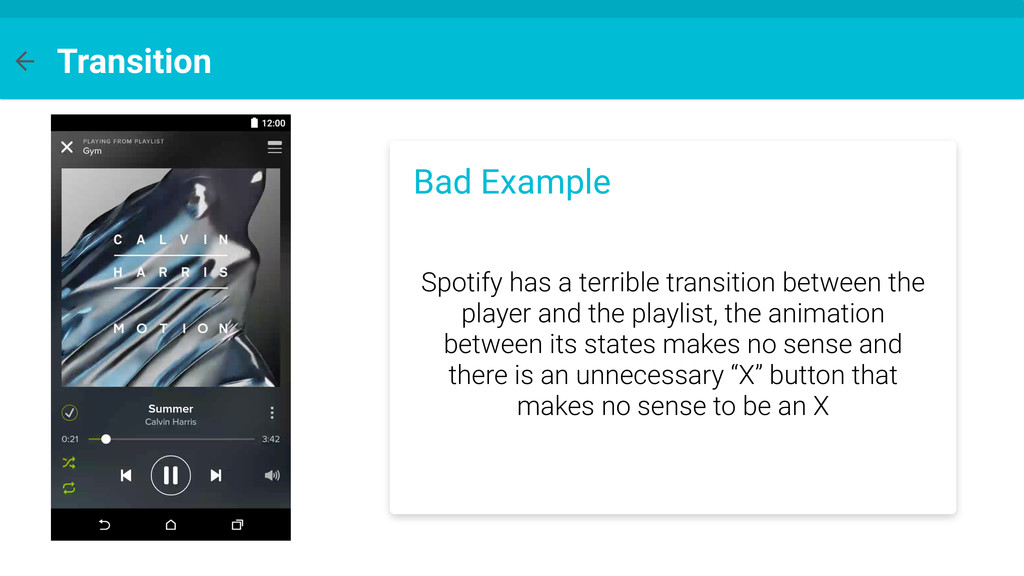
are on your timeline - You type Droidcon in the searchview. - You press search. - Then you type Andevcon in the searchview - You press back button. Will my search going to be cancelled? Will I be back to the timeline? Bad UX Challenge
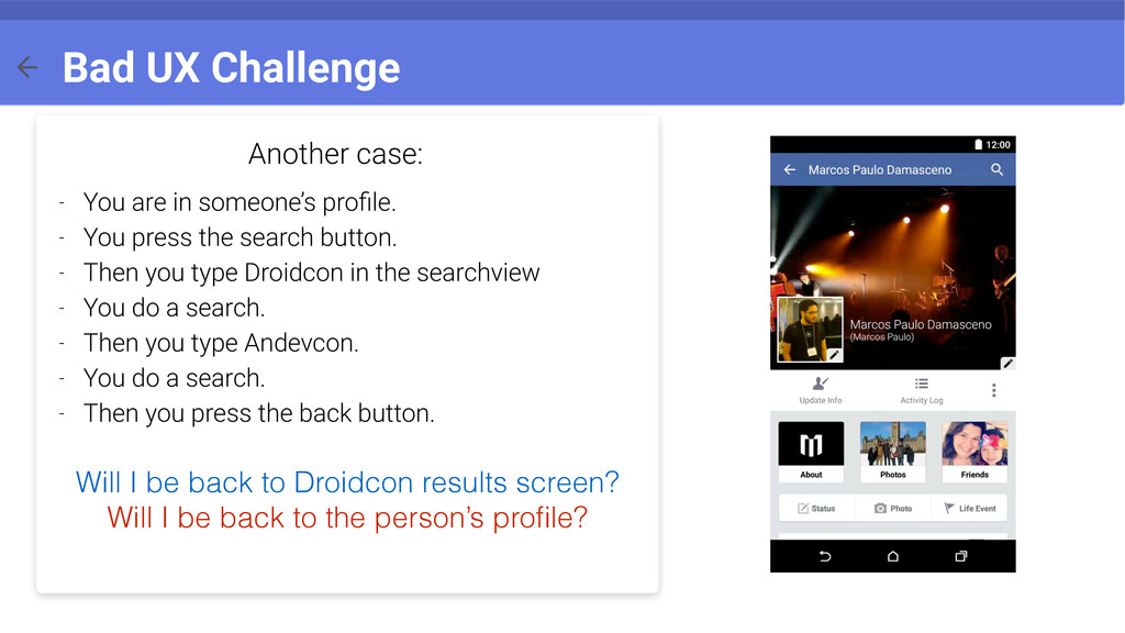
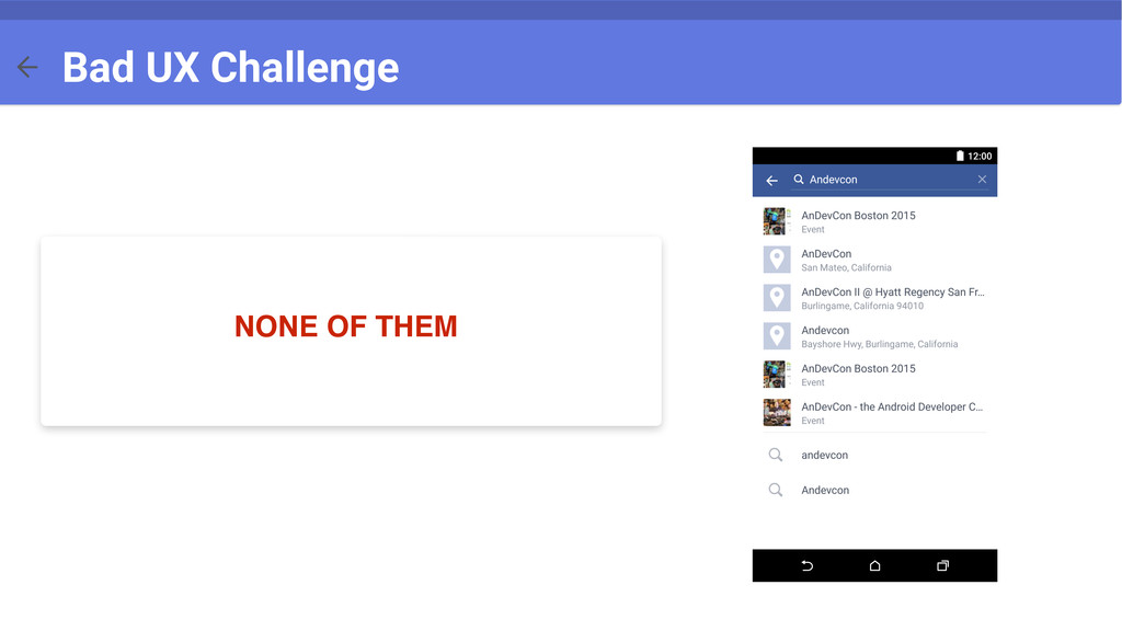
press the search button. - Then you type Droidcon in the searchview - You do a search. - Then you type Andevcon. - You do a search. - Then you press the back button. Will I be back to Droidcon results screen? Will I be back to the person’s profile? Bad UX Challenge
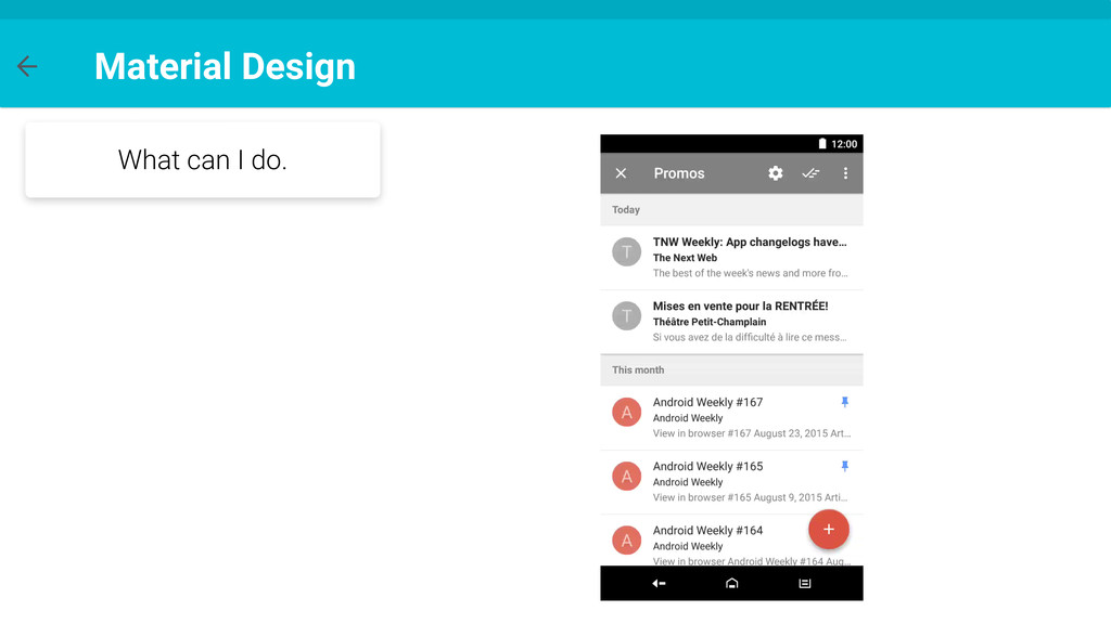
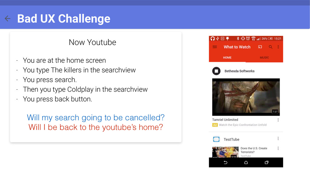
You type The killers in the searchview - You press search. - Then you type Coldplay in the searchview - You press back button. Will my search going to be cancelled? Will I be back to the youtube’s home? Bad UX Challenge
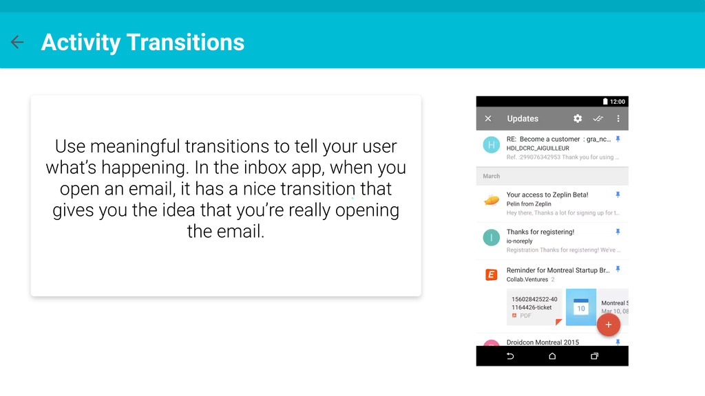
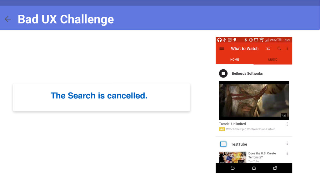
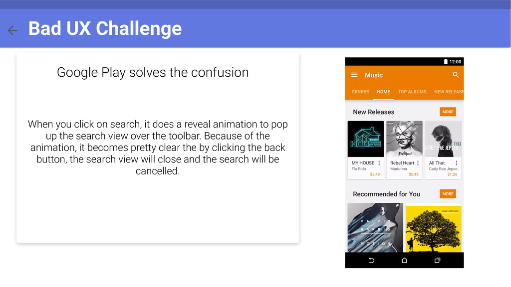
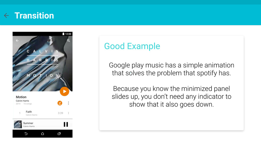
click on search, it does a reveal animation to pop up the search view over the toolbar. Because of the animation, it becomes pretty clear the by clicking the back button, the search view will close and the search will be cancelled.
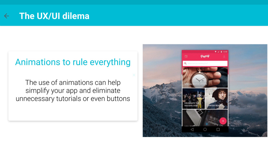
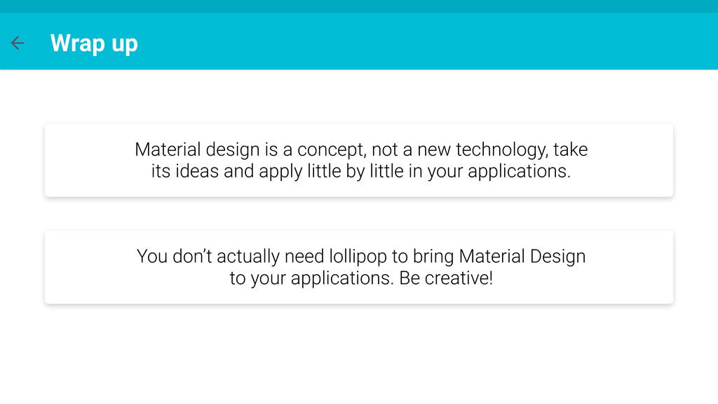
technology, take its ideas and apply little by little in your applications. You don’t actually need lollipop to bring Material Design to your applications. Be creative!