Upgrade to Pro — share decks privately, control downloads, hide ads and more …

[ForwardJS] React + X: Best Practices for Reusable UI Components

[ForwardJS] React + X: Best Practices for Reusable UI Components

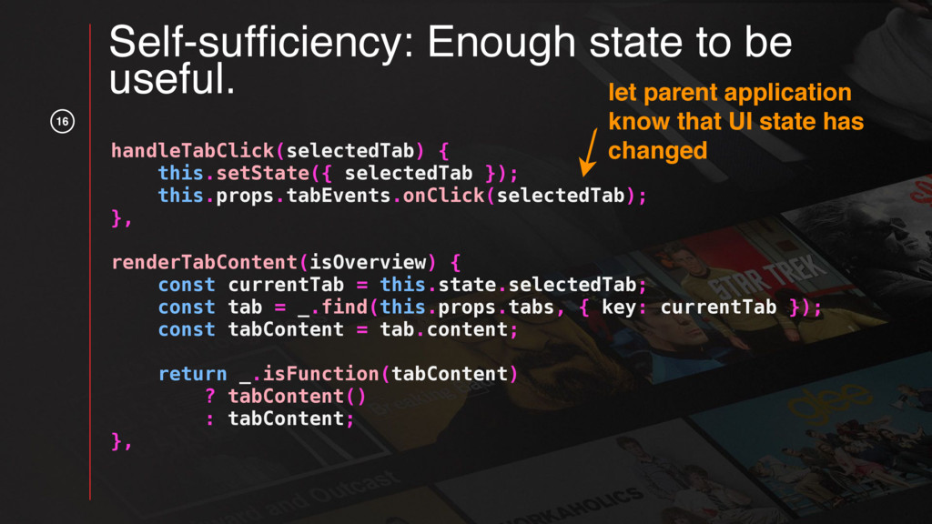
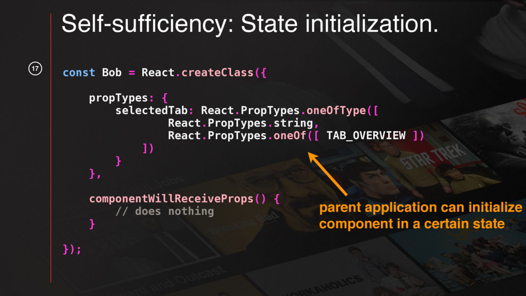
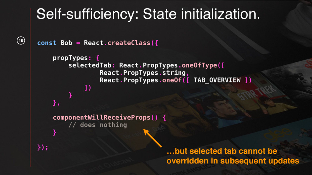
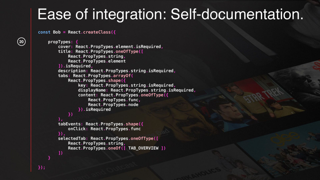
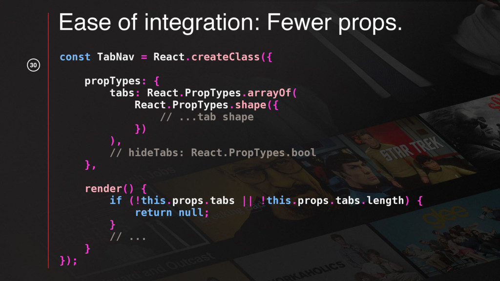
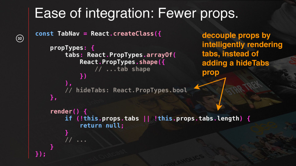
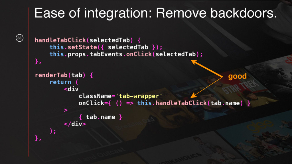
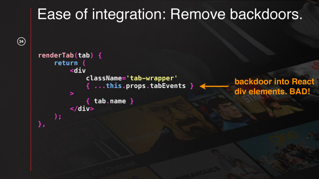
React is awesome but even good frameworks don’t prevent you from writing bad code. This talk will focus on some key principles for writing reusable UI components that will make them fun to use and keep your co-workers from going crazy.

React components are also very portable, allowing them to be used in various frameworks and build systems. The second half of this talk will focus on how to package and distribute reusable UI components so they can be used in a variety of project setups.

This talk was given at ForwardJS (https://forwardjs.com/) on March 1st, 2017.
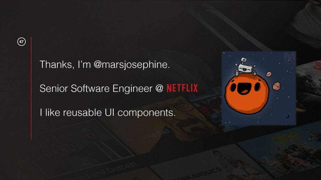
Mars Jullian

March 01, 2017
Tweet

More Decks by Mars Jullian

Other Decks in Programming

Transcript

  1. 1 React plus X Mars Jullian Senior UI Engineer Best

    practices for reusable UI components.
  2. 2 Why build a UI component library? • Breaking out

    of the monolith —> new repos for teams / products —> different frameworks & build systems. Brand & UX consistency —> Share & maintain the design & functionality across codebases easily.
  3. 3 Why build a UI component library? • Breaking out

    of the monolith —> new repos for teams / products —> different frameworks & build systems. • Brand & UX consistency —> Share & maintain the design & functionality across codebases easily.
  4. 5 React & Reusable UI components • JSX / no

    templates —> less files per component • Markup a function of state & props —> UI components can be independent of data source but still have full control over interactions. • Easily ported into different frameworks
  5. 6 React & Reusable UI components • JSX / no

    templates —> less files per component • Markup a function of state & props —> UI components can be independent of data source but still have full control over interactions. • Easily ported into different frameworks
  6. 7 React & Reusable UI components • JSX / no

    templates —> less files per component • Markup a function of state & props —> UI components can be independent of data source but still have full control over interactions. • Easily ported into different frameworks
  7. 10

  8. 11

  9. 13 Self-sufficiency: Don’t worry about data. const Bob = React.createClass({

    propTypes: { tabs: React.PropTypes.arrayOf( React.PropTypes.shape({ key: React.PropTypes.string.isRequired, displayName: React.PropTypes.string.isRequired, content: React.PropTypes.oneOfType({ React.PropTypes.func, React.PropTypes.node }).isRequired }) ), // ... more props } }); data / content not part of component state, should come from parent application
  10. Self-sufficiency: Enough state to be useful. handleTabClick(selectedTab) { this.setState({ selectedTab

    }); this.props.tabEvents.onClick(selectedTab); }, renderTabContent(isOverview) { const currentTab = this.state.selectedTab; const tab = _.find(this.props.tabs, { key: currentTab }); const tabContent = tab.content; return _.isFunction(tabContent) ? tabContent() : tabContent; }, keep track of currently selected tab 14
  11. 15 Self-sufficiency: Enough state to be useful. handleTabClick(selectedTab) { this.setState({

    selectedTab }); this.props.tabEvents.onClick(selectedTab); }, renderTabContent(isOverview) { const currentTab = this.state.selectedTab; const tab = _.find(this.props.tabs, { key: currentTab }); const tabContent = tab.content; return _.isFunction(tabContent) ? tabContent() : tabContent; }, knowing which tab is currently selected, means you know what application data / content to render
  12. 16 Self-sufficiency: Enough state to be useful. handleTabClick(selectedTab) { this.setState({

    selectedTab }); this.props.tabEvents.onClick(selectedTab); }, renderTabContent(isOverview) { const currentTab = this.state.selectedTab; const tab = _.find(this.props.tabs, { key: currentTab }); const tabContent = tab.content; return _.isFunction(tabContent) ? tabContent() : tabContent; }, let parent application know that UI state has changed
  13. 17 Self-sufficiency: State initialization. const Bob = React.createClass({ propTypes: {

    selectedTab: React.PropTypes.oneOfType([ React.PropTypes.string, React.PropTypes.oneOf([ TAB_OVERVIEW ]) ]) } }, componentWillReceiveProps() { // does nothing } }); parent application can initialize component in a certain state
  14. 18 const Bob = React.createClass({ propTypes: { selectedTab: React.PropTypes.oneOfType([ React.PropTypes.string,

    React.PropTypes.oneOf([ TAB_OVERVIEW ]) ]) } }, componentWillReceiveProps() { // does nothing } }); …but selected tab cannot be overridden in subsequent updates Self-sufficiency: State initialization.
  15. 20 const Bob = React.createClass({ propTypes: { cover: React.PropTypes.element.isRequired, title:

    React.PropTypes.oneOfType([ React.PropTypes.string, React.PropTypes.element ]).isRequired, description: React.PropTypes.string.isRequired, tabs: React.PropTypes.arrayOf( React.PropTypes.shape({ key: React.PropTypes.string.isRequired, displayName: React.PropTypes.string.isRequired, content: React.PropTypes.oneOfType({ React.PropTypes.func, React.PropTypes.node }).isRequired }) ), tabEvents: React.PropTypes.shape({ onClick: React.PropTypes.func }), selectedTab: React.PropTypes.oneOfType([ React.PropTypes.string, React.PropTypes.oneOf([ TAB_OVERVIEW ]) ]) } }); Ease of integration: Self-documentation.
  16. 21

  17. 22 const Bob = React.createClass({ propTypes: { cover: React.PropTypes.element.isRequired, title:

    React.PropTypes.oneOfType([ React.PropTypes.string, React.PropTypes.element ]).isRequired, description: React.PropTypes.string.isRequired, tabs: React.PropTypes.arrayOf( React.PropTypes.shape({ key: React.PropTypes.string.isRequired, displayName: React.PropTypes.string.isRequired, content: React.PropTypes.oneOfType({ React.PropTypes.func, React.PropTypes.node }).isRequired }) ), tabEvents: React.PropTypes.shape({ onClick: React.PropTypes.func }), selectedTab: React.PropTypes.oneOfType([ React.PropTypes.string, React.PropTypes.oneOf([ TAB_OVERVIEW ]) ]) } }); Ease of integration: Self-documentation. specify what types of props component expects
  18. 23 const Bob = React.createClass({ propTypes: { cover: React.PropTypes.element.isRequired, title:

    React.PropTypes.oneOfType([ React.PropTypes.string, React.PropTypes.element ]).isRequired, description: React.PropTypes.string.isRequired, tabs: React.PropTypes.arrayOf( React.PropTypes.shape({ key: React.PropTypes.string.isRequired, displayName: React.PropTypes.string.isRequired, content: React.PropTypes.oneOfType({ React.PropTypes.func, React.PropTypes.node }).isRequired }) ), tabEvents: React.PropTypes.shape({ onClick: React.PropTypes.func }), selectedTab: React.PropTypes.oneOfType([ React.PropTypes.string, React.PropTypes.oneOf([ TAB_OVERVIEW ]) ]) } }); Ease of integration: Self-documentation. specify which props are required for component to behave as expected
  19. 24 const Bob = React.createClass({ propTypes: { cover: React.PropTypes.element.isRequired, title:

    React.PropTypes.oneOfType([ React.PropTypes.string, React.PropTypes.element ]).isRequired, description: React.PropTypes.string.isRequired, tabs: React.PropTypes.arrayOf( React.PropTypes.shape({ key: React.PropTypes.string.isRequired, displayName: React.PropTypes.string.isRequired, content: React.PropTypes.oneOfType({ React.PropTypes.func, React.PropTypes.node }).isRequired }) ), tabEvents: React.PropTypes.shape({ onClick: React.PropTypes.func }), selectedTab: React.PropTypes.oneOfType([ React.PropTypes.string, React.PropTypes.oneOf([ TAB_OVERVIEW ]) ]) } }); Ease of integration: Self-documentation. specify that component expects tabs, and exactly what the tabs should look like
  20. 25 const Bob = React.createClass({ propTypes: { cover: React.PropTypes.element.isRequired, title:

    React.PropTypes.oneOfType([ React.PropTypes.string, React.PropTypes.element ]).isRequired, description: React.PropTypes.string.isRequired, tabs: React.PropTypes.arrayOf( React.PropTypes.shape({ key: React.PropTypes.string.isRequired, displayName: React.PropTypes.string.isRequired, content: React.PropTypes.oneOfType({ React.PropTypes.func, React.PropTypes.node }).isRequired }) ), tabEvents: React.PropTypes.shape({ onClick: React.PropTypes.func }), selectedTab: React.PropTypes.oneOfType([ React.PropTypes.string, React.PropTypes.oneOf([ TAB_OVERVIEW ]) ]) } }); Ease of integration: Self-documentation.
  21. 28

  22. 29 title: React.PropTypes.oneOfType([ React.PropTypes.string, React.PropTypes.element ]).isRequired, // titleLogoSrc: React.PropTypes.string.isRequired, //

    titleString: React.PropTypes.string.isRequired Ease of integration: Fewer props. one flexible prop vs. two differently named props
  23. 30 const TabNav = React.createClass({ propTypes: { tabs: React.PropTypes.arrayOf( React.PropTypes.shape({

    // ...tab shape }) ), // hideTabs: React.PropTypes.bool }, render() { if (!this.props.tabs || !this.props.tabs.length) { return null; } // ... } }); Ease of integration: Fewer props.
  24. 31

  25. 32 const TabNav = React.createClass({ propTypes: { tabs: React.PropTypes.arrayOf( React.PropTypes.shape({

    // ...tab shape }) ), // hideTabs: React.PropTypes.bool }, render() { if (!this.props.tabs || !this.props.tabs.length) { return null; } // ... } }); Ease of integration: Fewer props. decouple props by intelligently rendering tabs, instead of adding a hideTabs prop
  26. 33 handleTabClick(selectedTab) { this.setState({ selectedTab }); this.props.tabEvents.onClick(selectedTab); }, renderTab(tab) {

    return ( <div className='tab-wrapper' onClick={ () => this.handleTabClick(tab.name) } > { tab.name } </div> ); }, Ease of integration: Remove backdoors. good
  27. 34 renderTab(tab) { return ( <div className='tab-wrapper' { ...this.props.tabEvents }

    > { tab.name } </div> ); }, Ease of integration: Remove backdoors. backdoor into React div elements. BAD!
  28. 35 Ease of integration: Fill container element. margin border padding

    position - - - - - - - - - - - - just this your component
  29. 36 Ease of integration: Publish assets intelligently. …support as many

    build systems and developments environments as possible…
  30. 37 Ease of integration: Publish assets intelligently. Bob dist components

    Bob.js TabNav.js styles _tabNav.less bob.less bob.css dist.js src components Bob.jsx TabNav.jsx styles _tabNav.less bob.less dist.js CHANGELOG.md gulpfile.js package.json README.md publish components to a package manager… …and a CDN
  31. 38 Ease of integration: Publish assets intelligently. Bob dist components

    Bob.js TabNav.js styles _tabNav.less bob.less bob.css dist.js src components Bob.jsx TabNav.jsx styles _tabNav.less bob.less dist.js CHANGELOG.md gulpfile.js package.json README.md make sure components are versioned
  32. 39 Ease of integration: Publish assets intelligently. Bob dist components

    Bob.js TabNav.js styles _tabNav.less bob.less bob.css dist.js src components Bob.jsx TabNav.jsx styles _tabNav.less bob.less dist.js CHANGELOG.md gulpfile.js package.json README.md Bob dist components Bob.js TabNav.js styles _tabNav.less bob.less bob.css dist.js src components Bob.jsx TabNav.jsx styles _tabNav.less bob.less dist.js CHANGELOG.md gulpfile.js package.json README.md transpile ES6 & JSX into ES5 & JS
  33. 40 Ease of integration: Publish assets intelligently. Bob dist components

    Bob.js TabNav.js styles _tabNav.less bob.less bob.css dist.js src components Bob.jsx TabNav.jsx styles _tabNav.less bob.less dist.js CHANGELOG.md gulpfile.js package.json README.md Bob dist components Bob.js TabNav.js styles _tabNav.less bob.less bob.css dist.js src components Bob.jsx TabNav.jsx styles _tabNav.less bob.less dist.js CHANGELOG.md gulpfile.js package.json README.md pre-process stylesheets to replace relative asset URL’s with absolute URL’s (e.g. fonts and images)
  34. 41 Ease of integration: Publish assets intelligently. Bob dist components

    Bob.js TabNav.js styles _tabNav.less bob.less bob.css dist.js src components Bob.jsx TabNav.jsx styles _tabNav.less bob.less dist.js CHANGELOG.md gulpfile.js package.json README.md Bob dist components Bob.js TabNav.js styles _tabNav.less bob.less bob.css dist.js src components Bob.jsx TabNav.jsx styles _tabNav.less bob.less dist.js CHANGELOG.md gulpfile.js package.json README.md compile .less into .css
  35. 42 Ease of integration: Publish assets intelligently. Bob dist components

    Bob.js TabNav.js styles _tabNav.less bob.less bob.css dist.js src components Bob.jsx TabNav.jsx styles _tabNav.less bob.less dist.js CHANGELOG.md gulpfile.js package.json README.md Bob dist components Bob.js TabNav.js styles _tabNav.less bob.less bob.css dist.js src components Bob.jsx TabNav.jsx styles _tabNav.less bob.less dist.js CHANGELOG.md gulpfile.js package.json README.md compile JS into one file
  36. 43 Ease of integration: Publish assets intelligently. // Bob/src/dist.js gets

    compiled (without dependencies) // into Bob/dist/dist.js const Bob = require('./components/Bob.jsx'); window.YOUR_NAMESPACE = window.YOUR_NAMESPACE || {}; window.YOUR_NAMESPACE.Bob = Bob; supports teams loading code via CDN
  37. 44 Ease of integration: Publish assets intelligently. • Publish assets

    to multiple locations • Version components • Transpile JavaScript • Pre-process styles • Compile styles and JavaScript