Upgrade to Pro — share decks privately, control downloads, hide ads and more …

[NordicJS] Best Practices for Reusable UI Components

Mars Jullian
September 07, 2017

[NordicJS] Best Practices for Reusable UI Components

React is awesome but even good frameworks don’t prevent you from writing bad code. This talk will focus on some key principles for writing reusable UI components that will make them fun to use and keep your co-workers from going crazy.

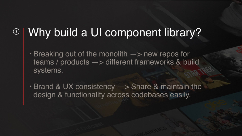
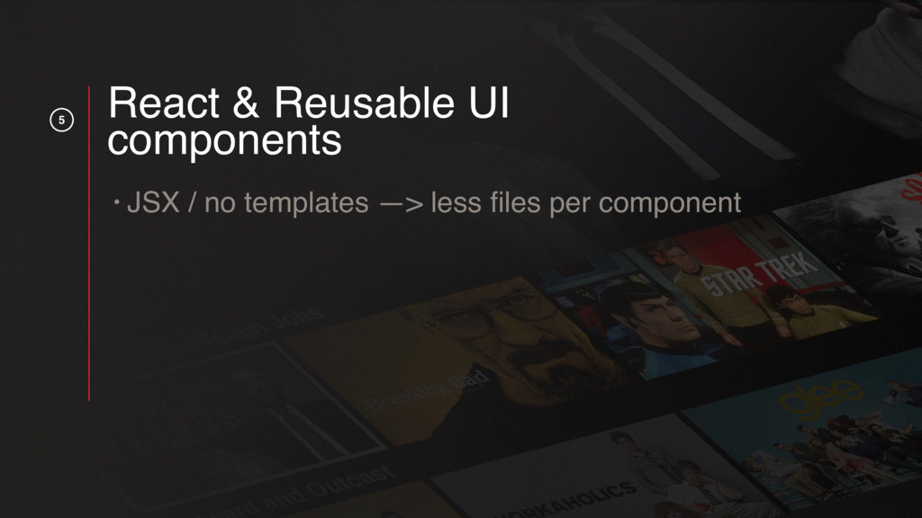
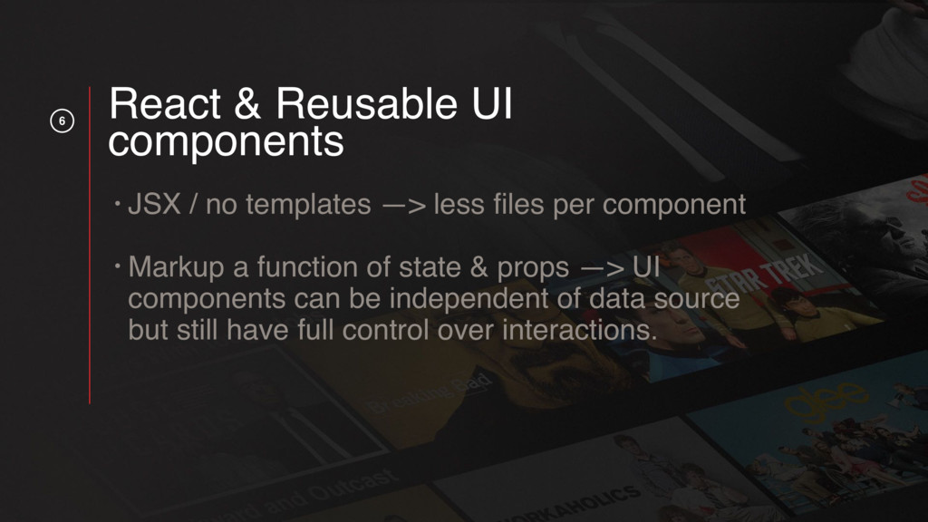
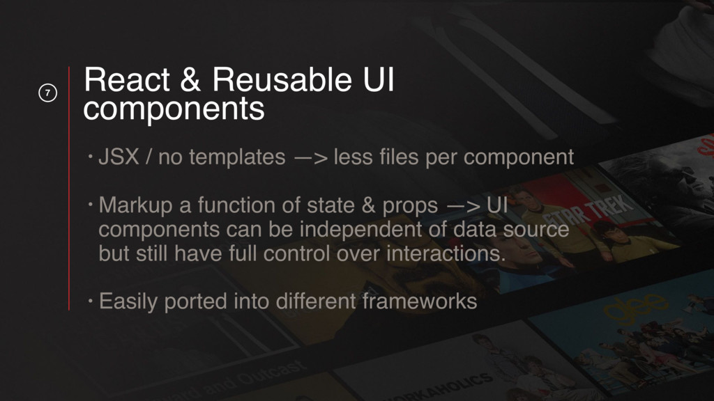
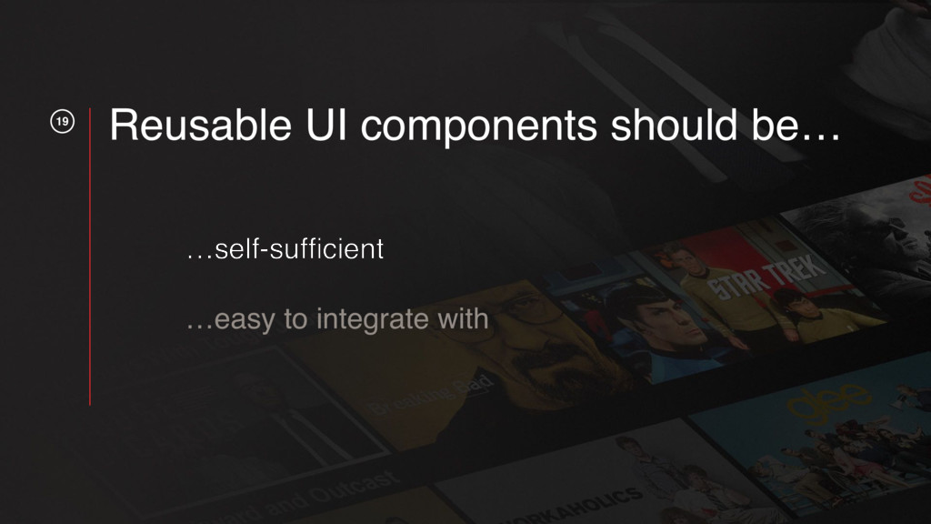
ReactJS has been adopted by many companies around the world and encouraged Frontend engineers to think about UI's in terms of small components, as opposed to large applications. While we as a community have started writing our UI's in terms of components, we are all still learning about the best way to write those components.

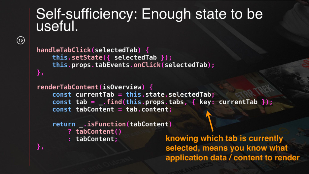
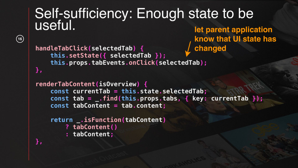
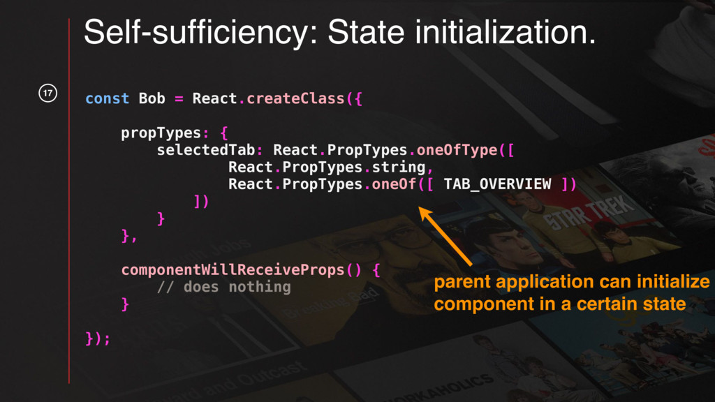
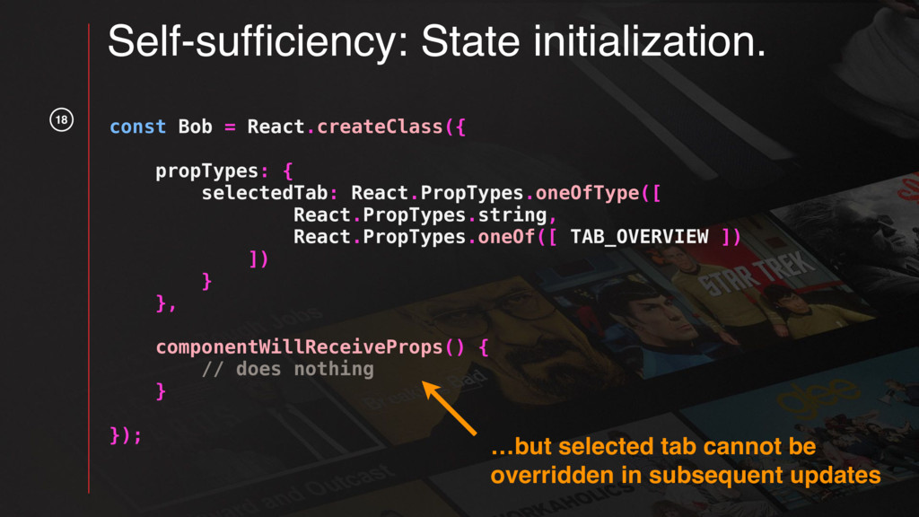
What size should the components be? How much state should each component contain?

This talk puts forth some best practices learned while building a reusable UI component library for an entire engineering team. And while the talk is specific to writing reusable UI components in React, the best practices and ways of thinking about components presented in this talk can be can be applied to components written in other frameworks as well.

Talk recording: https://www.youtube.com/watch?v=rMFI1HtuFv4&index=10&list=PLGP3VO5jDf8xpaeBAhJOJaEjt1C7sE5Sf

Mars Jullian

September 07, 2017
Tweet

More Decks by Mars Jullian

Other Decks in Technology

Transcript

  1. 1 React plus X Mars Jullian Senior UI Engineer Best

    practices for reusable UI components.
  2. 2 Why build a UI component library? • Breaking out

    of the monolith —> new repos for teams / products —> different frameworks & build systems. Brand & UX consistency —> Share & maintain the design & functionality across codebases easily.
  3. 3 Why build a UI component library? • Breaking out

    of the monolith —> new repos for teams / products —> different frameworks & build systems. • Brand & UX consistency —> Share & maintain the design & functionality across codebases easily.
  4. 5 React & Reusable UI components • JSX / no

    templates —> less files per component • Markup a function of state & props —> UI components can be independent of data source but still have full control over interactions. • Easily ported into different frameworks
  5. 6 React & Reusable UI components • JSX / no

    templates —> less files per component • Markup a function of state & props —> UI components can be independent of data source but still have full control over interactions. • Easily ported into different frameworks
  6. 7 React & Reusable UI components • JSX / no

    templates —> less files per component • Markup a function of state & props —> UI components can be independent of data source but still have full control over interactions. • Easily ported into different frameworks
  7. 10

  8. 11

  9. 13 Self-sufficiency: Don’t worry about data. const Bob = React.createClass({

    propTypes: { tabs: React.PropTypes.arrayOf( React.PropTypes.shape({ key: React.PropTypes.string.isRequired, displayName: React.PropTypes.string.isRequired, content: React.PropTypes.oneOfType({ React.PropTypes.func, React.PropTypes.node }).isRequired }) ), // ... more props } }); data / content not part of component state, should come from parent application
  10. Self-sufficiency: Enough state to be useful. handleTabClick(selectedTab) { this.setState({ selectedTab

    }); this.props.tabEvents.onClick(selectedTab); }, renderTabContent(isOverview) { const currentTab = this.state.selectedTab; const tab = _.find(this.props.tabs, { key: currentTab }); const tabContent = tab.content; return _.isFunction(tabContent) ? tabContent() : tabContent; }, keep track of currently selected tab 14
  11. 15 Self-sufficiency: Enough state to be useful. handleTabClick(selectedTab) { this.setState({

    selectedTab }); this.props.tabEvents.onClick(selectedTab); }, renderTabContent(isOverview) { const currentTab = this.state.selectedTab; const tab = _.find(this.props.tabs, { key: currentTab }); const tabContent = tab.content; return _.isFunction(tabContent) ? tabContent() : tabContent; }, knowing which tab is currently selected, means you know what application data / content to render
  12. 16 Self-sufficiency: Enough state to be useful. handleTabClick(selectedTab) { this.setState({

    selectedTab }); this.props.tabEvents.onClick(selectedTab); }, renderTabContent(isOverview) { const currentTab = this.state.selectedTab; const tab = _.find(this.props.tabs, { key: currentTab }); const tabContent = tab.content; return _.isFunction(tabContent) ? tabContent() : tabContent; }, let parent application know that UI state has changed
  13. 17 Self-sufficiency: State initialization. const Bob = React.createClass({ propTypes: {

    selectedTab: React.PropTypes.oneOfType([ React.PropTypes.string, React.PropTypes.oneOf([ TAB_OVERVIEW ]) ]) } }, componentWillReceiveProps() { // does nothing } }); parent application can initialize component in a certain state
  14. 18 const Bob = React.createClass({ propTypes: { selectedTab: React.PropTypes.oneOfType([ React.PropTypes.string,

    React.PropTypes.oneOf([ TAB_OVERVIEW ]) ]) } }, componentWillReceiveProps() { // does nothing } }); …but selected tab cannot be overridden in subsequent updates Self-sufficiency: State initialization.
  15. 20 const Bob = React.createClass({ propTypes: { cover: React.PropTypes.element.isRequired, title:

    React.PropTypes.oneOfType([ React.PropTypes.string, React.PropTypes.element ]).isRequired, description: React.PropTypes.string.isRequired, tabs: React.PropTypes.arrayOf( React.PropTypes.shape({ key: React.PropTypes.string.isRequired, displayName: React.PropTypes.string.isRequired, content: React.PropTypes.oneOfType({ React.PropTypes.func, React.PropTypes.node }).isRequired }) ), tabEvents: React.PropTypes.shape({ onClick: React.PropTypes.func }), selectedTab: React.PropTypes.oneOfType([ React.PropTypes.string, React.PropTypes.oneOf([ TAB_OVERVIEW ]) ]) } }); Ease of integration: Self-documentation.
  16. 21

  17. 22 const Bob = React.createClass({ propTypes: { cover: React.PropTypes.element.isRequired, title:

    React.PropTypes.oneOfType([ React.PropTypes.string, React.PropTypes.element ]).isRequired, description: React.PropTypes.string.isRequired, tabs: React.PropTypes.arrayOf( React.PropTypes.shape({ key: React.PropTypes.string.isRequired, displayName: React.PropTypes.string.isRequired, content: React.PropTypes.oneOfType({ React.PropTypes.func, React.PropTypes.node }).isRequired }) ), tabEvents: React.PropTypes.shape({ onClick: React.PropTypes.func }), selectedTab: React.PropTypes.oneOfType([ React.PropTypes.string, React.PropTypes.oneOf([ TAB_OVERVIEW ]) ]) } }); Ease of integration: Self-documentation. specify what types of props component expects
  18. 23 const Bob = React.createClass({ propTypes: { cover: React.PropTypes.element.isRequired, title:

    React.PropTypes.oneOfType([ React.PropTypes.string, React.PropTypes.element ]).isRequired, description: React.PropTypes.string.isRequired, tabs: React.PropTypes.arrayOf( React.PropTypes.shape({ key: React.PropTypes.string.isRequired, displayName: React.PropTypes.string.isRequired, content: React.PropTypes.oneOfType({ React.PropTypes.func, React.PropTypes.node }).isRequired }) ), tabEvents: React.PropTypes.shape({ onClick: React.PropTypes.func }), selectedTab: React.PropTypes.oneOfType([ React.PropTypes.string, React.PropTypes.oneOf([ TAB_OVERVIEW ]) ]) } }); Ease of integration: Self-documentation. specify which props are required for component to behave as expected
  19. 24 const Bob = React.createClass({ propTypes: { cover: React.PropTypes.element.isRequired, title:

    React.PropTypes.oneOfType([ React.PropTypes.string, React.PropTypes.element ]).isRequired, description: React.PropTypes.string.isRequired, tabs: React.PropTypes.arrayOf( React.PropTypes.shape({ key: React.PropTypes.string.isRequired, displayName: React.PropTypes.string.isRequired, content: React.PropTypes.oneOfType({ React.PropTypes.func, React.PropTypes.node }).isRequired }) ), tabEvents: React.PropTypes.shape({ onClick: React.PropTypes.func }), selectedTab: React.PropTypes.oneOfType([ React.PropTypes.string, React.PropTypes.oneOf([ TAB_OVERVIEW ]) ]) } }); Ease of integration: Self-documentation. specify that component expects tabs, and exactly what the tabs should look like
  20. 25 const Bob = React.createClass({ propTypes: { cover: React.PropTypes.element.isRequired, title:

    React.PropTypes.oneOfType([ React.PropTypes.string, React.PropTypes.element ]).isRequired, description: React.PropTypes.string.isRequired, tabs: React.PropTypes.arrayOf( React.PropTypes.shape({ key: React.PropTypes.string.isRequired, displayName: React.PropTypes.string.isRequired, content: React.PropTypes.oneOfType({ React.PropTypes.func, React.PropTypes.node }).isRequired }) ), tabEvents: React.PropTypes.shape({ onClick: React.PropTypes.func }), selectedTab: React.PropTypes.oneOfType([ React.PropTypes.string, React.PropTypes.oneOf([ TAB_OVERVIEW ]) ]) } }); Ease of integration: Self-documentation.
  21. 28

  22. 29 title: React.PropTypes.oneOfType([ React.PropTypes.string, React.PropTypes.element ]).isRequired, // titleLogoSrc: React.PropTypes.string.isRequired, //

    titleString: React.PropTypes.string.isRequired Ease of integration: Fewer props. one flexible prop vs. two differently named props
  23. 30 const TabNav = React.createClass({ propTypes: { tabs: React.PropTypes.arrayOf( React.PropTypes.shape({

    // ...tab shape }) ), // hideTabs: React.PropTypes.bool }, render() { if (!this.props.tabs || !this.props.tabs.length) { return null; } // ... } }); Ease of integration: Fewer props.
  24. 31

  25. 32 const TabNav = React.createClass({ propTypes: { tabs: React.PropTypes.arrayOf( React.PropTypes.shape({

    // ...tab shape }) ), // hideTabs: React.PropTypes.bool }, render() { if (!this.props.tabs || !this.props.tabs.length) { return null; } // ... } }); Ease of integration: Fewer props. decouple props by intelligently rendering tabs, instead of adding a hideTabs prop
  26. 33 handleTabClick(selectedTab) { this.setState({ selectedTab }); this.props.tabEvents.onClick(selectedTab); }, renderTab(tab) {

    return ( <div className='tab-wrapper' onClick={ () => this.handleTabClick(tab.name) } > { tab.name } </div> ); }, Ease of integration: Remove backdoors. good
  27. 34 renderTab(tab) { return ( <div className='tab-wrapper' { ...this.props.tabEvents }

    > { tab.name } </div> ); }, Ease of integration: Remove backdoors. backdoor into React div elements. BAD!
  28. 35 Ease of integration: Fill container element. margin border padding

    position - - - - - - - - - - - - just this your component