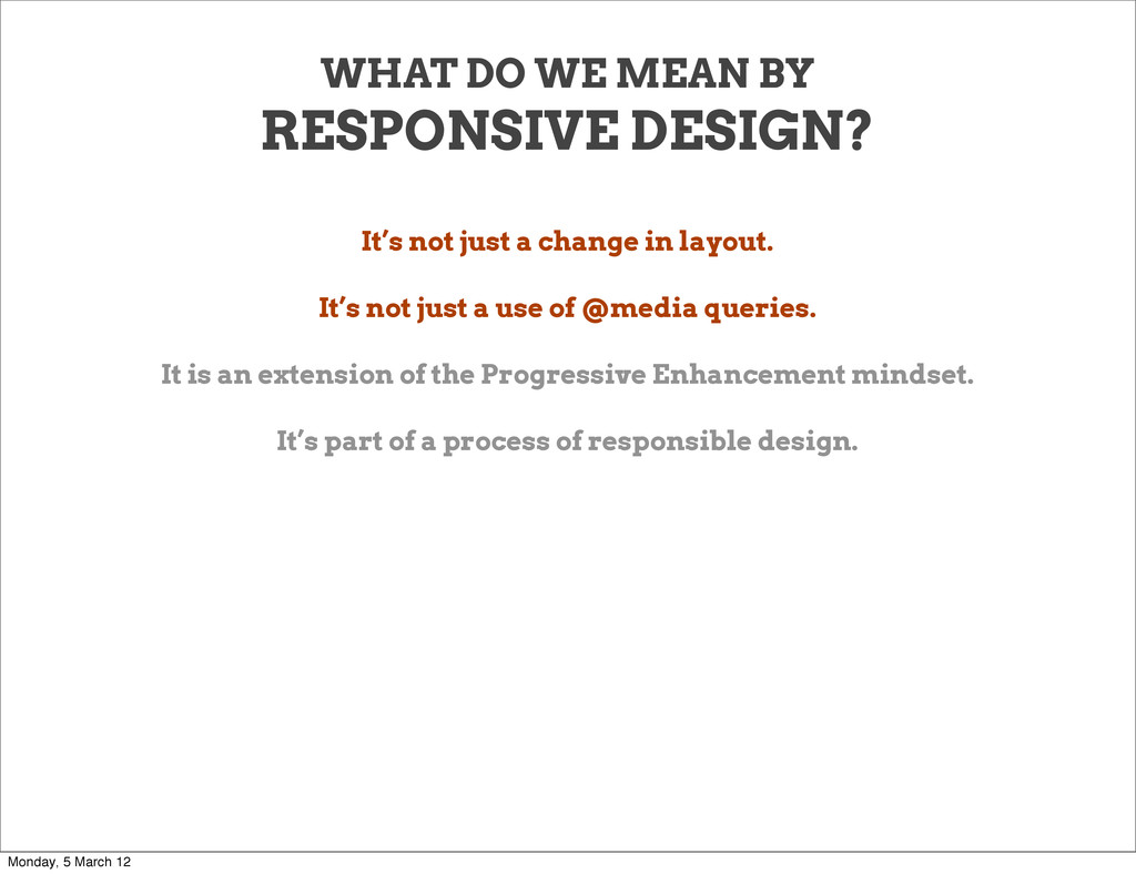
a change in layout. It’s not just a use of @media queries. It is an extension of the Progressive Enhancement mindset. It’s part of a process of responsible design. Monday, 5 March 12
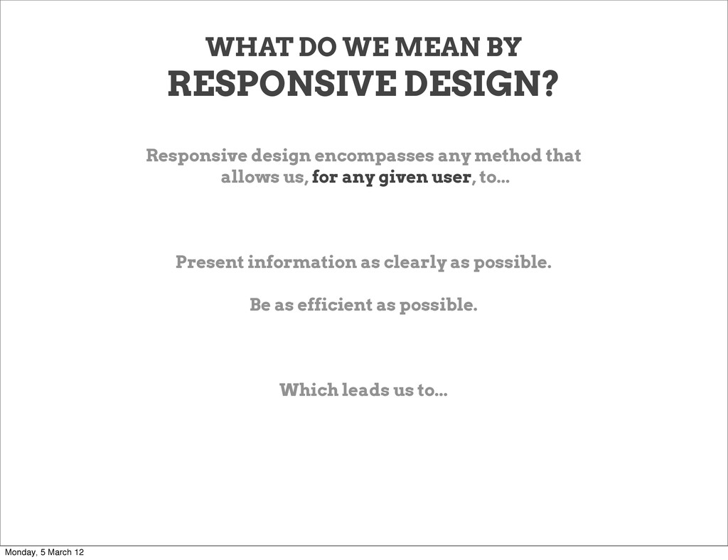
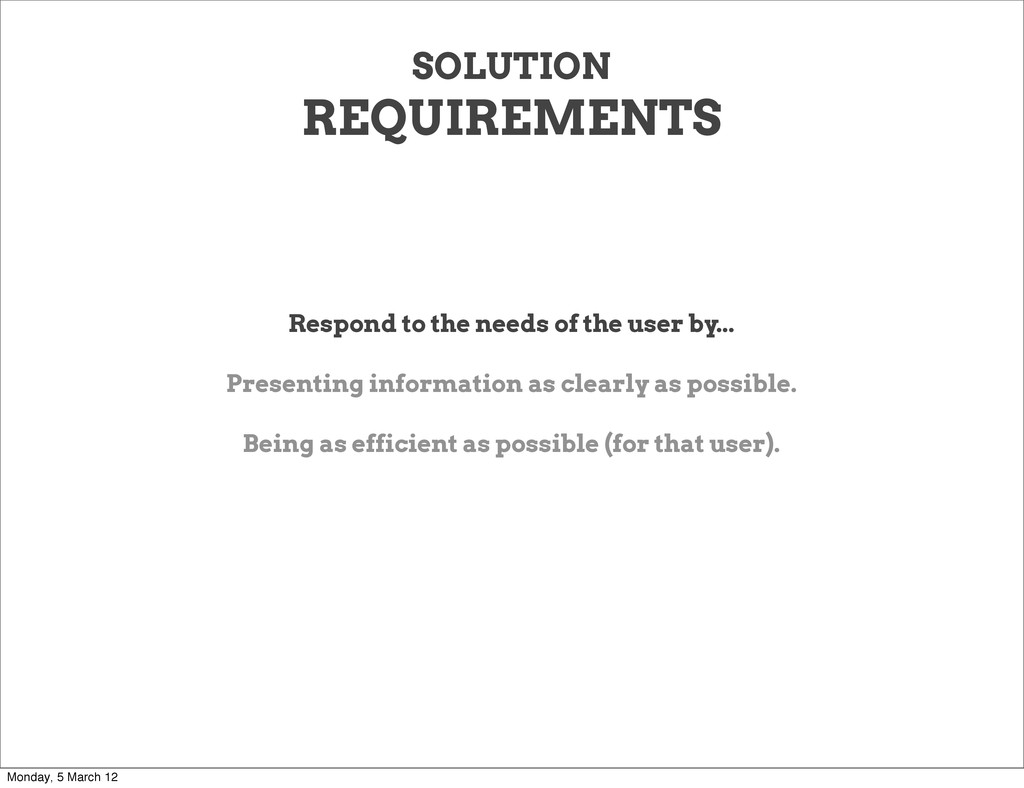
any method that allows us, for any given user, to... Present information as clearly as possible. Be as efficient as possible. Which leads us to... Monday, 5 March 12
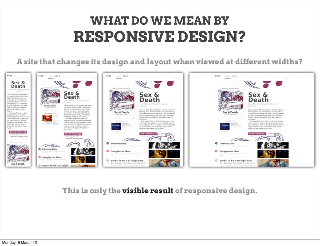
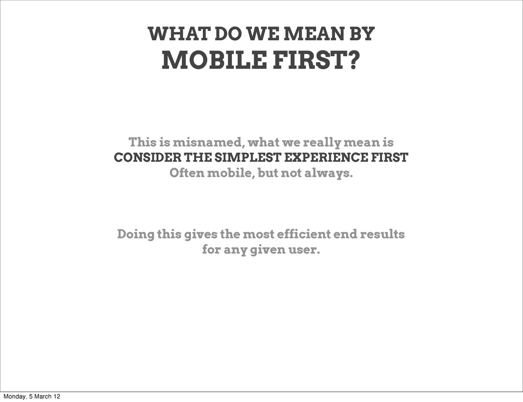
what we really mean is CONSIDER THE SIMPLEST EXPERIENCE FIRST Often mobile, but not always. Doing this gives the most efficient end results for any given user. Monday, 5 March 12
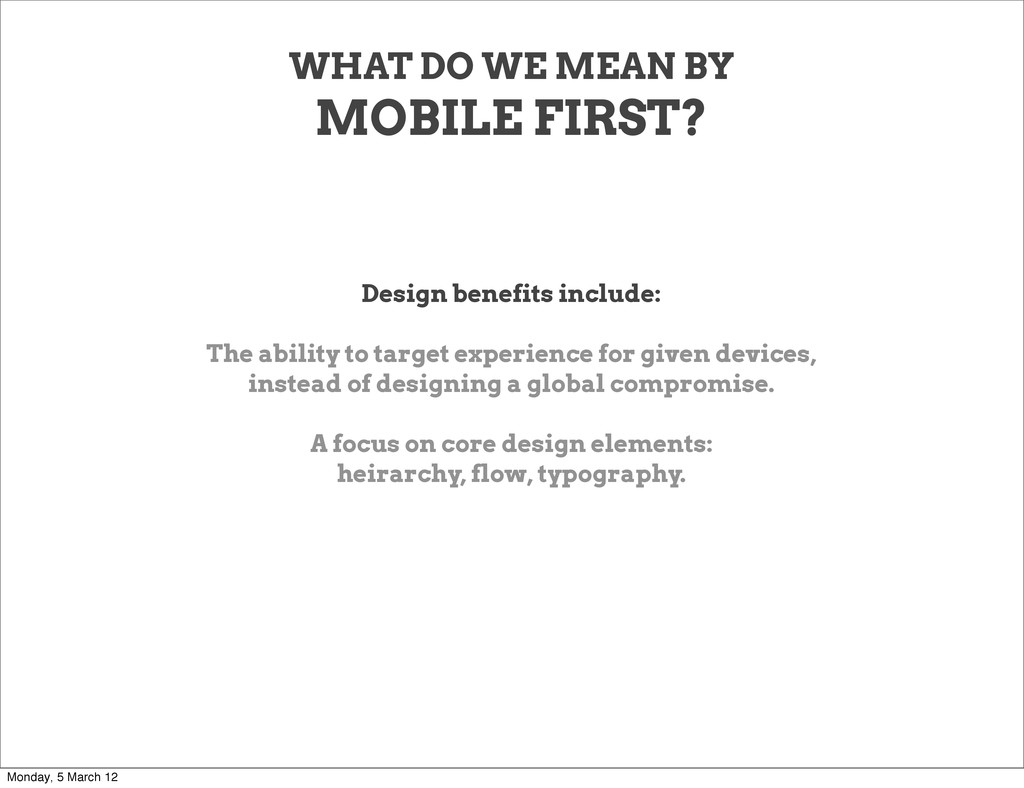
The ability to target experience for given devices, instead of designing a global compromise. A focus on core design elements: heirarchy, flow, typography. Monday, 5 March 12
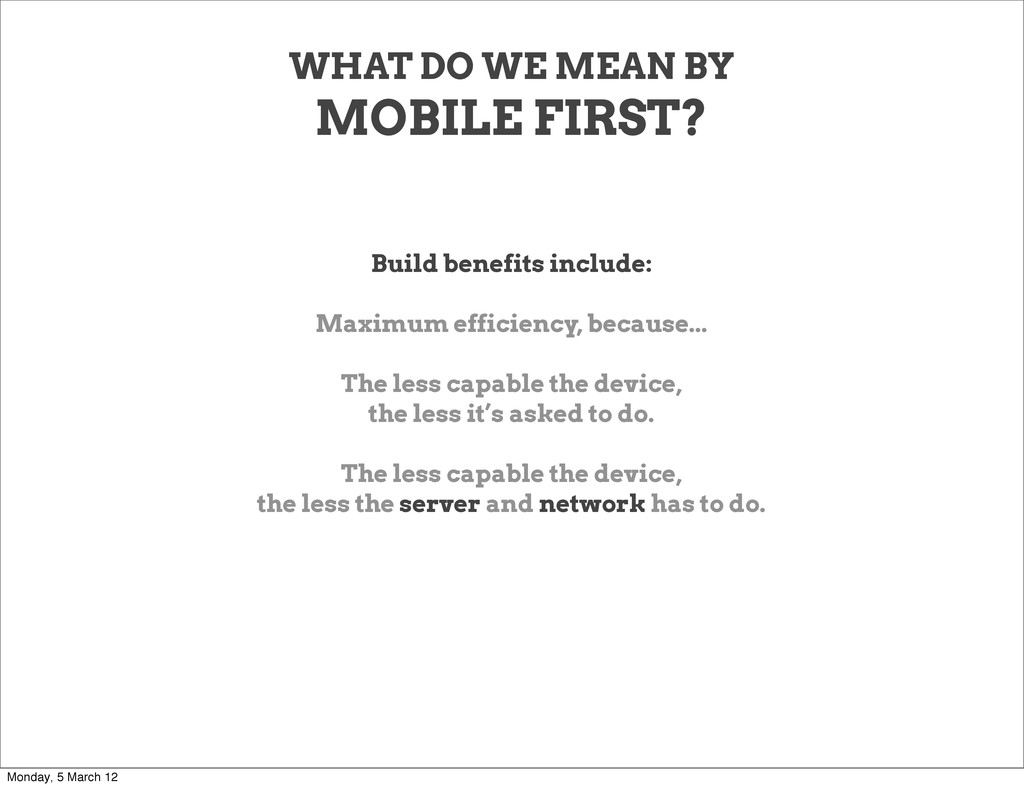
Maximum efficiency, because... The less capable the device, the less it’s asked to do. The less capable the device, the less the server and network has to do. Monday, 5 March 12
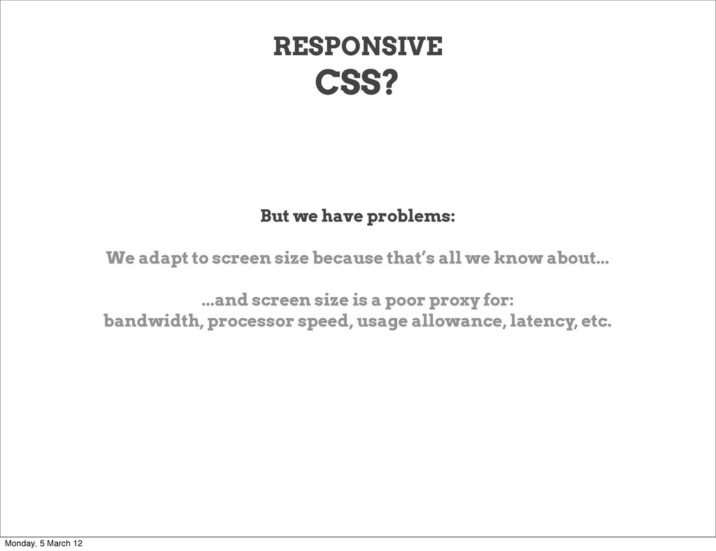
size because that’s all we know about... ...and screen size is a poor proxy for: bandwidth, processor speed, usage allowance, latency, etc. Monday, 5 March 12
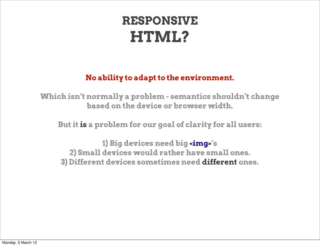
isn’t normally a problem - semantics shouldn’t change based on the device or browser width. But it is a problem for our goal of clarity for all users: 1) Big devices need big <img>’s 2) Small devices would rather have small ones. 3) Different devices sometimes need different ones. Monday, 5 March 12
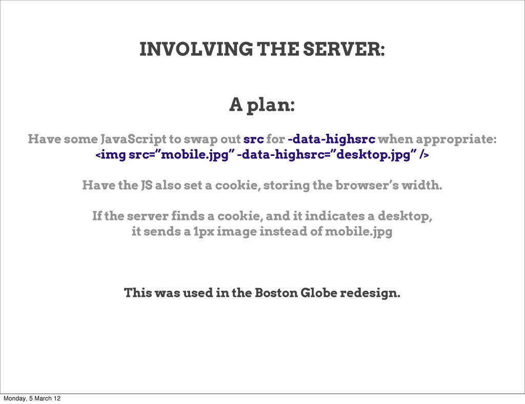
out src for -data-highsrc when appropriate: <img src=”mobile.jpg” -data-highsrc=”desktop.jpg” /> Have the JS also set a cookie, storing the browser’s width. If the server finds a cookie, and it indicates a desktop, it sends a 1px image instead of mobile.jpg This was used in the Boston Globe redesign. Monday, 5 March 12
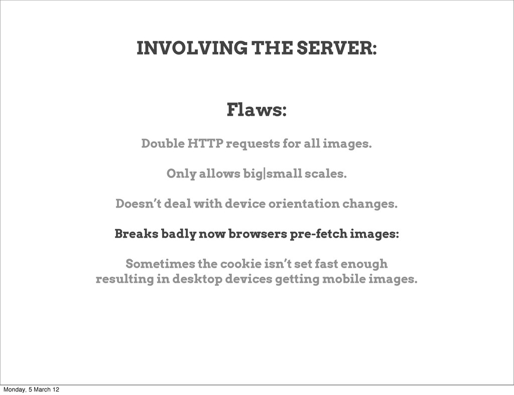
Only allows big|small scales. Doesn’t deal with device orientation changes. Breaks badly now browsers pre-fetch images: Sometimes the cookie isn’t set fast enough resulting in desktop devices getting mobile images. Monday, 5 March 12
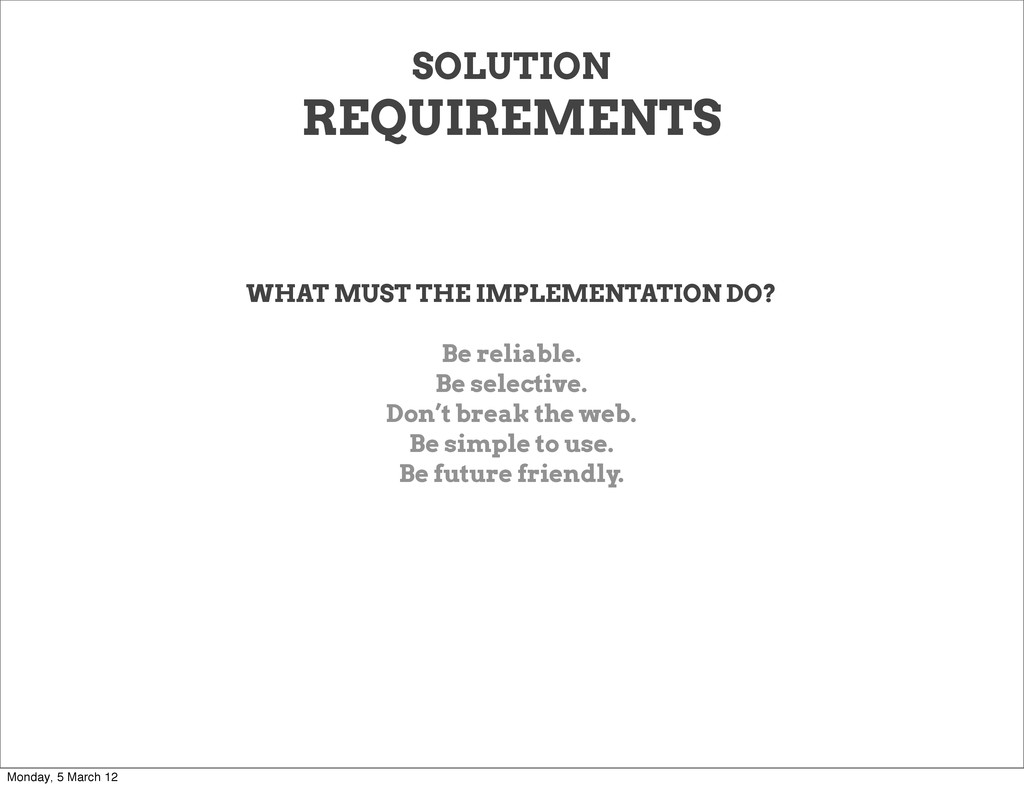
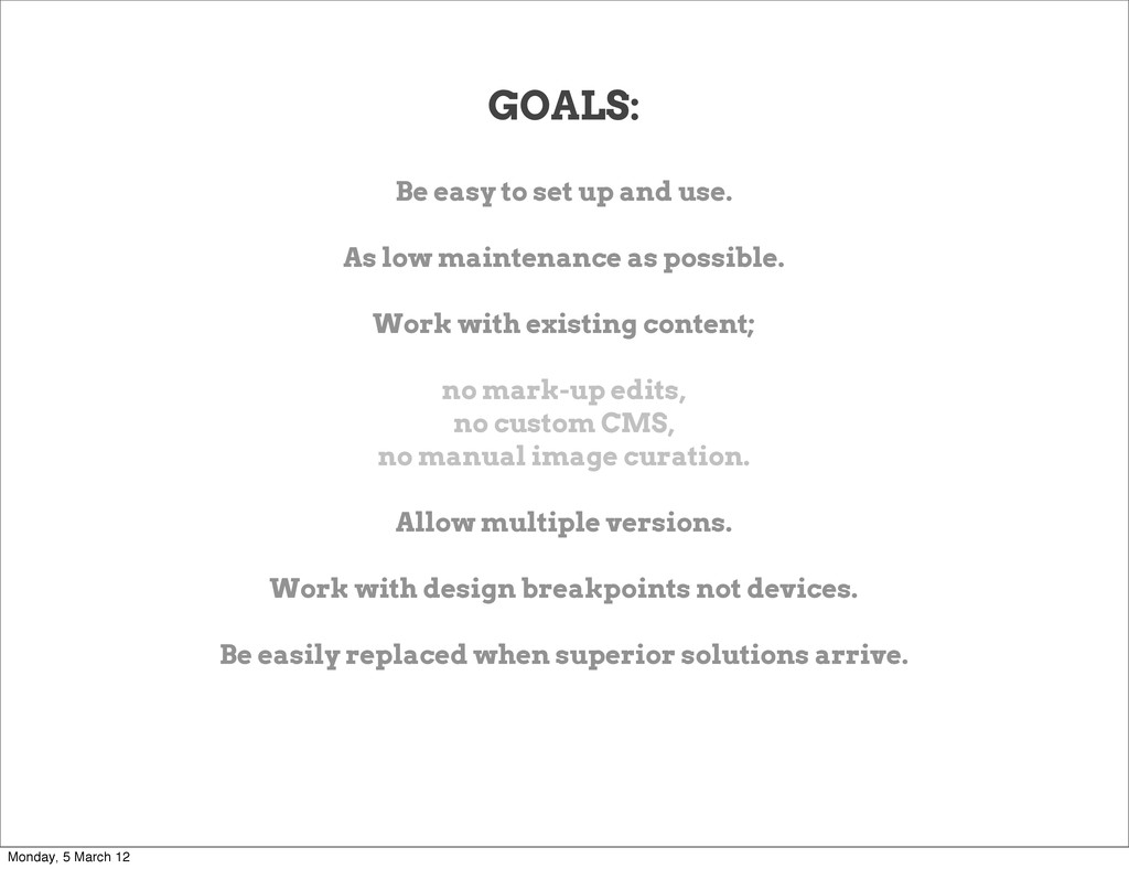
maintenance as possible. Work with existing content; no mark-up edits, no custom CMS, no manual image curation. Allow multiple versions. Work with design breakpoints not devices. Be easily replaced when superior solutions arrive. Monday, 5 March 12
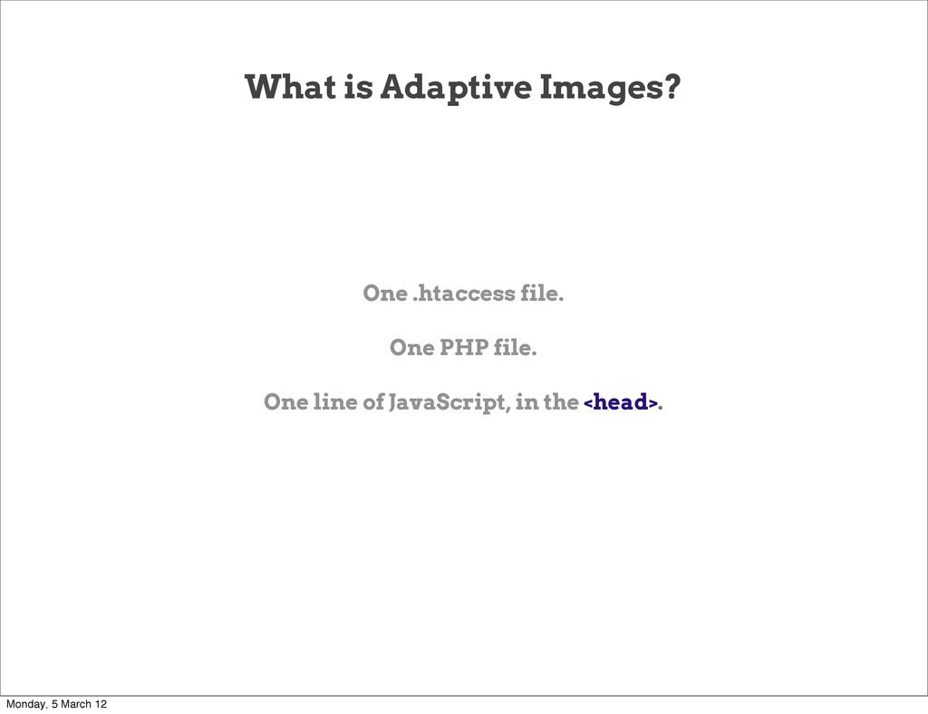
already the highest resolution. JS detects the largest screen dimension, stores it in a Cookie. .htaccess file points certain requests to adaptive-images.php (default: all JPG, GIF, PNG images that are not inside /assets/) PHP file does some smart processing, including... Monday, 5 March 12
result into breakpoints that match the CSS breakpoints. Checks it’s own cache directory to see if a version of the requested file exists at that breakpoint size. If it does, compares the modified dates on that and the original to ensure the cache version is not stale. If it doesn’t exist cached; Creates rescaled image only if the source image is larger than the requested breakpoint size. Caches it for future use, and serves it. Monday, 5 March 12
you want the AI cache folder. Set the quality of generated JPGs, like in Photoshop. Set how long browsers should cache the image for. Subtly sharpen generated images. Alternate JavaScript to detect high DPI devices. Monday, 5 March 12
.Net, WordPress, and Drupal. Project is Open Source and Creative Commons. Code is heavily commented. CDN’s and Proxies don’t know which asset to store. FAIL: Cache-Control: Vary. FAIL: HTTP redirects. SOLUTION: Images sent Cache-Control: Private This ensures CDNs and Proxies can’t break your site. But it does mean you can’t take advantage of CDNs & Proxies. Monday, 5 March 12
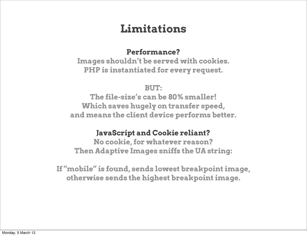
instantiated for every request. BUT: The file-size’s can be 80% smaller! Which saves hugely on transfer speed, and means the client device performs better. JavaScript and Cookie reliant? No cookie, for whatever reason? Then Adaptive Images sniffs the UA string: If “mobile” is found, sends lowest breakpoint image, otherwise sends the highest breakpoint image. Monday, 5 March 12
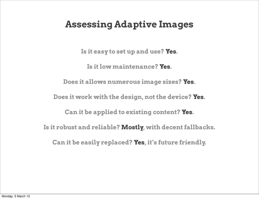
use? Yes. Is it low maintenance? Yes. Does it allows numerous image sizes? Yes. Does it work with the design, not the device? Yes. Can it be applied to existing content? Yes. Is it robust and reliable? Mostly, with decent fallbacks. Can it be easily replaced? Yes, it’s future friendly. Monday, 5 March 12
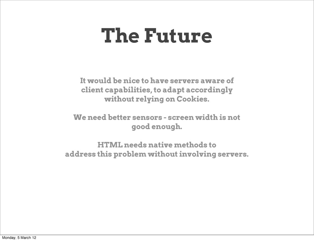
of client capabilities, to adapt accordingly without relying on Cookies. We need better sensors - screen width is not good enough. HTML needs native methods to address this problem without involving servers. Monday, 5 March 12
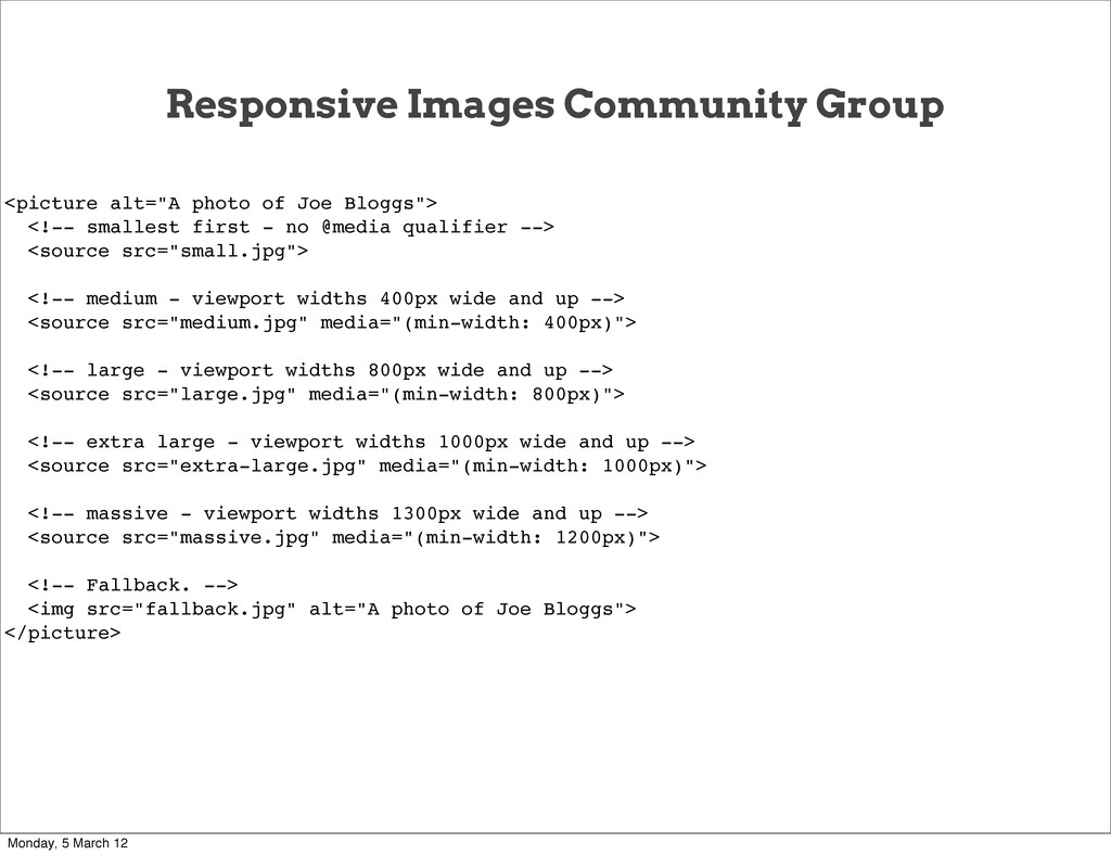
<!-- smallest first - no @media qualifier --> <source src="small.jpg"> <!-- medium - viewport widths 400px wide and up --> <source src="medium.jpg" media="(min-width: 400px)"> <!-- large - viewport widths 800px wide and up --> <source src="large.jpg" media="(min-width: 800px)"> <!-- extra large - viewport widths 1000px wide and up --> <source src="extra-large.jpg" media="(min-width: 1000px)"> <!-- massive - viewport widths 1300px wide and up --> <source src="massive.jpg" media="(min-width: 1200px)"> <!-- Fallback. --> <img src="fallback.jpg" alt="A photo of Joe Bloggs"> </picture> Monday, 5 March 12
makes it familiar syntactically to existing specifications. It allows a pure HTML way to adapt images for clarity and for efficiency. It has a built-in fall-back so old browsers will still show images. Monday, 5 March 12
By hand? CMS? Massive repetition. This mark-up would have to be repeated for every image on your site. It ties design breakpoints into the HTML. Which is terrible, what happens when you re-design? You have to change all of your mark-up site wide. GENERAL PROBLEMS WE’RE FACING: We’re repeating the same @media tests for the same page in three technologies, independently. Which is inefficient, hard to maintain, and future unfriendly. Monday, 5 March 12
with pictures: http://www.flickr.com/photos/mattwilcox/ (See, I do know what they are!) Damn, my head’s mashed, give me something different! http://www.youtube.com/watch?v=iG9CE55wbtY Monday, 5 March 12
 kworkdev
 sonic
sonic
 8maki
8maki
 oikon48
 hamukazu
 kinunori
 line_developers_tw
 lycorptech_jp
 oracle4engineer
 ezaki
ezaki
 ynt0485
 seafay
 pedronauck
 aleyda
 rakko
rakko
 jonyablonski
 sstephenson
 sachag
 addyosmani
 wjessup
 lynnandtonic
 jonoalderson
 tamaranovitovic
 charlesmeaden