 Ship Features Fearlessly
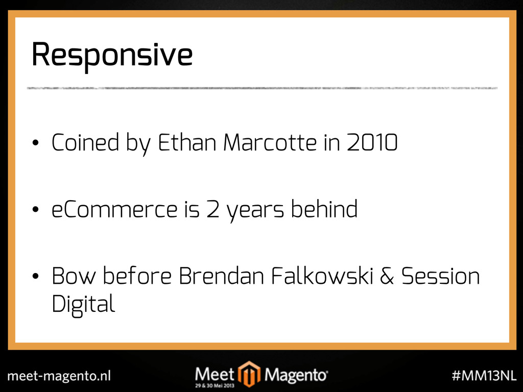
This session was inspired by recent work within the Meanbee team in the field of responsive design.
We would also like to thank Brendan Falkowski for his expertise and influence in the area.
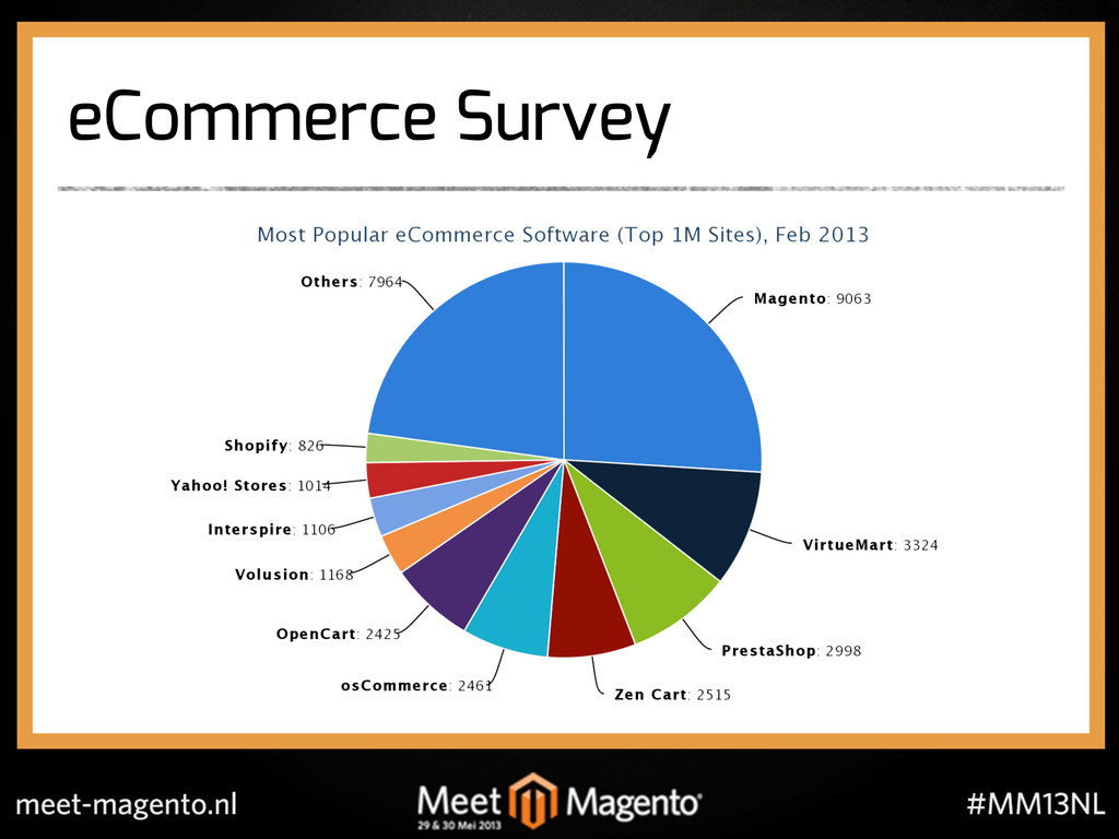
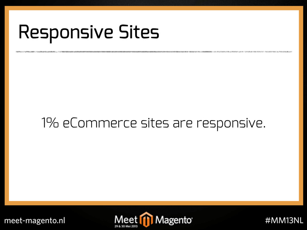
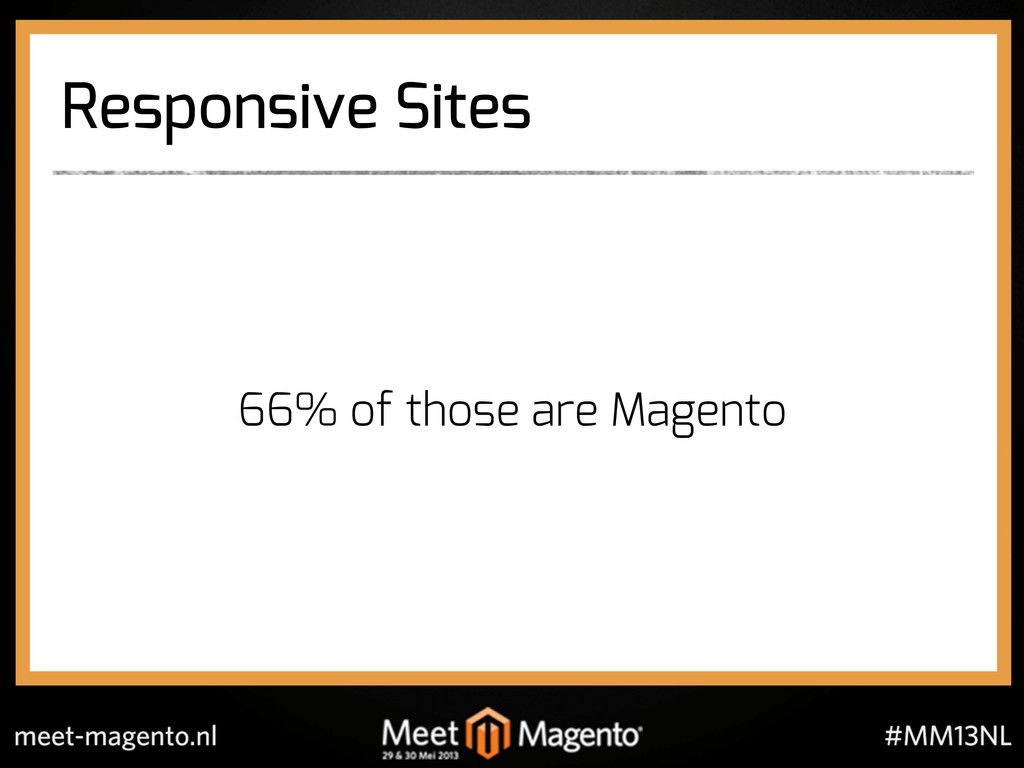
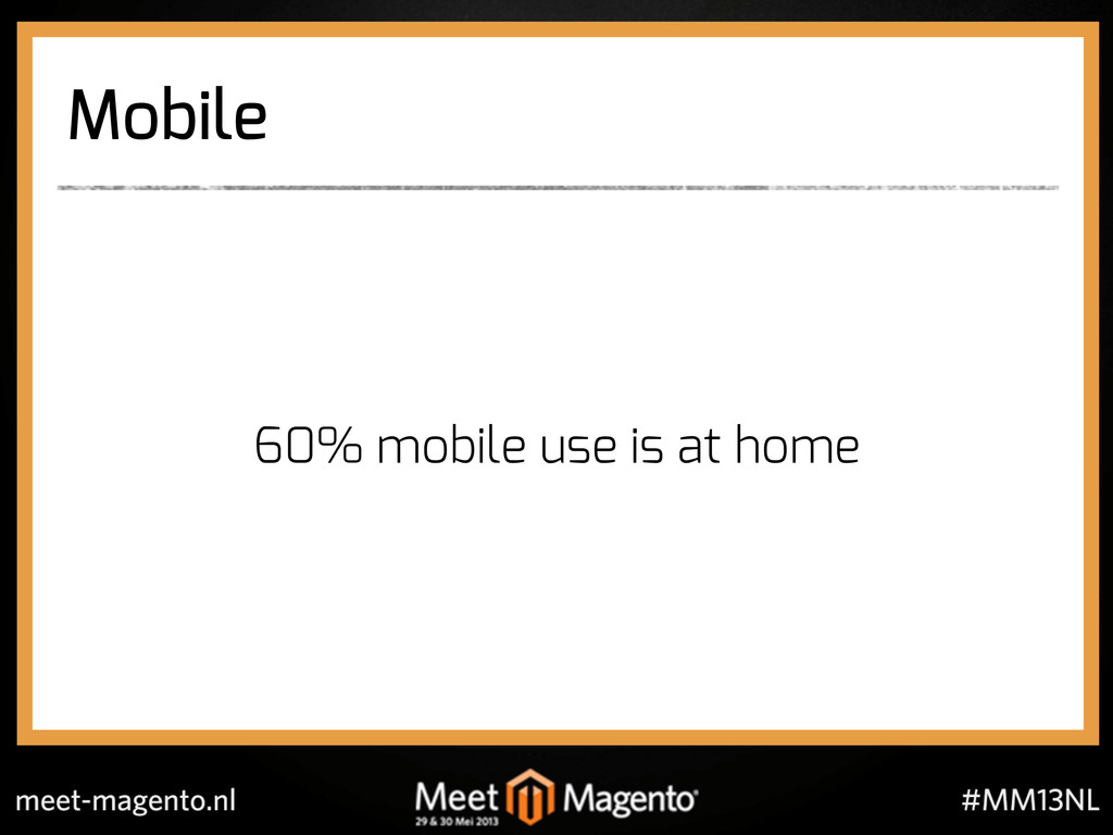
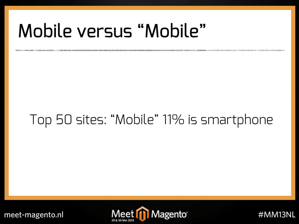
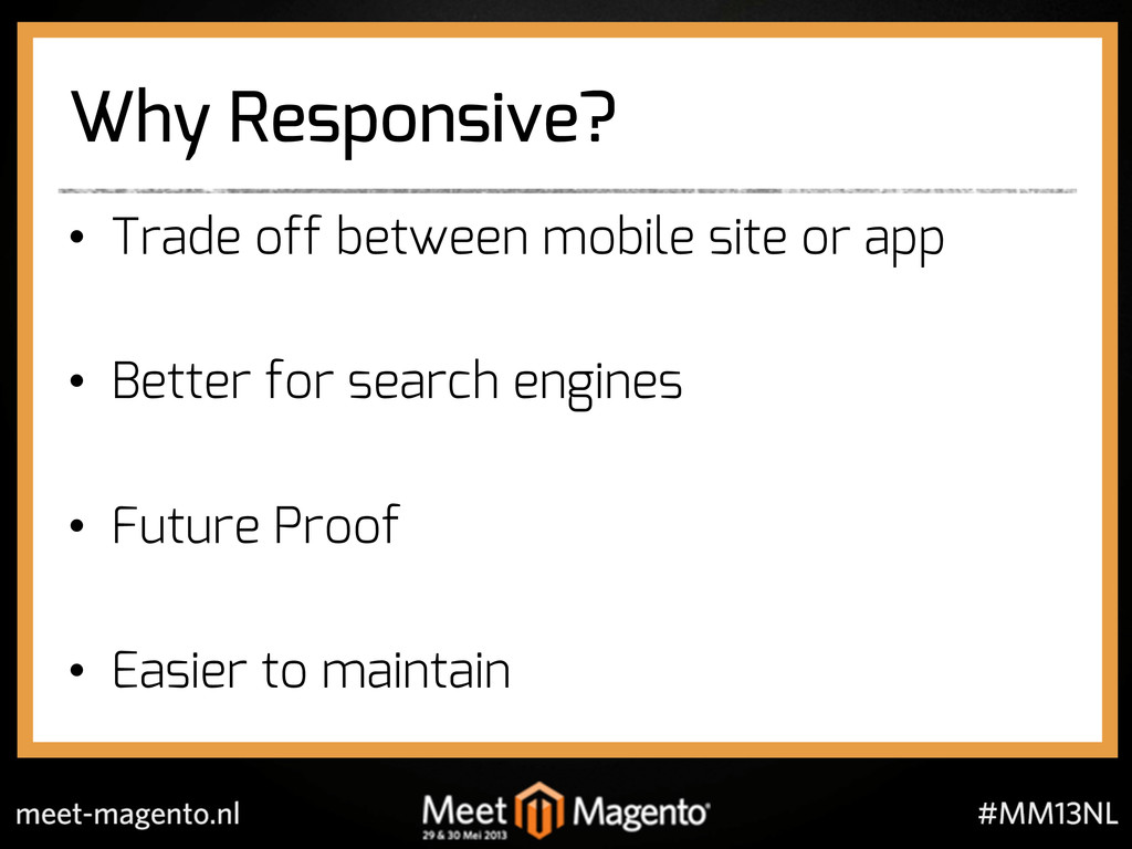
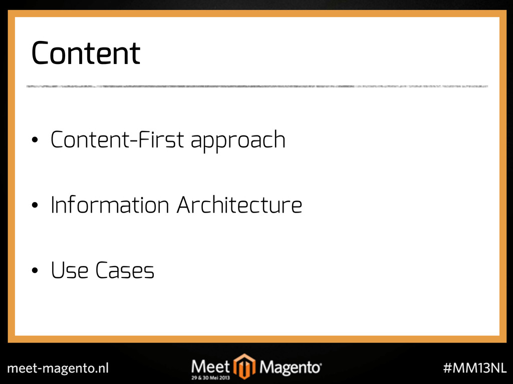
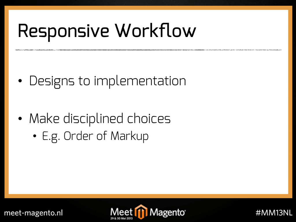
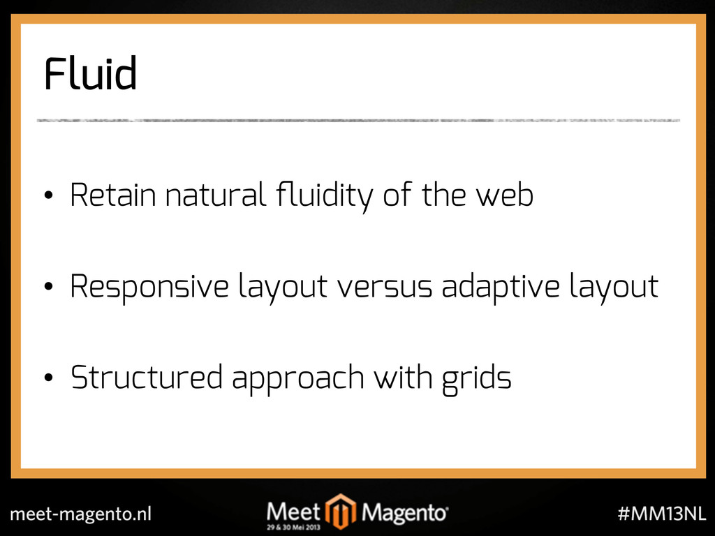
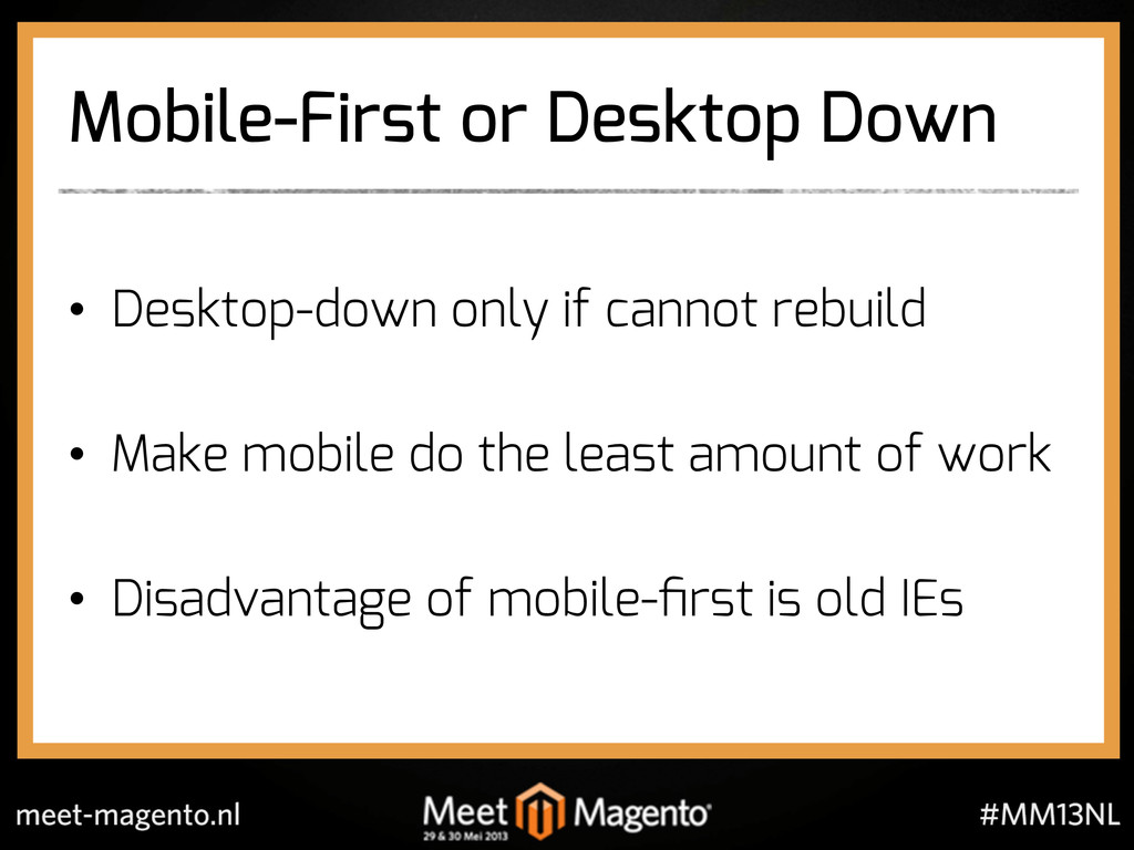
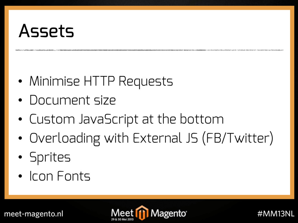
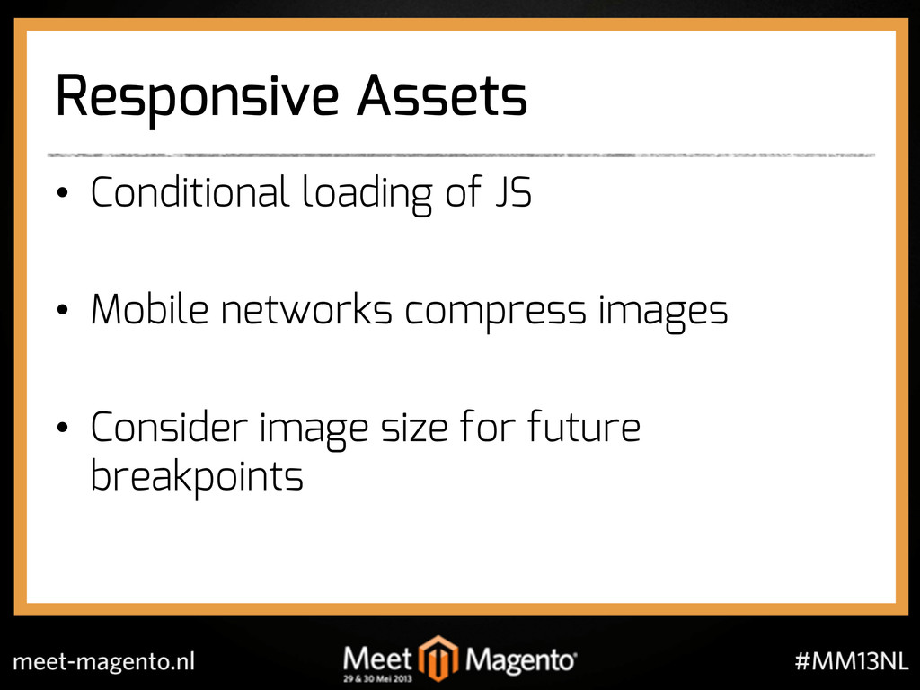
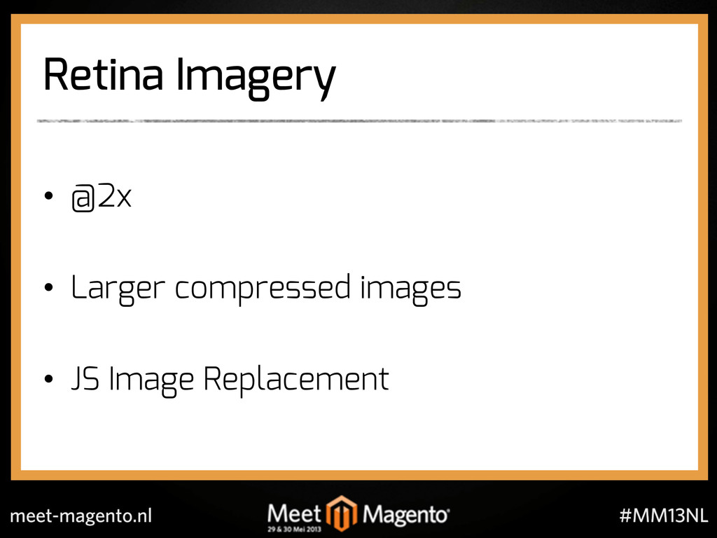
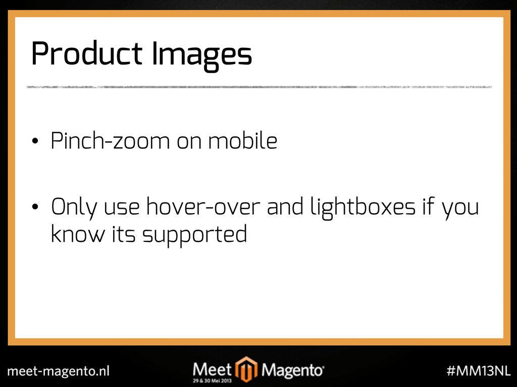
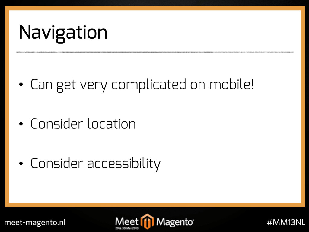
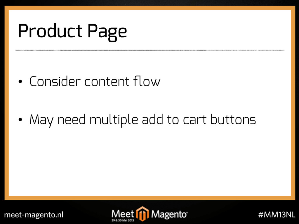
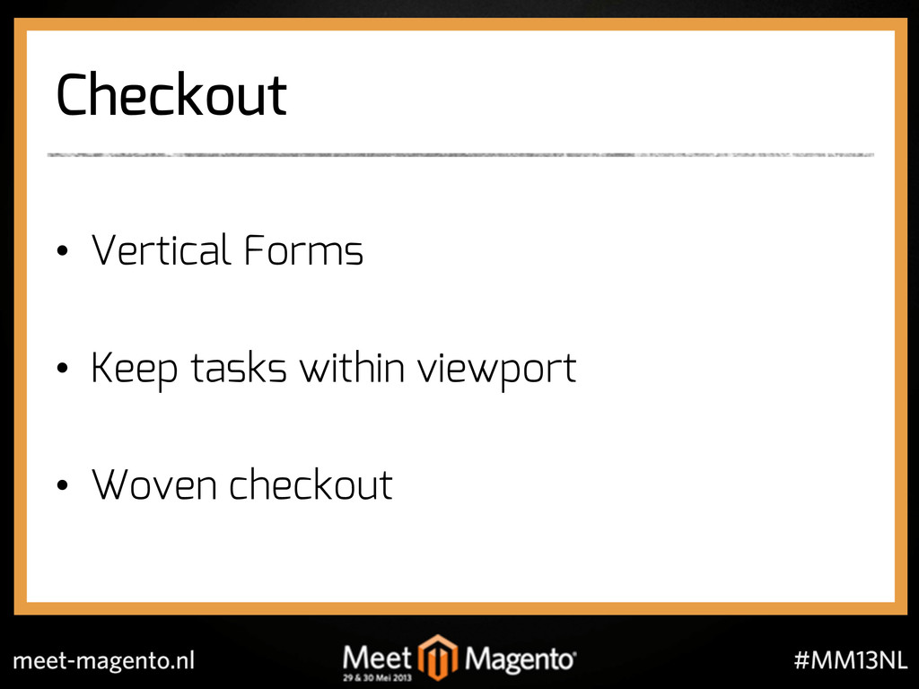
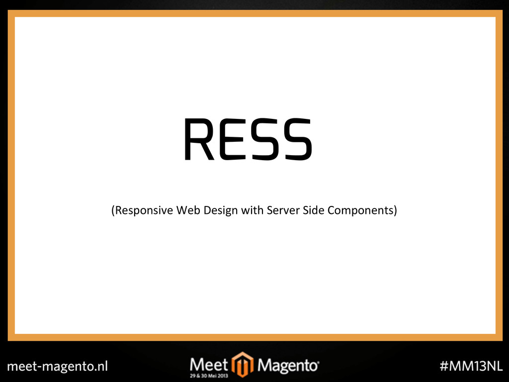
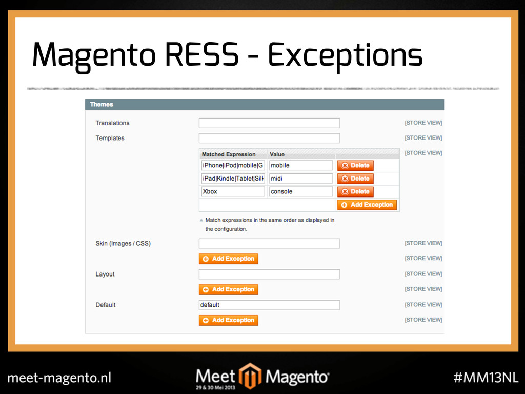
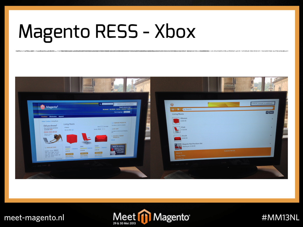
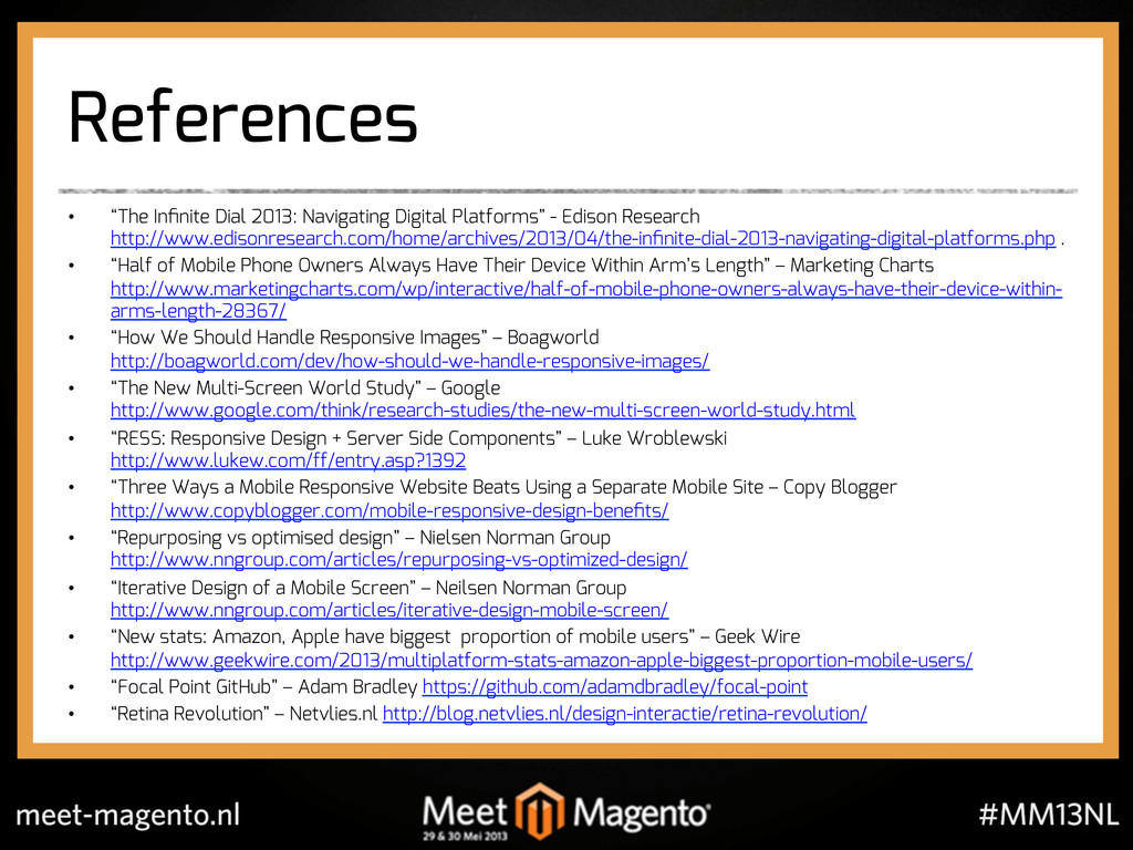
We gave details on why responsive is useful, how to start building responsively, what tools might be useful and some of the problems and techniques that we have employed.
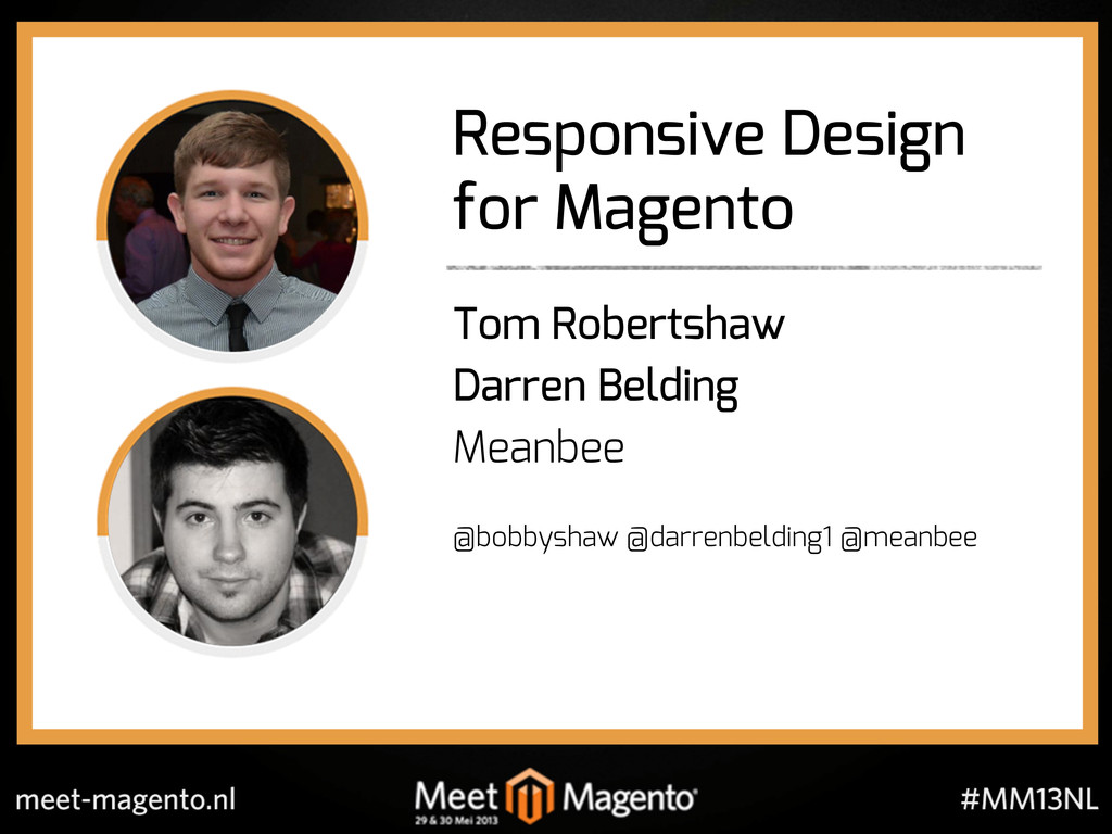
Presented by Darren Belding and Tom Robertshaw
 meanbee
 hjmkth
 ajstarks
 nishame
 kenichiota0711
 hilokifigma
 abokadotyann
 seto
seto
 kaikou
 satosio
 mhand01
 shoko_seven11
 ncdc
ncdc
 aleyda
 jonoalderson
 marketingsoph
 eileencodes
 davidcarrasco
 jmmastey
 mza
mza
 jacobian
 bluesmoon
 reverentgeek
 szymonslowik
 emna__ayadi
![Responsive Design for Magento Tom Robertshaw [email protected] @bobbyshaw Darren Belding](https://files.speakerdeck.com/presentations/675bfbe0290701315c0212ffa8674489/slide_38.jpg)