We share our experiences of building Magento stores with responsive techniques. Giving examples of tools that are useful, design and architecture decisions that need to be made, and also suggest partnering with server-side components to offer the best experience for customers.
Presented by Darren Belding and Tom Robertshaw
 meanbee
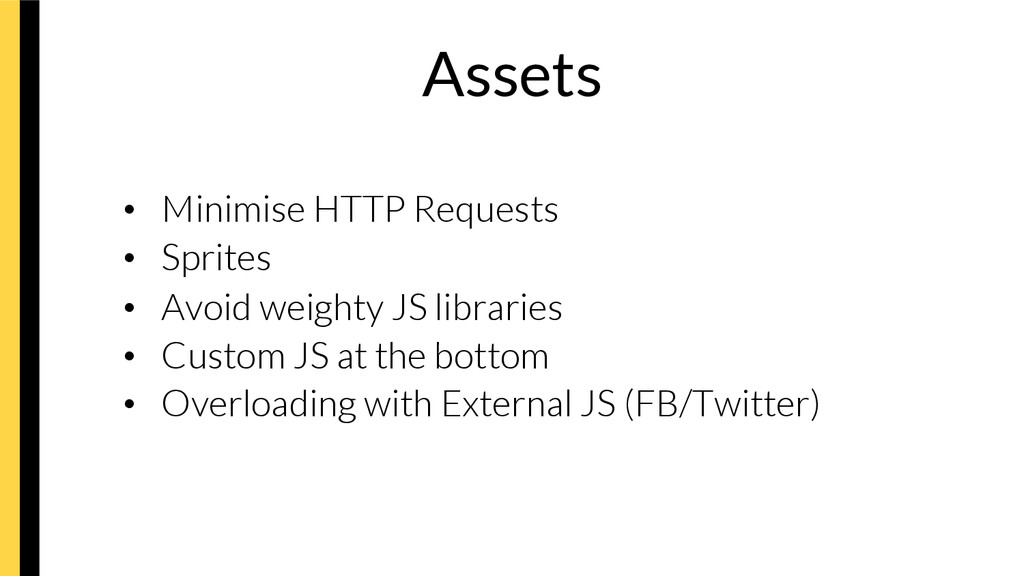
 flatt_security
 hatahata021
 ardbeg1958
 nek0128
 yuukiyo
 quiver
 moongift
 repunit
 glaforge
 i35_267
 hinac0
 subroh0508
 addyosmani
 katarinadahlin
 rasmusluckow
 sabderemane
 jonyablonski
 akademiya2063
 helmedeiros
 tammyeverts
 jct
jct
 lynnandtonic
 ipullrank