Upgrade to Pro — share decks privately, control downloads, hide ads and more …

Oh No! Spaghetti Code!

Fiona Chan
October 24, 2013

Oh No! Spaghetti Code!

https://www.youtube.com/watch?v=k1VOpxdoRIY

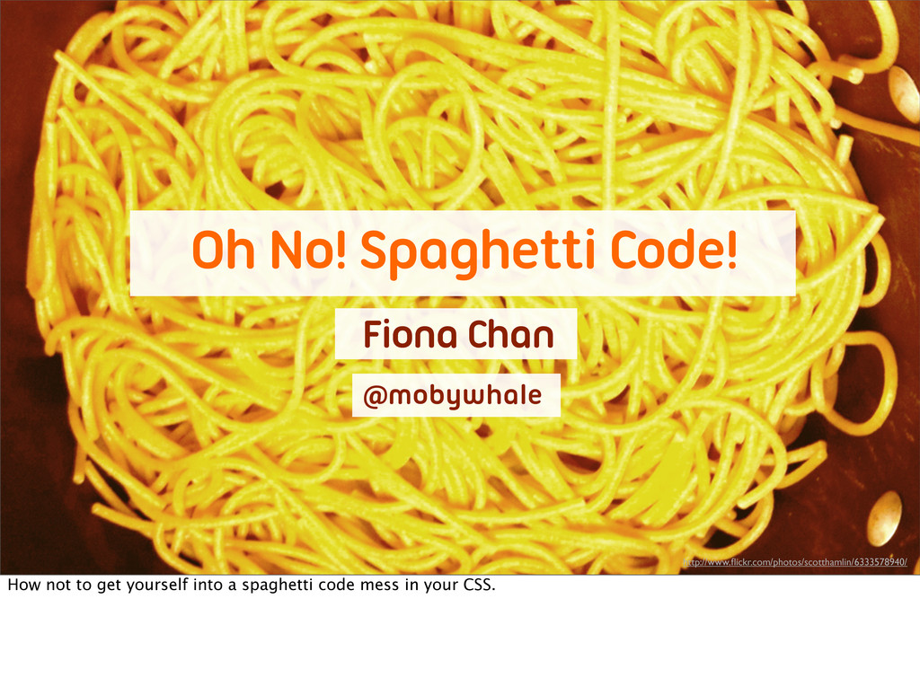
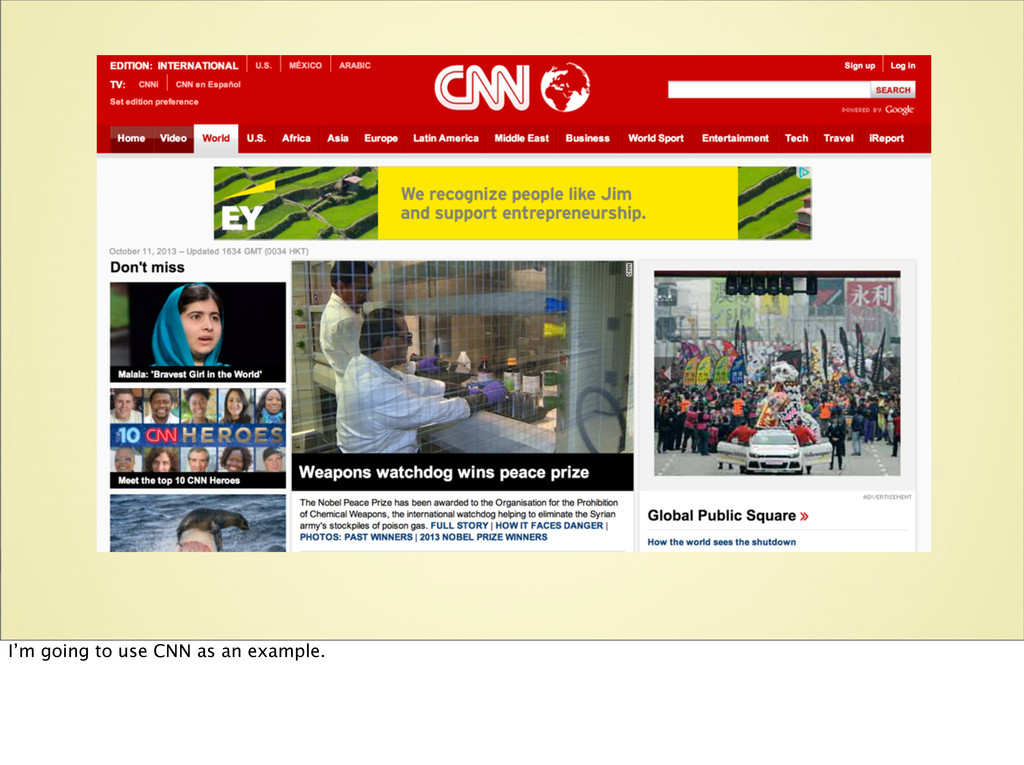
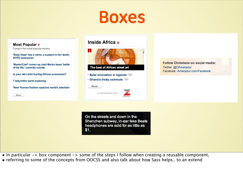
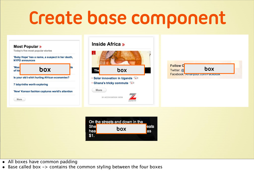
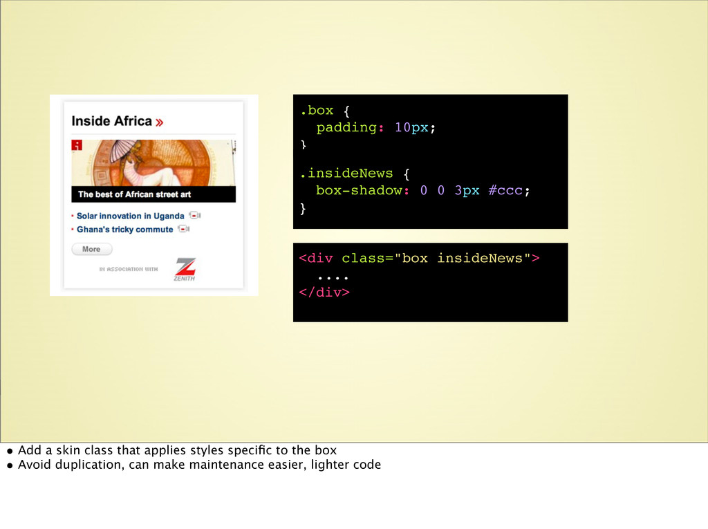
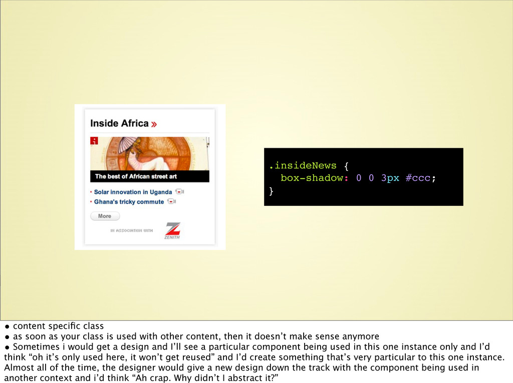
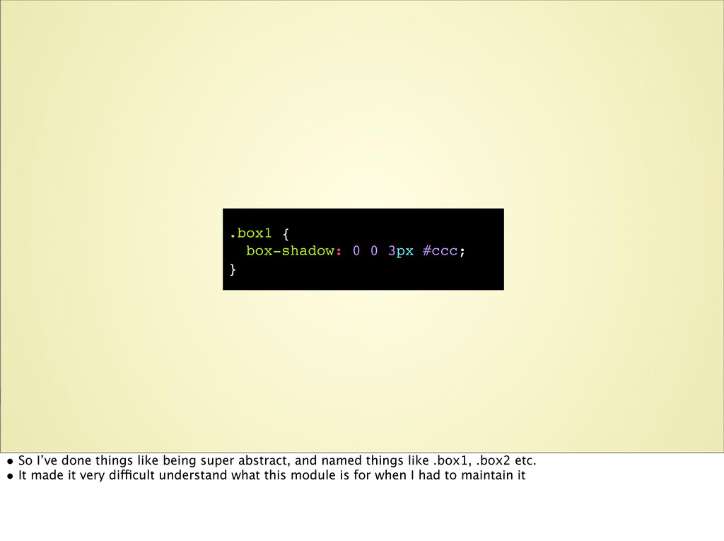
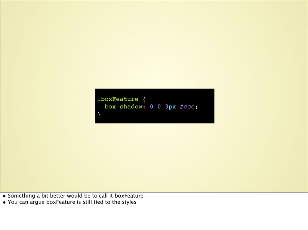
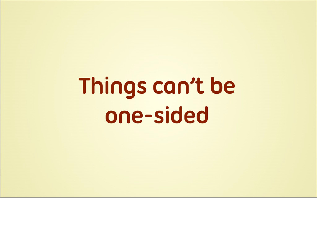
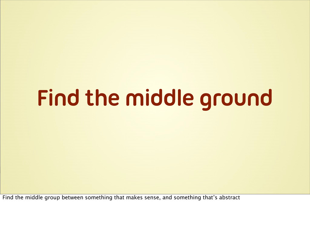
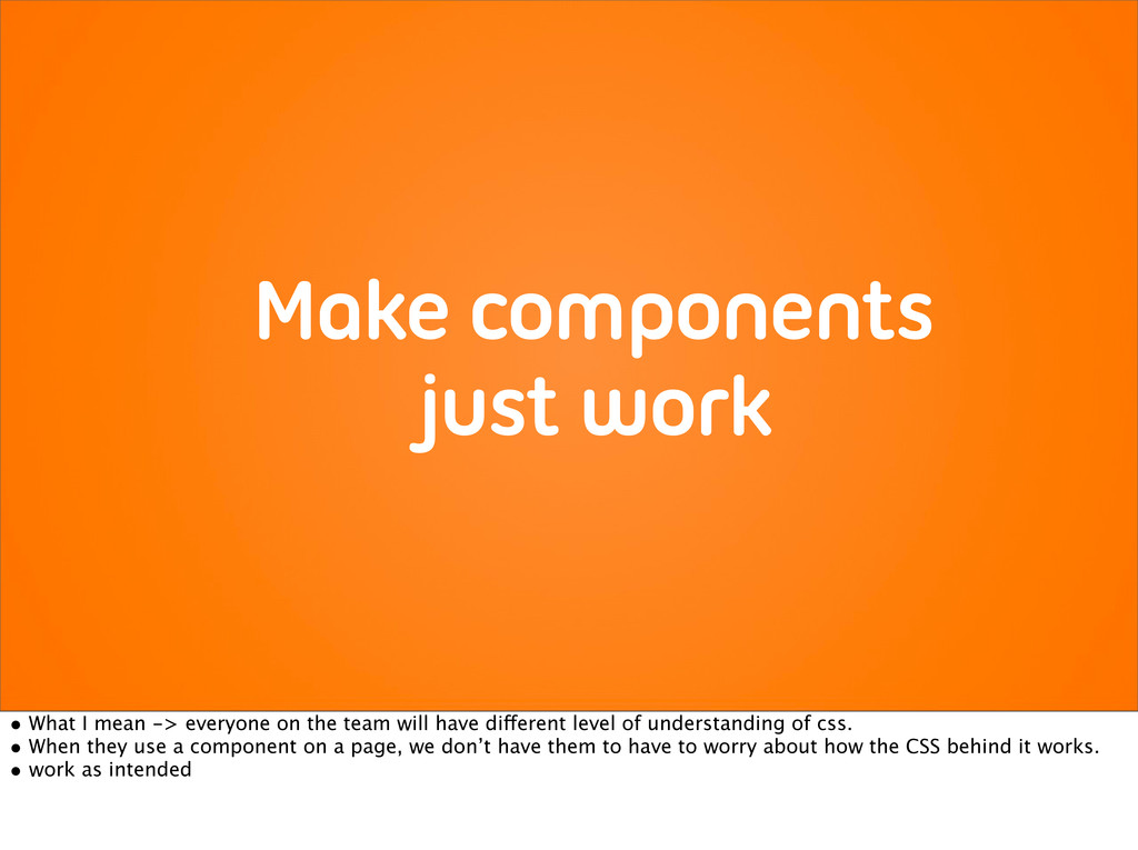
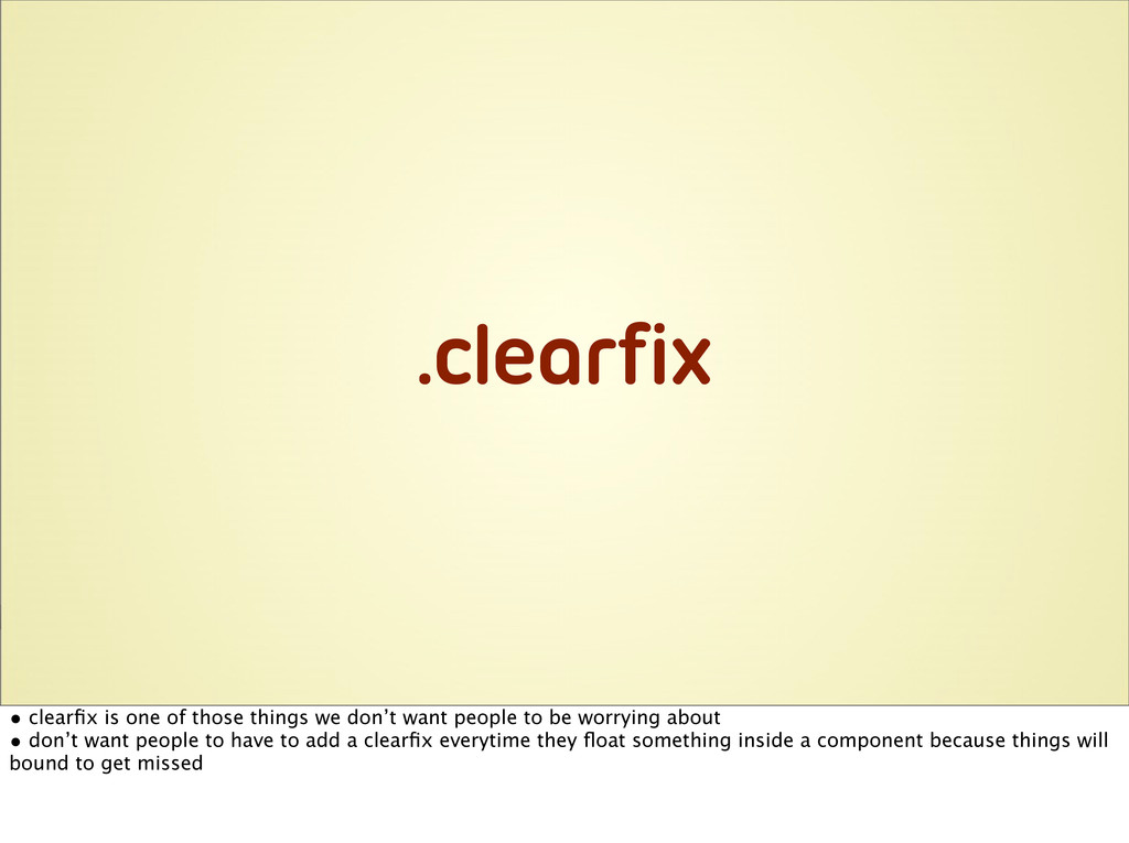
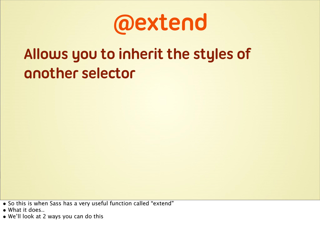
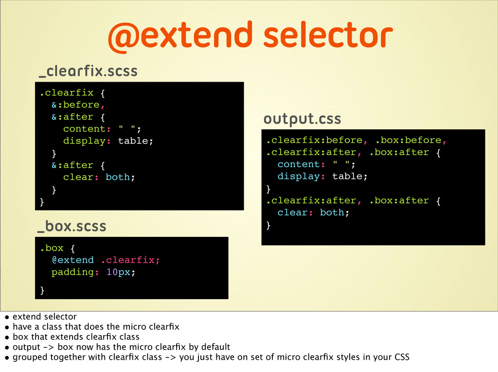
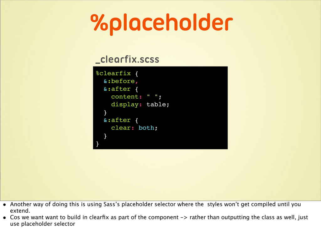
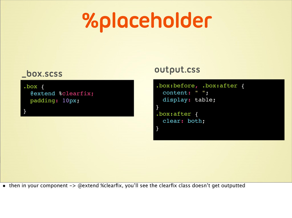
Remember the (painful) times when you had to use !important just so you could quickly override some styles you inherited? Or the times you stared at a giant stylesheet and couldn’t figure out where everything is? Large, unmaintainable CSS code is a common problem for many websites. It is often neglected because things can still somehow work even when the CSS is really bad! But not only does this slow down performance, it also inhibits developers from producing quality code. But if you start your site with a solid foundation, developing a large scale website with maintainable CSS is actually not so hard. In this talk, I’ll share with you some of the lessons I’ve learnt from building and maintaining large CSS files, and how Sass has helped to make that job easier.

This talk was presented at Web Directions South 13.

Fiona Chan

October 24, 2013
Tweet

More Decks by Fiona Chan

Other Decks in Technology

Transcript

  1. ...modifying some CSS makes your palms sweat because sh*t might

    break! I raised my hand twice as I have been in these situations more times than I’d really like.
  2. • Painful and dissatisfying when dealing with messy CSS •

    Small part of me dies a little everytime I have to use an !important to force some CSS to work
  3. Messy code inhibits developers from producing quality code No matter

    how good you are, if you have to constantly battle with messy code, it is extremely hard to produce quality code. Maybe you still can, but it will take a lot longer.
  4. Boxes • In particular -> box component -> some of

    the steps I follow when creating a reusable component, • referring to some of the concepts from OOCSS and also talk about how Sass helps.. to an extend
  5. Create base component b b b box box box box

    • All boxes have common padding • Base called box -> contains the common styling between the four boxes
  6. .box { padding: 10px; } .insideNews { box-shadow: 0 0

    3px #ccc; } <div class="box insideNews"> .... </div> b • Add a skin class that applies styles specific to the box • Avoid duplication, can make maintenance easier, lighter code
  7. Naming your component - Next thing to consider is naming

    your component - It is probably one of the hardest things to do.
  8. b .insideNews { box-shadow: 0 0 3px #ccc; } •

    content specific class • as soon as your class is used with other content, then it doesn’t make sense anymore • Sometimes i would get a design and I’ll see a particular component being used in this one instance only and I’d think “oh it’s only used here, it won’t get reused” and I’d create something that’s very particular to this one instance. Almost all of the time, the designer would give a new design down the track with the component being used in another context and i’d think “Ah crap. Why didn’t I abstract it?”
  9. Be abstract • good idea to be abstract from the

    start, and always think it can be reused. • a lot of people say “class name shouldn’t tie to content” or “it shouldn’t tie to styles”
  10. .box1 { box-shadow: 0 0 3px #ccc; } • So

    I’ve done things like being super abstract, and named things like .box1, .box2 etc. • It made it very difficult understand what this module is for when I had to maintain it
  11. .boxFeature { box-shadow: 0 0 3px #ccc; } • Something

    a bit better would be to call it boxFeature • You can argue boxFeature is still tied to the styles
  12. Find the middle ground Find the middle group between something

    that makes sense, and something that’s abstract
  13. Make components just work • What I mean -> everyone

    on the team will have different level of understanding of css. • When they use a component on a page, we don’t have them to have to worry about how the CSS behind it works. • work as intended
  14. .clearfix • clearfix is one of those things we don’t

    want people to be worrying about • don’t want people to have to add a clearfix everytime they float something inside a component because things will bound to get missed
  15. <div class="box boxFeature clearfix"> .... </div> • Because boxes are

    so commonly used, it’s very likely there’ll elements floated inside • So adding a clearfix to it preemptively is probably a good idea
  16. @extend Allows you to inherit the styles of another selector

    • So this is when Sass has a very useful function called “extend” • What it does.. • We’ll look at 2 ways you can do this
  17. @extend selector .clearfix { &:before, &:after { content: " ";

    display: table; } &:after { clear: both; } } _clearfix.scss .box { @extend .clearfix; padding: 10px; } _box.scss .clearfix:before, .box:before, .clearfix:after, .box:after { content: " "; display: table; } .clearfix:after, .box:after { clear: both; } output.css • extend selector • have a class that does the micro clearfix • box that extends clearfix class • output -> box now has the micro clearfix by default • grouped together with clearfix class -> you just have on set of micro clearfix styles in your CSS
  18. %placeholder %clearfix { &:before, &:after { content: " "; display:

    table; } &:after { clear: both; } } _clearfix.scss • Another way of doing this is using Sass’s placeholder selector where the styles won’t get compiled until you extend. • Cos we want want to build in clearfix as part of the component -> rather than outputting the class as well, just use placeholder selector
  19. %placeholder .box { @extend %clearfix; padding: 10px; } _box.scss .box:before,

    .box:after { content: " "; display: table; } .box:after { clear: both; } output.css • then in your component -> @extend %clearfix, you’ll see the clearfix class doesn’t get outputted
  20. %placeholder %baseSpacing { margin: 15px 0; } _spacing.scss .box, .tabs

    { margin: 15px 0; } output.css .box { @extend %baseSpacing; padding: 10px; } _box.scss .tabs { @extend %baseSpacing; } _tabs.scs • In OOCSS, another place where the placeholder selector is used is for the base spacing. • It’s a good idea to set a default top and bottom spacing for most of your components • Rather than using an actual class to do that, or repeat the base spacing all over your CSS, you can just use a placeholder selector and have your components extend it, then you won’t get the duplication
  21. BUT... • With great power comes great responsibilities. • extend

    in Sass is very useful and can definitely help eliminating repeated CSS, but it’s got its downsides
  22. .box { @extend %baseSpacing; padding: 10px; } _box.scss .boxFeature {

    @extend .box; box-shadow: 0 0 3px #ccc; } .boxBasic { @extend .box; border: 1px solid #ccc; } • Base box component extends the base spacing • We want the two skin classes to have the same styling as the box component so we extend class box
  23. .tabs { .box { background: #ccc; } } .dropdownMenu {

    .box { background: #999; } } _tabs.scss _dropdown.scss - Then we want to use the box component in the tabs and dropdown menu component and style it differently.
  24. Yikes!!! .tabs .box, .tabs .boxFeature, .tabs .boxBasic { background: #ccc;

    } .dropdownMenu .box, .dropdownMenu .boxFeature, .dropdownMenu .boxBasic { background: #ccc; } .tabs .box, .tabs .boxFeature, .tabs .boxBasic { background: #ccc; } .dropdownMenu .box, .dropdownMenu .boxFeature, .dropdownMenu .boxBasic { background: #ccc; } 1. Output tab boxFeature, tab boxbasic, all these unwanted classes. 2. Downside of @extend -> it’ll extend all the places where you’ve used that class you’ve extended 3.Important to always check your output and be really careful when you use extend, otherwise..
  25. b .header .heading • If we just give it a

    generic class name like header or heading...
  26. .boxFeature { .header { padding-bottom: 10px; border-bottom: 1px solid #ccc;

    .heading{ color: #000; } } } .boxFeature .header { padding-bottom: 10px; border-bottom: 1px solid #ccc; } .boxFeature .heading{ color: #000; } _box.scss output.scss • Then in our sass we’ll need to nest it within the component in case we’ve used the same class name in another component
  27. .boxFeature { box-shadow: 0 0 3px #ccc; } .boxHeader {

    padding-bottom: 10px; border-bottom: 1px solid #ccc; } .boxHeading { color: #000; } .boxFeature { box-shadow: 0 0 3px #ccc; } .boxHeader { padding-bottom: 10px; border-bottom: 1px solid #ccc; } .boxHeading { color: #000; } output.css _box.scss • But if you name space you class by prefixing your inner elements with the name of the component, then you can avoid your styles being overriden by other components and you won’t need to nest the class within the component class • -> this will lower specificity and creates a lot less bloat in your css as your components grow
  28. ...doesn’t mean you should. • Last thing, non-technical but it’s

    critical thing in making sure your code doesn’t turn into spaghetti code
  29. Code standard - Key thing to have within the team

    is written code standard - agreed on by the team and communicated to everyone - otherwise everyone will write in the same way and you won’t get this jumble of styles
  30. Living styleguide • Important to create a living styleguide ->

    one that uses real code, rather than done in a pdf • critical in documenting both your design and code • it’s one place the whole team can refer to, to see what components have been built, how everything looks
  31. Collaboration < > • Important to work with designers •

    If we can avoid creating new css by using something that exists on the site and does 80-90% of the job -> communicate back to design and ask if we can just re-use what exists and explain that it’ll mean less code and easier for maintenance. • Not saying we shouldn’t follow design, just saying there needs to be a balance between UX, design and code.