Upgrade to Pro — share decks privately, control downloads, hide ads and more …

Going Mobile as a Community: A Case Study from Stanford

Morgan Miller
October 25, 2013

Going Mobile as a Community: A Case Study from Stanford

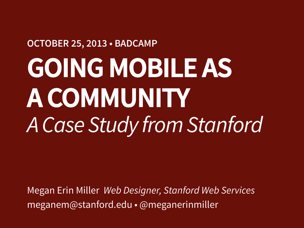
Presented at the 2013 Bay Area Drupal Camp Mobile Summit.

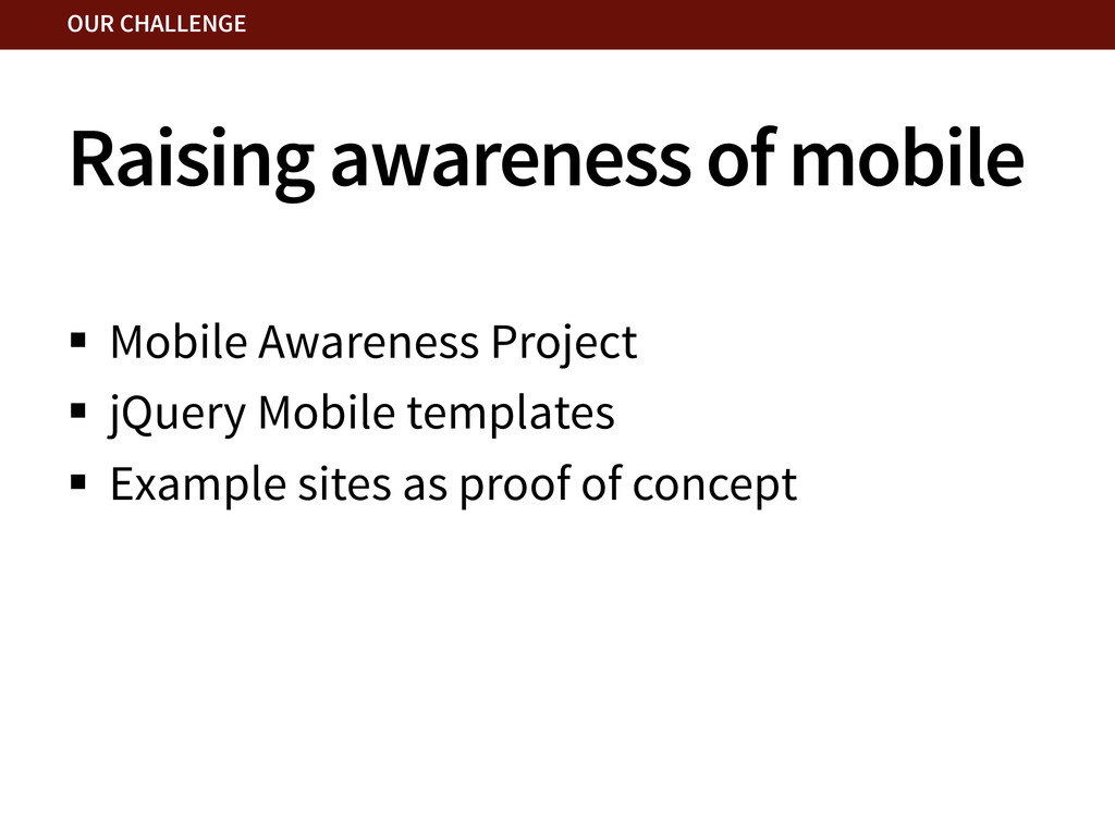
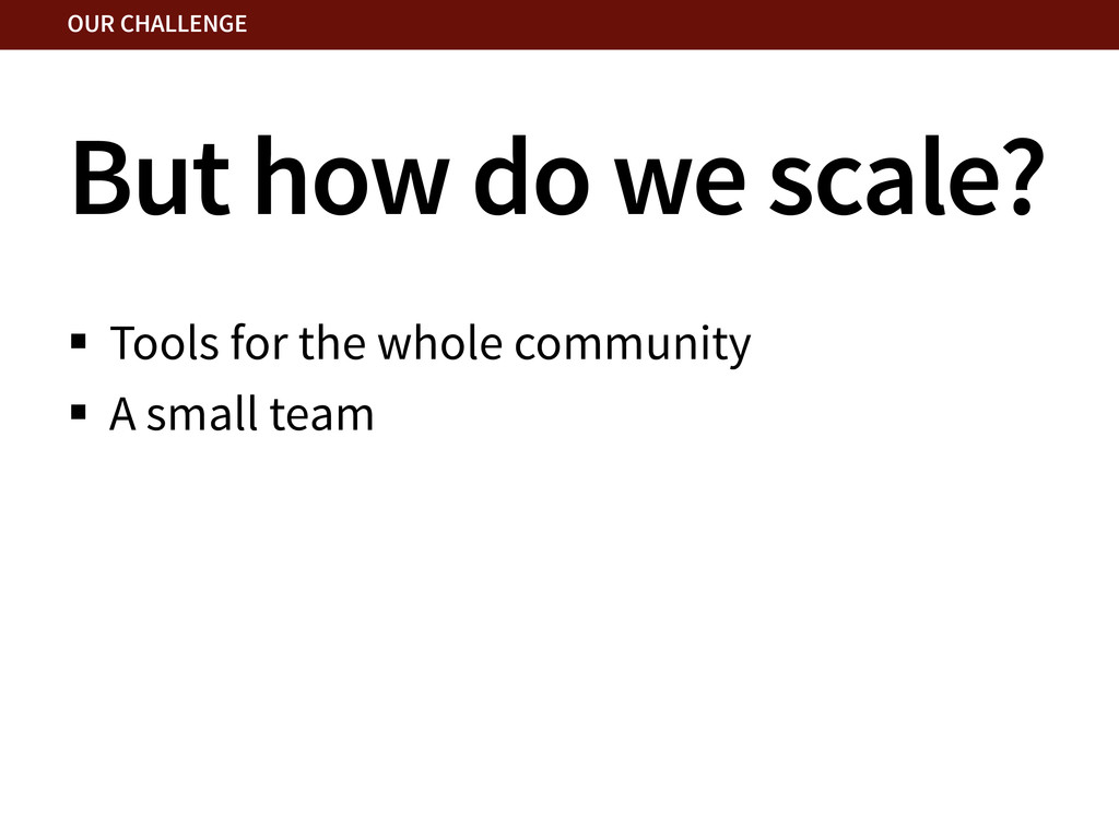
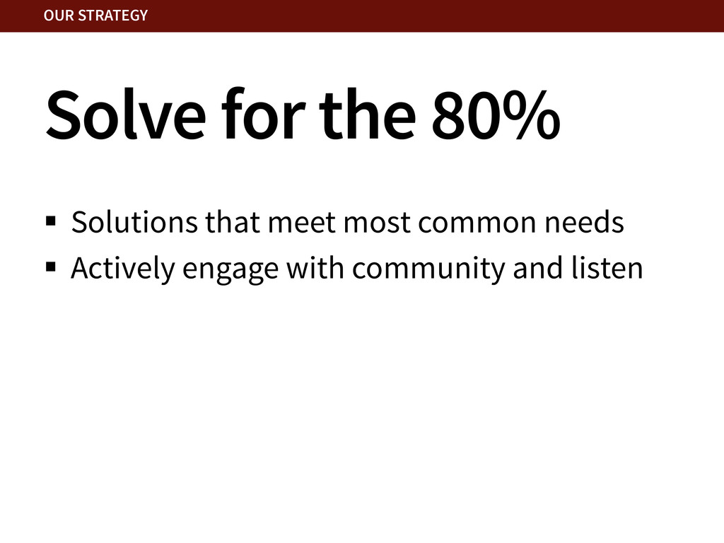
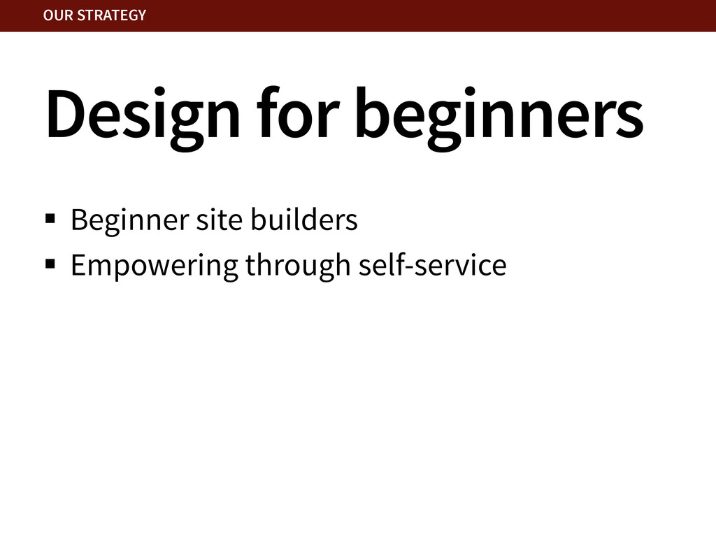
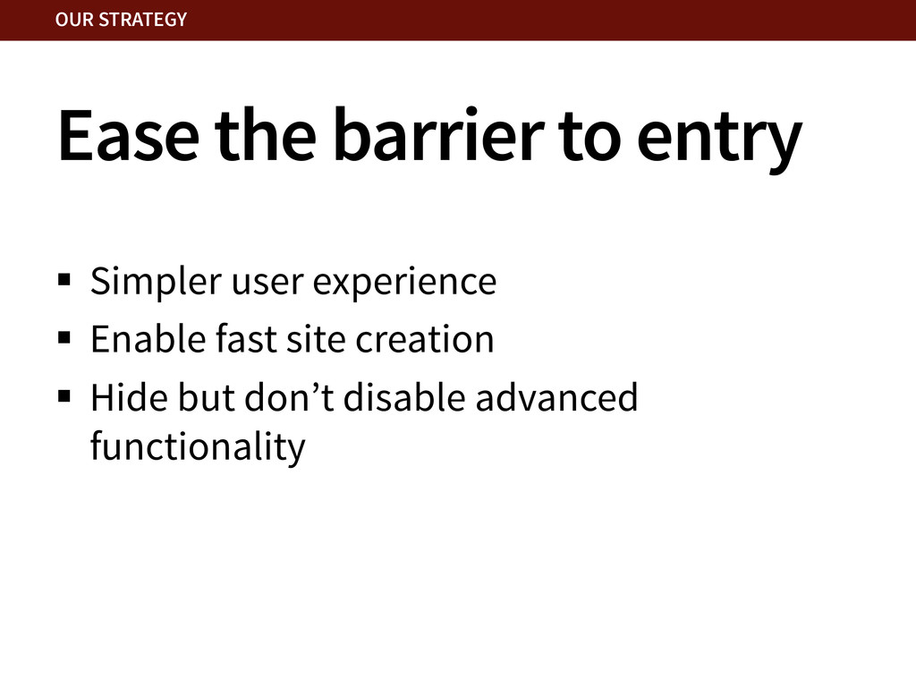
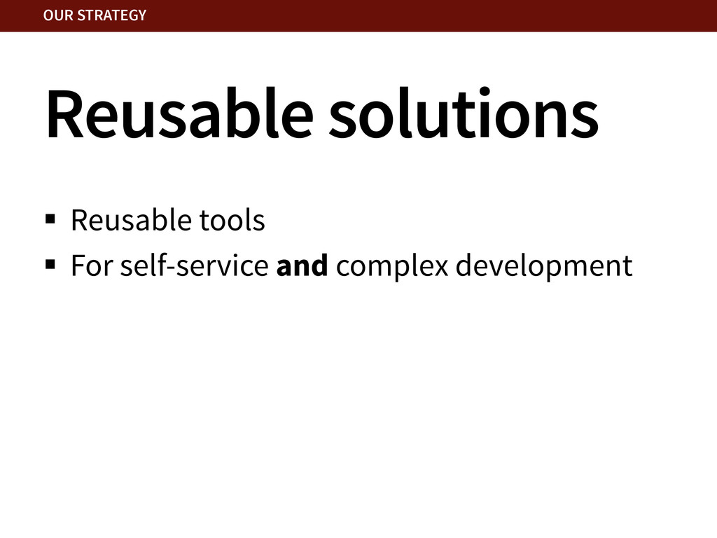
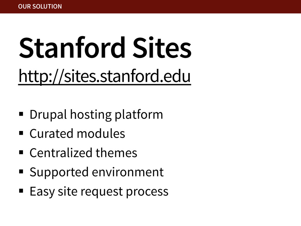
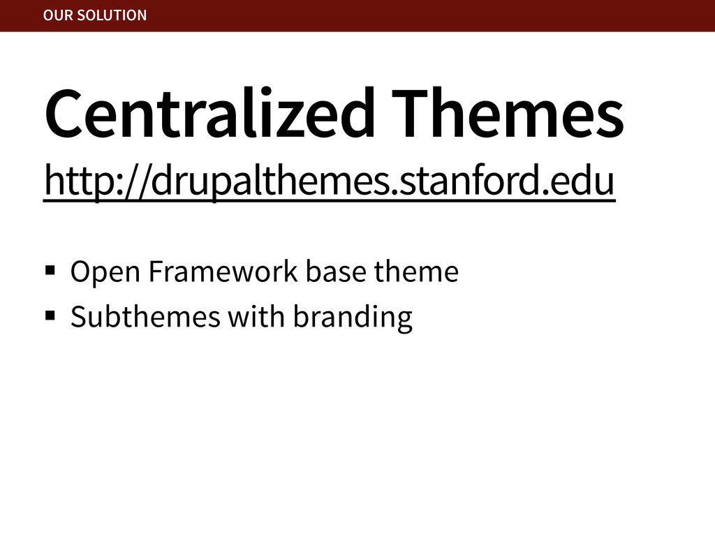
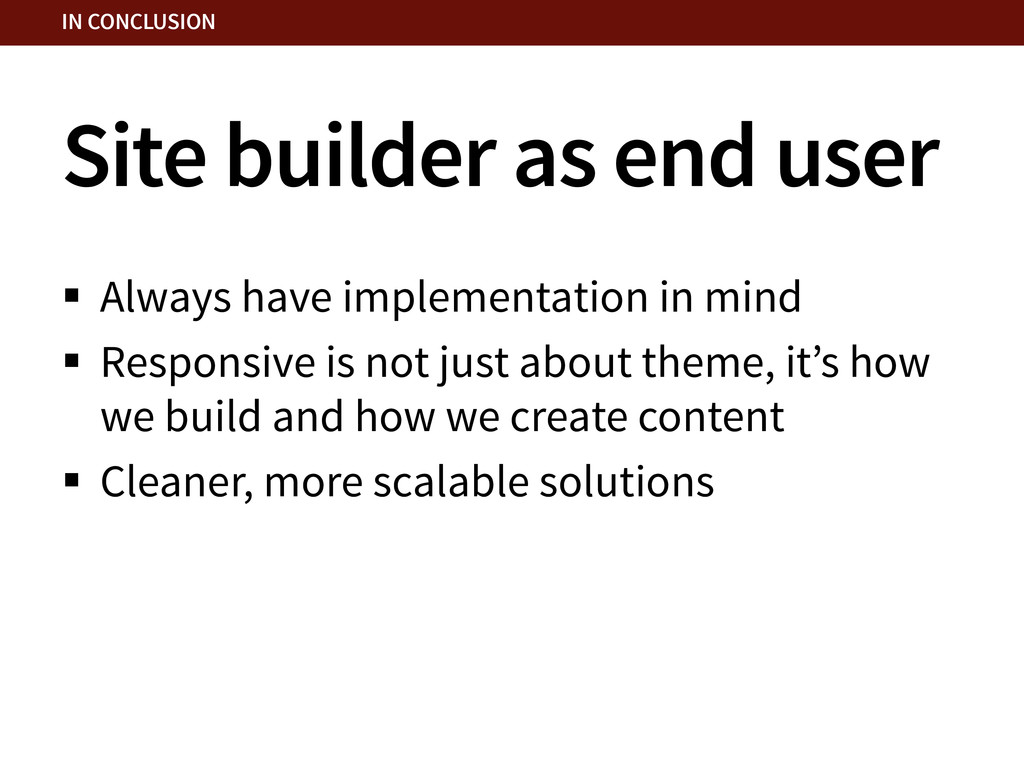
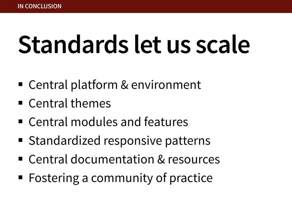
How does a small team support a large, diverse community with efficient, affordable website solutions? How do we enable a whole community to "go mobile?" In this case study, I share how Stanford Web Services has approached designing centralized tools and resources to help the Stanford community go mobile.

Morgan Miller

October 25, 2013
Tweet

More Decks by Morgan Miller

Other Decks in Design

Transcript

  1. GOING MOBILE AS A COMMUNITY A Case Study from Stanford

    OCTOBER 25, 2013 • BADCAMP Megan Erin Miller Web Designer, Stanford Web Services [email protected] • @meganerinmiller
  2. The Stanford Community §  Thousands of websites §  Every level

    of experience §  Small units with no web person §  Large units with whole web teams OUR CHALLENGE
  3. A challenging task §  How do you support a community

    this large? §  How do you provide efficient, affordable centralized website solutions? OUR CHALLENGE
  4. §  Founded in 2011 §  Small centralized team §  We

    design and build Drupal websites §  We also maintain central web services OUR CHALLENGE Stanford Web Services http://webservices.stanford.edu
  5. Make it easy to… §  make a website… §  make

    an accessible, secure, stable website §  make a more harmonious Stanford web presence §  go mobile responsive OUR CHALLENGE
  6. Raising awareness of mobile §  Mobile Awareness Project §  jQuery

    Mobile templates §  Example sites as proof of concept OUR CHALLENGE
  7. But how do we scale? §  Tools for the whole

    community §  A small team OUR CHALLENGE
  8. Solve for the 80% §  Solutions that meet most common

    needs §  Actively engage with community and listen OUR STRATEGY
  9. Ease the barrier to entry §  Simpler user experience § 

    Enable fast site creation §  Hide but don’t disable advanced functionality OUR STRATEGY
  10. Standards allow for better support §  Standardized platform & environment

    §  Curated modules and themes §  Better central documentation OUR STRATEGY
  11. Stanford Sites http://sites.stanford.edu §  Drupal hosting platform §  Curated modules

    §  Centralized themes §  Supported environment §  Easy site request process OUR SOLUTION
  12. Going responsive §  Sophisticated responsive regions (following a set responsive

    pattern) §  Standardized responsive menu OUR SOLUTION
  13. Responsive regions §  Blocks & regions approach §  “Flow” and

    “Stacked” regions §  Utilize Block Class module OUR SOLUTION
  14. Site builder as end user §  Always have implementation in

    mind §  Responsive is not just about theme, it’s how we build and how we create content §  Cleaner, more scalable solutions IN CONCLUSION
  15. Standards let us scale §  Central platform & environment § 

    Central themes §  Central modules and features §  Standardized responsive patterns §  Central documentation & resources §  Fostering a community of practice IN CONCLUSION
  16. Mobile is not just about themes and templates §  It’s

    about changing perceptions §  Educating a community §  Integrated solutions IN CONCLUSION