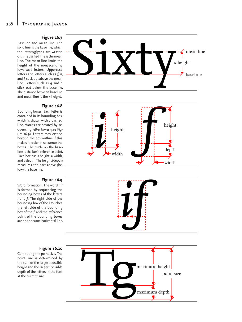
mean line. The solid line is the baseline, which the letters/glyphs are written on. The dashed line is the mean line. The mean line limits the height of the nonascending lowercase letters. Uppercase letters and letters such as f, h, and k stick out above the mean line. Letters such as g and p stick out below the baseline. The distance between baseline and mean line is the x-height. Figure 16.7 iheight width f height depth width Bounding boxes. Each letter is contained in its bounding box, which is drawn with a dashed line. Words are created by se- quencing letter boxes (see Fig- ure 16.9). Letters may extend beyond the box outline if this makes it easier to sequence the boxes. The circle on the base- line is the box’s reference point. Each box has a height, a width, and a depth. The height (depth) measures the part above (be- low) the baseline. Figure 16.8 if Word formation. The word ‘if’ is formed by sequencing the bounding boxes of the letters i and f. The right side of the bounding box of the i touches the left side of the bounding box of the f and the reference point of the bounding boxes are on the same horizontal line. Figure 16.9 maximum height maximum depth point size Tg Computing the point size. The point size is determined by the sum of the largest possible height and the largest possible depth of the letters in the font at the current size. Figure 16.10
between the letters in the pairs ‘Ve’ and ‘Ti’ on the first line is too large. In the second line this is re- solved by adjusting the dis- tances within the pairs. This is called kerning. In this exam- ple, kerning reduces the dis- tance between the reference points of the bounding boxes, which makes the bounding boxes overlap. The overlap is shown in grey. Figure 16.11 ffl ff l fi f i Ligatures. This figure shows two example of ligatures. At the top are the ligatures and at the bottom the letters that form the ligatures. Figure 16.12 leading The leading or line spacing is the distance between the baselines of two subsequent lines in the text. letterspacing Letterspacing or tracking refers to the uniform amount of space that is added to the left and right of the characters in a passage of text. ligature A ligature is a glyph that represents a combination of two or more individual letters, digits, or punctuation marks. Figure 16.12 shows two examples of ligatures. line spacing See leading. mean line The mean line is the virtual demarcation line for the height of the lowercase letters without ascenders. See Figure 16.7 for an example. oblique typeface See slanted typeface. roman typeface A roman or upright typeface is a typeface whose glyphs
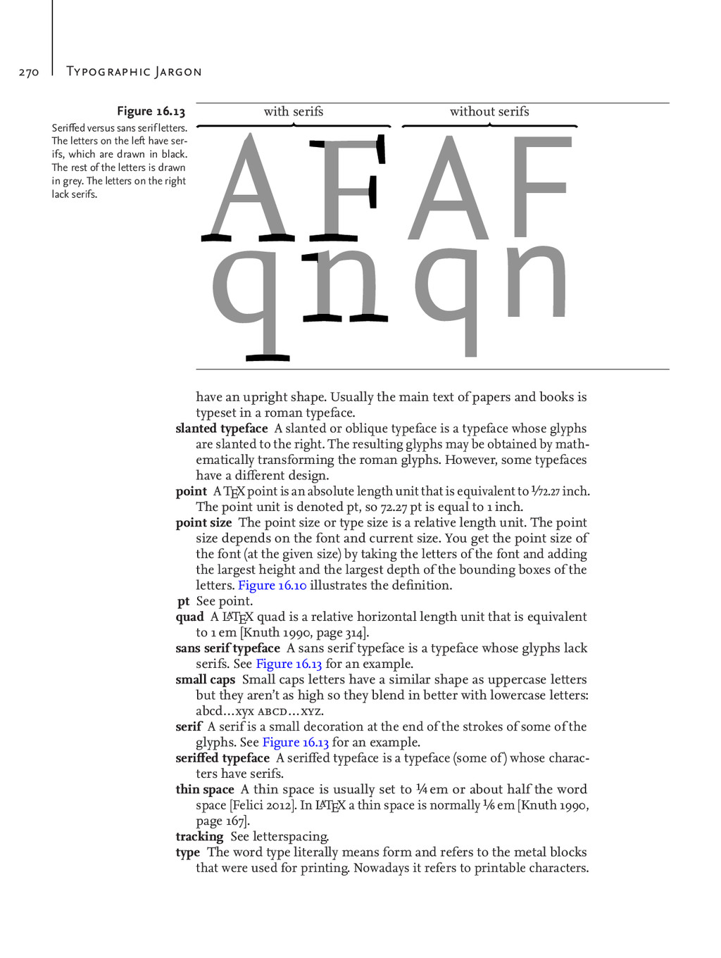
serifs without serifs Seriffed versus sans serif letters. The letters on the left have ser- ifs, which are drawn in black. The rest of the letters is drawn in grey. The letters on the right lack serifs. Figure 16.13 have an upright shape. Usually the main text of papers and books is typeset in a roman typeface. slanted typeface A slanted or oblique typeface is a typeface whose glyphs are slanted to the right. The resulting glyphs may be obtained by math- ematically transforming the roman glyphs. However, some typefaces have a different design. point A TEX point is an absolute length unit that is equivalent to 1⁄72.27 inch. The point unit is denoted pt, so 72.27 pt is equal to 1 inch. point size The point size or type size is a relative length unit. The point size depends on the font and current size. You get the point size of the font (at the given size) by taking the letters of the font and adding the largest height and the largest depth of the bounding boxes of the letters. Figure 16.10 illustrates the definition. pt See point. quad A L aTEX quad is a relative horizontal length unit that is equivalent to 1 em [Knuth 1990, page 314]. sans serif typeface A sans serif typeface is a typeface whose glyphs lack serifs. See Figure 16.13 for an example. small caps Small caps letters have a similar shape as uppercase letters but they aren’t as high so they blend in better with lowercase letters: abcd…xyx abcd…xyz. serif A serif is a small decoration at the end of the strokes of some of the glyphs. See Figure 16.13 for an example. seriffed typeface A seriffed typeface is a typeface (some of ) whose charac- ters have serifs. thin space A thin space is usually set to 1⁄4 em or about half the word space [Felici 2012]. In L aTEX a thin space is normally 1⁄6 em [Knuth 1990, page 167]. tracking See letterspacing. type The word type literally means form and refers to the metal blocks that were used for printing. Nowadays it refers to printable characters.
letters, digits, punctuation symbols, and other characters that share a common design and common fea- tures. typeface family A typeface family is a collection of typefaces that share some features. Many typeface families come with a roman shape, an italic shape, a slanted shape, and so on. Examples of typeface fami- lies are Computer Modern Roman, Computer Modern Sans Serif, Gentium, Linux Libertine Serif/Times New Roman, T EX Gyre Heros/Helvetica, T EX Gyre Pagella/Palatino Linotype, and so on. type size See point size. typewriter typeface A typewriter or monospaced typeface is a typeface whose glyphs have equal width. x-height The x-height is the distance between the mean line and the base- line. By design the distance coincides with the height of the lowercase x. See Figure 16.7 for an example.