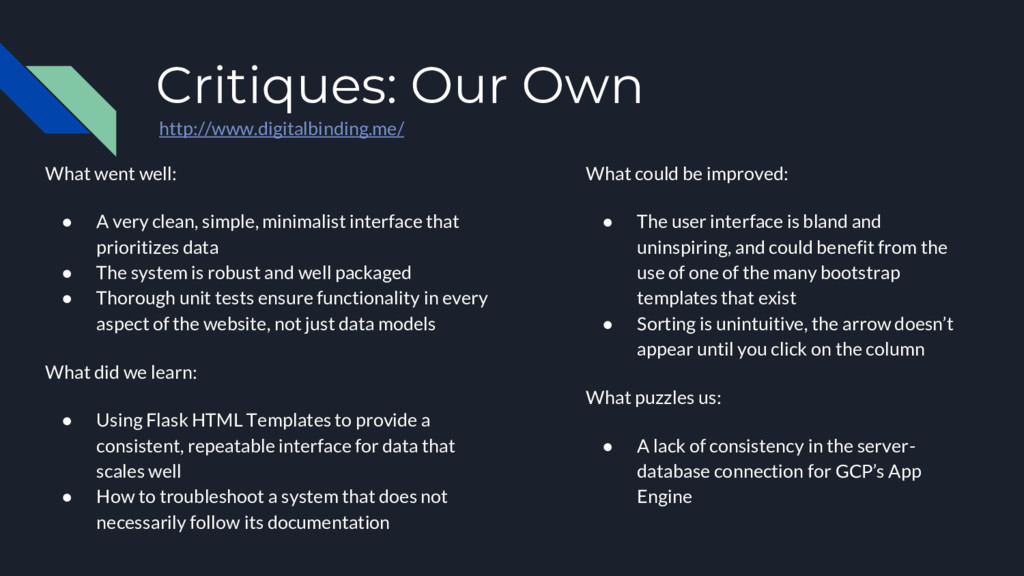
clean, simple, minimalist interface that prioritizes data • The system is robust and well packaged • Thorough unit tests ensure functionality in every aspect of the website, not just data models What did we learn: • Using Flask HTML Templates to provide a consistent, repeatable interface for data that scales well • How to troubleshoot a system that does not necessarily follow its documentation What could be improved: • The user interface is bland and uninspiring, and could benefit from the use of one of the many bootstrap templates that exist • Sorting is unintuitive, the arrow doesn’t appear until you click on the column What puzzles us: • A lack of consistency in the server- database connection for GCP’s App Engine
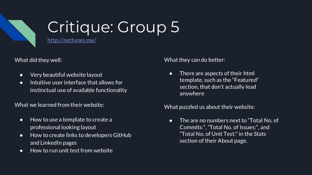
beautiful website layout • Intuitive user interface that allows for instinctual use of available functionality What we learned from their website: • How to use a template to create a professional looking layout • How to create links to developers GitHub and LinkedIn pages • How to run unit test from website What they can do better: • There are aspects of their html template, such as the “Featured” section, that don’t actually lead anywhere What puzzled us about their website: • The are no numbers next to “Total No. of Commits:”, “Total No. of Issues:”, and “Total No. of Unit Test:” in the Stats section of their About page.


 masakiokuda
 akhino
 kakehashi
 puhitaku
 yahonda
 shugo
 nealle
 pfn
 namiki64
 mhrtech
 takuroabe
 ishikawa_satoru
 marktimemedia
 kristinabergwall1
 aleyda
 watany
 jonoalderson
 lara
 ammeep
 tmiket
 axbom
 quramy
 brettharned