Upgrade to Pro — share decks privately, control downloads, hide ads and more …

Scalable CSS

Scalable CSS

Tips and tricks to make CSS scale for medium to large applications

Joe Ellis

June 18, 2013
Tweet

More Decks by Joe Ellis

Other Decks in Programming

Transcript

  1. Scalable CSS Tuesday, June 18, 13 Hello, welcome to my

    Scalable CSS Talk. We’re going to go into a bit on some best practices and tips for managing CSS in medium to large applications. I’ve certainly had my share of hours try to fix and deal with CSS, so I’m hoping here I can share some of the harder lessons I’ve learned while dealing with this stuff.
  2. Joe Ellis @notjoeellis [email protected] Tuesday, June 18, 13 Again, I’m

    Joe Ellis. I work at Audiosocket here in town. Here’s some contact info in case you want to bug me later. These slides will also be up on speaker deck so you can check them out later.
  3. Talk Context is For Medium to Large Apps Tuesday, June

    18, 13 Also, something to keep in mind: I’m assuming for this talk that we are talking about medium and large apps. Like with all code, the context of what you’re doing needs to be taken under account, and some of these methods could certainly be argued as overkill if your app is relatively small. For this current talk, I’m defining a “medium” app as something requiring the work of around at least 3 developers.
  4. YMMV Tuesday, June 18, 13 Also, although many of these

    are my preferred way to do things, everything again, depends on context and your app, these tips are not die hard rules that you must follow. In some cases, it makes more sense to go against these rules, these are just general guidelines that I have followed that have made my life much easier.
  5. You Need a CSS precompiler Tuesday, June 18, 13 Most

    of these rules are going to be based around the fact that you’re using a CSS precompiler like SASS or LESS. Otherwise, your CSS life will probably be unnecessarily painful. If you do not know what a CSS precompiler is, I highly suggest you look it up and start using one, they are fantastic.
  6. Ideal Goal • Reduce CSS maintenance as much as possible

    • Decouple CSS as much as possible • Don’t override classes - extend instead. Tuesday, June 18, 13 To create very scalable, easy to maintain CSS, we’re going to try and follow these main tenants: Reduce CSS Maintenance as much as possible - the main key to creating scalable CSS is to always be creating code that is safe and rarely needs to be touched or modified by other developers just to get their own code working. We also want to try and classes that are as reusable as possible. Decouple CSS as much as possible - we need to ensure that your CSS does not depend on any particular DOM structure or that changing your CSS would result in breaking some Javascript. Don’t override classes, extend instead - we’ll talk more about this, but we want to have a big focus on making sure we’re not trying to fight our classes, but instead adding to them.
  7. Avoid Element Selectors Tuesday, June 18, 13 So, in no

    particular order, let’s go over a couple of basic rules that can go along way to avoiding unnecessary maintenance. These are some basic best practices you can start doing that will probably help you save a lot of unnecessary headaches in the future. So first, avoiding element selectors. So what is an element selector?
  8. <div class="element-container"> <a href="#”>My Link</a> <span>...</span> </div> div.element-container { //styles...

    a { //styles... } span { //styles... } } Tuesday, June 18, 13 An element selector is when you qualify a class with an element before the class, or just using the element itself for styling. This kind of styling can help keep your DOM looking very clean and pretty, and can work fine on smaller sites. However, with bigger sites, you will absolutely end up running into a lot of issues with this kind of styling. First, these styles are not really re-usable as they are coupled to the DOM. We can only use them under the context of the .element-container class. Also, with styles like these, you’re essentially predicting the future for all anchor and span tags. As your site grows, and your .element-container starts to see more elements added to it, it’s fairly likely that it will see more anchors and more spans added to it, as these are very generic classes. It’s also likely that you’ll need different styles for them - for example, you want some anchors as links, but others as buttons. With this setup, to make it work, you’re going to eventually be forced to override styles at some point, which breaks one of our main tenants. So in the end, this isn’t great to maintain. Also, in the DOM, you can’t immediately tell anything is actually styled. So another developer may come in, change things, and then realize he broke a bunch of styles, and has to take the time to go figure out how it all works and fix it. It’s not a huge problem, but it’s time that can certainly be avoided. So what’s our solution here?
  9. .element-container { //styles. } .article-title { //styles } .list-of-things {

    //styles } <div class="element-container"> <h1 class="article-title"> My Title </h1> <ul class="list-of-things"> ... </ul> </div> Tuesday, June 18, 13 The solution is just avoid using element selectors at all. If you need to style something, it deserves a class name. This ensures that we are creating code that can be re-used, not necessarily coupled to the DOM in anyway, and makes a clear statement in the DOM about our stylings. A simple solution that just removes someone else having to come in later and fix things.
  10. Do Not Style IDS Tuesday, June 18, 13 Next, don’t

    style IDS. IDs carry with them an enormous amount of specificity weight and should be avoided in general. This is because when IDs are involved, you can no longer guarantee that your CSS will be predictable in the future and not affect other styles.
  11. #so-damn-unique { //styles... } .special { //styles... } <div id="so-damn-unique"

    class="special"> My Element </div> Tuesday, June 18, 13 Here’s an example. The ID styles are going to take precedent over the CSS class styles, and that essentially makes it a wild card in a system where we’re trying to build predictable and reusable CSS styles. This is going to introduce big specificity headaches later on, which only compounds on itself if you’re styling IDs all over the site. Often the case is made that an ID is faster performance wise for the browser during rendering. While this is technically true, the difference between the two in terms of reflow speed is so low I can’t really imagine a situation where it would be relevant unless you had you were a high trafficked site with millions of elements on the page, and I’d question the UI of such a site to begin with.
  12. .special { //all styling goes here... } <div id="so-damn-unique" class="special">

    My Element </div> Tuesday, June 18, 13 The solution is, don’t style IDs. Simple. Now I’m not saying to never use IDs, because they can still be useful, like if you need to be selecting unique elements on the DOM through Javascript. But, if that element needs a style, just add a class, style that, and avoid any future maintenance headaches.
  13. <div class="special" data-element=”id-4325”> My Element </div> Tuesday, June 18, 13

    My personal preference is to not use IDs at all on DOM elements because I think having an ID sometimes still tempts other developers to style it, which I want to avoid entirely, so I prefer to instead use data-attributes if I really need something unique. This is just a personal preference and alternate options, though, so if you still like using IDs, go for it.
  14. Separate CSS style classes and JS Selector Classes Tuesday, June

    18, 13 Separate CSS style classes and JS Selector classes. Make sure that when you’re making new elements and css classes, avoid using presentational CSS as DOM selectors in your Javascript. Here’s an example.
  15. $(".users-container").click(function() { // Javascript code }); <div class="users-container"> ... </div>

    .users-container { //styles... } Tuesday, June 18, 13 In this code, we are using the same class for both CSS styling and Javascript manipulation to select the same DOM element. This essentially couples your CSS to the Javascript which can be a problem as you can end up losing a lot of flexibility down the line. For example:
  16. $(".users-container").click(function() { // Javascript code }); <div class="new-users-container"> ... </div>

    Tuesday, June 18, 13 If we were to change the name of our class for styling purposes, perhaps we thought of a better semantic name for that element, it will break your Javascript code. That can be a huge pain, especially if you don’t yet have a Javascript testing suite in place to detect these kinds of errors. It’s also a pain for bigger teams because it can make your team reticent to change anything CSS or DOM related for fear of breaking some unknown Javascript code somewhere else. You can then end up with a lot of extra classes hanging around on DOM elements that no one remembers what they’re for, but are fearful to remove them because some Javascript somewhere to break, and then they’ll get a bug ticket a couple of days later and then try to remember what the hell it was that they did.
  17. $(".js-add-user").click(function() { // Javascript code }); <div class="users-container js-add-user"> ...

    </div> Tuesday, June 18, 13 A better way is to make a JS specific selector classes. A JS selector class shows this element is currently being used with Javascript and exists for another reason other than just presentational styling. That way anyone editing this DOM structure will have a clear idea of what’s going on. One way to make sure a selector is to prefix those types of classes with js-, or some other naming structure that makes it clear this element is being used for Javascript purposes. These types of classes are not meant to be styled though, only used for selecting with Javascript.
  18. $("[data-behavior=add-user]").click(function() { // Javascript code }); <div class="users-container" data-behavior=”add- user”>

    ... </div> Tuesday, June 18, 13 Personally I prefer to use data-attributes for these kind of selectors, because I like to keep those selector separate from classes entirely. As you can see, it can make the selector a bit verbose, but we implement jQuery custom selectors to help mitigate that:
  19. $.expr[':'].b = function(object, index, meta, stack) { _.contains(($(object).attr("data-behavior") || "").split("

    "), meta[3]) } $(":b(add-user)").click(function() { // Javascript code }); <div class="users-container" data-behavior=”add-user”> ... </div> Tuesday, June 18, 13 This is an example of a custom query selector we use, the syntax of which is outside the scope of this talk, so I’m not going to go into explaining it at the moment, but using a couple of lines of javascript, you can see that we can get much nicer syntax like :b(add-user) for doing our selections, and keep our class attribute strictly for presentational styles
  20. .container { //styles... .content { //styles... .articles { //styles... &

    > .post { //styles... .title { //styles... h1 { //styles... a { //styles... } } } } } } } <div class="container"> <div class="content"> <div class="articles"> <div class="post"> <div class="title"> <h1> <a href="#"> Hello World </a> </h1> </div> </div> </div> </div> </div> Tuesday, June 18, 13 Here’s an example that is not terribly unlike code I used to write. Dat’s some deep nesting. You can see how it is so coupled to the DOM that it nearly mirrors the DOM exactly. If someone changed the HTML code on the right to pretty much anything else, this entire styling structure would basically break, and you’d have to go in and fix it all again. Even worse is that none of these styles are going to end up being reusable. If we tried to break this up though, we’d most likely run into CSS override issues. Classes like .content or .post are certainly semantic, but they are, unfortunately, very generic, and we can’t depend on having them at the root level.
  21. .container { ... } .container .content { ... } .container

    .content .articles { ... } .container .content .articles > .post { ... } .container .content .articles > .post .title { ... } .container .content .articles > .post .title h1 { ... } .container .content .articles > .post .title h1 a { ... } Tuesday, June 18, 13 Plus, due to the deep nesting, the compiled CSS ends up being very verbose which results in larger file sizes, and speed is likely a big issue for a heavily trafficked medium to large web application. And, if you really care about performance, the above CSS code is technically slower as well since a browser reads CSS selectors from right to left when deciding how it needs to style elements on render.
  22. .main-container { //styles... } .main-content { //styles... } .main-articles {

    //styles... } .articles-post { //styles... } .articles-title { //styles... } .articles-header { //styles... } .articles-link { //styles... } <div class="main-container"> <div class="main-content"> <div class="main-articles"> <div class="articles-post"> <div class="articles-title"> <h1 class="articles-header"> <a href="#" class="articles-link"> Hello World </a> </h1> </div> </div> </div> </div> </div> Tuesday, June 18, 13 So for all this, we can solve a lot of our problems with some good namespacing. Instead of nesting and styling against a particular parent context and depending on that, with namespacing, we can get the exact same effect with none of the fragility. We also minimize the likelihood that new classes will conflict with an existing class. This is really great because, if you’re using namespaces, multiple developers add styles freely without worrying about overriding someone else’s class. It even will even generate a smaller compiled CSS file compared to what we saw in the last slide. A general rule of thumb is the Inception Rule which states “do not nest more than 4 levels deep.” You can’t always avoid nesting deeply (navigation and submenus come to mind), but if you can avoid it all, you should do your best to try. Also, I’ve chosen rather verbose namespacing here, but it’s up to you exactly how you want to namespace. Even abbreviated a class with a prefix is probably good enough to ensure that your styles are robust and protected.
  23. Components Tuesday, June 18, 13 Ok, now on to creating

    re-usable CSS components. A component is more or less a building block for your site. You could define it as the nav bar styles, table styles, button styles, anything that your site is likely to re-use over and over again. So we’re going to go through a workflow that shows how to create CSS components and hopefully that will help you see the idea. But first, I need to explain a bit about how preprocessors can help us do this.
  24. SASS & LESS Mixins / Extend / Placeholders Tuesday, June

    18, 13 So SASS and LESS and other CSS preprocessors give us a very nice set of tools to make our CSS life super easy and great. My three favorite things of these are mixins, extend, and placeholders. Now I’m sure many people here have used mixins before, perhaps with twitter bootstrap. You may know about extend a bit but not being using it very much, and I think extend is only in LESS as of its latest beta, so you may have never used it before. And unless you’re a SASS only person, you’ve probably never heard about placeholders as it’s a SASS specific function currently. But the same ideas we’re going to cover can apply regardless of the preprocessor you use.
  25. MIXINS @mixin button { color: red; } .user-button { @include

    button; } .close-button { @include button; } .user-button { color: red; } .close-button { color: red; } Tuesday, June 18, 13 So first mixins. This is a standard Sass mixins, which as far I know, is identical in functionality to a LESS mixin. All a mixin does is allow you to define some code, and include it into a class. This code is then copied each place you use and generates compiled CSS like on the right here. Here we just have a simple mixin button, and we can see as we include it in each class, the button mixin styles are copied into each one in the resulting compiled CSS. Also, notice that the mixin definition is not compiled in the resulting CSS, only it’s styles are when it’s included in a class.
  26. EXTENDS .button { color: red; } .user-button { @extend .button;

    } .close-button { @extend .button; } .button, .user-button, .close-button { color: red; } Tuesday, June 18, 13 So next we have extend. The idea of extend is to take an existing class, here .button, and bring it’s styles to other classes, essentially “extending” them. So here we have a .button class, and the .user-button class and the .close-button class are extend from that. In the compiled CSS, you can see that the preprocessor is smart enough to recognize that all of these classes are essentially using the same styles, so it optimizes that by smartly chaining them together. Very Handy.
  27. PLACEHOLDERS %button { color: red; } .user-button { @extend %button;

    } .close-button { @extend %button; } .user-button, .close-button { color: red; } Tuesday, June 18, 13 Ok, lastly we have placeholders. This is currently a SASS only functionality but may possibly be added to LESS in the future. A placeholder is very similar to an extend, except for one very big difference - like a mixin, the original definition is not compiled in the resulting CSS, but like an extend, we get the power of re-using existing classes. If you look on the right, you can see that no .button class is ever created in the resulting CSS. This is going to result in a smaller css file size and is really handy if we’re looking to make building blocks while also keeping file sizes down. Now we’re going to go into creating a simple CSS component, but remember this, as we’re going to be revisiting it shortly.
  28. <!-- index.html --> <div class="container"> <a class="button"> ... </a> </div>

    <div class="sidebar"> <a class="button"> ... </a> </div> // button.scss .button { display: inline-block; color: red; border: 1px solid black; font-size: 28px; font-weight: bold; } Tuesday, June 18, 13 So let’s do a walk through of making a CSS component. What we’re going to be focusing on doing is creating reusable CSS styles for our site that we can use worry free regardless of context or placement. So here we’ve got a container and a sidebar. In each, we have a big red button with a font-size of 28px and for some reason, we think this looks great. If we were working by ourselves on a smaller site, we could probably be good with this code, because we know what was created and where everything is located, so if we have any maintenance to do, it won’t be a big problem because we’ve got not that many styles and probably a handful of templates that would cause a problem.
  29. <!-- index.html --> <div class="container"> <a class="button"> ... </a> </div>

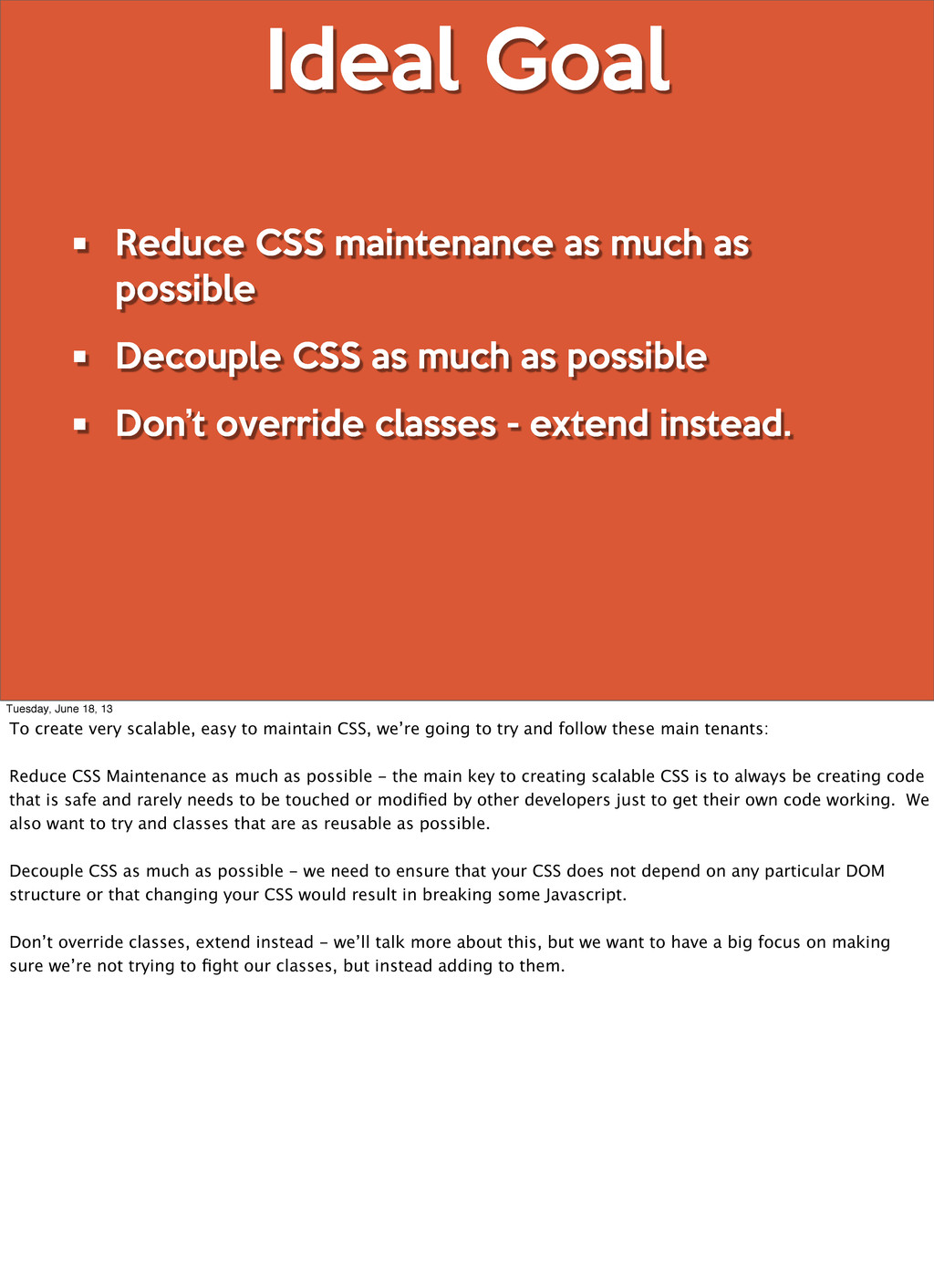
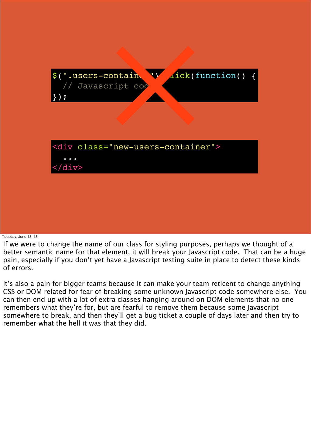
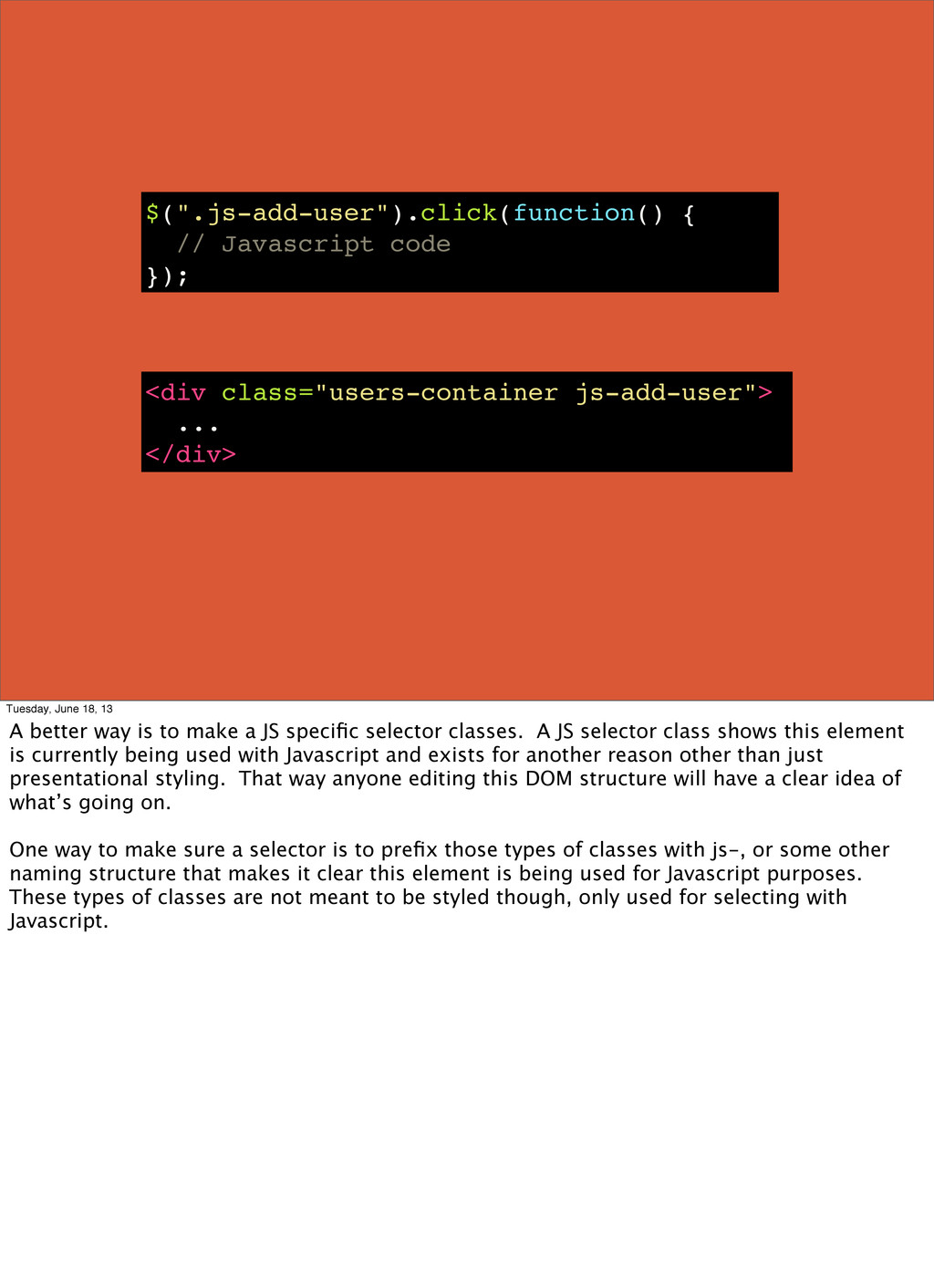
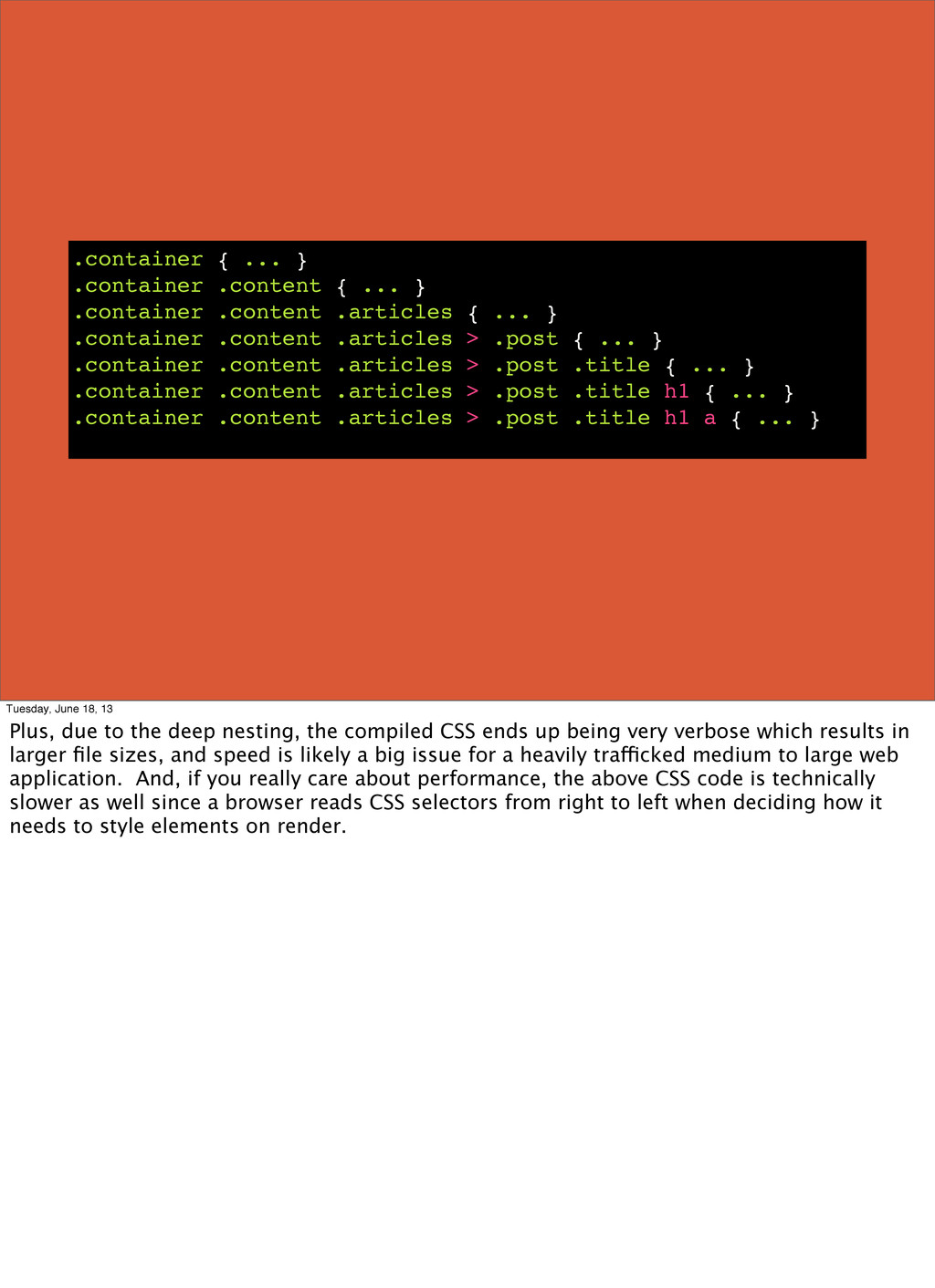
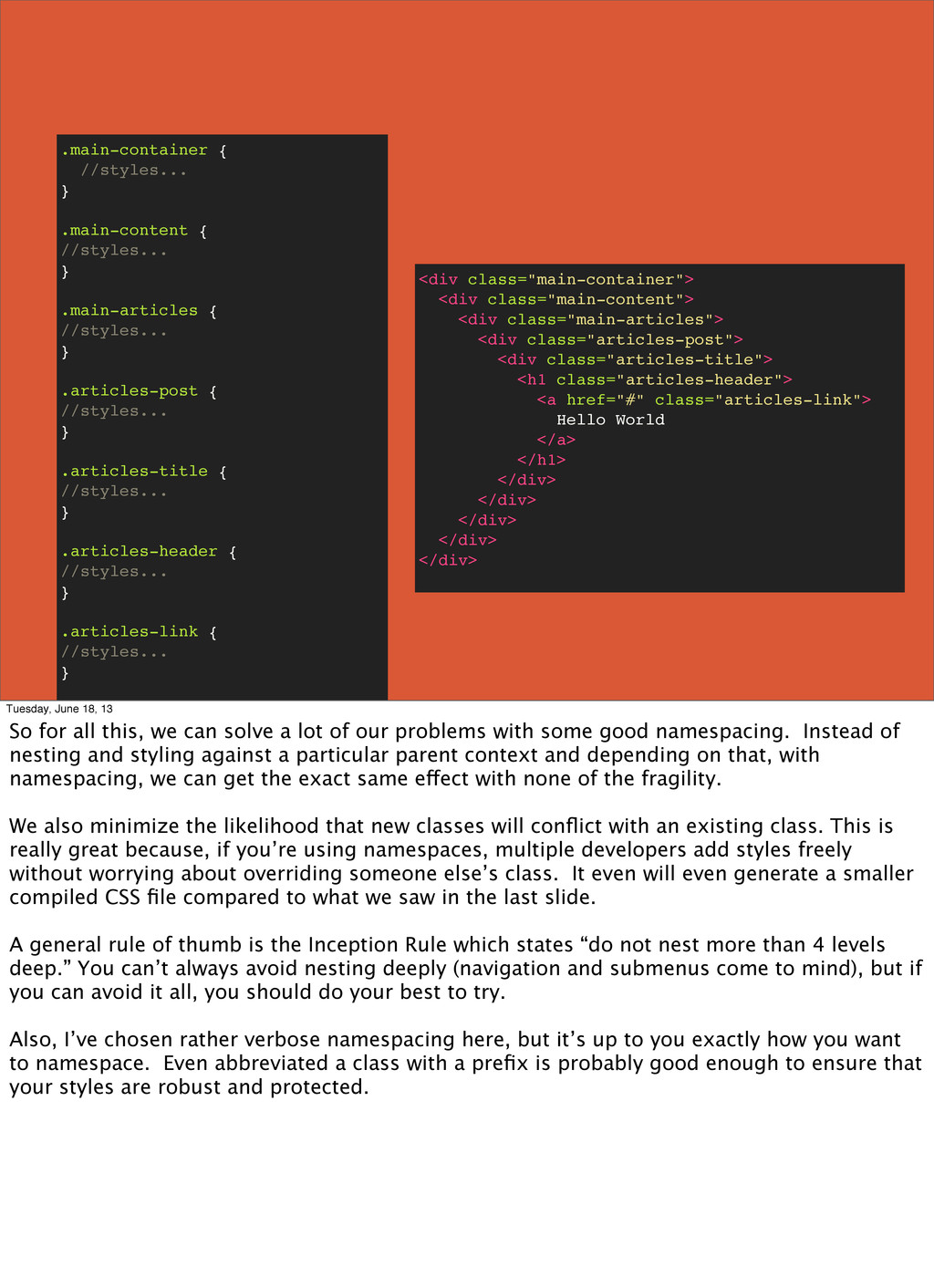
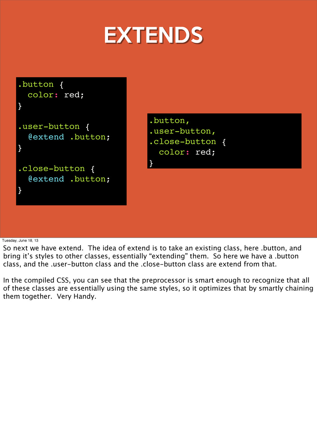
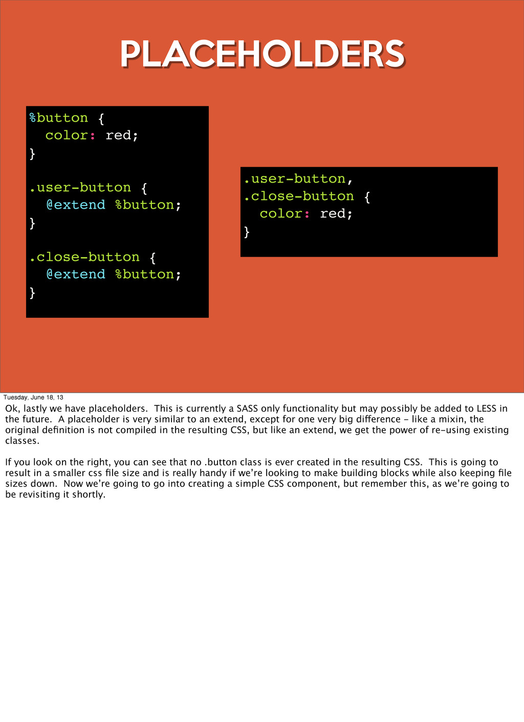
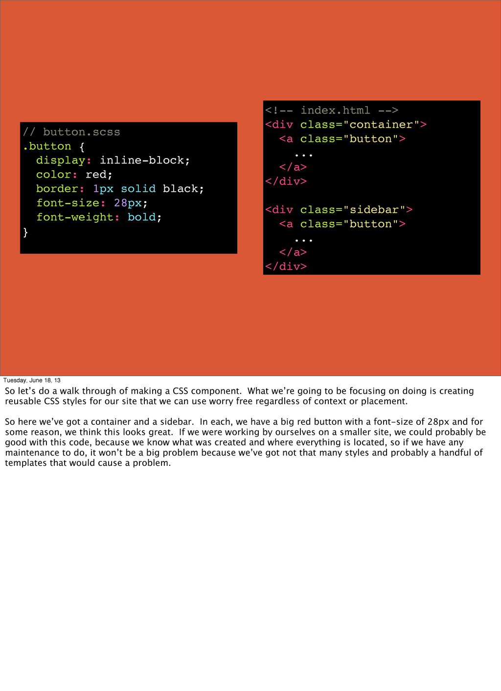
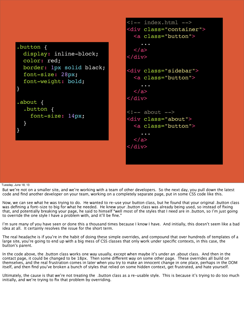
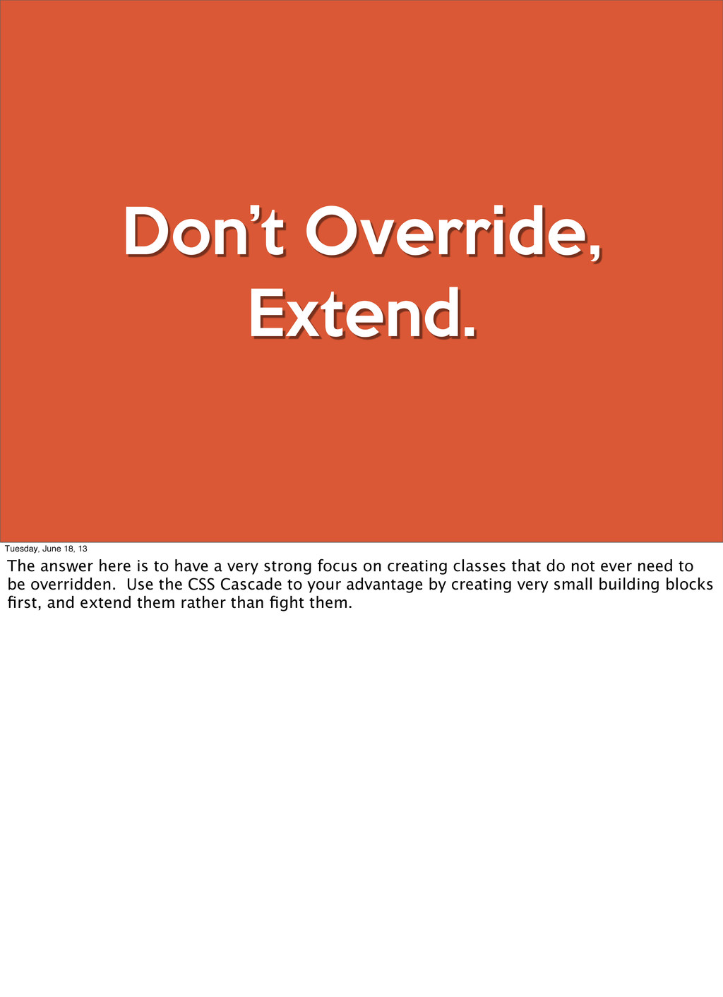
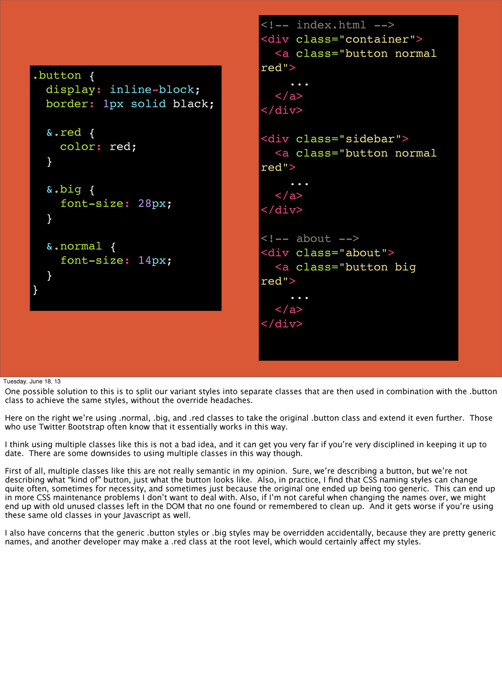
    <div class="sidebar"> <a class="button"> ... </a> </div> <!-- about --> <div class="about"> <a class="button"> ... </a> </div> .button { display: inline-block; color: red; border: 1px solid black; font-size: 28px; font-weight: bold; } .about { .button { font-size: 14px; } } Tuesday, June 18, 13 But we’re not on a smaller site, and we’re working with a team of other developers. So the next day, you pull down the latest code and find another developer on your team, working on a completely separate page, put in some CSS code like this. Now, we can see what he was trying to do. He wanted to re-use your button class, but he found that your original .button class was defining a font-size to big for what he needed. He knew your .button class was already being used, so instead of fixing that, and potentially breaking your page, he said to himself “well most of the styles that I need are in .button, so I’m just going to override the one style I have a problem with, and it’ll be fine.” I’m sure many of you have seen or done this a thousand times because I know I have. And initially, this doesn’t seem like a bad idea at all. It certainly resolves the issue for the short term. The real headache is if you’re in the habit of doing these simple overrides, and compound that over hundreds of templates of a large site, you’re going to end up with a big mess of CSS classes that only work under specific contexts, in this case, the button’s parent. In the code above, the .button class works one way usually, except when maybe it’s under an .about class. And then in the contact page, it could be changed to be 18px. Then some different way on some other page. These overrides all build on themselves, and the real frustration comes in later when you try to make an innocent change in one place, perhaps in the DOM itself, and then find you’ve broken a bunch of styles that relied on some hidden context, get frustrated, and hate yourself. Ultimately, the cause is that we’re not treating the .button class as a re-usable style. This is because it’s trying to do too much initially, and we’re trying to fix that problem by overriding.
  30. Don’t Override, Extend. Tuesday, June 18, 13 The answer here

    is to have a very strong focus on creating classes that do not ever need to be overridden. Use the CSS Cascade to your advantage by creating very small building blocks first, and extend them rather than fight them.
  31. <!-- index.html --> <div class="container"> <a class="button normal red"> ...

    </a> </div> <div class="sidebar"> <a class="button normal red"> ... </a> </div> <!-- about --> <div class="about"> <a class="button big red"> ... </a> </div> .button { display: inline-block; border: 1px solid black; &.red { color: red; } &.big { font-size: 28px; } &.normal { font-size: 14px; } } Tuesday, June 18, 13 One possible solution to this is to split our variant styles into separate classes that are then used in combination with the .button class to achieve the same styles, without the override headaches. Here on the right we’re using .normal, .big, and .red classes to take the original .button class and extend it even further. Those who use Twitter Bootstrap often know that it essentially works in this way. I think using multiple classes like this is not a bad idea, and it can get you very far if you’re very disciplined in keeping it up to date. There are some downsides to using multiple classes in this way though. First of all, multiple classes like this are not really semantic in my opinion. Sure, we’re describing a button, but we’re not describing what “kind of” button, just what the button looks like. Also, in practice, I find that CSS naming styles can change quite often, sometimes for necessity, and sometimes just because the original one ended up being too generic. This can end up in more CSS maintenance problems I don’t want to deal with. Also, if I’m not careful when changing the names over, we might end up with old unused classes left in the DOM that no one found or remembered to clean up. And it gets worse if you’re using these same old classes in your Javascript as well. I also have concerns that the generic .button styles or .big styles may be overridden accidentally, because they are pretty generic names, and another developer may make a .red class at the root level, which would certainly affect my styles.
  32. Program to a DOM Interface Tuesday, June 18, 13 To

    avoid this, my current solution to that is to create a semantic DOM that acts as an interface for my styles, which I believe is the way that CSS was intended to be. Here’s an example of what I mean.
  33. <!-- about.html --> <div class="about"> <a class="about-button"> ... </a> </div>

    // button.scss %button { display: inline-block; border: 1px solid black; } %button-red { @extend %button; color: red; } %button-normal { @extend %button; font-size: 14px; } ... // about.scss .about-button { @extend %button-normal; } Tuesday, June 18, 13 So here, we made a %button placeholder that we’re extending into other SASS placeholders of the varying classes we want. Then, in the .about-button, we’re extending the exact button style we want. This way, we can create the various classes we need from a base class, keep things very simple and extensible, and also create the same effect of using multiple classes while still being decoupled from the DOM. Our DOM ends up staying semantic, like it should be, and if we need to change some styling in the future, we really don’t need to touch the DOM at all. This is really nice because we end up having to edit fewer files to do our work, and our DOM ends up being more stable as a result. Also, everything related to styling truly stays in the CSS file where it belongs. Another really nice touch to this pattern is that by focusing on not overriding, and extending our styles with SASS, we essentially create our own CSS styleguide for free. We can have button.scss or nav.scss or table.scss fiels that explicitly state in code what sort of styles are available for all developers to use. Throw some commenting in there, and you’ve got a guide your team can use together to ensure you’re all programming consistently and with the same resuable styles.