Upgrade to Pro — share decks privately, control downloads, hide ads and more …

SPoTvis: A Geovisual Analytics Tool for Discovering Multi-Scale Spatial Patterns in Tweets Surrounding the 2013 US Government Shutdown

SPoTvis: A Geovisual Analytics Tool for Discovering Multi-Scale Spatial Patterns in Tweets Surrounding the 2013 US Government Shutdown

Jonathan Nelson, Penn State University
Sterling Quinn, Penn State University
Brian Swedberg, Penn State University
Wanghuan Chu, Penn State University
Maggie Houchen, Penn State University
Todd Bodnar, Penn State University
Alan M. MacEachren, Penn State University

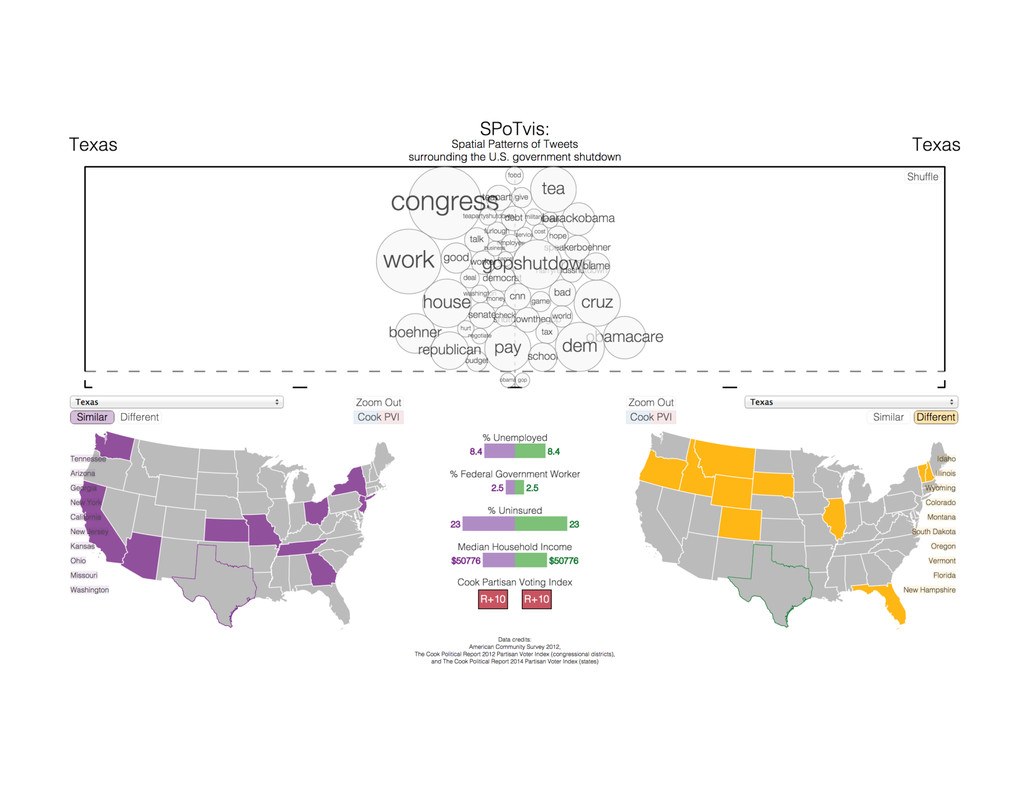
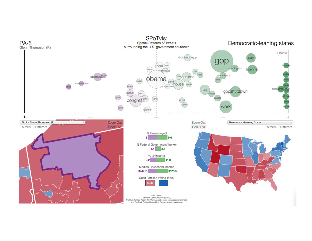
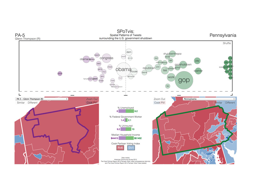
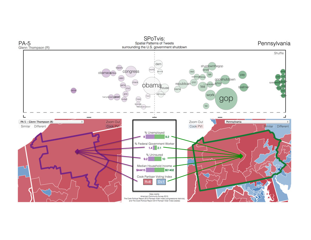
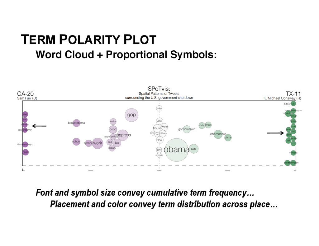
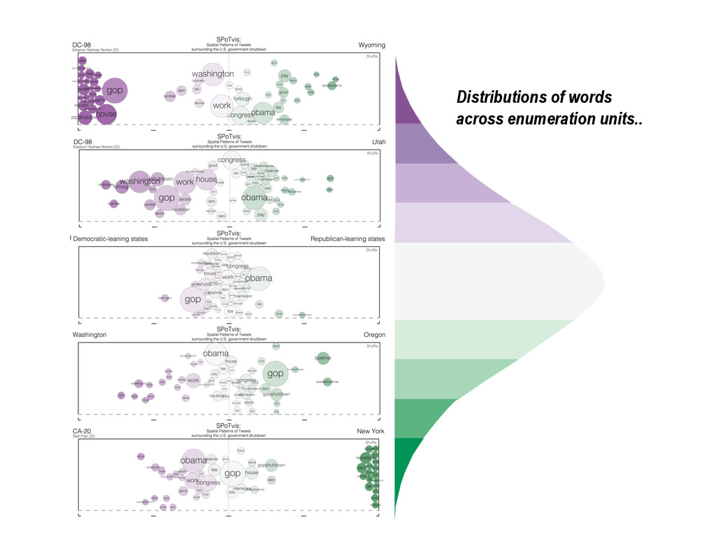
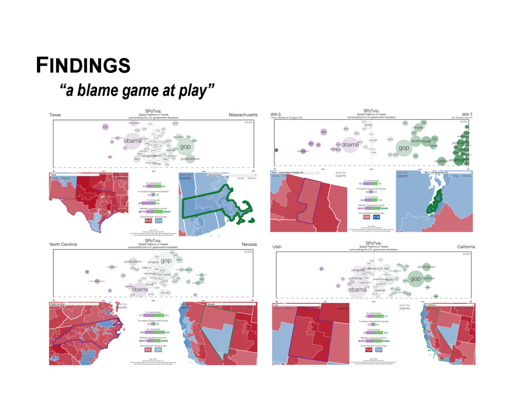
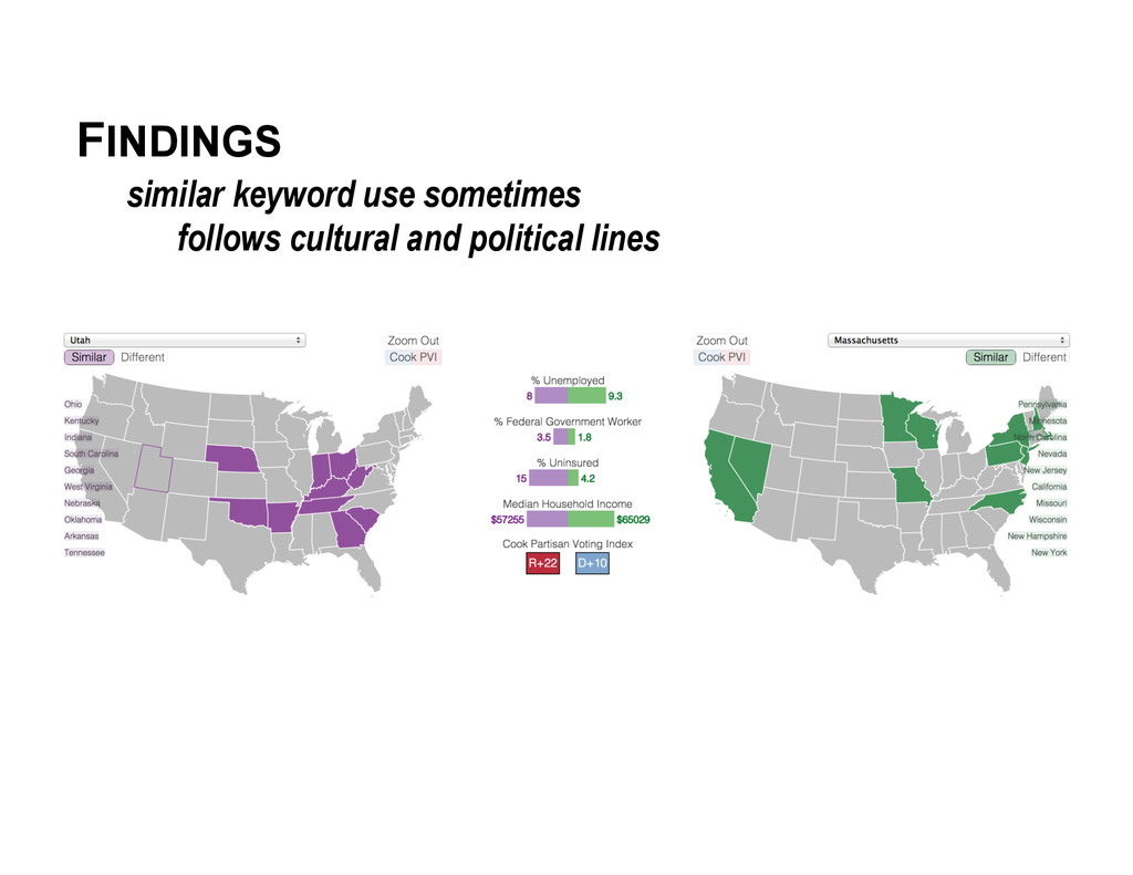
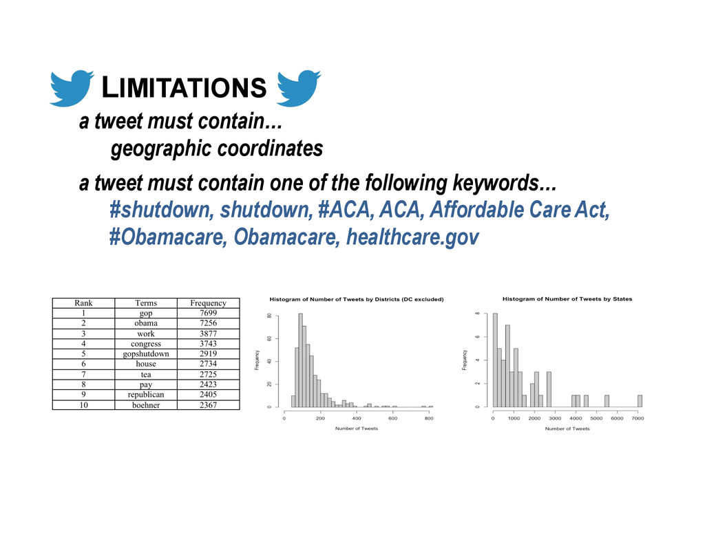
In October 2013, the US Congressional debate over allocation of funds to the Patient Protection and Affordable Care Act (commonly known as the ACA or 'Obamacare') culminated in a 16-day government shutdown. Meanwhile the online health insurance marketplace related to the ACA was making a public debut hampered by performance and functionality problems. Messages on Twitter during this time period included sharply divided opinions about these events, with many people angry about the shutdown and others supporting the delay of the ACA implementation. We introduce SPoTvis, a web-based geovisual analytics tool for exploring Twitter messages (or 'tweets') collected about the shutdown. Using an interactive map connected to a term polarity plot, users can compare the dominant subthemes of tweets in any two states or congressional districts. Demographic attributes and political information on the display, coupled with functionality to show (dis)similar features, enrich users' understandings of the units being compared.

Nathaniel V. KELSO

October 09, 2014
Tweet

More Decks by Nathaniel V. KELSO

Other Decks in Design

Transcript

  1. SPoTvis: A Geovisual Analytics Tool for Discovering Multi-Scale Spatial Patterns

    in Tweets Surrounding the 2013 US Government Shutdown Jonathan K. Nelson, Sterling Quinn, Brian Swedberg, Wanghuan Chu, Maggie Houchen, Todd Bodnar, Alan M. MacEachren
  2. VISUAL ANALYTICS Definition:! “science of analytical reasoning facilitated by interactive

    visual interfaces” “combination of automated analysis techniques with interactive visualizations to support effective understanding, reasoning, and decision making on the basis of very large and complex datasets” Thomas,  J.J.  and  Cook,  K.A.,  editors  2005:  Illumina<ng  the  Path:  The  Research  and  Development  Agenda  for  Visual   Analy<cs.  Los  Alamos,  CA:  IEEE  Computer  Society.;  Keim,  Daniel,  et  al.  Visual  analy<cs:  Defini<on,  process,  and  challenges.   Springer  Berlin  Heidelberg,  2008.  
  3. VISUAL ANALYTICS Purpose: enable insight discovery! "The possibilities to collect

    and store data increase at a faster rate than our ability to use it for making decisions." But, raw data have no value… Keim,  Daniel,  et  al.  Visual  analy<cs:  Defini<on,  process,  and  challenges.  Springer  Berlin  Heidelberg,  2008.   information overload!
  4. VISUAL ANALYTICS Goal: create tools to…! •  synthesize information and

    derive insight from massive, dynamic, ambiguous, and conflicting data •  detect the expected and discover the unexpected •  provide timely, definable, and understandable assessments •  communicate assessment effectively for action Keim,  Daniel,  et  al.  Visual  analy<cs:  Defini<on,  process,  and  challenges.  Springer  Berlin  Heidelberg,  2008.  
  5. VISUAL ANALYTICS Challenges:! •  Scaling humans to cope with big

    data and complex problems •  Data volume, dimensionality, and heterogeneity •  Quality of data and graphical representation •  Visual representation and level of detail •  Interface Design •  Evaluation •  Infrastructure Keim,  Daniel,  et  al.  Visual  analy<cs:  Defini<on,  process,  and  challenges.  Springer  Berlin  Heidelberg,  2008.  
  6. TERM POLARITY PLOT Word Cloud + Proportional Symbols:! Font and

    symbol size convey cumulative term frequency… Placement and color convey term distribution across place…
  7. TERM POLARITY PLOT Word Cloud + Proportional Symbols:! Font and

    symbol size convey cumulative term frequency… Placement and color convey term distribution across space…
  8. TERM POLARITY PLOT Word Cloud + Proportional Symbols:! Font and

    symbol size convey cumulative term frequency… Placement and color convey term distribution across place…
  9. TERM POLARITY PLOT Inspiration +! Milgram,  Stanley,  "Psychological  maps  of

     Paris,"  Environmental  Psychology:  People  and  their  Physical  SeRngs,  pp.  104-­‐124,  1976;  Funkhouser,  HG,  &  Walker,   HM  (1935).  Playfair  and  his  charts  .  MacMillan  and  Company.  Bostock,  Mike,  Shan  Carter,  and  Ma`hew  Ericson,  “At  the  Na<onal  Conven<ons,  the  Words   They  Used,”  New  York  Times,  September  6,  2012.     Collective mental map of place names in Paris, Stanley Milgram’s, 1976. Scaling circle size relative to country area, William Playfair’s, 1801 Integrating word clouds and proportional symbols, Mike Bostock et al., 2012. =!
  10. LIMITATIONS a tweet must contain… geographic coordinates a tweet must

    contain one of the following keywords… #shutdown, shutdown, #ACA, ACA, Affordable Care Act, #Obamacare, Obamacare, healthcare.gov
  11. USER STUDY a call for participants… Part 1: Interact with

    SPoTvis at your convenience. Create a role for yourself (e.g. politician, political scientist, journalist, etc.) and explore the data from the perspective of that role. Based on that role, write a short essay documenting interesting findings. Part 2: Follow-up online survey to assess the design, functionality, and future applications of SPoTvis.
  12. ACKNOWLEDGEMENTS This work was supported by the National Science Foundation

    under IGERT Award #DGE- 1144860, Big Data Social Science, and Pennsylvania State University.