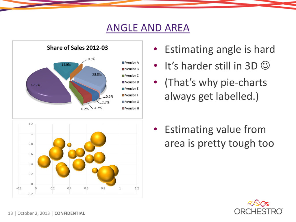
• The bar chart • Easy to read (even without the data labels) • Easy to identify which Vendor is associated with each bar • Provides much more data in the same space It just works… why ?
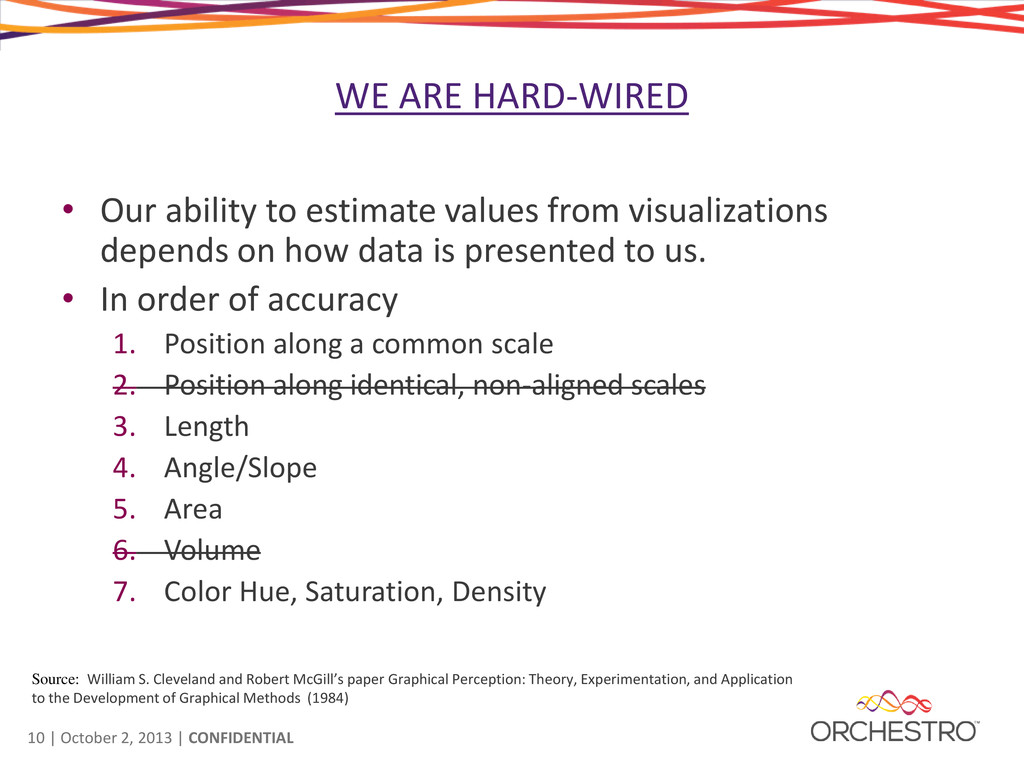
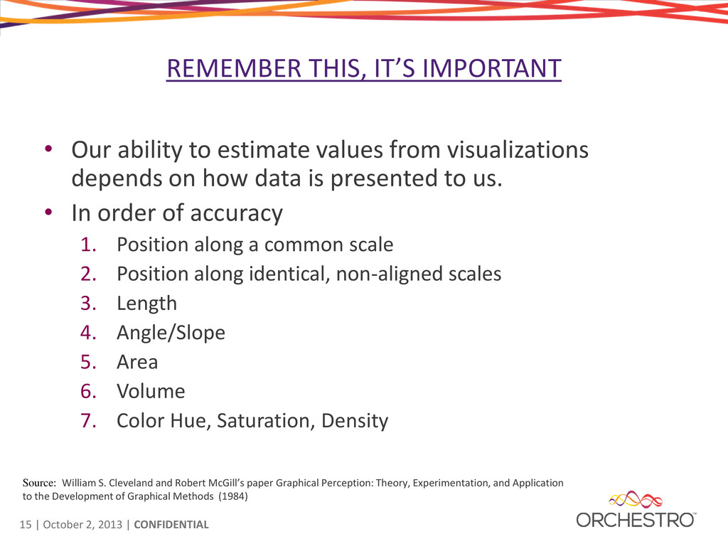
• Our ability to estimate values from visualizations depends on how data is presented to us. • In order of accuracy 1. Position along a common scale 2. Position along identical, non-aligned scales 3. Length 4. Angle/Slope 5. Area 6. Volume 7. Color Hue, Saturation, Density Source: William S. Cleveland and Robert McGill’s paper Graphical Perception: Theory, Experimentation, and Application to the Development of Graphical Methods (1984)
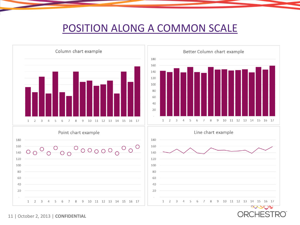
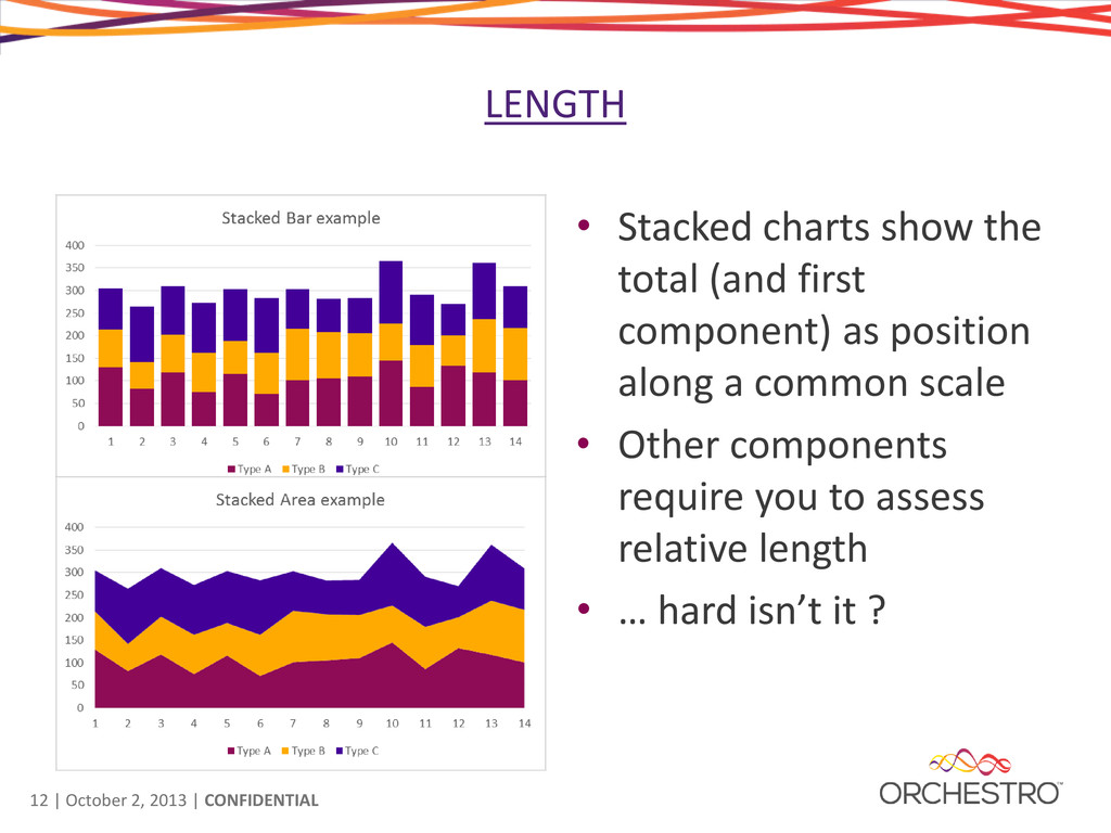
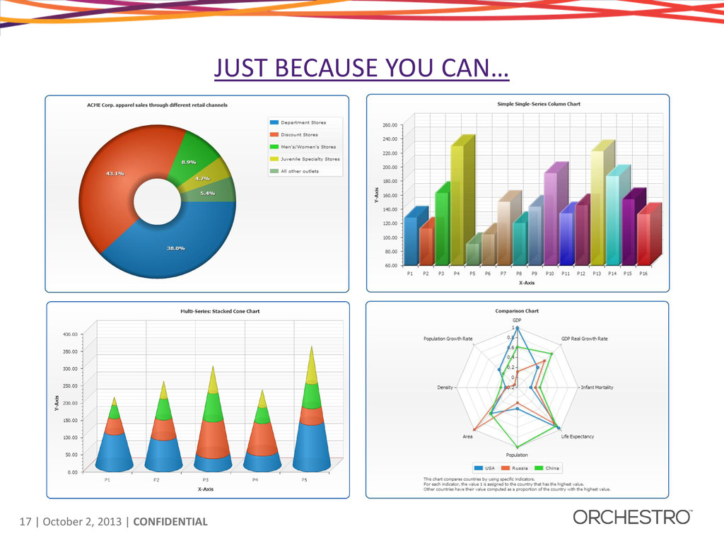
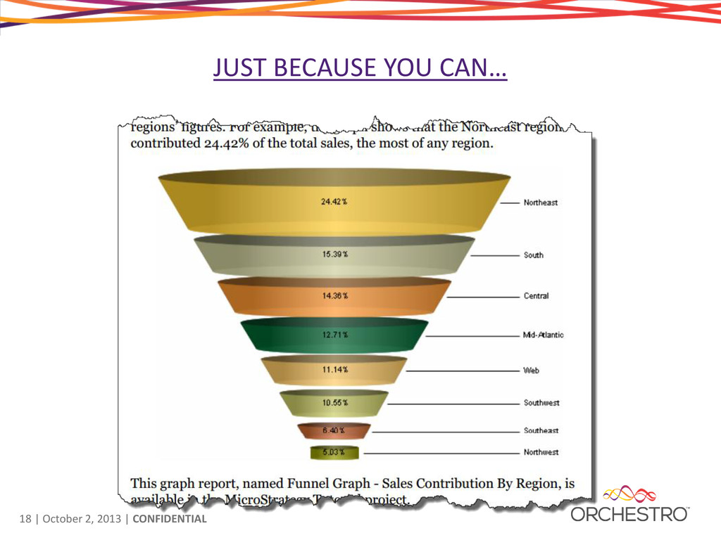
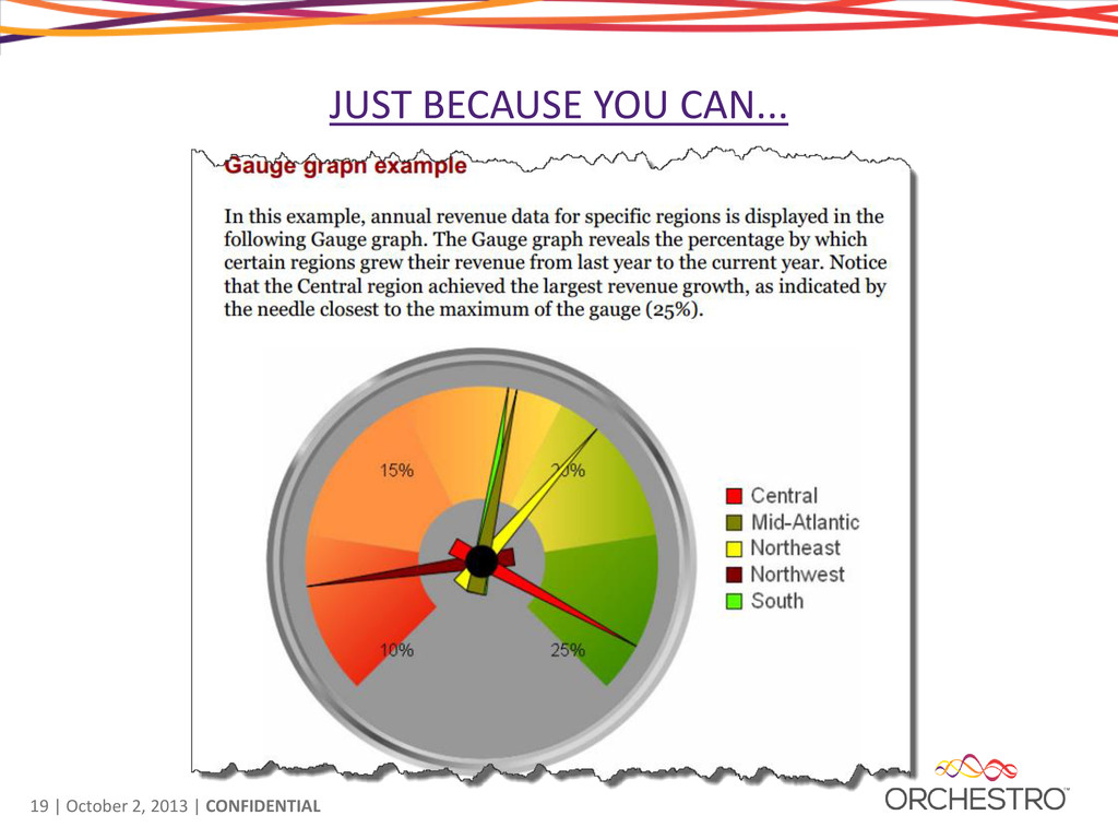
charts show the total (and first component) as position along a common scale • Other components require you to assess relative length • … hard isn’t it ?
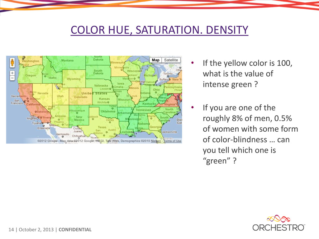
DENSITY • If the yellow color is 100, what is the value of intense green ? • If you are one of the roughly 8% of men, 0.5% of women with some form of color-blindness … can you tell which one is “green” ?
IMPORTANT • Our ability to estimate values from visualizations depends on how data is presented to us. • In order of accuracy 1. Position along a common scale 2. Position along identical, non-aligned scales 3. Length 4. Angle/Slope 5. Area 6. Volume 7. Color Hue, Saturation, Density Source: William S. Cleveland and Robert McGill’s paper Graphical Perception: Theory, Experimentation, and Application to the Development of Graphical Methods (1984)
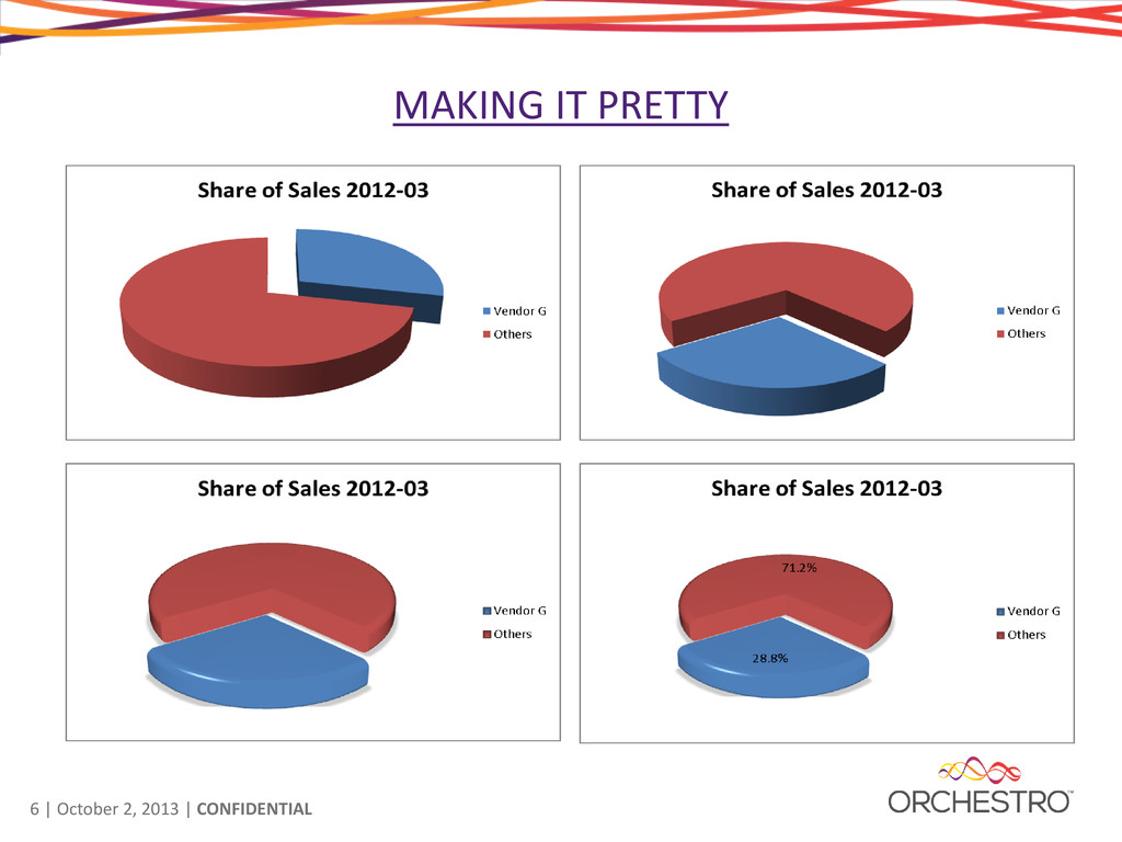
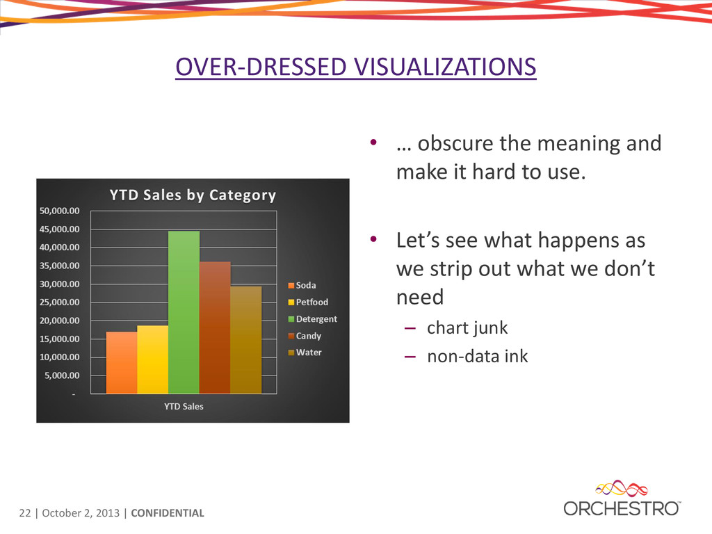
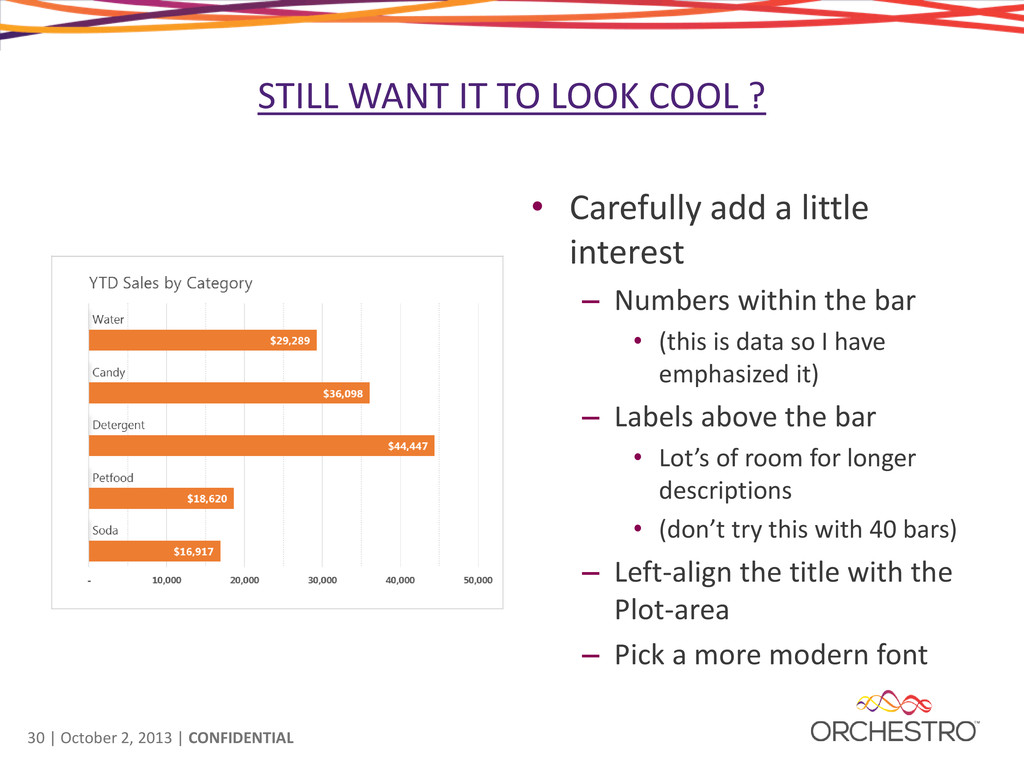
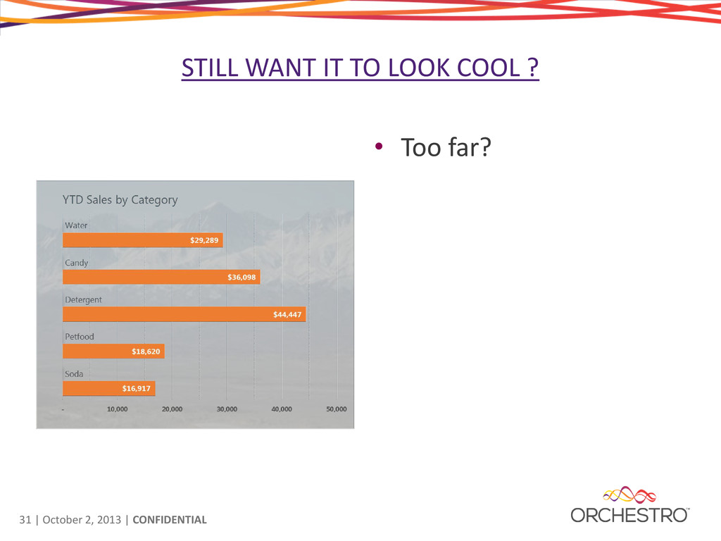
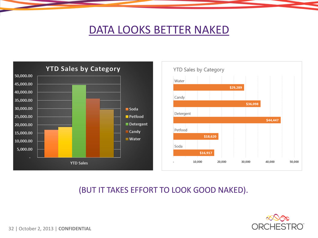
TO LOOK COOL ? • Carefully add a little interest – Numbers within the bar • (this is data so I have emphasized it) – Labels above the bar • Lot’s of room for longer descriptions • (don’t try this with 40 bars) – Left-align the title with the Plot-area – Pick a more modern font
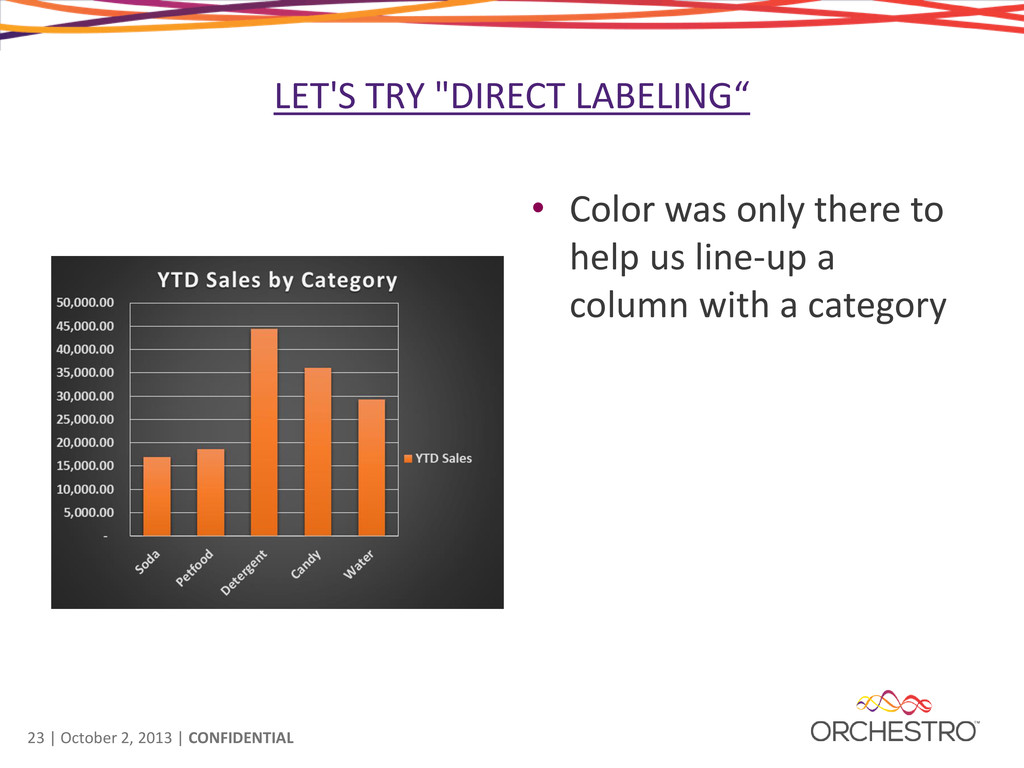
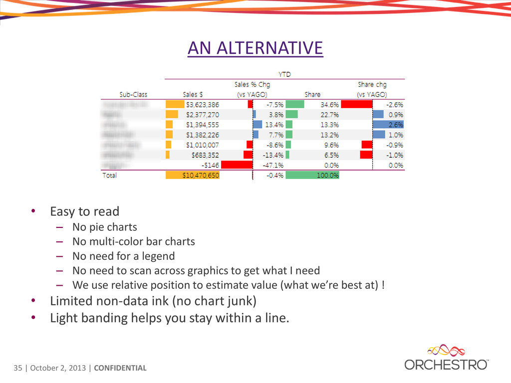
Easy to read – No pie charts – No multi-color bar charts – No need for a legend – No need to scan across graphics to get what I need – We use relative position to estimate value (what we’re best at) ! • Limited non-data ink (no chart junk) • Light banding helps you stay within a line.
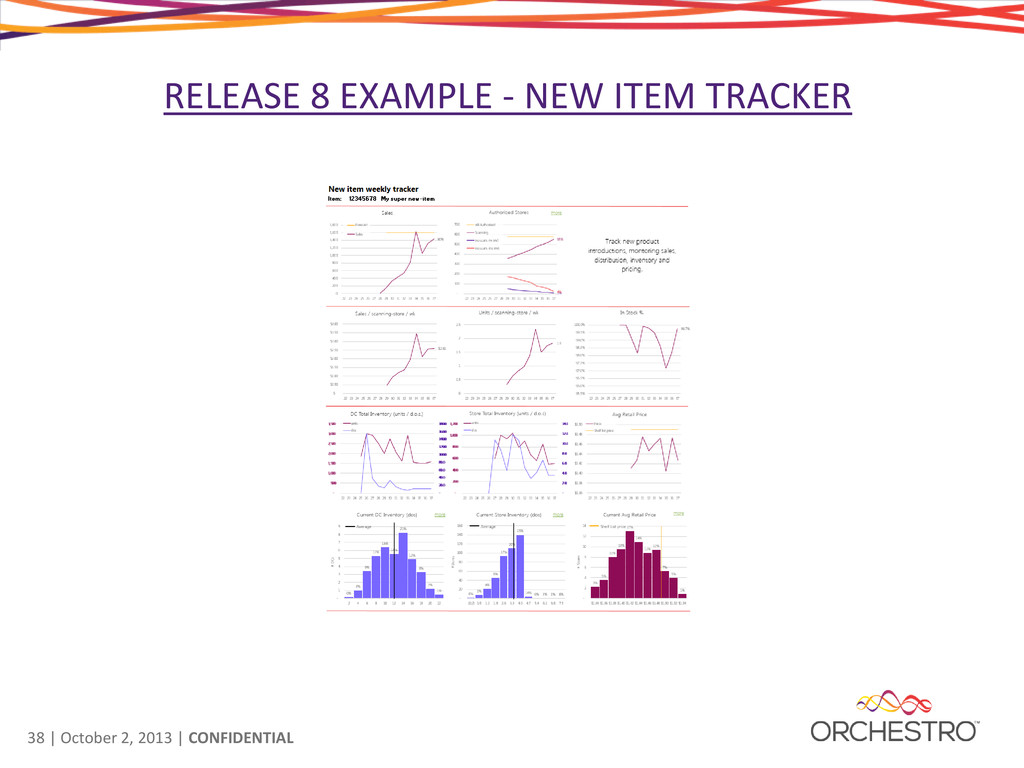
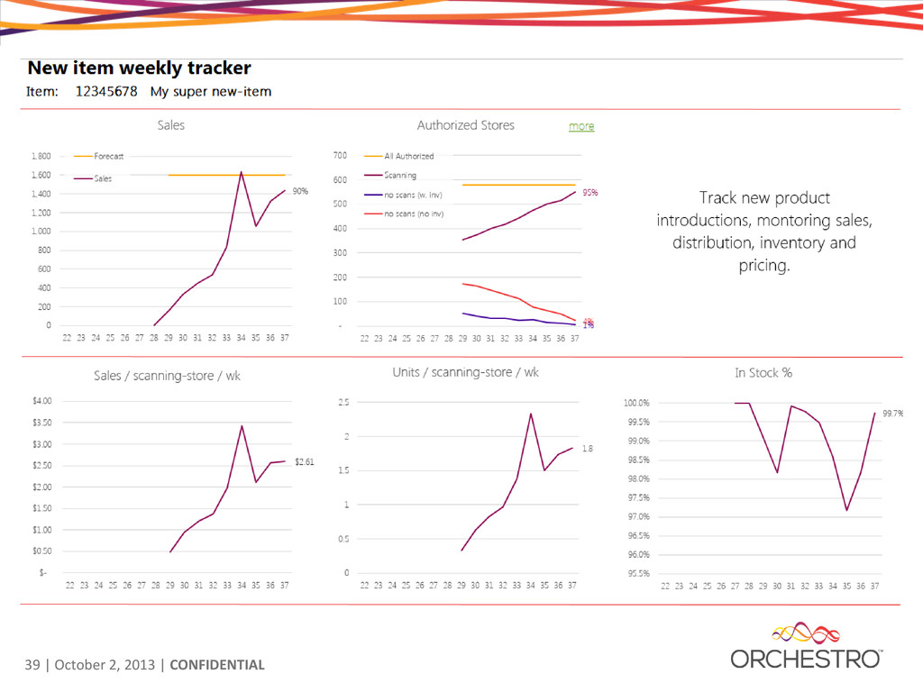
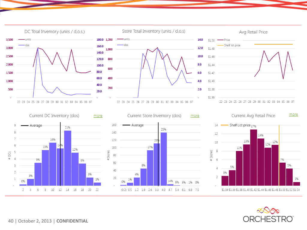
REPORTS • Orchestro Release 8 includes a number of standard report templates. – Designed to clear visualization guidelines – Have a clear purpose – No unnecessary “chart junk” – They just work.