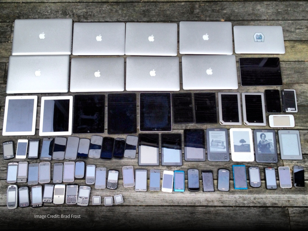
should be accessible from any kind of hardware that can connect to the Internet: stationary or mobile, small screen or large. Long Live the Web: A Call for Continued Open Standards and Neutrality — Tim Berners-Lee
really, really need to get a Retina MacBook Pro so you can see how bad your site looks on it and fix it. twitter.com/marcoarment/status/220968507117015040
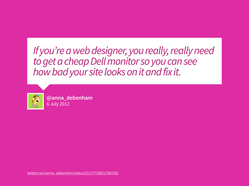
really, really need to get a cheap Dell monitor so you can see how bad your site looks on it and fix it. twitter.com/anna_debenham/status/221277339517067265
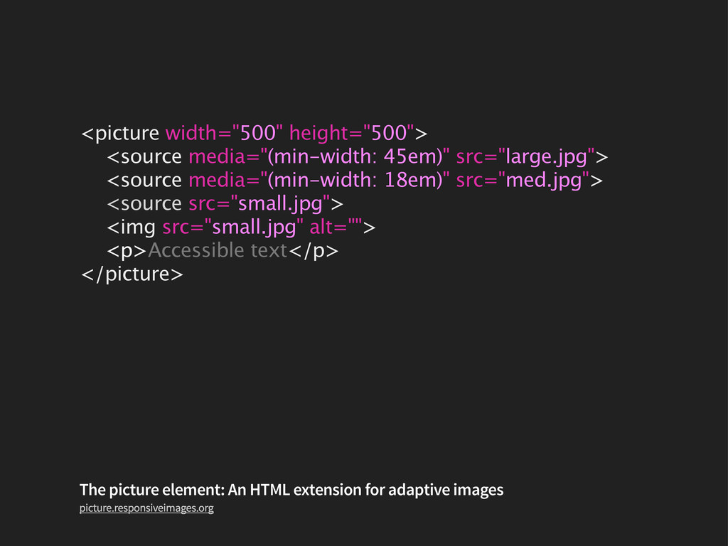
src="med.jpg"> <source src="small.jpg"> <img src="small.jpg" alt=""> <p>Accessible text</p> </picture> The picture element: An HTML extension for adaptive images picture.responsiveimages.org
inherently flexible nature of the web. Just because something works at one size doesn’t mean the same ratio will be appropriate at larger or smaller sizes. Baseline Grids on the Web — Jason Santa Maria
 paulrobertlloyd
 yomtsu
 sms_tech
 tmtgtkhs
 nicholaspegu
 amishiratori
 otanet
 mastervicedesign
 stmn
stmn
 storyartist
 aokashi
 takumasaito
 kiyoshifuwa
 destraynor
 samanthasiow
 jlugia
 panda_program
 pauljervisheath
 akosma
 csswizardry
 dougneiner
 aki_iinuma
 mongodb
 michaelherold