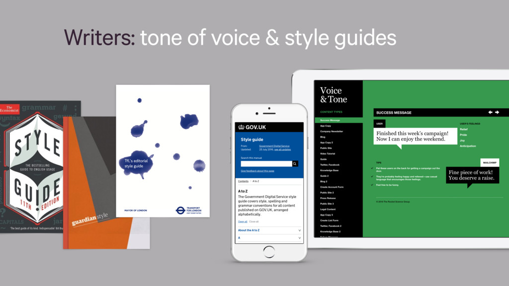
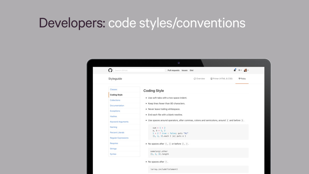
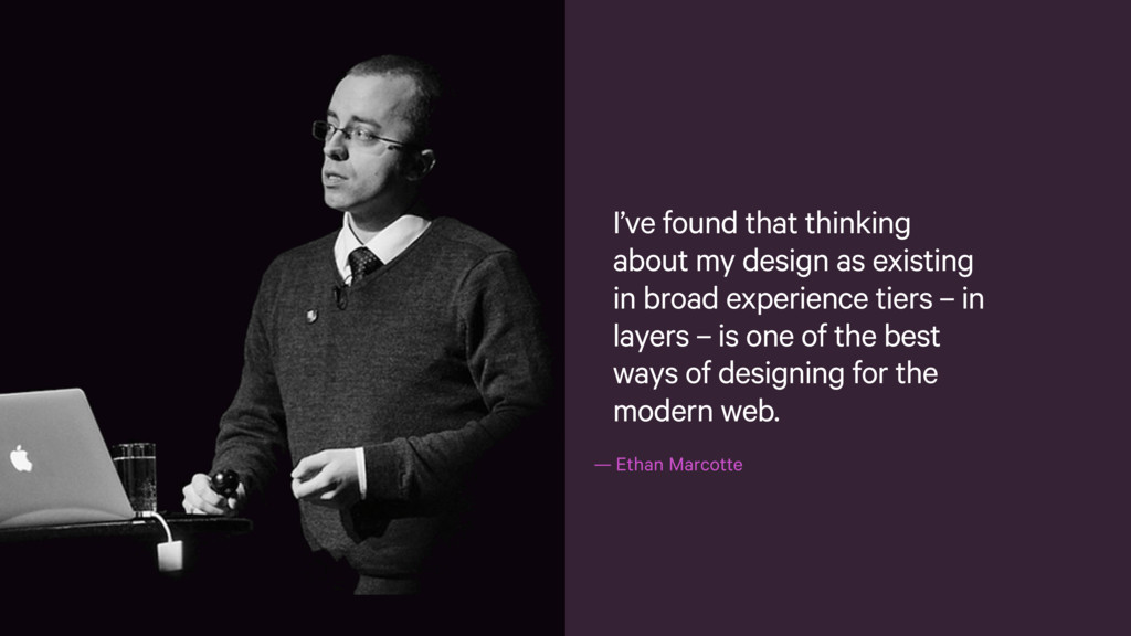
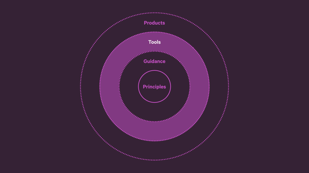
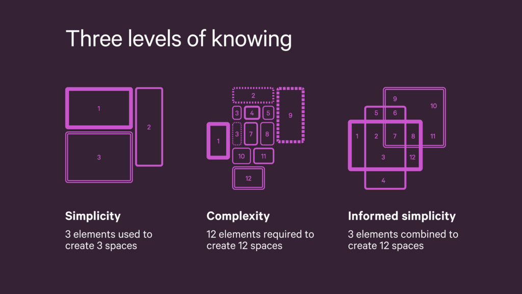
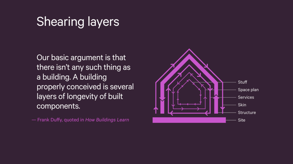
As our lives grow increasingly reliant on digital products, designers are asked to deliver coherent experiences across a multitude of platforms, all without sacrificing development efficiency and maintainability. To answer this need, our industry has looked to style guides, pattern libraries and front-end frameworks. Yet, without considering the audiences that will use them, they could do more harm than good.
 paulrobertlloyd
 aokashi
 atsushihomma
 natsuume
 goodpatch
 artcloudyu
 gakuoya
 kaitou
 tkhr_kws
.jpg) kamy0042
kamy0042
 mastervicedesign
 kakukoki
 ikeyatsu
 cassininazir
 yeseniaperezcruz
 morganepeng
 smashingmag
 hatefulcrawdad
 chrislema
 addyosmani
 destraynor
 mclloyd
 swwweet
 tanoku
 marktimemedia
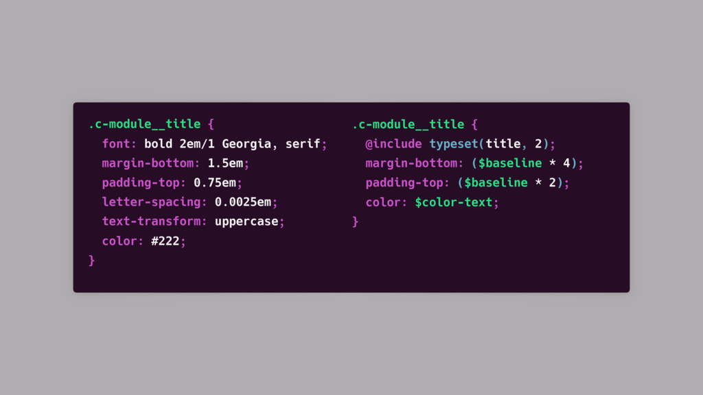
![.c-[module-name] {…} .c-[module-name]__body {…} // Header .c-[module-name]__header {…} .c-[module-name]__title {…}](https://files.speakerdeck.com/presentations/86b2365812f747bbbd10910c3f17d683/slide_37.jpg)