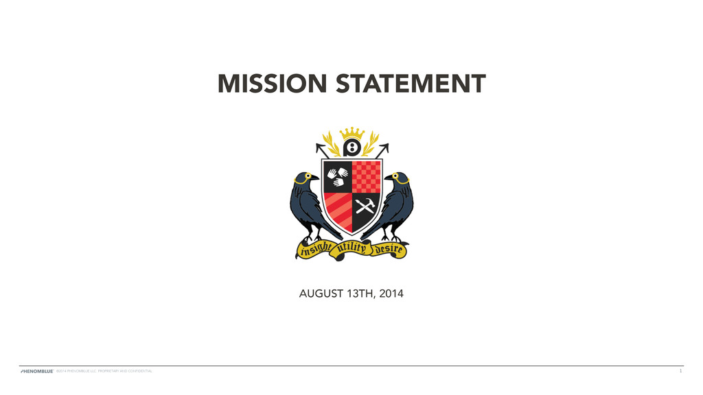
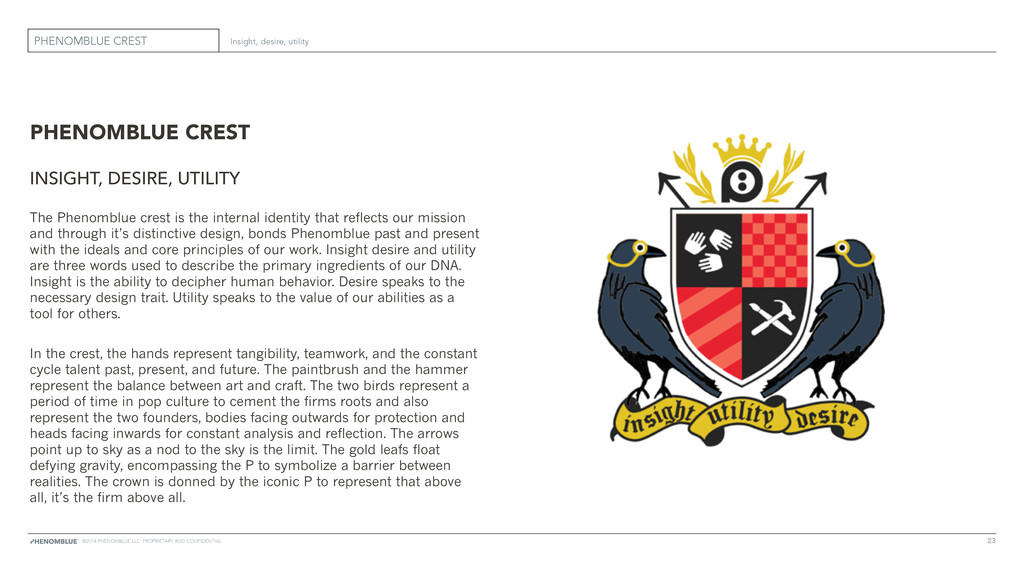
UTILITY The Phenomblue crest is the internal identity that reflects our mission and through it’s distinctive design, bonds Phenomblue past and present with the ideals and core principles of our work. Insight desire and utility are three words used to describe the primary ingredients of our DNA. Insight is the ability to decipher human behavior. Desire speaks to the necessary design trait. Utility speaks to the value of our abilities as a tool for others. In the crest, the hands represent tangibility, teamwork, and the constant cycle talent past, present, and future. The paintbrush and the hammer represent the balance between art and craft. The two birds represent a period of time in pop culture to cement the firms roots and also represent the two founders, bodies facing outwards for protection and heads facing inwards for constant analysis and reflection. The arrows point up to sky as a nod to the sky is the limit. The gold leafs float defying gravity, encompassing the P to symbolize a barrier between realities. The crown is donned by the iconic P to represent that above all, it’s the firm above all. ©2014 PHENOMBLUE LLC. PROPRIETARY AND CONFIDENTIAL