Responsive design is not just set of techniques or design rules, it’s more of a new mindset. If put into action properly, designing responsive sites will provide an entirely new perspective. Let me show you what I mean…
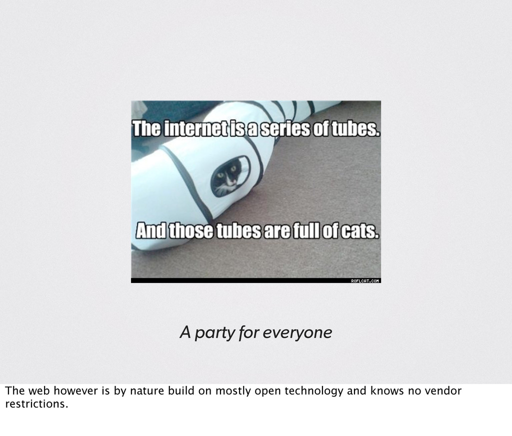
direct opposite of the web. Uses mostly closed and proprietary technology and doesn’t deal with vendors which is in part reason for it’s unprecedented success [EXPLAIN].
the responsible (as in being *) developers. We have to deal with X different vendors and then different versions of everything: OS, Browser, plugins, mark–up/CSS specs, …
— Stephanie Rieger, ALA The web has become ubiquitous, it’s everywhere and on every device. And each of these devices comes with it’s own set of “rules”.
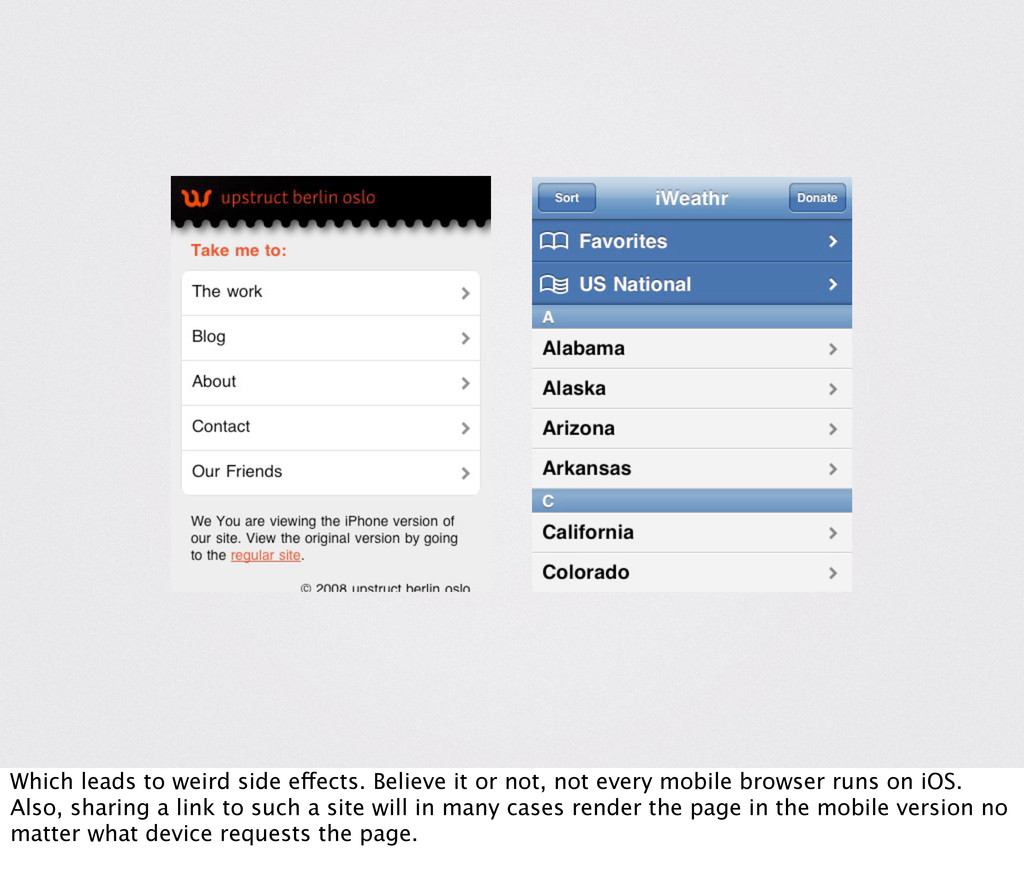
not every mobile browser runs on iOS. Also, sharing a link to such a site will in many cases render the page in the mobile version no matter what device requests the page.
good as hoped? —The web does not leap in big jumps forward. It gradually evolves: Despite what we have been told: * Not all publishing moved to digital. * We’re not browsing the web only on mobile devices. / [EXPLAIN theory of niches, using physical books]
evolves steadily, rapid change is rarely seen and real innovation is rare. Even rarer is innovation based on existing tools so clever and so painfully obvious… [EXPLAIN further]
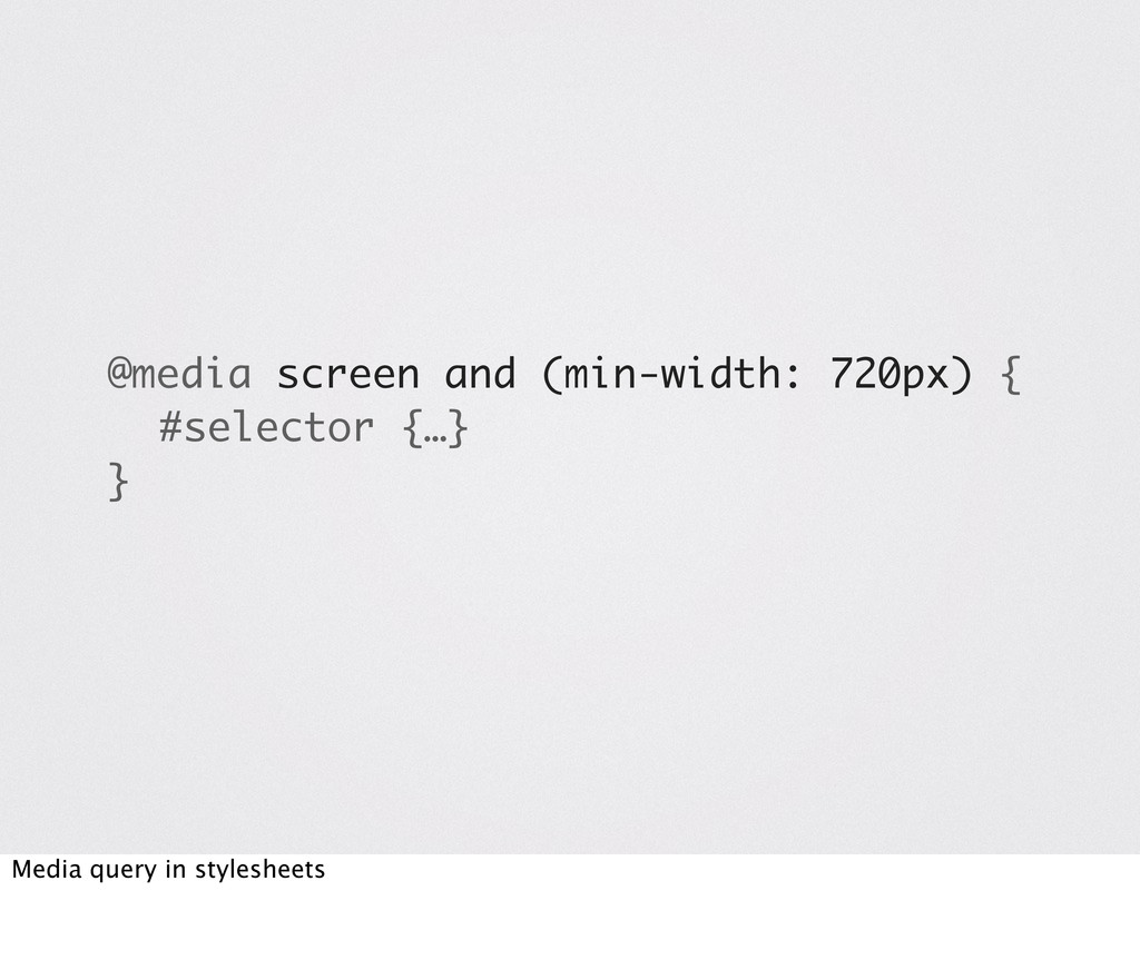
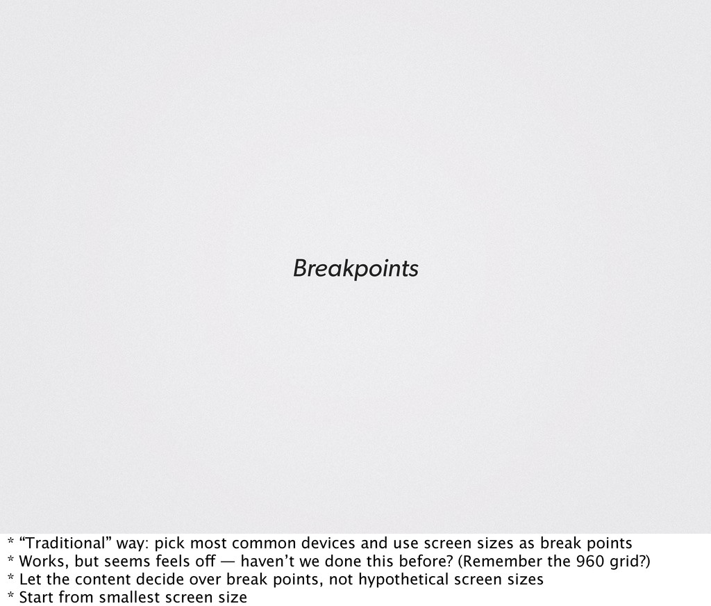
screen sizes as break points * Works, but seems feels off — haven’t we done this before? (Remember the 960 grid?) * Let the content decide over break points, not hypothetical screen sizes * Start from smallest screen size
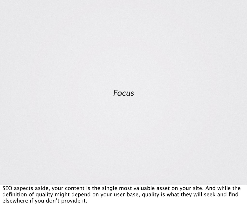
valuable asset on your site. And while the definition of quality might depend on your user base, quality is what they will seek and find elsewhere if you don’t provide it.
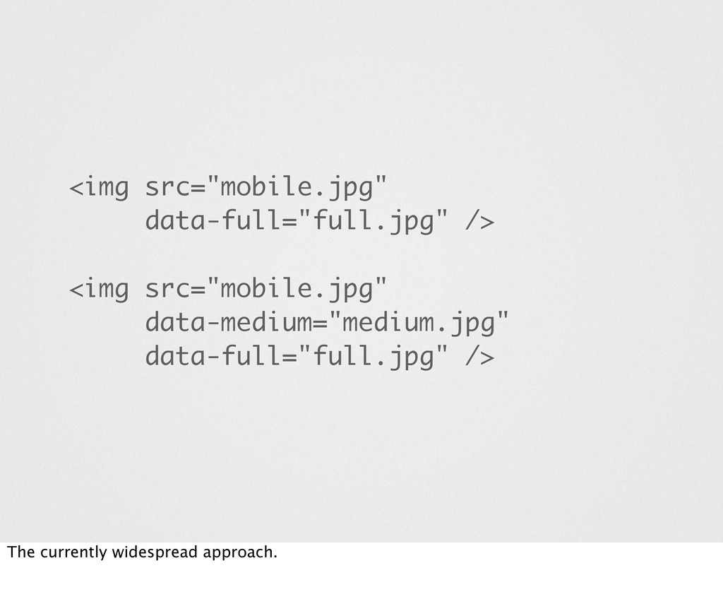
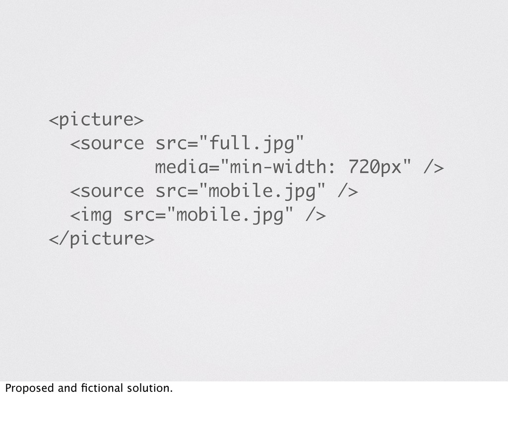
Difficult, no real solution yet. Every existing solution depends either on JS and or cookies. New problem: image prefetching implemented by newer browsers. Flash and overhead.
to "grow up" eventually ** It's okay to abuse stuff to get results when in an early stage ** But in the long run a solution adhering to the provided circumstances needs to be found, especially in an open environment such as the web
 polarblau
 chiemitaki
 ryu1013
 a2k
a2k
 koyaman
 dmattsun
 ajstarks
 kenichiota0711
 ashapiro
 karad
karad
 godlingkogami
 calpin
 uxman
uxman
 aleyda
 soudai
 greggifford
 jonyablonski
 watany
 maltzj
 mlcsv
mlcsv
 palkan
 geoffreycrofte
 elsirapls
 rasmusluckow
 jmmastey