Upgrade to Pro — share decks privately, control downloads, hide ads and more …

Responsive Images In The Wild

r31gN_
July 25, 2016

Responsive Images In The Wild

r31gN_

July 25, 2016
Tweet

More Decks by r31gN_

Other Decks in Technology

Transcript

  1. var codecamper = ‘you’;
 if (codecamper && ‘responsive images’)
 {

    console.log(‘Happy!’); } else
 { console.log(‘Oh no!’);
 }
  2. var codecamper = ‘you’;
 if (codecamper && ‘responsive images’)
 {

    console.log(‘Happy!’); } else
 { console.log(‘Oh no!’);
 }
  3. ‘’Responsive’’ +/- ‘’design’’ • term(s) coined by Ethan Marcotte in

    2010 in an article written for A list apart • a new mindset • invaded by a plethora of devices • break from standard web development process
  4. Responsive design challenges • it’s a must in these days

    • users want the same (if not better) experience • compatibility & A LOT of devices • bandwith, slow connectivity, latency, data traffic plan
  5. Images • visual impact • create & define user emotions

    • art • no img = designer will kill you • a big/ important part of the web
  6. Performance is a must also because... • starting from 2010

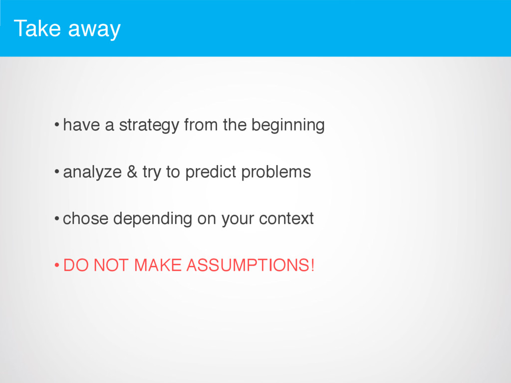
    Google includes loading time in Page Rank • for online businesses every wasted second is lost money • your product is a reflection of who you are as a company/developer/etc.
  7. 47% of users expect a web page to load in

    two seconds
 
 40% of users will abandon a web page if it takes more than three seconds to load
  8. The
 DON’T DO THIS OR I WILL PERSONALLY TRACK YOU

    AND KILL YOU IN YOUR SLEEP
 example
  9. Site summary • no distinction between mobile/desktop images • 285

    requests • 13.6 MB transferred (no cache) • onLoad event after 11s (on cable connection) • 181 images requests = 7.2 MB • it’s OPTIMIZED! (no kidding...)
  10. Main problem Serve the user only what he needs in

    terms of: • bytes • image resolution Also don’t break the layout and keep the site fluid and adaptive
  11. Solution one (CSS) div { background-image: url(img/large.png); @media screen and

    (max-width: 600px) { background-image: url(img/small.png); } }
  12. Advantages • easy to implement • good user control (because

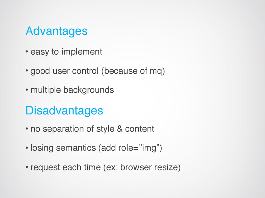
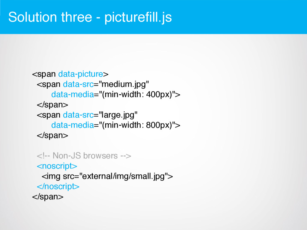
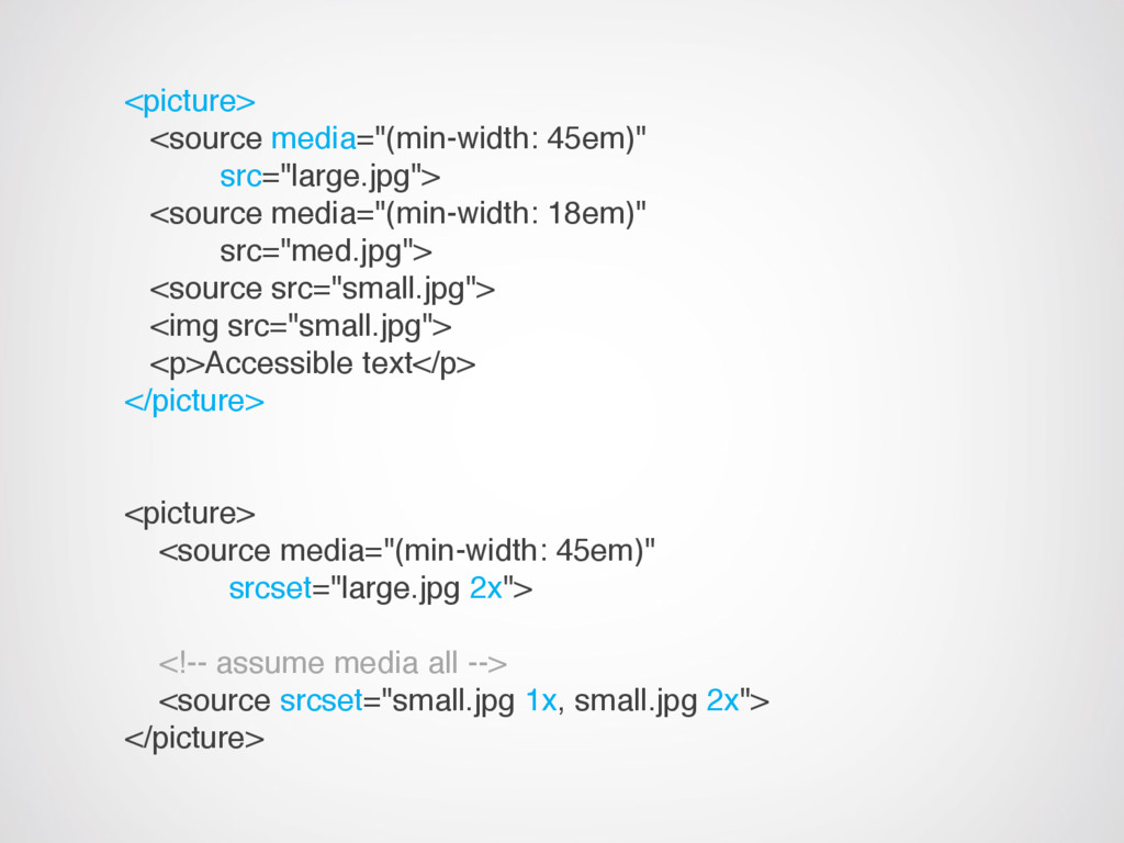
    of mq) • multiple backgrounds Disadvantages • no separation of style & content • losing semantics (add role=‘’img”) • request each time (ex: browser resize)
  13. Solution two (SVG) • late recommendation from W3C • vectors,

    vectors, vectors... • use it as image source, background-image, directly in your markup, data-uri, etc.
  14. Advantages • scales nicely, no blur, vector based • lots

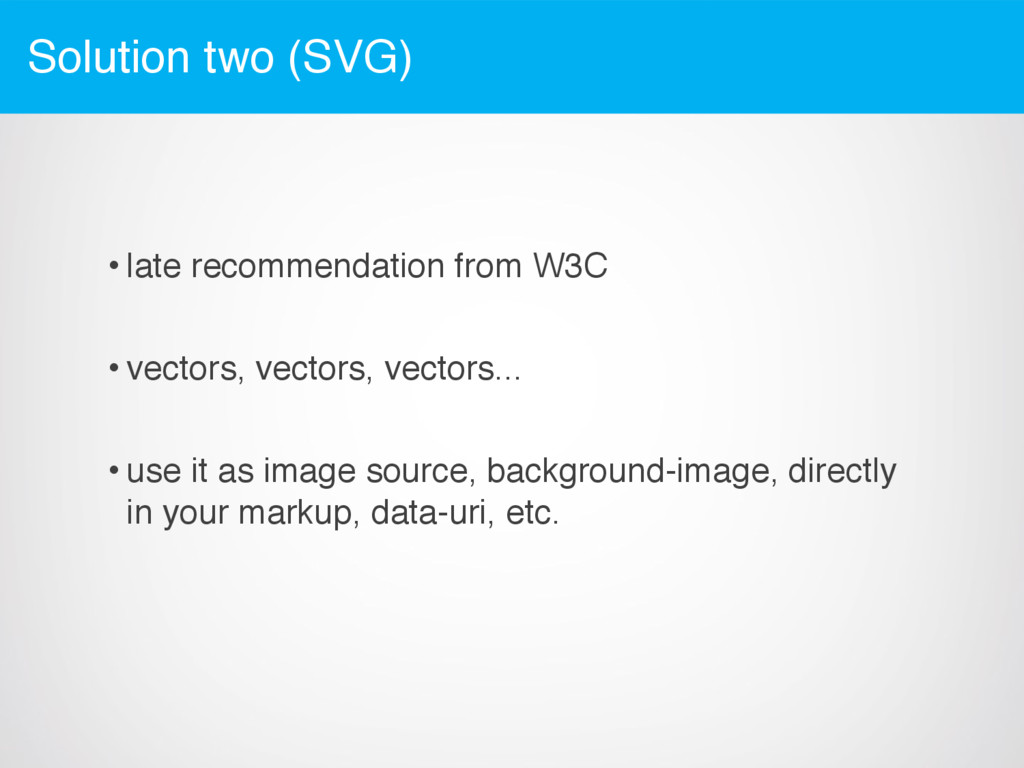
    of possibilities • one request Disadvantages • no IE 8 (that’s a shame...) • no Android 2.3 or lower • complex shapes can take up lots of space (bytes)
  15. Solution three - picturefill.js <span data-picture> <span data-src="medium.jpg" data-media="(min-width: 400px)">

    </span> <span data-src="large.jpg" data-media="(min-width: 800px)"> </span> <!-- Non-JS browsers --> <noscript> <img src="external/img/small.jpg"> </noscript> </span>
  16. Advantages • lightweight ~0.5kb • better semantics because of img

    • good browser support (even IE8 and non-js browsers if needed) • support for retina Disadvantages • nasty markup
  17. Future solutions • picture element and srcset attribute • proposed,

    not yet implemented • can (and should) be used together • aim to solve the responsive images problem and keep things coupled in markup only
  18. <picture> <source media="(min-width: 45em)" src="large.jpg"> <source media="(min-width: 18em)" src="med.jpg"> <source

    src="small.jpg"> <img src="small.jpg"> <p>Accessible text</p> </picture> <picture> <source media="(min-width: 45em)" srcset="large.jpg 2x"> <!-- assume media all --> <source srcset="small.jpg 1x, small.jpg 2x"> </picture>
  19. Advantages • it will be a native solution (someday....) •

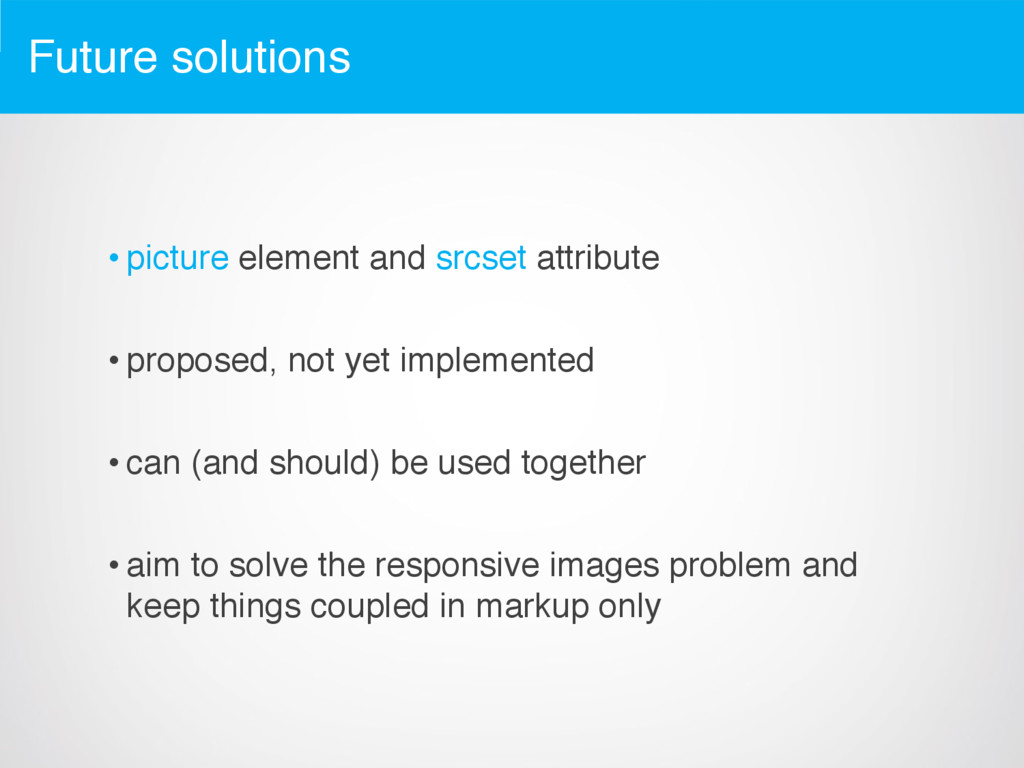
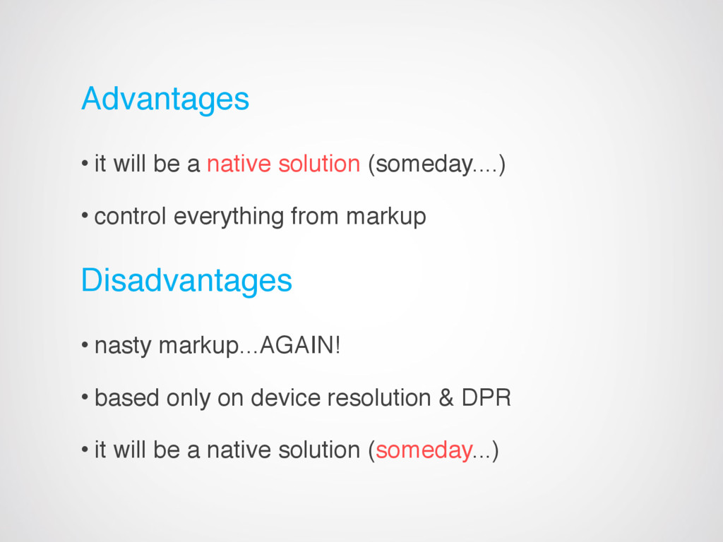
    control everything from markup Disadvantages • nasty markup...AGAIN! • based only on device resolution & DPR • it will be a native solution (someday...)
  20. Thoughts and things to look after • think about server

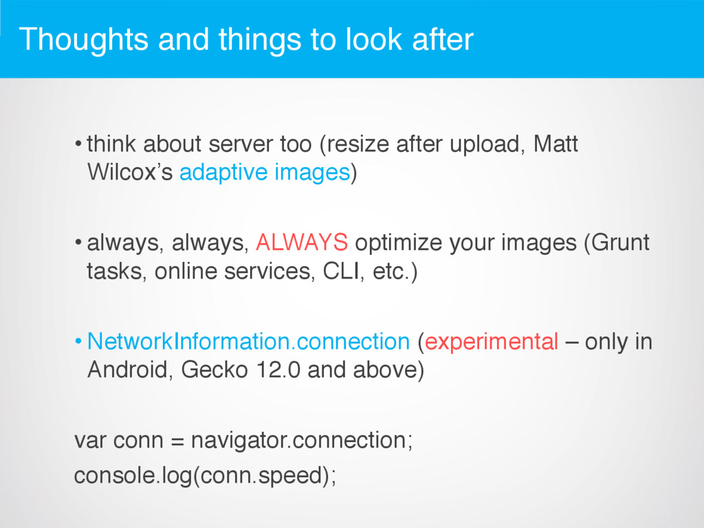
    too (resize after upload, Matt Wilcox’s adaptive images) • always, always, ALWAYS optimize your images (Grunt tasks, online services, CLI, etc.) • NetworkInformation.connection (experimental – only in Android, Gecko 12.0 and above) var conn = navigator.connection; console.log(conn.speed);
  21. How to chose your solution • do I have legacy

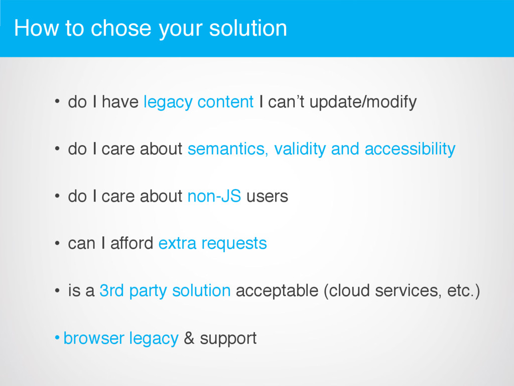
    content I can’t update/modify • do I care about semantics, validity and accessibility • do I care about non-JS users • can I afford extra requests • is a 3rd party solution acceptable (cloud services, etc.) • browser legacy & support
  22. Take away • have a strategy from the beginning •

    analyze & try to predict problems • chose depending on your context • DO NOT MAKE ASSUMPTIONS!
  23. Further resources • http://alistapart.com/article/responsive-web-design • http://httparchive.org/interesting.php • http://googlewebmastercentral.blogspot.ro/2010/04/using-site-speed-in- web-search-ranking.html •

    https://github.com/scottjehl/picturefill • http://www.w3.org/TR/html-picture-element/ • http://www.w3.org/html/wg/drafts/srcset/w3c-srcset/ • http://adaptive-images.com/ • http://addyosmani.com/blog/image-optimization-tools/ • http://www.netvlies.nl/blog/design-interactie/retina-revolution • http://css-tricks.com/which-responsive-images-solution-should-you-use/ • http://mobile.smashingmagazine.com/2013/09/16/responsive-images- performance-problem-case-study/ • http://mobile.smashingmagazine.com/2013/07/22/simple-responsive- images-with-css-backgrounds/