Upgrade to Pro — share decks privately, control downloads, hide ads and more …

Seattle Public Library Brand Case Study

Kyle Leitch
October 19, 2018

Seattle Public Library Brand Case Study

An (unofficial) branding case study exploring design strategies for the Seattle Public Library.

Kyle Leitch

October 19, 2018
Tweet

Other Decks in Design

Transcript

  1. The goals of this identity proposal are to bring a

    fresh face to the Library while maintaining the established visual identity that Seattleites recognize. This is accomplished by simply refreshing the logo and color palette, and focusing mainly on how the identity will interact with the public. 3 2 The Seattle Public Library brings people, information and ideas together to enrich lives and build community. SEATTLE CENTRAL LIBRARY 1000 FOURTH AVENUE OPENED MAY 2004
  2. The Logo BALLARD BRANCH 5614 22ND AVENUE N.W. OPENED MAY

    2005 FULL LOCKUP HEIGHT: 5 ‘e’ Use for applications like signage, internal documents, public-facing documents, collaterals, stationery, and webs. For most uses, the full-length logo lockup is required. It should not be stretched or deformed. Use the two-tone version on light backgrounds, and the monochrome white version on dark backgrounds. 5 The Logo 4
  3. The Lockup SHORT LOCKUP HEIGHT: 5 ‘e’ For other settings,

    the short lockup and logomark may be appropriate. Again, don’t stretch or deform the logo, and be sure to use a version that contrasts with the background. Use for public-facing documents containing “The Seattle Public Library” text, merchandise, social media posts Part of what will make this identity successful is its bold statement to “read ahead,” implying that you can get ahead by reading. TAGLINE TYPEFACE: THE TAGLINE IS SET IN FUTURA PT CONDENSED. SEE THE TYPOGRAPHY SECTION ON PAGE 15 FOR INFORMATION. LOGO COMBINATION: THE TAGLINE IS SET WITH THE SHORT LOGO LOCKUP, AND IS TILTED. THIS SPECIFIC EXAMPLE IS USED IN THE ANNE FRANK SOCIAL POST EXAMPLE IN THIS BOOK. 7 6 The Logo The Logo The Lockup READ AHEAD! The tagline can be combined with the long or short logo lockup. The arrangement of these elements can vary depending on the situation and mood.
  4. Clearspace Sizing the Logo The clearspace for all logos and

    alternates is equal to the width of the capital ‘P.’ When setting the logo, try to aim for a balance between size and legibility. When using the logo on a typical letter-sized document, setting the logos or lockups at 42 points tall preserves the integrity of the lockup’s words. 56 points tall should be the maximum height. TOO SMALL 14 POINTS 28 POINTS 42 POINTS 56 POINTS JUST RIGHT TOO BIG 9 8 The Logo The Logo Sizing the Logo Clearspace
  5. The Stack As part of the Library’s engagement with the

    public, the stack can be used to illustrate an exclamation or statement, or to draw attention to a particular point. The shape comes from the arrangement of shelves on the main floor of the Central Library. REAL LIFE STACKS THE STACKS DERIVE THEIR SHAPE AND ARRANGEMENT FROM THE BOOK STACKS ON THE MAIN FLOOR OF THE CENTRAL LIBRARY. THE SHAPES HAVE ONLY MINOR CHANGES TO MAKE THEM MORE SUITABLE FOR GRAPHIC USE. PRIMARY STACK (LEFT) USED IN THE LOGO LOCKUPS AND OTHER APPLICATIONS. EXAMPLE OF USAGE IN THIS SOCIAL MEDIA POST, THE ALTERNATE STACK IS USED WITH A QUOTE FROM FREDERICK DOUGLASS. PLACING THE STACK WITH THE FOCAL POINT TOWARD HIS FACE CONVEYS THE ACT OF SPEAKING. “once you learn to read you will be forever free” frederick douglass 11 10 The Stack The Stack The Stack EXAMPLE OF USAGE THE SHORT LOCKUP IN THIS EXAMPLE USES THE PRIMARY STACK TO CONVEY A STACK OF BOOKS.
  6. Incorrect Usage Colors Primary Colors Given the wide variety of

    graphic situations the Library faces, it’s easy to use logos and graphics incorrectly. Avoid these treatments of the graphics to preserve the consistency and strength of the identity. DON’T STRETCH, DEFORM: THE LOGO SHOULD ALWAYS BE COMPLETELY VISIBLE AND SET WITH ITS PROPORTIONATE WIDTH AND HEIGHT: FULL LOCKUP ≈ 1:6 H:W SHORT LOCKUP ≈ 1:2 H:W USE APPROVED COLORS: DON’T CHANGE THE COLORS OF THE LOGOS. USE CONTRAST: DON’T PLACE THE LOGO OVER A COLOR WITHOUT ENOUGH CONTRAST. FILL COLORS ONLY: DON’T OUTLINE THE LOGO ELEMENTS. 13 12 Incorrect Usage Primary Colors LIBRARY BLUE: PMS 279 C CMYK: 71, 37, 0, 0 RGB: #488BC9 LIBRARY GRAY: PMS 279 C CMYK: 65, 56, 53, 29 RGB: #545759 WHITE: PMS 279 C CMYK: 0, 0, 0, 0 RGB: #000000 Color plays an important role in the public’s recognition of the Library identity. The blue and gray colors were chosen to facilitate easier recognition of the logo despite the altered shapes and typeface. Use Library Blue for the logomark (but not the wordmark), headings, and graphic treatments like the social media post example on page 11. The website and catalog header sections should be this color with white text. Aa Aa Aa Use Library Gray for all text (black is okay too), unless Library Blue is used. Use white for situations where contrast between the logo or text and a dark background is needed. Page and website backgrounds should also be white, unless otherwise needed.
  7. Type System Secondary Colors Main Typeface 15 14 Colors Type

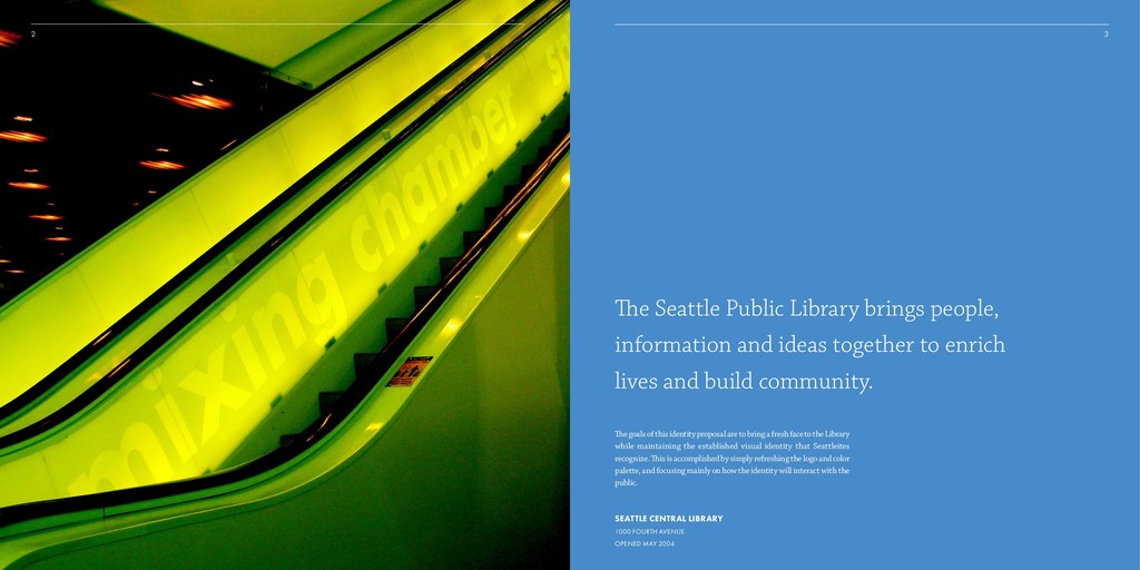
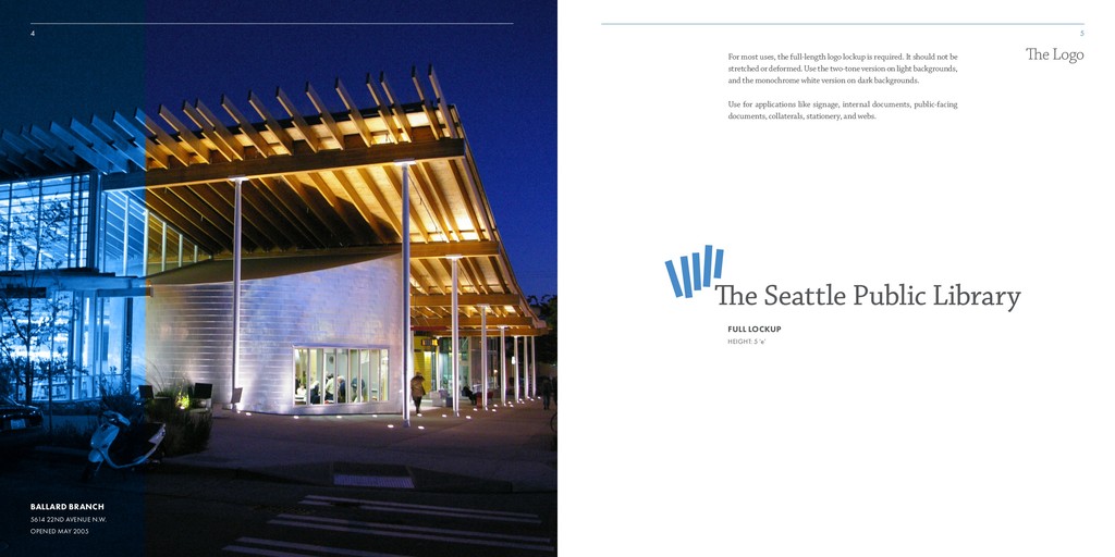
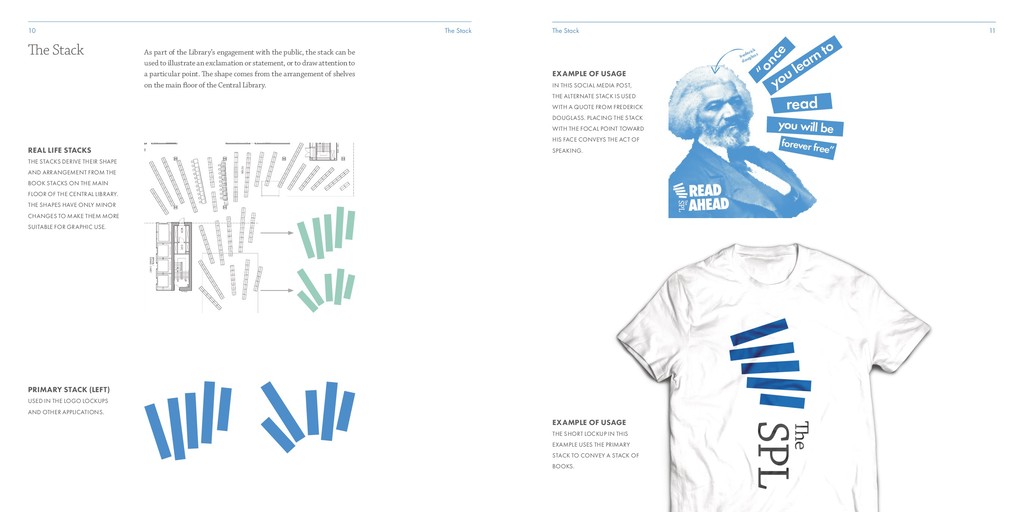
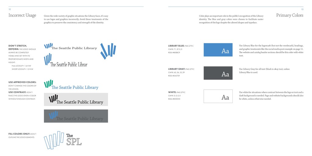
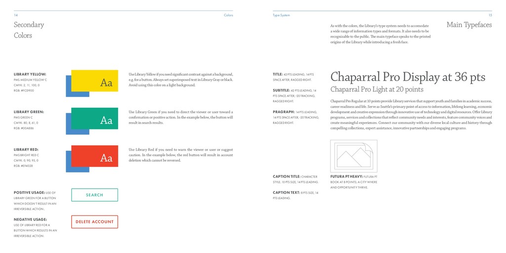
    System Secondary Colors LIBRARY YELLOW: PMS.MEDIUM YELLOW C CMYK: 2, 11, 100, 0 RGB: #FCD900 LIBRARY GREEN: PMS GREEN C CMYK: 80, 8, 61, 0 RGB: #00A886 LIBRARY RED: PMS BRIGHT RED C CMYK: 0, 90, 95, 0 RGB: #EF4028 POSITIVE USAGE: USE OF LIBRARY GREEN FOR A BUTTON WHICH DOESN’T RESULT IN AN IRREVERSIBLE ACTION.. NEGATIVE USAGE: USE OF LIBRARY RED FOR A BUTTON WHICH RESULTS IN AN IRREVERSIBLE ACTION. Use Library Yellow if you need significant contrast against a background, e.g. for a button. Always set superimposed text in Library Gray or black. Avoid using this color on a light background. Aa Aa Aa Use Library Green if you need to direct the viewer or user toward a confirmation or positive action. In the example below, the button will result in search results. Use Library Red if you need to warn the viewer or user or suggest caution. In the example below, the red button will result in account deletion which cannot be reversed. SEARCH DELETE ACCOUNT Main Typefaces Chaparral Pro Display at 36 pts Chaparral Pro Light at 20 points Chaparral Pro Regular at 10 points provide Library services that support youth and families in academic success, career readiness and life. Serve as Seattle’s primary point of access to information, lifelong learning, economic development and creative expression through innovative use of technology and digital resources. Offer Library programs, services and collections that reflect community needs and interests, feature community voices and create meaningful experiences. Connect our community with our diverse local culture and history through compelling collections, expert assistance, innovative partnerships and engaging programs. TITLE: 42 PTS LEADING, 14 PTS SPACE AFTER, RAGGED RIGHT. SUBTITLE: 42 PTS LEADING, 14 PTS SPACE AFTER, 20 TRACKING, RAGGED RIGHT. PRAGRAPH: 14 PTS LEADING, 14 PTS SPACE AFTER, 20 TRACKING, RAGGED RIGHT. CAPTION TITLE: CHARACTER STYLE. 10 PTS SIZE, 14 PTS LEADING. CAPTION TEXT: 8 PTS SIZE, 14 PTS LEADING. FUTURA PT HEAVY: FUTURA PT BOOK AT 8 POINTS; A CITY WHERE AND OPPORTUNITY THRIVE. As with the colors, the Library’s type system needs to accomodate a wide range of information types and formats. It also needs to be recognizable to the public. The main typeface speaks to the printed origins of the Library while introducing a fresh face.
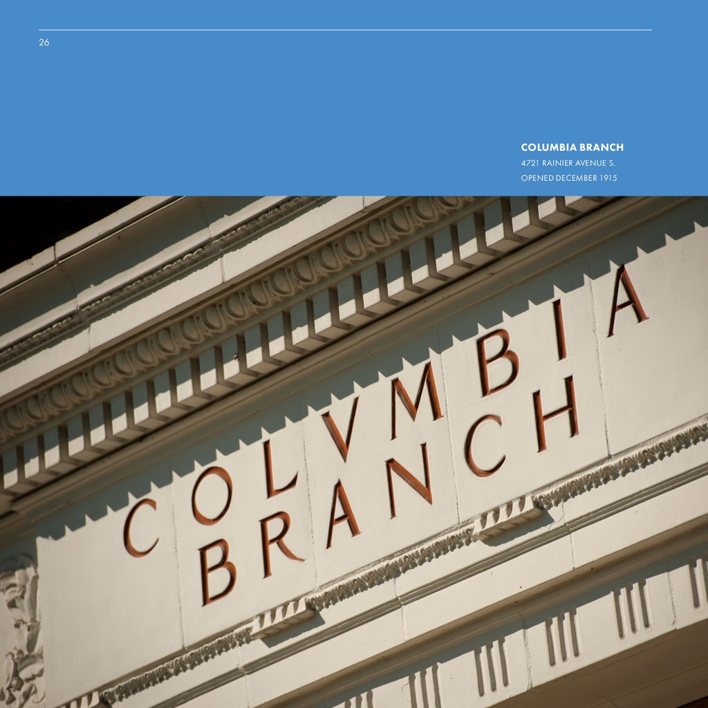
  8. Secondary Typeface 17 16 Type System Secondary Typeface Futura PT

    Bold at 36 pts Futura PT Bold at 20 points TITLE: 42 PTS LEADING, 14 PTS SPACE AFTER, RAGGED RIGHT. SUBTITLE: 42 PTS LEADING, 14 PTS SPACE AFTER, 25 TRACKING, RAGGED RIGHT. TAGLINE: 25 TRACKING, ALIGNMENT VARIES. THIS EXAMPLE IS SET AT 56 POINTS. TAGLINE (STACKED): 25 TRACKING, RAGGED RIGHT. THIS EXAMPLE IS SET AT 56 POINTS WITH 56 POINTS LEADING. READ AHEAD! READ AHEAD! To help retain the recognizablility of the Library, Futura is included as a secondary type system. This secondary system can be used to add contrast or texture to text applications, and will help reduce the burden of replacing signage which is already set in Futura. FREMONT BRANCH SEATTLE PUBLIC LIBRARY 731 N. 35TH STREET OPENED JULY 1921 SEATTLE’S FIRST LIBRARY BRANCH
  9. Activations Book Box The primary activation of the new identity

    is shown below. “Book Boxes” will be installed at various locations throughout Seattle where a library is not readily nearby. Ideal target sites include places with lots of foot traffic and playgrounds. The boxes will be able to accept returned books through a slot, and patrons will be able to check out any books contained in the kiosk online or on-site, as well as place holds to be delivered to a specified kiosk. 19 Activations 18 Activations The crucial component of this identity is its activations, which try to address public feedback about library accessibility and the Library’s five pillars of service. How will the brand interact with the public? How will it make the Library more accessible to more people? SEATTLE CENTRAL LIBRARY 1000 FOURTH AVENUE OPENED MAY 2004 Book Box BOOK BOXES: RECYCLED SHIPPING CONTAINERS, SEALED AND MODIFIED TO CONTAIN STORAGE AND MECHANICAL. EACH UNIT CAN BE SOLAR POWERED BY PANELS ON ITS ROOF.
  10. Facilities Neighborhood Merch Customized merchandise provides the opportunity to deepen

    community pride in their local branch libraries. 21 Activations 20 Activations Neighborhood Merch Facilities WINDOW APPLICATION MAGNOLIA BRANCH OPENED JULY 2008 CUSTOM EXAMPLE: SHIRT WITH CUSTOM GREENLAKE IMAGERY.
  11. Merchandise Social 23 22 Activations Activations Social Merchandise MERCH EXAMPLE:

    SMALL NOTEBOOK WITH EMBOSSED TAGLINE & ELASTIC. MERCH EXAMPLE: TOTE BAG WITH STACK ART QUOTE, LOGO, AND TAGLINE. SOCIAL EXAMPLE: STACK QUOTE BY ANNE FRANK, STYLIZED AND WITH TAGLINE, SHORT LOCKUP.
  12. Website & Catalog Trending Top Searches: Louisa May Alcott Fantastic

    Beasts Hamilton Chronicles of Narnia More The Underground Railroad by Colson Whitehead 968 holds on 147 copies VIEW IN CATALOG Moonglow by Michael Chabon 736 holds on 163 copies VIEW IN CATALOG The Mothers: A Novel by Brit Bennett 301 holds on 69 copies VIEW IN CATALOG The Girl Before by J P Delaney 188 holds on 35 copies VIEW IN CATALOG Happening at the Library Readings & Lectures Story Time Classes Homework Help More American Visionaries Immigration, Innovation & Freedom February 10, 2017, 6:30 – 9 p.m. SEE EVENT CALENDAR USING THE LIBRARY LOCATIONS SHOP LOG IN Articles & Research Government Museums Search Search for: keywords what would you like to find? SEARCH ADVANCED SEARCH HELP Books/Music/Videos Newspapers & Magazines Popular By Name By Location By Publisher CALENDAR USING THE LIBRARY LOCATIONS SHOP LOG IN Government Museums Search Books/Music/Videos Articles & Research NEWSPAPERS DATABASES JOURNALS JOB RESOURCES ARTICLES & RESEARCH HELP Search Articles for: what would you like to find? SEARCH ALLDATA OEM Auto Repair Information SIGN IN Ancestry.com Library Edition Census data, vital records, and more. SIGN IN Ancestry.com Library Edition Census data, vital records, and more. SIGN IN Ancestry.com Library Edition Census data, vital records, and more. SIGN IN 25 Activations Activations Website & Catalog 24 SOCIAL EXAMPLE: STACK QUOTE BY ANNE FRANK, STYLIZED AND WITH TAGLINE, SHORT LOCKUP. CATALOG SEARCH: PEOPLE TYPICALLY WANT TO SEARCH THE LIBRARY’S CATALOG, SO THIS SEARCH SCOPE IS PRESENTED MORE PROMINENTLY WITH OTHER SCOPES. ARTICLE SEARCH: OTHER SEARCH SCOPES. SOME SCOPES HAVE SUBCATEGORIES WHICH ARE DISPLAYED THU To address frustrations with the existing website’s organization, information is presented to the user in an easier-to-search format which makes it clearer what catalogs they can search through.