Upgrade to Pro — share decks privately, control downloads, hide ads and more …

Custom Design Systems in Compose UI

Custom Design Systems in Compose UI

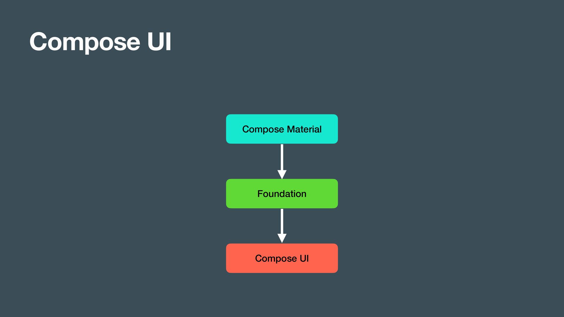
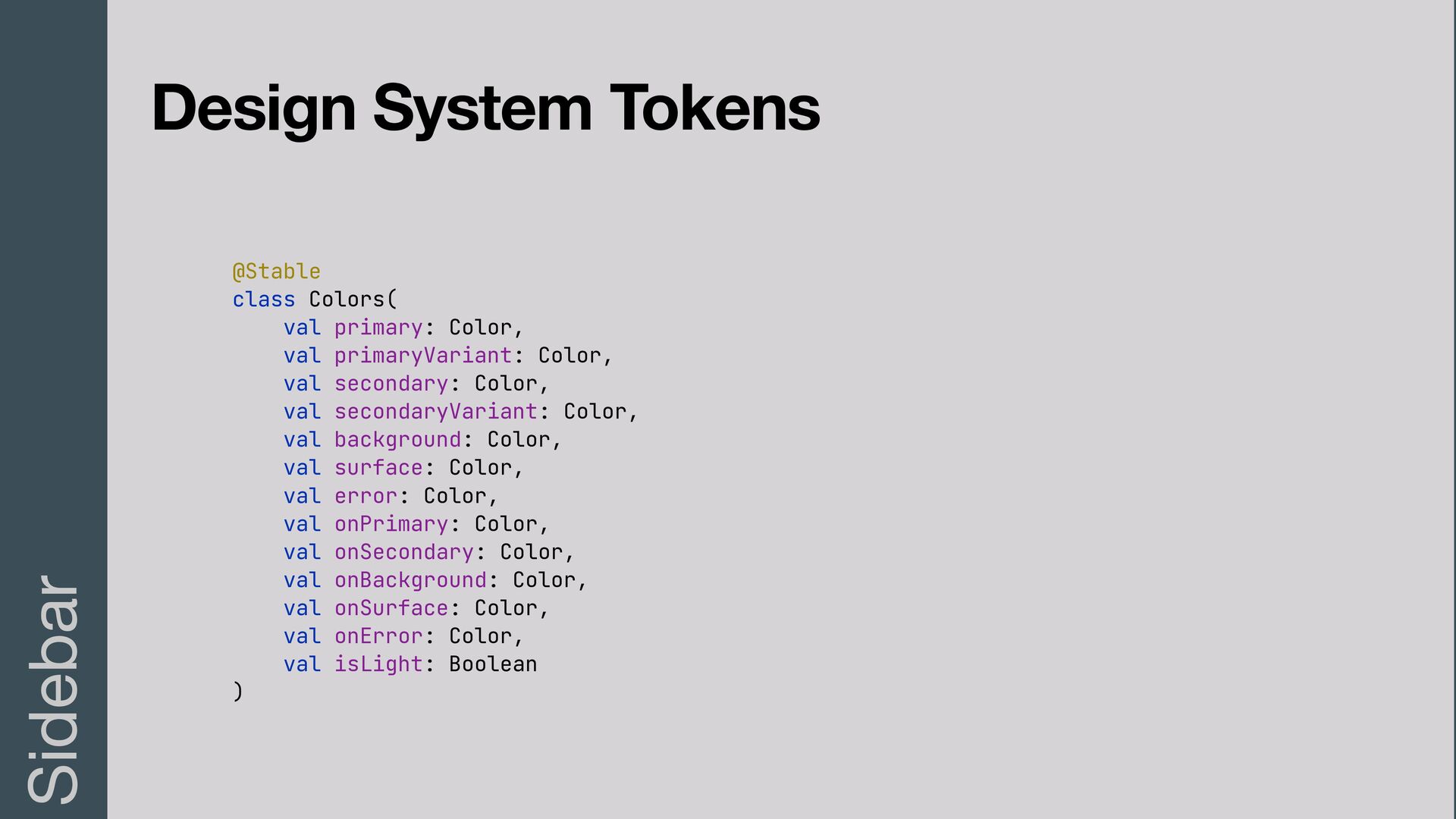
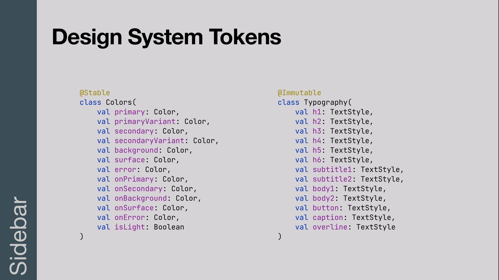
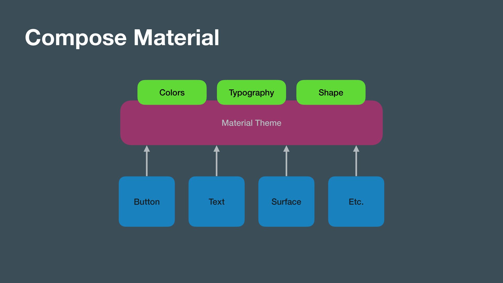
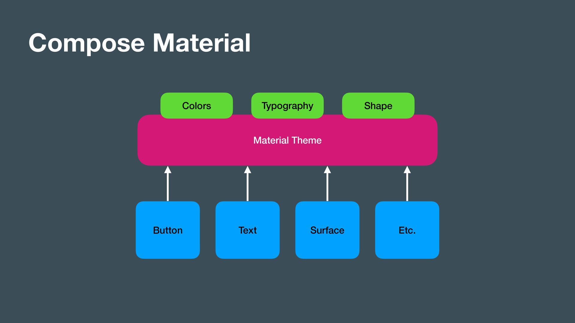
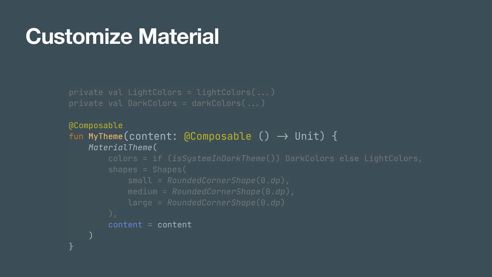
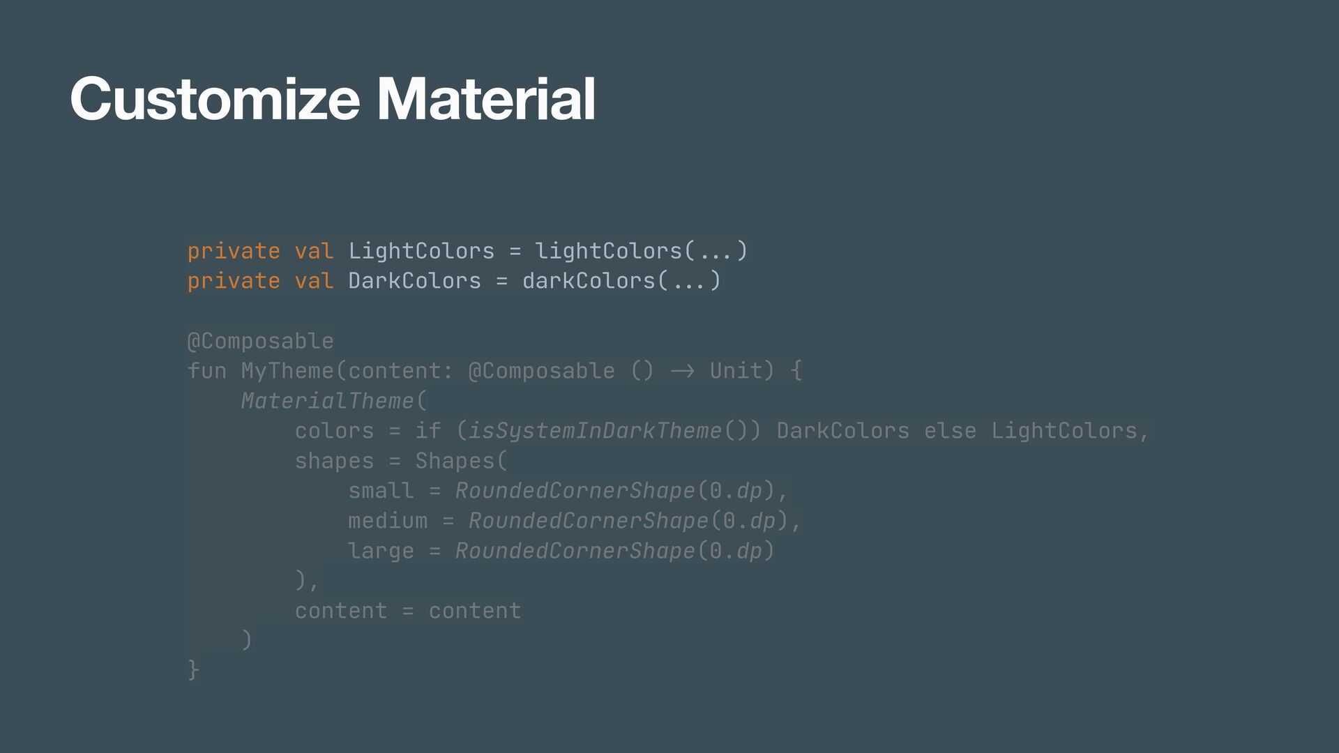
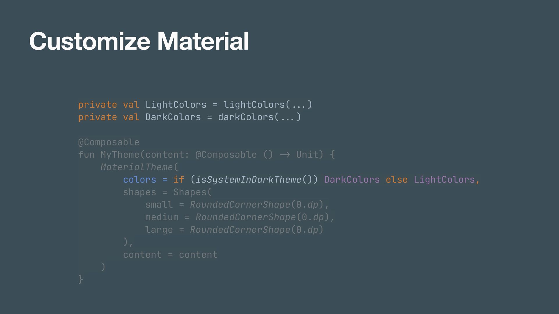
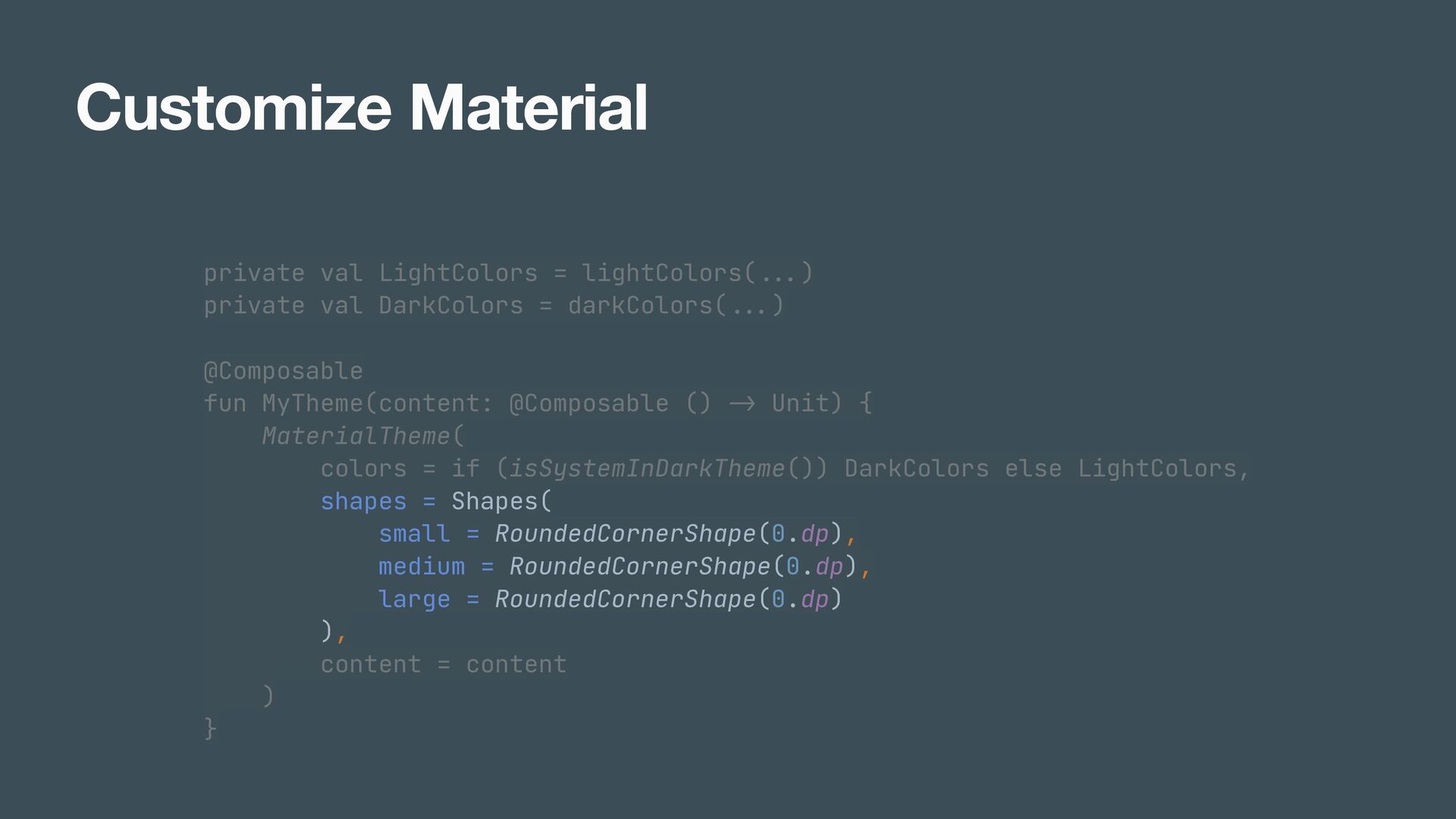
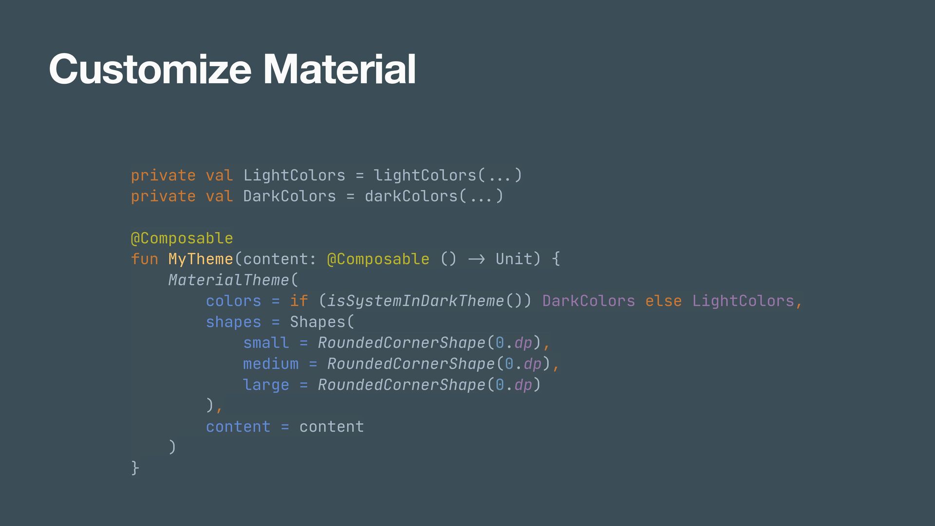
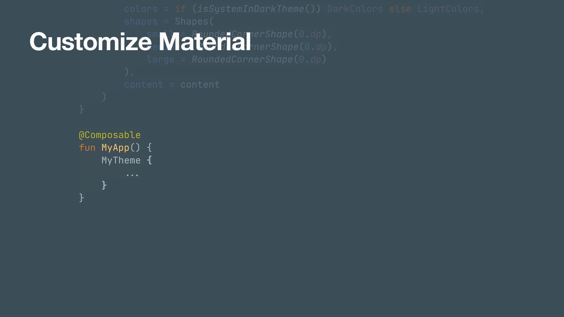
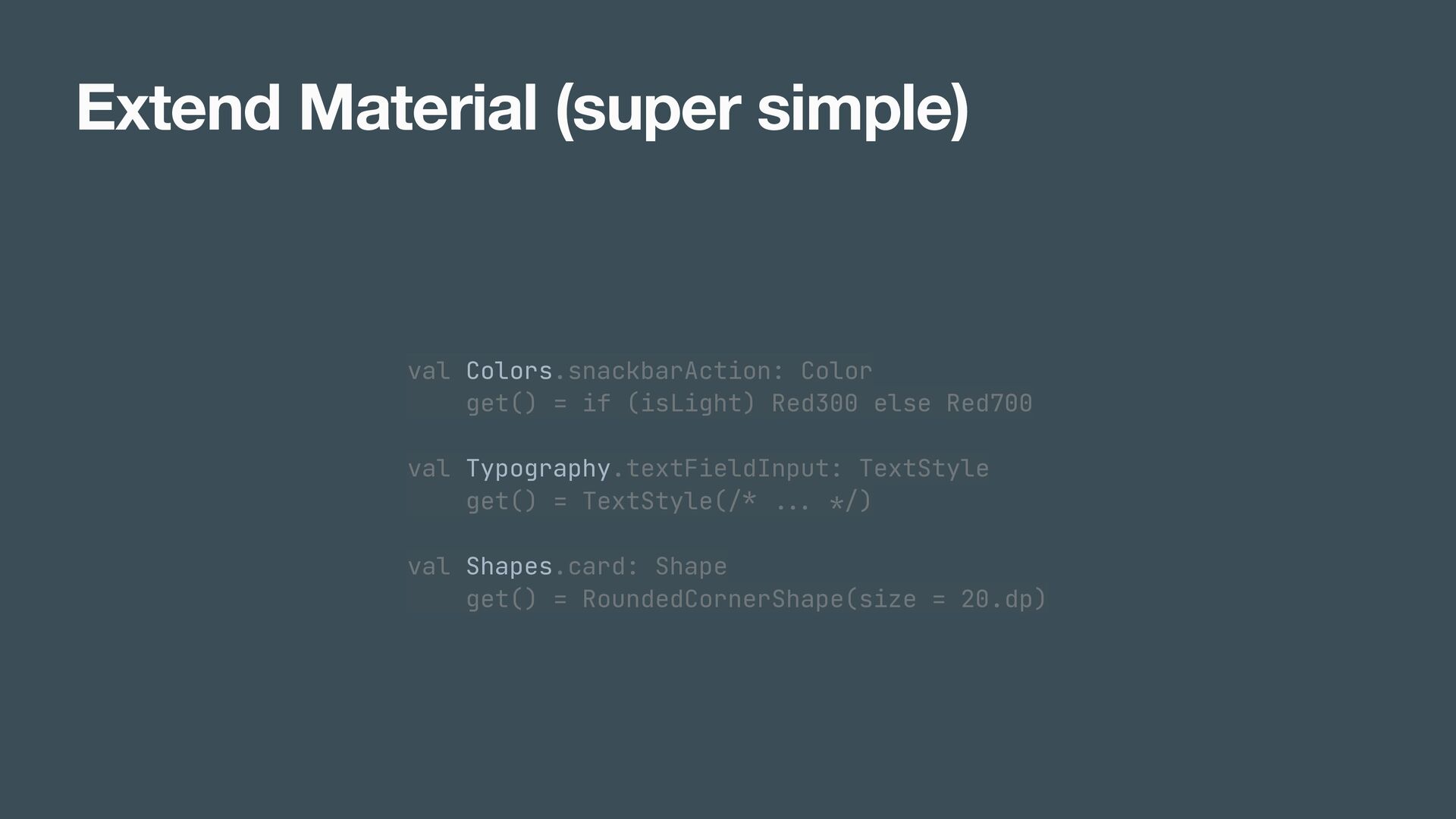
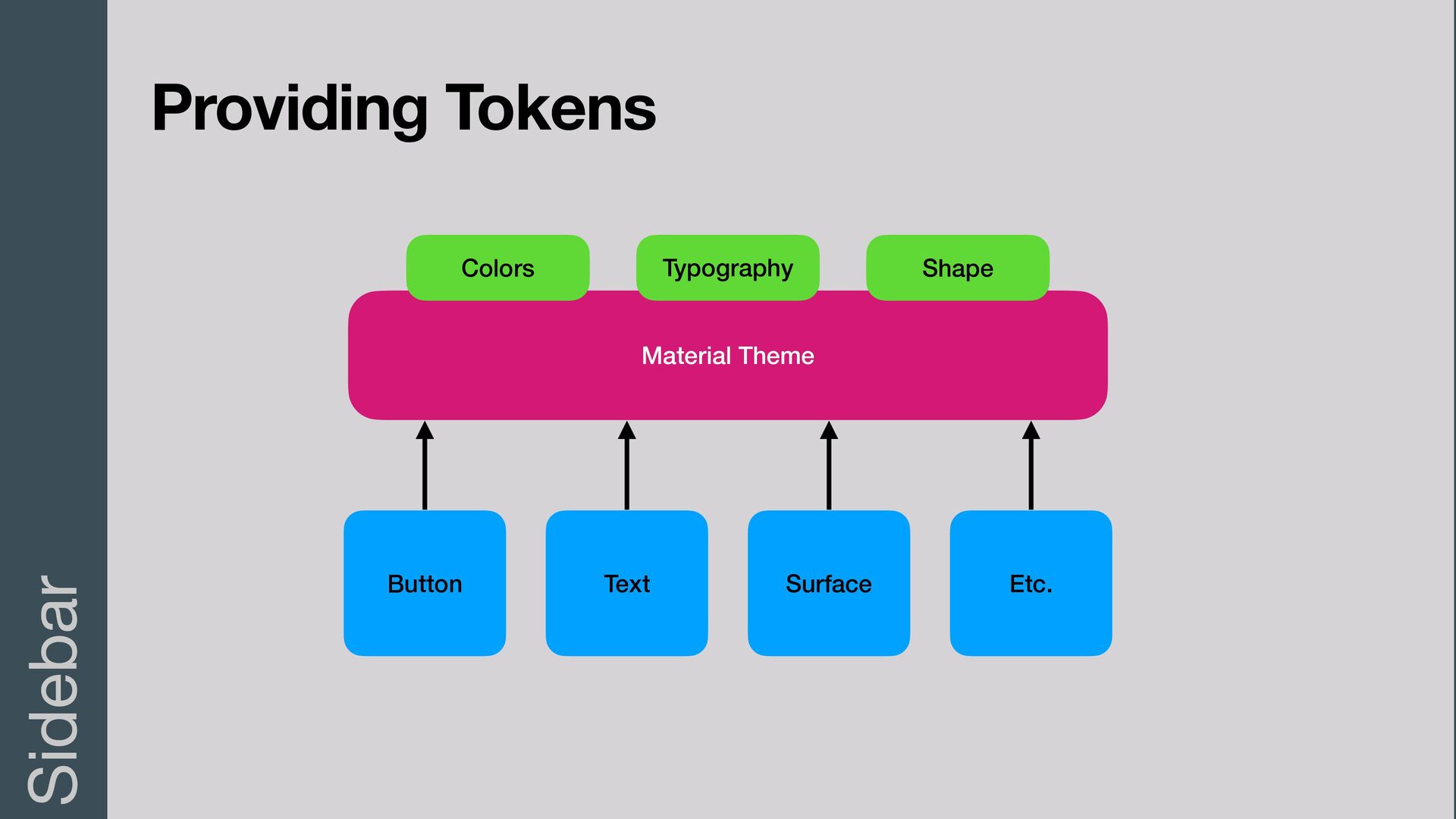
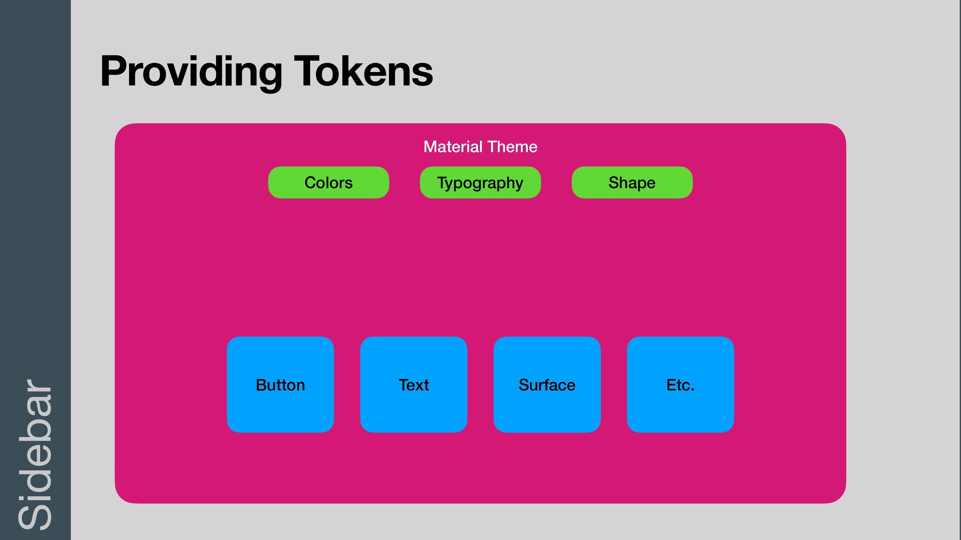
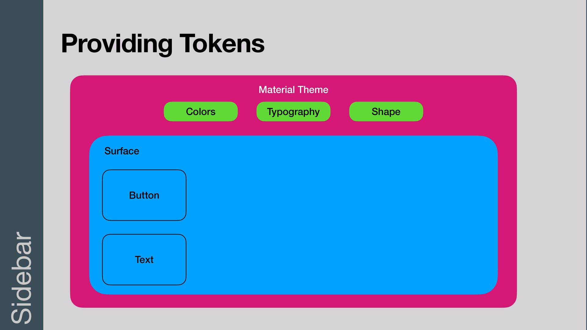
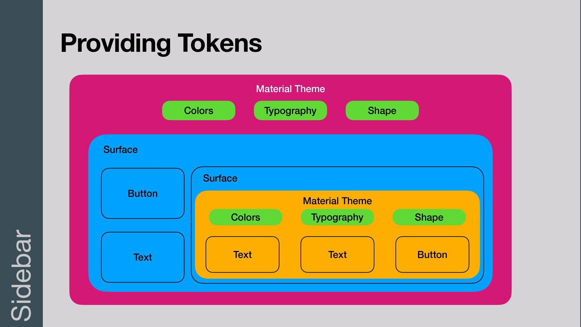
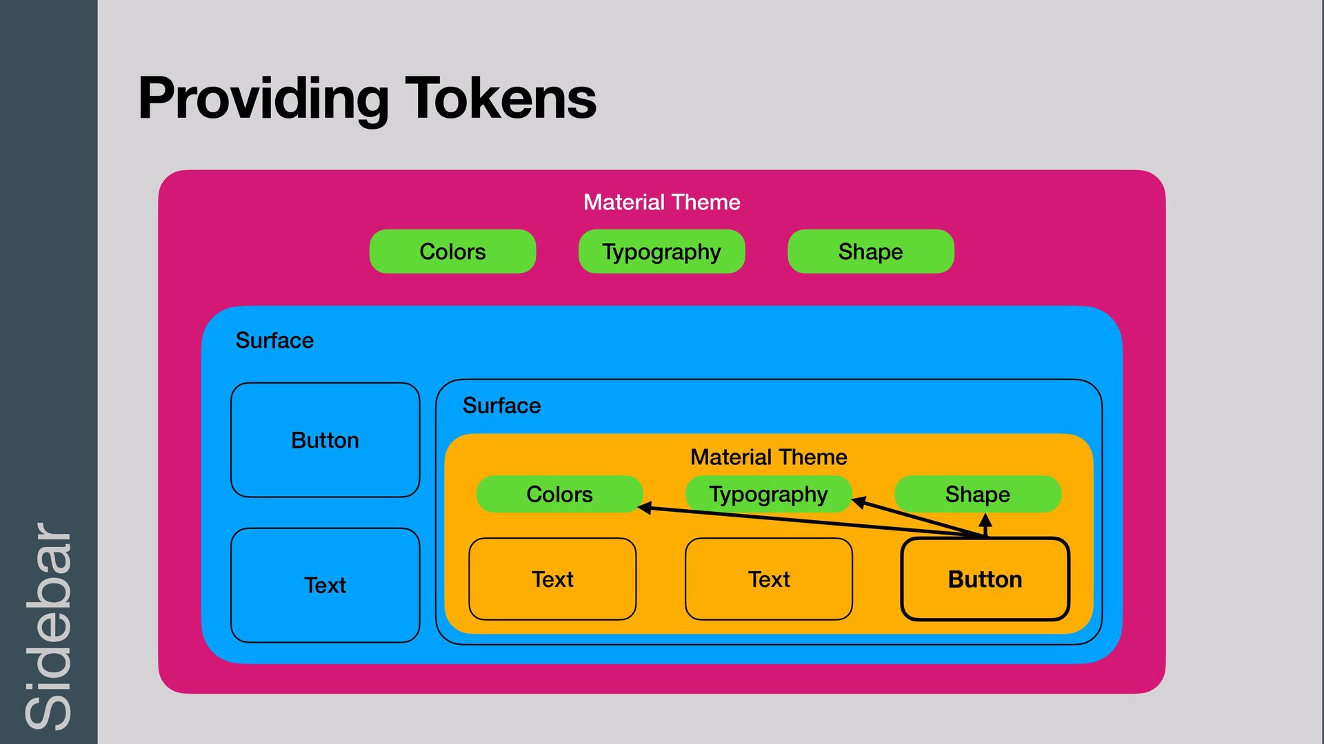
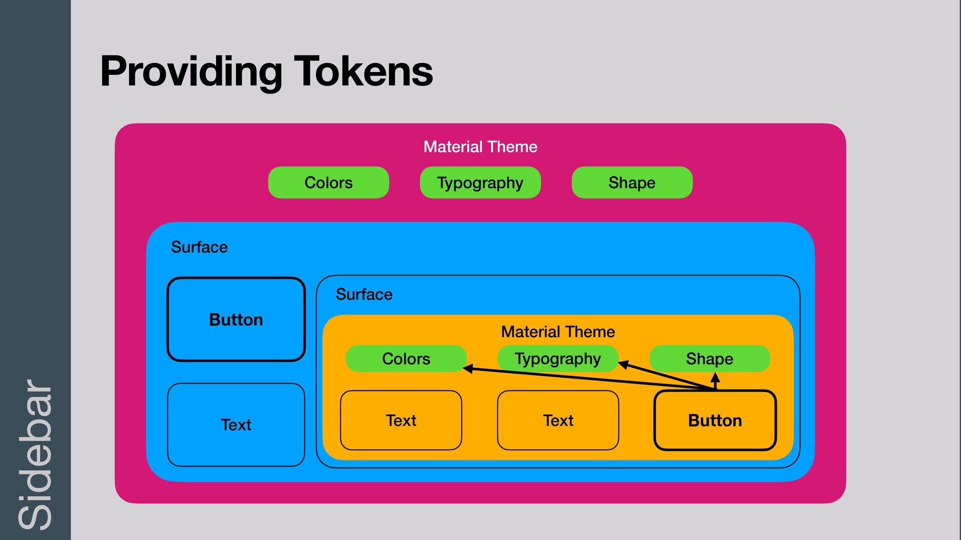
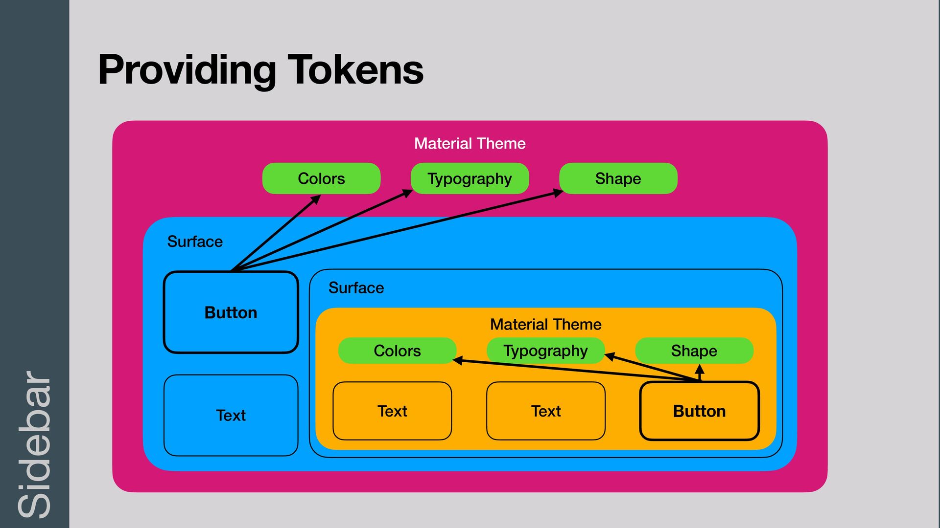
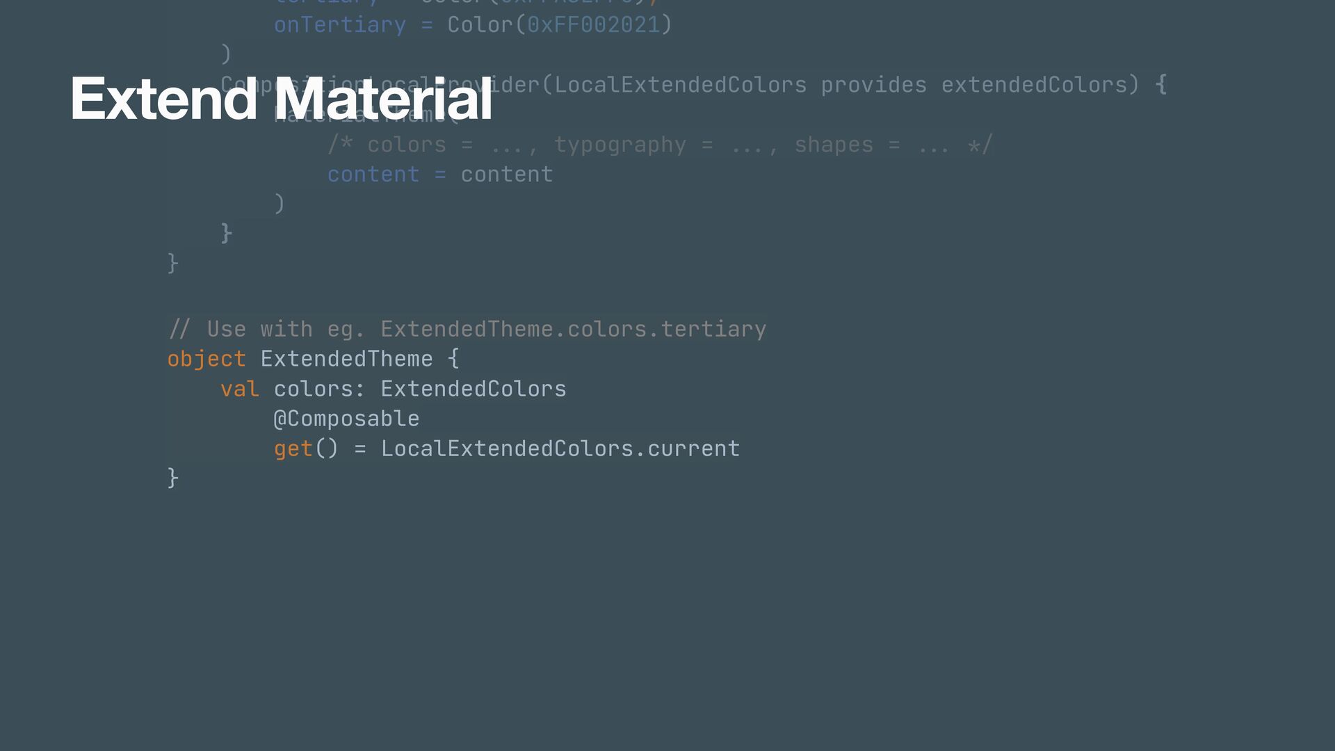
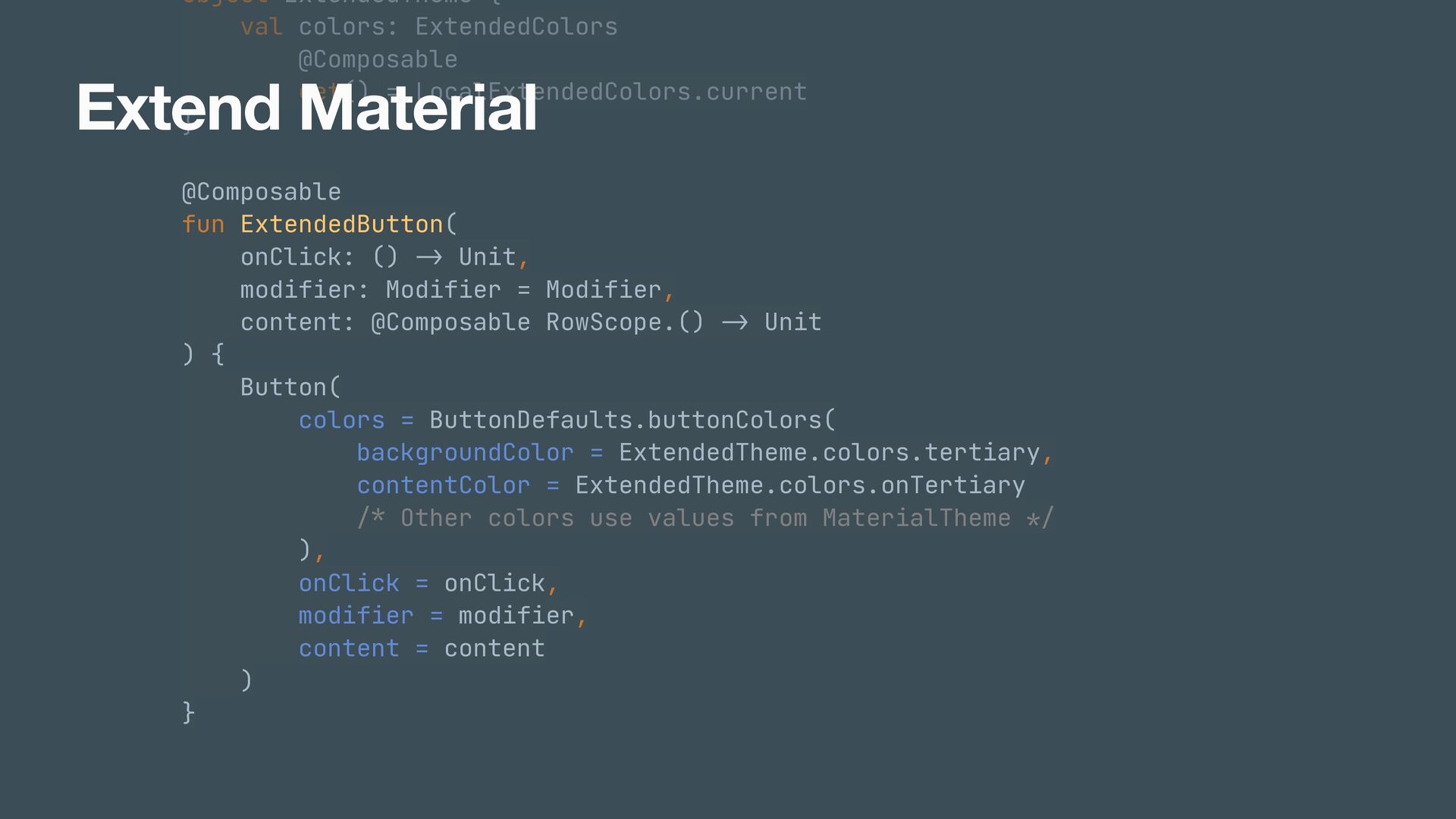
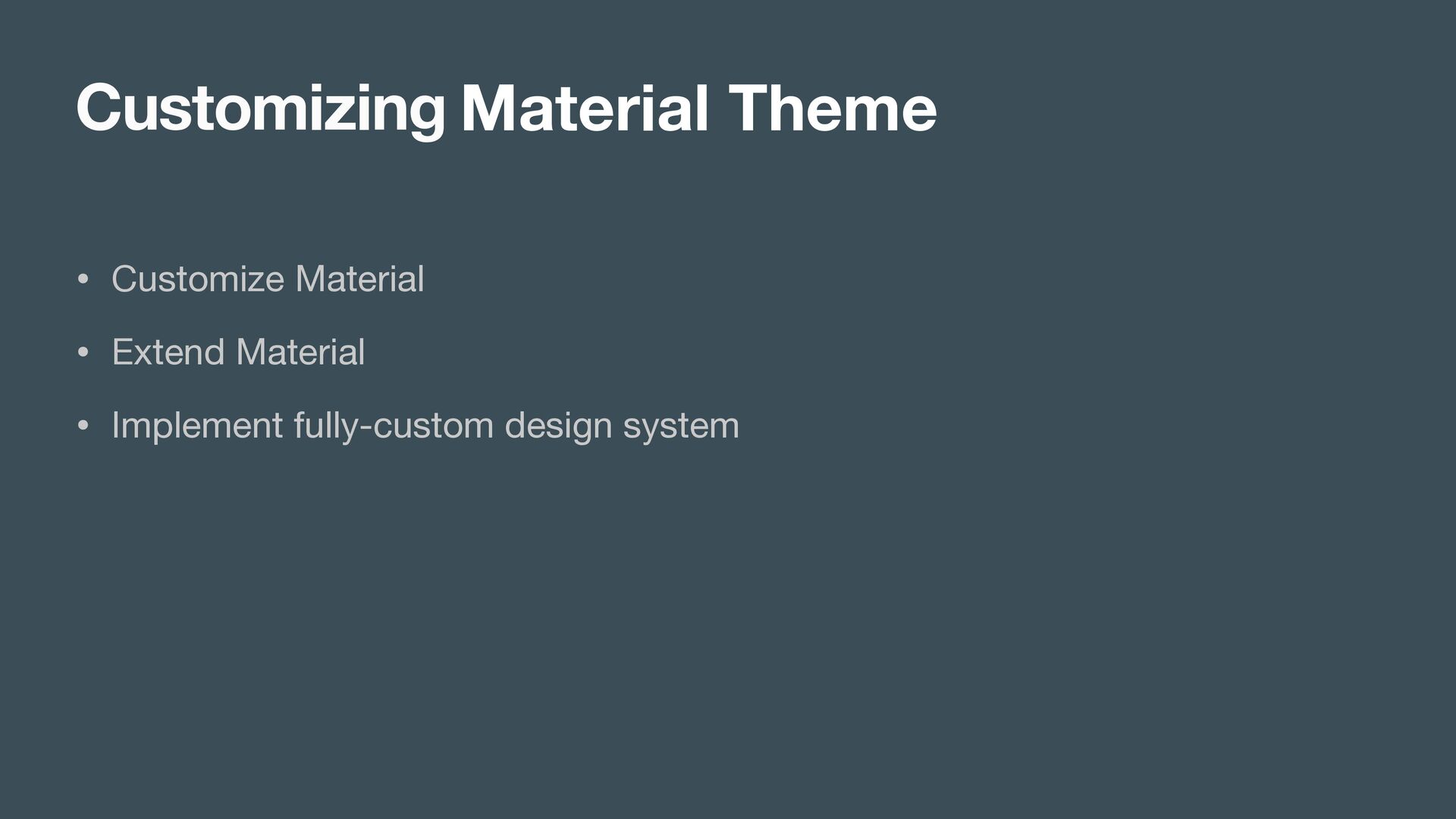
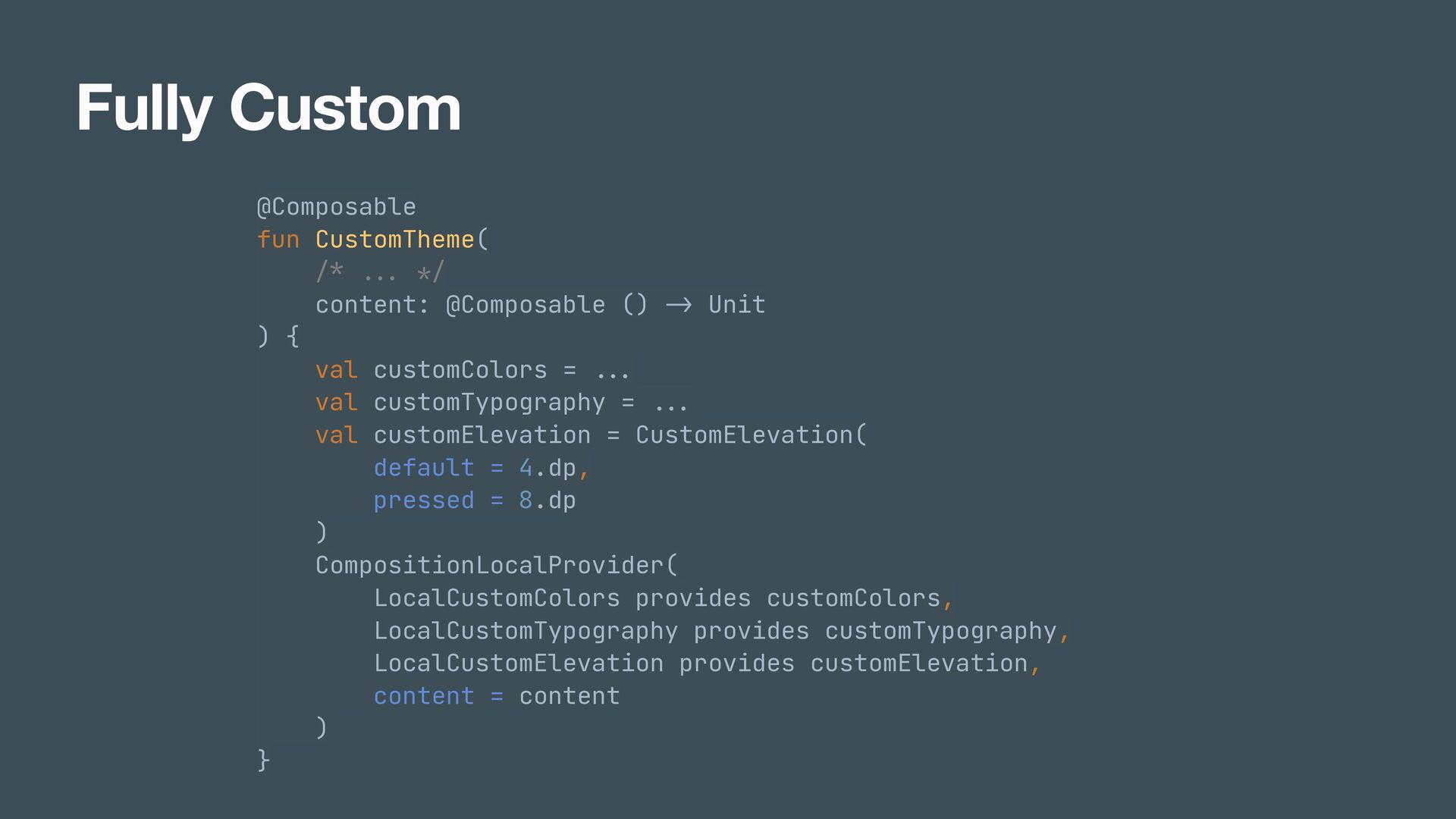
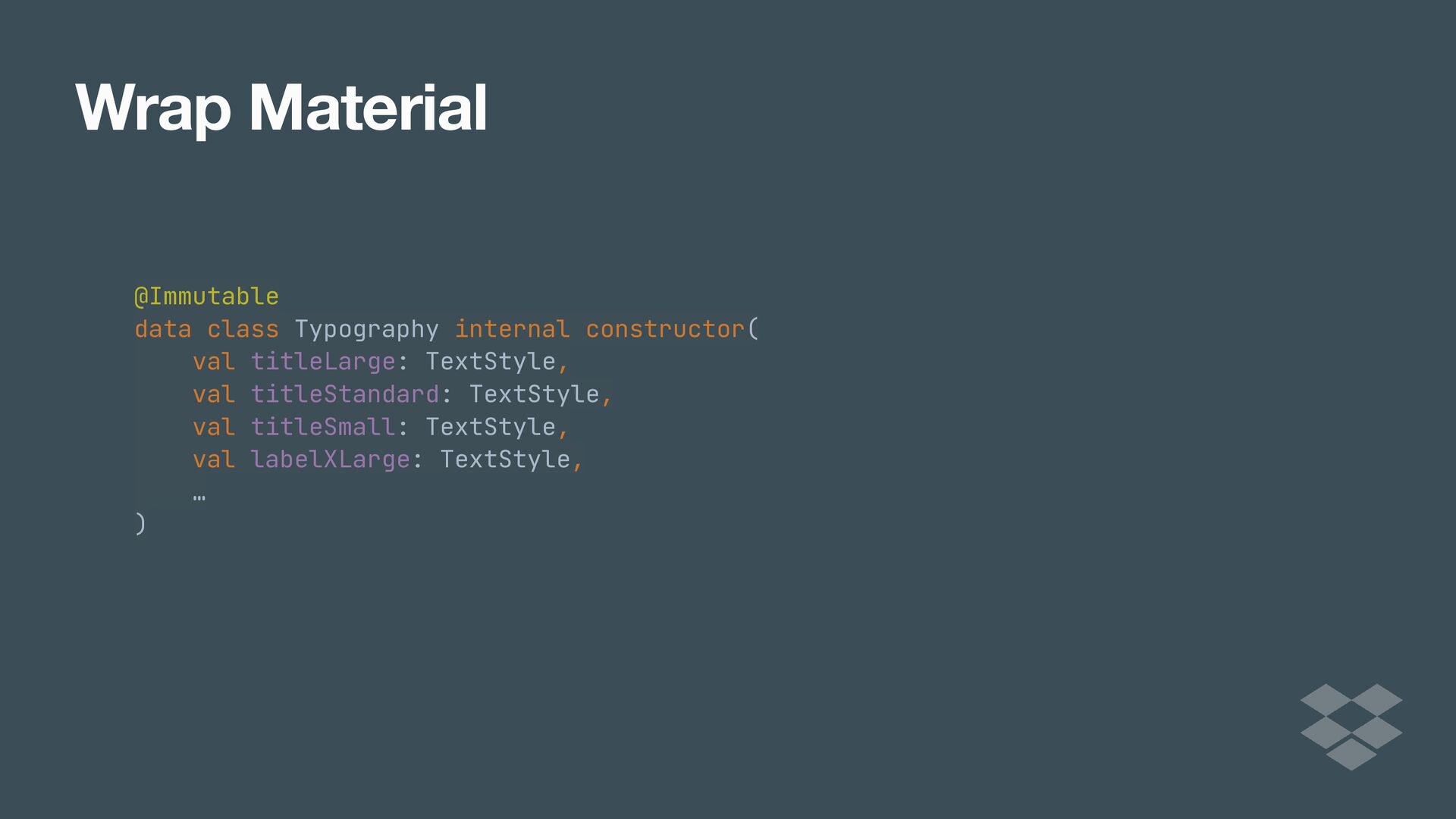
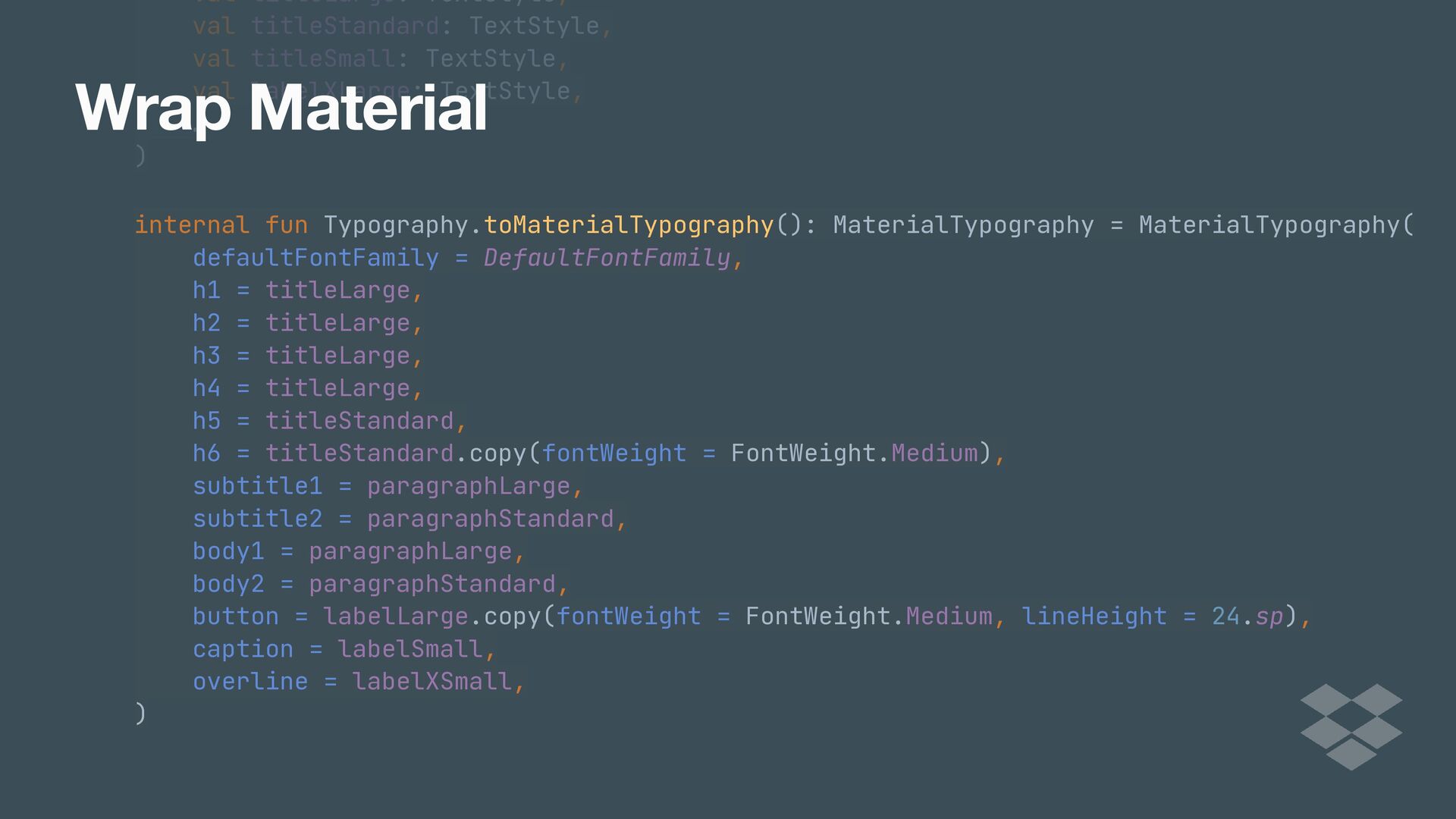
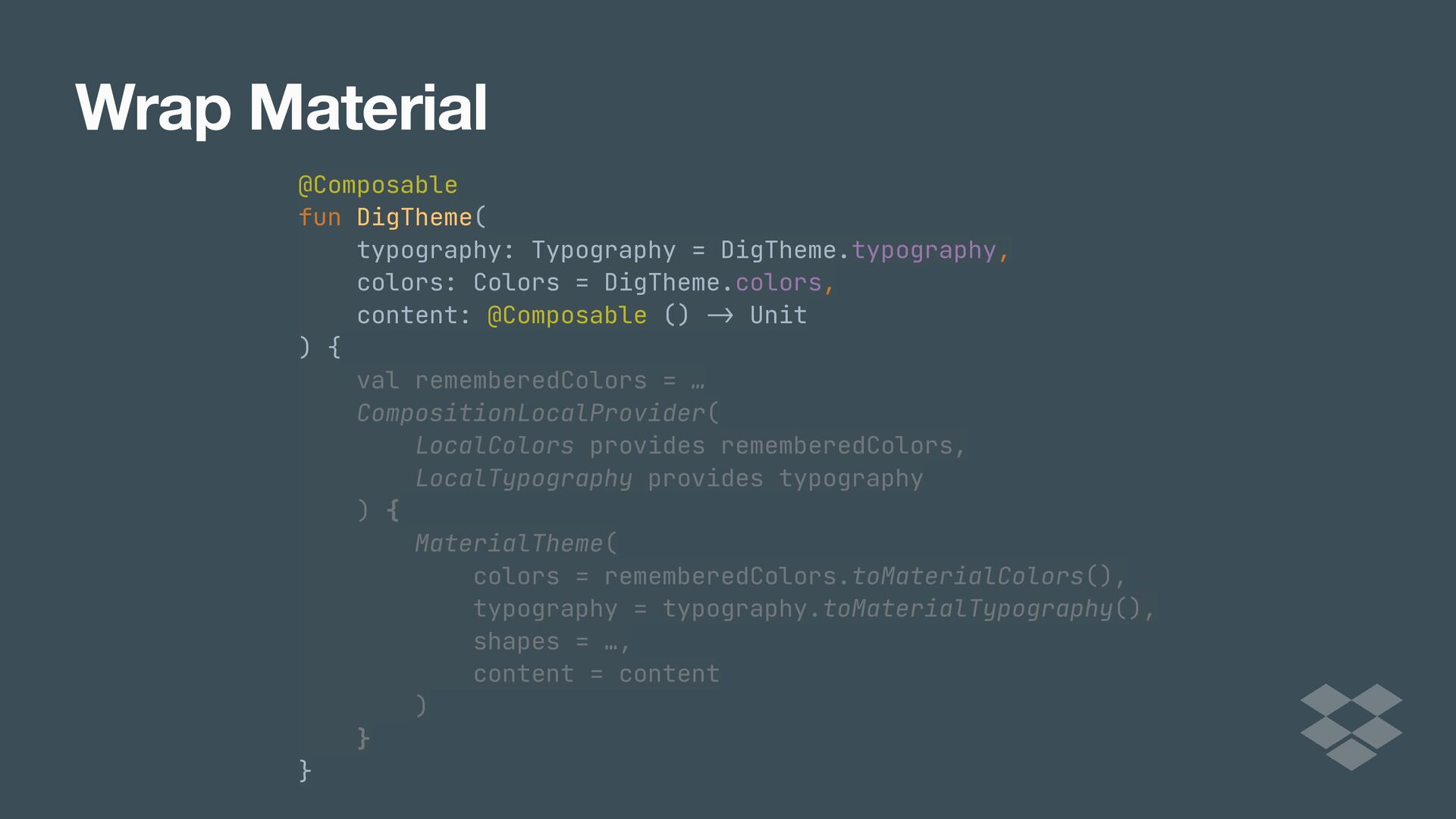
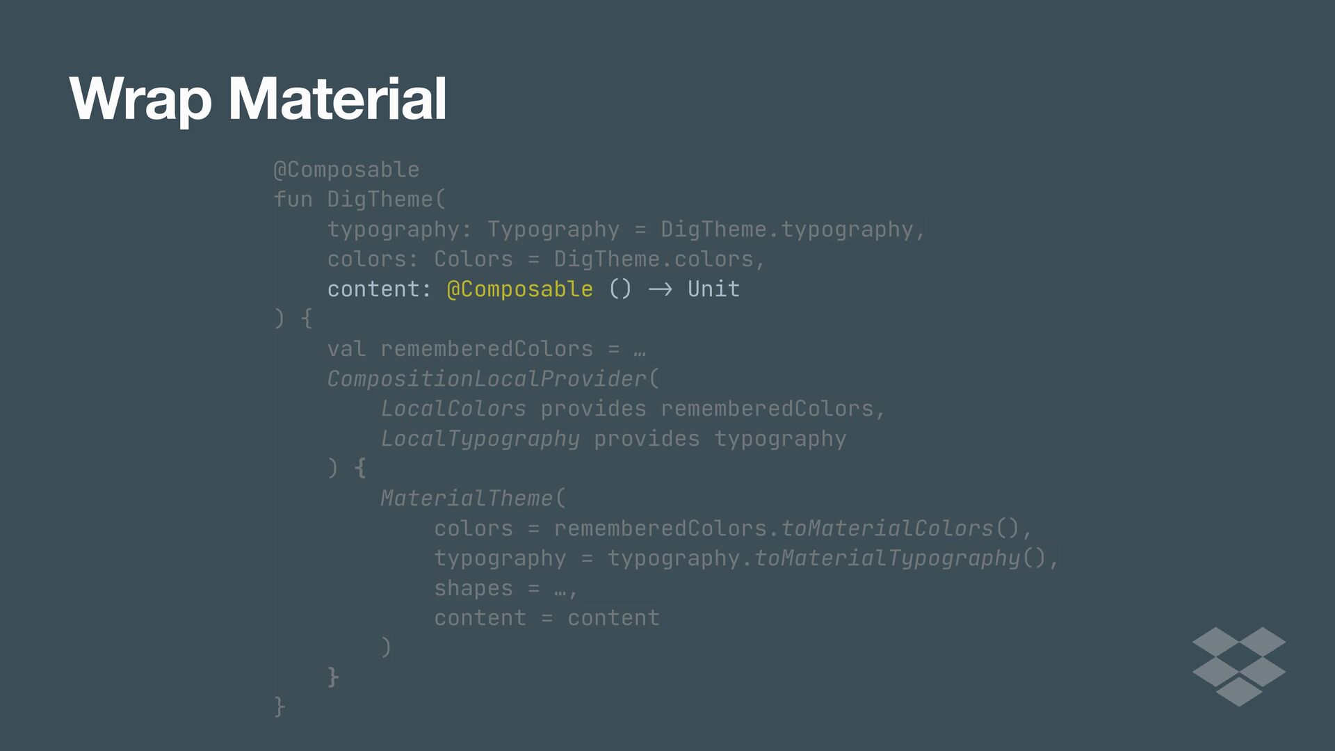
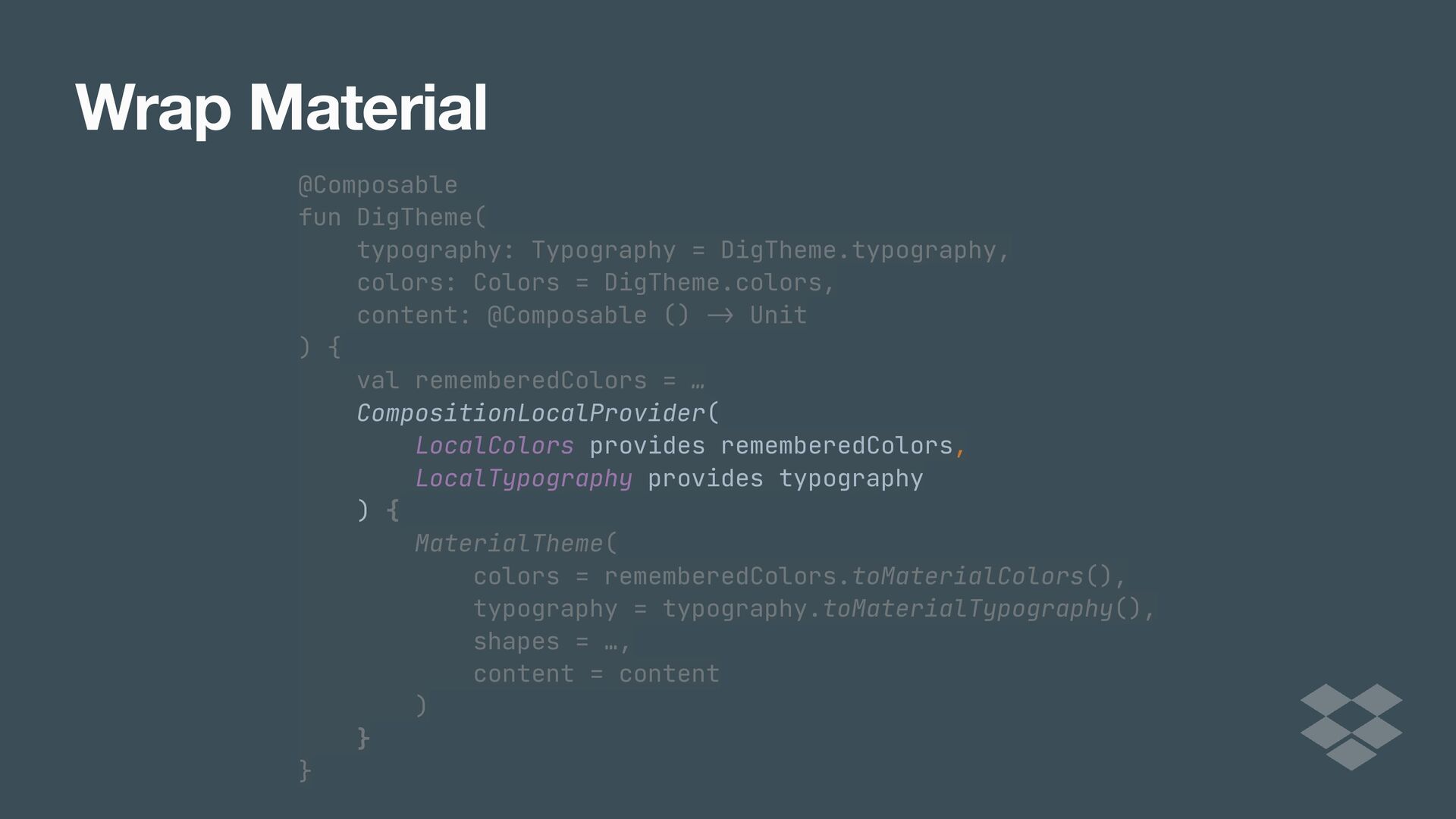
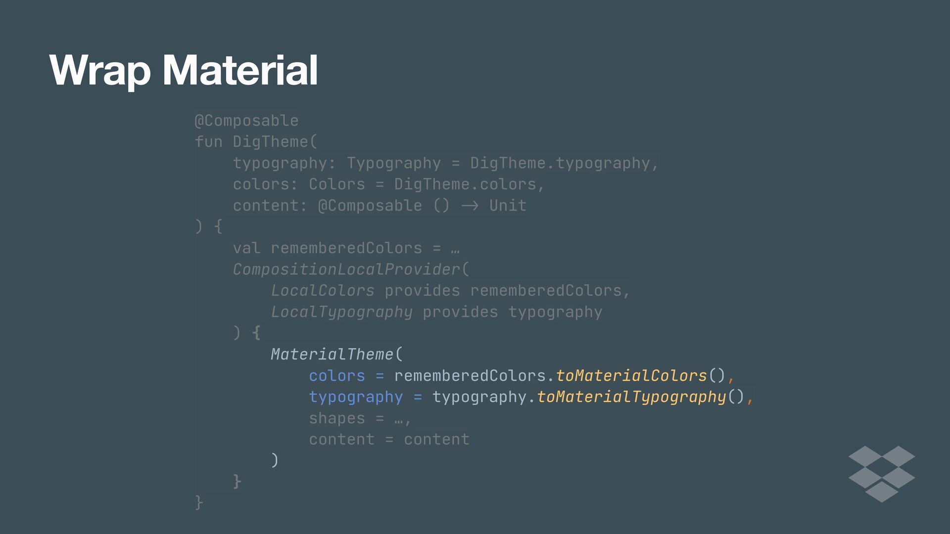
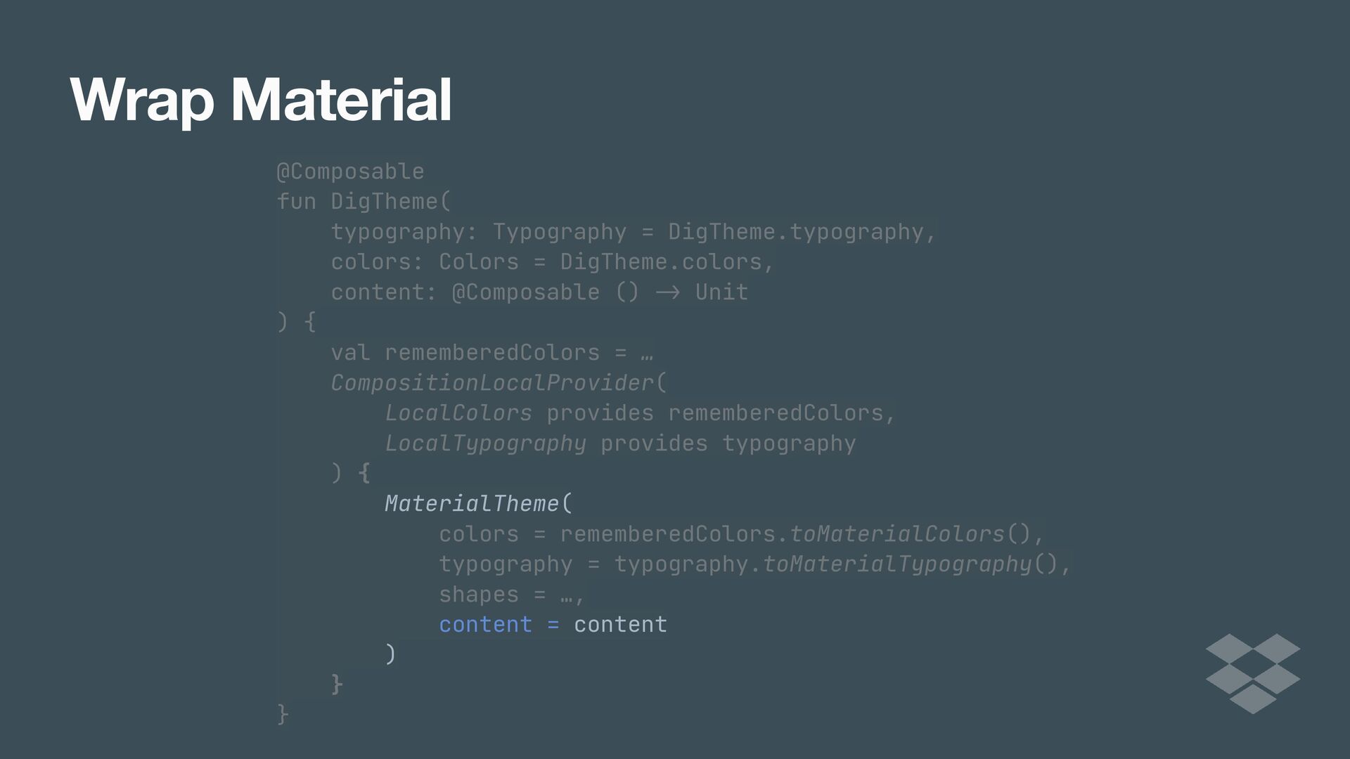
While Jetpack Compose comes with Google's Material Design system, many apps have their own design language and systems that they need to adhere to in order to offer consistency across platforms. As apps and teams scale, it eventually becomes beneficial to implement your own design system.

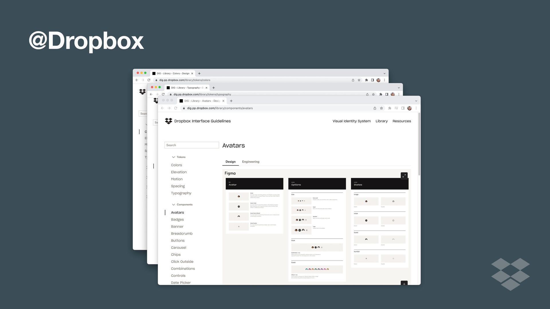
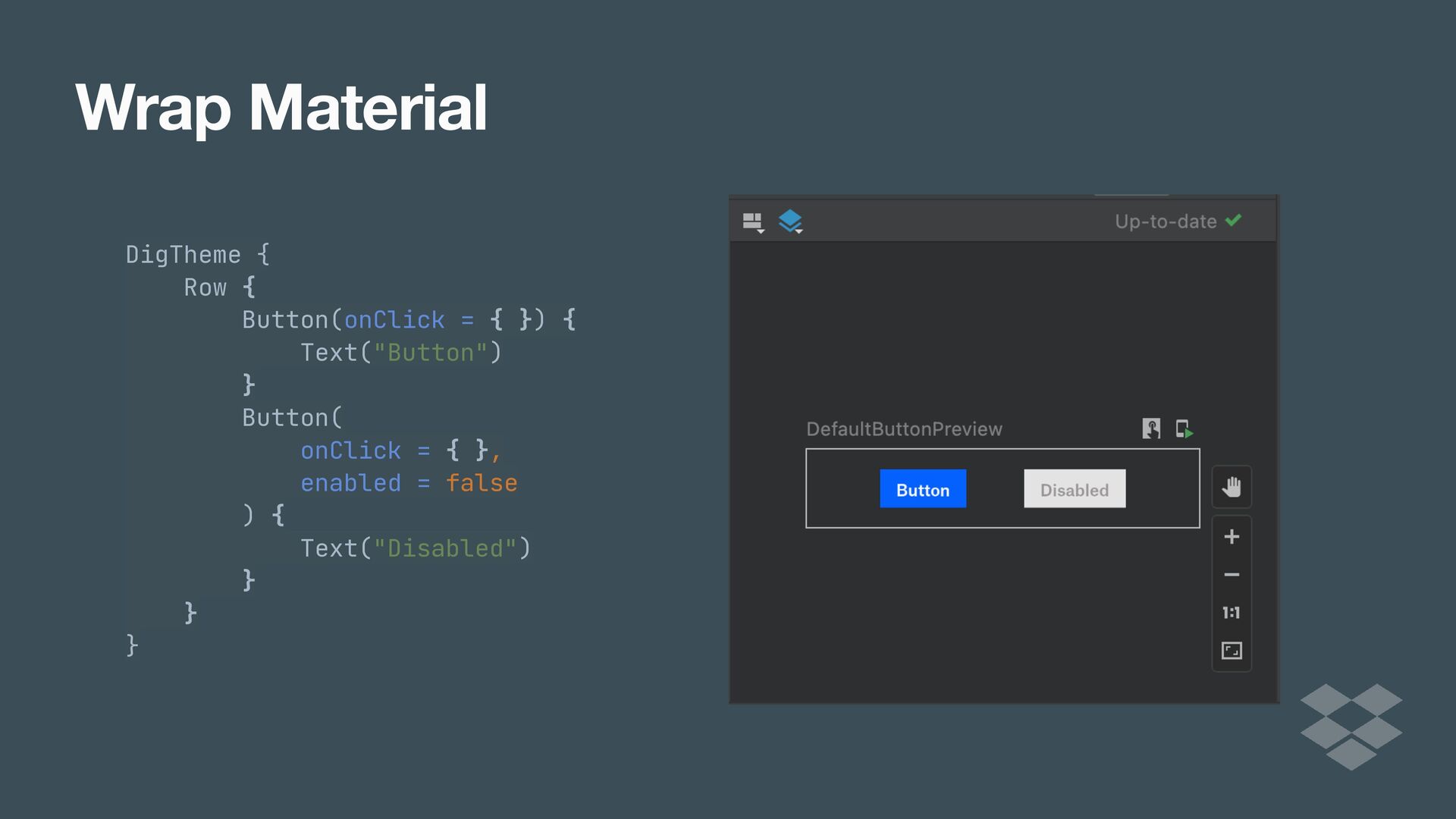
That's exactly the case at Dropbox. We recently went through the process of implementing our DIG design library in Compose, and have seen the benefits first hand.

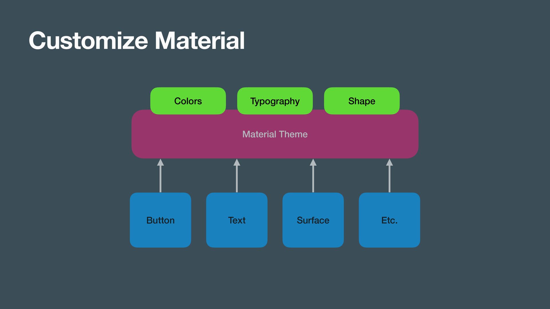
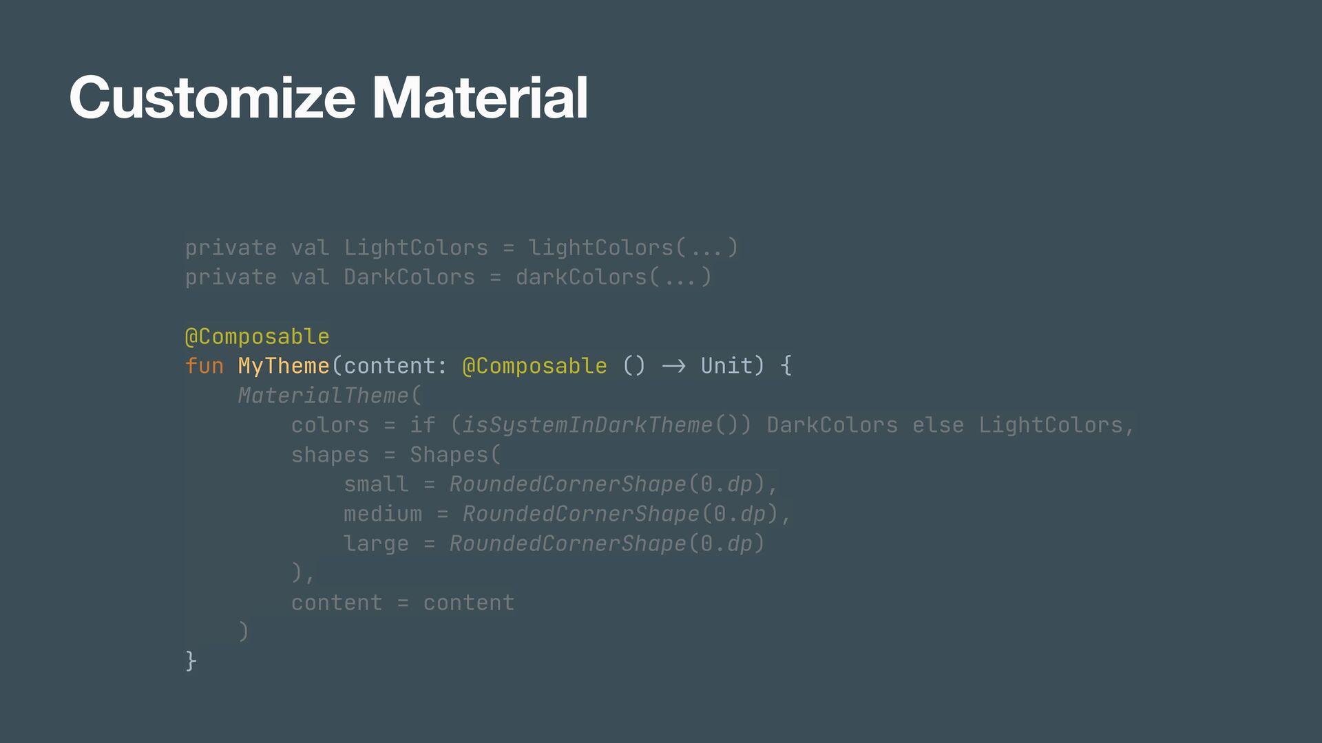
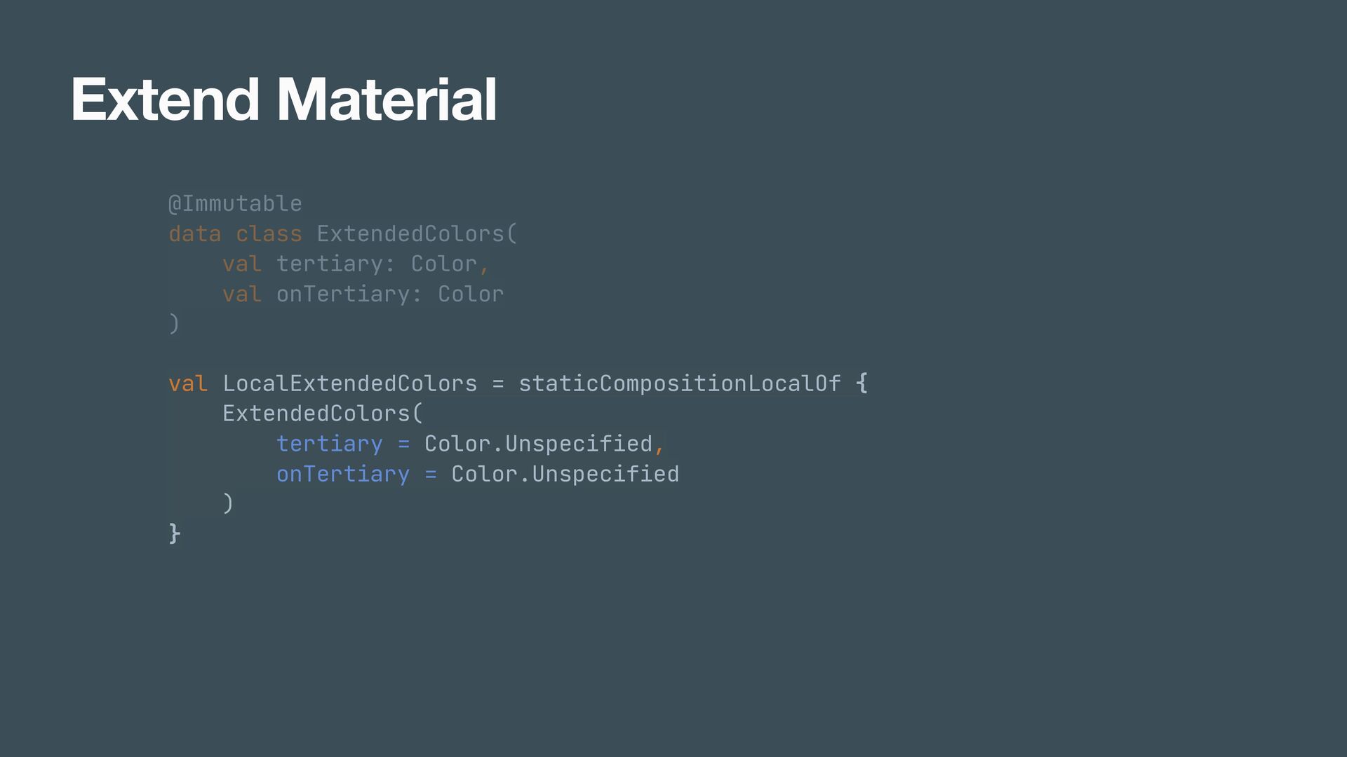
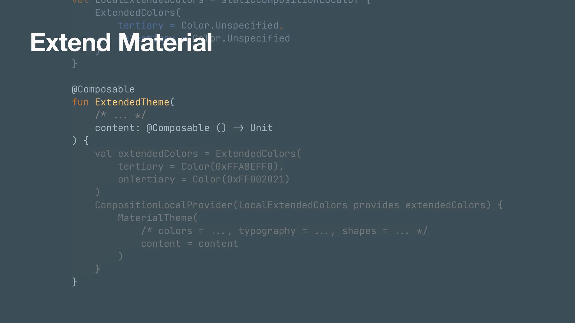
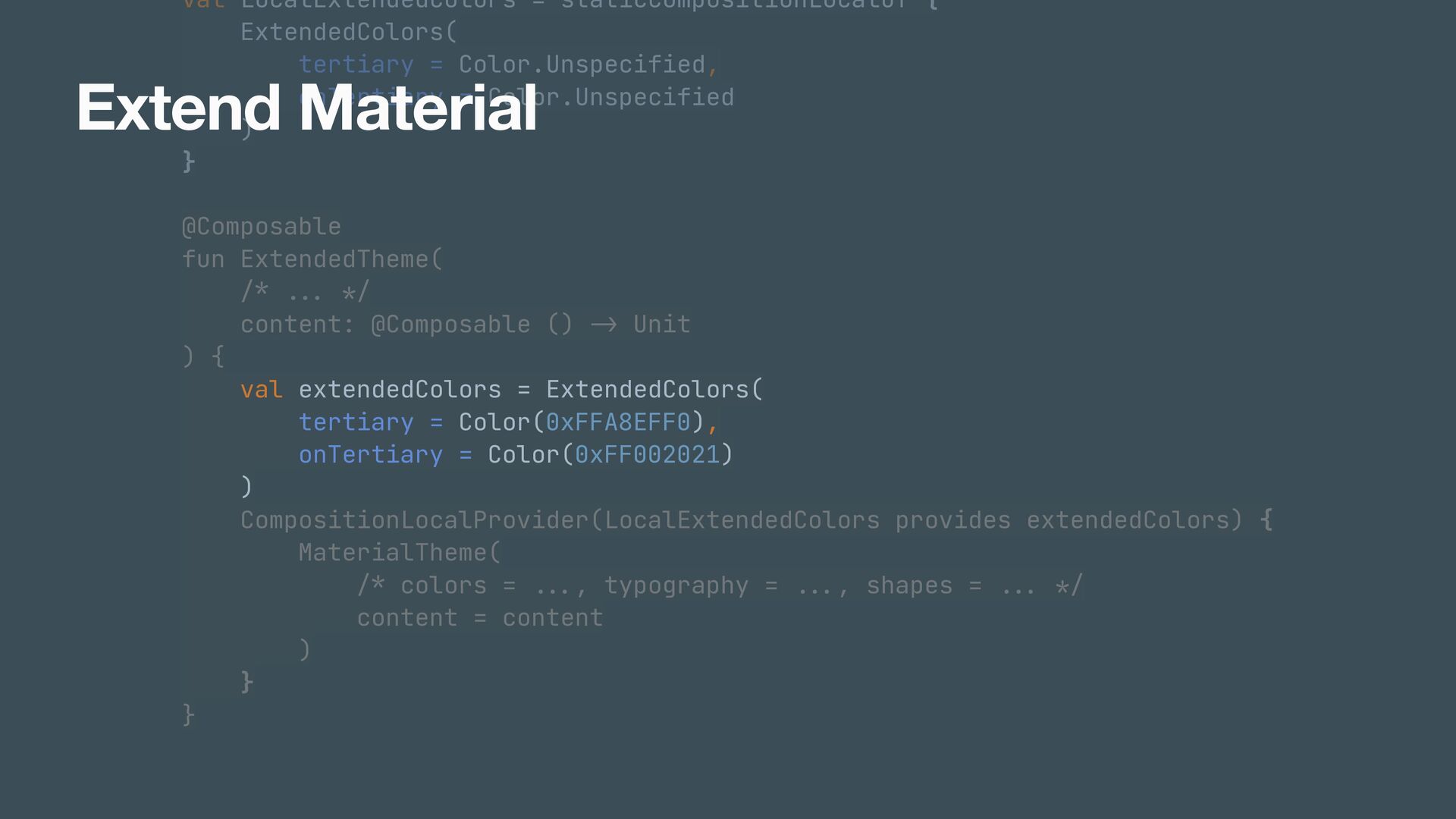
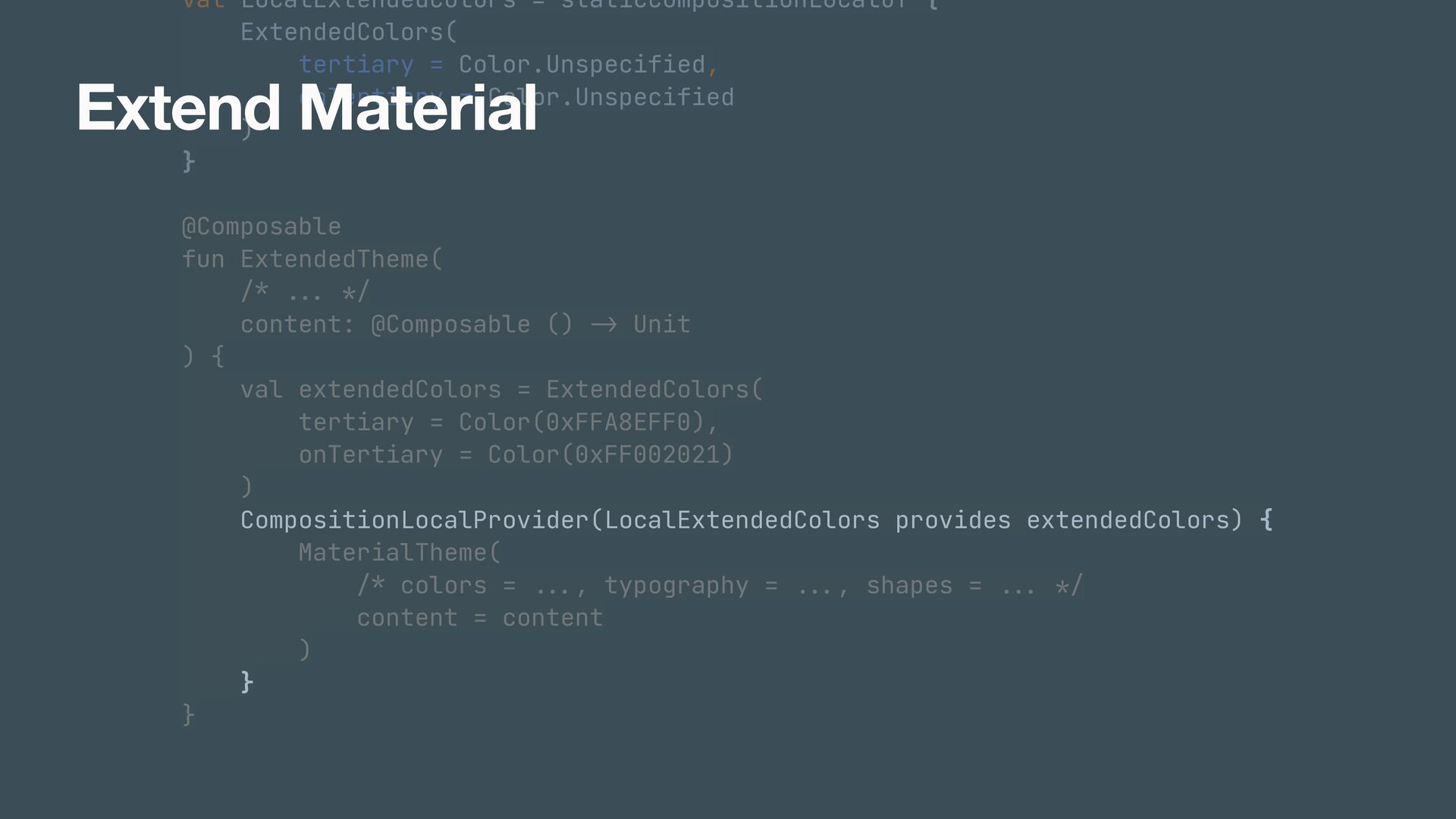
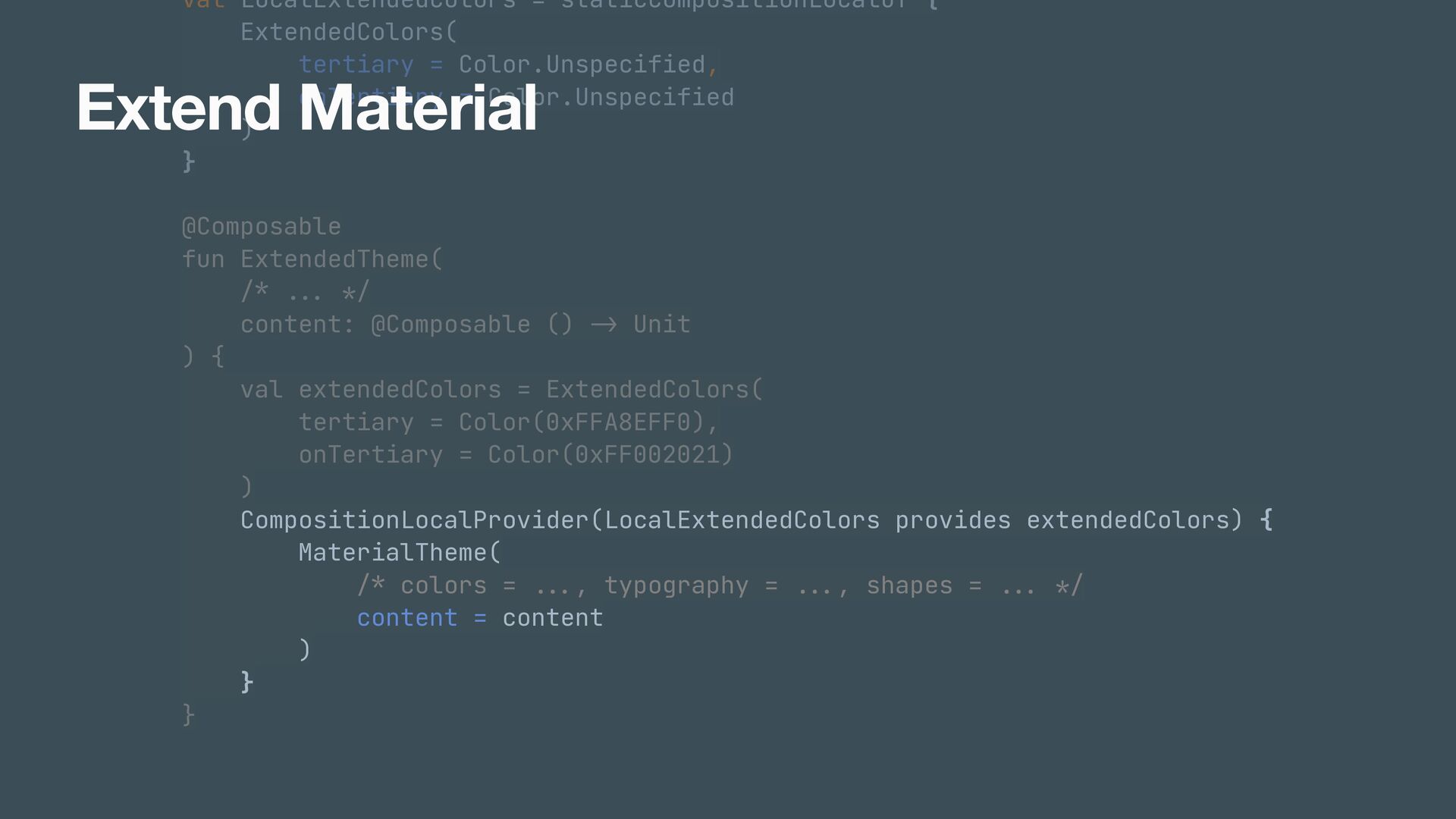
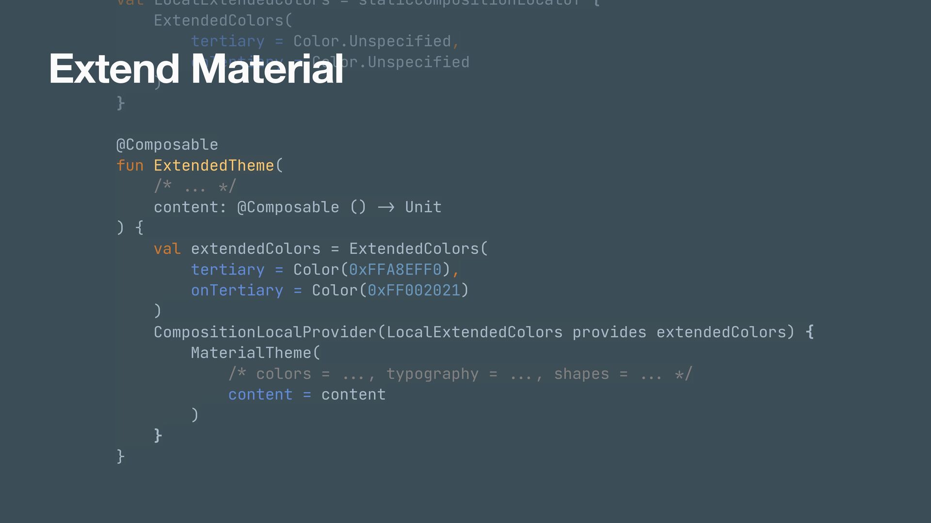
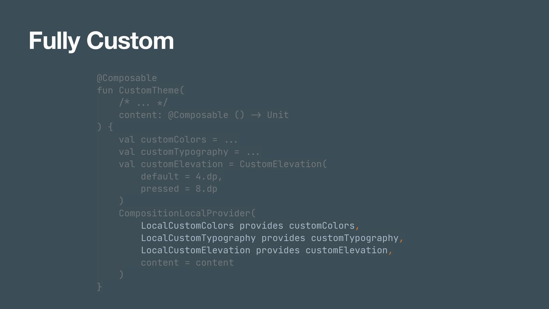
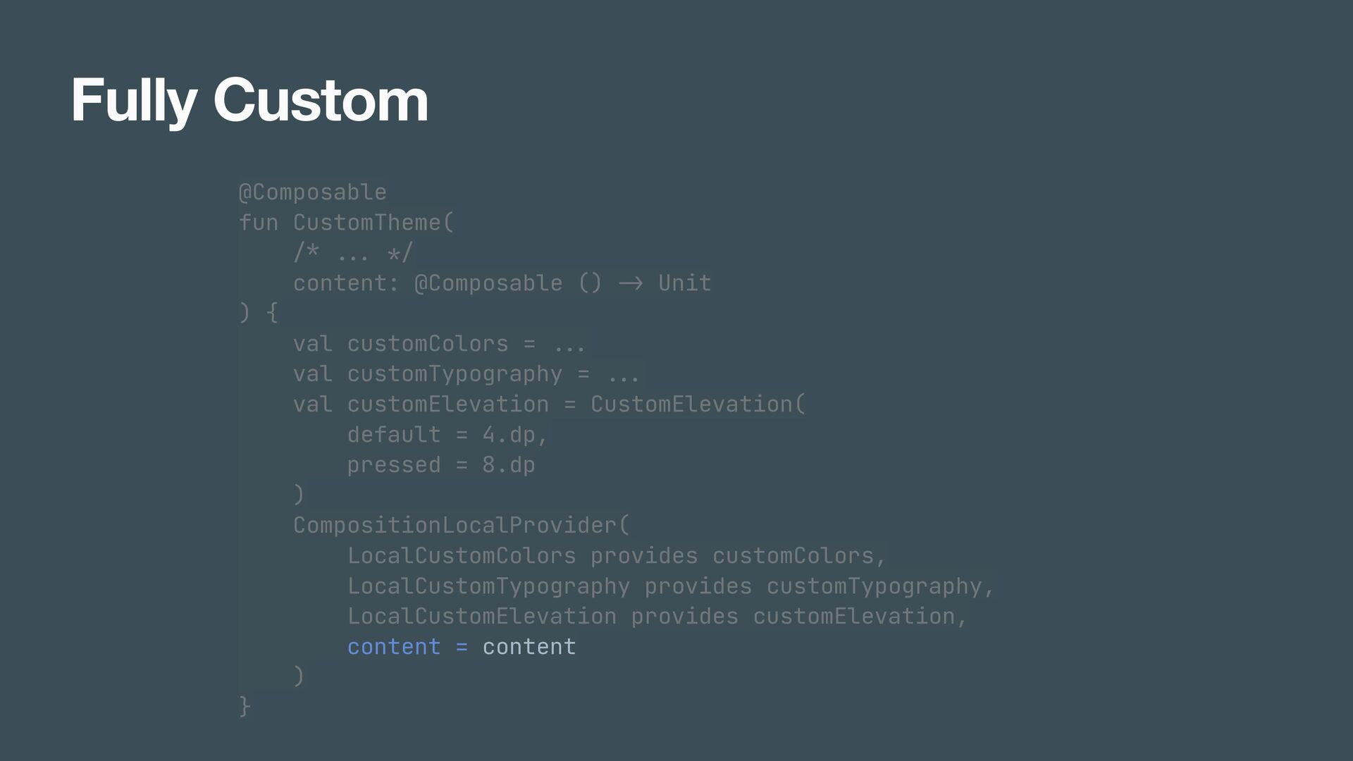
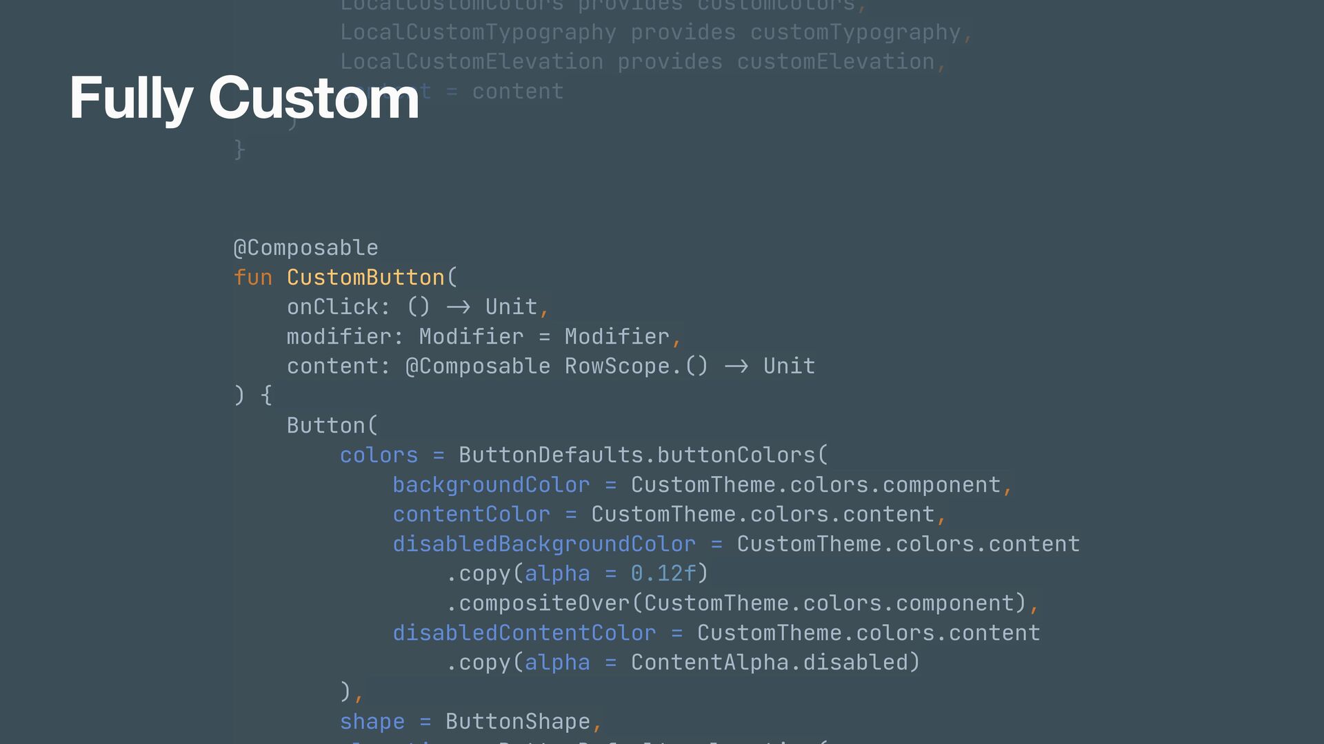
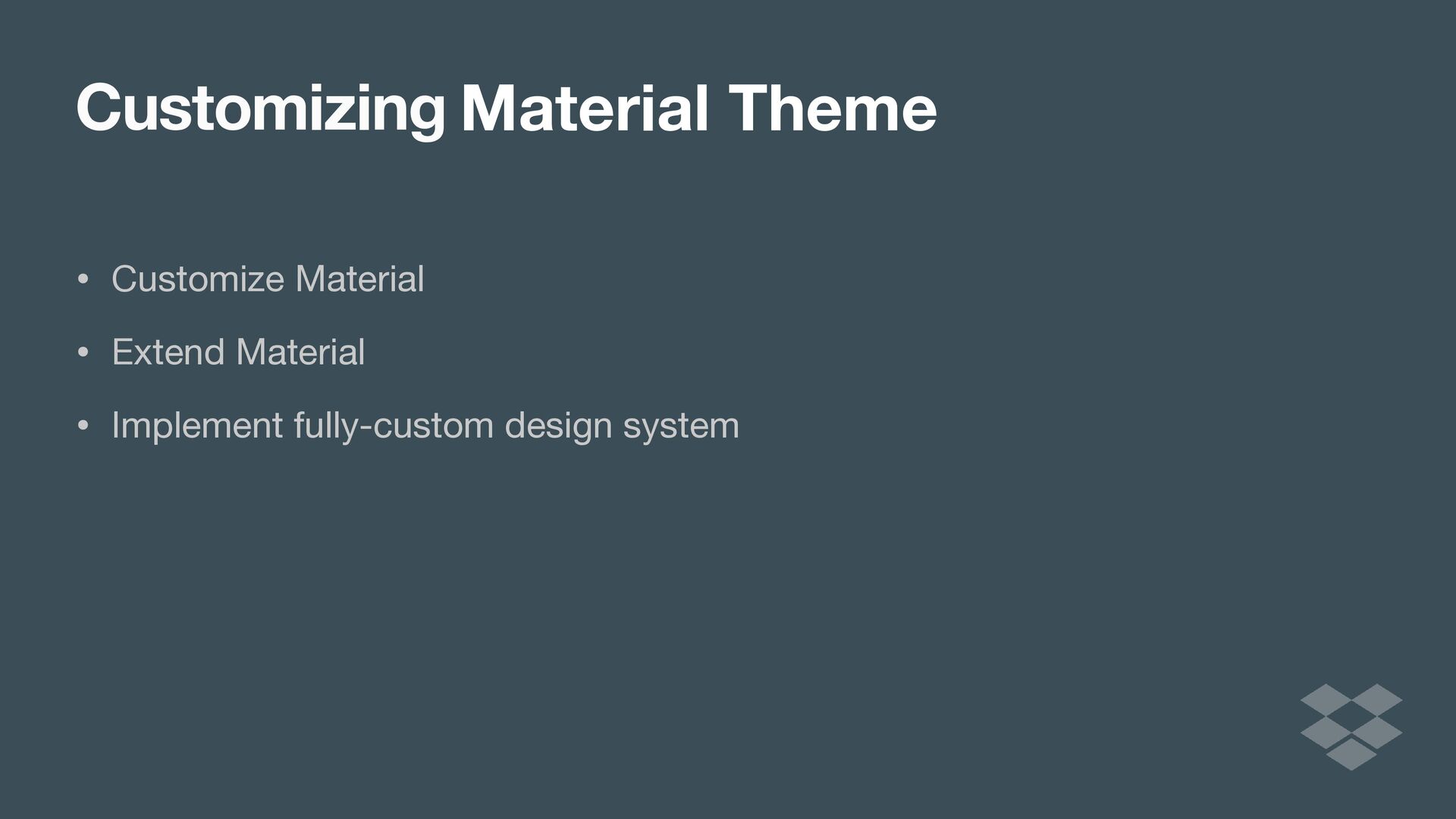
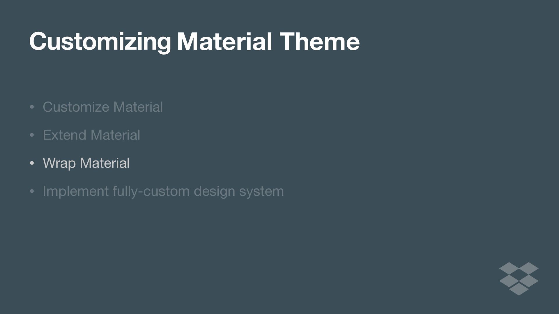
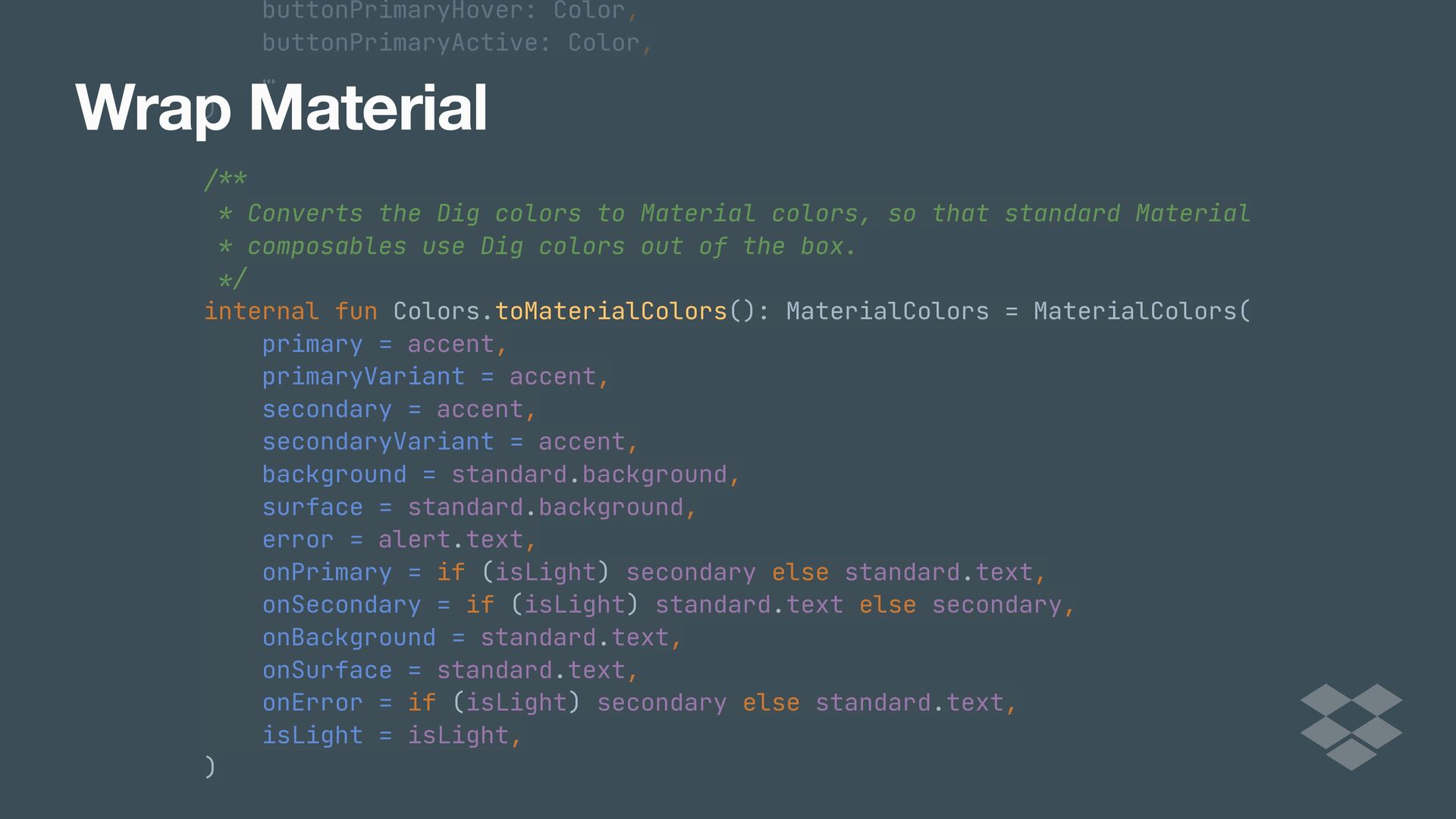
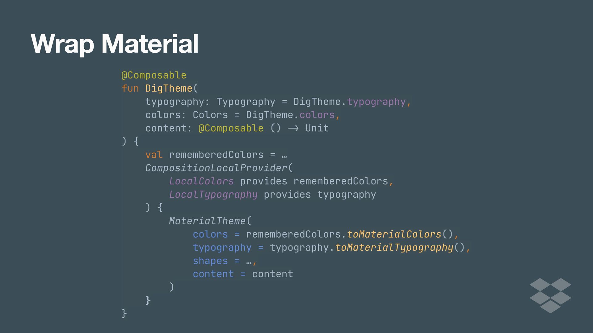
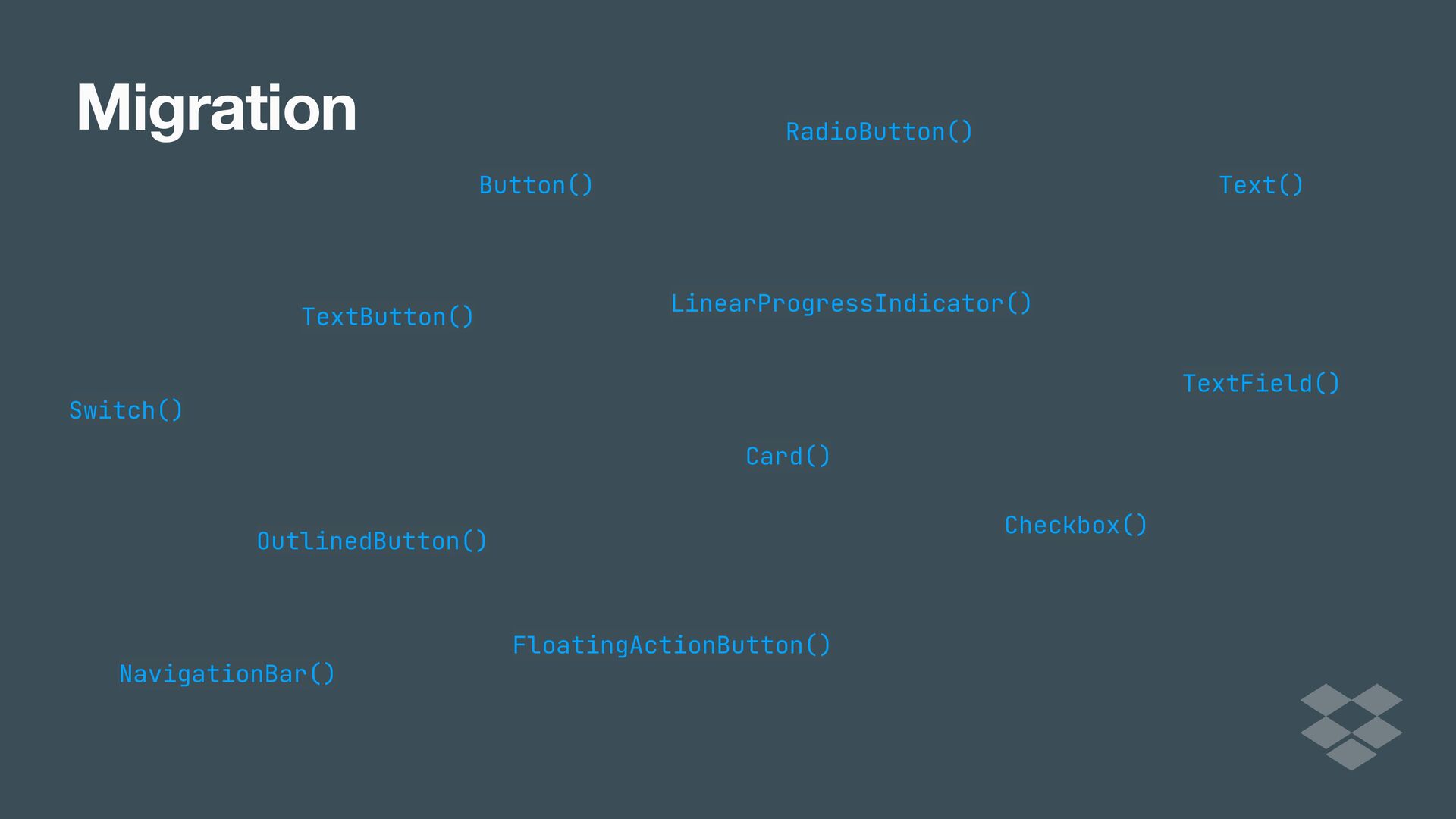
In this talk, we'll discuss different approaches to implementing custom design systems in Compose, from customizing the Material Theme, to extending it, all the way to implementing a full blown custom design library. We'll cover some of the benefits and drawbacks of each approach that you might want to consider.

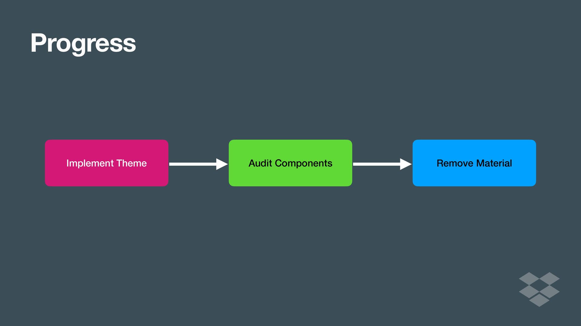
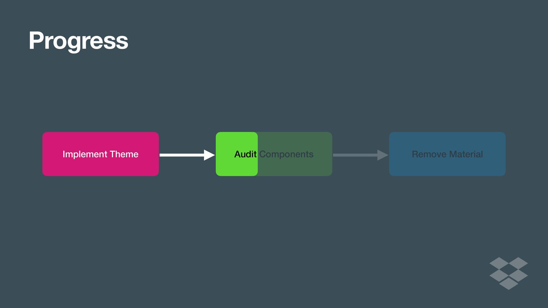
Lastly, we'll share the process we went through at Dropbox as we implemented our DIG design library. We'll report on our experience and reflect on the benefits we've seen and what our plans are for the future.

Ryan Harter

June 03, 2022
Tweet

More Decks by Ryan Harter

Other Decks in Programming

Transcript

  1. Sidebar Design System Tokens @Stable class Colors( val primary: Color,

    val primaryVariant: Color, val secondary: Color, val secondaryVariant: Color, val background: Color, val surface: Color, val error: Color, val onPrimary: Color, val onSecondary: Color, val onBackground: Color, val onSurface: Color, val onError: Color, val isLight: Boolean )
  2. Sidebar Design System Tokens @Stable class Colors( val primary: Color,

    val primaryVariant: Color, val secondary: Color, val secondaryVariant: Color, val background: Color, val surface: Color, val error: Color, val onPrimary: Color, val onSecondary: Color, val onBackground: Color, val onSurface: Color, val onError: Color, val isLight: Boolean ) @Stable class Colors( val : Color, val : Color, val : Color, val : Color, val : Color, val : Color, val : Color, val : Color, val : Color, val : Color, val : Color, val : Color, val : Boolean )
  3. Sidebar Design System Tokens @Stable class Colors( val primary: Color,

    val primaryVariant: Color, val secondary: Color, val secondaryVariant: Color, val background: Color, val surface: Color, val error: Color, val onPrimary: Color, val onSecondary: Color, val onBackground: Color, val onSurface: Color, val onError: Color, val isLight: Boolean ) @Immutable class Typography( val h1: TextStyle, val h2: TextStyle, val h3: TextStyle, val h4: TextStyle, val h5: TextStyle, val h6: TextStyle, val subtitle1: TextStyle, val subtitle2: TextStyle, val body1: TextStyle, val body2: TextStyle, val button: TextStyle, val caption: TextStyle, val overline: TextStyle )
  4. Sidebar Design System Tokens @Stable class Colors( val primary: Color,

    val primaryVariant: Color, val secondary: Color, val secondaryVariant: Color, val background: Color, val surface: Color, val error: Color, val onPrimary: Color, val onSecondary: Color, val onBackground: Color, val onSurface: Color, val onError: Color, val isLight: Boolean ) @Immutable class Typography( val h1: TextStyle, val h2: TextStyle, val h3: TextStyle, val h4: TextStyle, val h5: TextStyle, val h6: TextStyle, val subtitle1: TextStyle, val subtitle2: TextStyle, val body1: TextStyle, val body2: TextStyle, val button: TextStyle, val caption: TextStyle, val overline: TextStyle ) @Immutable class Typography( val : TextStyle, val : TextStyle, val : TextStyle, val : TextStyle, val : TextStyle, val : TextStyle, val : TextStyle, val : TextStyle, val : TextStyle, val : TextStyle, val : TextStyle, val : TextStyle, val : TextStyle )
  5. Sidebar Design System Tokens @Stable class Colors( val primary: Color,

    val primaryVariant: Color, val secondary: Color, val secondaryVariant: Color, val background: Color, val surface: Color, val error: Color, val onPrimary: Color, val onSecondary: Color, val onBackground: Color, val onSurface: Color, val onError: Color, val isLight: Boolean ) @Immutable class Typography( val h1: TextStyle, val h2: TextStyle, val h3: TextStyle, val h4: TextStyle, val h5: TextStyle, val h6: TextStyle, val subtitle1: TextStyle, val subtitle2: TextStyle, val body1: TextStyle, val body2: TextStyle, val button: TextStyle, val caption: TextStyle, val overline: TextStyle )
  6. private val LightColors = lightColors( . .. ) private val

    DarkColors = darkColors( . .. ) @Composable fun MyTheme(content: @Composable () - > Unit) { MaterialTheme( colors = if (isSystemInDarkTheme()) DarkColors else LightColors, shapes = Shapes( small = RoundedCornerShape(0.dp), medium = RoundedCornerShape(0.dp), large = RoundedCornerShape(0.dp) ), content = content ) } Customize Material
  7. private val LightColors = lightColors( . .. ) private val

    DarkColors = darkColors( . .. ) @Composable fun MyTheme MaterialTheme( colors = if (isSystemInDarkTheme()) DarkColors else LightColors, shapes = Shapes( small = RoundedCornerShape(0.dp), medium = RoundedCornerShape(0.dp), large = RoundedCornerShape(0.dp) ), content = content ) } Customize Material (content: @Composable () - > Unit) {
  8. private val LightColors = lightColors( . .. ) private val

    DarkColors = darkColors( . .. ) @Composable fun MyTheme MaterialTheme( colors = if (isSystemInDarkTheme()) DarkColors else LightColors, shapes = Shapes( small = RoundedCornerShape(0.dp), medium = RoundedCornerShape(0.dp), large = RoundedCornerShape(0.dp) ), content = content ) } : @Composable () -> Unit) { Customize Material (content
  9. private val LightColors = lightColors( . .. ) private val

    DarkColors = darkColors( . .. ) @Composable fun MyTheme MaterialTheme( colors = if (isSystemInDarkTheme()) DarkColors else LightColors, shapes = Shapes( small = RoundedCornerShape(0.dp), medium = RoundedCornerShape(0.dp), large = RoundedCornerShape(0.dp) ), content = content ) } : @Composable () -> Unit) { (content Customize Material content
  10. private val LightColors = lightColors( . .. ) private val

    DarkColors = darkColors( . .. ) @Composable fun MyTheme MaterialTheme( colors = if (isSystemInDarkTheme()) DarkColors else LightColors, shapes = Shapes( small = RoundedCornerShape(0.dp), medium = RoundedCornerShape(0.dp), large = RoundedCornerShape(0.dp) ), content = content ) } private val LightColors = lightColors( . .. ) private val DarkColors = darkColors( . .. ) @Composable fun MyTheme(content: @Composable () - > Unit) { MaterialTheme( colors = if (isSystemInDarkTheme()) DarkColors else LightColors, shapes = Shapes( small = RoundedCornerShape(0.dp), medium = RoundedCornerShape(0.dp), large = RoundedCornerShape(0.dp) ), content = content ) } Customize Material : @Composable () -> Unit) { content (content
  11. private val LightColors = lightColors( . .. ) private val

    DarkColors = darkColors( . .. ) @Composable fun MyTheme MaterialTheme( colors = if (isSystemInDarkTheme()) DarkColors else LightColors, shapes = Shapes( small = RoundedCornerShape(0.dp), medium = RoundedCornerShape(0.dp), large = RoundedCornerShape(0.dp) ), content = content ) } private val LightColors = lightColors( . .. ) private val DarkColors = darkColors( . .. ) @Composable fun MyTheme(content: @Composable () - > Unit) { MaterialTheme( colors = if (isSystemInDarkTheme()) DarkColors else LightColors, shapes = Shapes( small = RoundedCornerShape(0.dp), medium = RoundedCornerShape(0.dp), large = RoundedCornerShape(0.dp) ), content = content ) } Customize Material : @Composable () >
  12. private val LightColors = lightColors( . .. ) private val

    DarkColors = darkColors( . .. ) @Composable fun MyTheme(content: @Composable () - > Unit) { MaterialTheme( colors = if (isSystemInDarkTheme()) DarkColors else LightColors, shapes = Shapes( small = RoundedCornerShape(0.dp), medium = RoundedCornerShape(0.dp), large = RoundedCornerShape(0.dp) ), content = content ) } Customize Material
  13. private val LightColors = lightColors( . .. ) private val

    DarkColors = darkColors( . .. ) @Composable fun MyTheme(content: @Composable () - > Unit) { MaterialTheme( colors = if (isSystemInDarkTheme()) DarkColors else LightColors, shapes = Shapes( small = RoundedCornerShape(0.dp), medium = RoundedCornerShape(0.dp), large = RoundedCornerShape(0.dp) ), content = content ) } Customize Material
  14. private val LightColors = lightColors( . .. ) private val

    DarkColors = darkColors( . .. ) @Composable fun MyTheme(content: @Composable () - > Unit) { MaterialTheme( colors = if (isSystemInDarkTheme()) DarkColors else LightColors, shapes = Shapes( small = RoundedCornerShape(0.dp), medium = RoundedCornerShape(0.dp), large = RoundedCornerShape(0.dp) ), content = content ) } Customize Material
  15. private val LightColors = lightColors( . .. ) private val

    DarkColors = darkColors( . .. ) @Composable fun MyTheme(content: @Composable () - > Unit) { MaterialTheme( colors = if (isSystemInDarkTheme()) DarkColors else LightColors, shapes = Shapes( small = RoundedCornerShape(0.dp), medium = RoundedCornerShape(0.dp), large = RoundedCornerShape(0.dp) ), content = content ) } Customize Material @Composable
  16. Extend Material (super simple) val Colors.snackbarAction: Color get() = if

    (isLight) Red300 else Red700 val Typography.textFieldInput: TextStyle get() = TextStyle( / * ... */ ) val Shapes.card: Shape get() = RoundedCornerShape(size = 20.dp) val Colors.snackbarAction: Color get() = if (isLight) Red300 else Red700 val Typography.textFieldInput: TextStyle get() = TextStyle( / * ... */ ) val Shapes.card: Shape get() = RoundedCornerShape(size = 20.dp)
  17. Sidebar Material Theme Colors Typography Shape Surface 1 Providing Tokens

    Button Text Surface Surface 2 Surface Material Theme 2 Text Text Button Material Theme Colors Typography Shape
  18. Sidebar Material Theme Colors Typography Shape Surface 1 Providing Tokens

    Button Text Surface Surface 2 Surface Material Theme 2 Text Text Button Material Theme Colors Typography Shape
  19. Sidebar Material Theme Colors Typography Shape Surface 1 Providing Tokens

    Button Text Surface Surface 2 Surface Material Theme 2 Text Text Material Theme Colors Typography Shape Button
  20. Sidebar Material Theme Colors Typography Shape Surface 1 Providing Tokens

    Button Text Surface Surface 2 Surface Material Theme 2 Text Text Material Theme Colors Typography Shape Button
  21. Sidebar Material Theme Colors Typography Shape Surface 1 Providing Tokens

    Button Text Surface Surface 2 Surface Material Theme 2 Text Text Material Theme Colors Typography Shape Button
  22. @Immutable data class ExtendedColors( val tertiary: Color, val onTertiary: Color

    ) val LocalExtendedColors = staticCompositionLocalOf {
  23. fun ExtendedTheme( /* .. . * / content: @Composable ()

    - > Unit ) { val extendedColors = ExtendedColors( tertiary = Color(0xFFA8EFF0), onTertiary = Color(0xFF002021) ) CompositionLocalProvider(LocalExtendedColors provides extendedColors) { MaterialTheme( /* colors = ... , typography = .. . , shapes = .. . */ content = content ) } } Extend Material
  24. fun ExtendedTheme( /* .. . * / content: @Composable ()

    - > Unit ) { val extendedColors = ExtendedColors( tertiary = Color(0xFFA8EFF0), onTertiary = Color(0xFF002021) ) CompositionLocalProvider(LocalExtendedColors provides extendedColors) { MaterialTheme( /* colors = ... , typography = .. . , shapes = .. . */ content = content ) } } Extend Material
  25. fun ExtendedTheme( /* .. . * / content: @Composable ()

    - > Unit ) { val extendedColors = ExtendedColors( tertiary = Color(0xFFA8EFF0), onTertiary = Color(0xFF002021) ) CompositionLocalProvider(LocalExtendedColors provides extendedColors) { MaterialTheme( /* colors = ... , typography = .. . , shapes = .. . */ content = content ) } } Extend Material
  26. fun ExtendedTheme( /* .. . * / content: @Composable ()

    - > Unit ) { val extendedColors = ExtendedColors( tertiary = Color(0xFFA8EFF0), onTertiary = Color(0xFF002021) ) CompositionLocalProvider(LocalExtendedColors provides extendedColors) { MaterialTheme( /* colors = ... , typography = .. . , shapes = .. . */ content = content ) } } Extend Material
  27. fun ExtendedTheme( /* .. . * / content: @Composable ()

    - > Unit ) { val extendedColors = ExtendedColors( tertiary = Color(0xFFA8EFF0), onTertiary = Color(0xFF002021) ) CompositionLocalProvider(LocalExtendedColors provides extendedColors) { MaterialTheme( /* colors = ... , typography = .. . , shapes = .. . */ content = content ) } } Extend Material
  28. fun ExtendedTheme( /* .. . * / content: @Composable ()

    - > Unit ) { val extendedColors = ExtendedColors( tertiary = Color(0xFFA8EFF0), onTertiary = Color(0xFF002021) ) CompositionLocalProvider(LocalExtendedColors provides extendedColors) { MaterialTheme( /* colors = ... , typography = .. . , shapes = .. . */ content = content ) } } Extend Material
  29. fun ExtendedTheme( /* .. . * / content: @Composable ()

    - > Unit ) { val extendedColors = ExtendedColors( tertiary = Color(0xFFA8EFF0), onTertiary = Color(0xFF002021) ) CompositionLocalProvider(LocalExtendedColors provides extendedColors) { MaterialTheme( /* colors = ... , typography = .. . , shapes = .. . */ content = content ) } } Extend Material
  30. // Use with eg. ExtendedTheme.colors.tertiary object ExtendedTheme { val colors:

    ExtendedColors @Composable get() = LocalExtendedColors.current } tertiary = Color(0xFFA8EFF0),
  31. object ExtendedTheme { fun ExtendedButton( onClick: () -> Unit, modifier:

    Modifier = Modifier, content: @Composable RowScope.() -> Unit ) { Button( colors = ButtonDefaults.buttonColors( backgroundColor = ExtendedTheme.colors.tertiary, contentColor = ExtendedTheme.colors.onTertiary /* Other colors use values from MaterialTheme */ ), onClick = onClick, modifier = modifier, content = content ) }
  32. object ExtendedTheme { fun ExtendedButton( onClick: () -> Unit, modifier:

    Modifier = Modifier, content: @Composable RowScope.() -> Unit ) { Button( colors = ButtonDefaults.buttonColors( backgroundColor = ExtendedTheme.colors.tertiary, contentColor = ExtendedTheme.colors.onTertiary /* Other colors use values from MaterialTheme */ ), onClick = onClick, modifier = modifier, content = content ) }
  33. object ExtendedTheme { fun ExtendedButton( onClick: () -> Unit, modifier:

    Modifier = Modifier, content: @Composable RowScope.() -> Unit ) { Button( colors = ButtonDefaults.buttonColors( backgroundColor = ExtendedTheme.colors.tertiary, contentColor = ExtendedTheme.colors.onTertiary /* Other colors use values from MaterialTheme */ ), onClick = onClick, modifier = modifier, content = content ) }
  34. object ExtendedTheme { fun ExtendedButton( onClick: () -> Unit, modifier:

    Modifier = Modifier, content: @Composable RowScope.() -> Unit ) { Button( colors = ButtonDefaults.buttonColors( backgroundColor = ExtendedTheme.colors.tertiary, contentColor = ExtendedTheme.colors.onTertiary /* Other colors use values from MaterialTheme */ ), onClick = onClick, modifier = modifier, content = content ) }
  35. object ExtendedTheme { fun ExtendedButton( onClick: () -> Unit, modifier:

    Modifier = Modifier, content: @Composable RowScope.() -> Unit ) { Button( colors = ButtonDefaults.buttonColors( backgroundColor = ExtendedTheme.colors.tertiary, contentColor = ExtendedTheme.colors.onTertiary /* Other colors use values from MaterialTheme */ ), onClick = onClick, modifier = modifier, content = content ) }
  36. Fully Custom @Composable fun CustomTheme( /* .. . * /

    content: @Composable () - > Unit ) { val customColors = ... val customTypography = .. . val customElevation = CustomElevation( default = 4.dp, pressed = 8.dp ) CompositionLocalProvider( LocalCustomColors provides customColors, LocalCustomTypography provides customTypography, LocalCustomElevation provides customElevation, content = content ) }
  37. Fully Custom @Composable fun CustomTheme( /* .. . * /

    content: @Composable () - > Unit ) { val customColors = ... val customTypography = .. . val customElevation = CustomElevation( default = 4.dp, pressed = 8.dp ) CompositionLocalProvider( LocalCustomColors provides customColors, LocalCustomTypography provides customTypography, LocalCustomElevation provides customElevation, content = content ) }
  38. Fully Custom @Composable fun CustomTheme( /* .. . * /

    content: @Composable () - > Unit ) { val customColors = ... val customTypography = .. . val customElevation = CustomElevation( default = 4.dp, pressed = 8.dp ) CompositionLocalProvider( LocalCustomColors provides customColors, LocalCustomTypography provides customTypography, LocalCustomElevation provides customElevation, content = content ) }
  39. @Composable fun CustomTheme( /* .. . * / content: @Composable

    () - > Unit ) { val customColors = ... val customTypography = .. . val customElevation = CustomElevation( default = 4.dp, pressed = 8.dp ) CompositionLocalProvider( LocalCustomColors provides customColors, LocalCustomTypography provides customTypography, LocalCustomElevation provides customElevation, content = content ) } Fully Custom
  40. @Composable fun CustomTheme( /* .. . * / content: @Composable

    () - > Unit ) { val customColors = ... val customTypography = .. . val customElevation = CustomElevation( default = 4.dp, pressed = 8.dp ) CompositionLocalProvider( LocalCustomColors provides customColors, LocalCustomTypography provides customTypography, LocalCustomElevation provides customElevation, content = content ) } Fully Custom
  41. @Composable fun CustomTheme( /* .. . * / content: @Composable

    () - > Unit ) { val customColors = ... val customTypography = .. . val customElevation = CustomElevation( default = 4.dp, pressed = 8.dp ) CompositionLocalProvider( LocalCustomColors provides customColors, LocalCustomTypography provides customTypography, LocalCustomElevation provides customElevation, content = content ) } Fully Custom
  42. @Composable fun CustomButton( onClick: () -> Unit, modifier: Modifier =

    Modifier, content: @Composable RowScope.() -> Unit ) { Button( colors = ButtonDefaults.buttonColors( backgroundColor = CustomTheme.colors.component, contentColor = CustomTheme.colors.content, disabledBackgroundColor = CustomTheme.colors.content .copy(alpha = 0.12f) .compositeOver(CustomTheme.colors.component), disabledContentColor = CustomTheme.colors.content .copy(alpha = ContentAlpha.disabled) ), shape = ButtonShape, LocalCustomColors provides customColors,
  43. .copy(alpha = 0.12f) .compositeOver(CustomTheme.colors.component), disabledContentColor = CustomTheme.colors.content .copy(alpha = ContentAlpha.disabled)

    ), shape = ButtonShape, elevation = ButtonDefaults.elevation( defaultElevation = CustomTheme.elevation.default, pressedElevation = CustomTheme.elevation.pressed ), onClick = onClick, modifier = modifier, content = { ProvideTextStyle( value = CustomTheme.typography.body ) { content() } } ) } Fully Custom
  44. Where we started • Already have design system • Color

    Tokens • Typography Tokens • Components
  45. Goals • Get started fast • Easy to use (no

    cheat sheet) • Access to all of the existing Material composables • Use Compose while implementing design system • Incrementally migrate away from Material
  46. • Customize Material • Extend Material • Wrap Material •

    Implement fully-custom design system Customizing Material Theme
  47. • Customize Material • Extend Material • Wrap Material •

    Implement fully-custom design system Customizing Material Theme
  48. /** * Converts the Dig colors to Material colors, so

    that standard Material * composables use Dig colors out of the box. */ internal fun Colors.toMaterialColors(): MaterialColors = MaterialColors( primary = accent, primaryVariant = accent, secondary = accent, secondaryVariant = accent, background = standard.background, surface = standard.background, error = alert.text, onPrimary = if (isLight) secondary else standard.text, onSecondary = if (isLight) standard.text else secondary, onBackground = standard.text, onSurface = standard.text, onError = if (isLight) secondary else standard.text, isLight = isLight, ) Wrap Material
  49. @Immutable data class Typography internal constructor( val titleLarge: TextStyle, val

    titleStandard: TextStyle, val titleSmall: TextStyle, val labelXLarge: TextStyle, … ) internal fun Typography.toMaterialTypography(): MaterialTypography = MaterialTypography(
  50. val titleLarge: TextStyle, defaultFontFamily = DefaultFontFamily, h1 = titleLarge, h2

    = titleLarge, h3 = titleLarge, h4 = titleLarge, h5 = titleStandard, h6 = titleStandard.copy(fontWeight = FontWeight.Medium), subtitle1 = paragraphLarge, subtitle2 = paragraphStandard, body1 = paragraphLarge, body2 = paragraphStandard, button = labelLarge.copy(fontWeight = FontWeight.Medium, lineHeight = 24.sp), caption = labelSmall, overline = labelXSmall, ) Wrap Material
  51. Wrap Material @Composable fun DigTheme( typography: Typography = DigTheme.typography, colors:

    Colors = DigTheme.colors, content: @Composable () - > Unit ) { val rememberedColors = … CompositionLocalProvider( LocalColors provides rememberedColors, LocalTypography provides typography ) { MaterialTheme( colors = rememberedColors.toMaterialColors(), typography = typography.toMaterialTypography(), shapes = …, content = content ) } }
  52. Wrap Material @Composable fun DigTheme( typography: Typography = DigTheme.typography, colors:

    Colors = DigTheme.colors, content: @Composable () - > Unit ) { val rememberedColors = … CompositionLocalProvider( LocalColors provides rememberedColors, LocalTypography provides typography ) { MaterialTheme( colors = rememberedColors.toMaterialColors(), typography = typography.toMaterialTypography(), shapes = …, content = content ) } }
  53. Wrap Material @Composable fun DigTheme( typography: Typography = DigTheme.typography, colors:

    Colors = DigTheme.colors, content: @Composable () - > Unit ) { val rememberedColors = … CompositionLocalProvider( LocalColors provides rememberedColors, LocalTypography provides typography ) { MaterialTheme( colors = rememberedColors.toMaterialColors(), typography = typography.toMaterialTypography(), shapes = …, content = content ) } }
  54. Wrap Material @Composable fun DigTheme( typography: Typography = DigTheme.typography, colors:

    Colors = DigTheme.colors, content: @Composable () - > Unit ) { val rememberedColors = … CompositionLocalProvider( LocalColors provides rememberedColors, LocalTypography provides typography ) { MaterialTheme( colors = rememberedColors.toMaterialColors(), typography = typography.toMaterialTypography(), shapes = …, content = content ) } }
  55. Wrap Material @Composable fun DigTheme( typography: Typography = DigTheme.typography, colors:

    Colors = DigTheme.colors, content: @Composable () - > Unit ) { val rememberedColors = … CompositionLocalProvider( LocalColors provides rememberedColors, LocalTypography provides typography ) { MaterialTheme( colors = rememberedColors.toMaterialColors(), typography = typography.toMaterialTypography(), shapes = …, content = content ) } }
  56. Wrap Material @Composable fun DigTheme( typography: Typography = DigTheme.typography, colors:

    Colors = DigTheme.colors, content: @Composable () - > Unit ) { val rememberedColors = … CompositionLocalProvider( LocalColors provides rememberedColors, LocalTypography provides typography ) { MaterialTheme( colors = rememberedColors.toMaterialColors(), typography = typography.toMaterialTypography(), shapes = …, content = content ) } }
  57. Wrap Material @Composable fun DigTheme( typography: Typography = DigTheme.typography, colors:

    Colors = DigTheme.colors, content: @Composable () - > Unit ) { val rememberedColors = … CompositionLocalProvider( LocalColors provides rememberedColors, LocalTypography provides typography ) { MaterialTheme( colors = rememberedColors.toMaterialColors(), typography = typography.toMaterialTypography(), shapes = …, content = content ) } }
  58. Wrap Material @Composable fun DigTheme( typography: Typography = DigTheme.typography, colors:

    Colors = DigTheme.colors, content: @Composable () - > Unit ) { val rememberedColors = … CompositionLocalProvider( LocalColors provides rememberedColors, LocalTypography provides typography ) { MaterialTheme( colors = rememberedColors.toMaterialColors(), typography = typography.toMaterialTypography(), shapes = …, content = content ) } }
  59. Wrap Material DigTheme { Row { Button(onClick = { })

    { Text("Button") } Button( onClick = { }, enabled = false ) { Text("Disabled") } } }
  60. Wrap Material DigTheme { Row { Button(onClick = { })

    { Text("Button") } Button( onClick = { }, enabled = false ) { Text("Disabled") } } }
  61. Migration • Not all Material elements perform like we expect

    • Ex. TopAppBar uses accent color, we use surface color. • Mitigate by creating custom composables • Which implementation to use?
  62. Migration Button() TextButton() OutlinedButton() FloatingActionButton() Switch() Checkbox() RadioButton() Text() TextField()

    LinearProgressIndicator() Card() Button() TextButton() OutlinedButton() FloatingActionButton() Switch() Checkbox() RadioButton() Text() TextField() LinearProgressIndicator() Card() TopAppBar() NavigationBar()
  63. dependencies { api(libs.androidx.compose.ui) api(libs.androidx.compose.runtime) api(libs.androidx.compose.foundation) api(libs.androidx.compose.material) implementation(libs.androidx.activity.activity.compose) implementation(libs.androidx.compose.animation) implementation(libs.androidx.lifecycle.lifecycle.viewmodel.compose) implementation(libs.androidx.compose.ui.ui.tooling.preview)

    debugImplementation(libs.androidx.compose.ui.ui.tooling) } dependencies { api(libs.androidx.compose.ui) api(libs.androidx.compose.runtime) api(libs.androidx.compose.foundation) implementation(libs.androidx.compose.material) implementation(libs.androidx.activity.activity.compose) implementation(libs.androidx.compose.animation) implementation(libs.androidx.lifecycle.lifecycle.viewmodel.compose) implementation(libs.androidx.compose.ui.ui.tooling.preview) debugImplementation(libs.androidx.compose.ui.ui.tooling) } Migration