Upgrade to Pro — share decks privately, control downloads, hide ads and more …

Custom Design Systems in Compose - Chicago Roboto

Custom Design Systems in Compose - Chicago Roboto

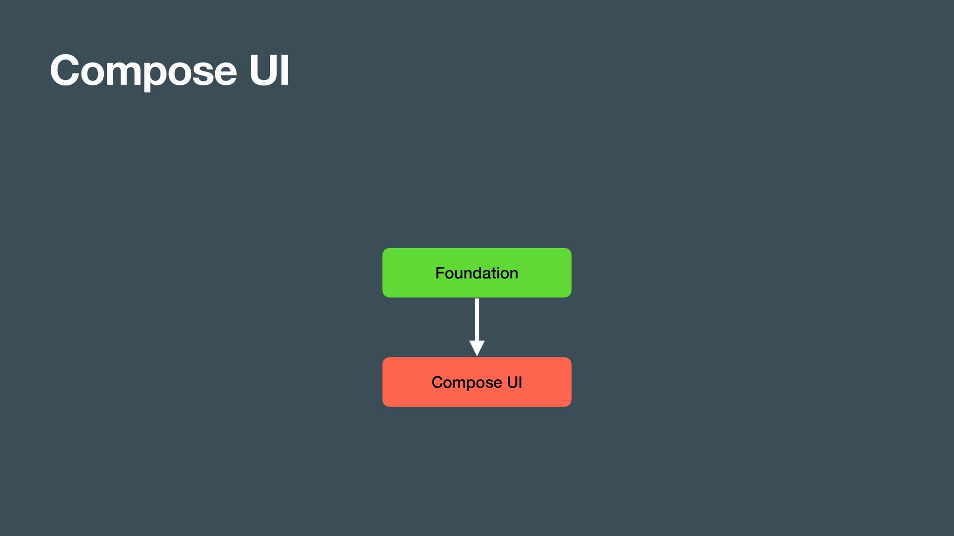
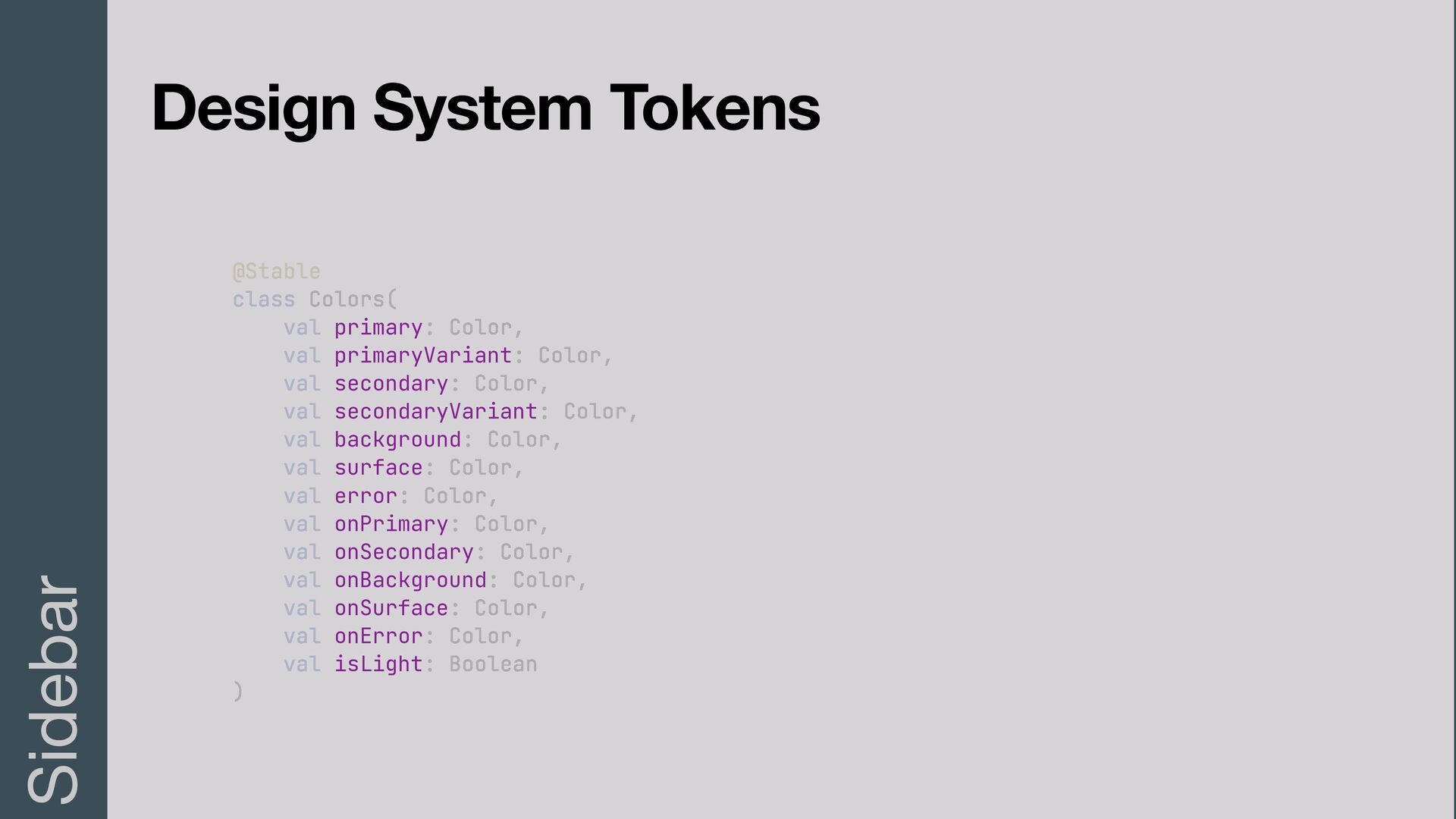
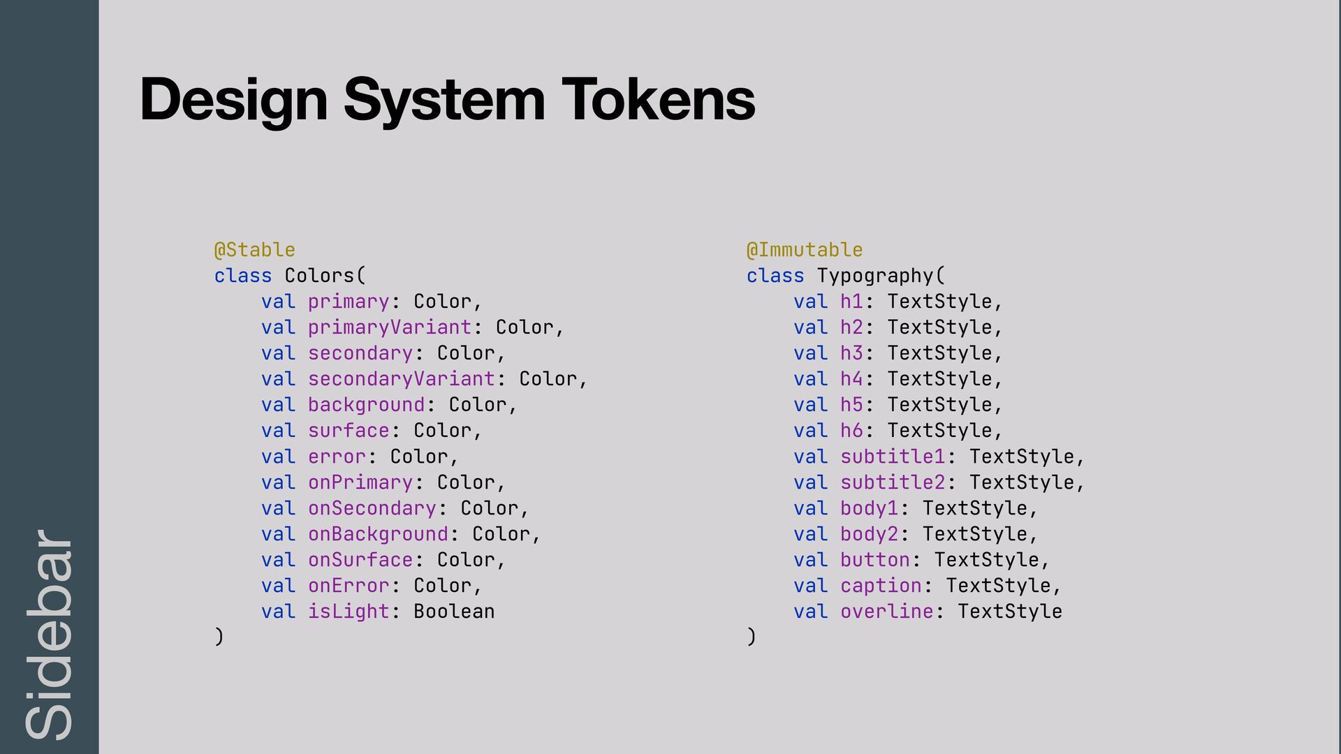
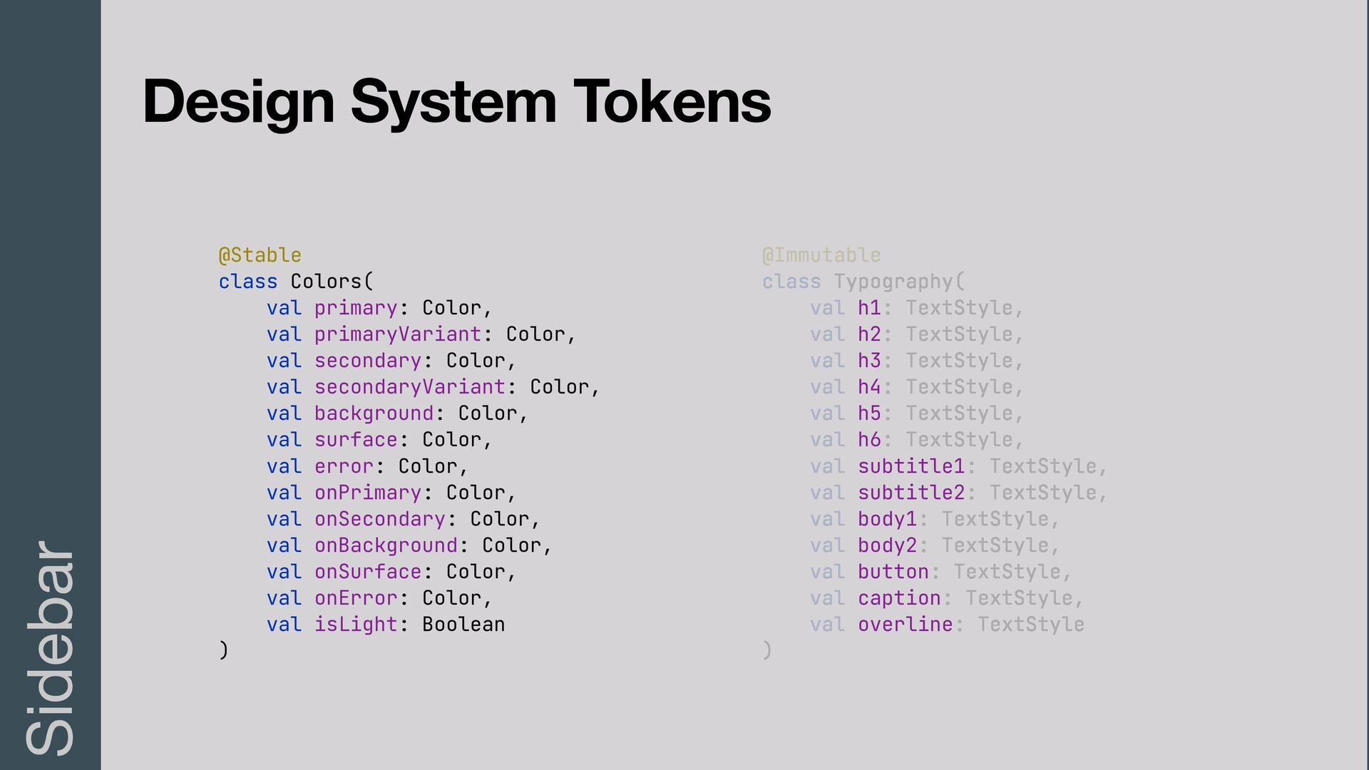
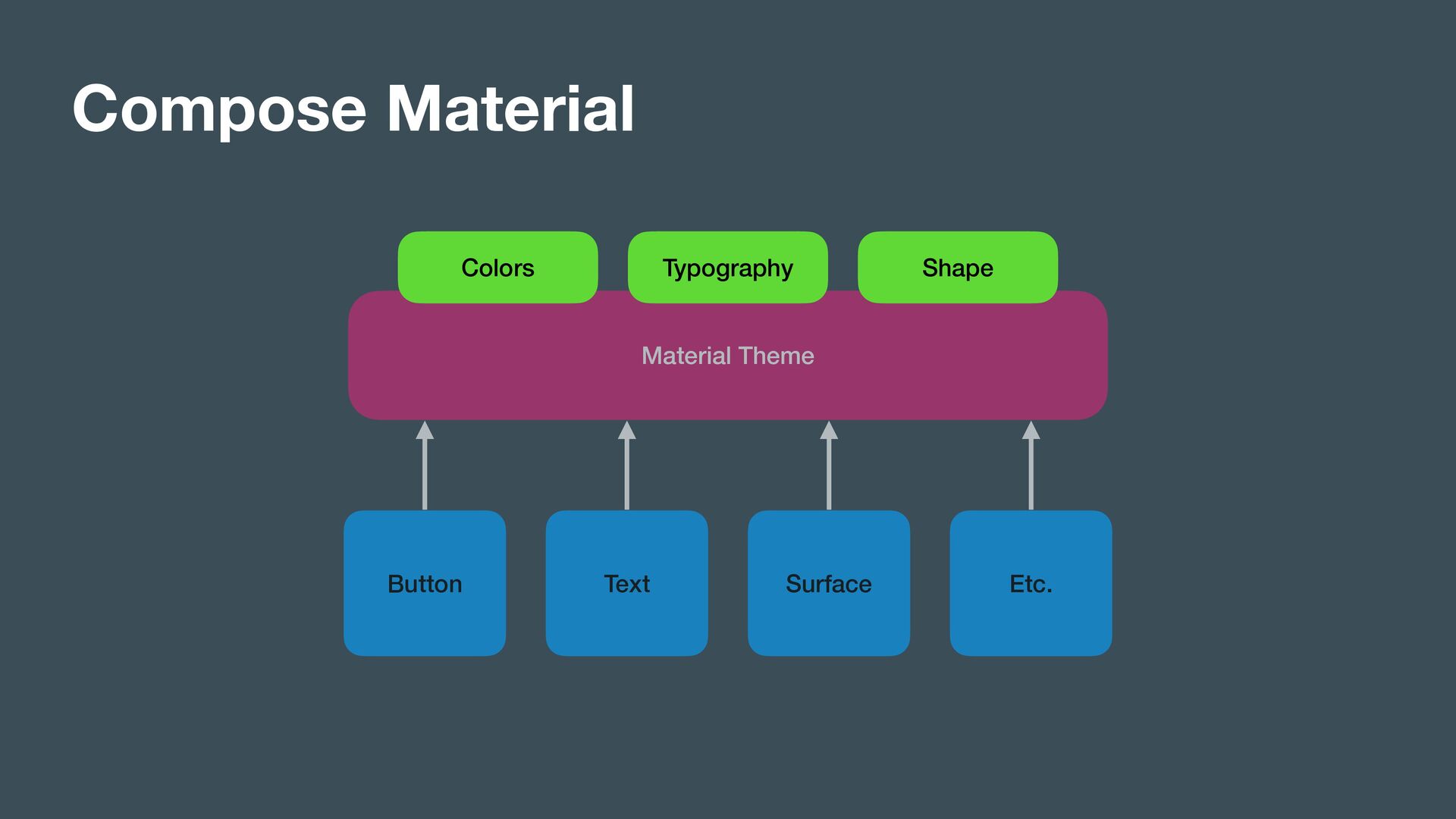
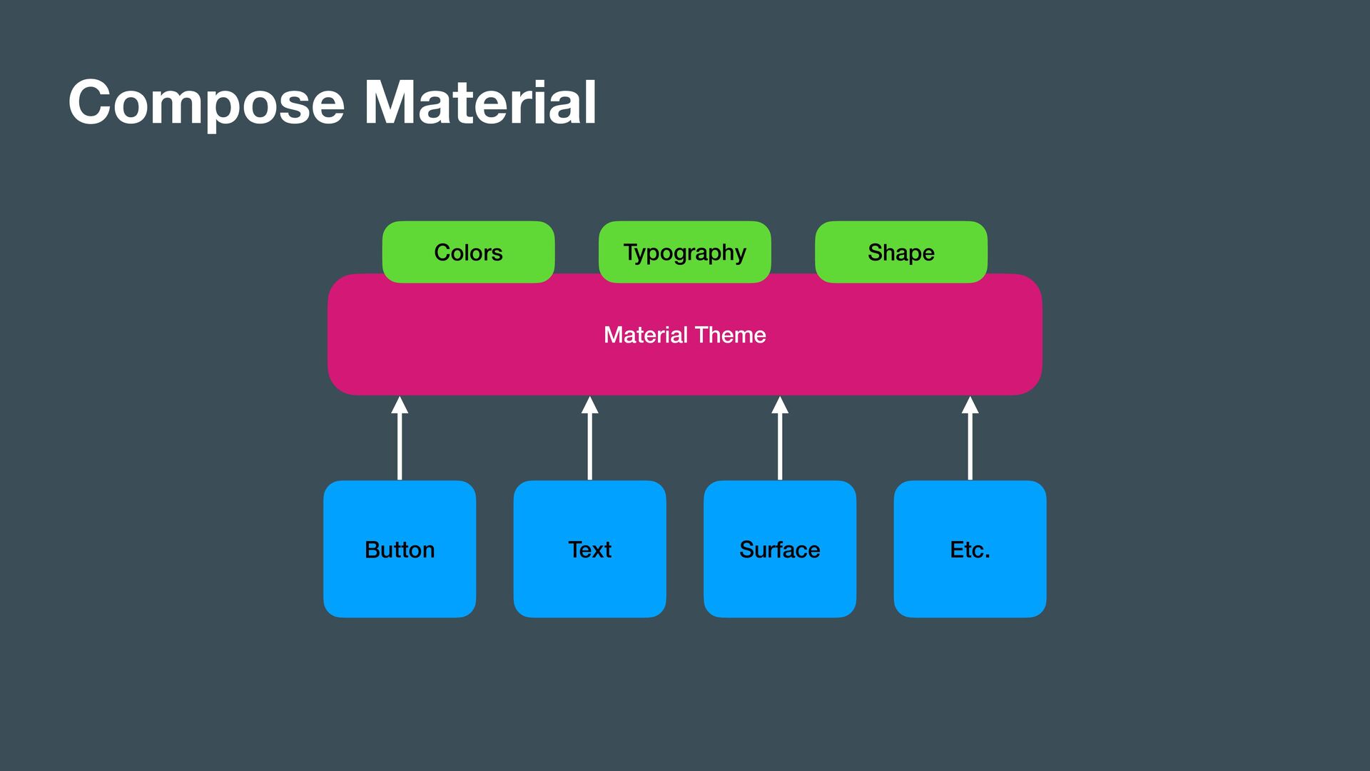
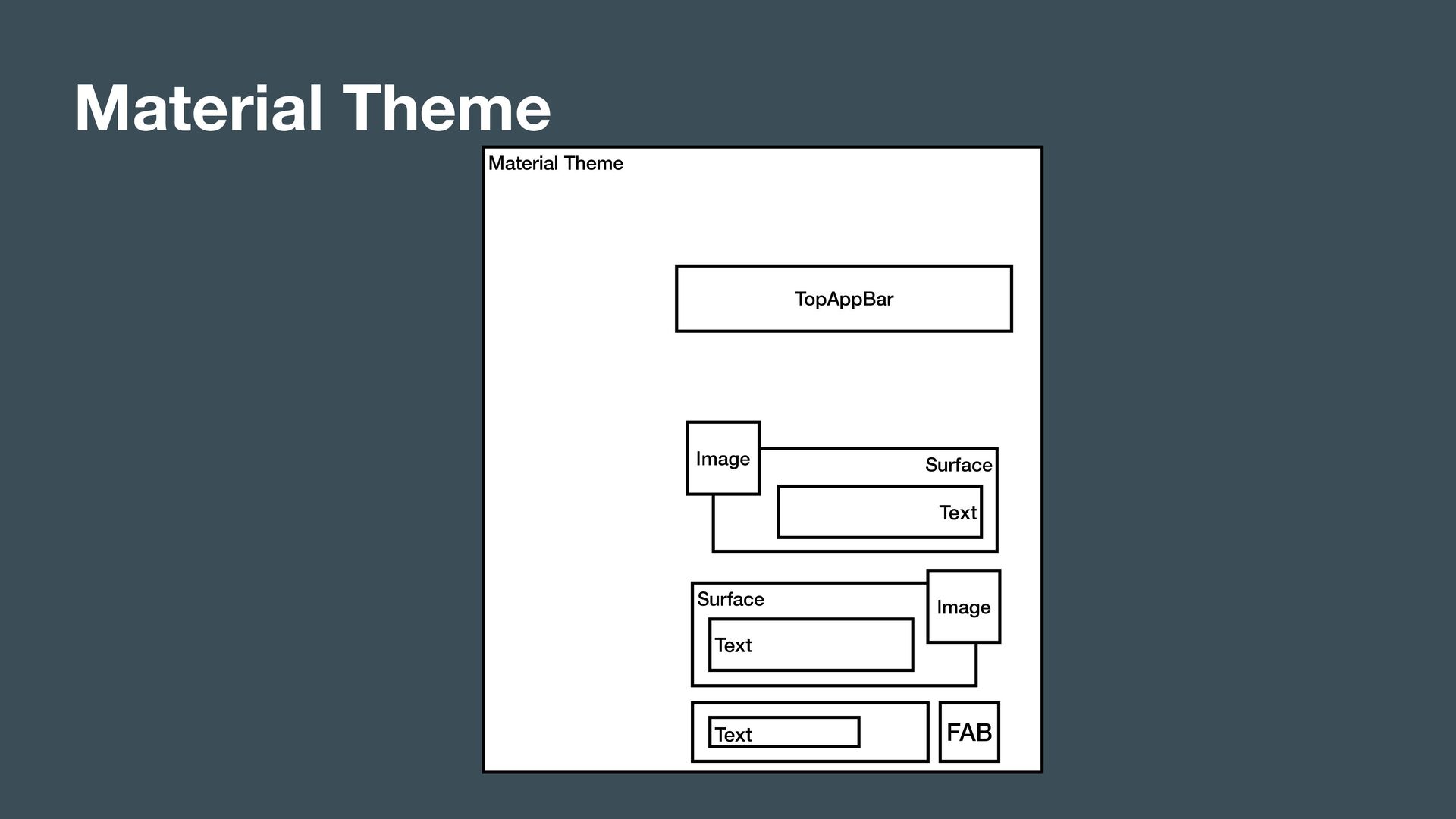
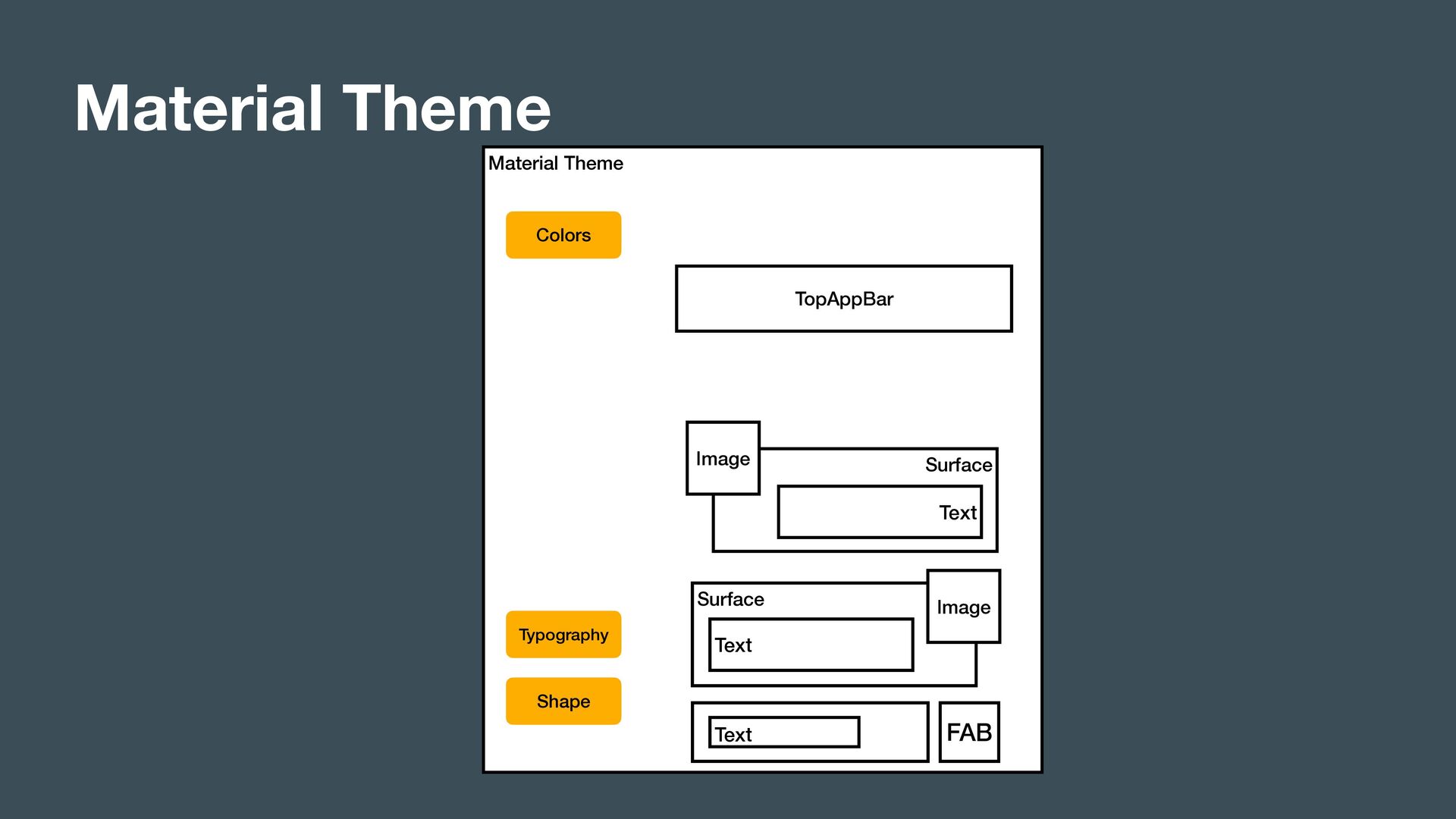
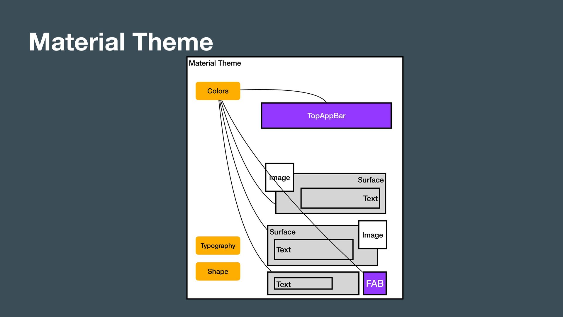
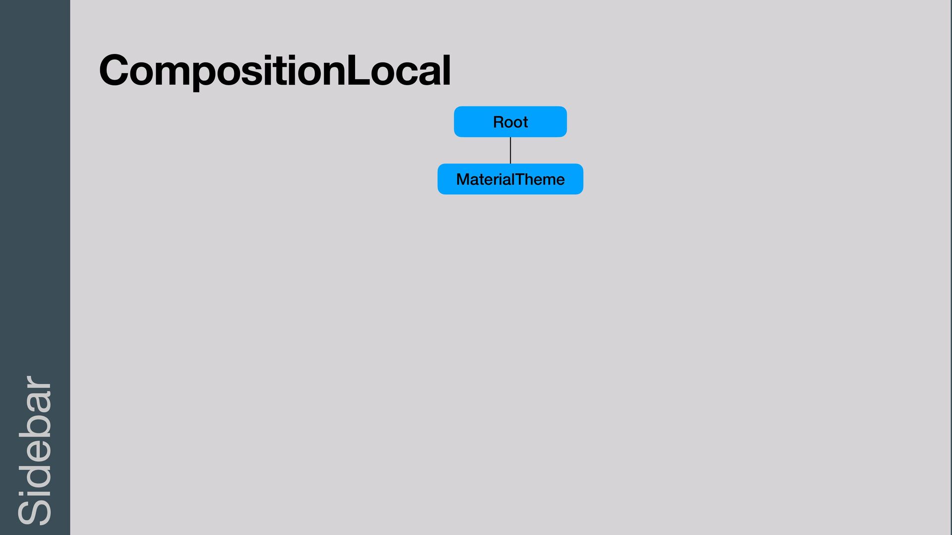
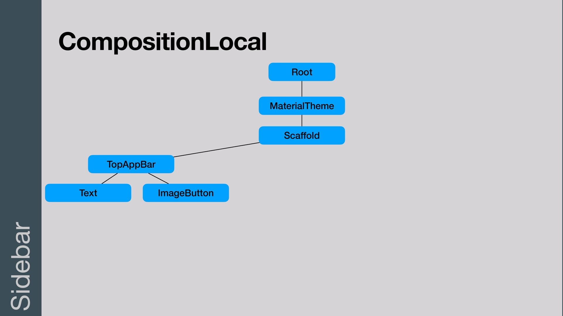
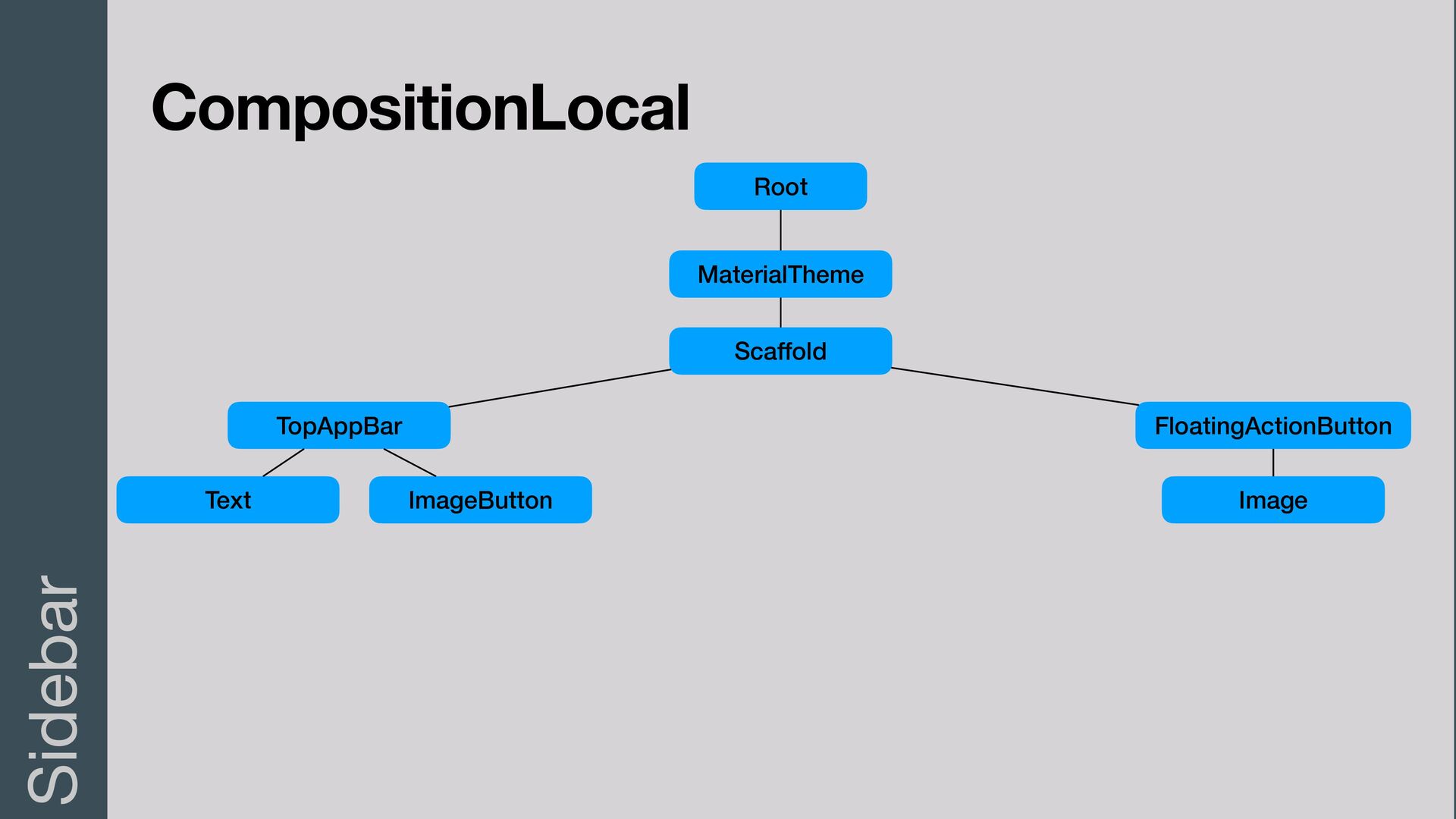
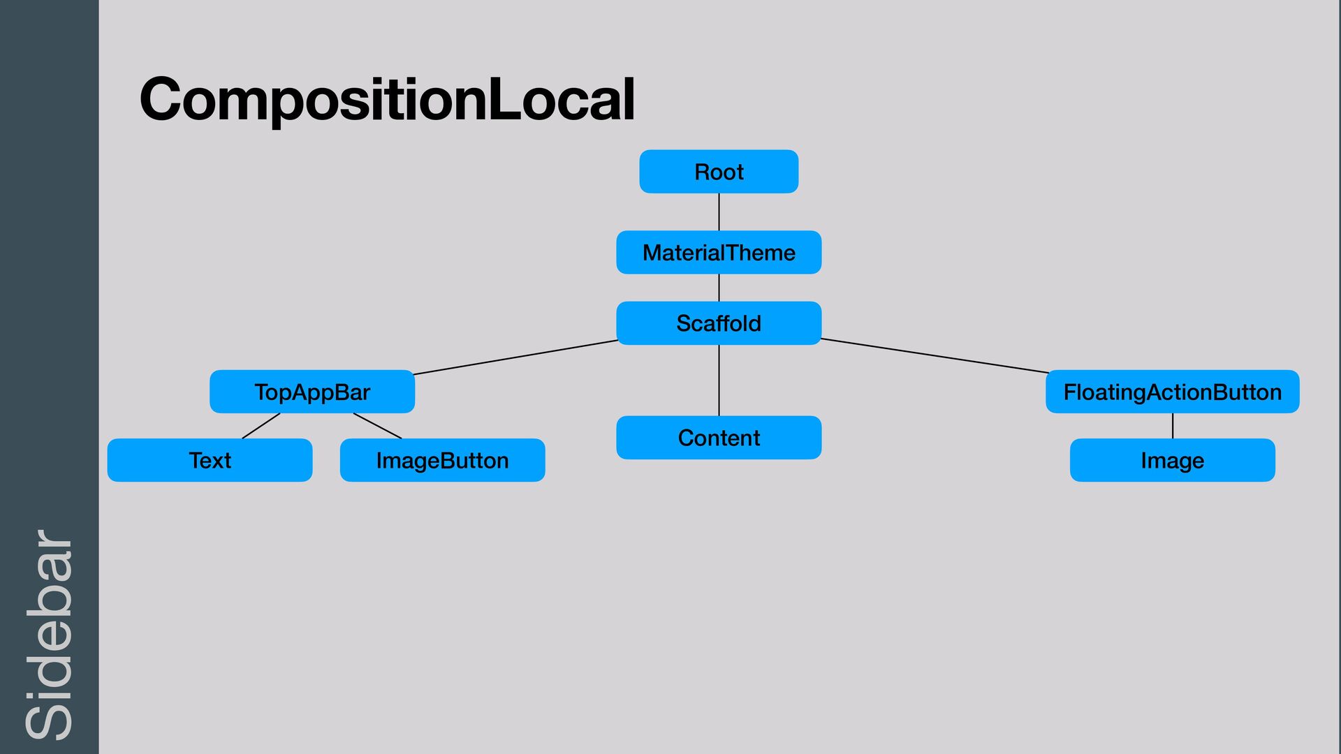
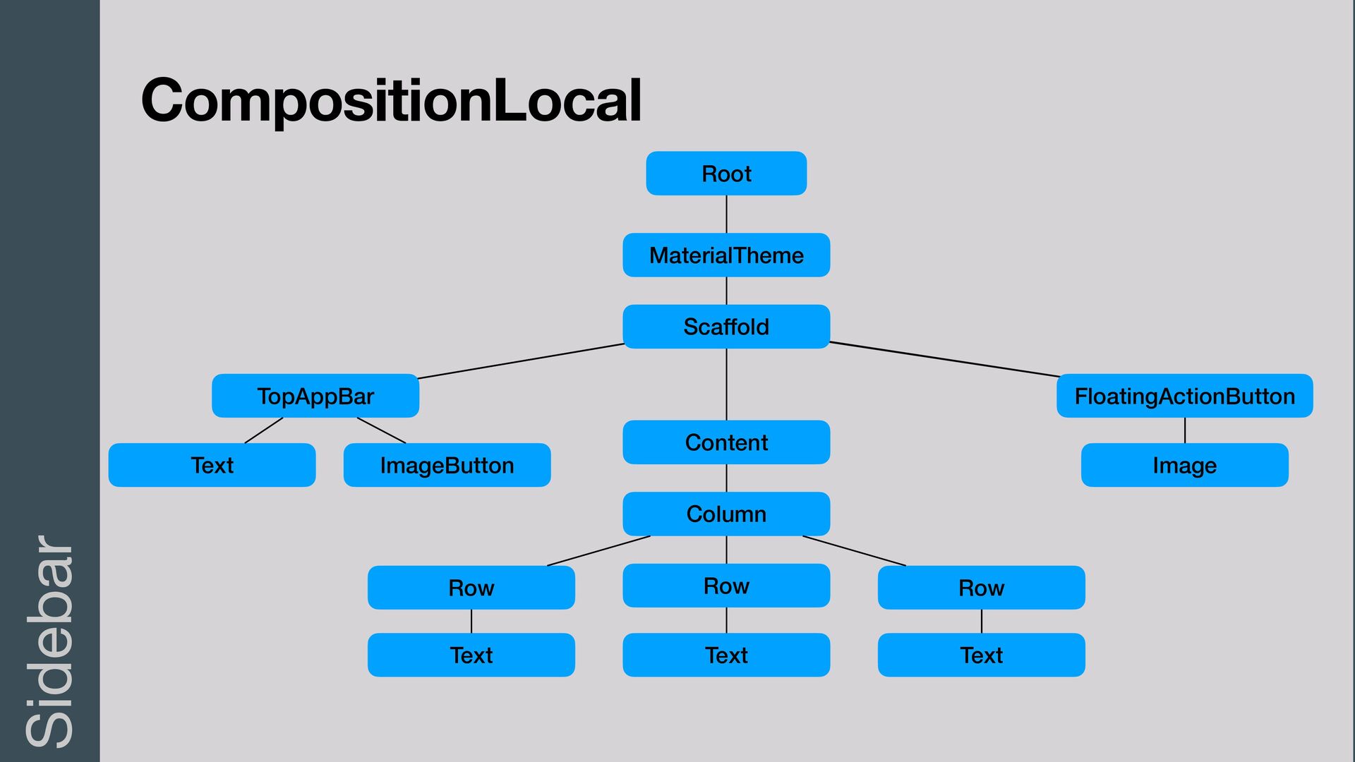
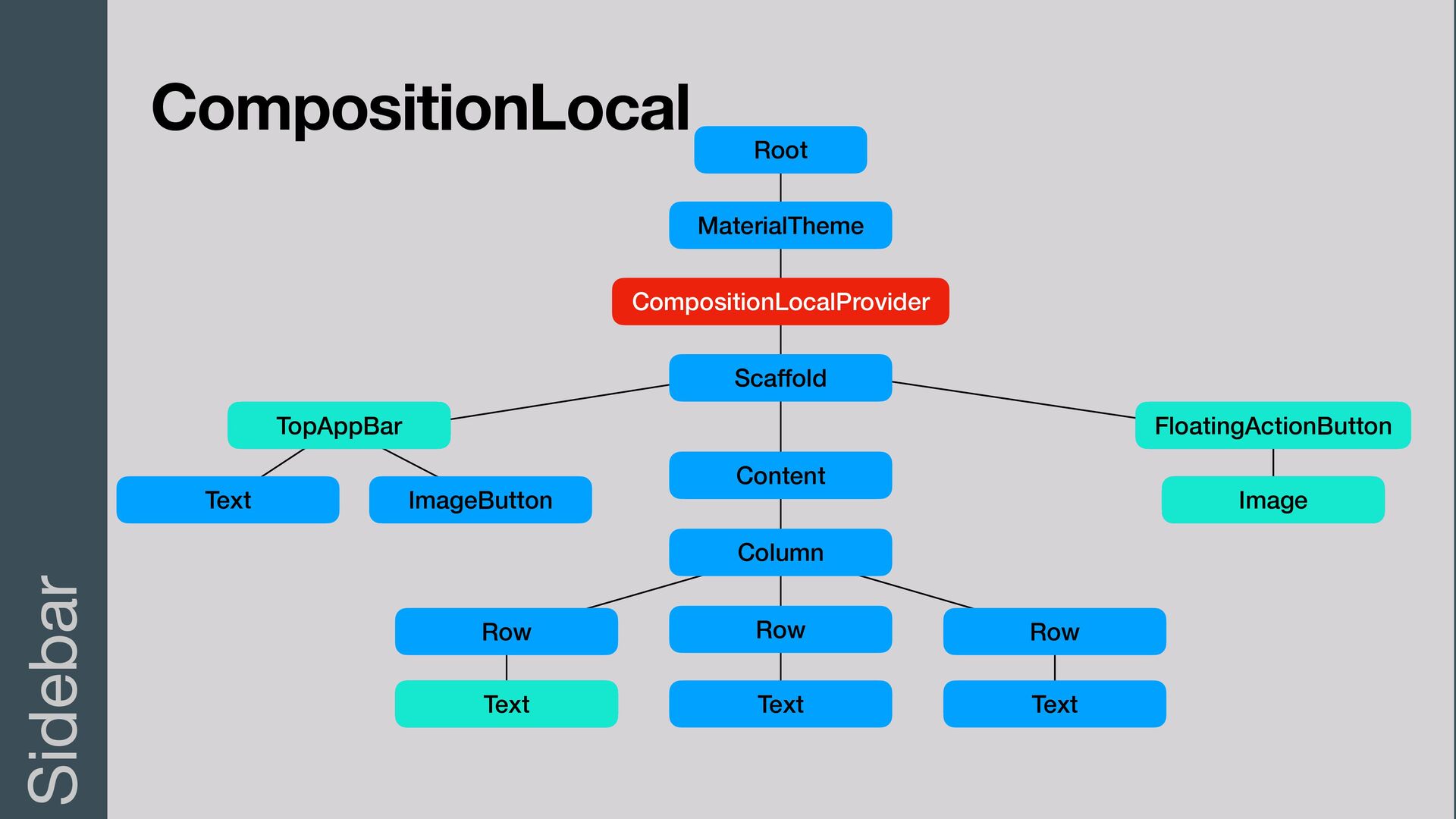
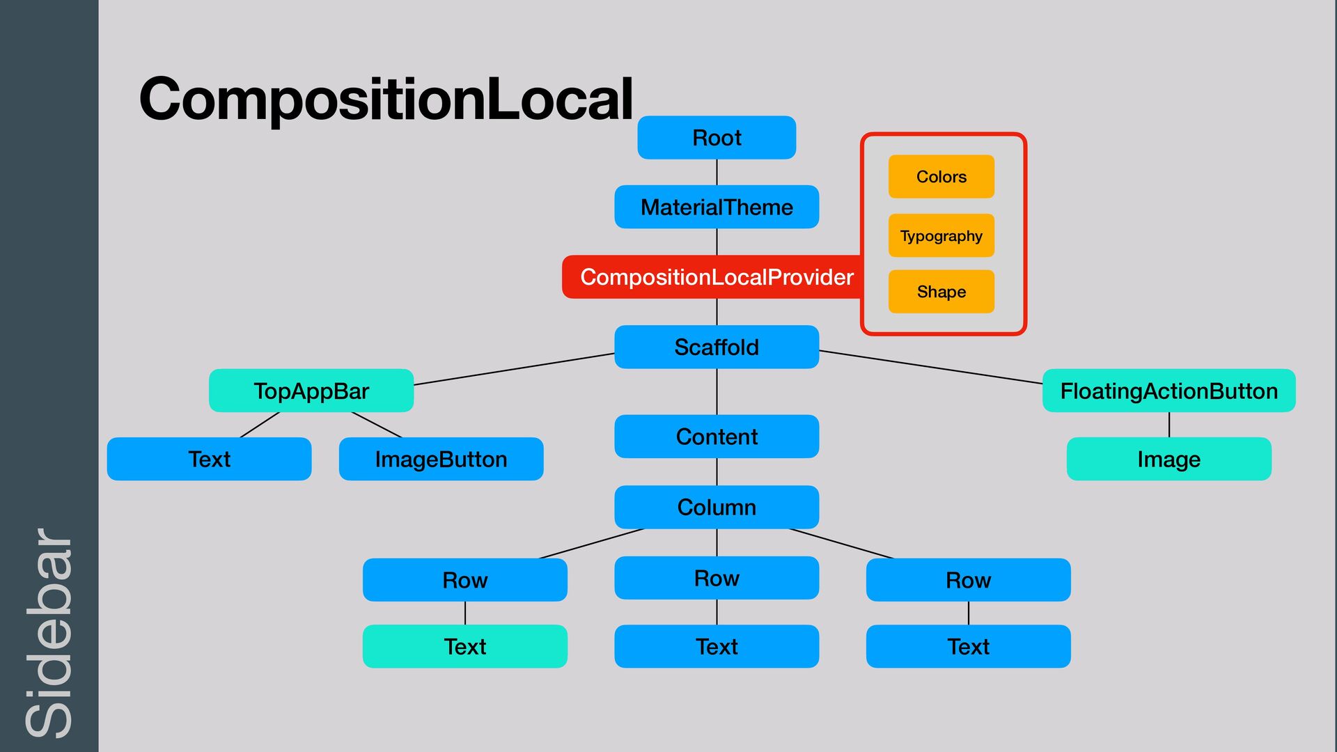
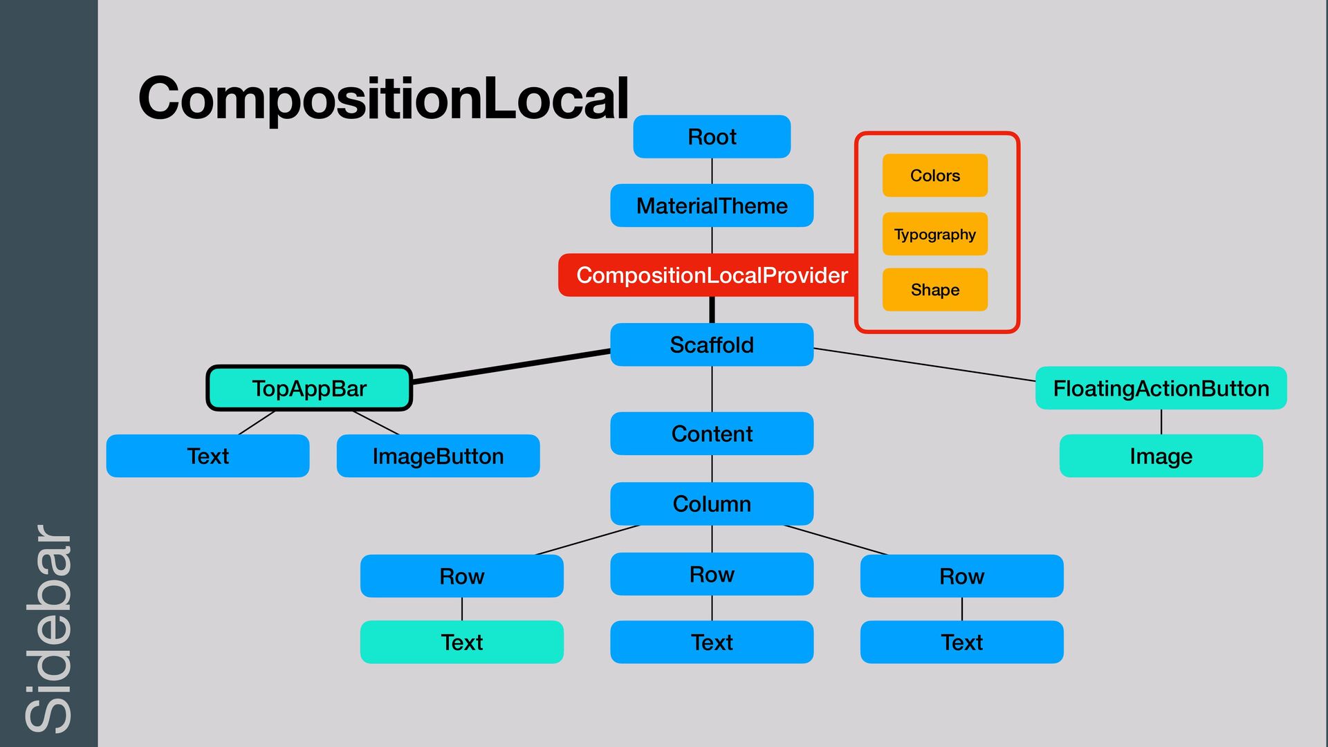
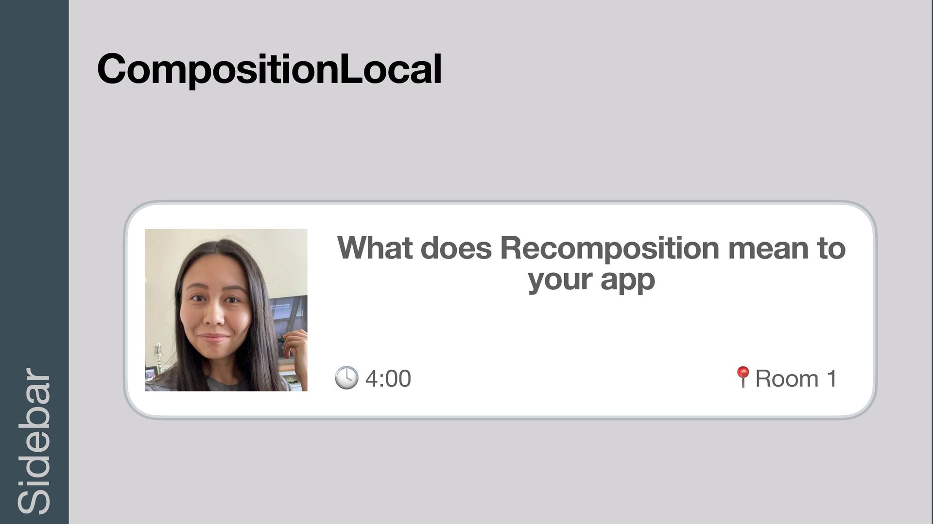
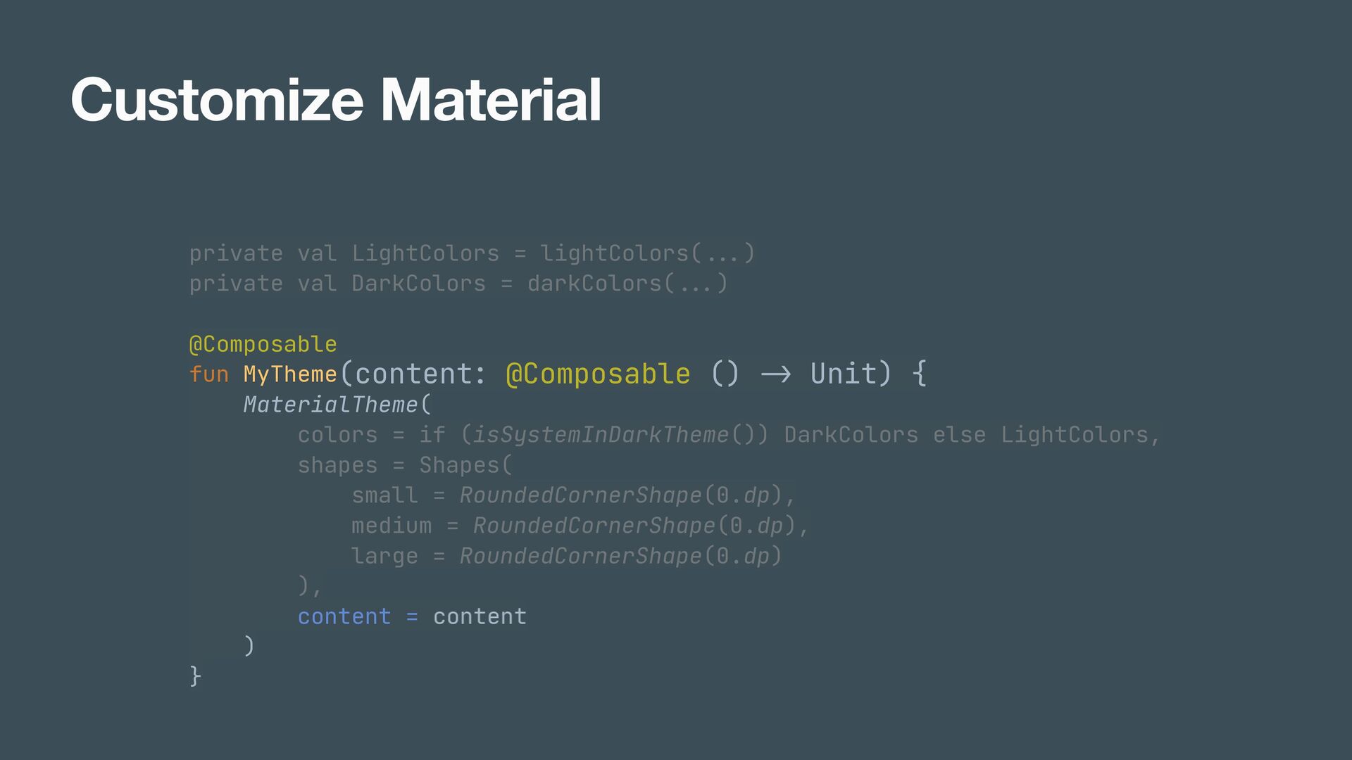
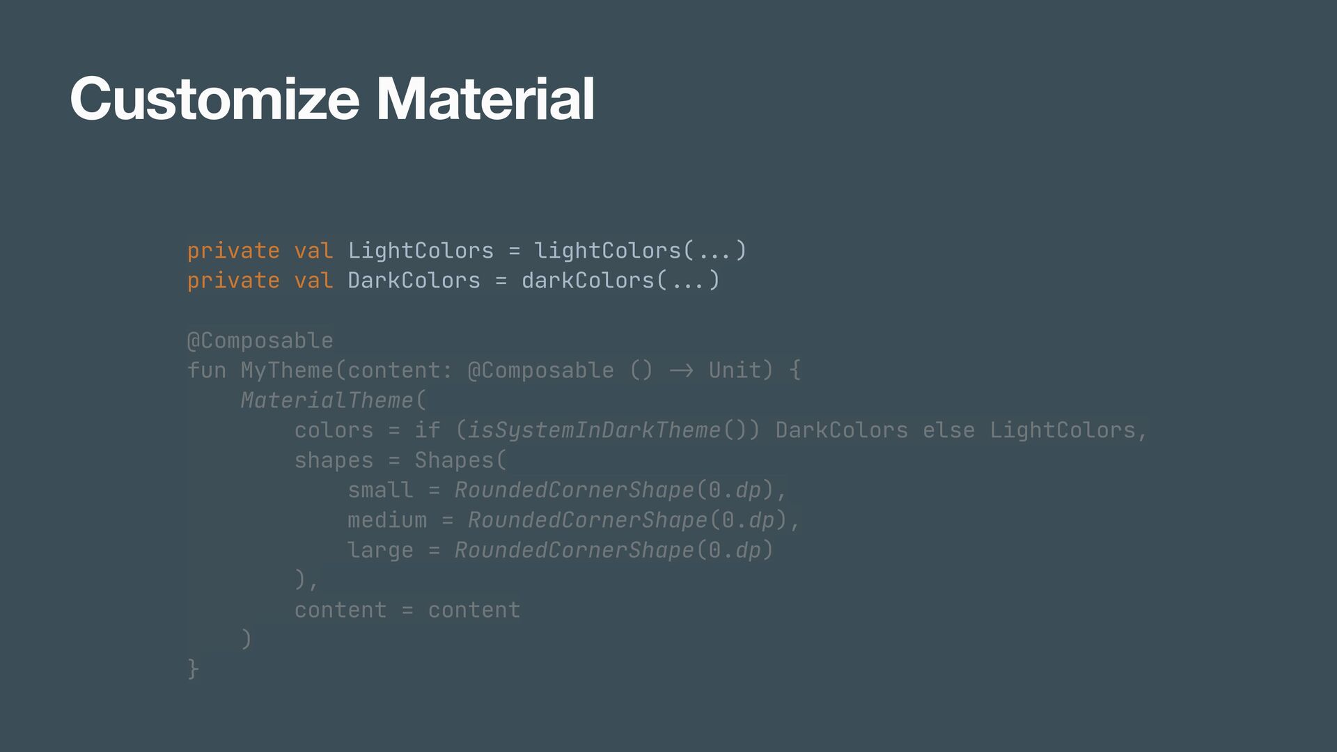
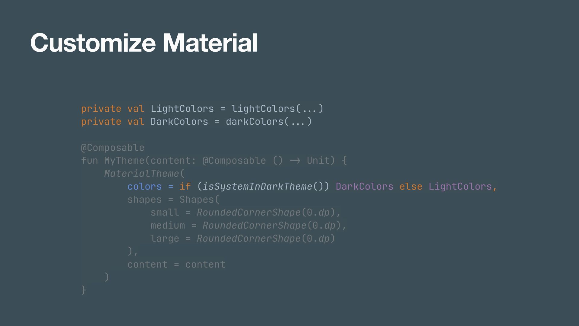
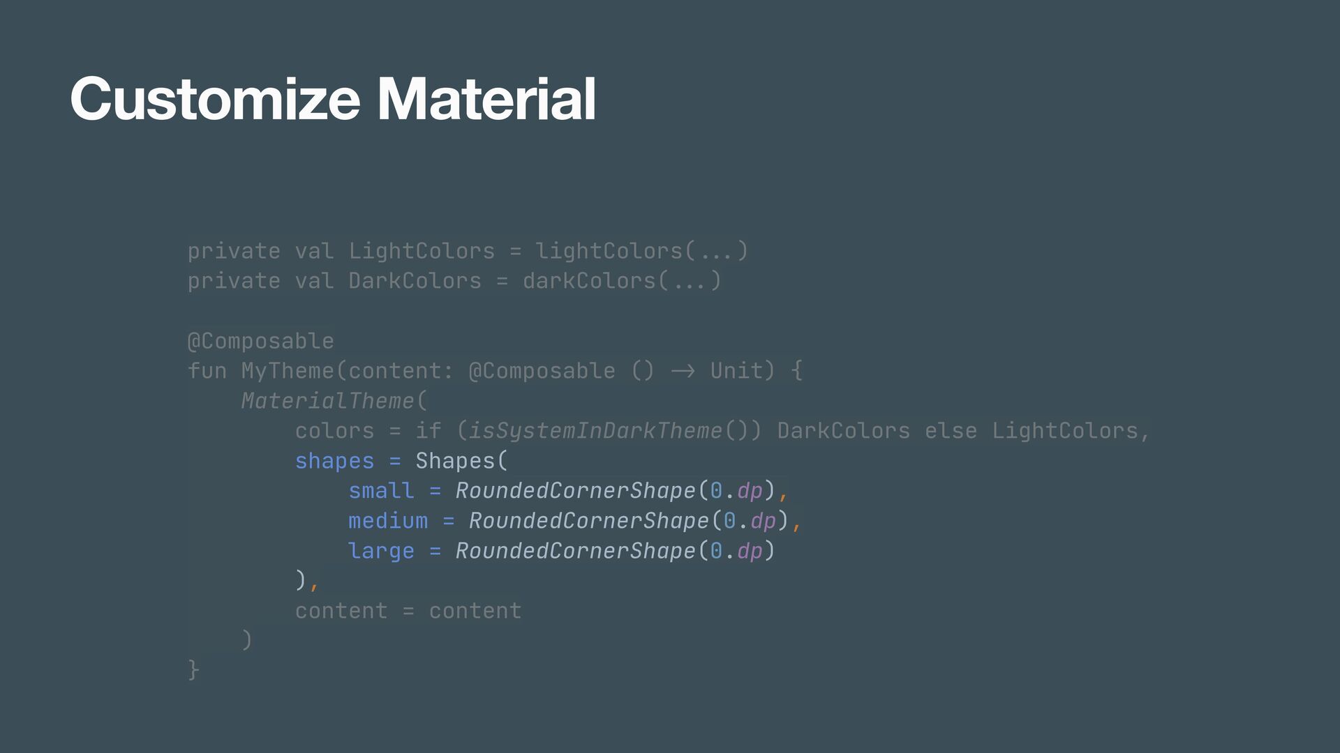
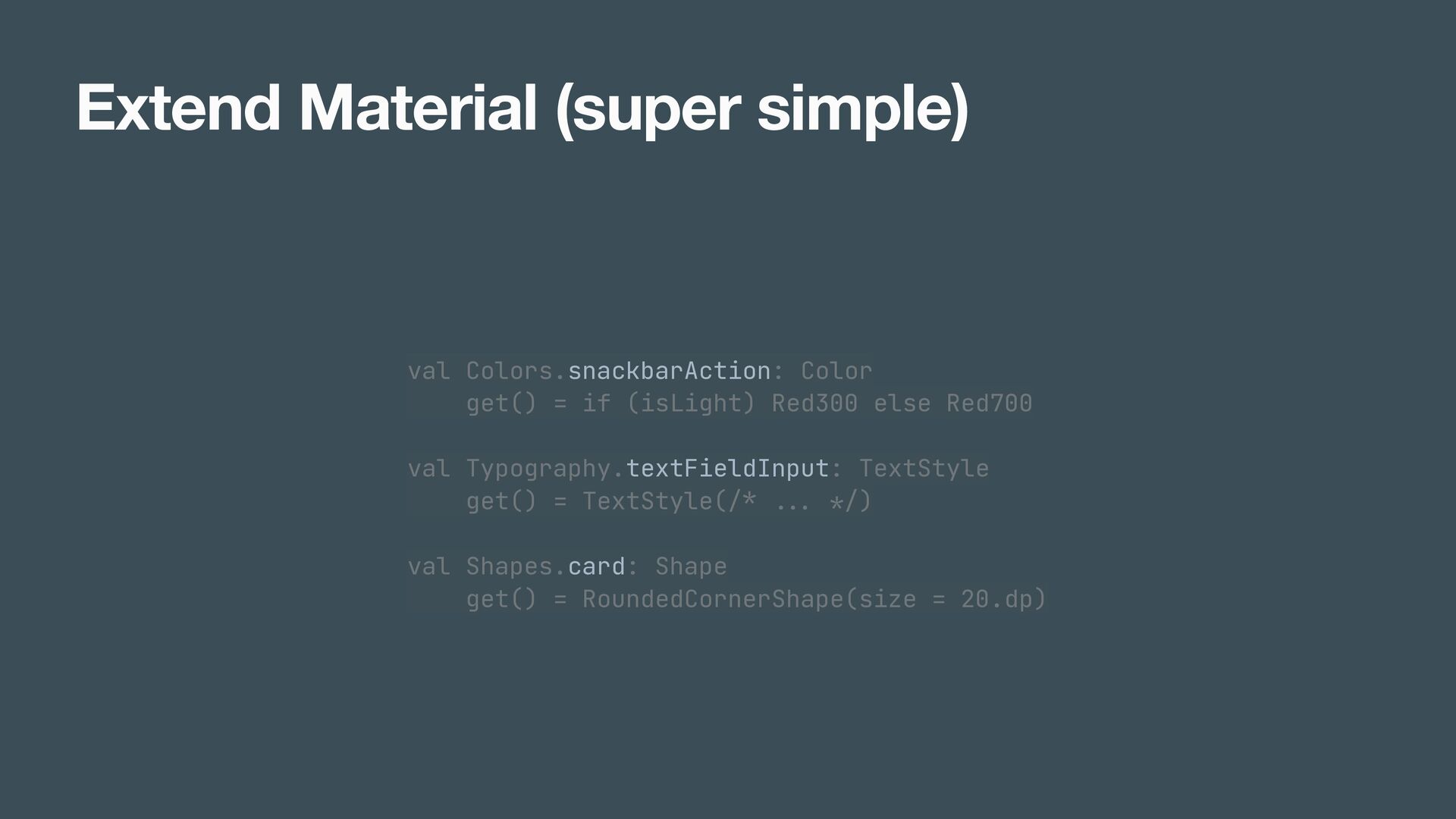
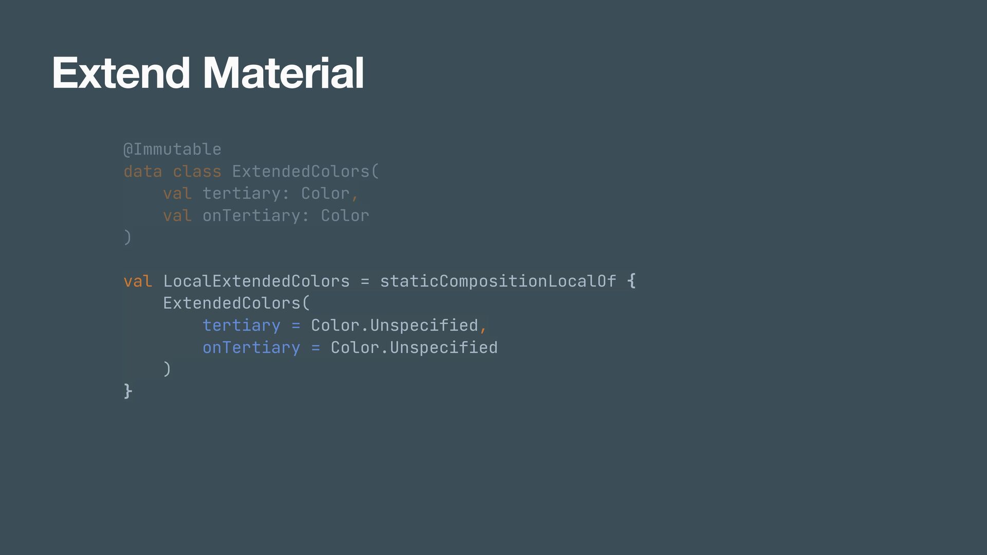
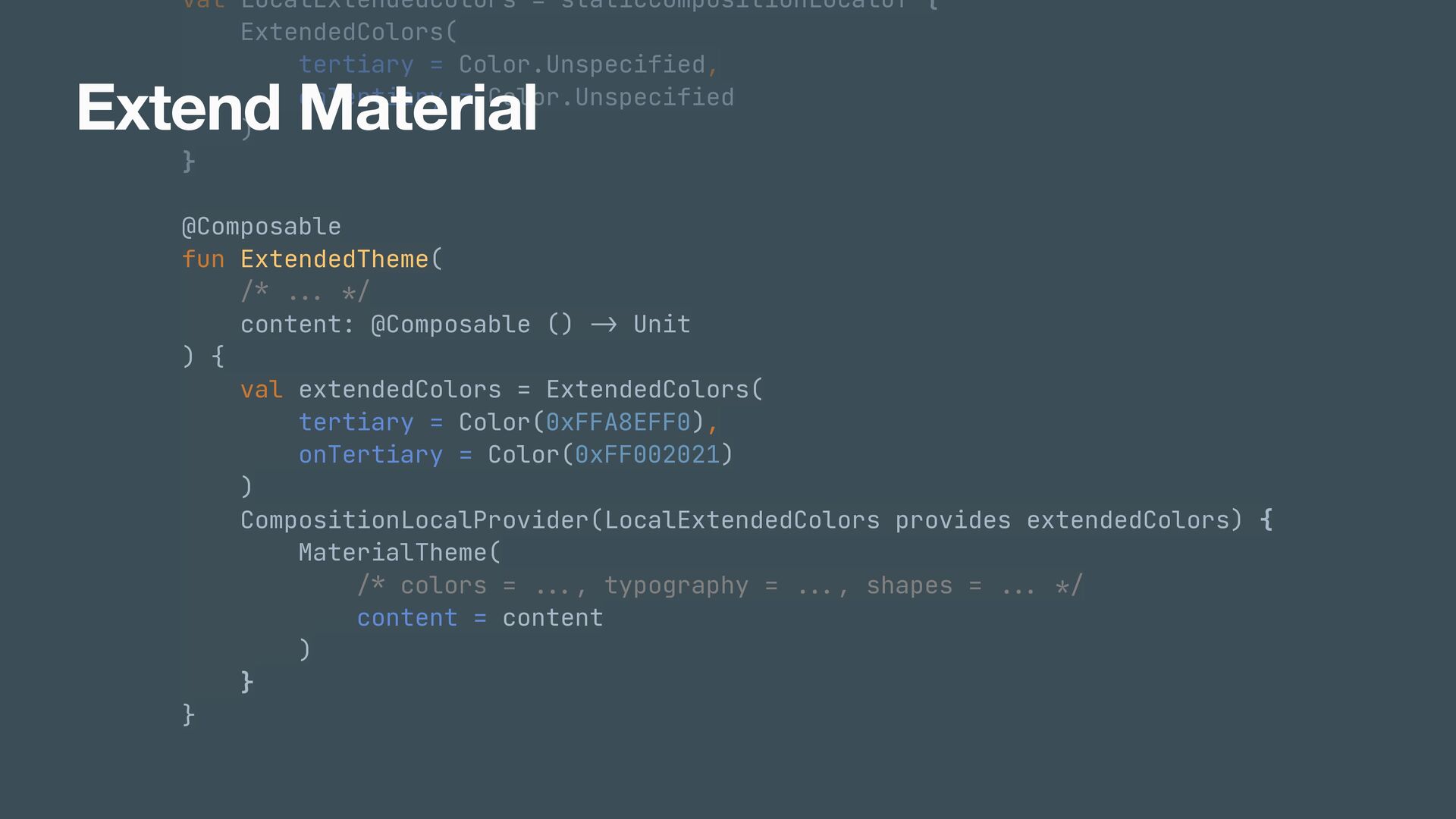
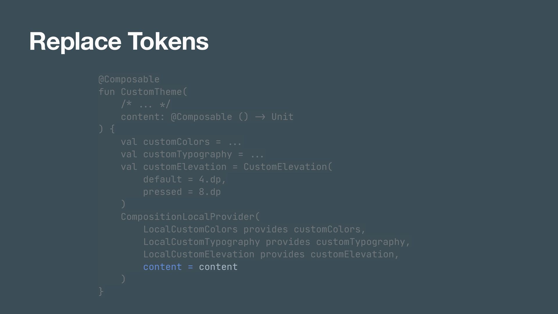
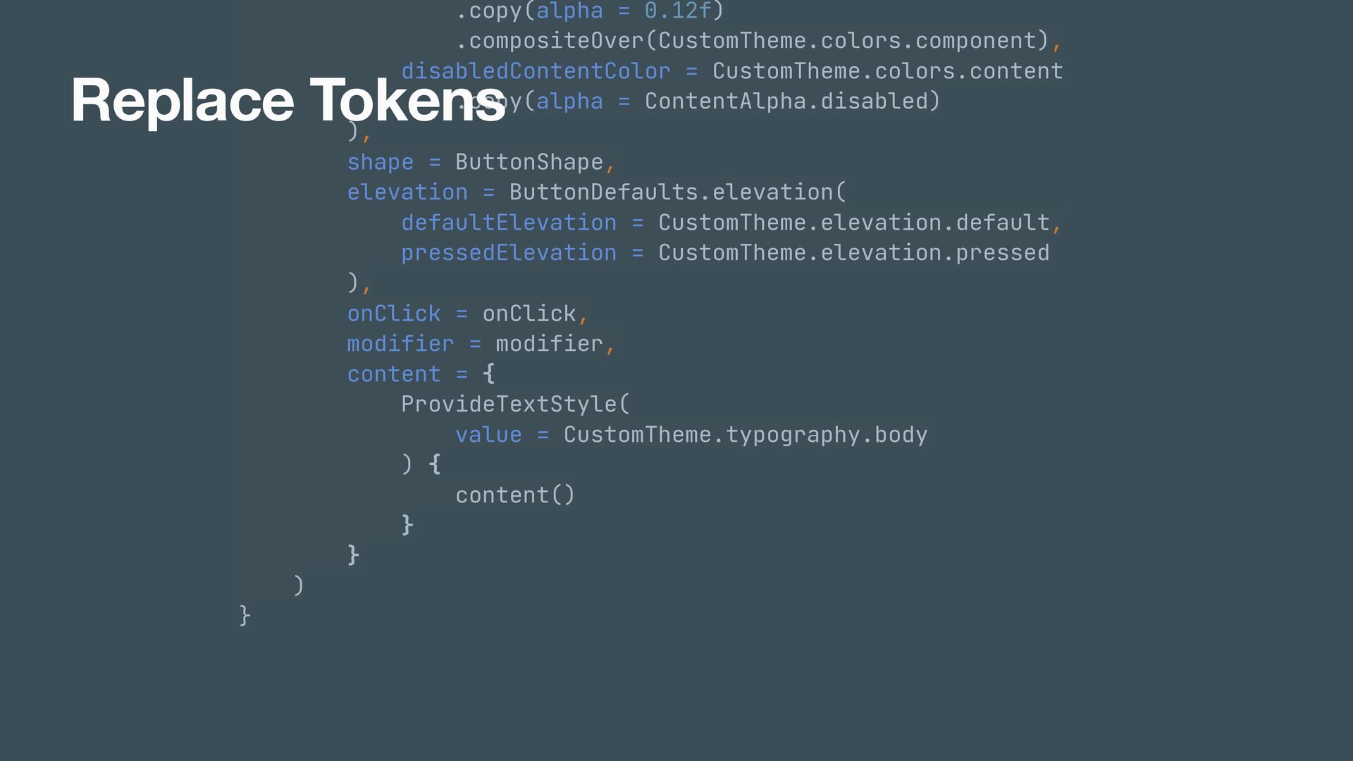
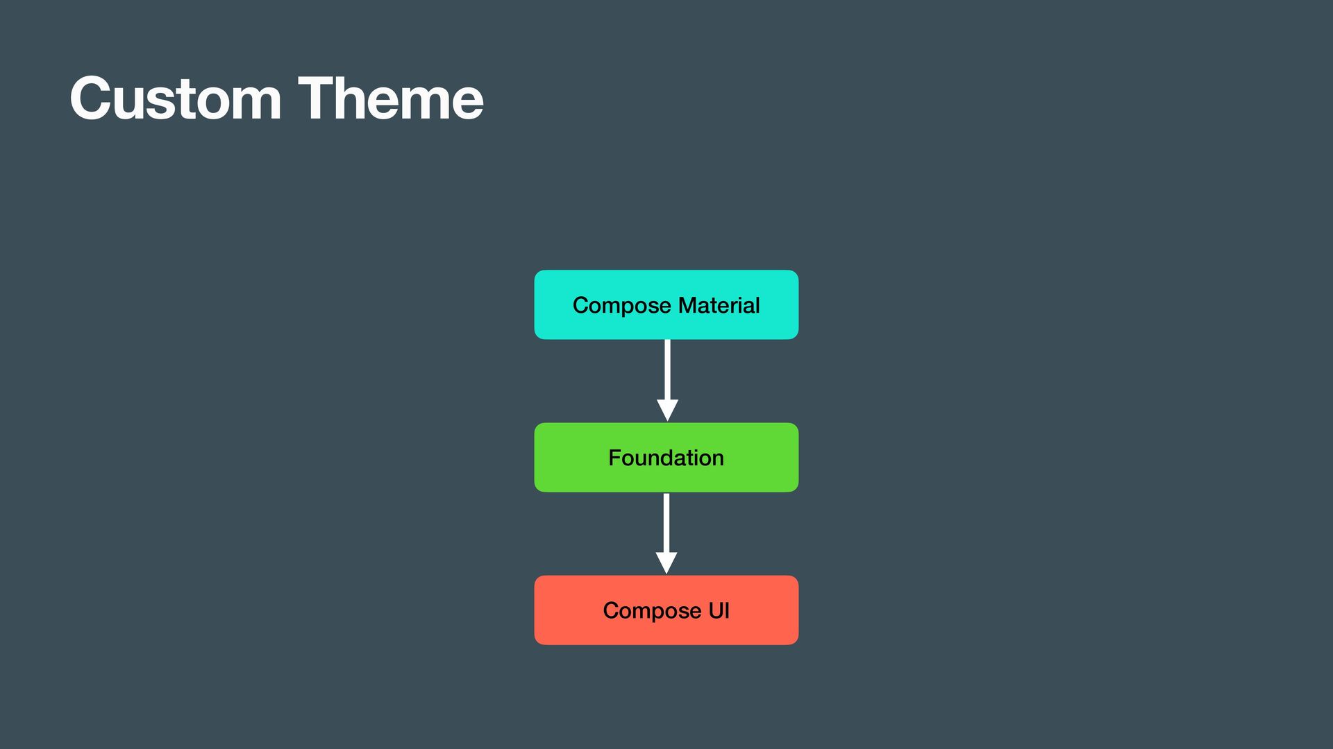
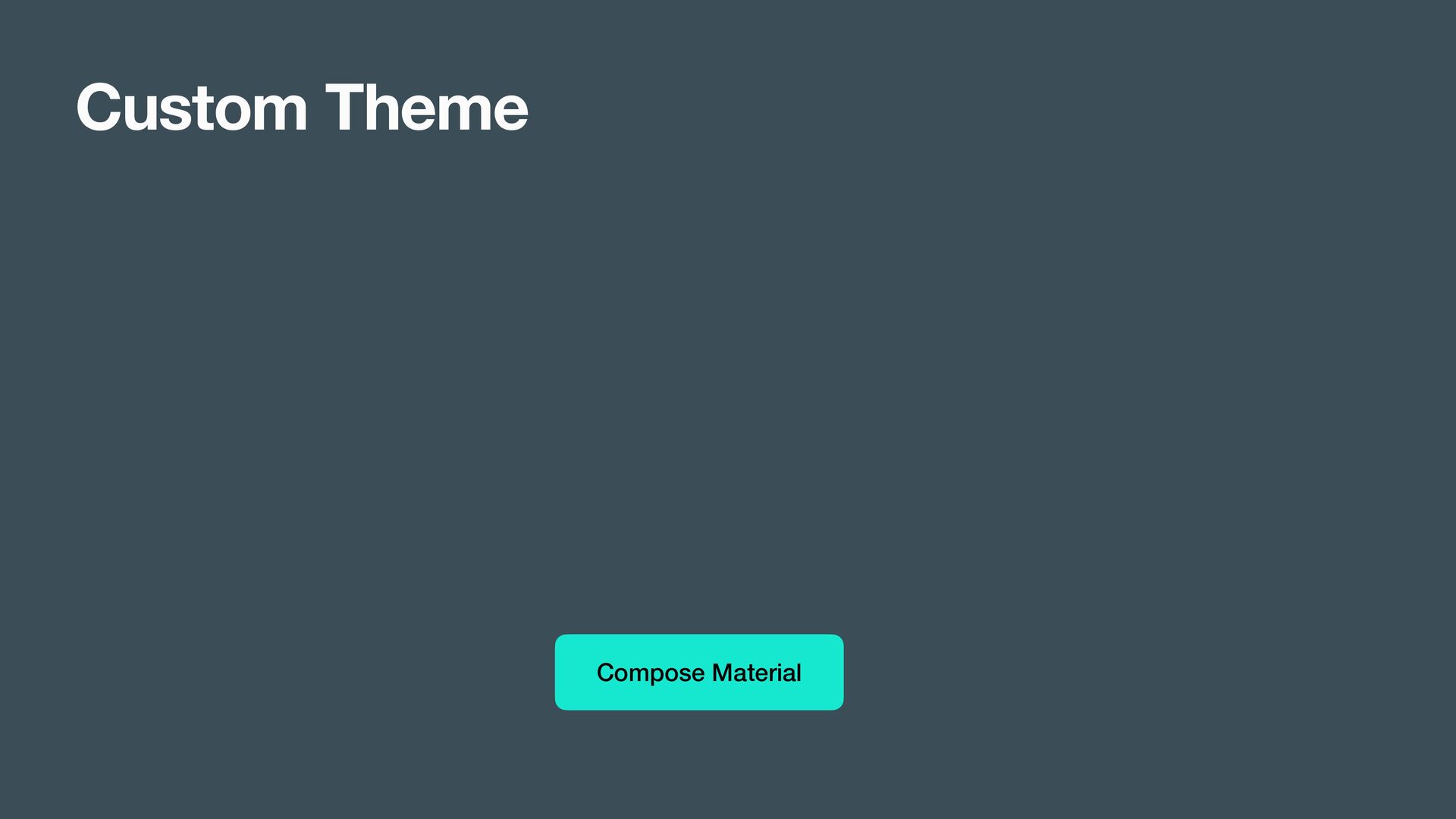
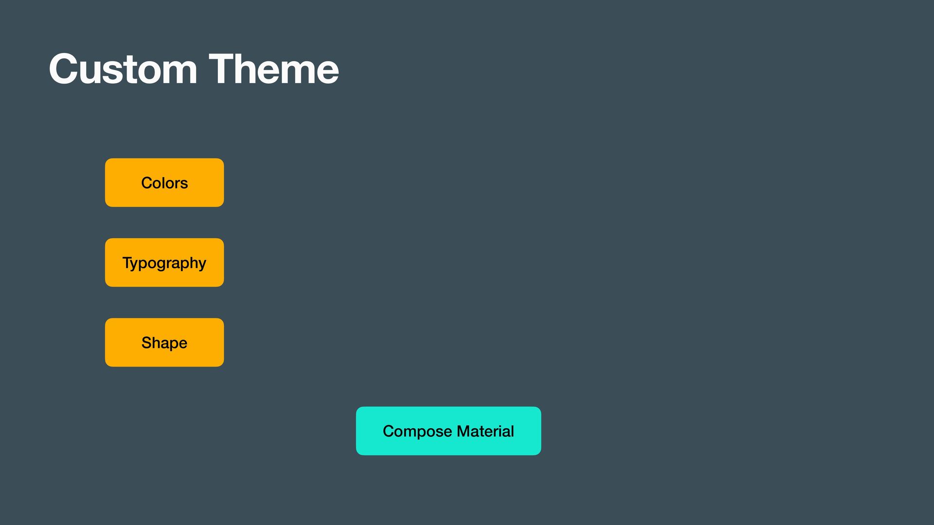
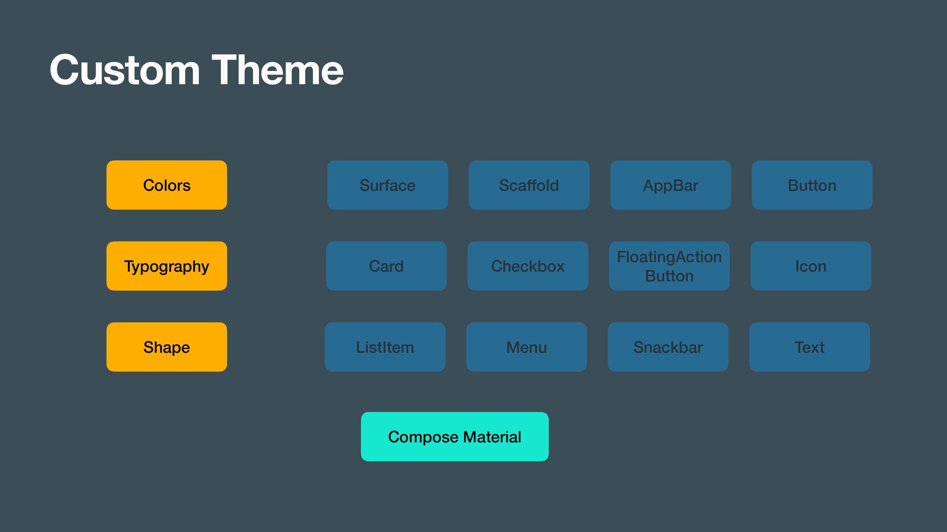
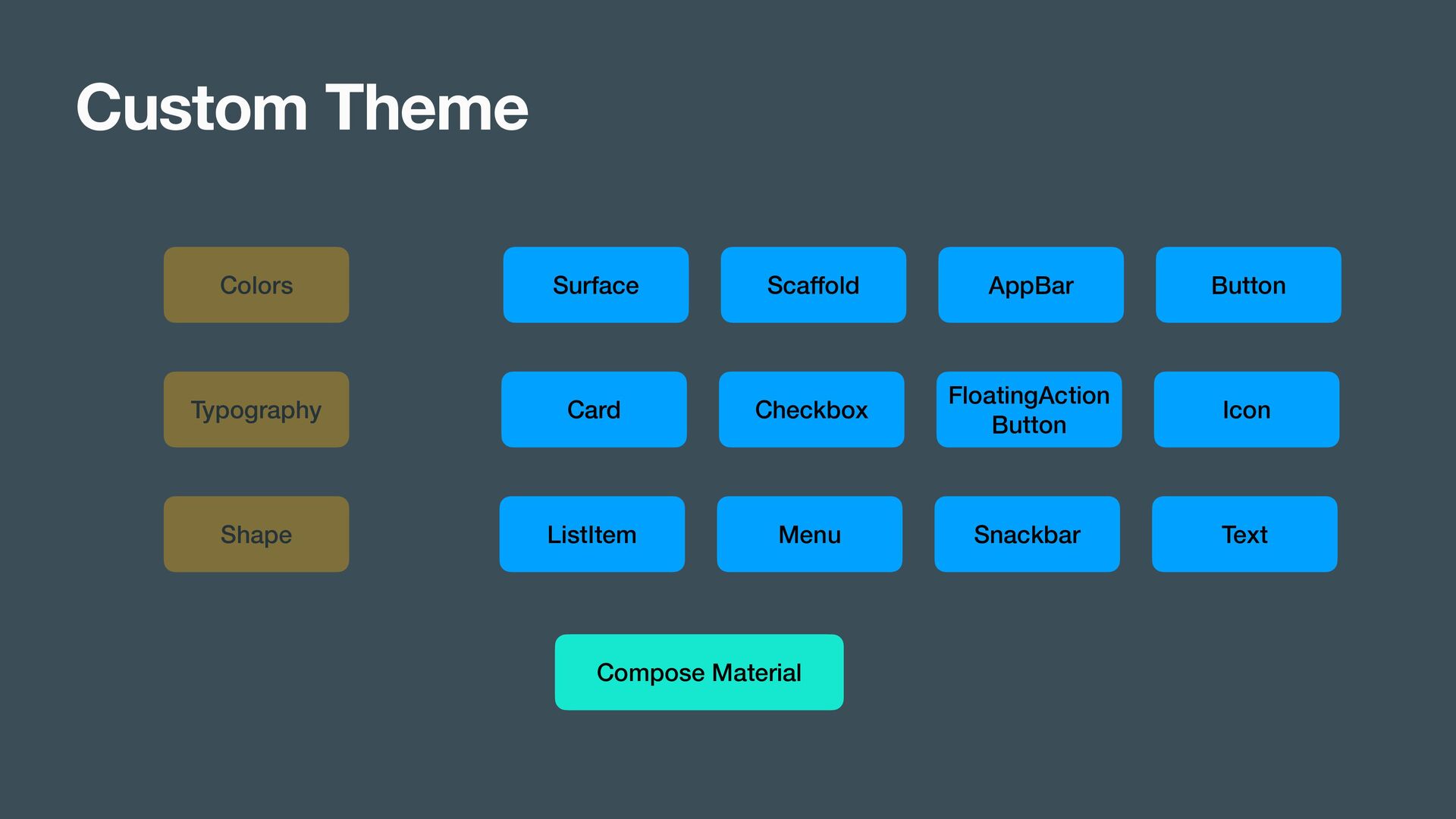
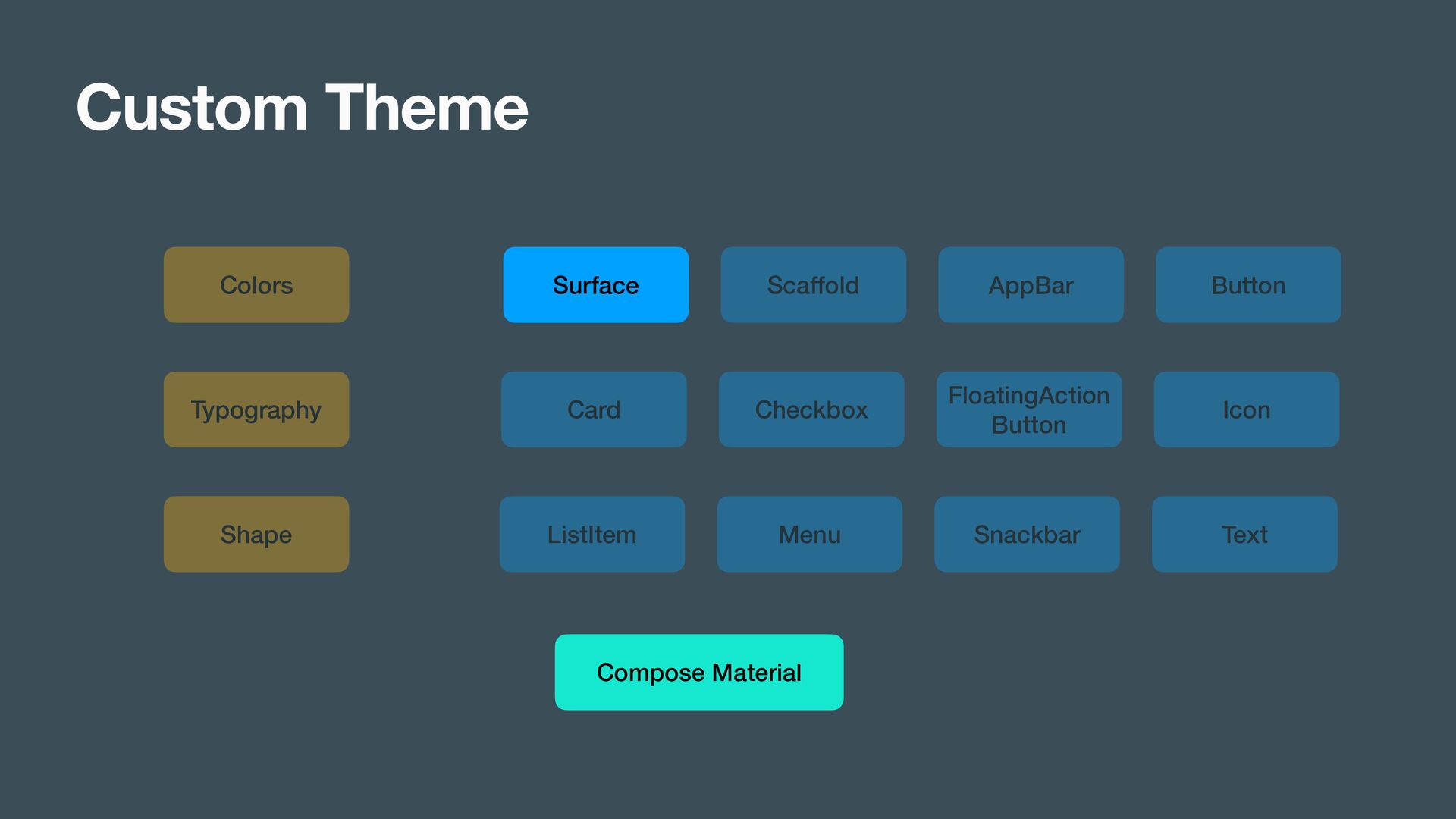
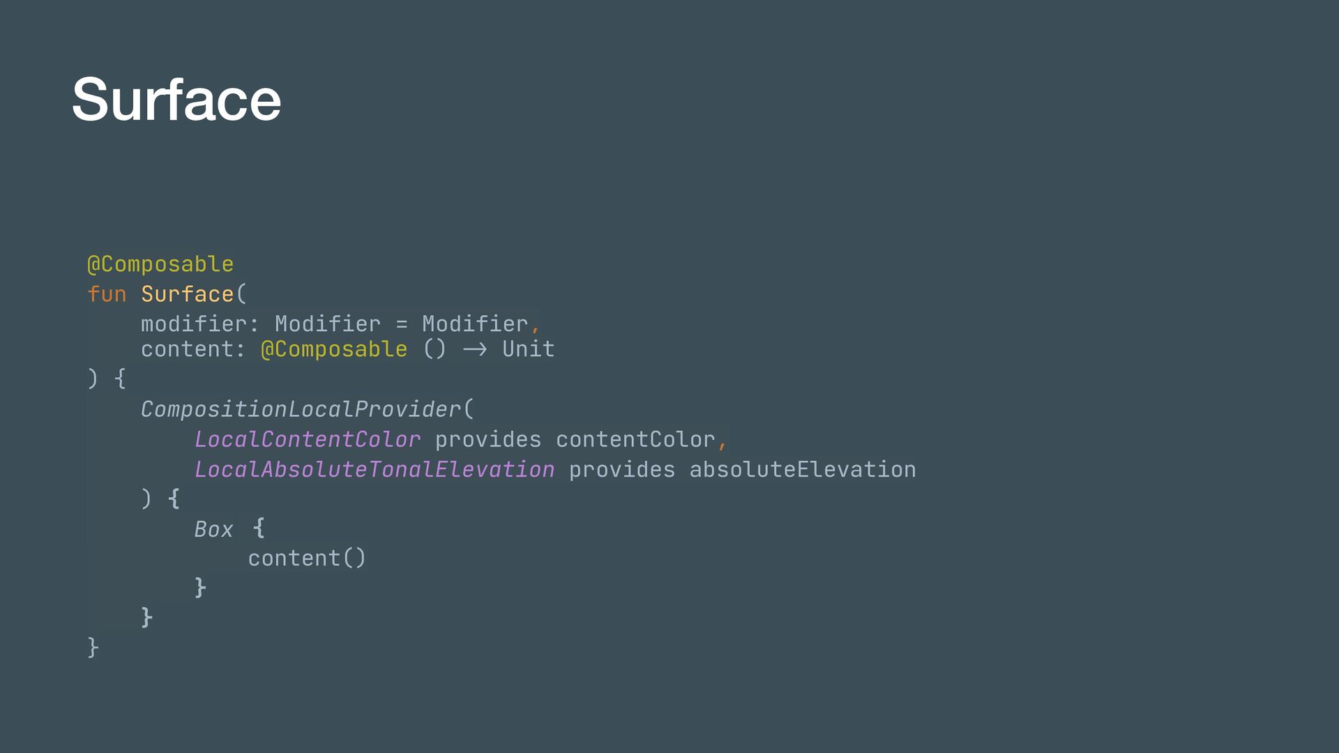
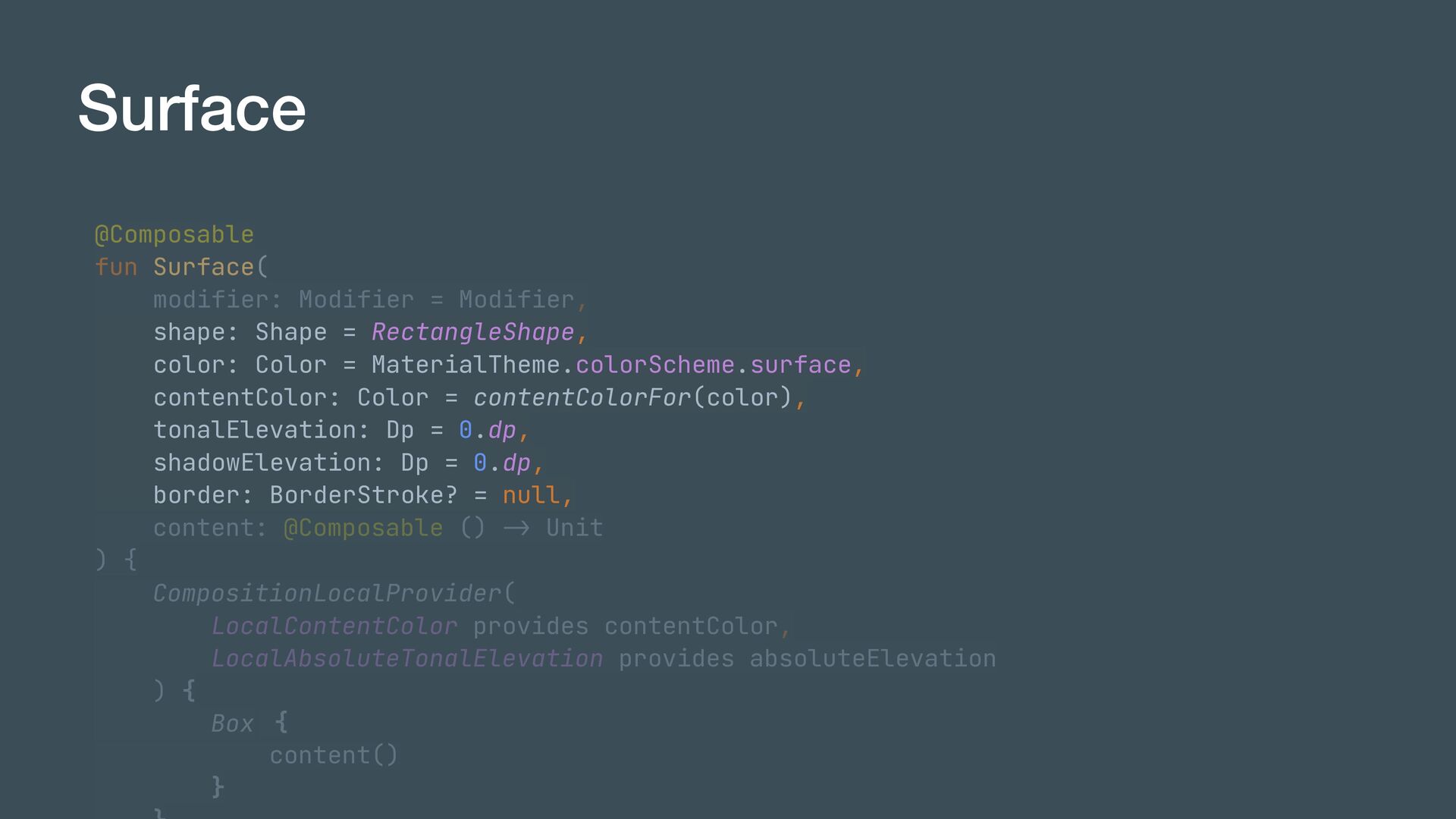
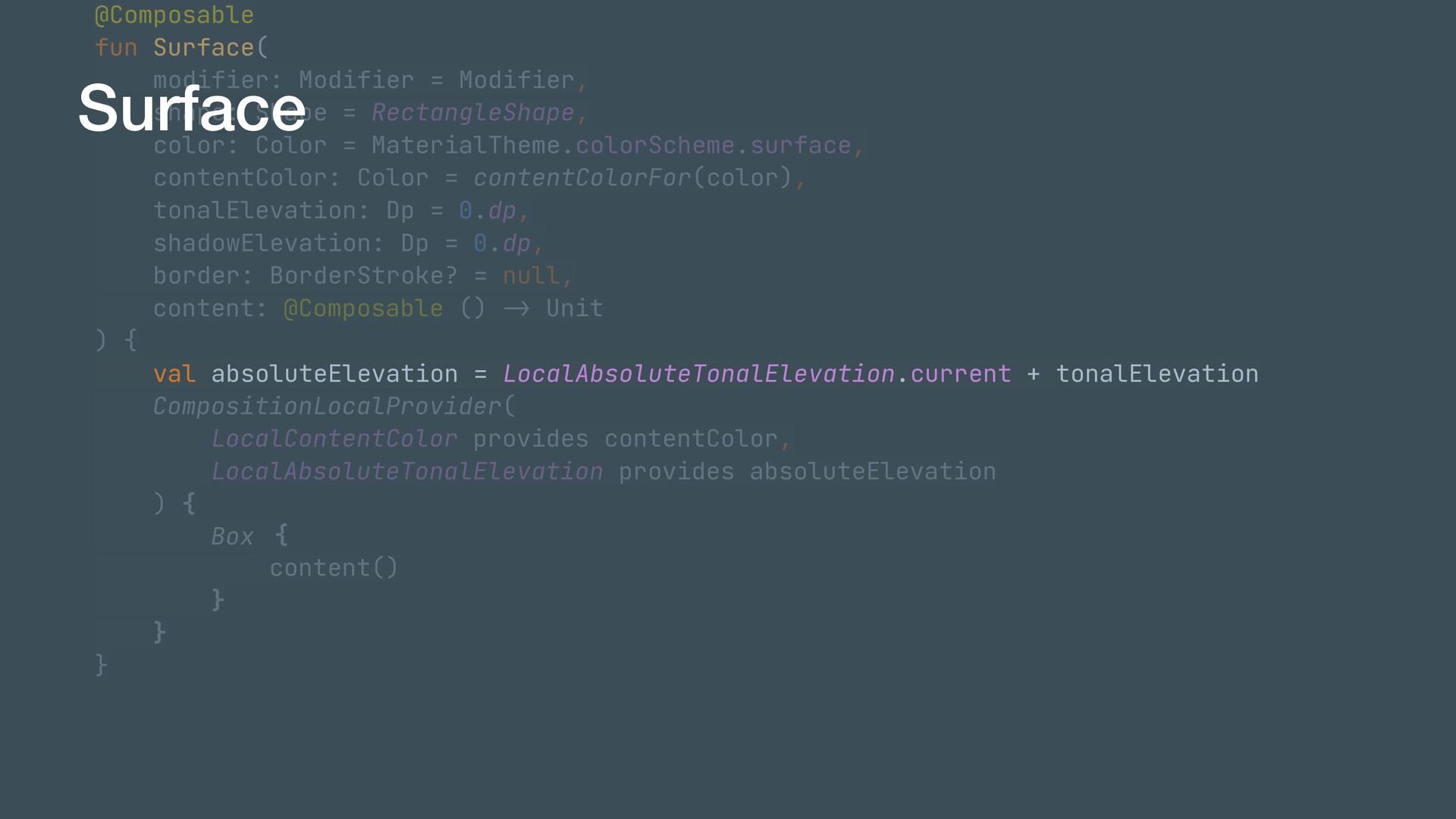
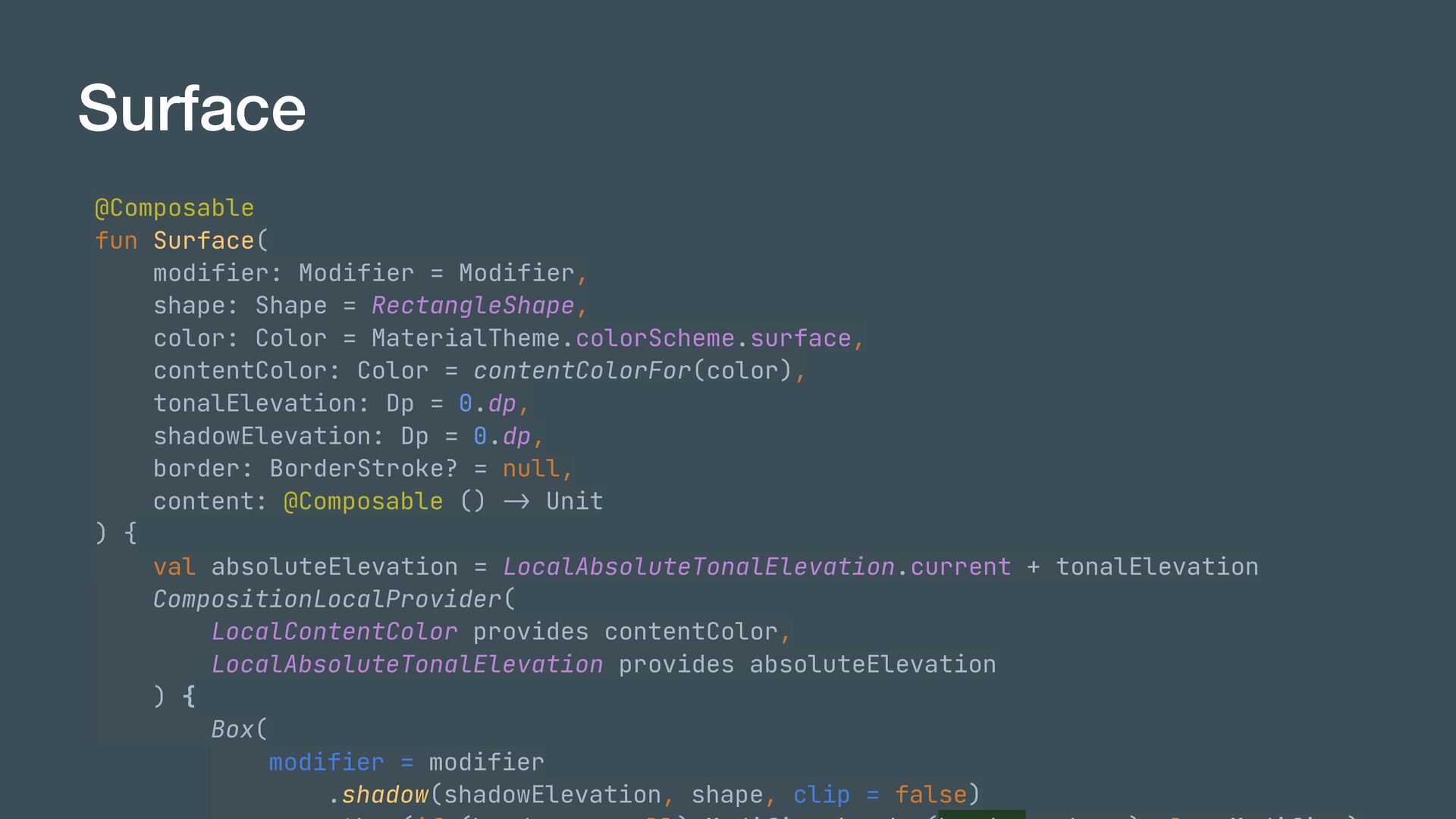
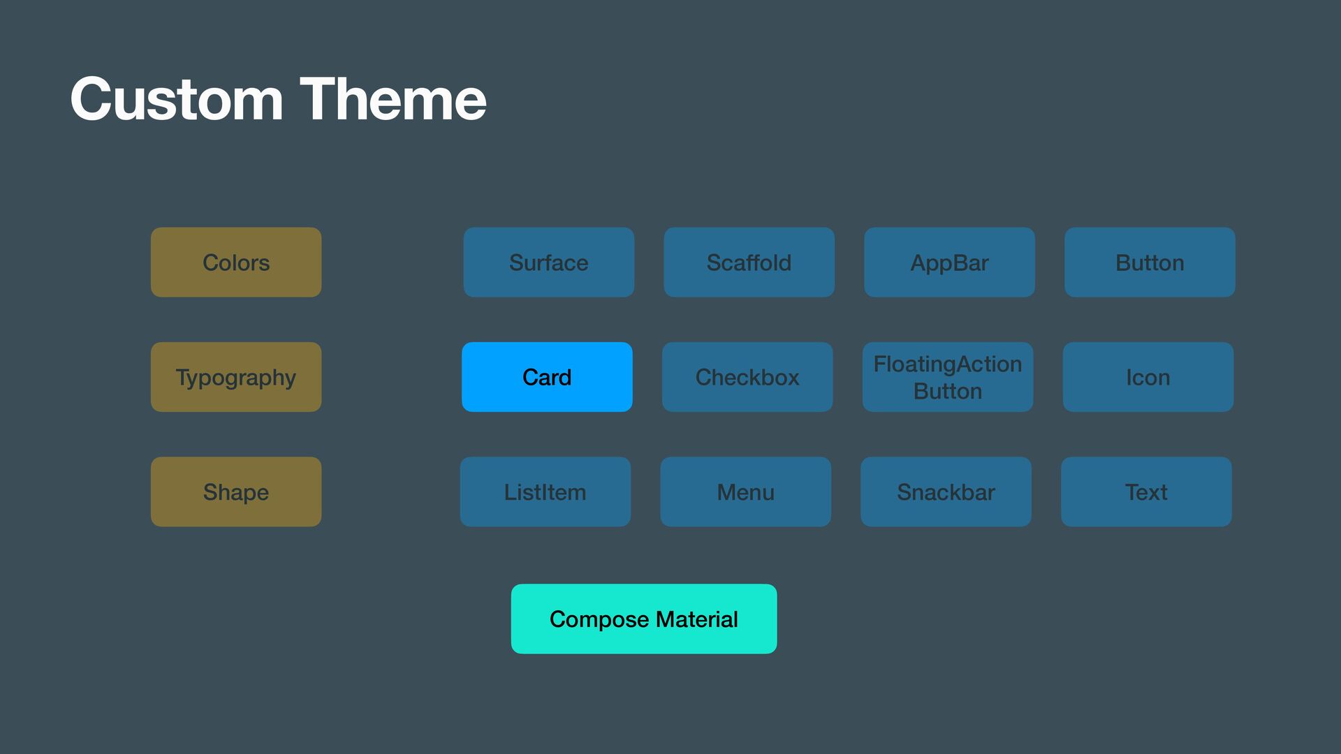
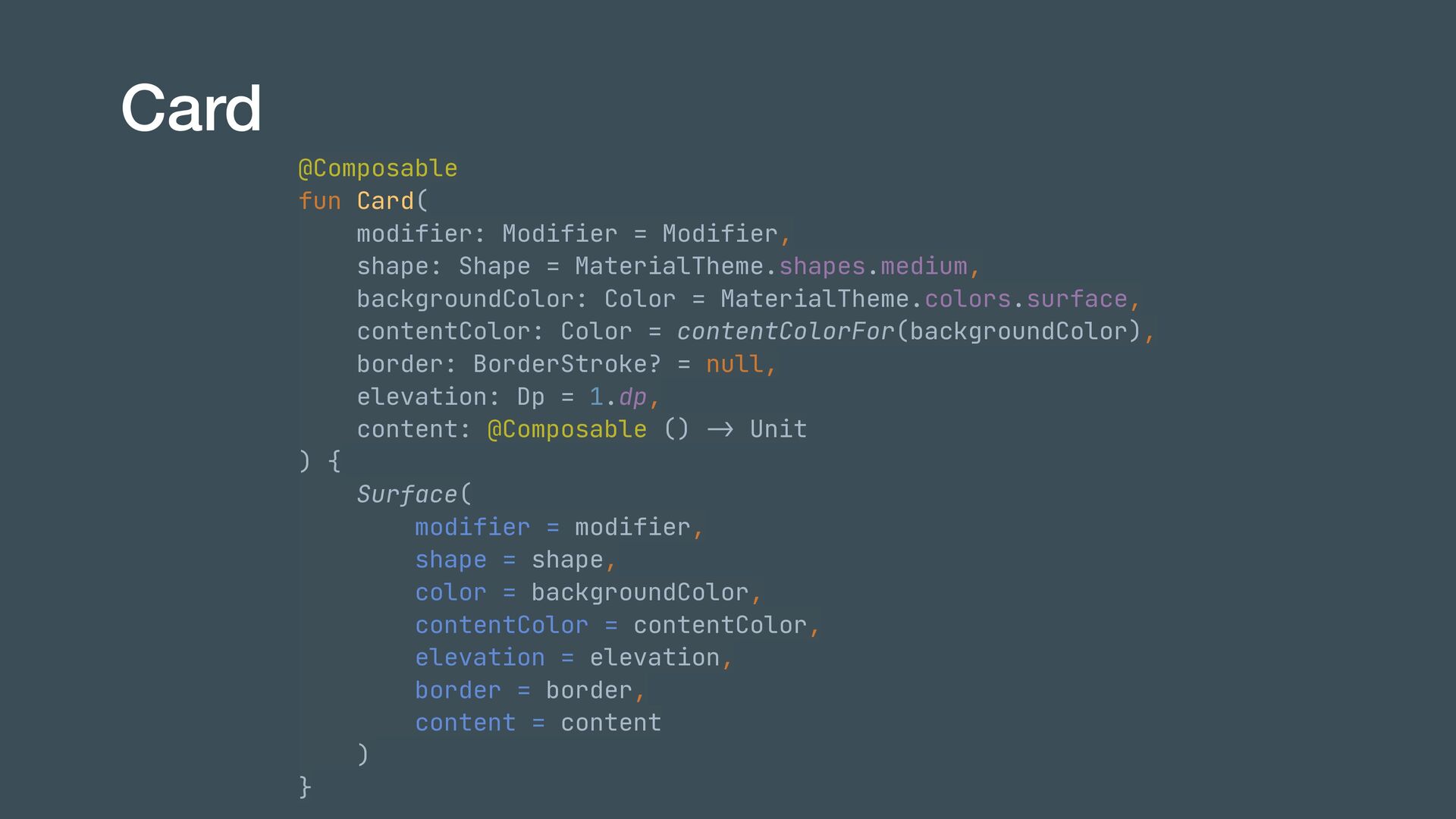
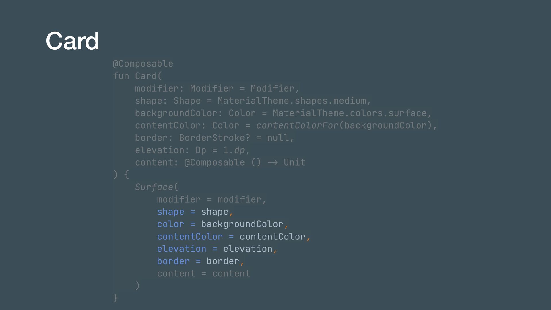
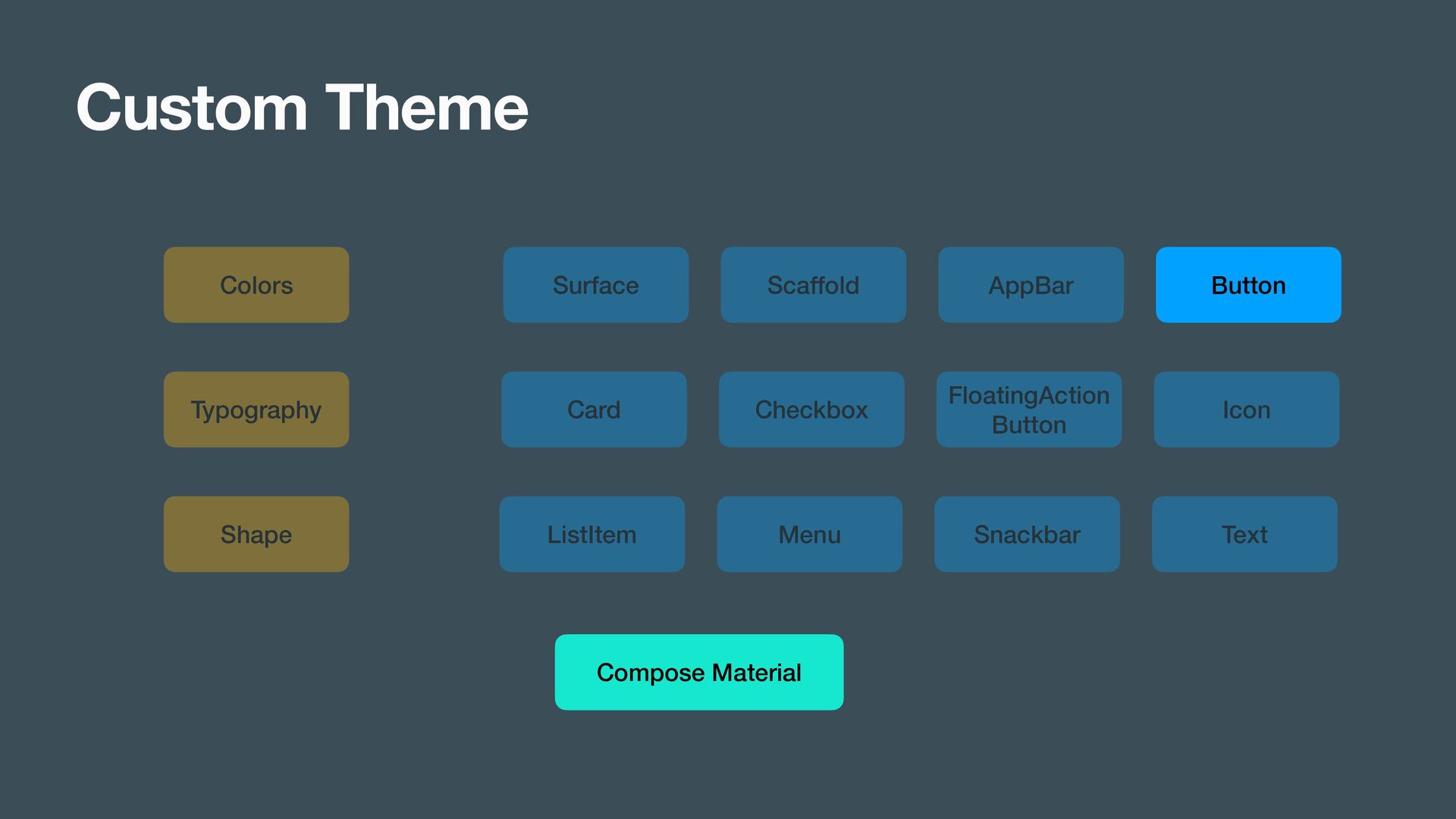
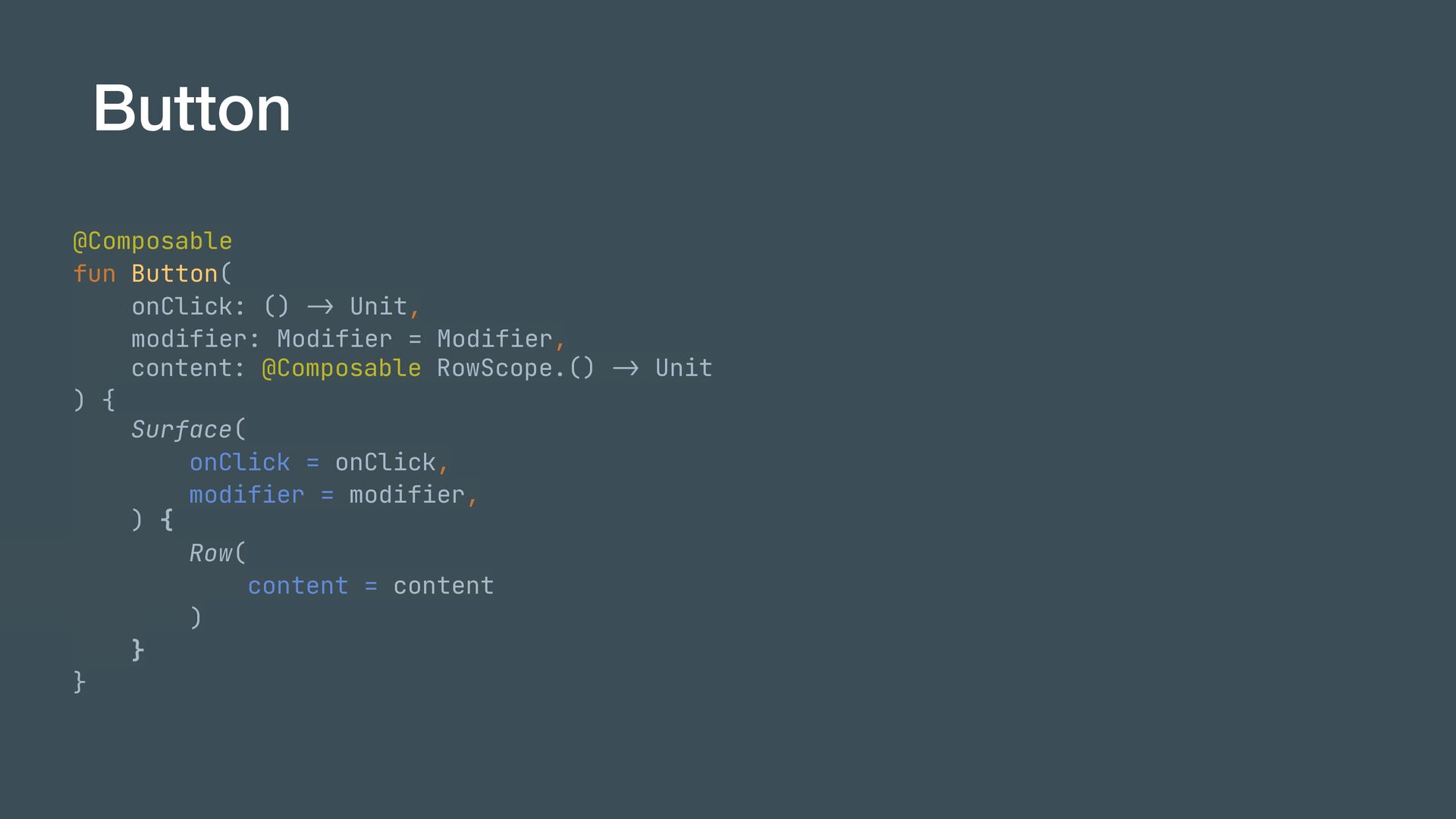
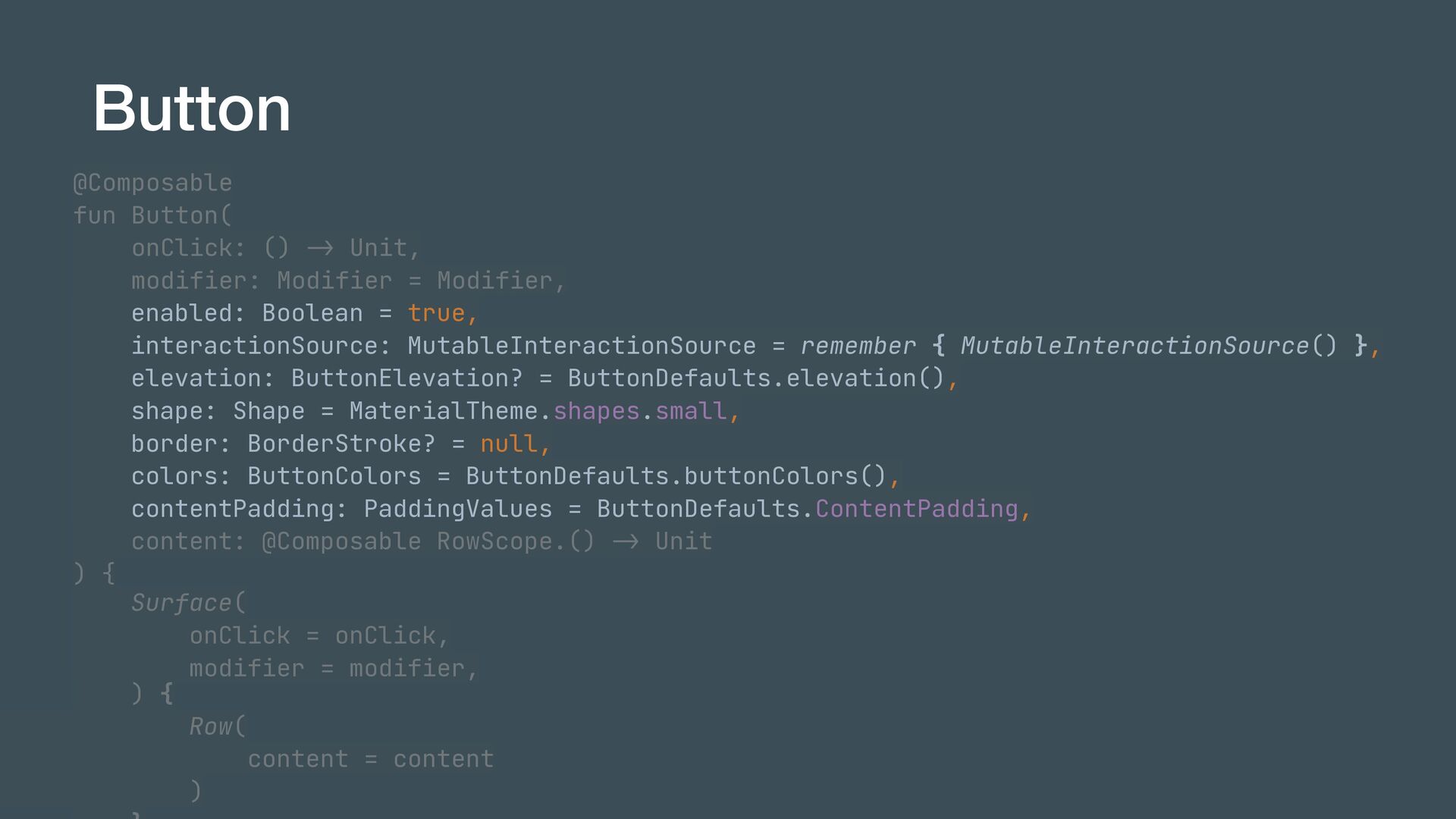
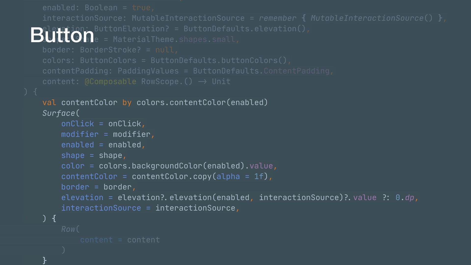
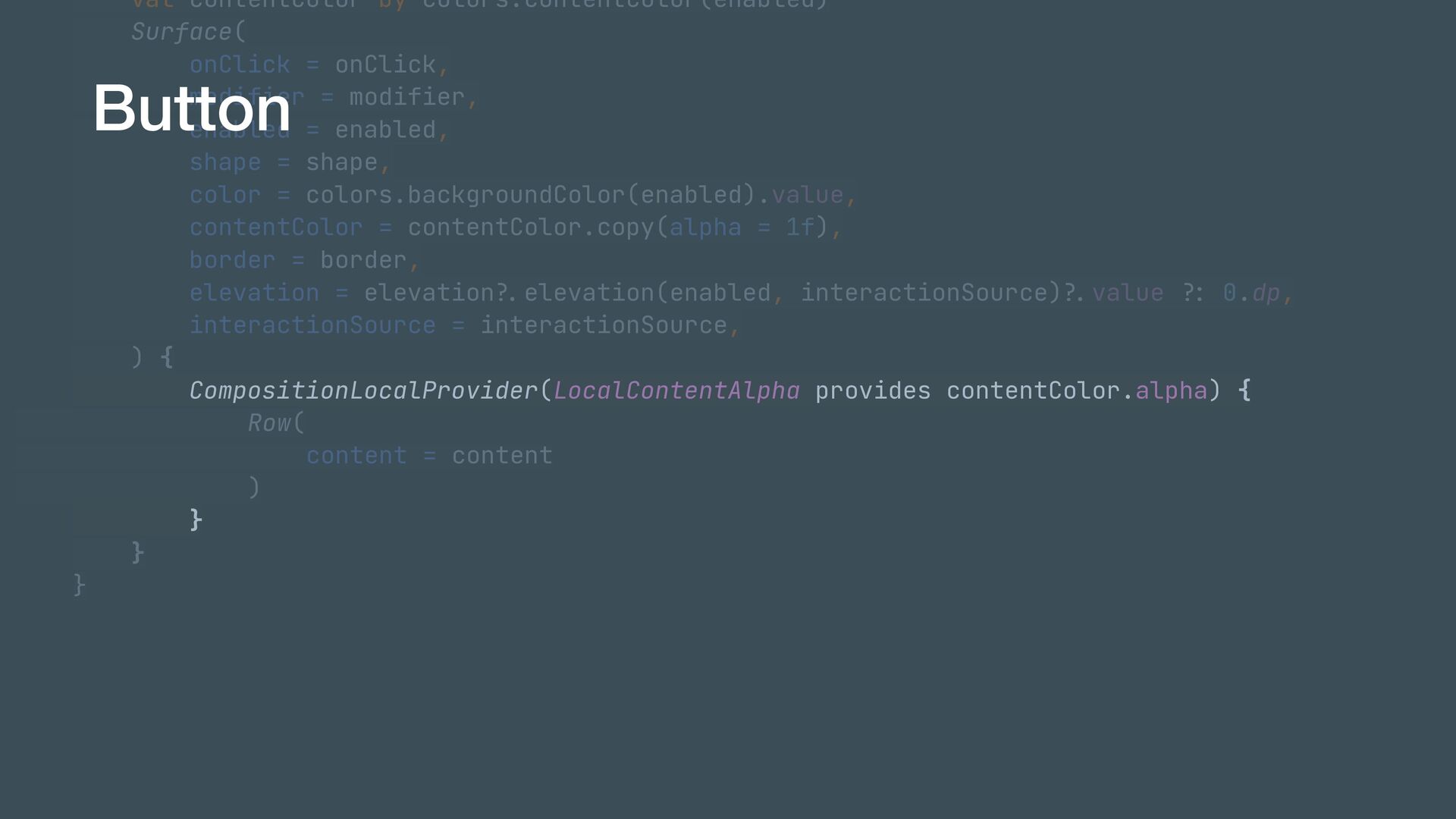
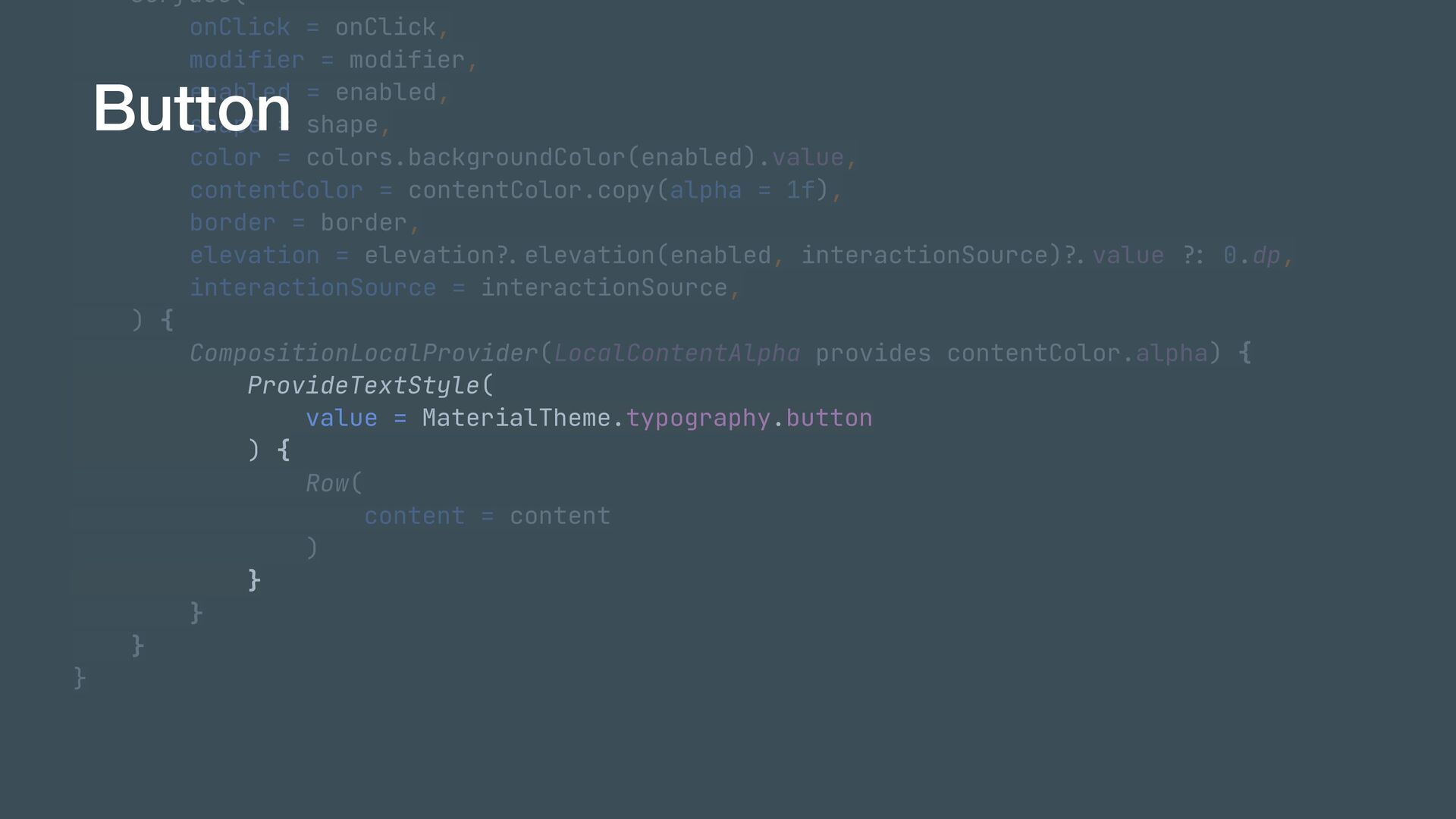
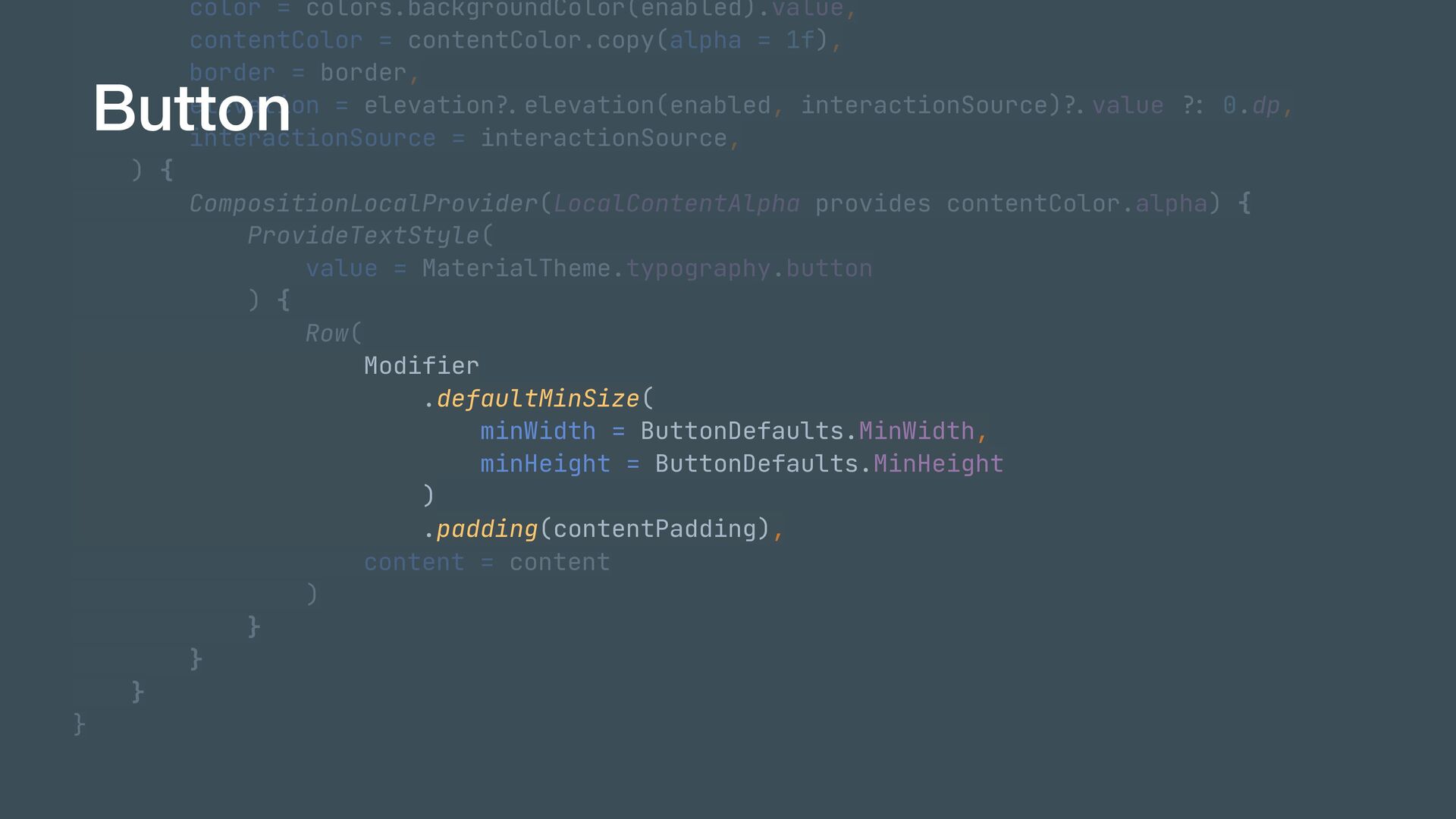
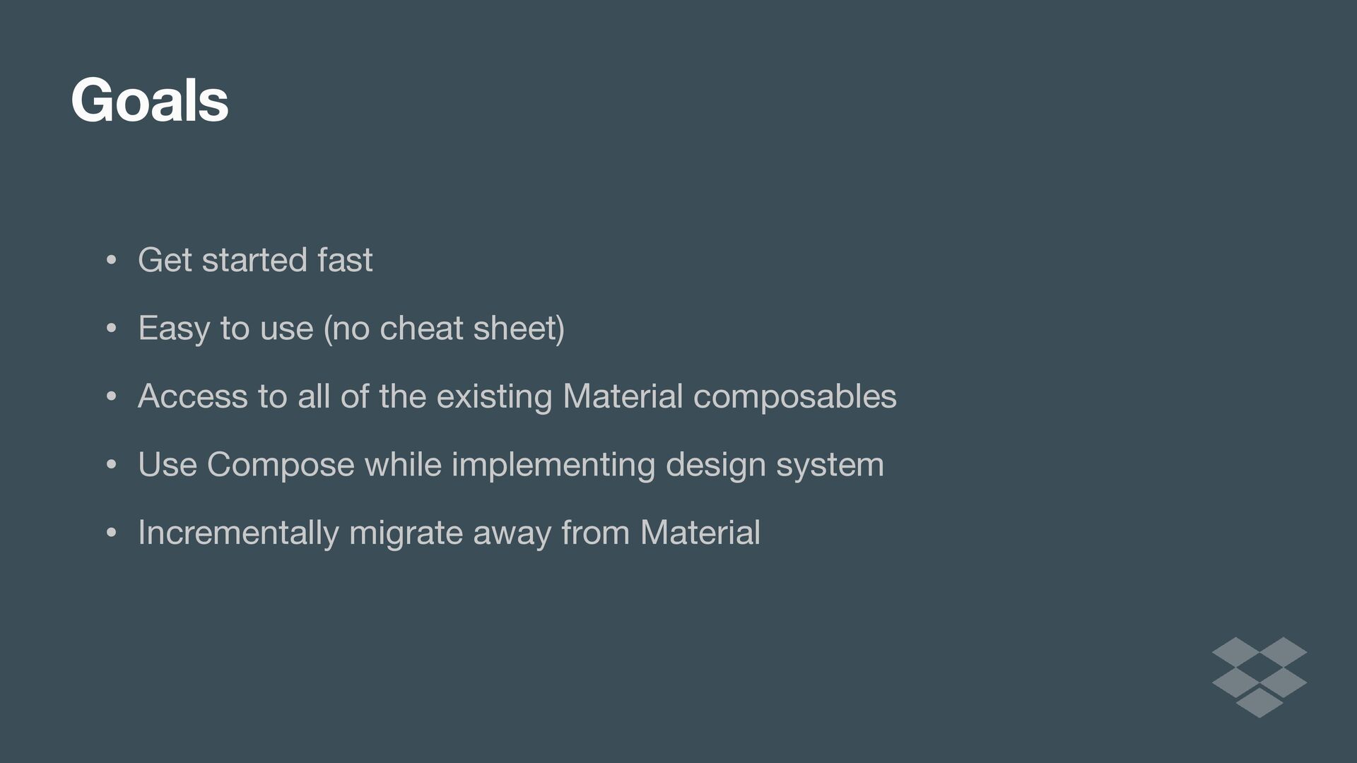
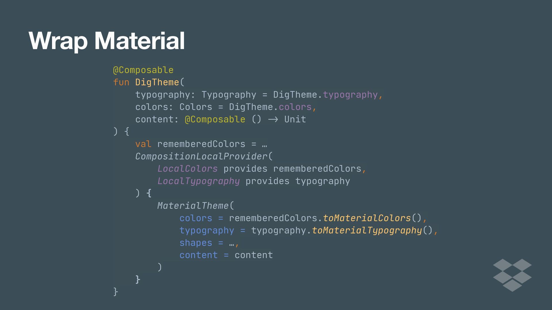
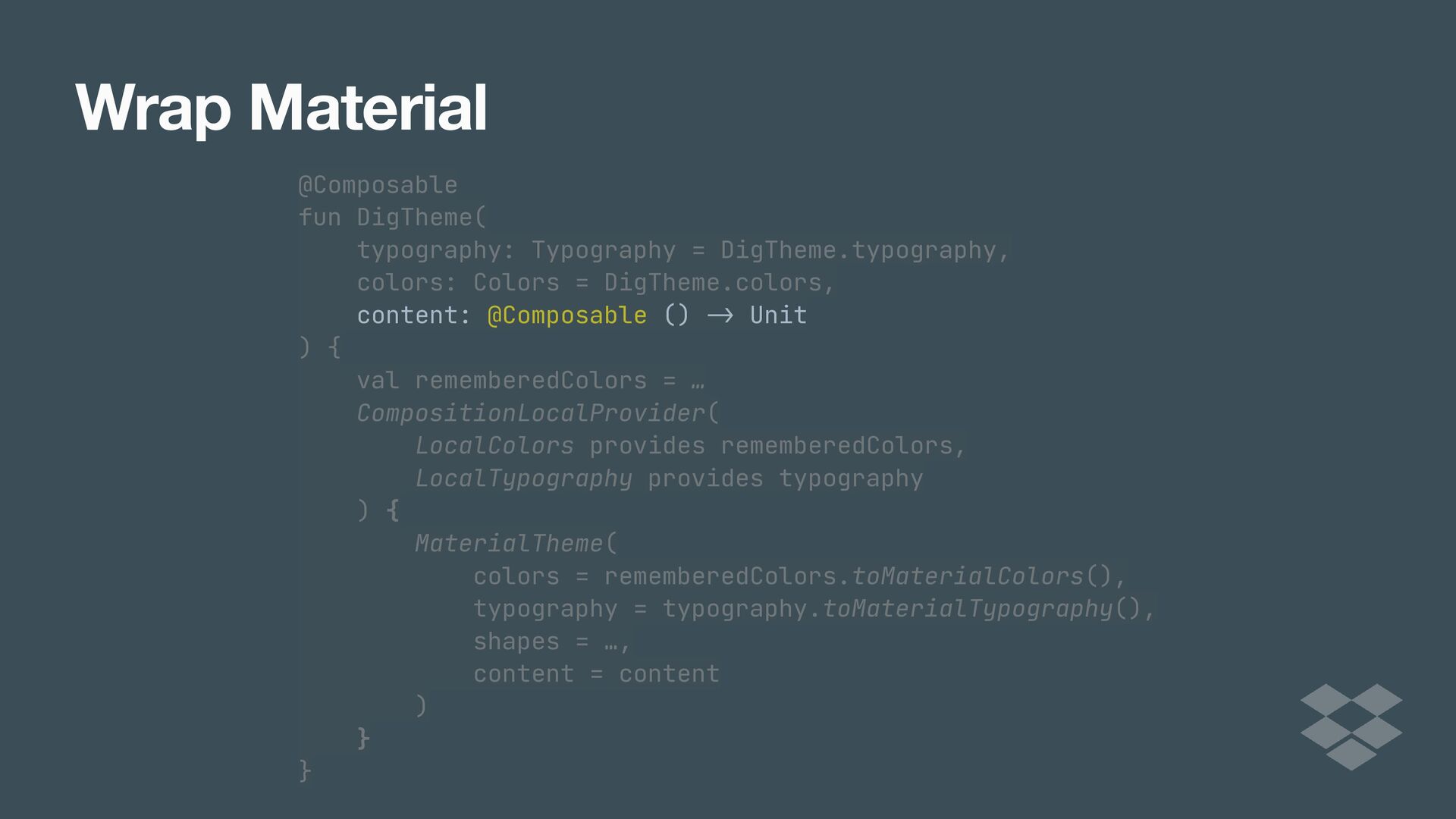
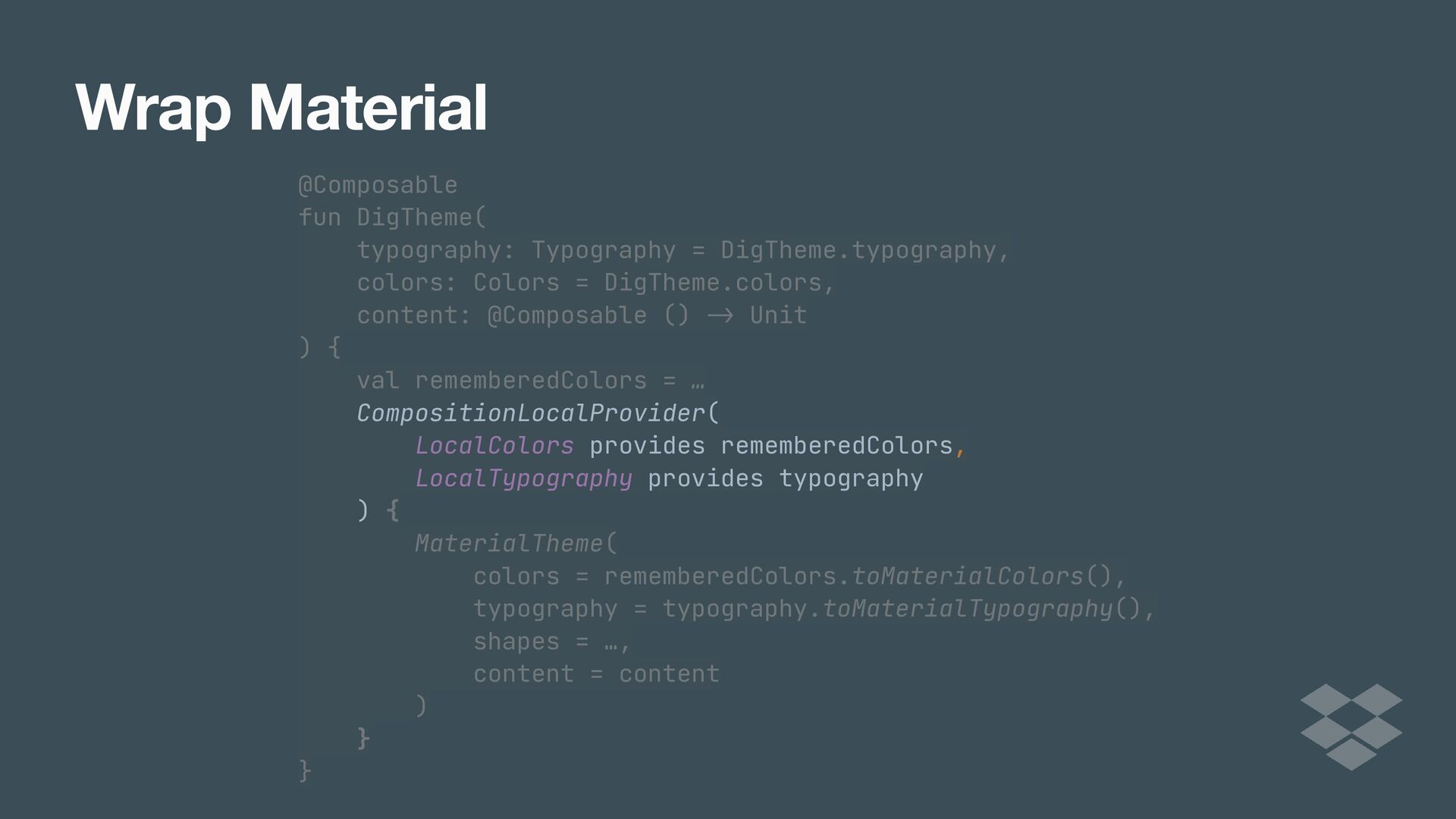
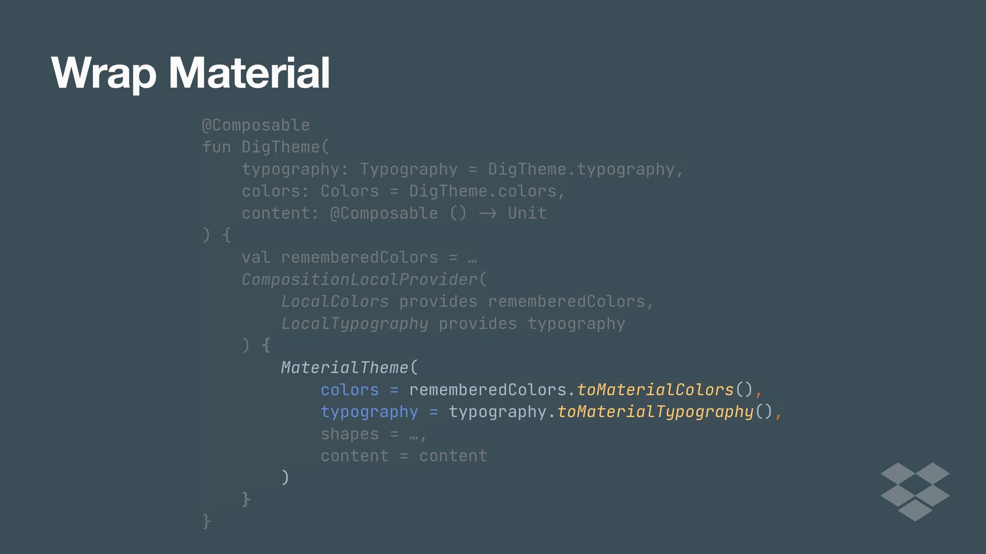
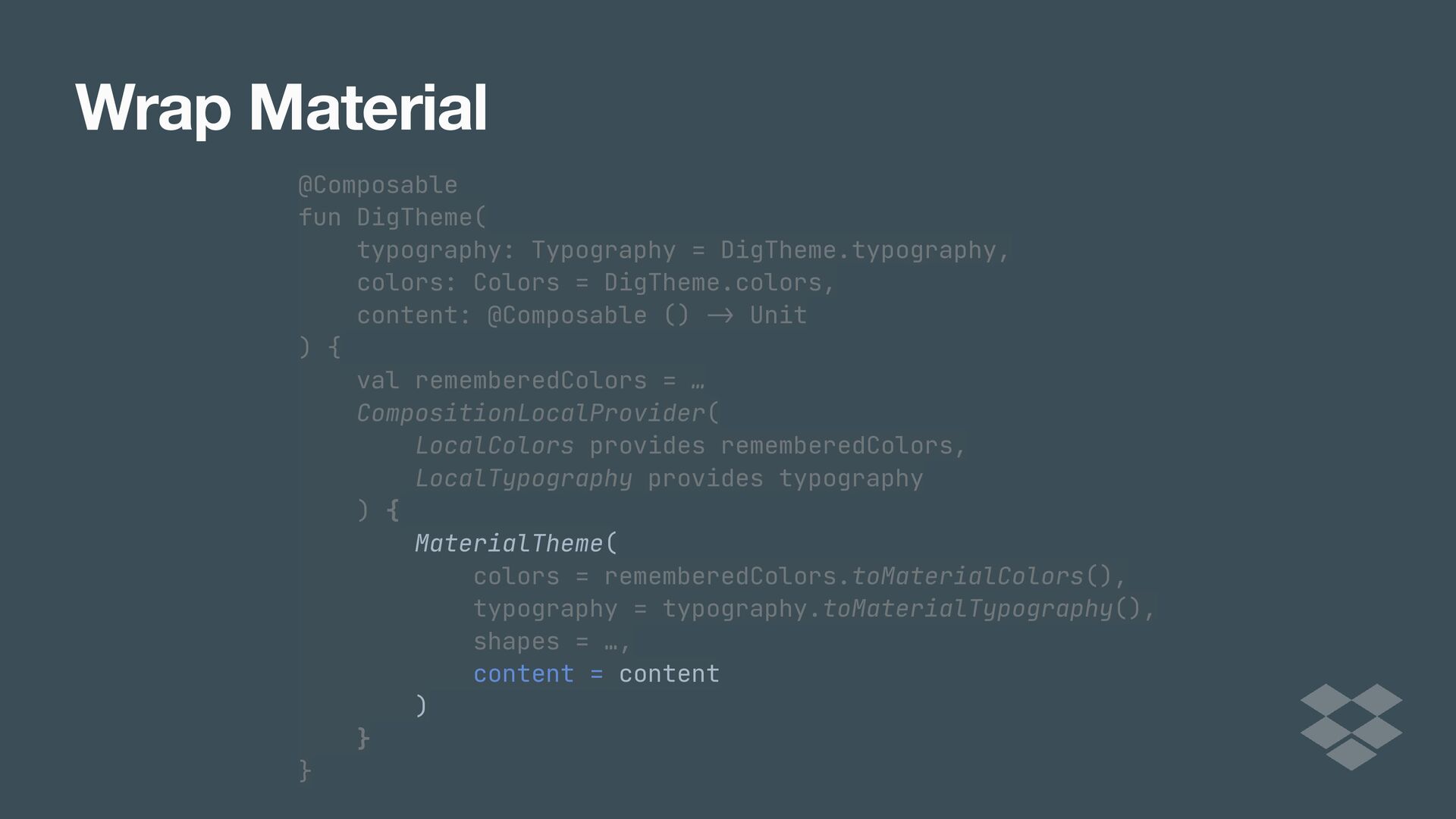
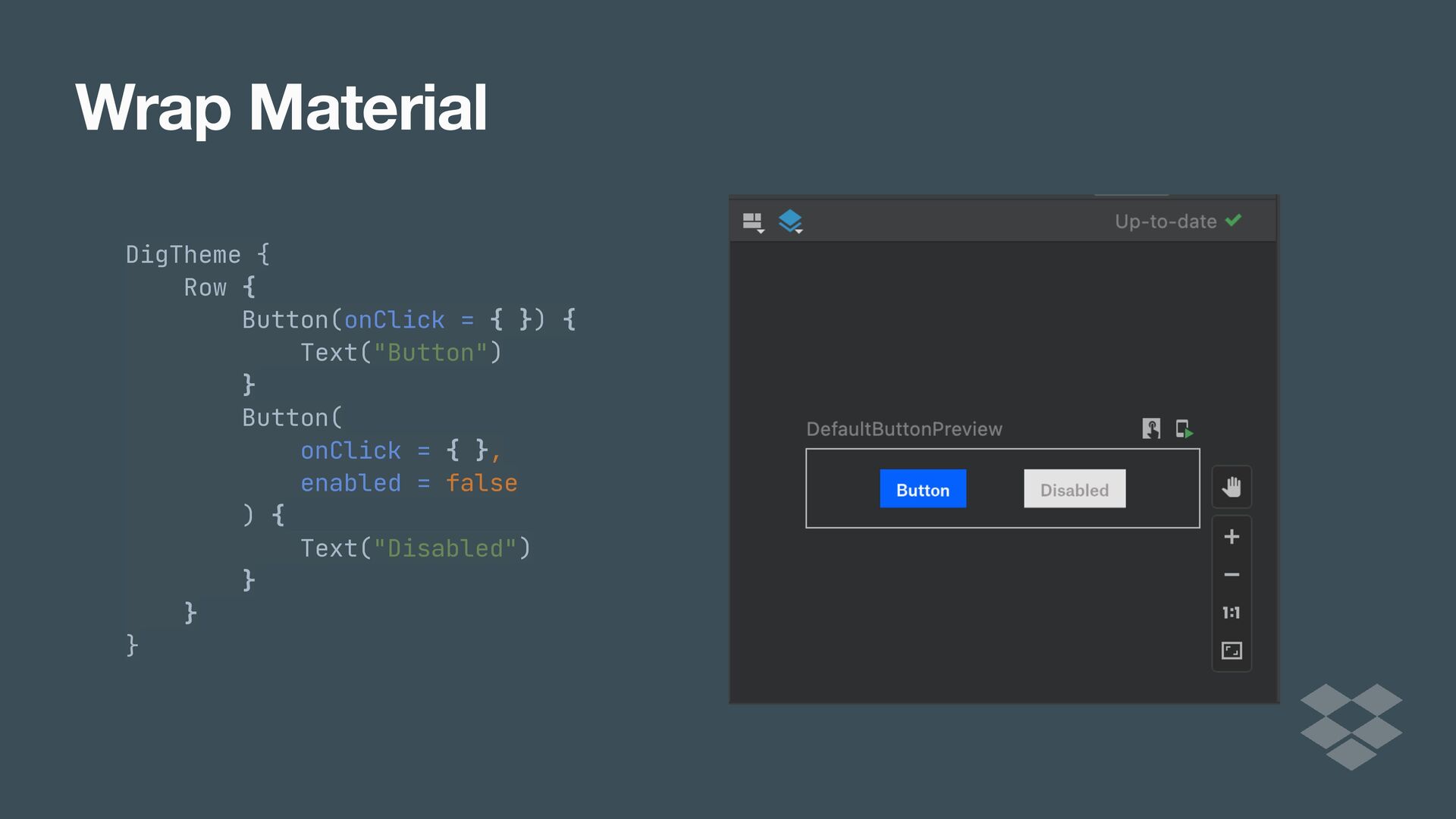
While Jetpack Compose comes with Google’s Material Design system, many apps have their own design language and systems that they need to adhere to in order to offer consistency across platforms. As apps and teams scale, it eventually becomes beneficial to implement your own design system.

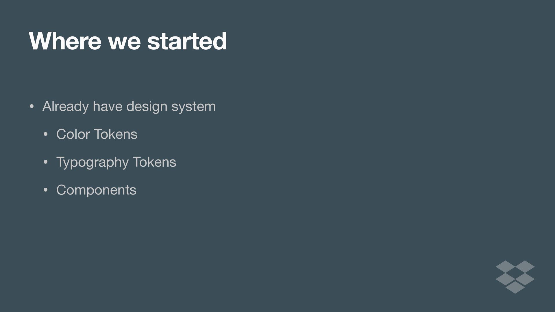
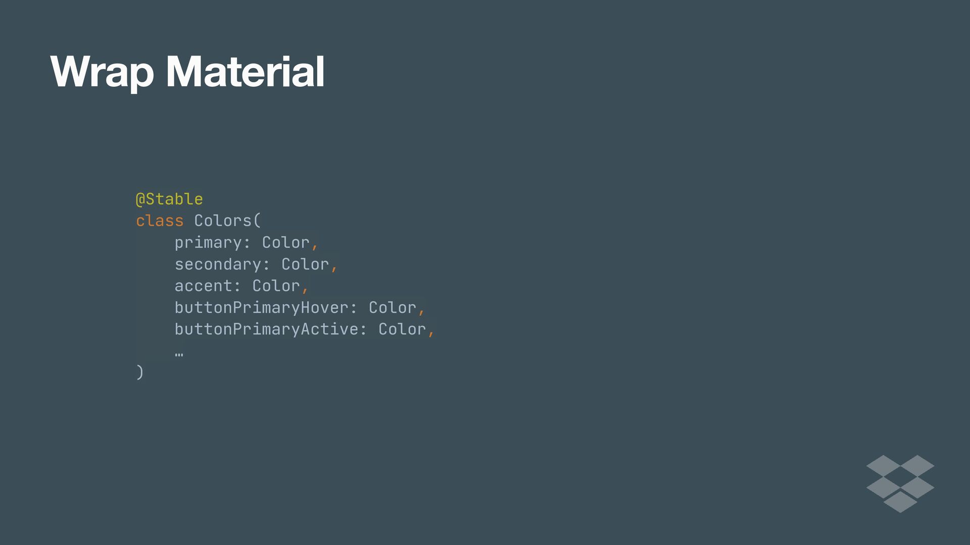
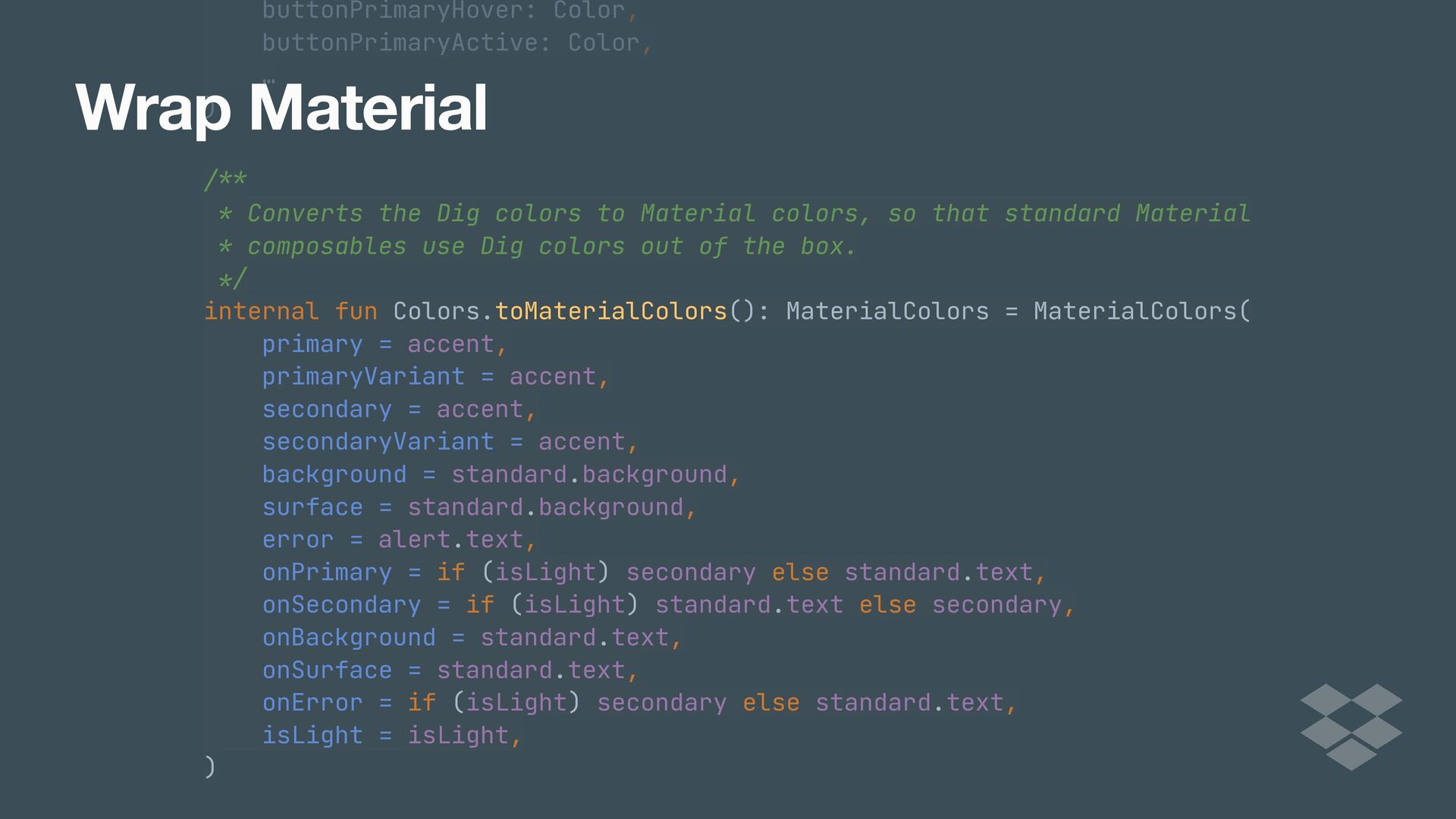
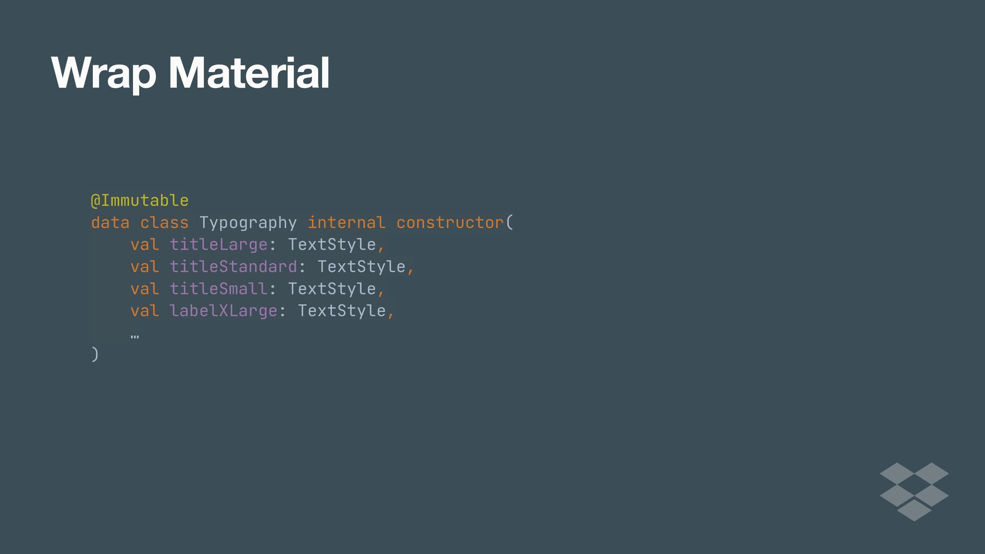
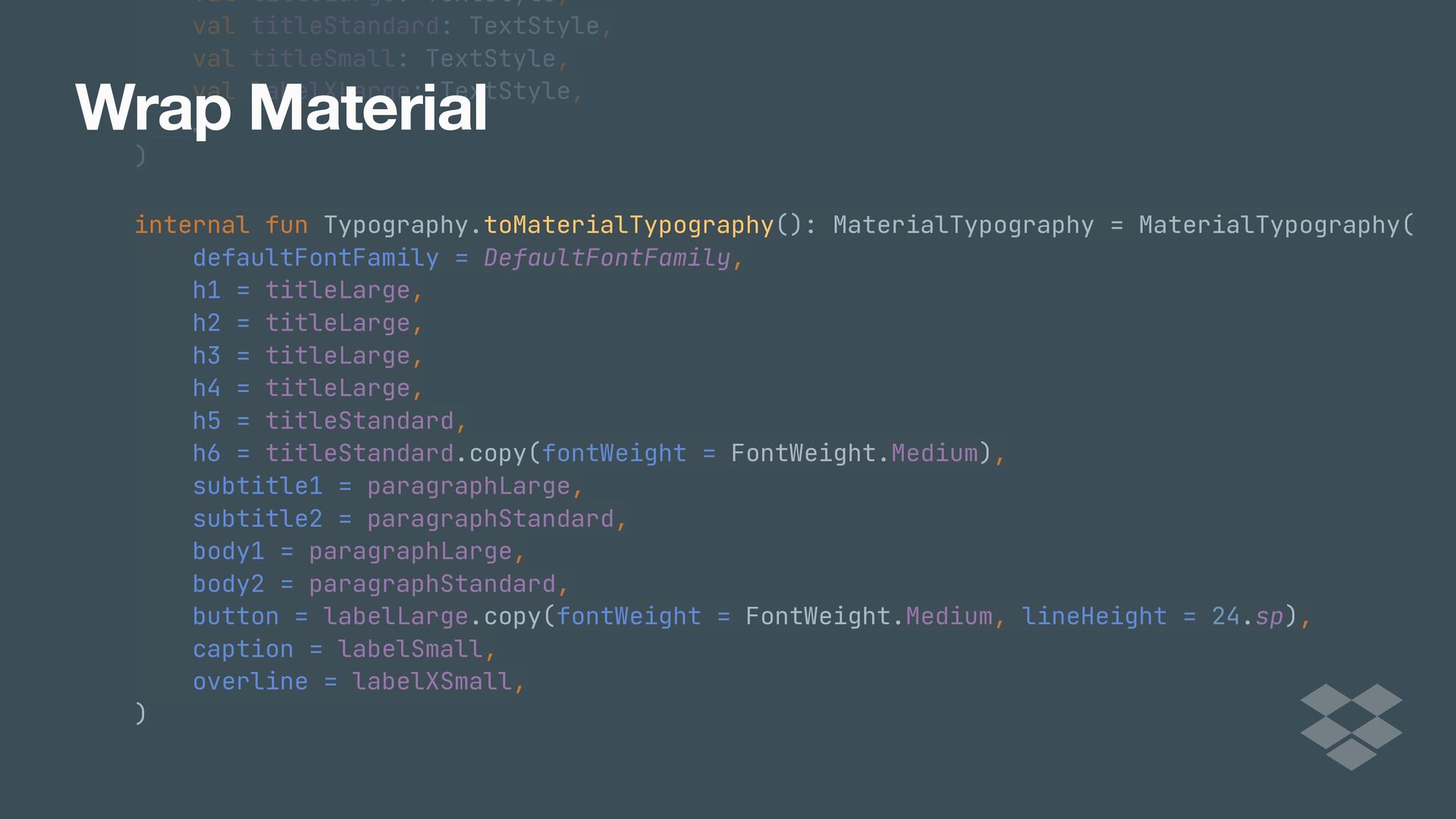
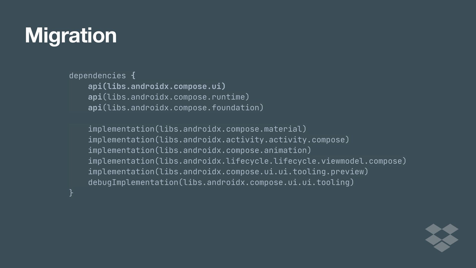
That’s exactly the case at Dropbox. We recently went through the process of implementing our DIG design library in Compose, and have seen the benefits first hand.

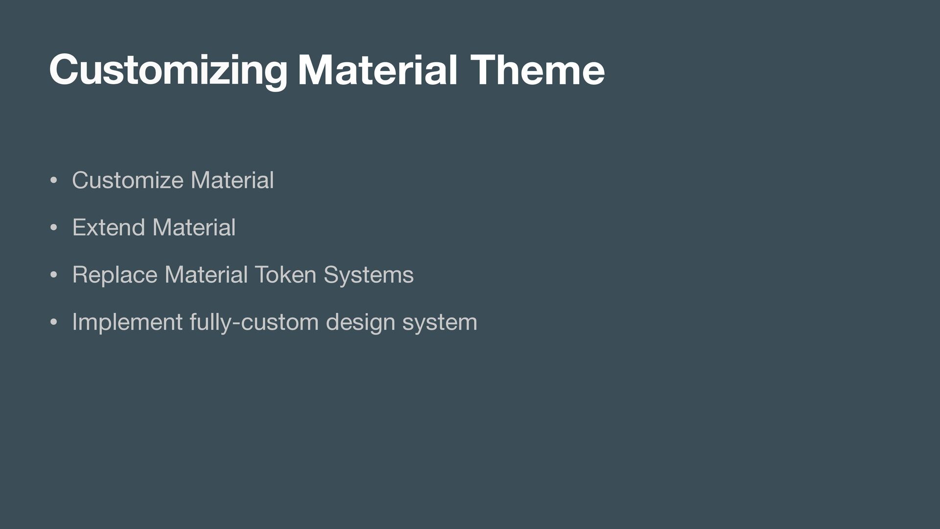
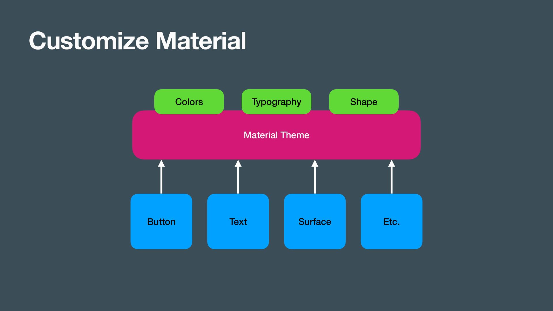
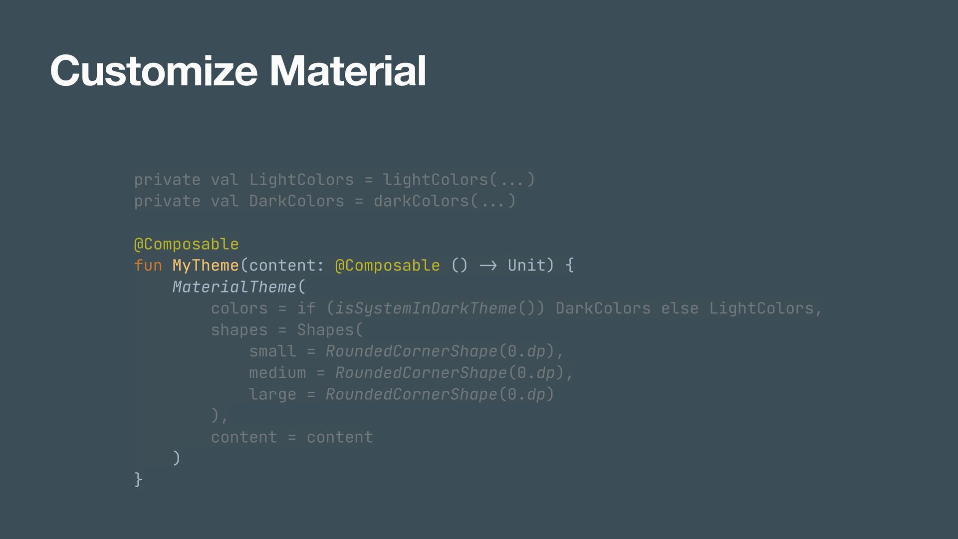
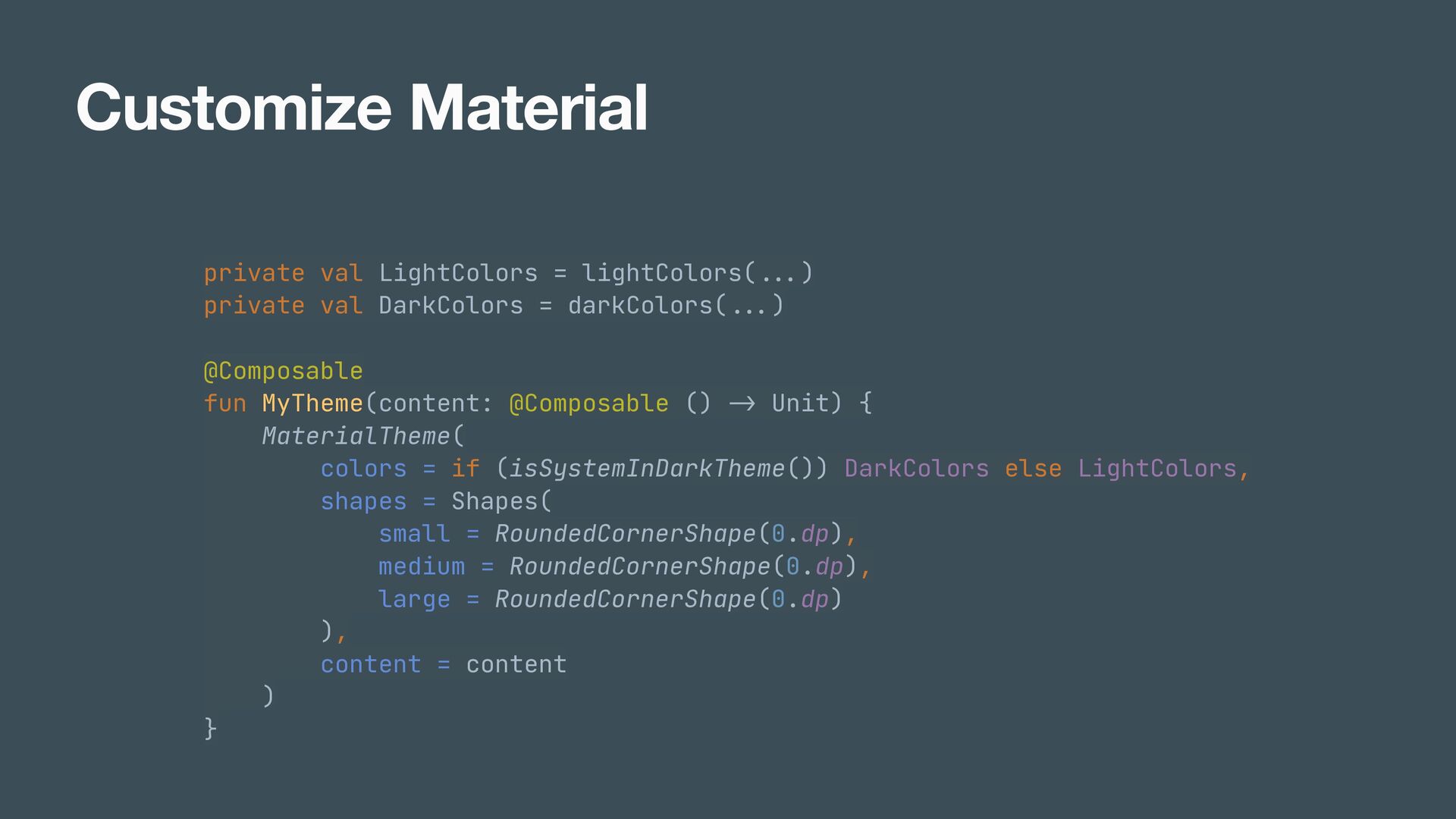
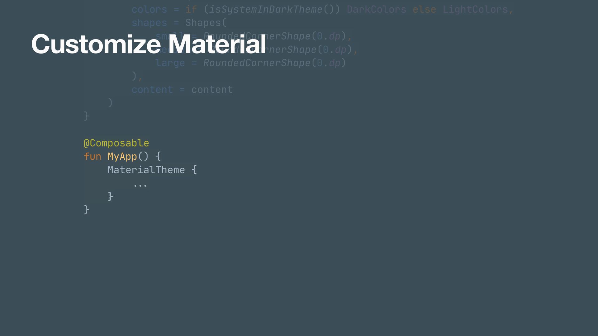
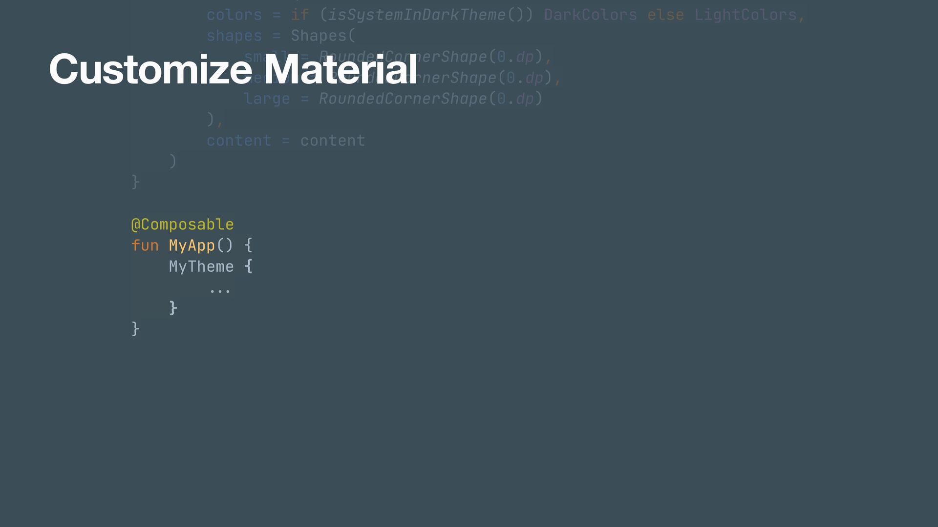
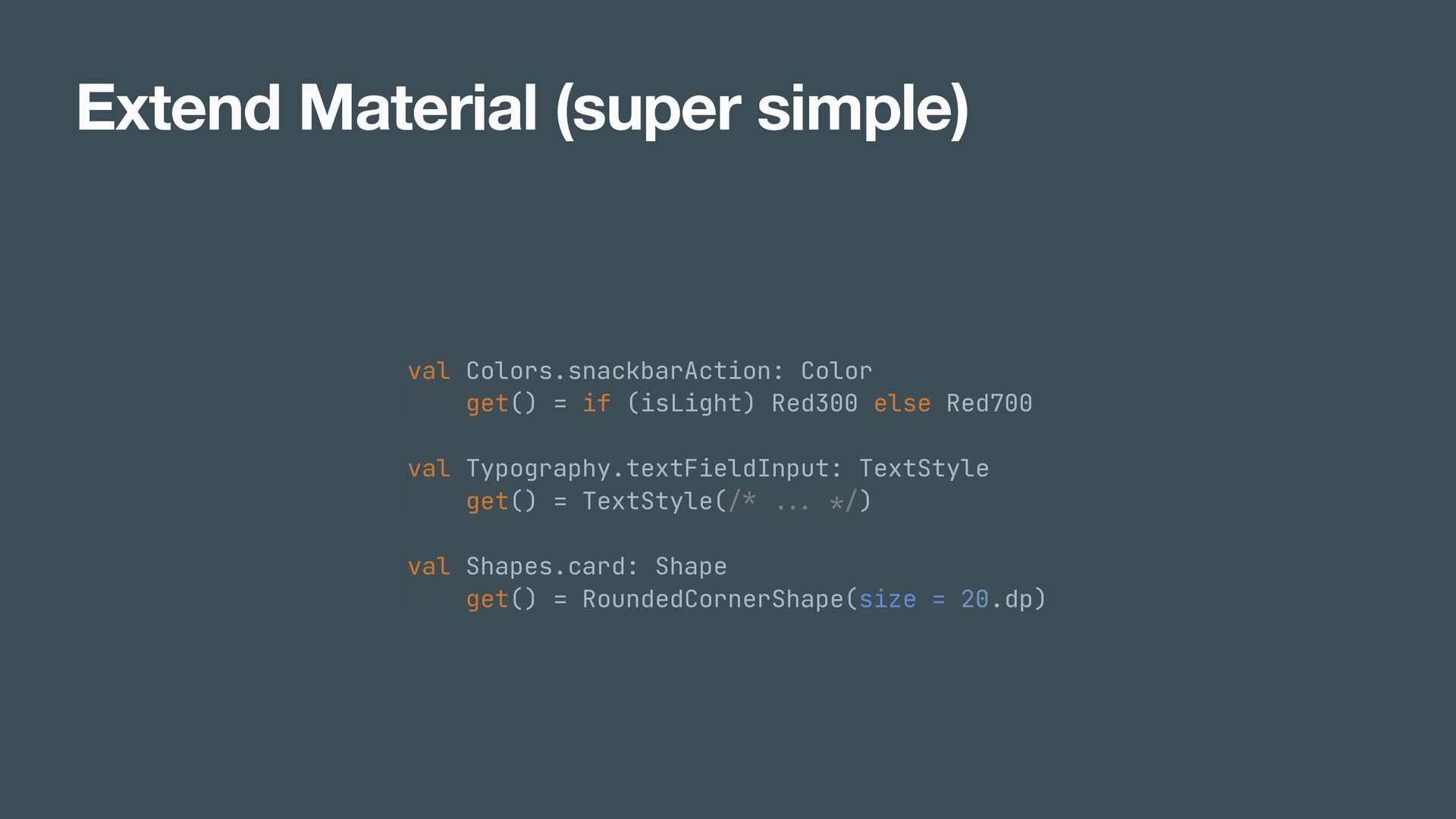
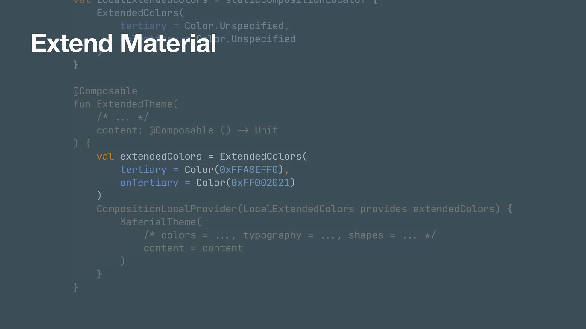
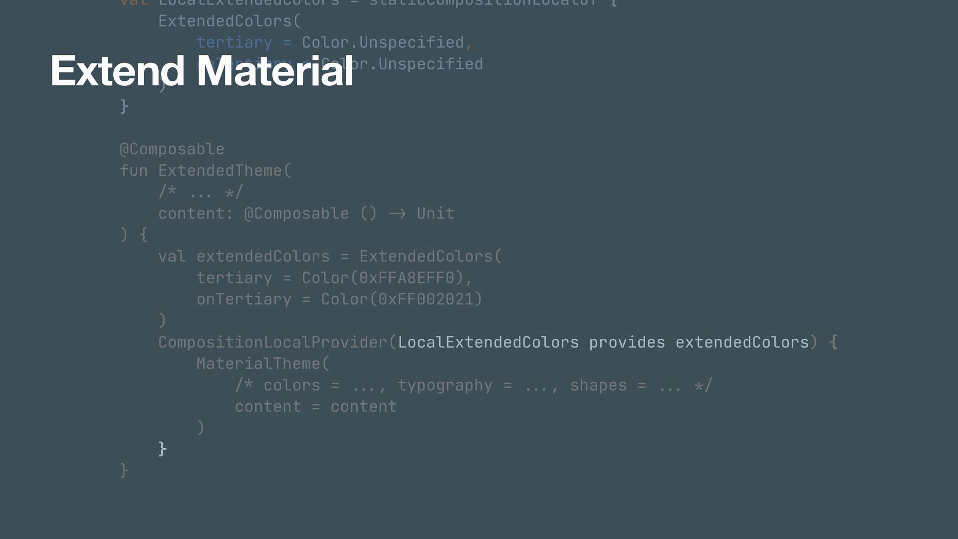
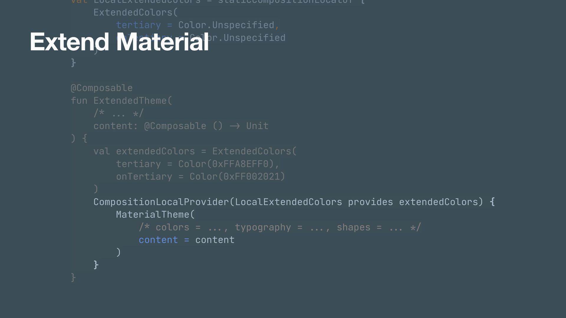
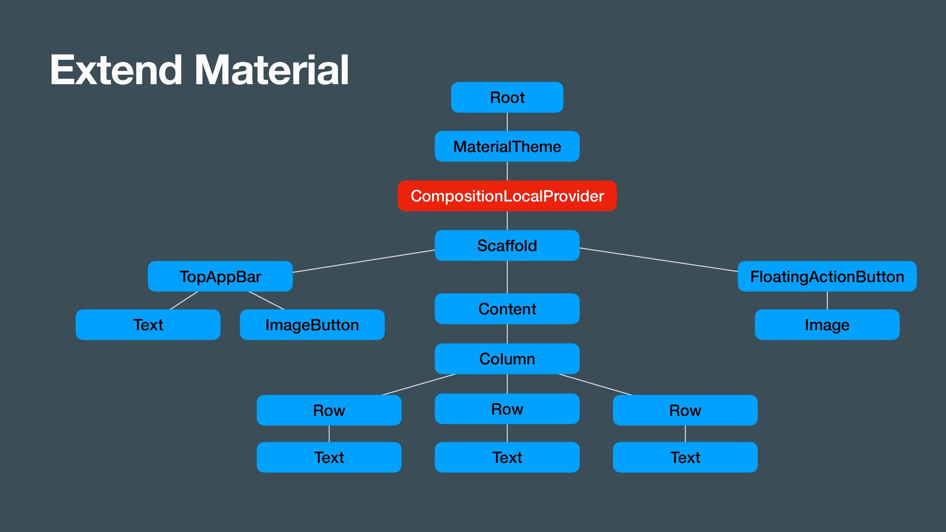
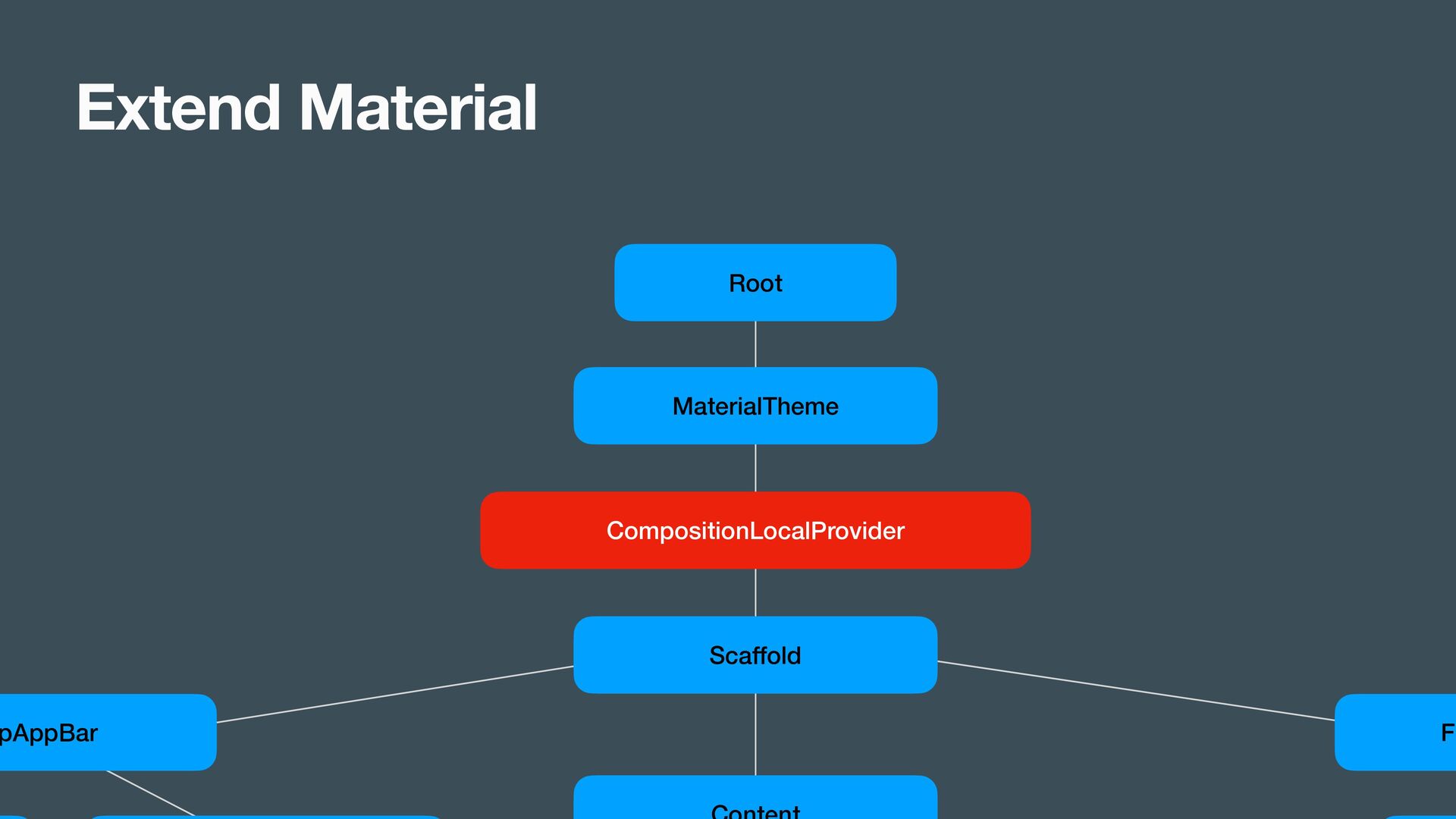
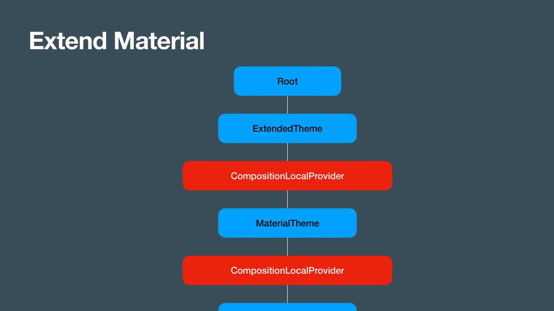
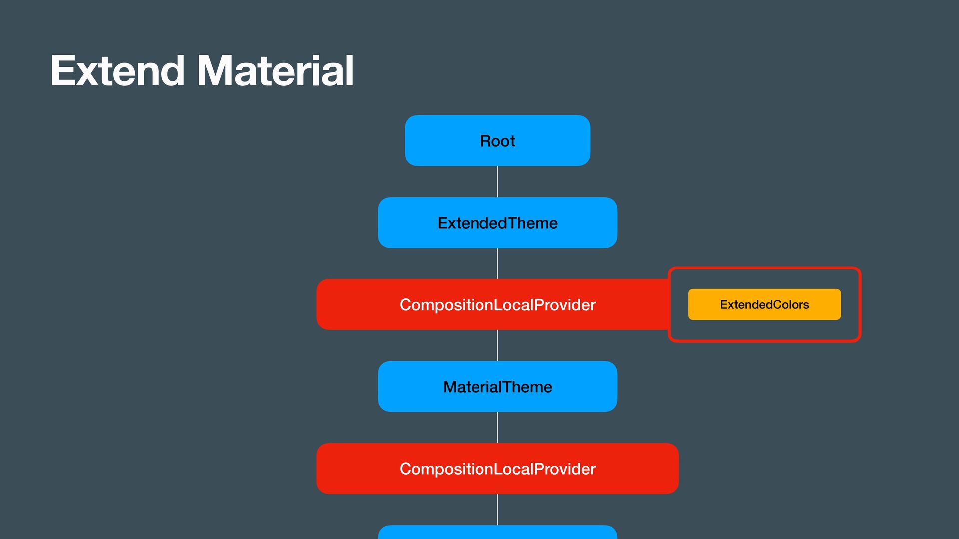
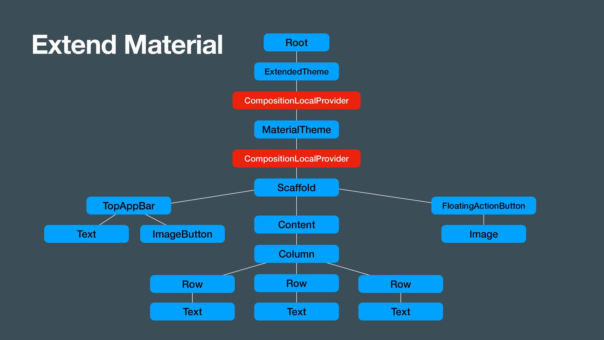
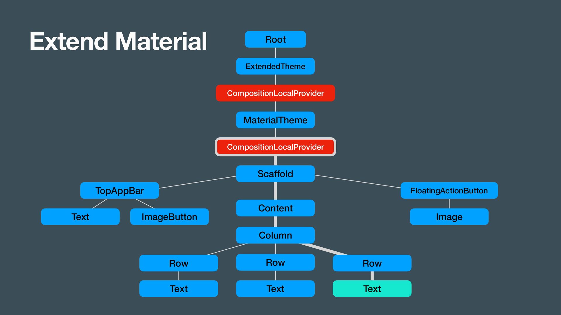
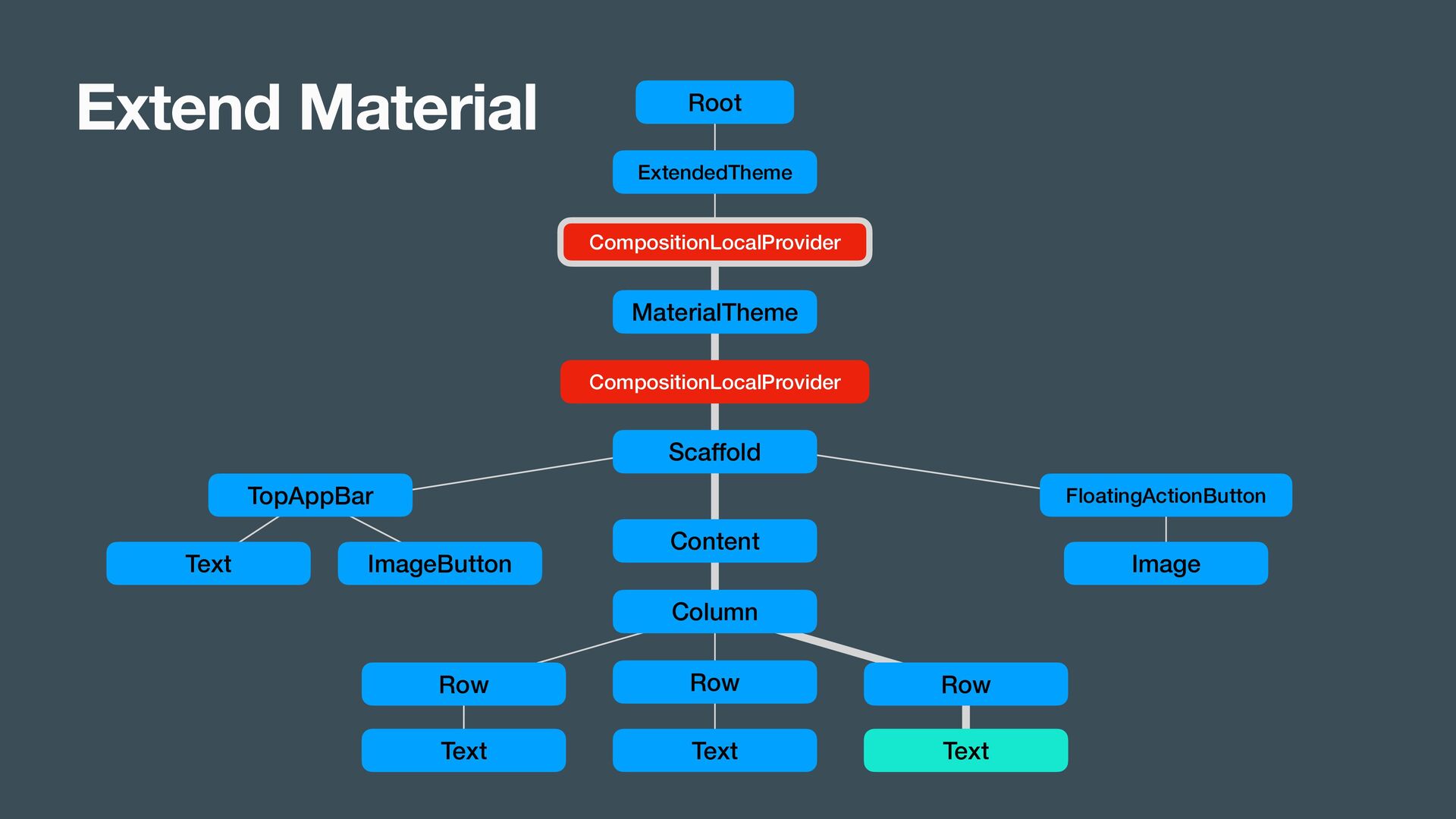
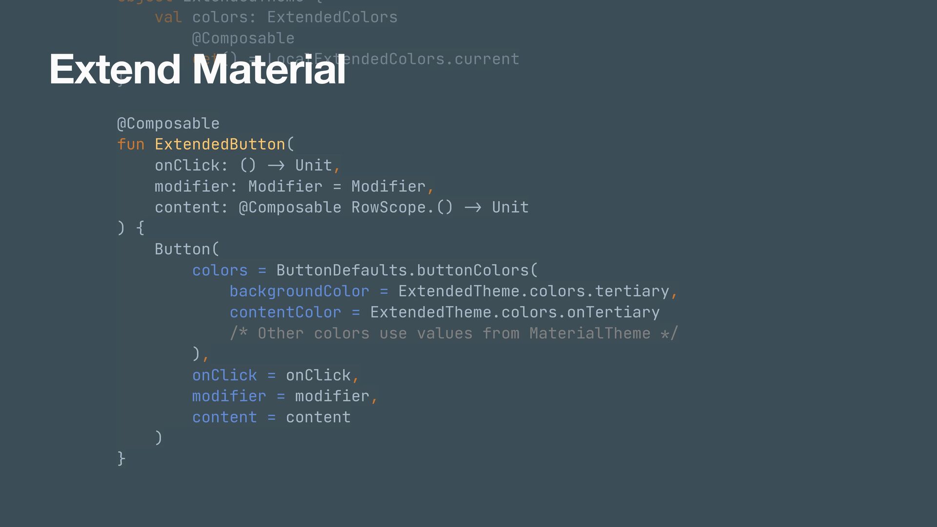
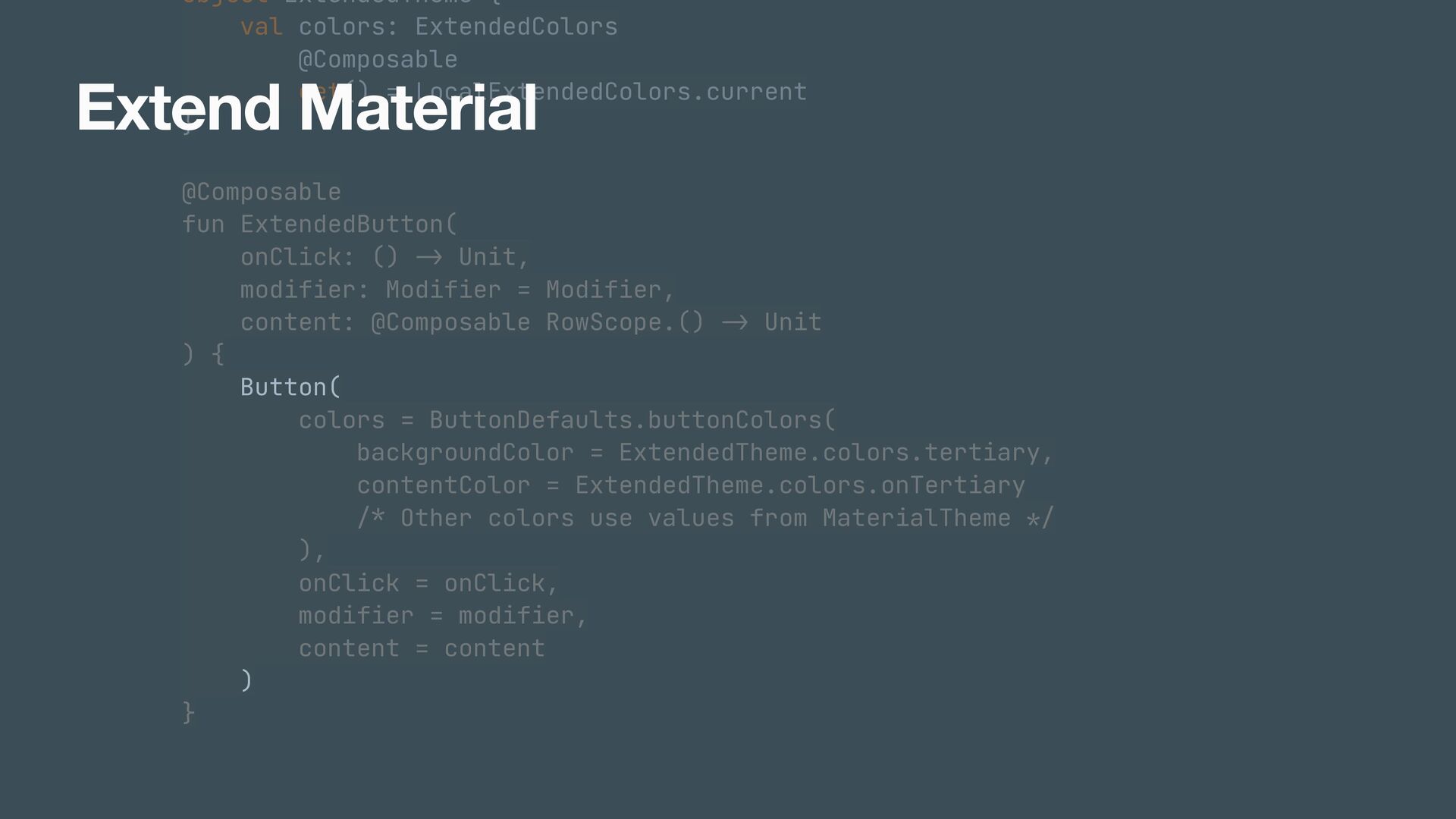
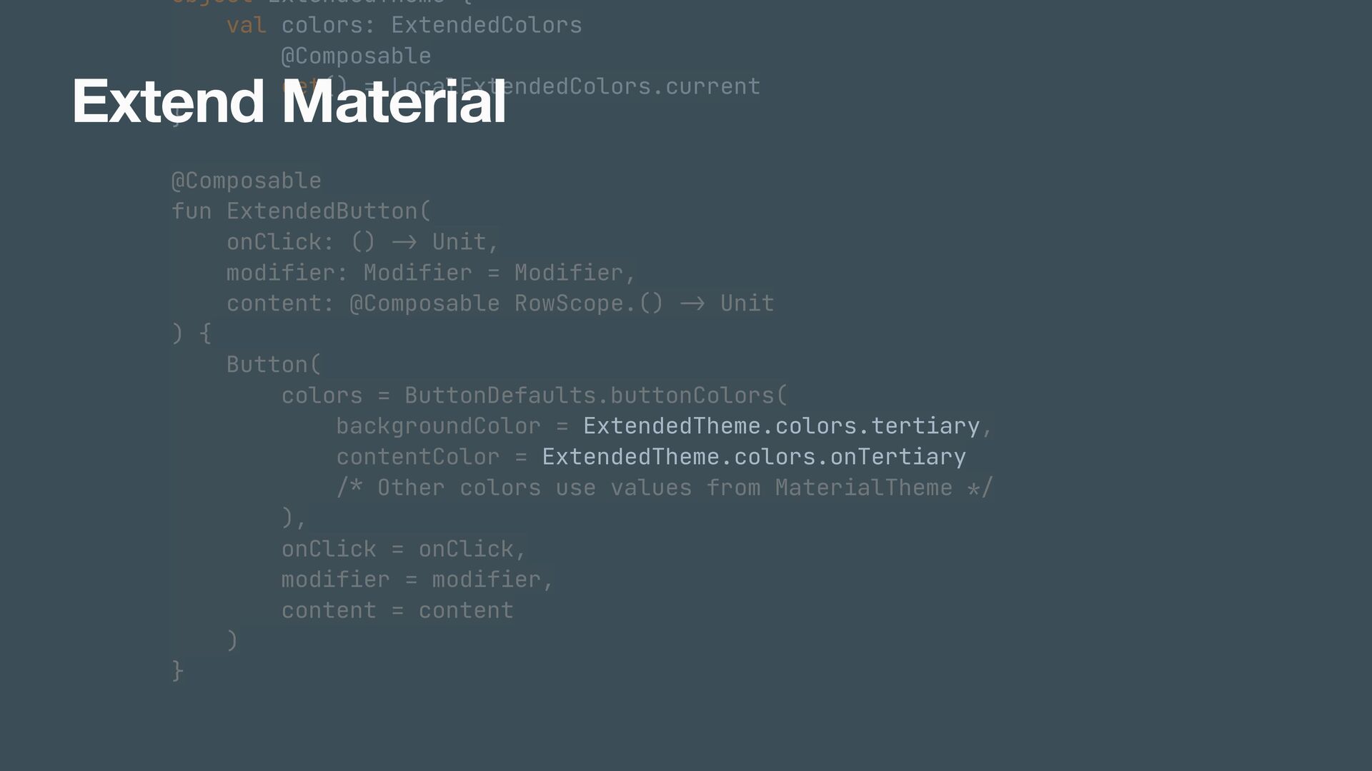
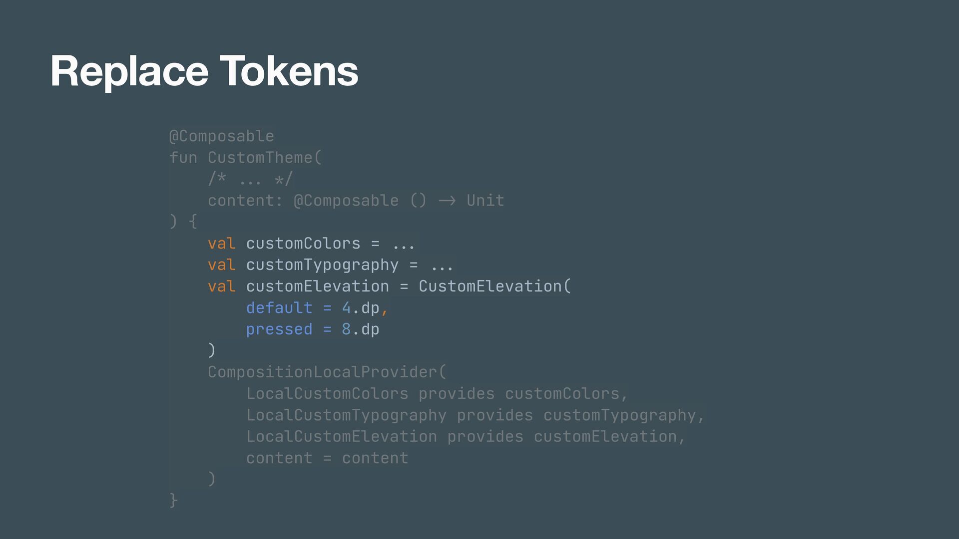
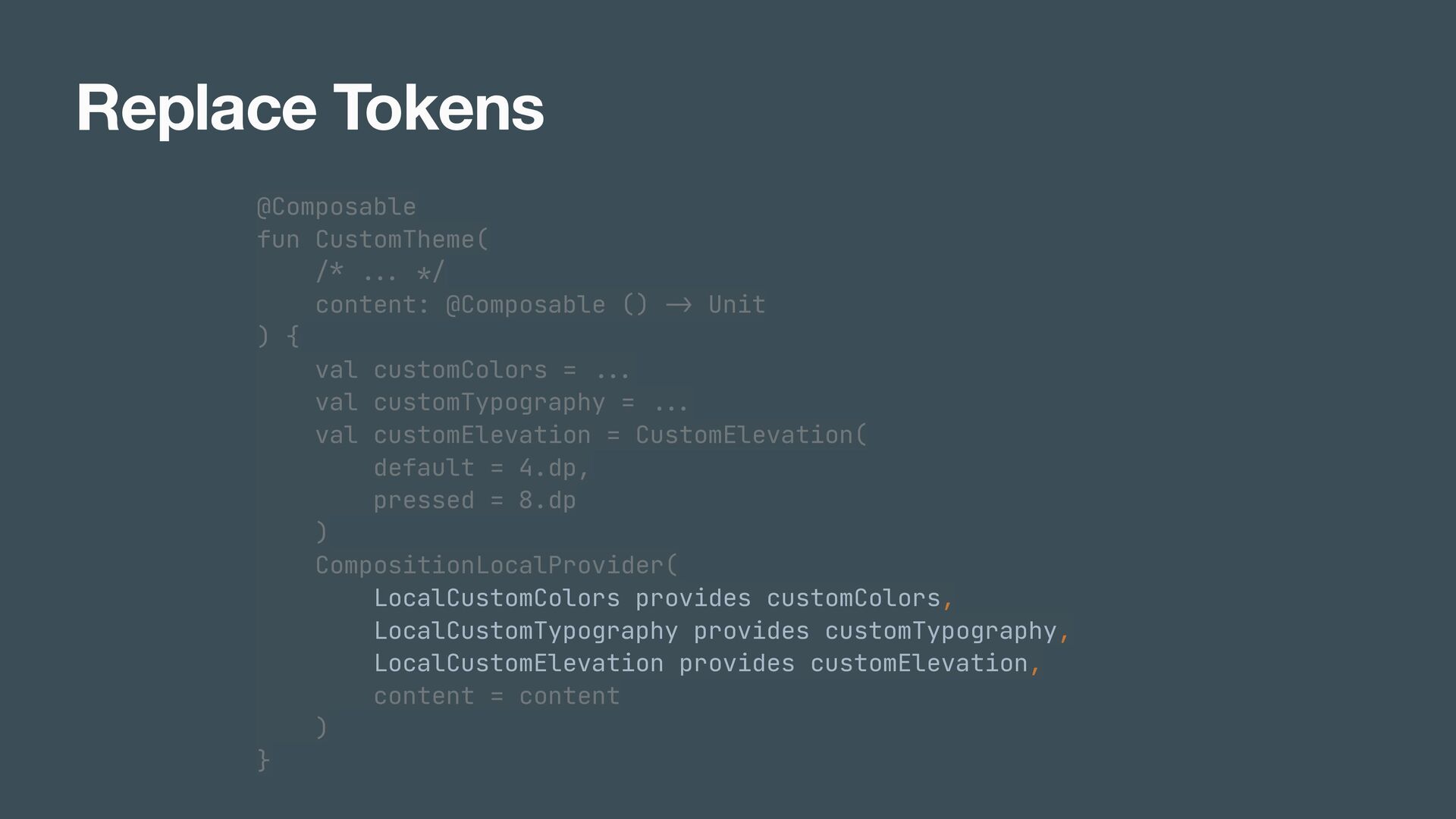
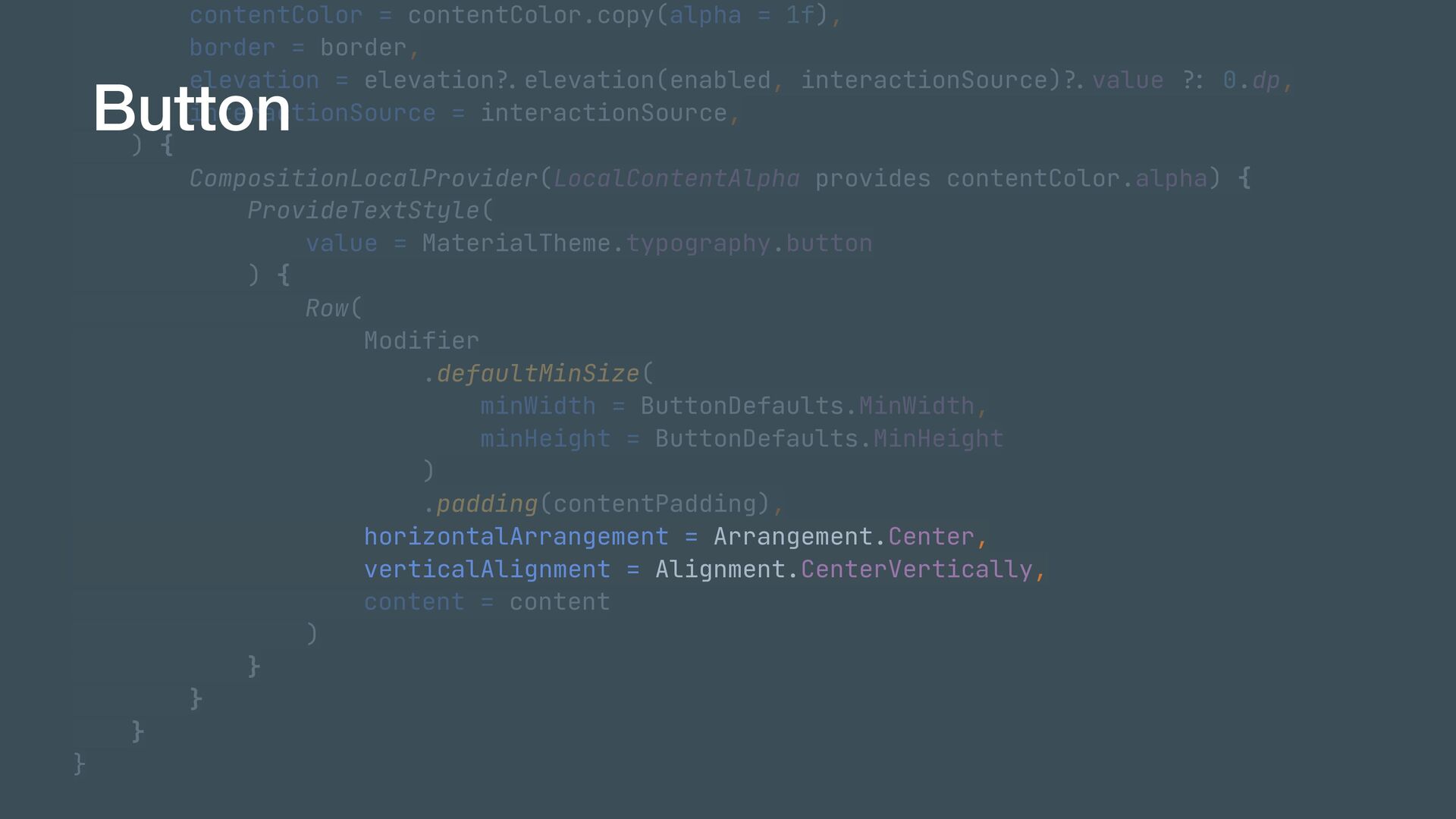
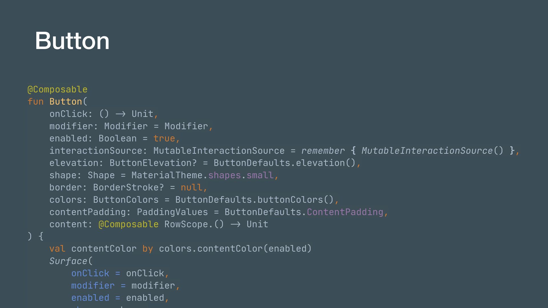
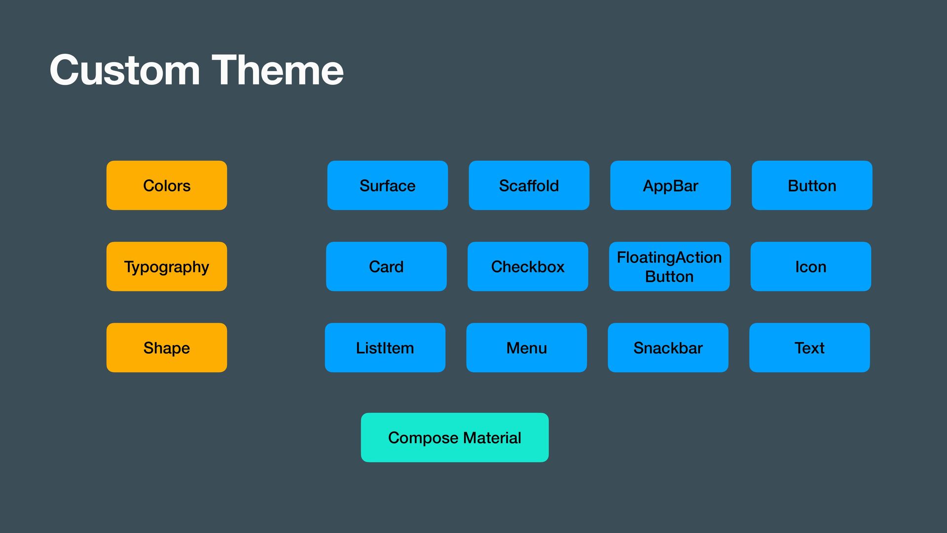
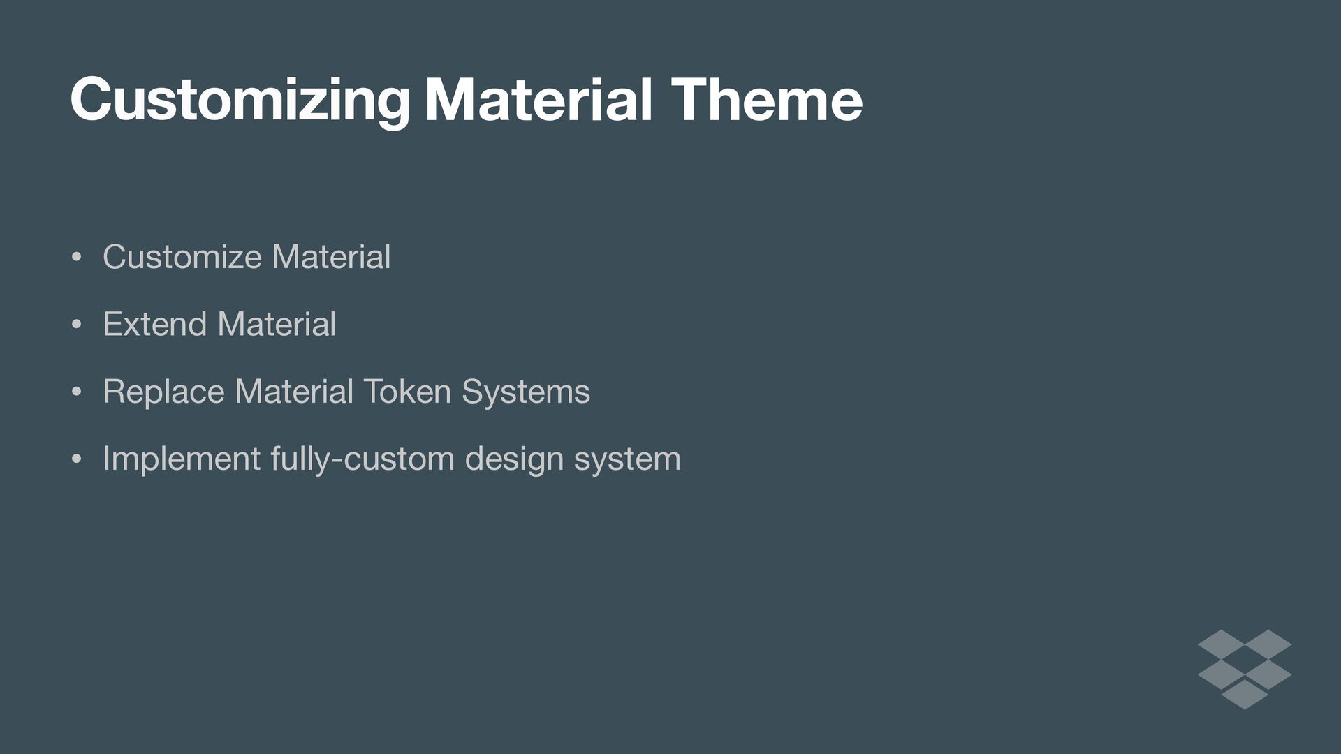
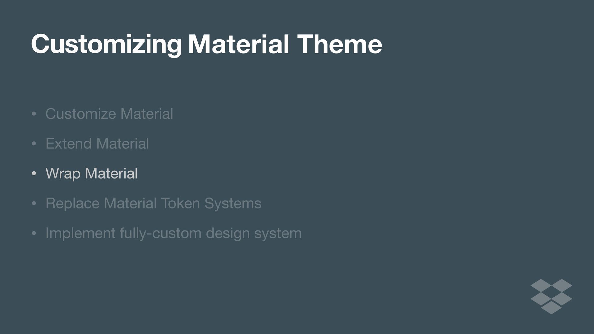
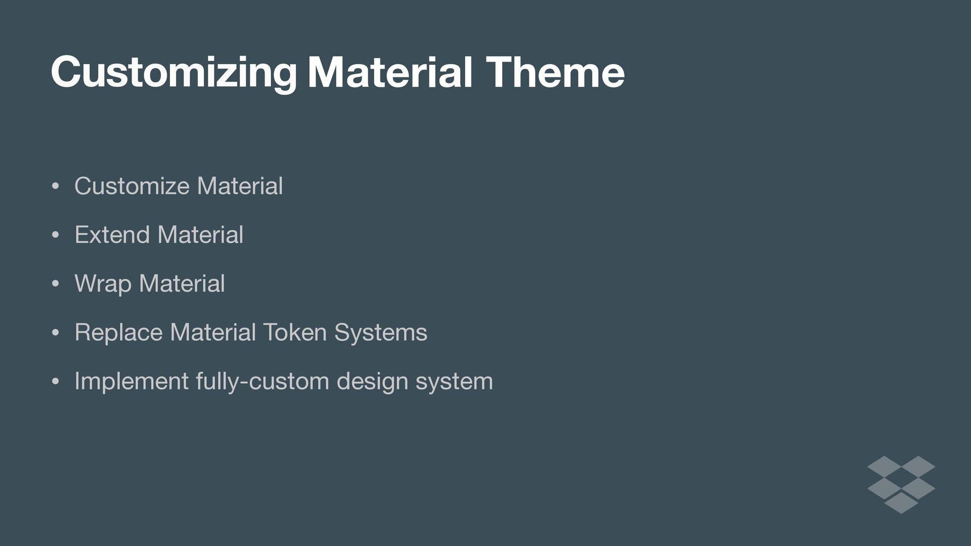
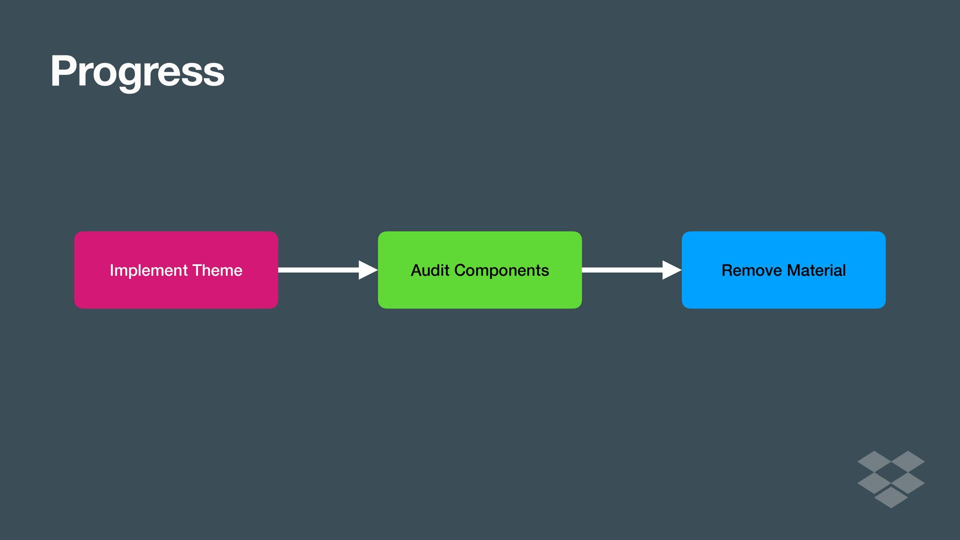
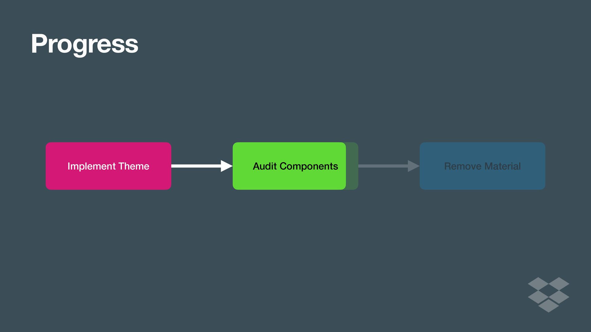
In this talk, we’ll discuss different approaches to implementing custom design systems in Compose, from customizing the Material Theme, to extending it, all the way to implementing a full blown custom design library. We’ll cover some of the benefits and drawbacks of each approach that you might want to consider.

Lastly, we’ll share the process we went through at Dropbox as we implemented our DIG design library. We’ll report on our experience and reflect on the benefits we’ve seen and what our plans are for the future.

Ryan Harter

August 02, 2022
Tweet

More Decks by Ryan Harter

Other Decks in Technology

Transcript

  1. Ryan Harter @rharter
    Custom Design Systems
    in Jetpack Compose

    View Slide

  2. Ryan Harter @RHARter
    Custom Design Systems
    in Jetpack Compose UI

    View Slide

  3. Ryan Harter @RHARter
    Follow Along
    https://ryans.link/roboto22

    View Slide

  4. Compose UI

    View Slide

  5. Compose UI
    Compose UI

    View Slide

  6. Compose UI
    Compose UI
    Foundation

    View Slide

  7. Compose UI
    Compose UI
    Foundation
    Compose Material

    View Slide

  8. Compose Material
    Material Theme
    Colors Typography
    Button Text Surface Etc.
    Shape

    View Slide

  9. Compose Material
    Material Theme
    Colors Typography
    Button Text Surface Etc.
    Shape

    View Slide

  10. Sidebar
    Design System Tokens

    View Slide

  11. Sidebar
    Design System Tokens
    @Stable


    class Colors(


    val primary: Color,


    val primaryVariant: Color,


    val secondary: Color,


    val secondaryVariant: Color,


    val background: Color,


    val surface: Color,


    val error: Color,


    val onPrimary: Color,


    val onSecondary: Color,


    val onBackground: Color,


    val onSurface: Color,


    val onError: Color,


    val isLight: Boolean


    )

    View Slide

  12. Sidebar
    Design System Tokens
    @Stable


    class Colors(


    val primary: Color,


    val primaryVariant: Color,


    val secondary: Color,


    val secondaryVariant: Color,


    val background: Color,


    val surface: Color,


    val error: Color,


    val onPrimary: Color,


    val onSecondary: Color,


    val onBackground: Color,


    val onSurface: Color,


    val onError: Color,


    val isLight: Boolean


    )
    @Stable


    class Colors(


    val : Color,


    val : Color,


    val : Color,


    val : Color,


    val : Color,


    val : Color,


    val : Color,


    val : Color,


    val : Color,


    val : Color,


    val : Color,


    val : Color,


    val : Boolean


    )

    View Slide

  13. Sidebar
    Design System Tokens
    @Stable


    class Colors(


    val primary: Color,


    val primaryVariant: Color,


    val secondary: Color,


    val secondaryVariant: Color,


    val background: Color,


    val surface: Color,


    val error: Color,


    val onPrimary: Color,


    val onSecondary: Color,


    val onBackground: Color,


    val onSurface: Color,


    val onError: Color,


    val isLight: Boolean


    )
    @Immutable


    class Typography(


    val h1: TextStyle,


    val h2: TextStyle,


    val h3: TextStyle,


    val h4: TextStyle,


    val h5: TextStyle,


    val h6: TextStyle,


    val subtitle1: TextStyle,


    val subtitle2: TextStyle,


    val body1: TextStyle,


    val body2: TextStyle,


    val button: TextStyle,


    val caption: TextStyle,


    val overline: TextStyle


    )

    View Slide

  14. Sidebar
    Design System Tokens
    @Stable


    class Colors(


    val primary: Color,


    val primaryVariant: Color,


    val secondary: Color,


    val secondaryVariant: Color,


    val background: Color,


    val surface: Color,


    val error: Color,


    val onPrimary: Color,


    val onSecondary: Color,


    val onBackground: Color,


    val onSurface: Color,


    val onError: Color,


    val isLight: Boolean


    )
    @Immutable


    class Typography(


    val h1: TextStyle,


    val h2: TextStyle,


    val h3: TextStyle,


    val h4: TextStyle,


    val h5: TextStyle,


    val h6: TextStyle,


    val subtitle1: TextStyle,


    val subtitle2: TextStyle,


    val body1: TextStyle,


    val body2: TextStyle,


    val button: TextStyle,


    val caption: TextStyle,


    val overline: TextStyle


    )
    @Immutable


    class Typography(


    val : TextStyle,


    val : TextStyle,


    val : TextStyle,


    val : TextStyle,


    val : TextStyle,


    val : TextStyle,


    val : TextStyle,


    val : TextStyle,


    val : TextStyle,


    val : TextStyle,


    val : TextStyle,


    val : TextStyle,


    val : TextStyle


    )

    View Slide

  15. Sidebar
    Design System Tokens
    @Stable


    class Colors(


    val primary: Color,


    val primaryVariant: Color,


    val secondary: Color,


    val secondaryVariant: Color,


    val background: Color,


    val surface: Color,


    val error: Color,


    val onPrimary: Color,


    val onSecondary: Color,


    val onBackground: Color,


    val onSurface: Color,


    val onError: Color,


    val isLight: Boolean


    )
    @Immutable


    class Typography(


    val h1: TextStyle,


    val h2: TextStyle,


    val h3: TextStyle,


    val h4: TextStyle,


    val h5: TextStyle,


    val h6: TextStyle,


    val subtitle1: TextStyle,


    val subtitle2: TextStyle,


    val body1: TextStyle,


    val body2: TextStyle,


    val button: TextStyle,


    val caption: TextStyle,


    val overline: TextStyle


    )

    View Slide

  16. Compose Material
    Material Theme
    Colors Typography
    Button Text Surface Etc.
    Shape

    View Slide

  17. Compose Material
    Material Theme
    Button Text Surface Etc.
    Colors Typography Shape

    View Slide

  18. Material Theme

    View Slide

  19. Material Theme

    View Slide

  20. Material Theme

    View Slide

  21. Material Theme
    FAB
    Text
    Surface
    Text
    Image
    Surface
    Text
    Image
    TopAppBar
    Material Theme

    View Slide

  22. Material Theme
    FAB
    Text
    Surface
    Text
    Image
    Surface
    Text
    Image
    TopAppBar
    Material Theme

    View Slide

  23. Material Theme
    FAB
    Text
    Surface
    Text
    Image
    Surface
    Text
    Image
    TopAppBar
    Colors
    Typography
    Shape
    Material Theme

    View Slide

  24. Material Theme
    Surface
    Surface
    FAB
    Surface
    Text
    Image
    TopAppBar
    Colors
    Typography
    Shape
    TopAppBar
    Surface
    Text
    Image
    Text FAB
    Material Theme

    View Slide

  25. Sidebar
    CompositionLocal

    View Slide

  26. Sidebar
    CompositionLocal
    Root

    View Slide

  27. Sidebar
    CompositionLocal
    Root
    MaterialTheme

    View Slide

  28. Sidebar
    CompositionLocal
    Root
    MaterialTheme
    Scaffold

    View Slide

  29. Sidebar
    CompositionLocal
    Root
    MaterialTheme
    Scaffold
    TopAppBar
    Text ImageButton

    View Slide

  30. Sidebar
    CompositionLocal
    Root
    MaterialTheme
    Scaffold
    TopAppBar FloatingActionButton
    Image
    Text ImageButton

    View Slide

  31. Sidebar
    CompositionLocal
    Root
    MaterialTheme
    Scaffold
    TopAppBar
    Content
    FloatingActionButton
    Image
    Text ImageButton

    View Slide

  32. Sidebar
    CompositionLocal
    Root
    MaterialTheme
    Scaffold
    TopAppBar
    Content
    FloatingActionButton
    Column
    Row Row
    Row
    Text Text Text
    Image
    Text ImageButton

    View Slide

  33. Sidebar
    CompositionLocal
    Root
    MaterialTheme
    Scaffold
    TopAppBar
    Content
    FloatingActionButton
    Column
    Row Row
    Row
    Text Text Text
    Image
    Text ImageButton
    TopAppBar
    Text
    FloatingActionButton
    Image

    View Slide

  34. Sidebar
    CompositionLocal
    Root
    MaterialTheme
    Scaffold
    TopAppBar
    Content
    FloatingActionButton
    Column
    Row Row
    Row
    Text Text Text
    Image
    Text ImageButton
    TopAppBar
    Text
    FloatingActionButton
    Image
    CompositionLocalProvider

    View Slide

  35. Sidebar
    CompositionLocalProvider
    CompositionLocal
    Root
    MaterialTheme
    Scaffold
    TopAppBar
    Content
    FloatingActionButton
    Column
    Row Row
    Row
    Text Text Text
    Image
    Text ImageButton
    TopAppBar
    Text
    FloatingActionButton
    Image
    Colors
    Typography
    Shape

    View Slide

  36. Sidebar
    CompositionLocalProvider
    CompositionLocal
    Root
    MaterialTheme
    Scaffold
    TopAppBar
    Content
    FloatingActionButton
    Column
    Row Row
    Row
    Text Text Text
    Image
    Text ImageButton
    TopAppBar
    Text
    FloatingActionButton
    Image
    Colors
    Typography
    Shape

    View Slide

  37. Sidebar
    CompositionLocal
    What does Recomposition mean to
    your app
    📍Room 1
    🕓 4:00

    View Slide

  38. Material Theme
    Surface
    Surface
    FAB
    Surface
    Text
    Image
    TopAppBar
    Colors
    Typography
    Shape
    TopAppBar
    Surface
    Text
    Image
    Text FAB
    Material Theme

    View Slide

  39. Customizing
    • Customize Material

    • Extend Material

    • Replace Material Token Systems

    • Implement fully-custom design system
    Material Theme

    View Slide

  40. Material Theme
    Button Text Surface Etc.
    Colors Typography Shape
    Customize Material

    View Slide

  41. Material Theme
    Colors Typography
    Button Text Surface Etc.
    Shape
    Customize Material

    View Slide

  42. private val LightColors = lightColors(
    .
    ..
    )


    private val DarkColors = darkColors(
    .
    ..
    )


    @Composable


    fun MyTheme(content: @Composable ()
    -
    >
    Unit) {


    MaterialTheme(


    colors = if (isSystemInDarkTheme()) DarkColors else LightColors,


    shapes = Shapes(


    small = RoundedCornerShape(0.dp),


    medium = RoundedCornerShape(0.dp),


    large = RoundedCornerShape(0.dp)


    ),


    content = content


    )


    }
    Customize Material

    View Slide

  43. private val LightColors = lightColors(
    .
    ..
    )


    private val DarkColors = darkColors(
    .
    ..
    )


    @Composable


    fun MyTheme


    MaterialTheme(


    colors = if (isSystemInDarkTheme()) DarkColors else LightColors,


    shapes = Shapes(


    small = RoundedCornerShape(0.dp),


    medium = RoundedCornerShape(0.dp),


    large = RoundedCornerShape(0.dp)


    ),


    content = content


    )


    }
    Customize Material
    (content: @Composable ()
    - >
    Unit) {

    View Slide

  44. private val LightColors = lightColors(
    .
    ..
    )


    private val DarkColors = darkColors(
    .
    ..
    )


    @Composable


    fun MyTheme


    MaterialTheme(


    colors = if (isSystemInDarkTheme()) DarkColors else LightColors,


    shapes = Shapes(


    small = RoundedCornerShape(0.dp),


    medium = RoundedCornerShape(0.dp),


    large = RoundedCornerShape(0.dp)


    ),


    content = content


    )


    }
    : @Composable ()
    ->
    Unit) {
    Customize Material
    (content

    View Slide

  45. private val LightColors = lightColors(
    .
    ..
    )


    private val DarkColors = darkColors(
    .
    ..
    )


    @Composable


    fun MyTheme


    MaterialTheme(


    colors = if (isSystemInDarkTheme()) DarkColors else LightColors,


    shapes = Shapes(


    small = RoundedCornerShape(0.dp),


    medium = RoundedCornerShape(0.dp),


    large = RoundedCornerShape(0.dp)


    ),


    content = content


    )


    }
    : @Composable ()
    ->
    Unit) {
    (content
    Customize Material
    content

    View Slide

  46. private val LightColors = lightColors(
    .
    ..
    )


    private val DarkColors = darkColors(
    .
    ..
    )


    @Composable


    fun MyTheme


    MaterialTheme(


    colors = if (isSystemInDarkTheme()) DarkColors else LightColors,


    shapes = Shapes(


    small = RoundedCornerShape(0.dp),


    medium = RoundedCornerShape(0.dp),


    large = RoundedCornerShape(0.dp)


    ),


    content = content


    )


    }
    private val LightColors = lightColors(
    .
    ..
    )


    private val DarkColors = darkColors(
    .
    ..
    )


    @Composable


    fun MyTheme(content: @Composable ()
    -
    >
    Unit) {


    MaterialTheme(


    colors = if (isSystemInDarkTheme()) DarkColors else LightColors,


    shapes = Shapes(


    small = RoundedCornerShape(0.dp),


    medium = RoundedCornerShape(0.dp),


    large = RoundedCornerShape(0.dp)


    ),


    content = content


    )


    }
    Customize Material
    : @Composable ()
    ->
    Unit) {
    content
    (content

    View Slide

  47. private val LightColors = lightColors(
    .
    ..
    )


    private val DarkColors = darkColors(
    .
    ..
    )


    @Composable


    fun MyTheme


    MaterialTheme(


    colors = if (isSystemInDarkTheme()) DarkColors else LightColors,


    shapes = Shapes(


    small = RoundedCornerShape(0.dp),


    medium = RoundedCornerShape(0.dp),


    large = RoundedCornerShape(0.dp)


    ),


    content = content


    )


    }
    private val LightColors = lightColors(
    .
    ..
    )


    private val DarkColors = darkColors(
    .
    ..
    )


    @Composable


    fun MyTheme(content: @Composable ()
    -
    >
    Unit) {


    MaterialTheme(


    colors = if (isSystemInDarkTheme()) DarkColors else LightColors,


    shapes = Shapes(


    small = RoundedCornerShape(0.dp),


    medium = RoundedCornerShape(0.dp),


    large = RoundedCornerShape(0.dp)


    ),


    content = content


    )


    }
    Customize Material
    : @Composable ()
    >

    View Slide

  48. private val LightColors = lightColors(
    .
    ..
    )


    private val DarkColors = darkColors(
    .
    ..
    )


    @Composable


    fun MyTheme(content: @Composable ()
    -
    >
    Unit) {


    MaterialTheme(


    colors = if (isSystemInDarkTheme()) DarkColors else LightColors,


    shapes = Shapes(


    small = RoundedCornerShape(0.dp),


    medium = RoundedCornerShape(0.dp),


    large = RoundedCornerShape(0.dp)


    ),


    content = content


    )


    }
    Customize Material

    View Slide

  49. private val LightColors = lightColors(
    .
    ..
    )


    private val DarkColors = darkColors(
    .
    ..
    )


    @Composable


    fun MyTheme(content: @Composable ()
    -
    >
    Unit) {


    MaterialTheme(


    colors = if (isSystemInDarkTheme()) DarkColors else LightColors,


    shapes = Shapes(


    small = RoundedCornerShape(0.dp),


    medium = RoundedCornerShape(0.dp),


    large = RoundedCornerShape(0.dp)


    ),


    content = content


    )


    }
    Customize Material

    View Slide

  50. private val LightColors = lightColors(
    .
    ..
    )


    private val DarkColors = darkColors(
    .
    ..
    )


    @Composable


    fun MyTheme(content: @Composable ()
    -
    >
    Unit) {


    MaterialTheme(


    colors = if (isSystemInDarkTheme()) DarkColors else LightColors,


    shapes = Shapes(


    small = RoundedCornerShape(0.dp),


    medium = RoundedCornerShape(0.dp),


    large = RoundedCornerShape(0.dp)


    ),


    content = content


    )


    }
    Customize Material

    View Slide

  51. private val LightColors = lightColors(
    .
    ..
    )


    private val DarkColors = darkColors(
    .
    ..
    )


    @Composable


    fun MyTheme(content: @Composable ()
    -
    >
    Unit) {


    MaterialTheme(


    colors = if (isSystemInDarkTheme()) DarkColors else LightColors,


    shapes = Shapes(


    small = RoundedCornerShape(0.dp),


    medium = RoundedCornerShape(0.dp),


    large = RoundedCornerShape(0.dp)


    ),


    content = content


    )


    }
    Customize Material
    @Composable


    View Slide


  52. fun MyApp() {


    MaterialTheme {


    . ..

    }


    }

    View Slide


  53. fun MyApp() {


    MyTheme {


    . ..

    }


    }

    View Slide

  54. Customizing
    • Customize Material

    • Extend Material

    • Replace Material Token Systems

    • Implement fully-custom design system
    Material Theme

    View Slide

  55. Extend Material

    View Slide

  56. Extend Material (super simple)
    val Colors.snackbarAction: Color


    get() = if (isLight) Red300 else Red700


    val Typography.textFieldInput: TextStyle


    get() = TextStyle(
    / * ... */
    )


    val Shapes.card: Shape


    get() = RoundedCornerShape(size = 20.dp)


    View Slide

  57. Extend Material (super simple)
    val Colors.snackbarAction: Color


    get() = if (isLight) Red300 else Red700


    val Typography.textFieldInput: TextStyle


    get() = TextStyle(
    / * ... */
    )


    val Shapes.card: Shape


    get() = RoundedCornerShape(size = 20.dp)


    View Slide

  58. Extend Material (super simple)
    val Colors.snackbarAction: Color


    get() = if (isLight) Red300 else Red700


    val Typography.textFieldInput: TextStyle


    get() = TextStyle(
    / * ... */
    )


    val Shapes.card: Shape


    get() = RoundedCornerShape(size = 20.dp)


    val Colors.snackbarAction: Color


    get() = if (isLight) Red300 else Red700


    val Typography.textFieldInput: TextStyle


    get() = TextStyle(
    / * ... */
    )


    val Shapes.card: Shape


    get() = RoundedCornerShape(size = 20.dp)


    View Slide

  59. Extend Material (super simple)
    val Colors.snackbarAction: Color


    get() = if (isLight) Red300 else Red700


    val Typography.textFieldInput: TextStyle


    get() = TextStyle(
    / * ... */
    )


    val Shapes.card: Shape


    get() = RoundedCornerShape(size = 20.dp)


    View Slide

  60. Extend Material

    View Slide

  61. @Immutable


    data class ExtendedColors(


    val tertiary: Color,


    val onTertiary: Color


    )
    val LocalExtendedColors = staticCompositionLocalOf {


    View Slide

  62. @Immutable


    ExtendedColors(


    tertiary = Color.Unspecified,


    onTertiary = Color.Unspecified


    )


    }
    @Composable


    View Slide


  63. fun ExtendedTheme(


    /* .. . * /

    content: @Composable ()
    -
    >
    Unit


    ) {


    val extendedColors = ExtendedColors(


    tertiary = Color(0xFFA8EFF0),


    onTertiary = Color(0xFF002021)


    )


    CompositionLocalProvider(LocalExtendedColors provides extendedColors) {


    MaterialTheme(


    /*
    colors =
    ...
    , typography =
    ..
    .
    , shapes =
    ..
    . */

    content = content


    )


    }


    }
    Extend Material

    View Slide


  64. fun ExtendedTheme(


    /* .. . * /

    content: @Composable ()
    -
    >
    Unit


    ) {


    val extendedColors = ExtendedColors(


    tertiary = Color(0xFFA8EFF0),


    onTertiary = Color(0xFF002021)


    )


    CompositionLocalProvider(LocalExtendedColors provides extendedColors) {


    MaterialTheme(


    /*
    colors =
    ...
    , typography =
    ..
    .
    , shapes =
    ..
    . */

    content = content


    )


    }


    }
    Extend Material

    View Slide


  65. fun ExtendedTheme(


    /* .. . * /

    content: @Composable ()
    -
    >
    Unit


    ) {


    val extendedColors = ExtendedColors(


    tertiary = Color(0xFFA8EFF0),


    onTertiary = Color(0xFF002021)


    )


    CompositionLocalProvider(LocalExtendedColors provides extendedColors) {


    MaterialTheme(


    /*
    colors =
    ...
    , typography =
    ..
    .
    , shapes =
    ..
    . */

    content = content


    )


    }


    }
    Extend Material

    View Slide


  66. fun ExtendedTheme(


    /* .. . * /

    content: @Composable ()
    -
    >
    Unit


    ) {


    val extendedColors = ExtendedColors(


    tertiary = Color(0xFFA8EFF0),


    onTertiary = Color(0xFF002021)


    )


    CompositionLocalProvider(LocalExtendedColors provides extendedColors) {


    MaterialTheme(


    /*
    colors =
    ...
    , typography =
    ..
    .
    , shapes =
    ..
    . */

    content = content


    )


    }


    }
    Extend Material

    View Slide


  67. fun ExtendedTheme(


    /* .. . * /

    content: @Composable ()
    -
    >
    Unit


    ) {


    val extendedColors = ExtendedColors(


    tertiary = Color(0xFFA8EFF0),


    onTertiary = Color(0xFF002021)


    )


    CompositionLocalProvider(LocalExtendedColors provides extendedColors) {


    MaterialTheme(


    /*
    colors =
    ...
    , typography =
    ..
    .
    , shapes =
    ..
    . */

    content = content


    )


    }


    }
    Extend Material

    View Slide


  68. fun ExtendedTheme(


    /* .. . * /

    content: @Composable ()
    -
    >
    Unit


    ) {


    val extendedColors = ExtendedColors(


    tertiary = Color(0xFFA8EFF0),


    onTertiary = Color(0xFF002021)


    )


    CompositionLocalProvider(LocalExtendedColors provides extendedColors) {


    MaterialTheme(


    /*
    colors =
    ...
    , typography =
    ..
    .
    , shapes =
    ..
    . */

    content = content


    )


    }


    }
    Extend Material

    View Slide

  69. Extend Material
    Root
    MaterialTheme
    Scaffold
    TopAppBar
    Content
    FloatingActionButton
    Column
    Row Row
    Row
    Text Text Text
    Image
    Text ImageButton
    CompositionLocalProvider

    View Slide

  70. Extend Material
    Root
    MaterialTheme
    Scaffold
    pAppBar Fl
    CompositionLocalProvider

    View Slide

  71. Extend Material
    Root
    MaterialTheme
    CompositionLocalProvider
    ExtendedTheme
    /CompositionLocalProvider/

    View Slide

  72. Extend Material
    Root
    MaterialTheme
    CompositionLocalProvider
    ExtendedTheme
    /CompositionLocalProvider/ ExtendedColors

    View Slide

  73. Extend Material Root
    MaterialTheme
    Scaffold
    TopAppBar
    Content
    FloatingActionButton
    Column
    Row Row
    Row
    Text Text Text
    Image
    Text ImageButton
    CompositionLocalProvider
    ExtendedTheme
    /CompositionLocalProvider/

    View Slide

  74. Extend Material Root
    MaterialTheme
    Scaffold
    TopAppBar
    Content
    FloatingActionButton
    Column
    Row Row
    Row
    Text Text
    Image
    Text ImageButton
    Text
    CompositionLocalProvider
    ExtendedTheme
    /CompositionLocalProvider/
    Text
    Text

    View Slide

  75. Extend Material Root
    MaterialTheme
    Scaffold
    TopAppBar
    Content
    FloatingActionButton
    Column
    Row Row
    Row
    Text Text
    Image
    Text ImageButton
    Text
    CompositionLocalProvider
    ExtendedTheme
    /CompositionLocalProvider/
    Text
    Text

    View Slide


  76. fun ExtendedTheme(


    /* .. . * /

    content: @Composable ()
    -
    >
    Unit


    ) {


    val extendedColors = ExtendedColors(


    tertiary = Color(0xFFA8EFF0),


    onTertiary = Color(0xFF002021)


    )


    CompositionLocalProvider(LocalExtendedColors provides extendedColors) {


    MaterialTheme(


    /*
    colors =
    ...
    , typography =
    ..
    .
    , shapes =
    ..
    . */

    content = content


    )


    }


    }
    Extend Material

    View Slide

  77. //
    Use with eg. ExtendedTheme.colors.tertiary


    object ExtendedTheme {


    val colors: ExtendedColors


    @Composable


    get() = LocalExtendedColors.current


    }
    tertiary = Color(0xFFA8EFF0),


    View Slide

  78. object ExtendedTheme {


    fun ExtendedButton(


    onClick: ()
    ->
    Unit,


    modifier: Modifier = Modifier,


    content: @Composable RowScope.()
    ->
    Unit


    ) {


    Button(


    colors = ButtonDefaults.buttonColors(


    backgroundColor = ExtendedTheme.colors.tertiary,


    contentColor = ExtendedTheme.colors.onTertiary


    /*
    Other colors use values from MaterialTheme
    */

    ),


    onClick = onClick,


    modifier = modifier,


    content = content


    )


    }


    View Slide

  79. object ExtendedTheme {


    fun ExtendedButton(


    onClick: ()
    ->
    Unit,


    modifier: Modifier = Modifier,


    content: @Composable RowScope.()
    ->
    Unit


    ) {


    Button(


    colors = ButtonDefaults.buttonColors(


    backgroundColor = ExtendedTheme.colors.tertiary,


    contentColor = ExtendedTheme.colors.onTertiary


    /*
    Other colors use values from MaterialTheme
    */

    ),


    onClick = onClick,


    modifier = modifier,


    content = content


    )


    }


    View Slide

  80. object ExtendedTheme {


    fun ExtendedButton(


    onClick: ()
    ->
    Unit,


    modifier: Modifier = Modifier,


    content: @Composable RowScope.()
    ->
    Unit


    ) {


    Button(


    colors = ButtonDefaults.buttonColors(


    backgroundColor = ExtendedTheme.colors.tertiary,


    contentColor = ExtendedTheme.colors.onTertiary


    /*
    Other colors use values from MaterialTheme
    */

    ),


    onClick = onClick,


    modifier = modifier,


    content = content


    )


    }


    View Slide

  81. object ExtendedTheme {


    fun ExtendedButton(


    onClick: ()
    ->
    Unit,


    modifier: Modifier = Modifier,


    content: @Composable RowScope.()
    ->
    Unit


    ) {


    Button(


    colors = ButtonDefaults.buttonColors(


    backgroundColor = ExtendedTheme.colors.tertiary,


    contentColor = ExtendedTheme.colors.onTertiary


    /*
    Other colors use values from MaterialTheme
    */

    ),


    onClick = onClick,


    modifier = modifier,


    content = content


    )


    }


    View Slide

  82. object ExtendedTheme {


    fun ExtendedButton(


    onClick: ()
    ->
    Unit,


    modifier: Modifier = Modifier,


    content: @Composable RowScope.()
    ->
    Unit


    ) {


    Button(


    colors = ButtonDefaults.buttonColors(


    backgroundColor = ExtendedTheme.colors.tertiary,


    contentColor = ExtendedTheme.colors.onTertiary


    /*
    Other colors use values from MaterialTheme
    */

    ),


    onClick = onClick,


    modifier = modifier,


    content = content


    )


    }


    View Slide

  83. Customizing
    • Customize Material

    • Extend Material

    • Replace Material Token Systems

    • Implement fully-custom design system
    Material Theme

    View Slide

  84. Replace Tokens

    View Slide

  85. Replace Tokens
    @Composable


    fun CustomTheme(


    /* .. . * /

    content: @Composable ()
    -
    >
    Unit


    ) {


    val customColors =
    ...

    val customTypography =
    ..
    .

    val customElevation = CustomElevation(


    default = 4.dp,


    pressed = 8.dp


    )


    CompositionLocalProvider(


    LocalCustomColors provides customColors,


    LocalCustomTypography provides customTypography,


    LocalCustomElevation provides customElevation,


    content = content


    )


    }


    View Slide

  86. Replace Tokens
    @Composable


    fun CustomTheme(


    /* .. . * /

    content: @Composable ()
    -
    >
    Unit


    ) {


    val customColors =
    ...

    val customTypography =
    ..
    .

    val customElevation = CustomElevation(


    default = 4.dp,


    pressed = 8.dp


    )


    CompositionLocalProvider(


    LocalCustomColors provides customColors,


    LocalCustomTypography provides customTypography,


    LocalCustomElevation provides customElevation,


    content = content


    )


    }


    View Slide

  87. Replace Tokens
    @Composable


    fun CustomTheme(


    /* .. . * /

    content: @Composable ()
    -
    >
    Unit


    ) {


    val customColors =
    ...

    val customTypography =
    ..
    .

    val customElevation = CustomElevation(


    default = 4.dp,


    pressed = 8.dp


    )


    CompositionLocalProvider(


    LocalCustomColors provides customColors,


    LocalCustomTypography provides customTypography,


    LocalCustomElevation provides customElevation,


    content = content


    )


    }


    View Slide

  88. @Composable


    fun CustomTheme(


    /* .. . * /

    content: @Composable ()
    -
    >
    Unit


    ) {


    val customColors =
    ...

    val customTypography =
    ..
    .

    val customElevation = CustomElevation(


    default = 4.dp,


    pressed = 8.dp


    )


    CompositionLocalProvider(


    LocalCustomColors provides customColors,


    LocalCustomTypography provides customTypography,


    LocalCustomElevation provides customElevation,


    content = content


    )


    }


    Replace Tokens

    View Slide

  89. @Composable


    fun CustomTheme(


    /* .. . * /

    content: @Composable ()
    -
    >
    Unit


    ) {


    val customColors =
    ...

    val customTypography =
    ..
    .

    val customElevation = CustomElevation(


    default = 4.dp,


    pressed = 8.dp


    )


    CompositionLocalProvider(


    LocalCustomColors provides customColors,


    LocalCustomTypography provides customTypography,


    LocalCustomElevation provides customElevation,


    content = content


    )


    }


    Replace Tokens

    View Slide

  90. @Composable


    fun CustomTheme(


    /* .. . * /

    content: @Composable ()
    -
    >
    Unit


    ) {


    val customColors =
    ...

    val customTypography =
    ..
    .

    val customElevation = CustomElevation(


    default = 4.dp,


    pressed = 8.dp


    )


    CompositionLocalProvider(


    LocalCustomColors provides customColors,


    LocalCustomTypography provides customTypography,


    LocalCustomElevation provides customElevation,


    content = content


    )


    }


    Replace Tokens

    View Slide

  91. @Composable


    fun CustomButton(


    onClick: ()
    ->
    Unit,


    modifier: Modifier = Modifier,


    content: @Composable RowScope.()
    ->
    Unit


    ) {


    Button(


    colors = ButtonDefaults.buttonColors(


    backgroundColor = CustomTheme.colors.component,


    contentColor = CustomTheme.colors.content,


    disabledBackgroundColor = CustomTheme.colors.content


    .copy(alpha = 0.12f)


    .compositeOver(CustomTheme.colors.component),


    disabledContentColor = CustomTheme.colors.content


    .copy(alpha = ContentAlpha.disabled)


    ),


    shape = ButtonShape,


    LocalCustomColors provides customColors,


    View Slide


  92. .copy(alpha = 0.12f)


    .compositeOver(CustomTheme.colors.component),


    disabledContentColor = CustomTheme.colors.content


    .copy(alpha = ContentAlpha.disabled)


    ),


    shape = ButtonShape,


    elevation = ButtonDefaults.elevation(


    defaultElevation = CustomTheme.elevation.default,


    pressedElevation = CustomTheme.elevation.pressed


    ),


    onClick = onClick,


    modifier = modifier,


    content = {


    ProvideTextStyle(


    value = CustomTheme.typography.body


    ) {


    content()


    }


    }


    )


    }


    Replace Tokens

    View Slide

  93. Customizing
    • Customize Material

    • Extend Material

    • Replace Material Token Systems

    • Implement fully-custom design system
    Material Theme

    View Slide

  94. Custom Theme
    Compose UI
    Foundation
    Compose Material

    View Slide

  95. Custom Theme
    Compose UI
    Foundation
    Your Theme
    Compose Material

    View Slide

  96. Custom Theme
    Compose Material Your Theme

    View Slide

  97. Custom Theme
    Compose Material
    Colors
    Typography
    Shape

    View Slide

  98. Custom Theme
    Compose Material
    Colors
    Typography
    Shape
    Surface Scaffold AppBar Button
    Card Checkbox
    FloatingAction
    Button
    Icon
    ListItem Menu Snackbar Text

    View Slide

  99. Custom Theme
    Compose Material
    Colors
    Typography
    Shape
    Surface Scaffold AppBar Button
    Card Checkbox
    FloatingAction
    Button
    Icon
    ListItem Menu Snackbar Text

    View Slide

  100. Custom Theme
    Compose Material
    Colors
    Typography
    Shape
    Surface Scaffold AppBar Button
    Card Checkbox
    FloatingAction
    Button
    Icon
    ListItem Menu Snackbar Text

    View Slide

  101. Custom Theme
    Compose Material
    Colors
    Typography
    Shape
    Surface Scaffold AppBar Button
    Card Checkbox
    FloatingAction
    Button
    Icon
    ListItem Menu Snackbar Text

    View Slide

  102. Surface

    View Slide

  103. CompositionLocalProvider(


    LocalContentColor provides contentColor,


    LocalAbsoluteTonalElevation provides absoluteElevation


    ) {


    Box
    @Composable


    fun Surface(
    @Composable


    fun Surface(


    modifier: Modifier = Modifier,
    content: @Composable ()
    -
    >
    Unit


    ) {
    content()


    }
    {
    }


    }
    Surface

    View Slide

  104. CompositionLocalProvider(


    color: Color = MaterialTheme.colorScheme.surface,


    contentColor: Color = contentColorFor(color),


    tonalElevation: Dp = 0.dp,


    shadowElevation: Dp = 0.dp,


    border: BorderStroke? = null,
    content: @Composable ()


    View Slide

  105. CompositionLocalProvider(


    View Slide

  106. (


    modifier = modifier


    .shadow(shadowElevation, shape, clip = false)


    .then(if (border
    !=
    null) Modifier.border(border, shape) else Modifier)


    .background(


    color = surfaceColorAtElevation(color, absoluteElevation),


    shape = shape


    )


    .clip(shape)


    .semantics(mergeDescendants = false) {},


    propagateMinConstraints = true


    )
    content: @Composable ()


    View Slide

  107. (


    modifier = modifier


    .shadow(shadowElevation, shape, clip = false)


    !=

    @Composable


    fun Surface(


    modifier: Modifier = Modifier,
    shape: Shape = RectangleShape,


    color: Color = MaterialTheme.colorScheme.surface,


    contentColor: Color = contentColorFor(color),


    tonalElevation: Dp = 0.dp,


    shadowElevation: Dp = 0.dp,


    border: BorderStroke? = null,
    content: @Composable ()
    -
    >
    Unit


    ) {
    val absoluteElevation = LocalAbsoluteTonalElevation.current + tonalElevation
    CompositionLocalProvider(


    LocalContentColor provides contentColor,


    LocalAbsoluteTonalElevation provides absoluteElevation


    ) {


    Box
    Surface

    View Slide

  108. Custom Theme
    Compose Material
    Colors
    Typography
    Shape
    Surface Scaffold AppBar Button
    Card Checkbox
    FloatingAction
    Button
    Icon
    ListItem Menu Snackbar Text

    View Slide

  109. Custom Theme
    Compose Material
    Colors
    Typography
    Shape
    Surface Scaffold AppBar Button
    Card Checkbox
    FloatingAction
    Button
    Icon
    ListItem Menu Snackbar Text

    View Slide

  110. Card

    View Slide

  111. Card
    @Composable


    fun Card(


    modifier: Modifier = Modifier,


    shape: Shape = MaterialTheme.shapes.medium,


    backgroundColor: Color = MaterialTheme.colors.surface,


    contentColor: Color = contentColorFor(backgroundColor),


    border: BorderStroke? = null,


    elevation: Dp = 1.dp,


    content: @Composable ()
    -
    >
    Unit


    ) {


    Surface(


    modifier = modifier,


    shape = shape,


    color = backgroundColor,


    contentColor = contentColor,


    elevation = elevation,


    border = border,


    content = content


    )


    }

    View Slide

  112. Card
    @Composable


    fun Card(


    modifier: Modifier = Modifier,


    shape: Shape = MaterialTheme.shapes.medium,


    backgroundColor: Color = MaterialTheme.colors.surface,


    contentColor: Color = contentColorFor(backgroundColor),


    border: BorderStroke? = null,


    elevation: Dp = 1.dp,


    content: @Composable ()
    -
    >
    Unit


    ) {


    Surface(


    modifier = modifier,


    shape = shape,


    color = backgroundColor,


    contentColor = contentColor,


    elevation = elevation,


    border = border,


    content = content


    )


    }

    View Slide

  113. Card
    @Composable


    fun Card(


    modifier: Modifier = Modifier,


    shape: Shape = MaterialTheme.shapes.medium,


    backgroundColor: Color = MaterialTheme.colors.surface,


    contentColor: Color = contentColorFor(backgroundColor),


    border: BorderStroke? = null,


    elevation: Dp = 1.dp,


    content: @Composable ()
    -
    >
    Unit


    ) {


    Surface(


    modifier = modifier,


    shape = shape,


    color = backgroundColor,


    contentColor = contentColor,


    elevation = elevation,


    border = border,


    content = content


    )


    }

    View Slide

  114. Card
    @Composable


    fun Card(


    modifier: Modifier = Modifier,


    shape: Shape = MaterialTheme.shapes.medium,


    backgroundColor: Color = MaterialTheme.colors.surface,


    contentColor: Color = contentColorFor(backgroundColor),


    border: BorderStroke? = null,


    elevation: Dp = 1.dp,


    content: @Composable ()
    -
    >
    Unit


    ) {


    Surface(


    modifier = modifier,


    shape = shape,


    color = backgroundColor,


    contentColor = contentColor,


    elevation = elevation,


    border = border,


    content = content


    )


    }

    View Slide

  115. Card
    @Composable


    fun Card(


    modifier: Modifier = Modifier,


    shape: Shape = MaterialTheme.shapes.medium,


    backgroundColor: Color = MaterialTheme.colors.surface,


    contentColor: Color = contentColorFor(backgroundColor),


    border: BorderStroke? = null,


    elevation: Dp = 1.dp,


    content: @Composable ()
    -
    >
    Unit


    ) {


    Surface(


    modifier = modifier,


    shape = shape,


    color = backgroundColor,


    contentColor = contentColor,


    elevation = elevation,


    border = border,


    content = content


    )


    }

    View Slide

  116. Card
    @Composable


    fun Card(


    modifier: Modifier = Modifier,


    shape: Shape = MaterialTheme.shapes.medium,


    backgroundColor: Color = MaterialTheme.colors.surface,


    contentColor: Color = contentColorFor(backgroundColor),


    border: BorderStroke? = null,


    elevation: Dp = 1.dp,


    content: @Composable ()
    -
    >
    Unit


    ) {


    Surface(


    modifier = modifier,


    shape = shape,


    color = backgroundColor,


    contentColor = contentColor,


    elevation = elevation,


    border = border,


    content = content


    )


    }

    View Slide

  117. Custom Theme
    Compose Material
    Colors
    Typography
    Shape
    Surface Scaffold AppBar Button
    Card Checkbox
    FloatingAction
    Button
    Icon
    ListItem Menu Snackbar Text

    View Slide

  118. Custom Theme
    Compose Material
    Colors
    Typography
    Shape
    Surface Scaffold AppBar Button
    Card Checkbox
    FloatingAction
    Button
    Icon
    ListItem Menu Snackbar Text

    View Slide

  119. Button

    View Slide

  120. @Composable


    fun Button(


    onClick: ()
    ->
    Unit,


    modifier: Modifier = Modifier,
    content: @Composable RowScope.()
    ->
    Unit


    ) {
    Surface(


    onClick = onClick,


    modifier = modifier,
    ) {
    Row(
    content = content
    )
    }
    }
    Button

    View Slide

  121. @Composable


    fun Button(


    onClick: ()
    ->
    Unit,


    modifier: Modifier = Modifier,
    enabled: Boolean = true,


    interactionSource: MutableInteractionSource = remember { MutableInteractionSource() },


    elevation: ButtonElevation? = ButtonDefaults.elevation(),


    shape: Shape = MaterialTheme.shapes.small,


    border: BorderStroke? = null,


    colors: ButtonColors = ButtonDefaults.buttonColors(),


    contentPadding: PaddingValues = ButtonDefaults.ContentPadding,
    content: @Composable RowScope.()
    ->
    Unit


    ) {
    Surface(


    onClick = onClick,


    modifier = modifier,
    ) {
    Row(
    content = content
    )
    Button

    View Slide

  122. enabled: Boolean = true,


    onClick = onClick,


    modifier = modifier,
    enabled = enabled,


    shape = shape,


    color = colors.backgroundColor(enabled).value,


    contentColor = contentColor.copy(alpha = 1f),


    border = border,


    elevation = elevation
    ?.
    elevation(enabled, interactionSource)
    ?.
    value
    ?:
    0.dp,


    interactionSource = interactionSource,
    ) {
    Row(
    content = content
    )
    }
    Button

    View Slide

  123. val contentColor by colors.contentColor(enabled)
    Surface(


    View Slide

  124. Surface(


    value = MaterialTheme.typography.button


    ) {
    Row(
    content = content
    )
    }
    }
    }
    }
    Button

    View Slide

  125. color = colors.backgroundColor(enabled).value,


    .defaultMinSize(


    minWidth = ButtonDefaults.MinWidth,


    minHeight = ButtonDefaults.MinHeight


    )


    .padding(contentPadding),
    content = content
    )
    }
    }
    }
    }
    Button

    View Slide


  126. verticalAlignment = Alignment.CenterVertically,
    content = content
    )
    }
    }
    }
    }
    Button

    View Slide

  127. @Composable


    fun Button(


    onClick: ()
    ->
    Unit,


    modifier: Modifier = Modifier,


    enabled: Boolean = true,


    interactionSource: MutableInteractionSource = remember { MutableInteractionSource() },


    elevation: ButtonElevation? = ButtonDefaults.elevation(),


    shape: Shape = MaterialTheme.shapes.small,


    border: BorderStroke? = null,


    colors: ButtonColors = ButtonDefaults.buttonColors(),


    contentPadding: PaddingValues = ButtonDefaults.ContentPadding,


    content: @Composable RowScope.()
    ->
    Unit


    ) {


    val contentColor by colors.contentColor(enabled)


    Surface(


    onClick = onClick,


    modifier = modifier,


    enabled = enabled,


    @Composable


    fun Button(


    onClick: ()
    ->
    Unit,


    modifier: Modifier = Modifier,
    enabled: Boolean = true,


    interactionSource: MutableInteractionSource = remember { MutableInteractionSource() },


    elevation: ButtonElevation? = ButtonDefaults.elevation(),


    shape: Shape = MaterialTheme.shapes.small,


    border: BorderStroke? = null,


    colors: ButtonColors = ButtonDefaults.buttonColors(),


    contentPadding: PaddingValues = ButtonDefaults.ContentPadding,
    content: @Composable RowScope.()
    ->
    Unit


    ) {
    val contentColor by colors.contentColor(enabled)
    Surface(


    onClick = onClick,


    modifier = modifier,
    enabled = enabled,


    Button

    View Slide

  128. Custom Theme
    Compose Material
    Colors
    Typography
    Shape
    Surface Scaffold AppBar Button
    Card Checkbox
    FloatingAction
    Button
    Icon
    ListItem Menu Snackbar Text

    View Slide

  129. Custom Theme
    Compose Material
    Colors
    Typography
    Shape
    Surface Scaffold AppBar Button
    Card Checkbox
    FloatingAction
    Button
    Icon
    ListItem Menu Snackbar Text

    View Slide

  130. @Dropbox

    View Slide

  131. Where we started
    • Already have design system

    • Color Tokens

    • Typography Tokens

    • Components

    View Slide

  132. Goals
    • Get started fast

    • Easy to use (no cheat sheet)

    • Access to all of the existing Material composables

    • Use Compose while implementing design system

    • Incrementally migrate away from Material

    View Slide

  133. • Customize Material

    • Extend Material
    • Replace Material Token Systems

    • Implement fully-custom design system
    Customizing Material Theme

    View Slide

  134. • Customize Material

    • Extend Material
    • Wrap Material
    • Replace Material Token Systems

    • Implement fully-custom design system
    Customizing Material Theme

    View Slide

  135. • Customize Material

    • Extend Material
    • Wrap Material
    Customizing Material Theme
    • Replace Material Token Systems

    • Implement fully-custom design system

    View Slide

  136. Wrap Material

    View Slide

  137. @Stable


    class Colors(


    primary: Color,


    secondary: Color,


    accent: Color,


    buttonPrimaryHover: Color,


    buttonPrimaryActive: Color,


    )


    View Slide

  138. /**

    * Converts the Dig colors to Material colors, so that standard Material


    * composables use Dig colors out of the box.


    */

    internal fun Colors.toMaterialColors(): MaterialColors = MaterialColors(


    primary = accent,


    primaryVariant = accent,


    secondary = accent,


    secondaryVariant = accent,


    background = standard.background,


    surface = standard.background,


    error = alert.text,


    onPrimary = if (isLight) secondary else standard.text,


    onSecondary = if (isLight) standard.text else secondary,


    onBackground = standard.text,


    onSurface = standard.text,


    onError = if (isLight) secondary else standard.text,


    isLight = isLight,


    )


    Wrap Material

    View Slide

  139. @Immutable


    data class Typography internal constructor(


    val titleLarge: TextStyle,


    val titleStandard: TextStyle,


    val titleSmall: TextStyle,


    val labelXLarge: TextStyle,


    )
    internal fun Typography.toMaterialTypography(): MaterialTypography = MaterialTypography(


    View Slide

  140. val titleLarge: TextStyle,


    defaultFontFamily = DefaultFontFamily,


    h1 = titleLarge,


    h2 = titleLarge,


    h3 = titleLarge,


    h4 = titleLarge,


    h5 = titleStandard,


    h6 = titleStandard.copy(fontWeight = FontWeight.Medium),


    subtitle1 = paragraphLarge,


    subtitle2 = paragraphStandard,


    body1 = paragraphLarge,


    body2 = paragraphStandard,


    button = labelLarge.copy(fontWeight = FontWeight.Medium, lineHeight = 24.sp),


    caption = labelSmall,


    overline = labelXSmall,


    )
    Wrap Material

    View Slide

  141. Wrap Material
    @Composable


    fun DigTheme(


    typography: Typography = DigTheme.typography,


    colors: Colors = DigTheme.colors,


    content: @Composable ()
    -
    >
    Unit


    ) {


    val rememberedColors = …


    CompositionLocalProvider(


    LocalColors provides rememberedColors,


    LocalTypography provides typography


    ) {


    MaterialTheme(


    colors = rememberedColors.toMaterialColors(),


    typography = typography.toMaterialTypography(),


    shapes = …,


    content = content


    )


    }


    }

    View Slide

  142. Wrap Material
    @Composable


    fun DigTheme(


    typography: Typography = DigTheme.typography,


    colors: Colors = DigTheme.colors,


    content: @Composable ()
    -
    >
    Unit


    ) {


    val rememberedColors = …


    CompositionLocalProvider(


    LocalColors provides rememberedColors,


    LocalTypography provides typography


    ) {


    MaterialTheme(


    colors = rememberedColors.toMaterialColors(),


    typography = typography.toMaterialTypography(),


    shapes = …,


    content = content


    )


    }


    }

    View Slide

  143. Wrap Material
    @Composable


    fun DigTheme(


    typography: Typography = DigTheme.typography,


    colors: Colors = DigTheme.colors,


    content: @Composable ()
    -
    >
    Unit


    ) {


    val rememberedColors = …


    CompositionLocalProvider(


    LocalColors provides rememberedColors,


    LocalTypography provides typography


    ) {


    MaterialTheme(


    colors = rememberedColors.toMaterialColors(),


    typography = typography.toMaterialTypography(),


    shapes = …,


    content = content


    )


    }


    }

    View Slide

  144. Wrap Material
    @Composable


    fun DigTheme(


    typography: Typography = DigTheme.typography,


    colors: Colors = DigTheme.colors,


    content: @Composable ()
    -
    >
    Unit


    ) {


    val rememberedColors = …


    CompositionLocalProvider(


    LocalColors provides rememberedColors,


    LocalTypography provides typography


    ) {


    MaterialTheme(


    colors = rememberedColors.toMaterialColors(),


    typography = typography.toMaterialTypography(),


    shapes = …,


    content = content


    )


    }


    }

    View Slide

  145. Wrap Material
    @Composable


    fun DigTheme(


    typography: Typography = DigTheme.typography,


    colors: Colors = DigTheme.colors,


    content: @Composable ()
    -
    >
    Unit


    ) {


    val rememberedColors = …


    CompositionLocalProvider(


    LocalColors provides rememberedColors,


    LocalTypography provides typography


    ) {


    MaterialTheme(


    colors = rememberedColors.toMaterialColors(),


    typography = typography.toMaterialTypography(),


    shapes = …,


    content = content


    )


    }


    }

    View Slide

  146. Wrap Material
    @Composable


    fun DigTheme(


    typography: Typography = DigTheme.typography,


    colors: Colors = DigTheme.colors,


    content: @Composable ()
    -
    >
    Unit


    ) {


    val rememberedColors = …


    CompositionLocalProvider(


    LocalColors provides rememberedColors,


    LocalTypography provides typography


    ) {


    MaterialTheme(


    colors = rememberedColors.toMaterialColors(),


    typography = typography.toMaterialTypography(),


    shapes = …,


    content = content


    )


    }


    }

    View Slide

  147. Wrap Material
    @Composable


    fun DigTheme(


    typography: Typography = DigTheme.typography,


    colors: Colors = DigTheme.colors,


    content: @Composable ()
    -
    >
    Unit


    ) {


    val rememberedColors = …


    CompositionLocalProvider(


    LocalColors provides rememberedColors,


    LocalTypography provides typography


    ) {


    MaterialTheme(


    colors = rememberedColors.toMaterialColors(),


    typography = typography.toMaterialTypography(),


    shapes = …,


    content = content


    )


    }


    }

    View Slide

  148. Wrap Material
    @Composable


    fun DigTheme(


    typography: Typography = DigTheme.typography,


    colors: Colors = DigTheme.colors,


    content: @Composable ()
    -
    >
    Unit


    ) {


    val rememberedColors = …


    CompositionLocalProvider(


    LocalColors provides rememberedColors,


    LocalTypography provides typography


    ) {


    MaterialTheme(


    colors = rememberedColors.toMaterialColors(),


    typography = typography.toMaterialTypography(),


    shapes = …,


    content = content


    )


    }


    }

    View Slide

  149. Wrap Material
    DigTheme {


    }

    View Slide

  150. Wrap Material
    DigTheme {


    Row {


    Button(onClick = { }) {


    Text("Button")


    }


    Button(


    onClick = { },


    enabled = false


    ) {


    Text("Disabled")


    }


    }


    }

    View Slide

  151. Wrap Material
    DigTheme {


    Row {


    Button(onClick = { }) {


    Text("Button")


    }


    Button(


    onClick = { },


    enabled = false


    ) {


    Text("Disabled")


    }


    }


    }

    View Slide

  152. Migration
    • Not all Material elements perform like we expect

    • Ex. TopAppBar uses accent color, we use surface color.

    • Mitigate by creating custom composables

    • Which implementation to use?

    View Slide

  153. Migration
    Button()
    TextButton()
    OutlinedButton()
    FloatingActionButton()
    Switch()
    Checkbox()
    RadioButton()
    Text()
    TextField()
    LinearProgressIndicator()
    Card()
    Button()
    TextButton()
    OutlinedButton()
    FloatingActionButton()
    Switch()
    Checkbox()
    RadioButton()
    Text()
    TextField()
    LinearProgressIndicator()
    Card()
    TopAppBar()
    NavigationBar()

    View Slide

  154. dependencies {


    api(libs.androidx.compose.ui)


    api(libs.androidx.compose.runtime)


    api(libs.androidx.compose.foundation)


    api(libs.androidx.compose.material)


    implementation(libs.androidx.activity.activity.compose)


    implementation(libs.androidx.compose.animation)


    implementation(libs.androidx.lifecycle.lifecycle.viewmodel.compose)


    implementation(libs.androidx.compose.ui.ui.tooling.preview)


    debugImplementation(libs.androidx.compose.ui.ui.tooling)


    }
    Migration

    View Slide

  155. dependencies {


    api(libs.androidx.compose.ui)


    api(libs.androidx.compose.runtime)


    api(libs.androidx.compose.foundation)


    api(libs.androidx.compose.material)


    implementation(libs.androidx.activity.activity.compose)


    implementation(libs.androidx.compose.animation)


    implementation(libs.androidx.lifecycle.lifecycle.viewmodel.compose)


    implementation(libs.androidx.compose.ui.ui.tooling.preview)


    debugImplementation(libs.androidx.compose.ui.ui.tooling)


    }
    dependencies {


    api(libs.androidx.compose.ui)


    api(libs.androidx.compose.runtime)


    api(libs.androidx.compose.foundation)


    implementation(libs.androidx.compose.material)


    implementation(libs.androidx.activity.activity.compose)


    implementation(libs.androidx.compose.animation)


    implementation(libs.androidx.lifecycle.lifecycle.viewmodel.compose)


    implementation(libs.androidx.compose.ui.ui.tooling.preview)


    debugImplementation(libs.androidx.compose.ui.ui.tooling)


    }
    Migration

    View Slide

  156. Progress
    Implement Theme Audit Components Remove Material

    View Slide

  157. Progress
    Implement Theme Audit Components Remove Material
    Implement Theme Audit Components

    View Slide

  158. Ryan Harter @RHARter
    https://www.dropbox.com/jobs
    Work with me

    View Slide

  159. Ryan Harter @RHARter
    Custom Design Systems
    in Jetpack Compose UI

    View Slide